Category Archives: 3: too true

Image 1: Thomas Knuebuhler “untitled #4” 2003. The clear, simplistic, and breadth of the photograph seems very empty, yet suggests the narrative of the countless individuals working/living/etc. in the building.

Image 2: Alex Prager “Susie and Friends” 2008. Prager’s photographs are often inspired by films such as Pulp Fiction, which is clear in the vibrant, busy photograph here, which invites the viewer to imagine a multitude of stories surrounding the subjects of the photograph.

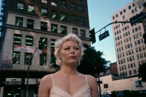
Image 3: Hannah Starkey “Untitled” 2003. I like the painting-like quality of this photograph, which seems to play with the truth of the image before us, wavering between photography and painting. This quality also makes it difficult to first discern what we’re even seeing.

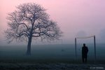
Image 4: Yeondoo Jung “Location #1” 2005. The construction of a stage in this image makes the viewer question the reality of everything else, playing into the preconceptions of theater and the stage.

Image 5: Rune Guneriussen “Bustle of plausible alliances” 2013. Guneriussen’s work constructs odd, yet beautiful structures in nature, which don’t look as if they would exist in reality, but they do, blurring the line between expected truth and the photograph.

Image 6: Marilyn Minter “Gasp” 2004. I love the visceral, gritty quality of these images, which seem almost unreal with the colors and items in the photograph. The viewer attempts to figure out the “truth” of what is happening in the photograph.

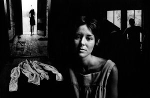
Image 7: Todd Hido. I love the creepy, lonely feeling of the photograph. Even though the image is of a house, a familiar, often “safe” object, the portrayal in this work seems unsettling and off.

Image 8: Philip-Lorca Dicorcia “W” 2000. This image is so driven by the color palette, which makes the truth of the photograph stretch, the viewer questions whether these people are in the same room/same time/etc.

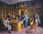
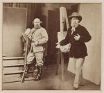
Image 9: Yinka Shonibare “Diary of a Victorian Dandy 14:00 Hours” 1998. Similar to the last image, the painting-like quality of this photograph seems to stretch the truth, especially within a historical context. The image is full of narrative, with various elements and stories playing out at once.

Image 10: JR “Rooftops” in Women are Heroes 2009. This image is combination of photography in the real world being photographed. The truth of the unreal looking women on the rooftops pushes the viewer to question the reality of the image.

Too True

Salam Nassar: Too True

From Portraits and Dreams (Saudi Arabia) 1989: the subject manipulated the negative to hide her identity.

Secondhand Tires Displayed for Sale; March 1940. This image feels constructed to me because we don’t usually see things for sale displayed on the faces of buildings. The nod to Walker Evans’s work also makes this photo feel constructed.

Race Car (sometime in the 20th Century?); This photo is somewhat troubling because we know that the wheel of a racer probably isn’t quite oblong like that.

Untitled from Twilight (2001-2002). The scene looks real because of the nature of how we approach viewing photographs; however, the scene is entirely staged and constructed from scratch.

Falling Soldier (1936); This photo is accepted to be the first photograph of death on a battle field; however, it is highly likely that this photo was completely staged and that the man in the picture wasn’t even dying.

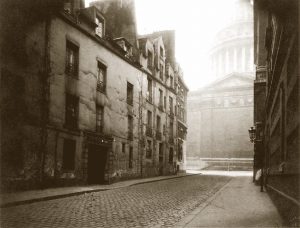
Paris (not sure of date); Atget’s photographs of the streets of Paris are deceiving because they are taken in broad daylight in the middle of downtown Paris, yet many of his photographs do not include people.

Mother and Baby of Family on the Road (1939). Dorothea Lange’s photos were commissioned to document the effects of the Dust Bowl and Great depression on the lives of Americans. This photograph is questionable in its depiction of the truth, because there is a sister image of the same mother and child in which both are smiling, the the child’s face is actually relatively clean.

A Naked Man Being a Woman (1965). This image blends our expectations and perceptions of masculine and feminine bodies, seemingly with the intention to initially deceive or make the viewer take a second look.

Mt. Williamson (negative 1944, print 1981). This image feels highly constructed and manipulated in the sense of Adams’ aesthetic such that every inch of the photograph must be completely in focus.

Media Market (2016). This photo is an amalgamation of photos to create a single image in which every object is completely in focus.

Too True

In sequential order:

  1. New York Times, 2010. Photographer unknown. Doing some research, it turns out that this image was staged. It is an image I have seen over and over again and found it to be compelling because of how it was composed, and how concentrated the subjects are on the artwork. Their gaze seemed natural but apparently was not.
  2. Lunch atop a skyscraper, 1932. Charles C. Ebbets. This photo is one that hangs in my friend’s dorm room here at Bowdoin. I also found it scary and given this assignment, I’ve come to realize my uneasiness with it stems from the fact that it can’t be real. It doesn’t seem probable that these workers could be sitting far above an outlook of NYC.
  3. Sarah Jones, 1997. The scale of the tea cup makes it seem unlikely that this is one photo but rather a compilation of multiple images to produce one image.
  4. Unknown. I found this one an art site called haasandhaas.com and they had some tableau photos that I found aesthetically pleasing. This one in specific seems real but at closer look it is apparent that the sun is hitting one building and not another, causing me to conclude that they are two different photos.
  5. Unknown. Haasandhaas.com. I chose this photo because I like the color in it. It’s a great photo, really. The woman looks like she will either fall backward or forward and when analyzed deeper, it appears that this is two different photos; the background photo taken at a low angle but facing the sky, while the foreground is also a low angle but taken from the ground up.
  6. Fandra Chang, 2000. Aesthetically pleasing photo as well but the angles and uniformity of the houses, especially as it extends back, questions the plausibility of the photograph.
  7. Robert Adams, 1974. I’m a fan of Robert Adams and this specific photo makes me question scale and the origin of the smoke. To me, the tree seems too small from where the camera is positioned and the smoke seems too uniformed. It’s all really odd but pleasant to look at.
  8. – 10. John Pfahl from his series “Altered Landscapes” (1974-1978). We viewed some of Pfahl’s photographs in Photo I and honestly, I’m not sure whether some of these are false creations or not. The thing is, is that everything seems too perfectly aligned to believe it to be natural. There is a play with scale and distance in his photos and they seem like interesting photos to analyze.

Too True

Cape Canaveral, Florida by Tseng Kwong Chi, 1985: Chi, a Chinese-American, performs his Chinese identity by taking photos of himself dressed as a Mao type figure, interacting with American landmarks.

Fading Away by Henry Peach Robinson, 1858: Robinson is using composite imagery to create pictorial scenes here. The image looks real because it is a photograph, but its actually highly staged and a composite of multiple photos.

The Mythic Being: Sol’s Drawing #1-5 by Adrian Piper, 1974: In this series Adrian Piper dons the hyper masculine identity of the mythic being. The untruth here is that this appears to be a portrait of a man but it is actually a self portrait of the artist.

Malaika #07 by Lise Sarfati, 2010: Sarfati poses her models, aspring LA actors, in scenes that are meant to capture their experiences. These are based on real feelings, but the actual scenes are creations.

Child with Toy Hand Grenade by Diane Arbus, 1962: This famous Arbus photo seems to show some war traumatized child, but its actually just a kid who wants to get back to playing. Arbus creates a narrative that isn’t actually in front of her.

Spiral Jetty After Robert Smithson by Vik Muniz, 1997: Muniz recreates Robert Smithson’s massive, “Spiral Jetty” as a shoe box sized scene. You can’t tell its a recreation from the photo alone though.

Room #1 by Jerry Uelsmann, 1963: This is a composite image of around 6 different photos, combined to create a surreal, dream like scene

Untitled #355 by Cindy Sherman, 2000: This is a self portrait of the artist who transforms her identity with makeup, becoming a different person in the photograph.

Untitled by Jo Ann Callis, n.d: Callis carefully creates scenes with women that play with feminine identities

Too True Ben Painter