The data collection team was composed of Vincent Dong ’21, and Drew Macdonald ’20. As the team name suggest, our team was in charge of collecting the necessary data relating to the Bowdoin Gallery. This included painting data, object data, and spatial data.
We first measured the locations of the display cases in the Bowdoin gallery. We also collected the dimensions of the room, which was used by the Database Design team to construct the graph database. We used these measurements to create a to-scale digital map of the gallery, which was useful for all teams in visualizing the area.
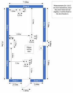
Diagram of the Bowdoin Gallery
An issue we encountered during this process, was that after taking these measurements, the gallery underwent renovation, and the paintings and objects were swapped out for a new collection. After we retook these measurements, we met with two coordinators at the library, Sean Burrus, and Joachim Homann, to discuss how to divide the paintings into themed zones. It was decided that it would be best from a narrative perspective to split the gallery into seven zones. Since we were the first of our class to visit the updated gallery, we recorded pictures of each zone, so that other groups could see how each zone was organized. Additionally Joachim provided us with a detailed sketch of the floor-plan of the updated gallery, which included information on where each painting would be located.
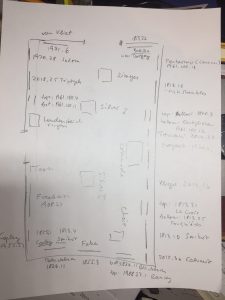
Sketch Floorplan from Joachim
We were told that objects weren’t getting installed until May, so due to time constraints and talking to other teams we decided to only focus on painting data.
David Francis, the manager of the museum’s database, provided us with a comprehensive spreadsheet of everything owned by Bowdoin, with the fields we had specified. These fields were decided upon by meeting with the database design team. From there, we manually pulled out each painting that would be installed in the updated gallery, while adding two new fields of our own. These were “Zone”, which specified which zone the painting resided in, and “Description”, which was a brief description provided by Joachim of the piece. We were able to add this zone data using the diagram that Joachim provided.
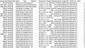
Spreadsheet of Painting Data
When combing through the data sent to us by Joachim, we noticed that a description field for one of the paintings was empty. We inspected the corresponding plaque for the painting in the Bowdoin gallery, and after pointing this out to Joachim, he realized that plaque was incorrect. Thus, we were able to quickly catch a mistake in the gallery, before it opened to the public.
As well as this spreadsheet of the collection, Sean and Joachim provided a large amount of information on the layout, and history of the paintings. This information was then passed on to the UX/UI team, so that they could structure the narrative, and virtual tour of the gallery. This information on zones and narrative was also passed along to the entire class, as it was instrumental in constructing the graph database, as well as the mobile application. The spreadsheet of painting data was directly pushed onto the database team as a CSV file.
Once the data collection aspect of the project was complete, we were moved into the UX/UI team, to assist with creating the website you are currently on. In this role we helped with all aspects of the design, and content management of the site.