
The soviet propaganda posters are all so rich both artistically and visually, I am sad that many of the first years in this course never got a chance to see the wonderful exhibition of soviet propaganda that was in our art museum. Last class when we talked about what “socialist realism” should be, the propaganda posters are perfect illustrations of the doctrine. They show life not as it is but idealized. They are easily understood and serve a distinct purpose of the state. I know given the time frame of our class we won’t have a chance to talk in-depth about each one, so I hope to in my post do a deep dive into one poster.
The poster I want to talk of is from the “Lenin era” specifically the one of the blind man (hopefully it is shown below). The intended message of the poster is written below “An illiterate man is like a blind man. Everywhere failures and misfortunes await him.” Skillfully and subtly, this poster visually fortifies the written meaning. Most notably, the man is walking to the left, which is unnatural to the viewing eye who is used to reading left to right. This motion indicates the man is walking the wrong way, away from the left to right arrow of progress that is the norm. Additionally, the Man is seen with long hair and a beard, perhaps referencing “old believers” and showing their “backwardness.” More so, the visual style of this poster is that of the wood prints we looked at early in the semester, antiquing illiteracy and the illiterate man. Interestingly also, the cliff seen here mirrors that of the statue of the bronze horseman. Whereas in that statue, Peter rears his horse pointing and looking off of the cliff into the modern world, the blind man instead stumbles backwards off of it.
You can see the amount of meaning that these Soviet artists saturated their posters with! It is an incredible form of art, just dripping with cultural meaning. To open this up as a discussion, perhaps people can put in the thread other posters, and historical cultural references they see in them, and how those references are being used under the “socialist realism” doctrine.
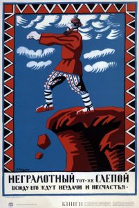
Excellent close analysis, Brennan, and a great idea to suggest ways to open up the discussion! I would just make one important correction: this poster dates from 1920, the time when the Soviets were just beginning to consolidate power and, simultaneously trying to eradicate illiteracy–both to modernize the country, and to be better able to spread their propaganda. The doctrine of socialist realism was not adopted until 1932.
I’m not completely sure that the man in the image is supposed to be a representation of the Old Believers. The reason I don’t believe so is that the man, aside from his hair, lacks any Old Believer iconography (i.e. distinct way of doing the cross). I think the colors used are to more show the Russian peasant highlighted by the color choice used. I wonder if the clouds have any stylistic choices as they seem to be going in the same “wrong” direction as the man.
I agree with the point Colby makes: for the Soviets, it was enough to be a backward, illiterate, unenlightened peasant (all of whom were traditionally religious–it didn’t matter at all to the Soviets what “flavor” of religion, since all religion was being eradicated). This man is not marked in any way as an Old Believer, and whether he is or isn’t, just isn’t significant to the poster’s message.
I really liked your analysis Brennan! I think all of the cultural meaning you pointed out was very interesting. One thing I found intriguing was the the “wrong” was in which the man is walking. I also agree with Colby that the clouds seem to be going in the same “wrong direction. Another aspect that I noticed was the use of only red and blue as contrasting colors in the image.