This week I did a drawing on just the reflection of glass and water in the glass (however, the colors of the reflections are influenced by the environmental colors around it). I found that the reflected colors are very rich and has a lot of ‘layers’. This week I had better chance blending the colors, although I still haven’t put pastel white onto the drawing (I found some pastel pencils that I bought, so I could add some highlights and post again). Think I will stay with drawings reflections with coloured pencils from now on. 🙂

X


Hi Julie,
It’s good to see you picking up steam, and I see a lot of promise in the three drawings we’ve seen so far, but it’s time to bring that promise to fruition.
I feel like you’re at a crossroads at the moment. The images could become higher resolution (more “photorealistic”) or more abstract. These two are not mutually exclusive (as with Janet Fish) but the tight cropping on this week’s drawing seems to be tipping toward the latter. Jack’s suggestion to add more objects is a good one if you prefer the former—to generate more subject matter and opportunities for refractions and reflections.
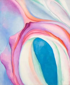
Either way, the work needs a wider range of edges from sharper to softer and higher contrast (see the O’Keeffe I’ve attached) to create more dramatic visual effects. As is, these feel fairly pedestrian and lacking in ambition—not lacking in the quality of your thesis but in the force with which you’re putting it forward.
An analogy: In electricity, we measure electrical power in terms of amperage and voltage. Amperage is the amount of electrical power in a line but voltage is the force or pressure with which that power is conducted. Even with high amperage, low voltage means less power (or wattage).
Right now your work is showing high amperage but low voltage—not much pressure, especially given how much this idea has to offer.
Even during a single work session from the model, before break, you were someone who could spin out 2-3 ambitious, finished drawings that any one of us would have been proud to make—high amperage and high voltage, and very high wattage.
Working on your own, however, you’re setting your sights much too low. These are very good in their humble way but need to be bigger (at least somewhat) and your pencils need to be sharper, to give you higher resolution. Right now, at this scale, the grain of your mark is competing with the image. Again, look at O’Keeffe or Fish for better examples.
You’re also being modest in the quantity of your work. Something this size and intricacy (which is not very intricate) must be taking you far less than the 10 hours per week we have budgeted.
In short, it’s time to up your game. One suggestion I have is to switch to watercolor and possibly colored pencil over watercolor. I’d also get on to a bright white paper rather than a toned paper, if luminosity is a goal, as it appears it should be.
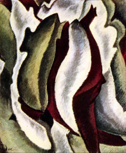
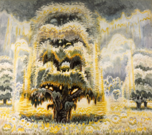
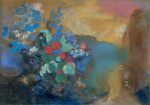
Other artists you might want to look at are O’Keeffe’s very good friend, Arthur Dove (attached), or their contemporary, Charles Burchfield (also attached), who some call “the American Van Gogh.” And Odilon Redon (Matisse’s teacher, although you’d never guess it).
If my premise is wrong about what you’re after, please correct me but either way I need to see a greater show of force—mostly because what you can do is so good.
Hi Mark! I have read your comments and I do agree with what you have said so far. When this drawing was produced I had no other materials other than my notebook and coloured pencils. In week four, I upgraded to a larger drawing pad. Now, since I have my watercolour as well, (and a large drawing pad), I could upgrade my game for the final.
Thanks for the O’Keeffe suggestion! I looked at some of her paintings of colourful enlarged flowers. Very inspiring.
Julie,
I think this is a really interesting direction to take this project from last week.
You personally are staying in the world of representational drawing, but as the viewer starts to lose pieces of visual detail to orient themselves within the image, the viewing experience becomes increasingly about the abstract ways in which the colors and gradients and shapes play with each other.
I would argue again the side of not letting the edges fade out, because maintaining a crisp frame for the image I think would help the viewer not lose themselves, especially as the innards of the image have started becoming more disorienting.
One thing about the glass which I keep coming back to is that I’m not convinced by the ellipse you’ve drawn here- but maybe it’s one of those squarish round glasses? I guess that’s part of what you’re doing here, is making these abstracted shapes and asking the viewer to trust you that it is in fact a glass.
I love the shapes in the refractions which are coming out- they have really interesting boundaries, defined by color shifts. My favorites are the blue horseshoe in the middle, a bit on the right, and the whitish L-shape it connects to, on the left.
I think in terms of photographing, that blowing off some of the eraser bits left on the drawing would help a lot, or maybe using a scrap of paper to sweep them off.
I think it’s really cool that you, who have an incredible base of drawing representationally without color, are diving into both color, and a certain mix of representation and abstraction.
Looking forward to seeing what you have next week!
So far I have read through all the comments and I think they are all very helpful. However, I would like to explain that currently I don’t have a large sketchpad with me (and the one I ordered never got delivered here). Wondering if there’s anything I could do with that.
Hi Julie,
I like your choice of subject matter and your medium. The two provide a cohesive echo in terms of materiality. Sometimes I find it hard to recognize the exact form of your object, which I mainly think comes from your zoomed-in cropping decisions. In this case, I wouldn’t particularly argue against it, given how it responds well to your rationale of a “looking glass”.
However, there might be ways and methods for you to try to bring some uplifting touches to your composition, identifying points of highlights and visual concentration. What I can think of is to selectively differentiate the amount of “blending” you do on the paper in order to bring forward points of higher contrast. Spending some time with multiple smaller pieces might bring you faster to what you envision.