Architecture Drawing


Ink Drawing 8.5’x11”

X

Are these washes really brown, or is that the photo? If they’re black and white, use the Saturation slider to remove the color.

And the exposure on this next one…what’s the word? Oh, yeah–SUCKS. Please take a better photo of this one for the class show (no cast shadows and no glare on the ink).

Ink Drawing 8.5’x11′

X

Giovanni Battista Piranesi

He’s most famous in art history for his imaginary Prisons series, above, but his day job was making straight-forward engravings of exisiting buildings–kind of an 18th c. version of a travel souvenir for travelers to take home with them.

This dichotomy reminds me of the two paths I’ve seen you entertaining for the past 5 weeks. Glad you’ve come down on the side of the angels.


I switched back to pen and ink and added brush and ink wash to the formula. I took myself back to some of Louis Hahn’s architecture and chose some of the photographs that are more geometrical terms of composition. I decided to be more expressive with my strokes.

Compare to my attempts last week, I feel more comfortable with my current approaches of putting my focus on lighting, texture, and especially on geometries and gestures.

I still have some doubts about my methods: 1) Is the amount of texture variation distracting? would the drawings benefit more from simpler use of material? 2) Should I do the next drawings from life?

Portraits

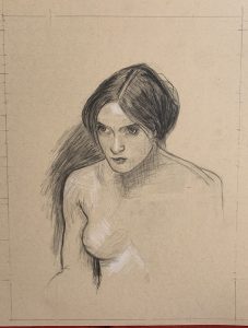
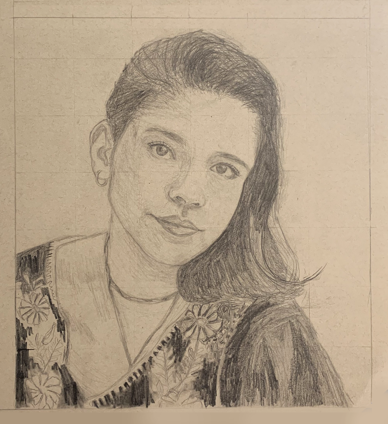
John William Waterhouse portrait

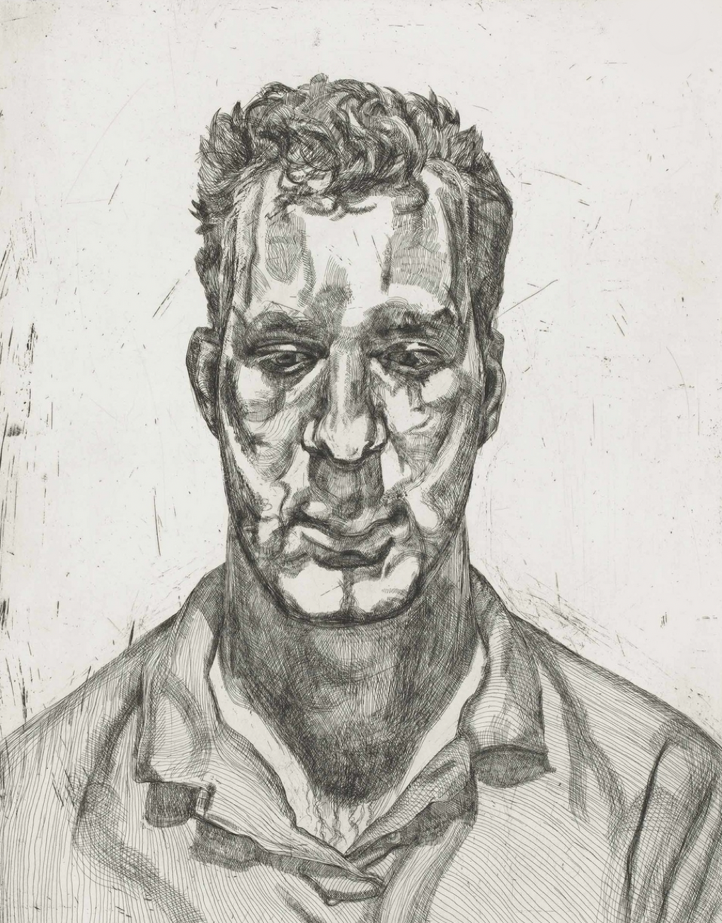
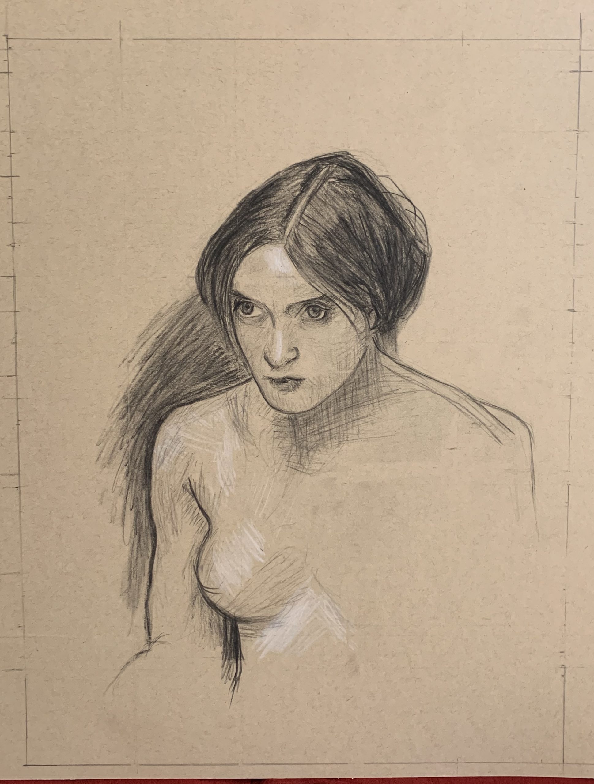
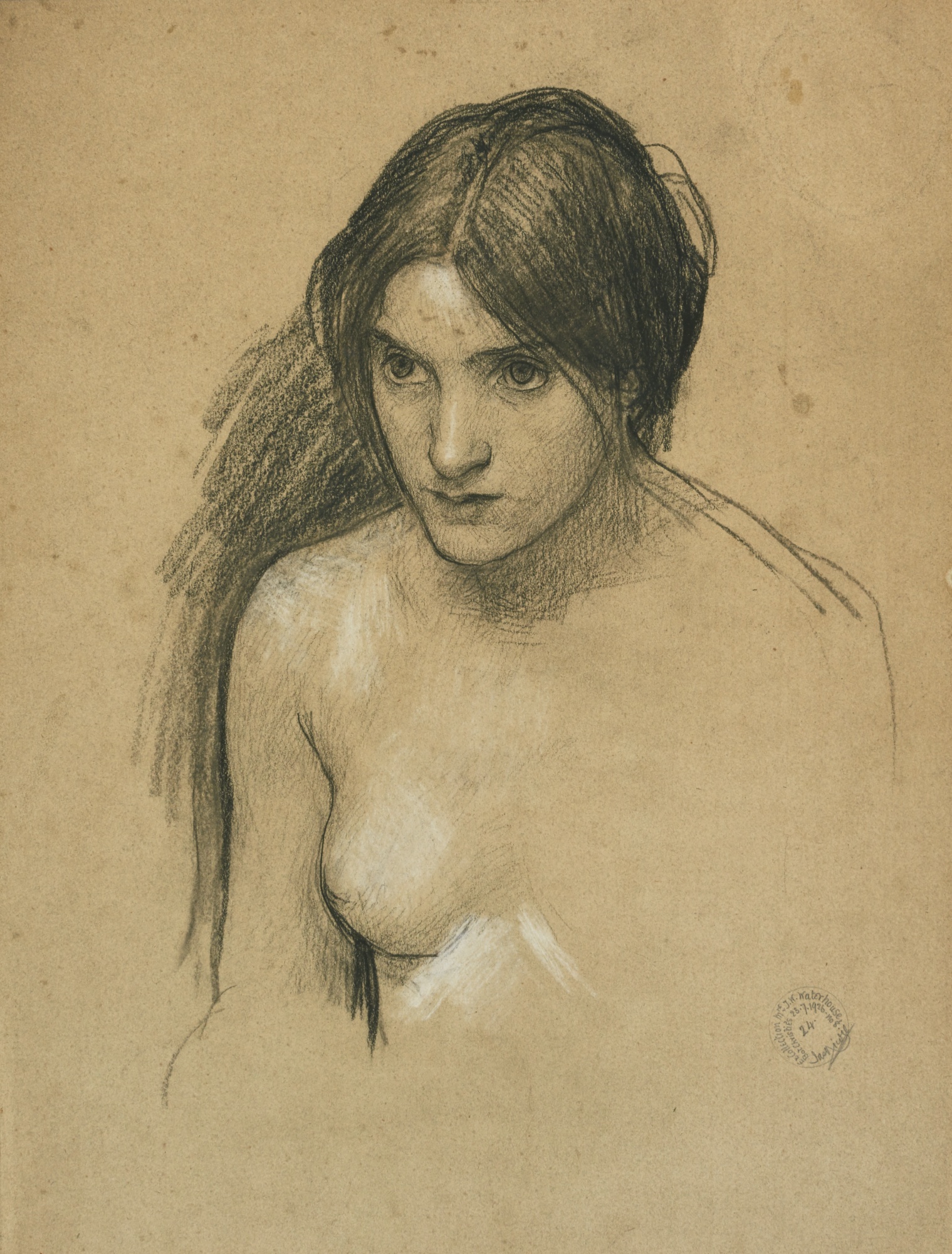
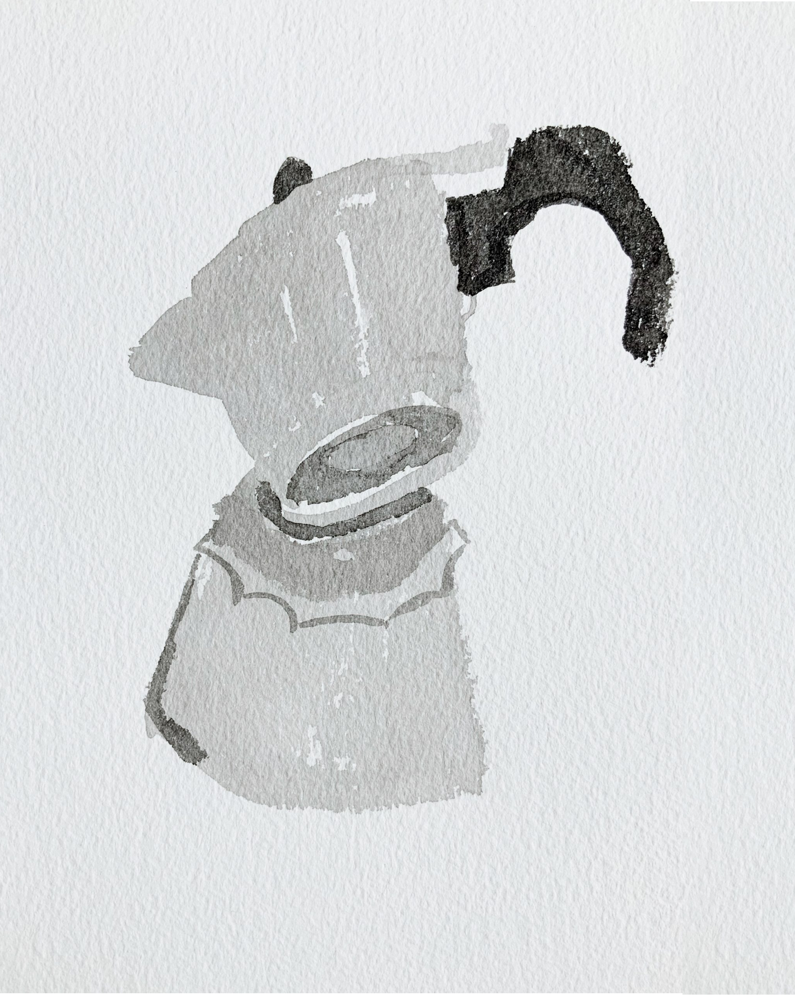
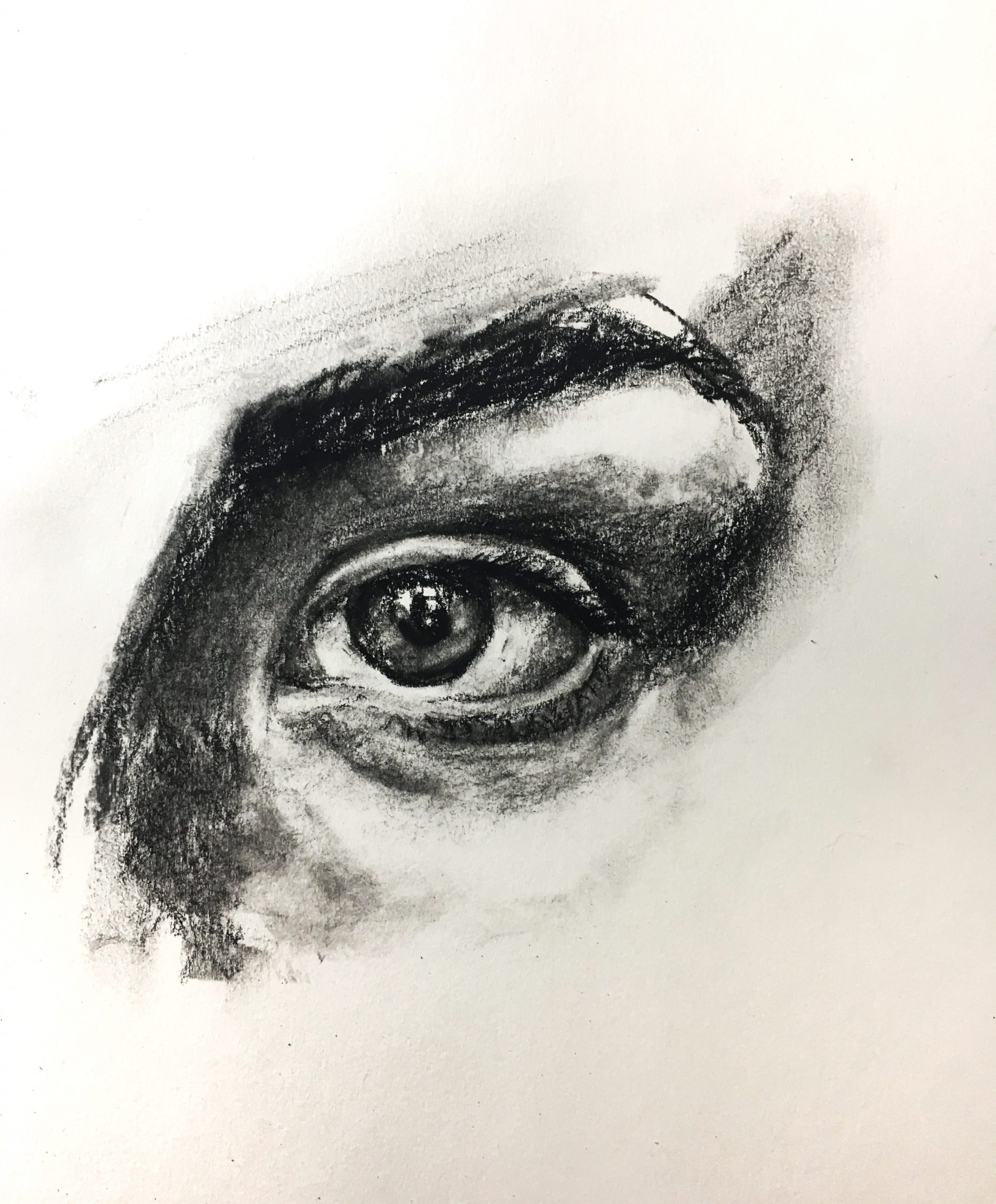
Despite your doubts, this is a fine rendition  of the Waterhouse. As I mentioned to you elsewhere, even if he did a second version it would come out differently. Expressions like being pensive and being angry often hang on the slightest of nuances–raising an eyebrow a scintilla, the slightest flair in a nostril.

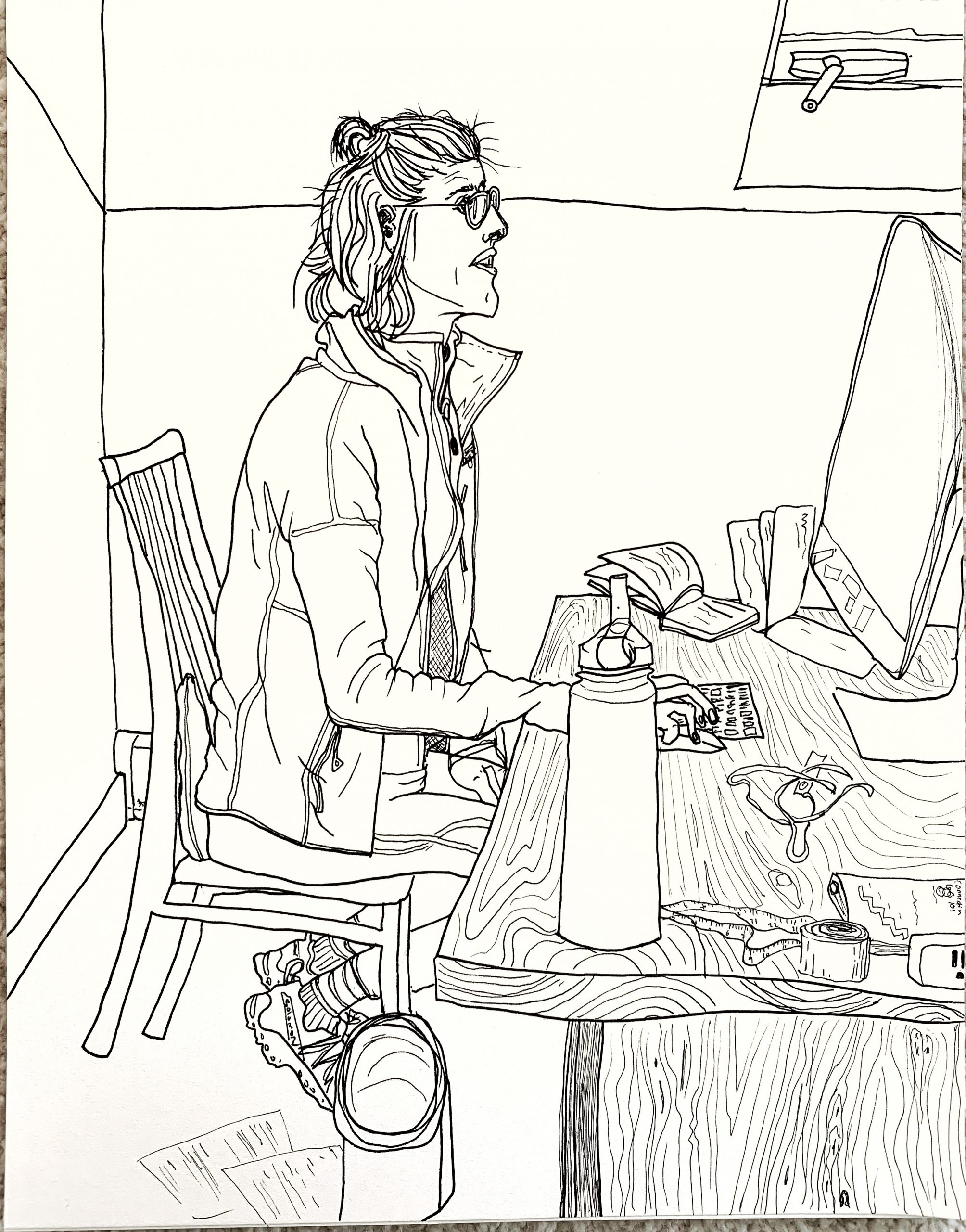
I notice here, as in your self-portrait below, that you’ve added space above her head. This also has a psychological effect on how we read the image. Composition contributes to meaning as much as (maybe more than) any other element.


Charcoal pencil on paper. 12.5X16

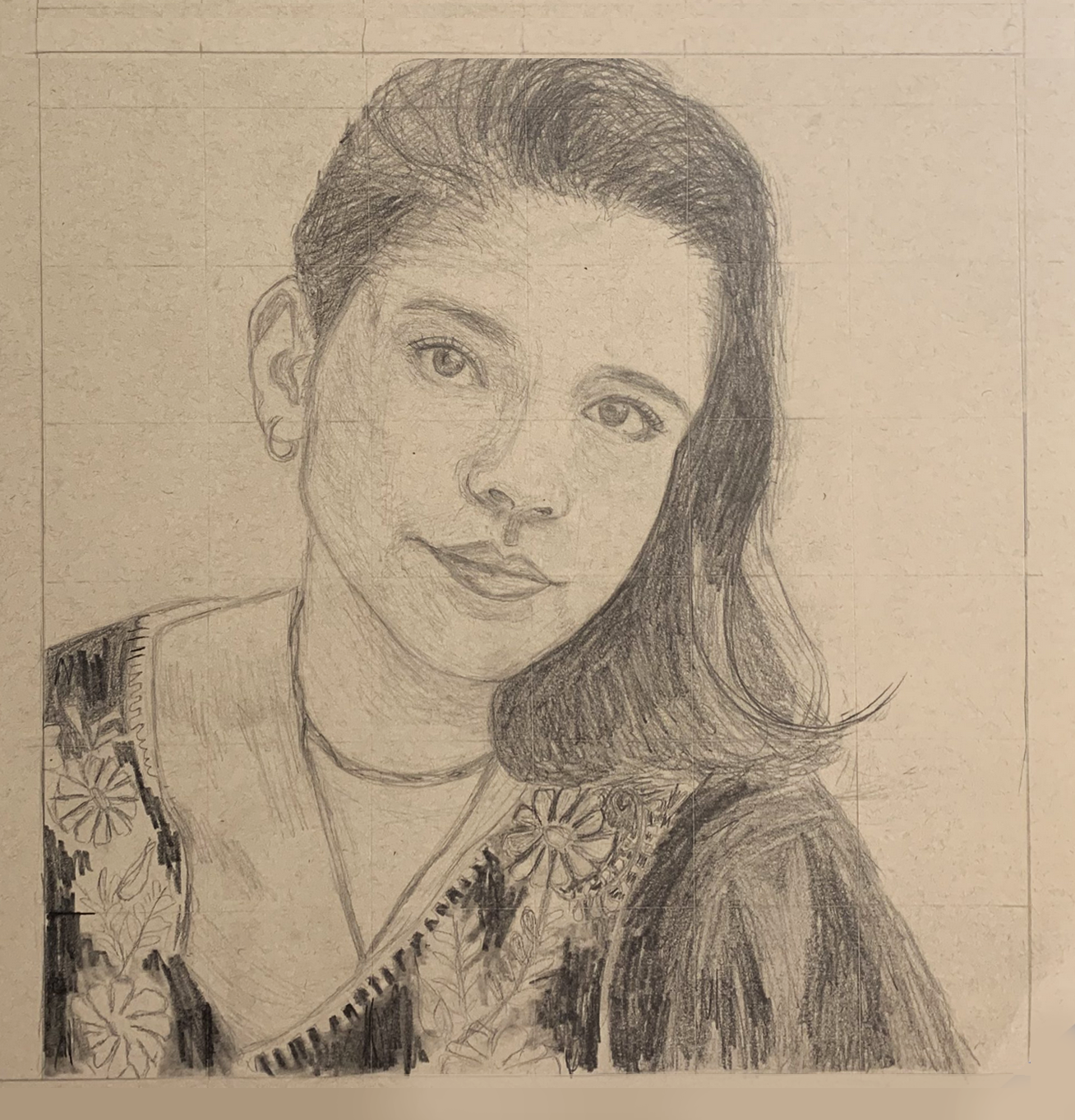
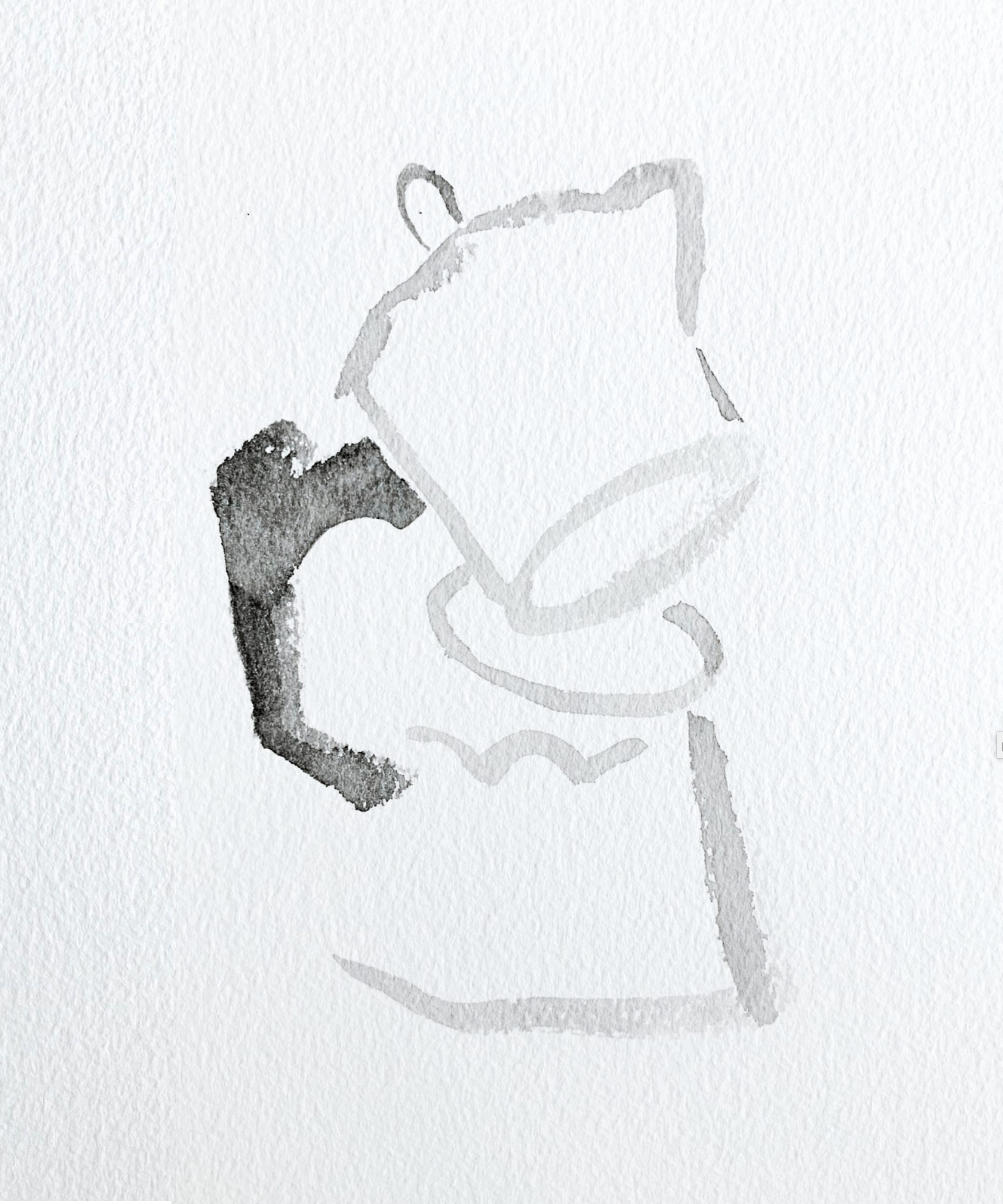
X (but with a better cropping)

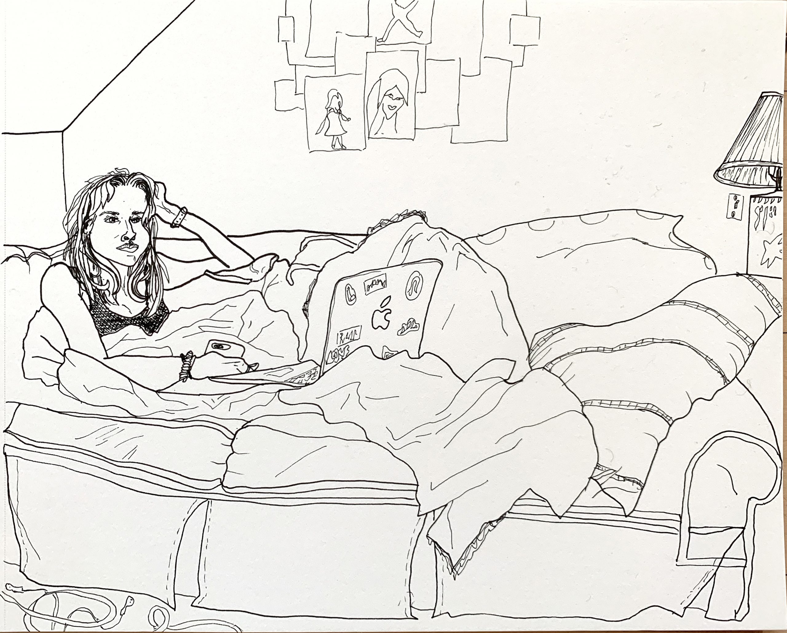
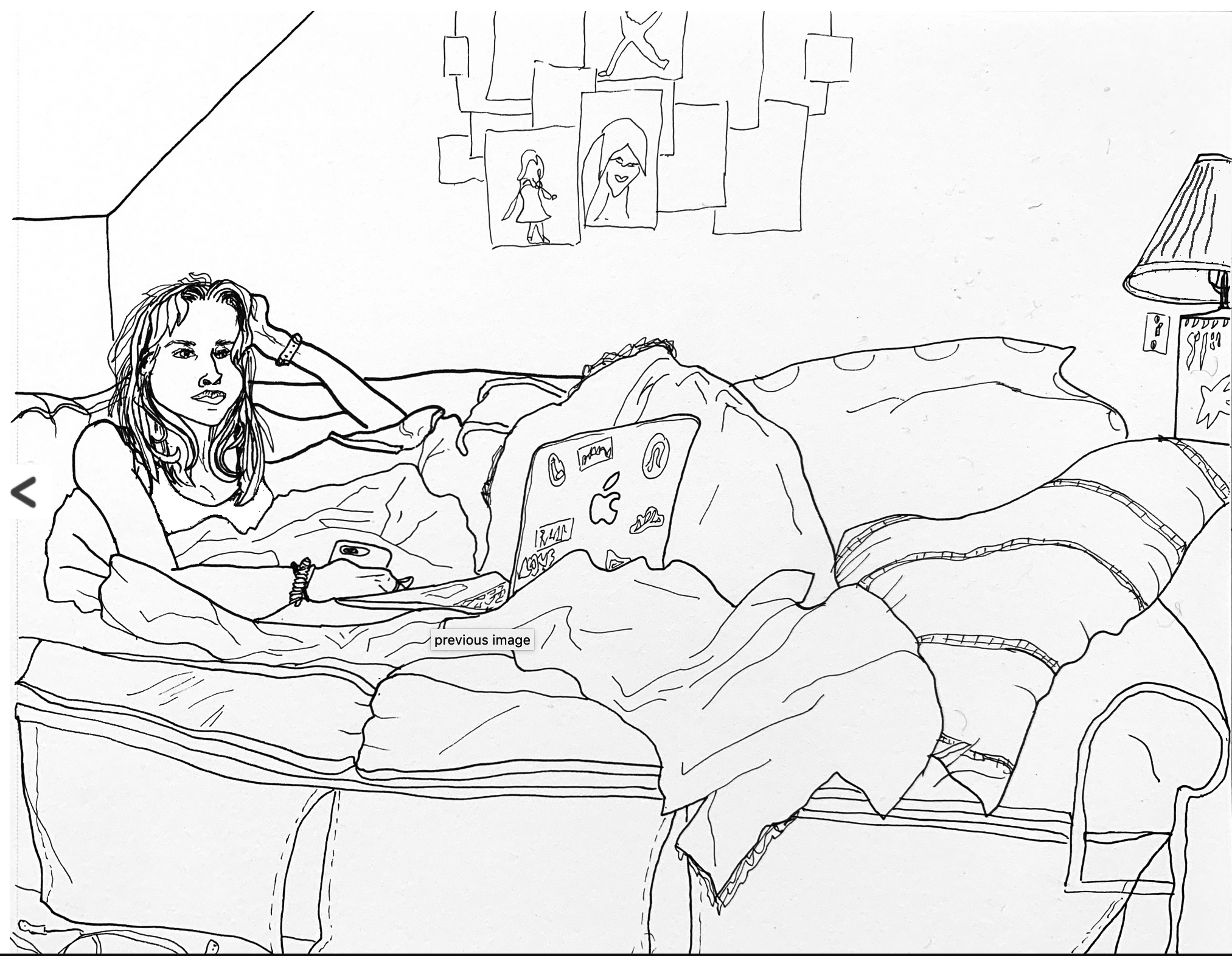
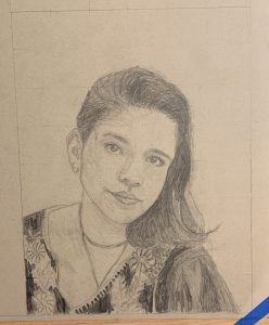
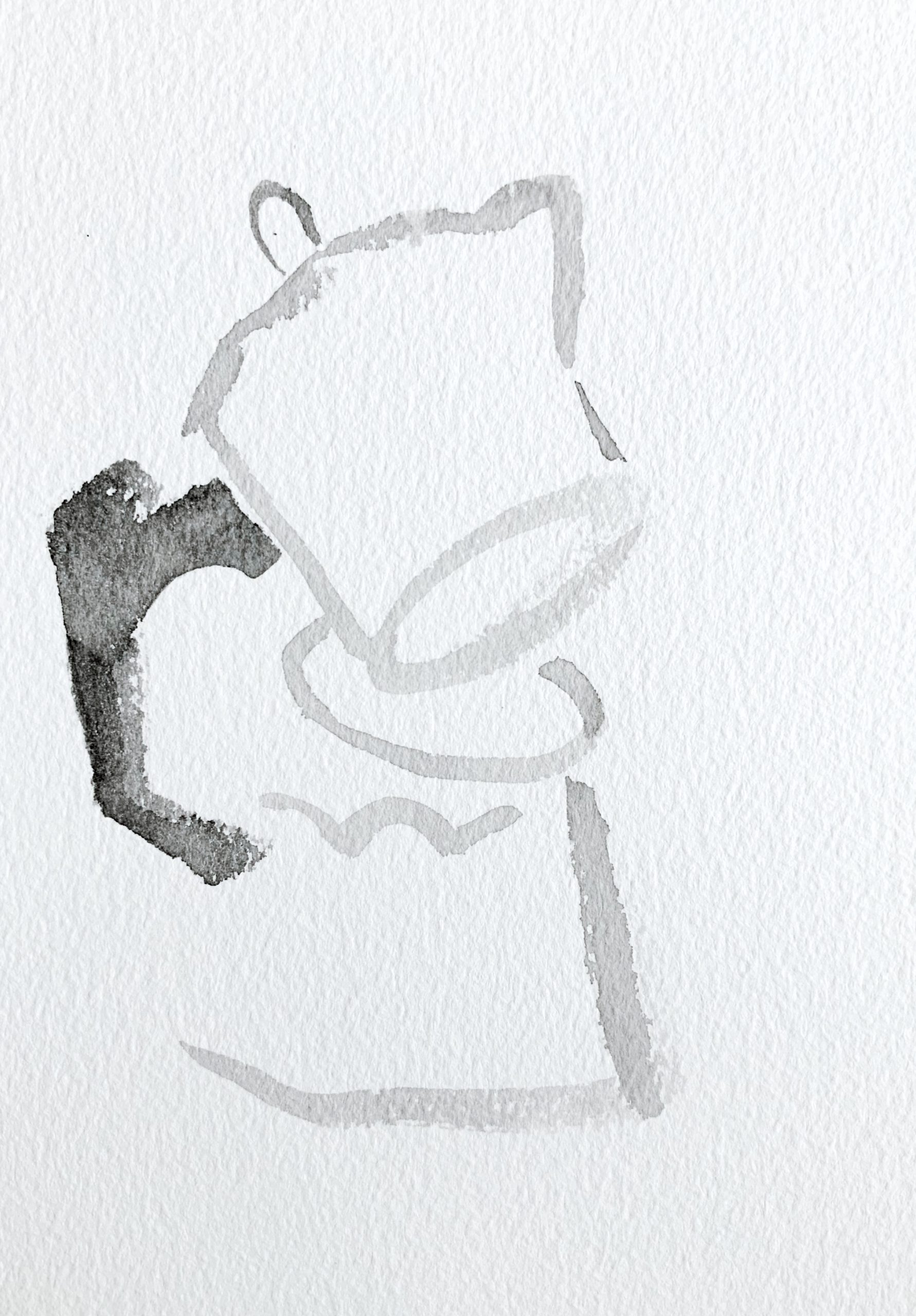
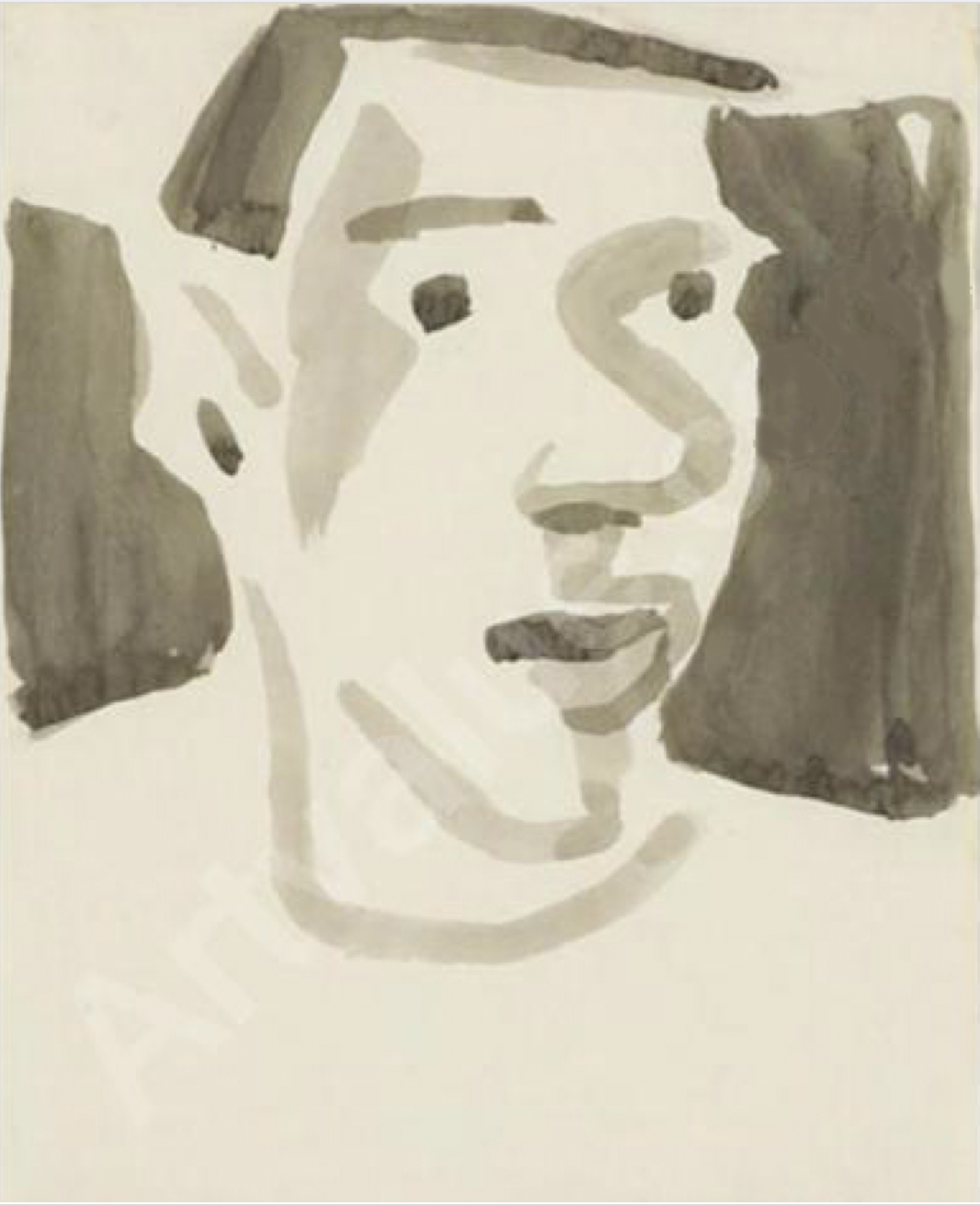
First, I squared up the image (below), gave it an even border (you should leave more than that bottom edge at the start–at least an inch, in case it ever gets matted and framed), removed the tape, and increased the contrast slightly, just to make the drawing more legible….

Then I’m suggesting cropping it closer to the top of the head. A rule of thumb in portraiture is to have the eyes in the upper half of the composition. Yours are about half way down, which makes the figure feel more diminutive (both physically and expressively).

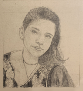
But I’d go so far as to crop into the hair slightly, which activates the negative spaces to either side of the head (and therefore all of your other shapes), and draws more attention to the eyes. It also creates a more uniquely proportioned rectangle rather than the business-as-usual rectangles that paper (and photos) come in.

As for the drawing itself–it’s beautiful.

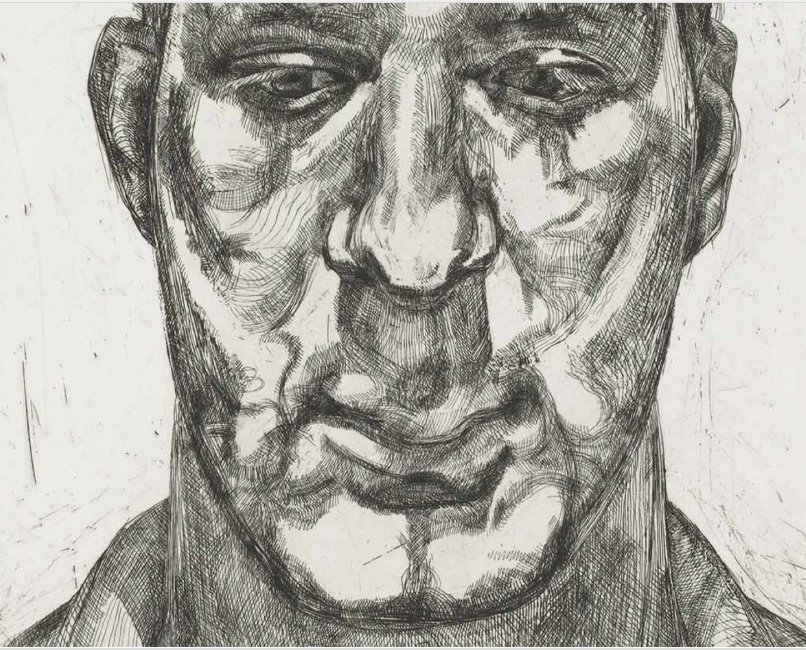
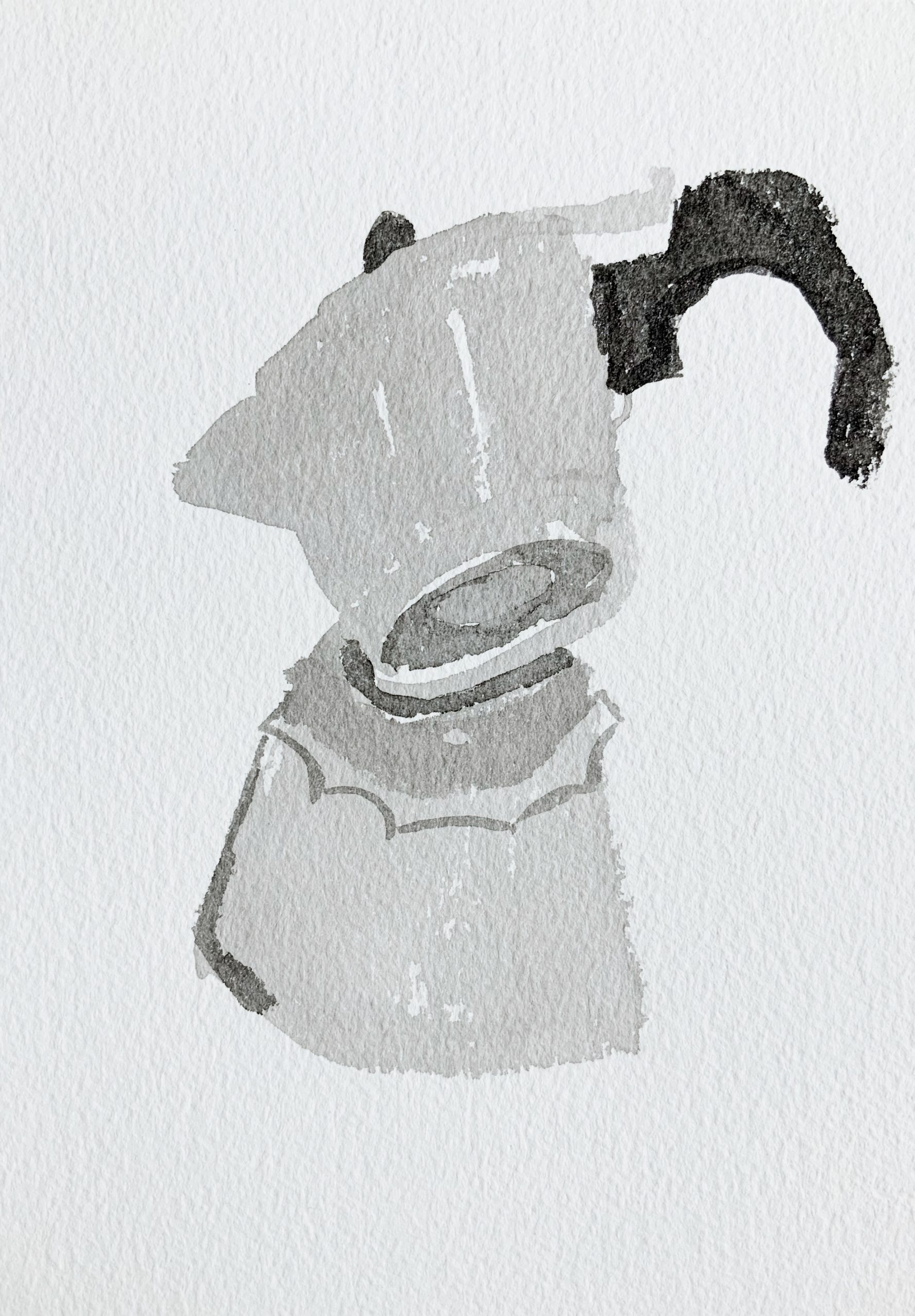
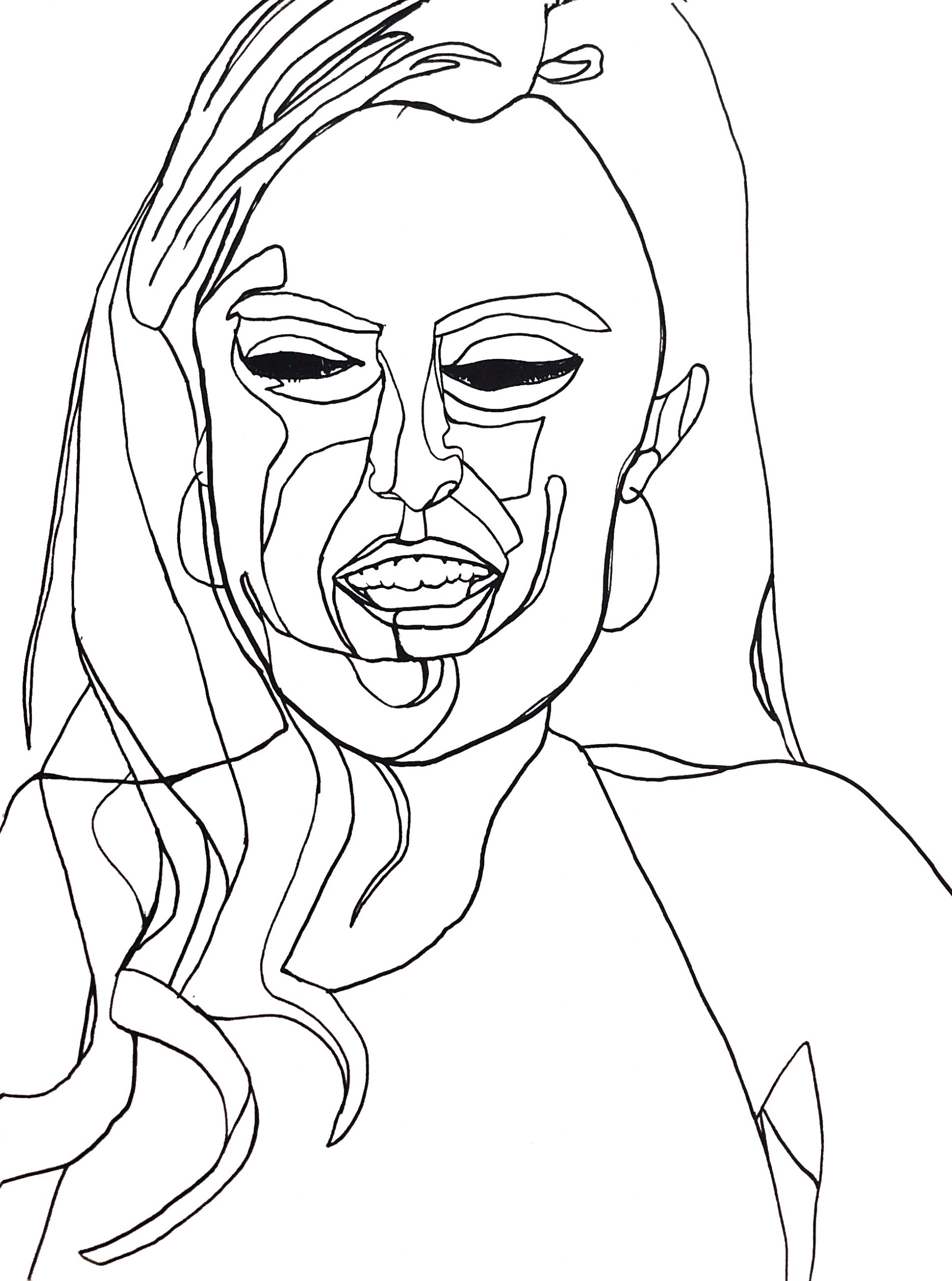
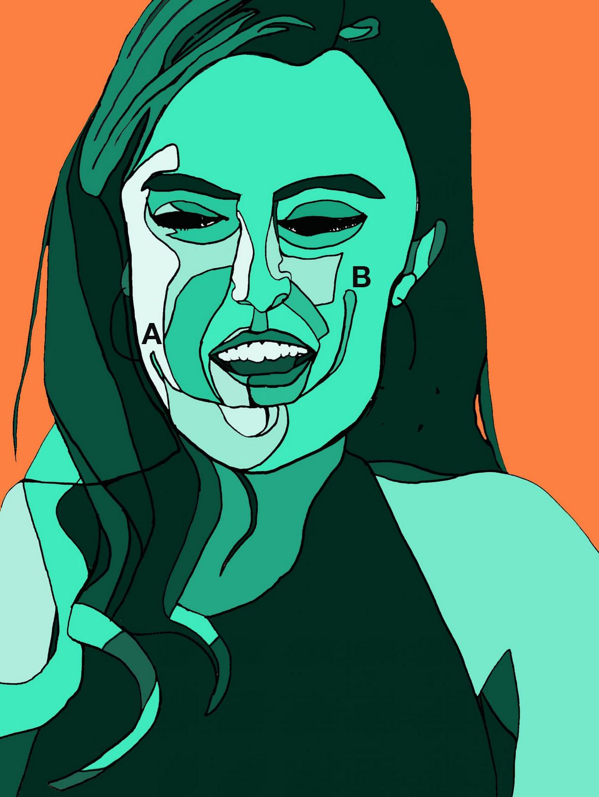
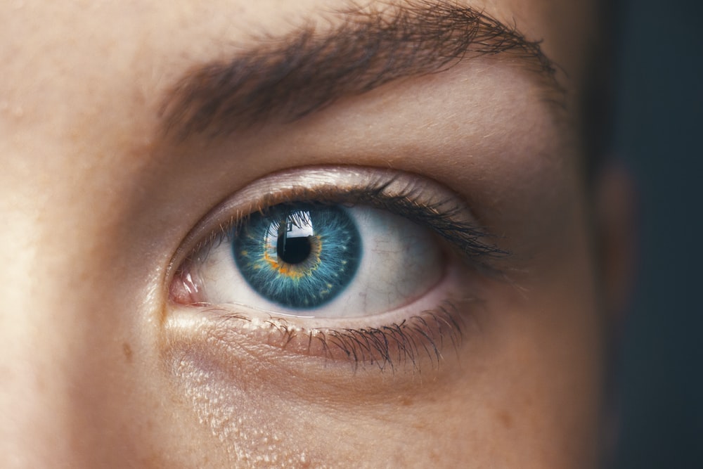
Drawings are like lie detectors–this one is telling us you’re more captivated by the patterns on the dress than the portrait. The portrait is great but drawn with a certain reservation. Punching up the contrast in the eyes alone would help a lot. Also, her right eye (on our left) should be a bit closer to the bridge of the nose. As in the photo, note how the tear duct is directly above the side of the nostril. You nailed this on the other eye.

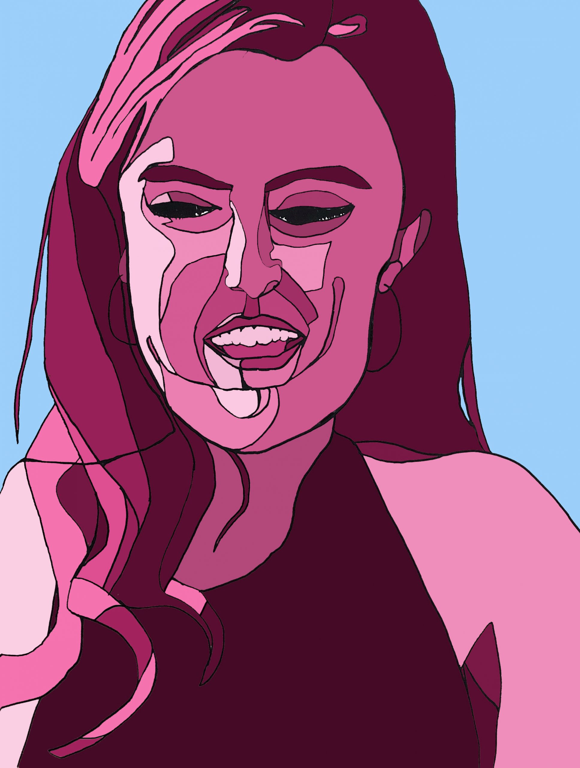
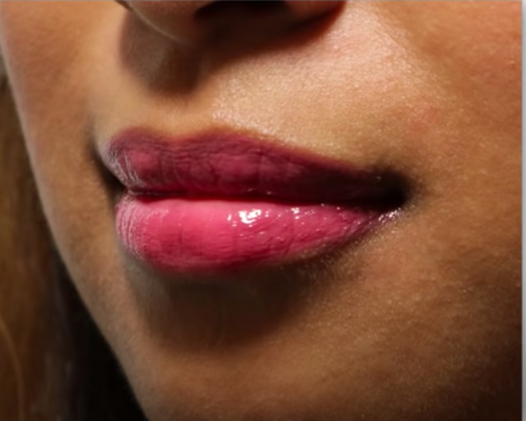
As in the Waterhouse copy, being on toned paper, this is ripe for some white highlights. They only need to be very delicate but they’d add a lot, especially given the light in the photo–

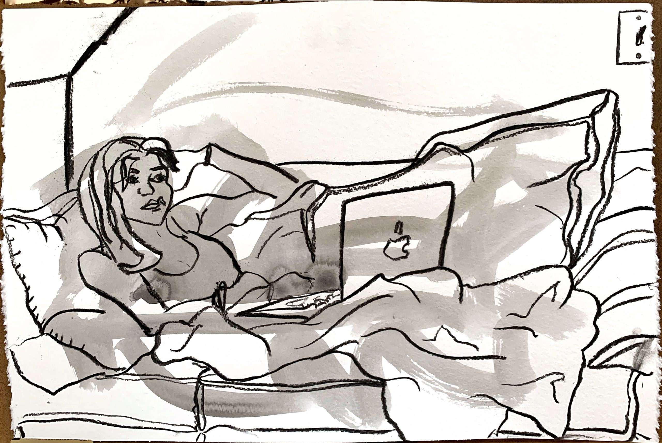
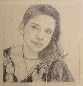
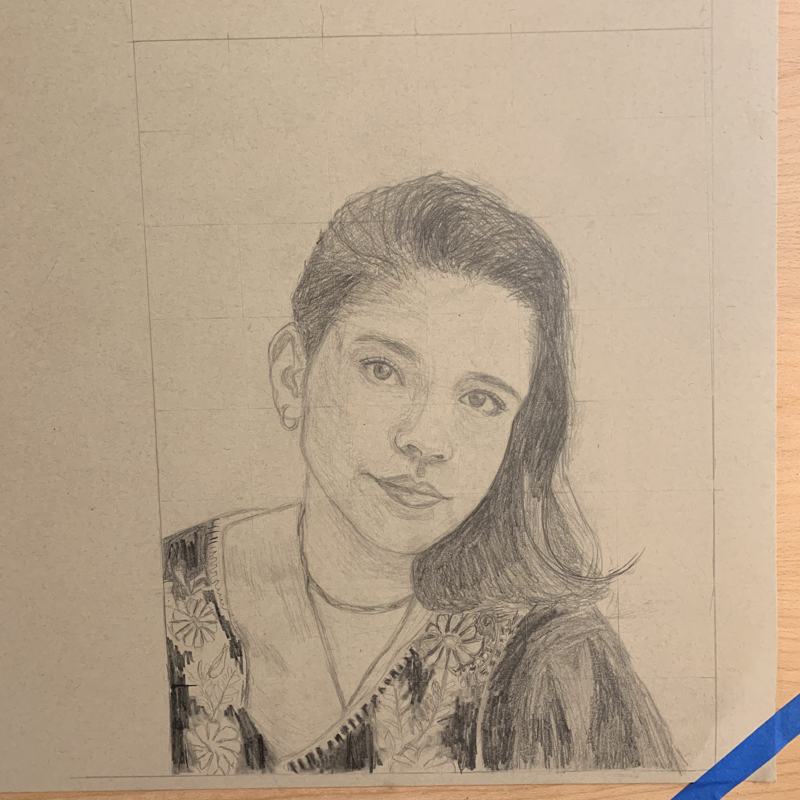
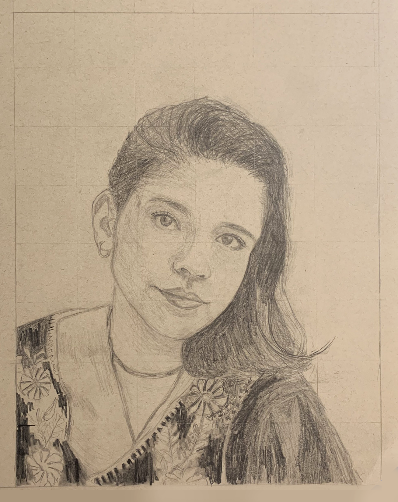
Pencil on paper 12 X 16

I just not realized that the weekly assignments Mark sent us were just a suggestion and for the Drawing I class. I’ve been more concerned with completing the assignments than with maintaining my thesis. I was so confused why everyone else wasn’t following, and this is why there has been such a disconnect between my works.

ANYWAY

There is some continuity though. Both of these drawings are portraits and from photos. The first is based off of a John William Waterhouse study. And the second is from a photo I took on my phone for the “self-portrait” assignment. (I’m really kicking myself for this) I’m more please with the Waterhouse drawing but I don’t think I successfully captured the look in her eyes. My eyes are more intense while the original’s are not. I also think I made the face shorter than it really is. And the nose more pointy than it should be.

For both of these drawings, I placed a grid on the photo to help with my spacing. I think it was successful in the first but didn’t really help me with the second. The eyes do not align with each other and the shape of the face is off. The forehead is more square than my reference. I don’t know man… I watched the videos mark sent us but I’m still really struggling with drawing the portrait. I’m going to do more studies this week to prepare for a drawing I will do of my sister.


moka pot

Ink wash, dip pen on 5×8 inch watercolor paper

X

Ink wash on 5×8 inch watercolor paper

X

See my comment about the following:

Muqi Fashang, Six Persimmons, Ink wash, 13th century


Ink wash on 5×8 inch watercolor paper

X


I’m suggesting that the one above and the next one down could be better composed to activate the page. They both feel a little cramped to me. Note the difference in the two revised versions I’ve included. I think it also isolates the objects more in space and makes it a bit more…forlorn?

There’s also something to be said for breaking out of the standard 9×12, 12×16, 16×20 world and  working in a proportion that’s as decisive and unique as the images you’re making.

Suggested composition


Ink wash on 5×8 inch watercolor paper

X


Suggested composition


I ran across the following portrait of Richard Diebenkorn, by his friend David Park, and thought of your work. Just a few strokes, shapes, and values, but mostly about activating the white of the page.

Also an interesting hybrid of your two main approaches–insouciant brushwork with an activated ground, but still “tied off” to the sides of the rectangle.

Through the Looking Glass–Fruits

So, I finally got the 11 x 14 inch mixed media drawing pad. The texture of paper is very heavy and there’s a lot of substance in it.

For this drawing, I did three glass cups with three fruits, one inside the cup and two outside the cups. The reflection of the cup in the front “splits” the cup on the left into “two-halfs”, creating an illusion. The cups and the fruits were not very difficult to draw, except there are a lot of details that I have to take care of (and takes a lot of time). I wonder if I should finish up the background and everything as well or just leave the drawing like this since it showcases the most important structures and reflections of the cups and the fruits.

X

(MW) I was pleased to see that the comments shared some observations about the white space, so I took it back into Snapseed to get a better sense of how it’s working (by lightening the paper). There were slight losses in the pencil areas as a result (you need a better original exposure to get bright whites and strong colors) but no problem–it proved my guess that the paper is working just beautifully.

This might seem like an odd comparison, but this drawing actually brings to mind Willem deKooning‘s late work. The color somewhat but what I’m getting at is how the marks activate the white field to such a high degree that it actually becomes about that quality.

The other artist this brought to mind for the same reason is Charles Demuth (a contemporary and friend of O’Keeffe). Different subject, of course, but a similar dance between the drawing and the paper:

Photoshop Portrait Color Experiments

Acrylic Paint Marker on Paper, 24 x 18 inches

X

X

These are great. Love the color and the color background. The only thing I don’t understand is your interpretation of the planes described by the U-shaped line A-B, which cuts through and disrupts some major plane changes.

The area below the mouth seems unduly complicated. Be careful to maintain the same degree of abstraction throughout–it feels like you got caught up trying to show us nuances when this isn’t about that (or at least that’s the way the majority of the piece, as well as your previous work seems to be pointing). This needs greater simplification–here’s my suggestion, based on the degree of simplification everywhere else in the image:

I made these changes in Photoshop. Now that you’re coloring there you could also revise the drawing there if you like–or start with a pencil drawing before you ink to get the best possible breakdown. The Cut-out filter in PS could also be a helpful ally.

You might benefit from studying renderings like these of the planes of the face (this were in the Powerpoint I sent, with some others, including my drawing of Patrick Steward in planes):


Acrylic Paint Marker on Paper with Photoshop Editing, 24 x 18 inches

Acrylic Paint Marker on Paper with Photoshop Editing, 24 x 18 inches

X

Reference Photo

Snuggle 2


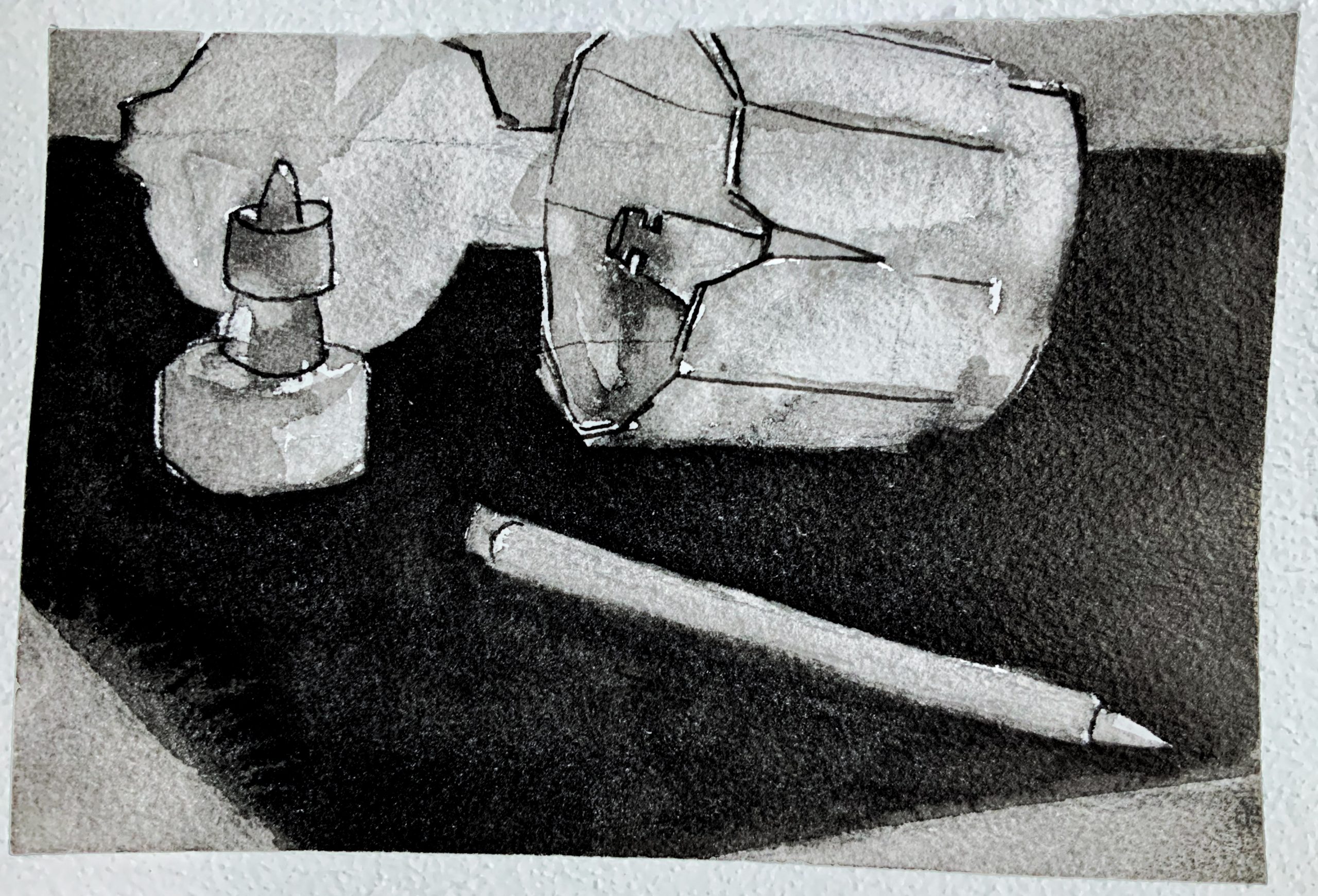
Charcoal and Vine 18×24
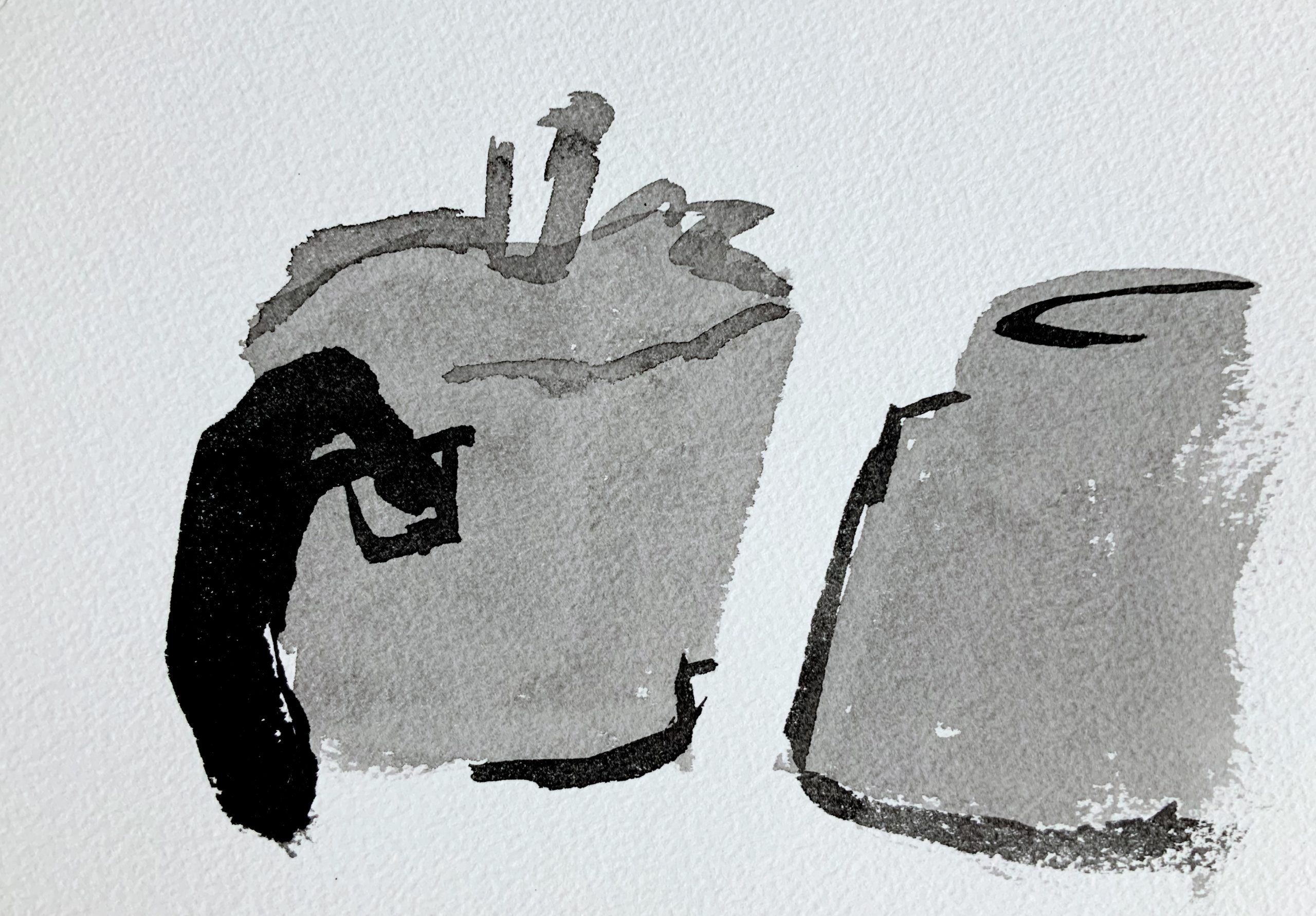
X (but the desaturated version)


Small matter, but look how much better this looks with the (incidental) color removed. You can do this by moving the Saturation slider in Snapseed all the way to the left.

Terrific drawing, and what feels like a very individualized portrait of your friend. Great expression in that foreground paw as well, and how it goes from fairly high def to a brief flourish of schematic lines in just a heartbeat.

Something you wrote to me about in an email is also in full evidence here–great disegno–the dog is a creature of the couch and of the rectangle at the same time. That dark emphasis on the tail is also doing major work supporting the whole design.


Screen Time

ink wash and vine on watercolor paper 15×22


pen on paper 8×10

X (If you like my suggestions below, or on the one of your mom–or any drawing you want to “repair”–you wouldn’t be the first artist to carefully paste a piece of paper over any area you want to change and redraw it. Or, do it digitally. Ask me if I can tell you more).

A couple of notes. About the nose, the less said the better, especially in a contour drawing. Get in and get out as quickly and economically as possible. In a pen drawing this size this extends to other contours on the face as well, which you can see I’ve removed.

(and look how much better it looks with the color taken out of it, and increased  contrast).

I also took the hatching away from her top. It felt like an outlier (no hatching anywhere else) and it was detracting from the portrait. Easy to say in hindsight, of course, but a lesson for next time.

Great line weights overall but the lamp shows signs you were getting fatigued or running out of time. Those lines are more random and less deliberate. I took them away and left fewer lines but put them down more intentionally. I see them as the call and response to the lines of the hair, so they need to be in the same “key.” You’re so good at this 97% of the time it doesn’t need saying, but this kind of drawing insists on a thorough and consistent performance…like this next one–brilliant.

See below how much better it looks with white paper and  higher contrast.


pen on paper 10×8

X


The only thing to improve here is the basket (?) and random papers on the floor at her feet. Like the lamp shade in the one above, these are too “phoned in.” The magic in your contour work all semester has been it’s very selective but unfailing attention to detail. Giving any part of the drawing less than your full attention breaks the spell and undercuts their magic.

There’s a great perspective move here, though–we’re looking down into the basket, then we can see more foreshortened ellipses on the desktop, but then her eyes are clearly at our eye level, or maybe slightly above (driven home beautifully by that line in the background, which meets a line on the left wall inclining downward). The effect is that of a shifting point of view that guides the viewers’ eye up and down the space.

And the woodgrain! Killer!


Searching for the finale


micron pen and paper, 9 x 12

I noticed your hatching style, which I love overall, works much better on the garlic and the pears than on the muffin (which looks a little like a giant garlic). That’s because hatching isn’t one size fits all (actually it can be, if you’re Morandi, but even he was careful to chose objects with smoother planes). The muffin is getting lost in there somehow. Consider changing up to different, more textural hatching:

I also snuck in a suggestion here to make your hatching on the table more studied and purposeful. Note how those horizontal lines really hug that plane, rather than moving it, as in yours. Also using a more broken line to make the light flicker.

Study the all time great hatchers: Rembrandt, Goya, Whistler, Picasso, Morandi, Robert Crumb, and Freud, shown here:

Click to enlarge, look and learn:


Consider also minimizing the background “noise,” as I’ve done to yours here:

And then give more thought to composition (with either a drawn border or an X-Acto).


This is a great page, but needs better photography:


X (but with a better exposure)

micron pen on paper, 9 x 12


X

micron pen on paper, 9x 12

Love the quixotic and wistful relationship between the garlic and the outlet (a children’s book waiting to happen), but these are weirdly composed and don’t go far enough:


micron pen on paper, 9 x 12


Just a little more TLC in editing would make this so much better. Crop out the noise around the border and move the Saturation slider all the way to the left to eliminate the incidental color.


micron and prismacolor markers, 9 x 12

X

Note how it becomes so much more unified and coherent. I wasn’t even sure I liked this one, but now I do–a lot. Great contrast in the hatching for onion skin (perfect pairing) and the background hatching. Great composition as well–