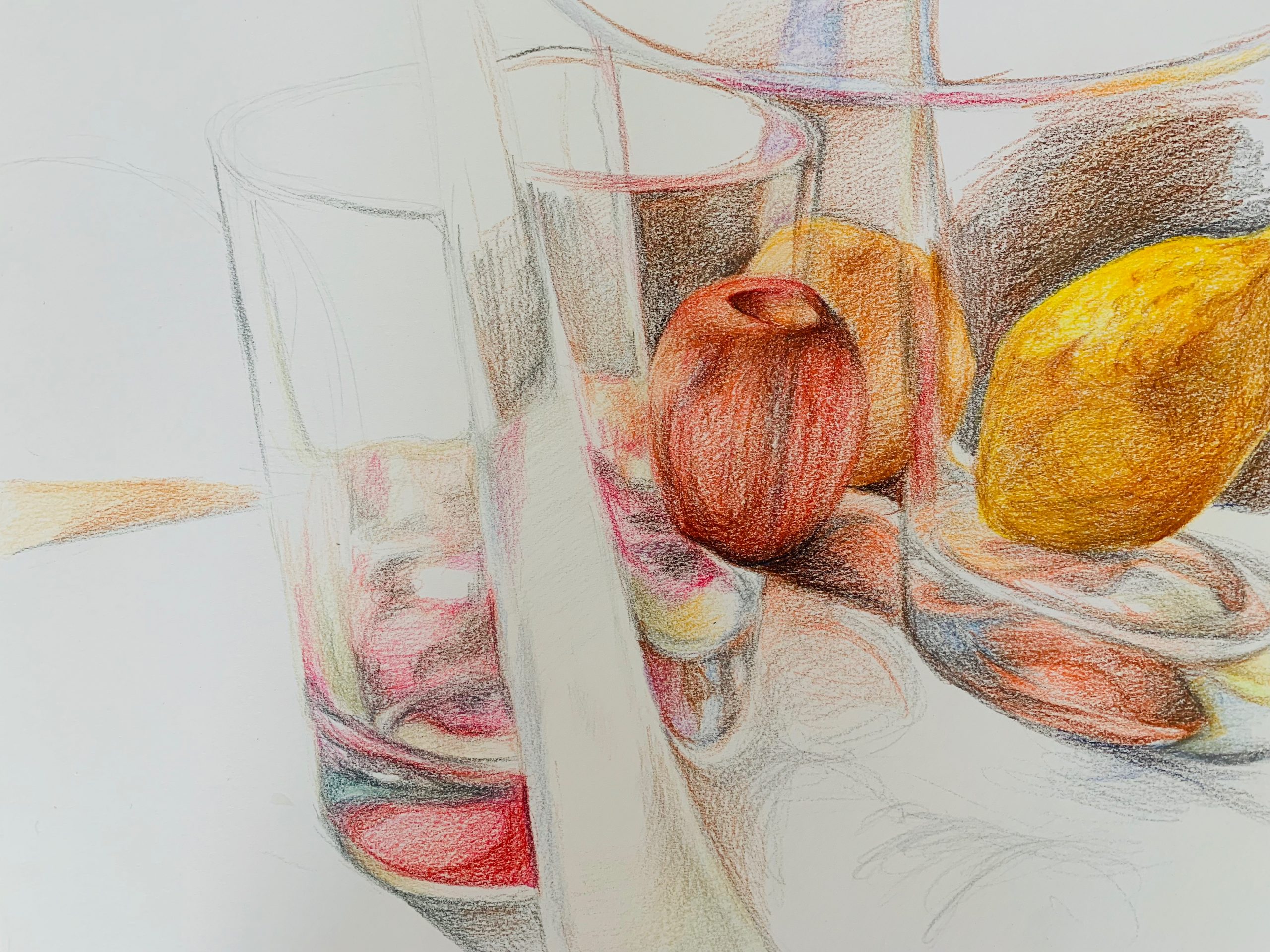
So, I finally got the 11 x 14 inch mixed media drawing pad. The texture of paper is very heavy and there’s a lot of substance in it.
For this drawing, I did three glass cups with three fruits, one inside the cup and two outside the cups. The reflection of the cup in the front “splits” the cup on the left into “two-halfs”, creating an illusion. The cups and the fruits were not very difficult to draw, except there are a lot of details that I have to take care of (and takes a lot of time). I wonder if I should finish up the background and everything as well or just leave the drawing like this since it showcases the most important structures and reflections of the cups and the fruits.
X
(MW) I was pleased to see that the comments shared some observations about the white space, so I took it back into Snapseed to get a better sense of how it’s working (by lightening the paper). There were slight losses in the pencil areas as a result (you need a better original exposure to get bright whites and strong colors) but no problem–it proved my guess that the paper is working just beautifully.
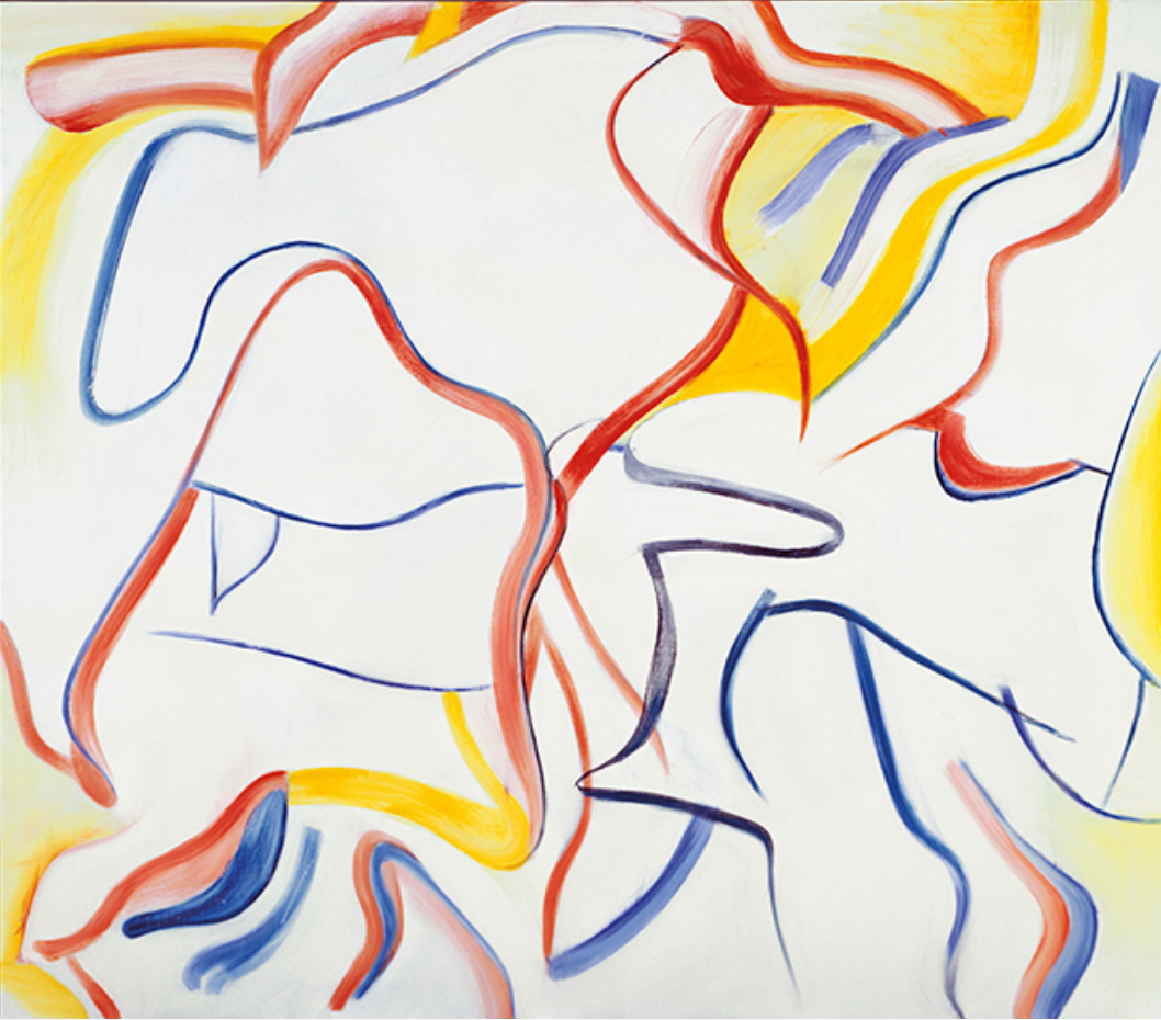
This might seem like an odd comparison, but this drawing actually brings to mind Willem deKooning‘s late work. The color somewhat but what I’m getting at is how the marks activate the white field to such a high degree that it actually becomes about that quality.
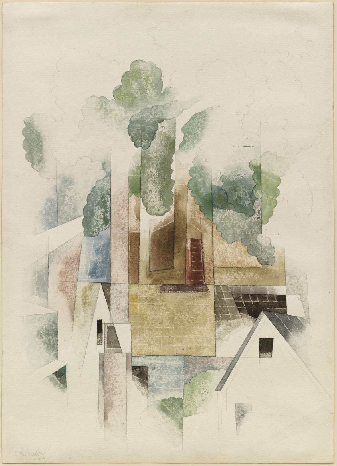
The other artist this brought to mind for the same reason is Charles Demuth (a contemporary and friend of O’Keeffe). Different subject, of course, but a similar dance between the drawing and the paper:
This is really fantastic Julie, I really think this project had a breakthrough moment this week! Keep it up!
This is amazing! So cool!
Hello Julie!
These drawing is fantastic. Are you planning to add a color to the background? I think having the blank space doesn’t really show the texture of glass. Having a little bit of color on the background and adding white marks on the glass would help to create that idea of surface and texture. Have fun and keep the work going!
Hi Julie!
I totally agree with Adam and Perrin! This drawing is impressive. I really like the colors you chose to use – they are very bright which makes the fruit pop off the page, as well as the reflections in the glass. The smooth, shiny, transparent quality of the glass is really conveyed. I love the composition you chose and the high density of color and detail on the right side of the page. I think it was a good decision to leave the drawing as it is; you conveyed the shadows and forms successfully! The only idea I have is to possibly include the color and texture of the table (if it has them). This could add even more contrast to the drawing (whether in terms of color or texture). I like the background being left as is because it gives a great sense of space. Keep up the great work!
Julie, I very much like the concept behind this drawing and the ones that have led up to it, both its literal sense and the sensory experience (how does curved glass alter shapes and colors?) and its figurative sense (how much of what we see is an illusion?). The pencil work is exquisite. I find my eyes delightfully surprised as they travel between carefully blended colors to quick cross-hatching to spare arcs. The one aspect of the drawing that distracts me from appreciating the overall form and movement is the division by the glass of the apple in the center. It seems a missed opportunity to demonstrate the boundary, curvature, and depth of the glass with some sort of distortion, the way you did with the right (but not the left) side of the orange (?) behind. But that’s a minor point. It’s still a pleasing, inviting drawing. By the way, when you post your drawings be sure to activate the function that makes them expand when you click on them, so we can zoom in on the finer details
Oh yea! Thanks for pointing it out. I have already made modifications.
This is a terrific drawing, Julie, and it’s great to see you up and running (and so unfortunate that it took so long to get your materials–I’m already missing the ones you weren’t able to make). But hopefully this week’s output will bear similar fruit.
This is also a big step forward from last week. Very exciting work–keep it up.
You’ll find more notes from me above—