Through The Looking Glass–Week 5

So, emm, think this is the final week. Anyways, I returned to the same objects that I portrayed from my first week–flowers and glass. Summer is slowly appearing in Maine for now, and thanks for the suggestion from Mark about O’Keeffe, I decided to portray a wide range of colors in this drawing. The drawing was done with water color, colored pencils, and white pastel. While the middle of the drawing has a clear reflection, the edges of the drawing are portrayed with meshed together color. Enjoy!

X

Here are two close-ups:


Through the Looking Glass–Fruits

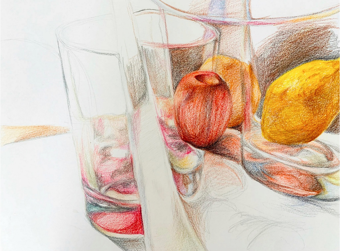
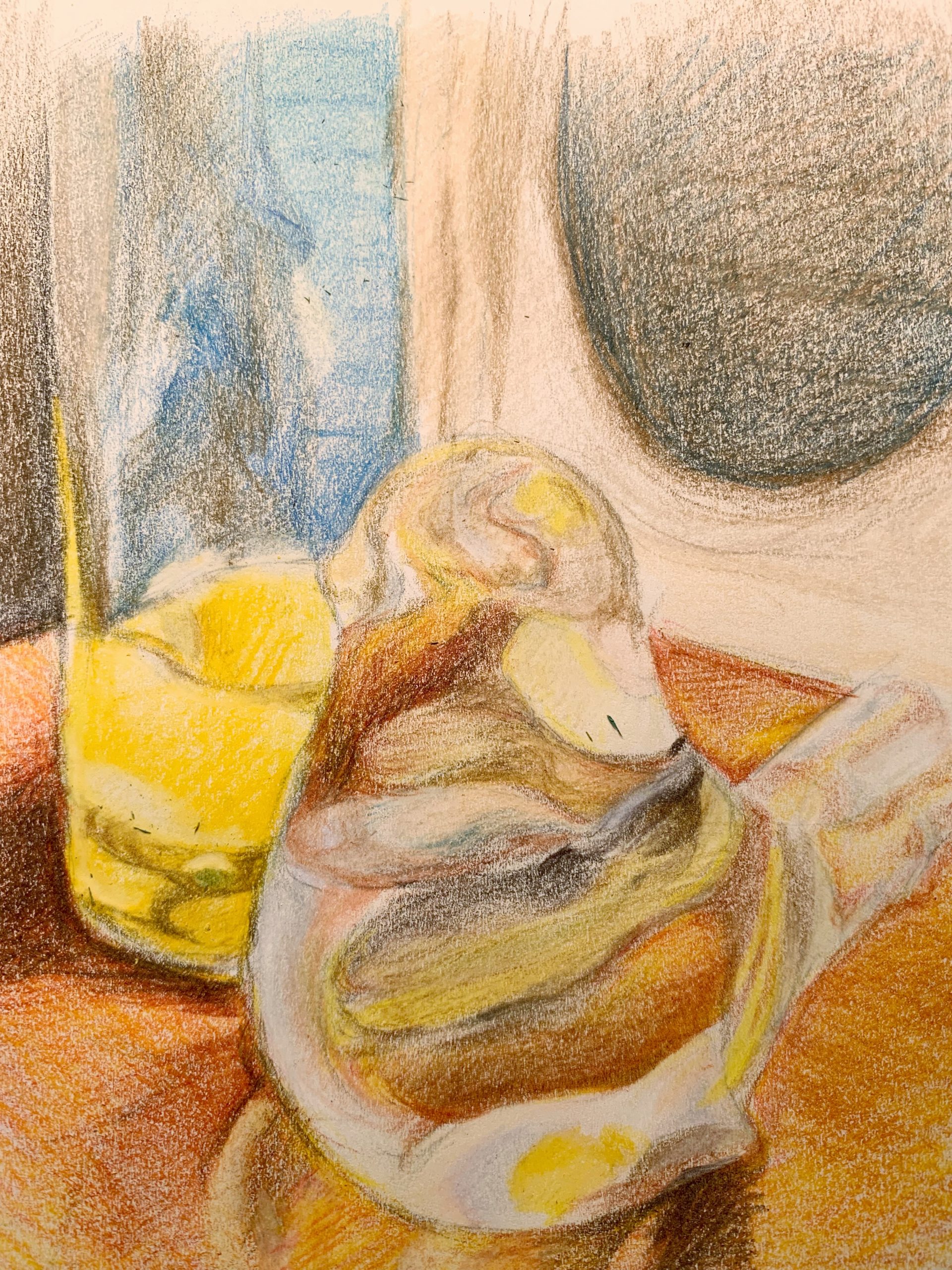
So, I finally got the 11 x 14 inch mixed media drawing pad. The texture of paper is very heavy and there’s a lot of substance in it.

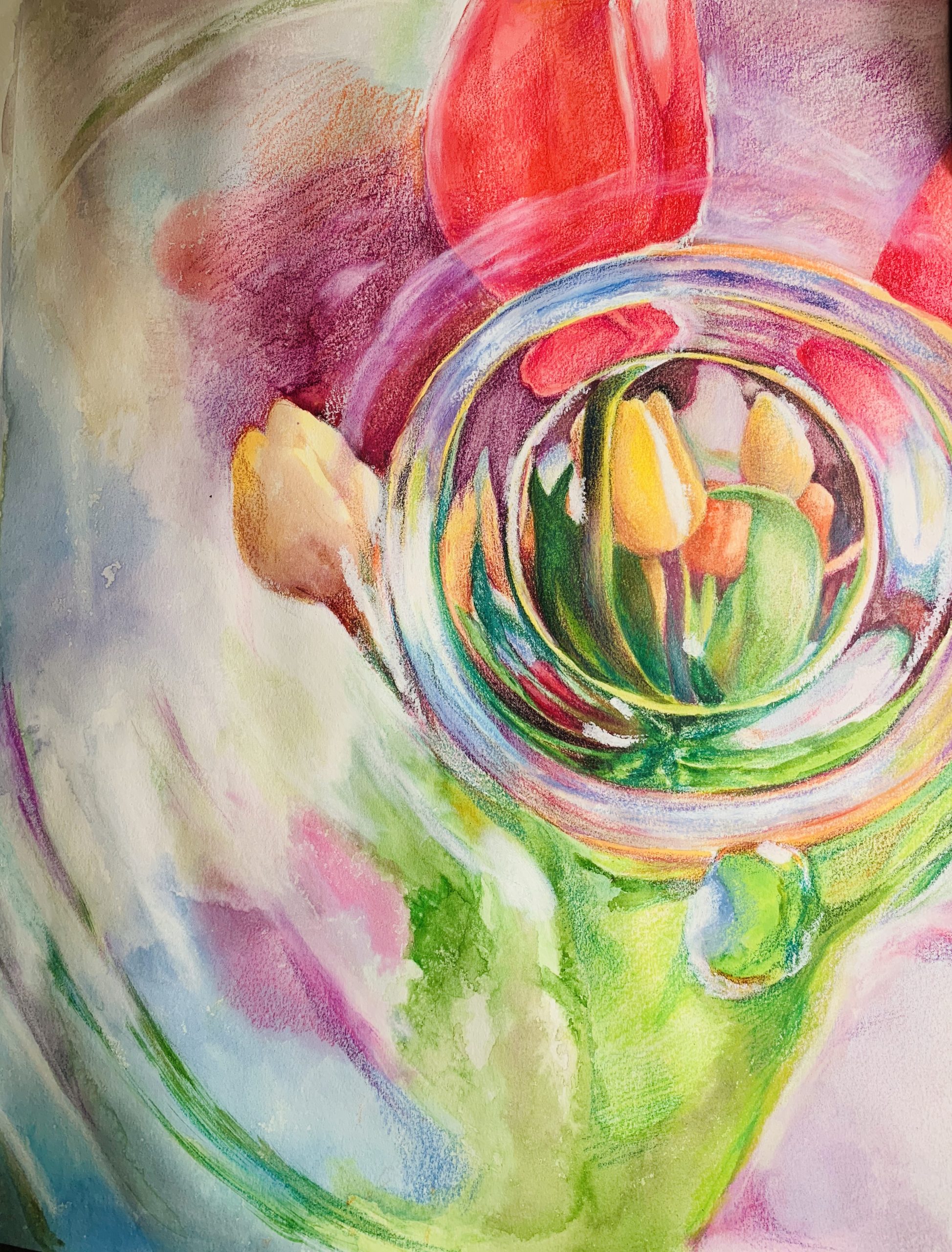
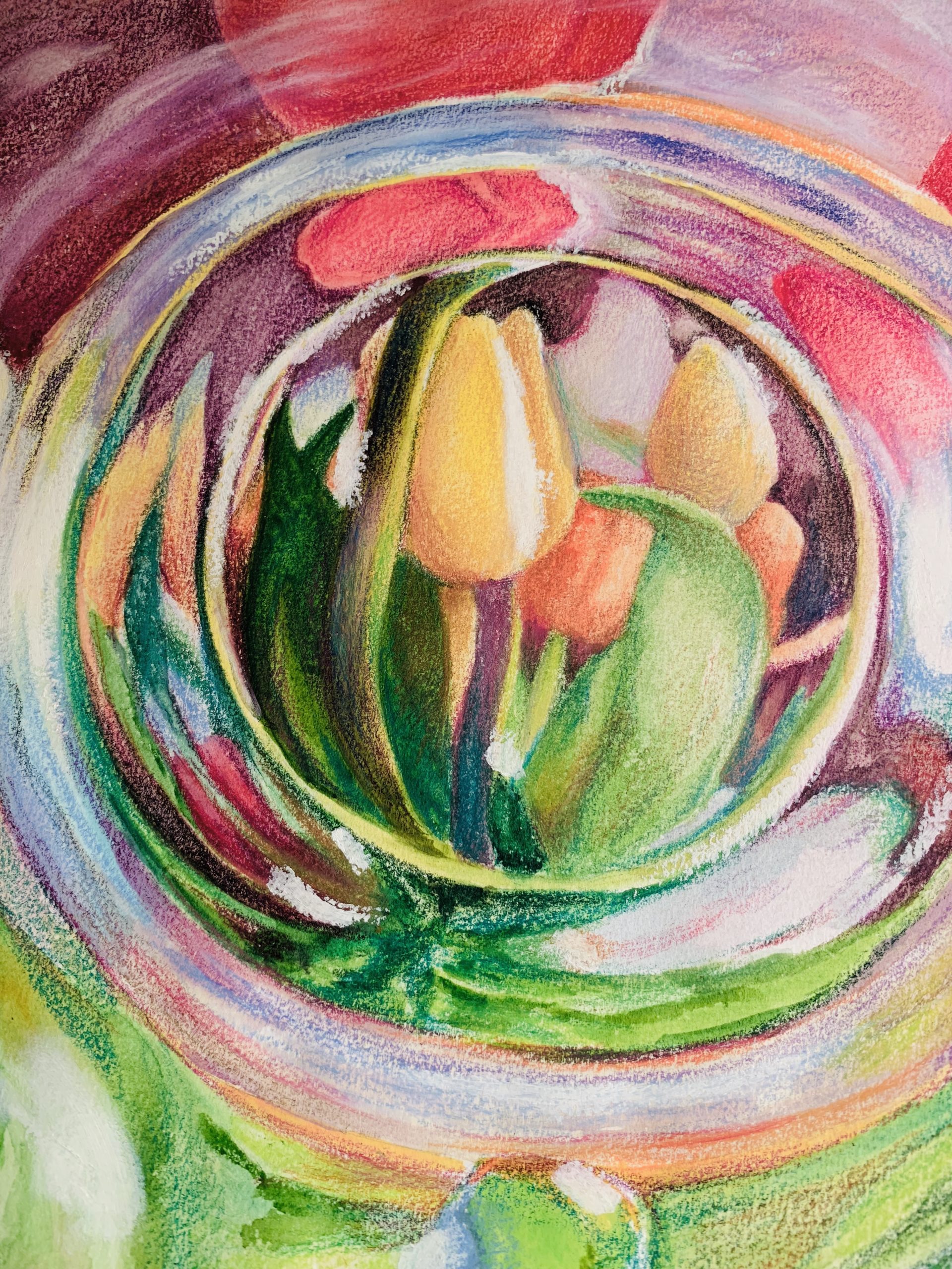
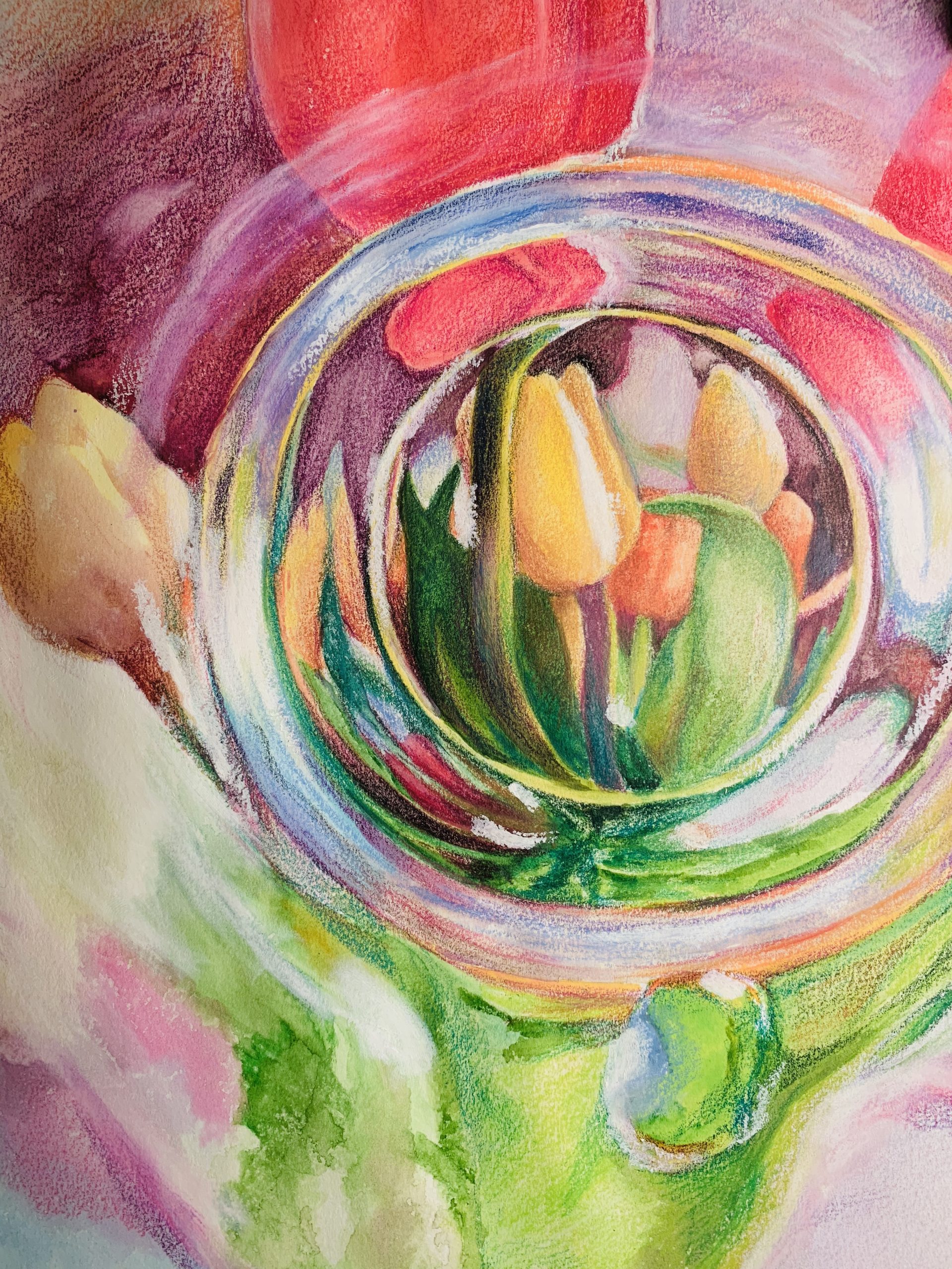
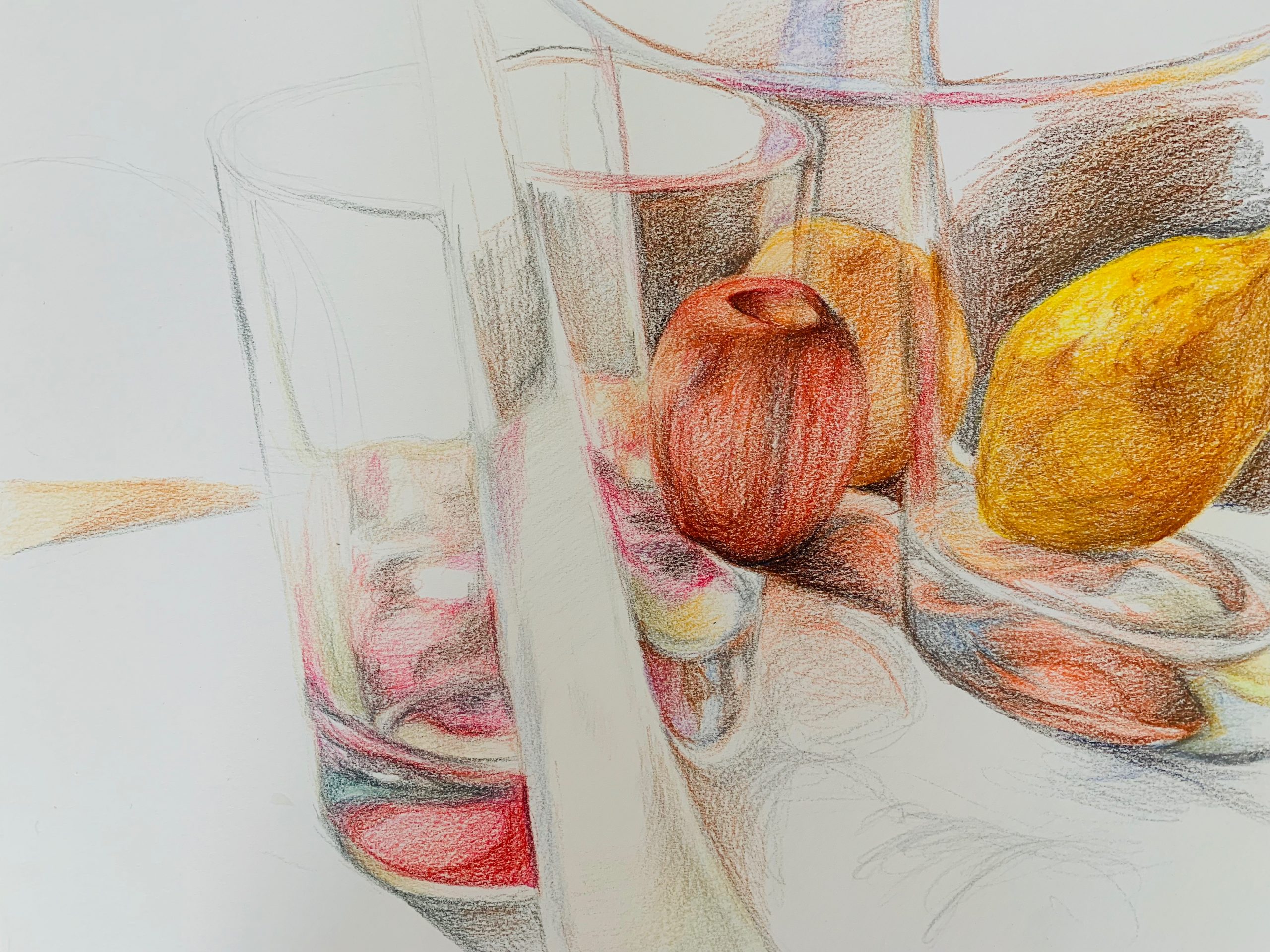
For this drawing, I did three glass cups with three fruits, one inside the cup and two outside the cups. The reflection of the cup in the front “splits” the cup on the left into “two-halfs”, creating an illusion. The cups and the fruits were not very difficult to draw, except there are a lot of details that I have to take care of (and takes a lot of time). I wonder if I should finish up the background and everything as well or just leave the drawing like this since it showcases the most important structures and reflections of the cups and the fruits.

X

(MW) I was pleased to see that the comments shared some observations about the white space, so I took it back into Snapseed to get a better sense of how it’s working (by lightening the paper). There were slight losses in the pencil areas as a result (you need a better original exposure to get bright whites and strong colors) but no problem–it proved my guess that the paper is working just beautifully.

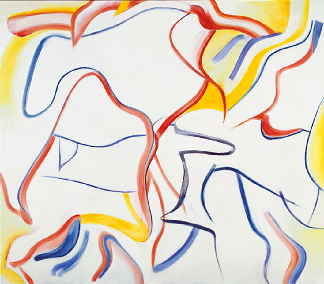
This might seem like an odd comparison, but this drawing actually brings to mind Willem deKooning‘s late work. The color somewhat but what I’m getting at is how the marks activate the white field to such a high degree that it actually becomes about that quality.

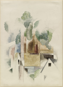
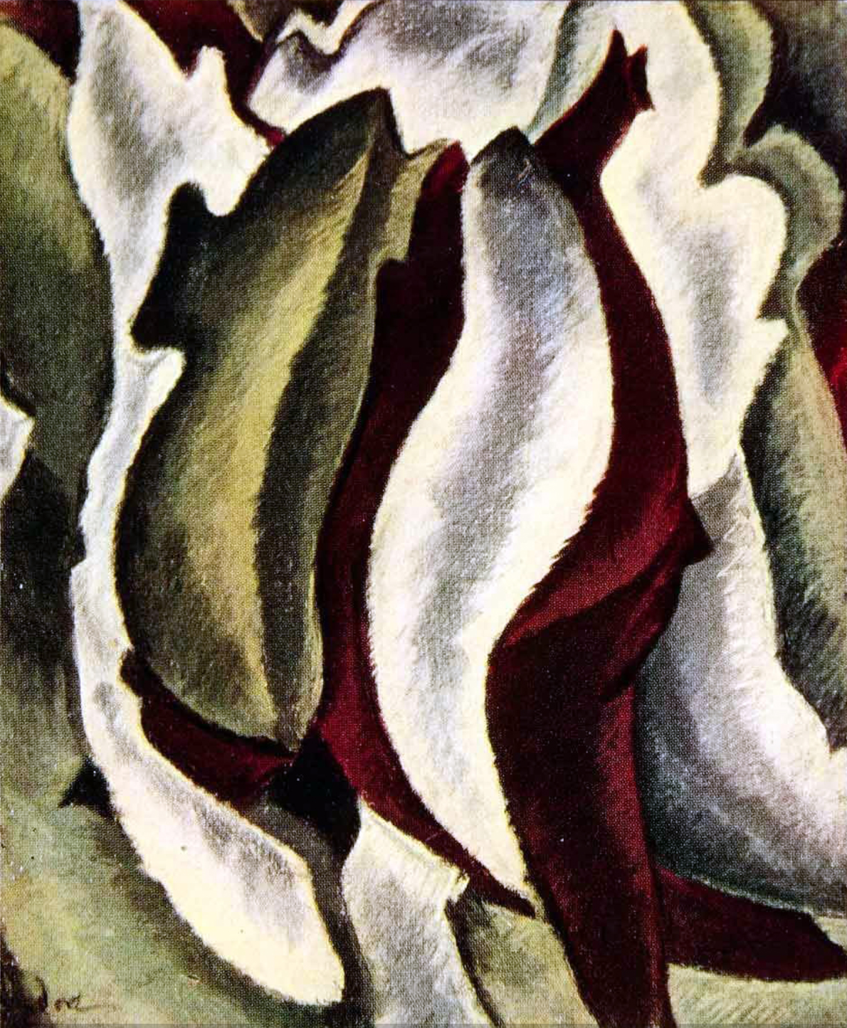
The other artist this brought to mind for the same reason is Charles Demuth (a contemporary and friend of O’Keeffe). Different subject, of course, but a similar dance between the drawing and the paper:

Through The Looking Glass-Week 3

This week I did a drawing on just the reflection of glass and water in the glass (however, the colors of the reflections are influenced by the environmental colors around it). I found that the reflected colors are very rich and has a lot of ‘layers’. This week I had better chance blending the colors, although I still haven’t put pastel white onto the drawing (I found some pastel pencils that I bought, so I could add some highlights and post again). Think I will stay with drawings reflections with coloured pencils from now on. 🙂

X

O’Keeffe

Arthur Dove

Charles Burchfield

Odilon Redon

Through The Looking Glass–Week #2

This week, I focused more on using color to portray my objects. I did a glass bird and a glass with orange juice with hard colored pencil. Unfortunately, the pastel pencil order got canceled, so I couldn’t use blend-able pastel colors. Any advice are welcome!

For my self-reflection, I found that coloring with colored pencil was not as hard as I had thought, though I have never used colored pencils much. Drawing approximate ‘areas’ that divide the different colors before adding in the colors helps me with mastering the general look of the objects. The gradient effect and shades could be made with layering colors on top of each other (just like mixing colors in oil painting). It took me a little while to get used to blending colors in this manner. However, though layering dark colors over light colors was not difficult, it was a different story for doing the reverse. It was impossible when I was trying to add white highlights to the bird and the glass, so I did the highlights in eraser instead. I would like to add more touches of pastel pencil onto the colored pencil drawing to make better blends in the colors for next week. (If my pastel pencils arrive!)

5 x 8 1/4, white sketch paper with colored pencils

X