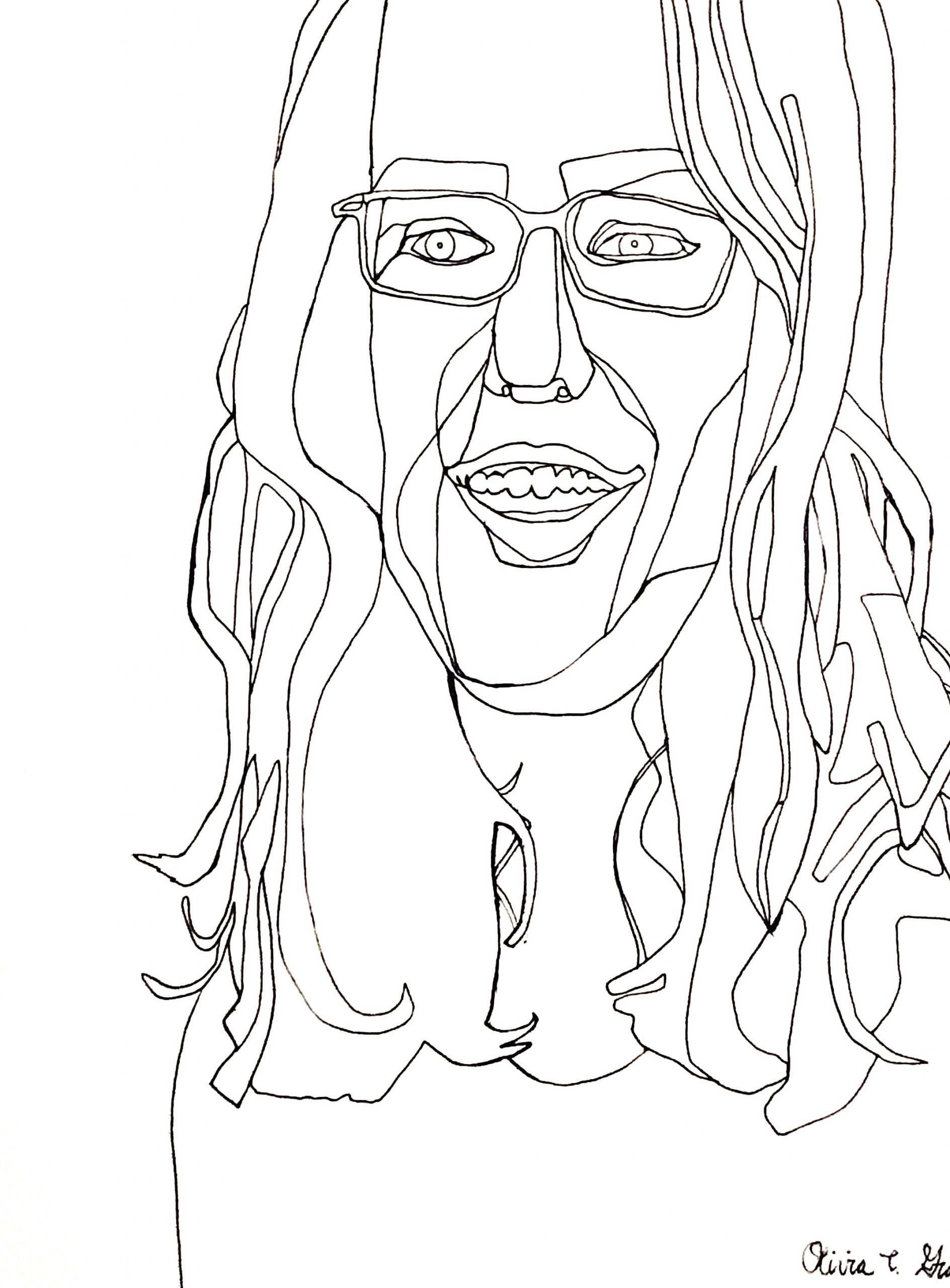
Acrylic Paint Marker on Paper, 24 x 18 inches
X
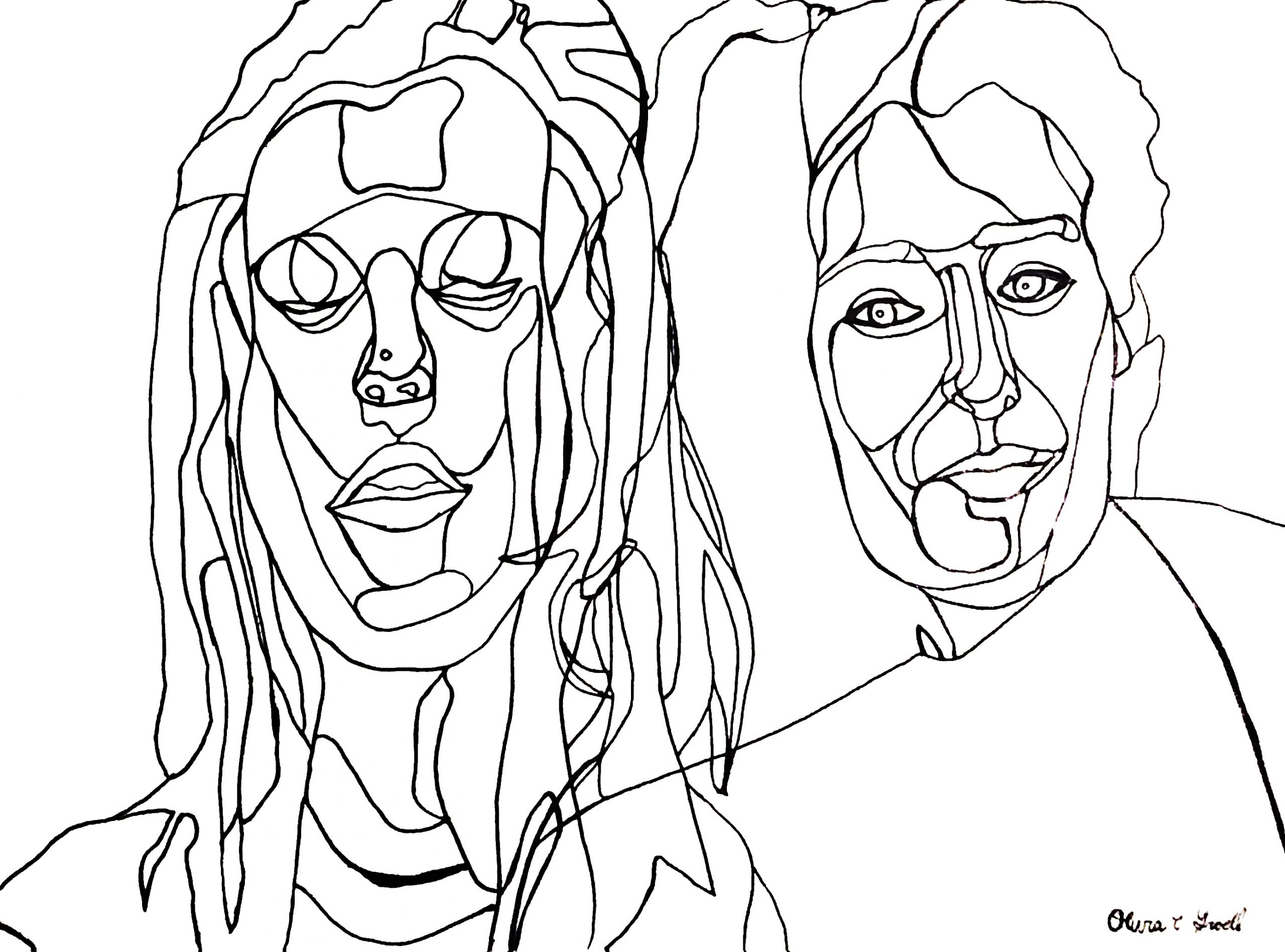
Acrylic Paint Marker on Paper, 18 x 24 inches
X (like others in the class, I think this is a better drawing than you do, but don’t include it if it doesn’t do the trick for you)
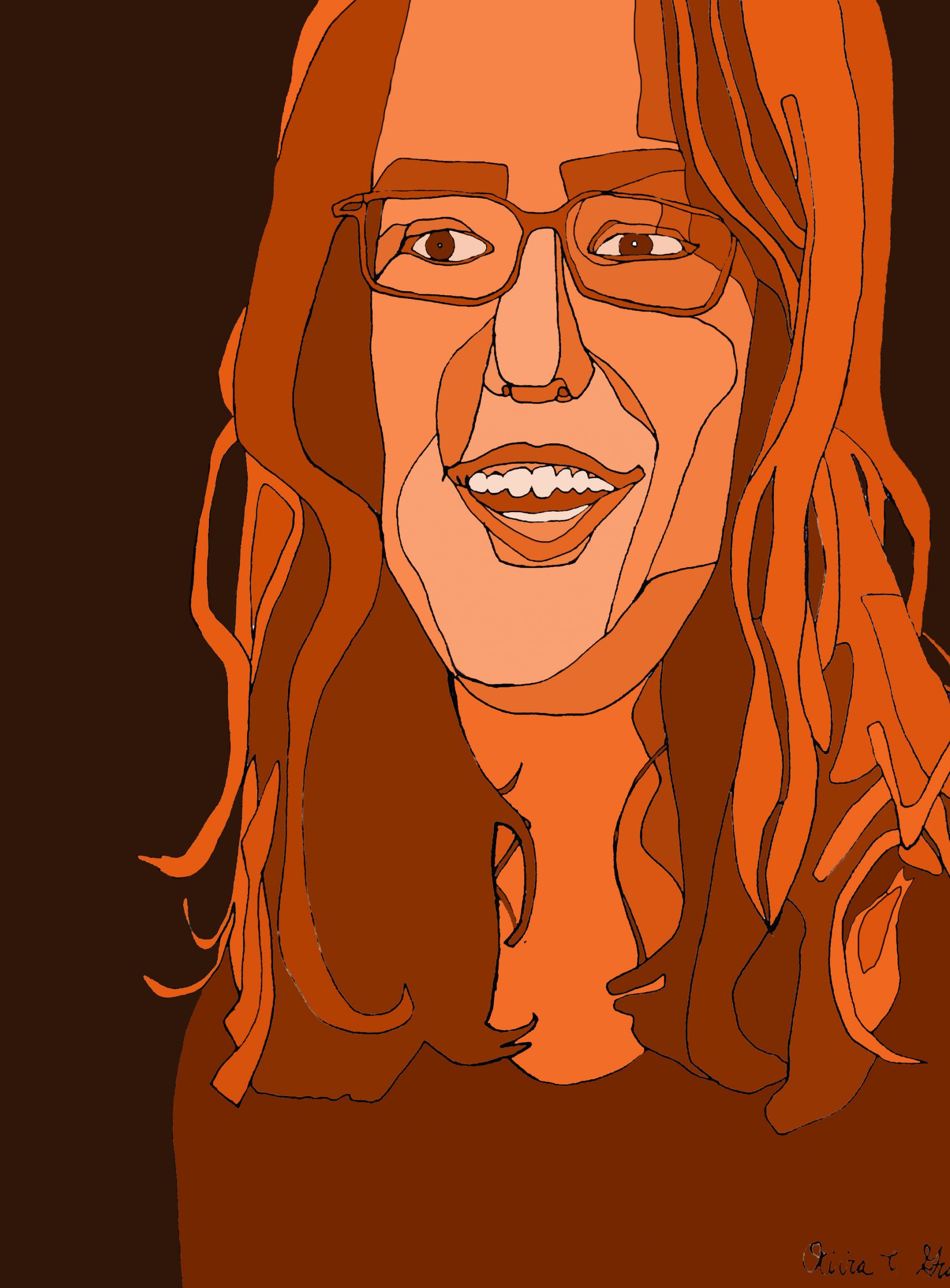
Acrylic Paint Marker on Paper, edited in Photoshop, 24 x 18 inches
X
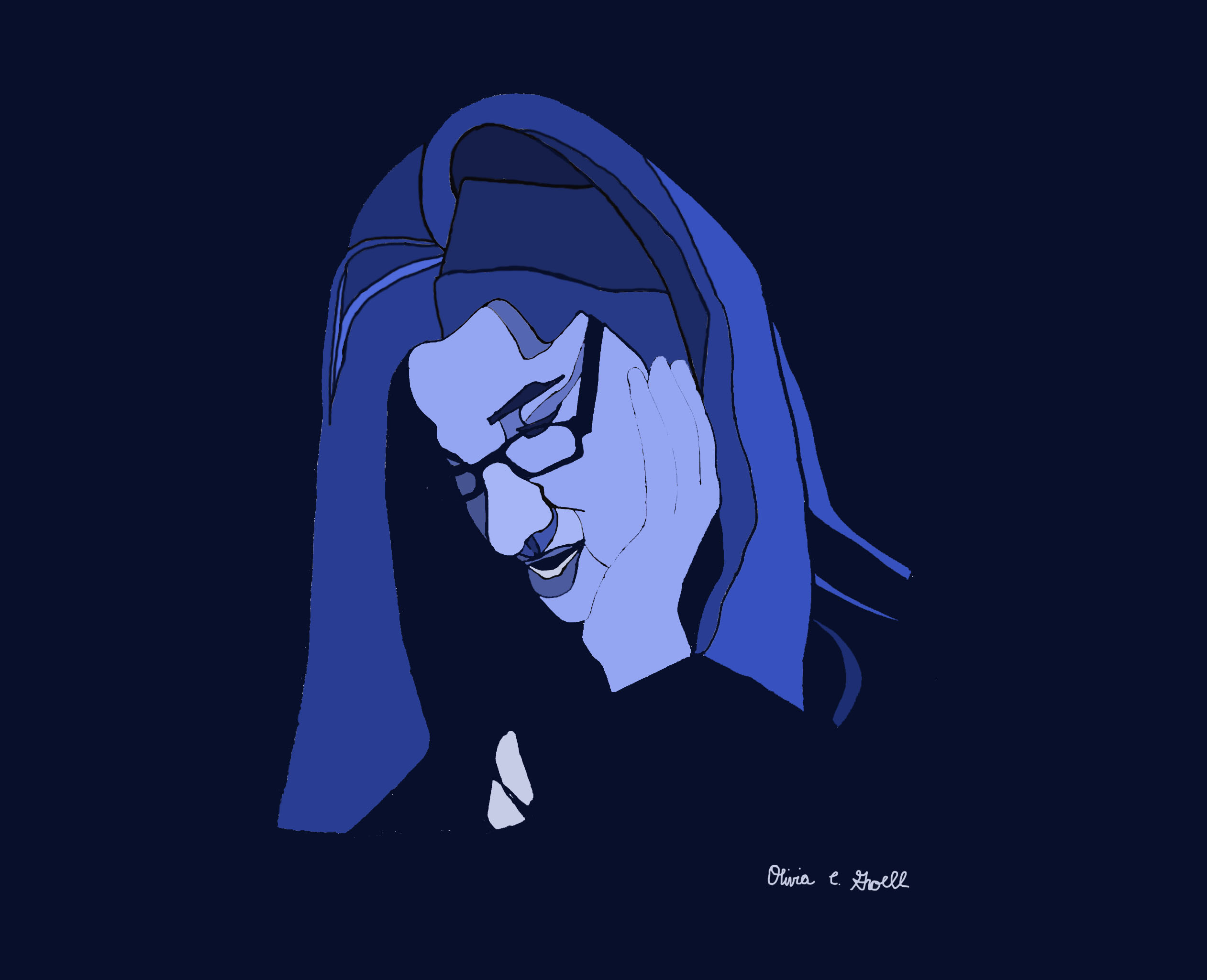
Sharpie on Paper, edited in Photoshop, 17 1/2 x 22 1/2 inches
I think the line drawing of this works better because of its positive/negative space ambiguity. This version pins that down and disrupts the visual play. It might still work by defining what rectangle she’s in (like we talked about) but the line between the hand and the face needs to be stronger as well.
Acrylic Paint Marker on Paper, edited in Photoshop, 17 1/2 x 22 1/2 inches
X
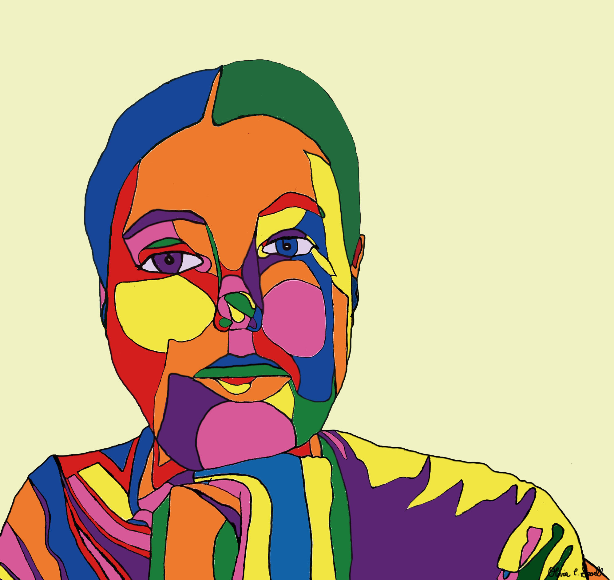
This week I created two new drawings (first and second pieces) and edited one of them (third piece) in Photoshop (adding color, adjusting lines, etc.). I also edited two other drawings (fourth and fifth pieces), which I had previously posted, in Photoshop. I had a lot of fun with each of the drawings and am really pleased with the cohesive, colorful series I have built. In terms of the new drawings, I first drew the double portrait, as I wanted to try out a new kind of composition where the portraits are stylistically the same but overlap on one page of paper. I wasn’t as happy with the result as I had hoped. I like each individual portrait on their own, but they don’t seem to go together in one single composition. Maybe it was the two portraits I chose? Or maybe overlapping portraits makes the page too busy? I’d really love to hear your thoughts about this piece – I have a lot of mixed feelings about it, which is why I didn’t put it into Photoshop. Nonetheless, I am really happy with the way the second drawing (first on the page) came out. This drawing, along with the second portrait in the double portrait drawing, were based off of pictures that I used to make drawings in Week 2. I feel like my continuous contour line drawings are much more realistic now, while still maintaining an expressionistic style. Any thoughts on what to edit/include in my portfolio are welcome!