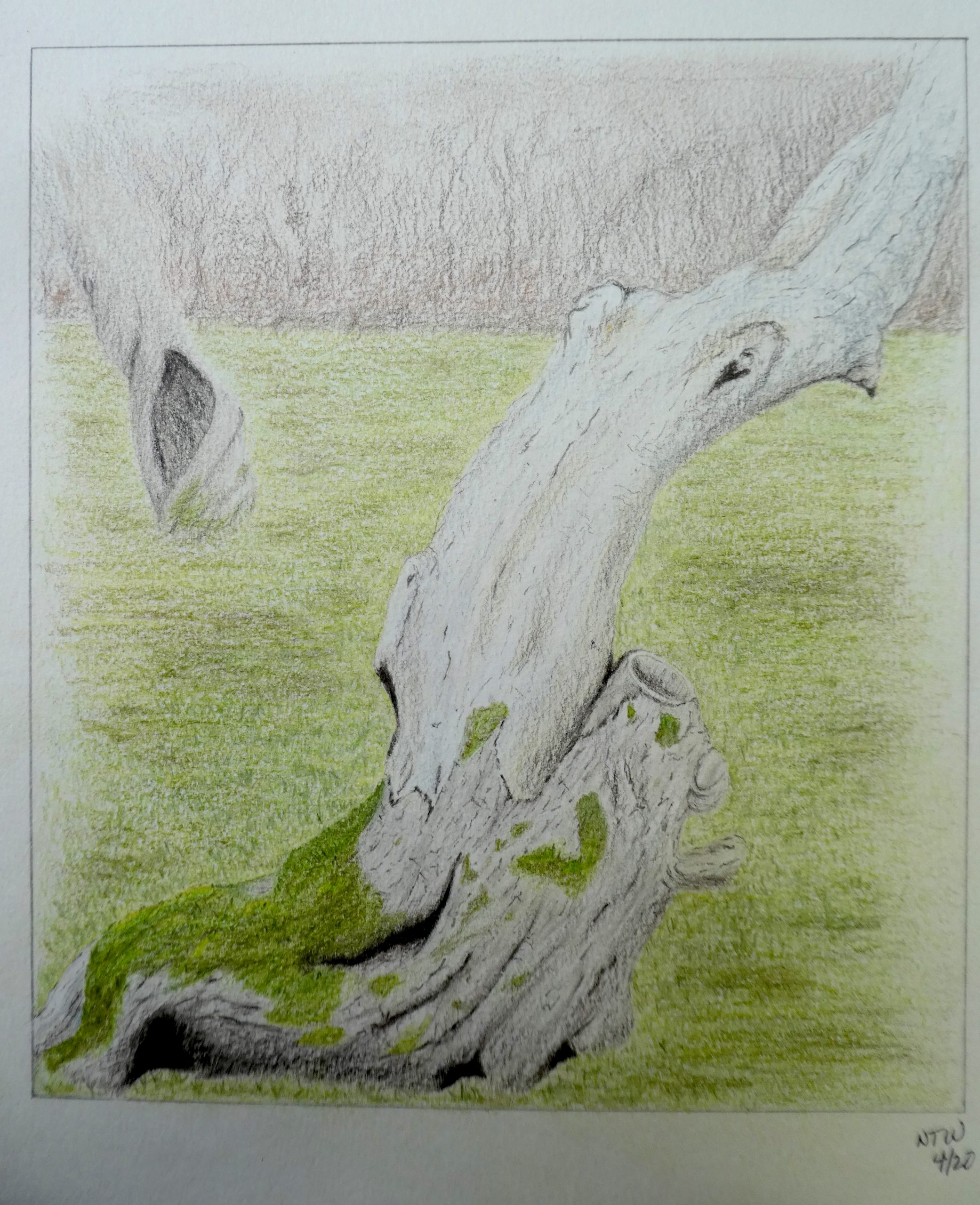
8 x 9″, colored pencils on watercolor paper
X (better yet with the revisions you mentioned at the end of the class meeting)
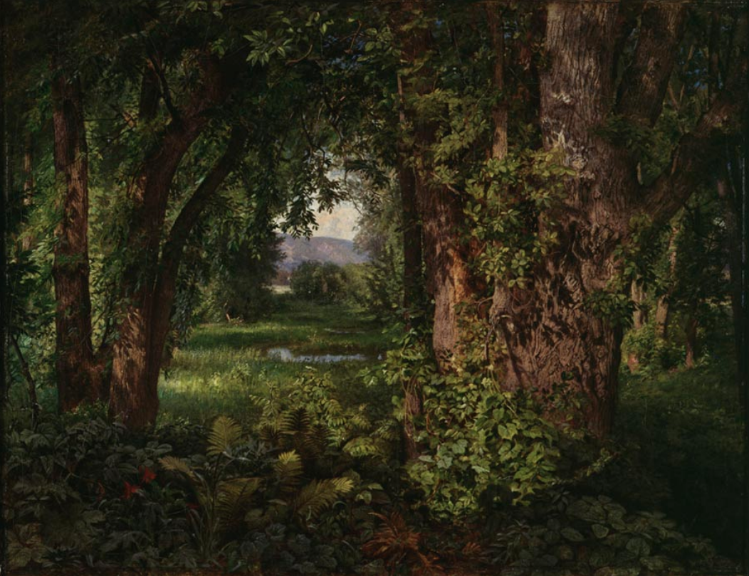
William Trost Richards
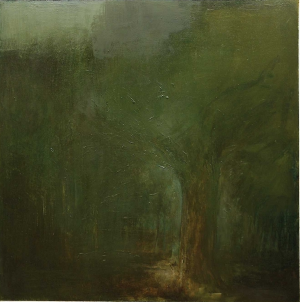
Jake Berthot
Professor Mark Wethli – Spring 2020
X (better yet with the revisions you mentioned at the end of the class meeting)
William Trost Richards
Jake Berthot
You must be logged in to post a comment.
Next to our house there’s an old apple tree that died several years ago. Its curves and subtle shades intrigue me so much that I decided to see if I could bring it back to life with wax-based colored pencils. To my eyes, its moss skirt provided a vibrant contrast to the silvered bony trunk.
There was a lot of trial and error as I went along, trying to capture the feel of the grassy field and distant forest line, but I discovered that layering with colored pencils allows you to progress slowly and fix issues as they come up. I wasn’t sure about fading the background on the sides and tops. As always, I’d welcome your thoughts about that and any other aspects.
Hi Nat,
When this came on the screen I had to rub my eyes, zoom in, and rub them again. Then I wondered if you had glued moss on to a drawing. That looks so convincing. Just amazing.
I think you’ve achieved your goal of a vibrant contrast between the moss and the silvery trunk–so much so that I don’t care all that much about anything else. Like the drawing before this one I think the main issues are the executive decisions of composition (an early decision) and then elaboration (the very last decisions). I don’t know if you’re doing this, but some thumbnails before you start could help work out the compositional bugs and think through where the drawing is likely headed.
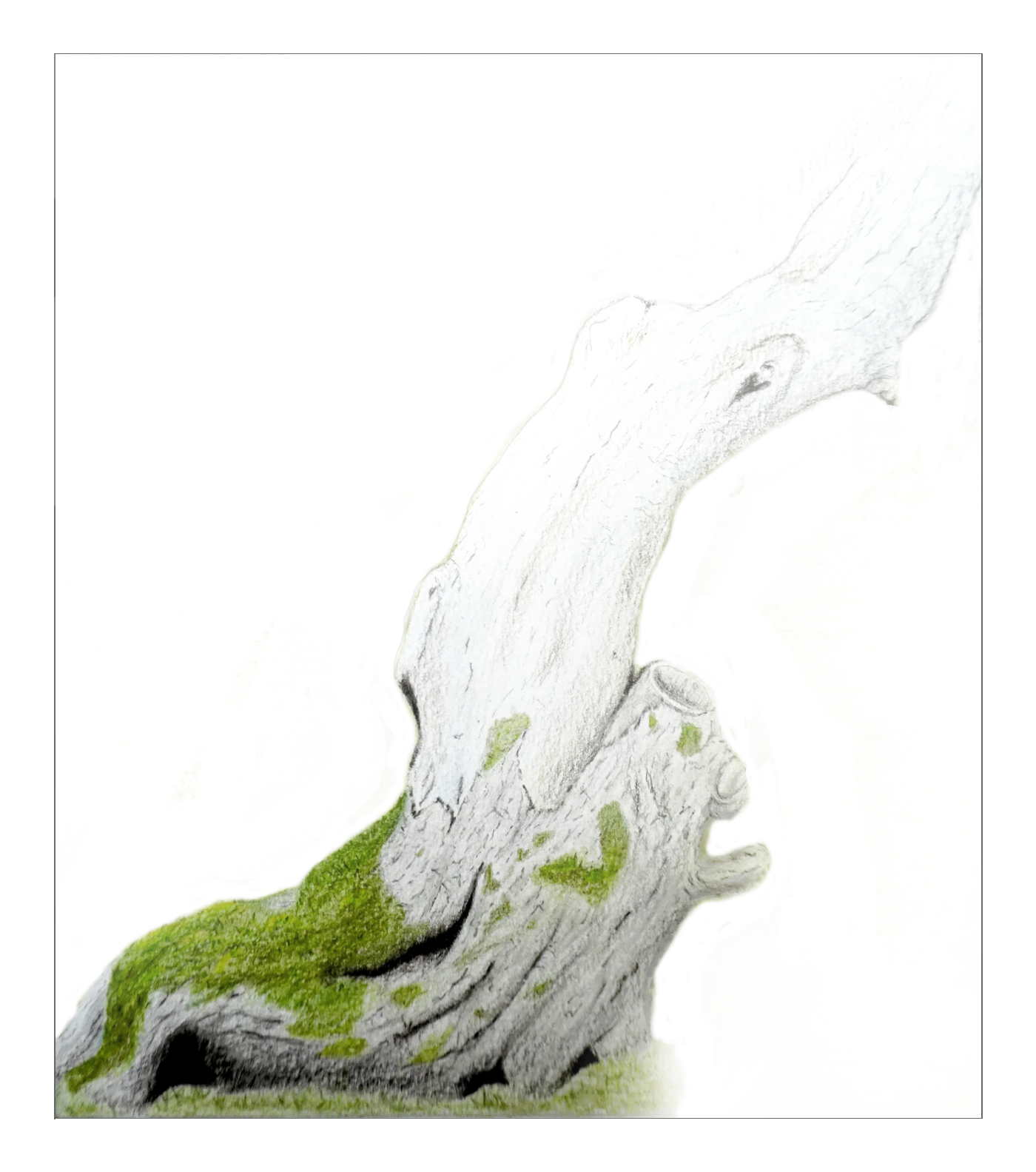
As the semester wraps up one of the lingering questions is your sense of form and space–are the backgrounds important? How much can a drawing do before it needs to be a watercolor or a painting? I’m more taken with your work this semester that skews closer to drawing, in the sense of being about lines and tones and the open ground (paper), rather than rendering every square foot, even schematically. Perhaps he’s just a favorite of mine, but I’d steer you back to that Seurat.
It feels clear to me that whoever drew this cared way more about that lowest section of the tree than anything else, but the challenge is always what to do with it. My suggestion is above, inspired by…you–from that earlier tree with no background. I don’t think it’s dodging your responsibility as much as honing the drawing to what really matters to you. There’s also a hint here of Audubon or Furbish, isolating the “specimen” in space.
This piece and last week’s remind me of one of my favorite paintings in the Bowdoin Musuem, by William Trost Richards (above). As I write this I’m reminded of another favorite painter who has something to say about this, Jake Berthot, also above Although both he and Richards “fade to black” and I’m suggesting you “fade to white” it’s the same principle.
Great work, Nat.