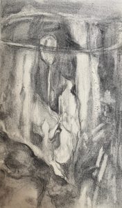
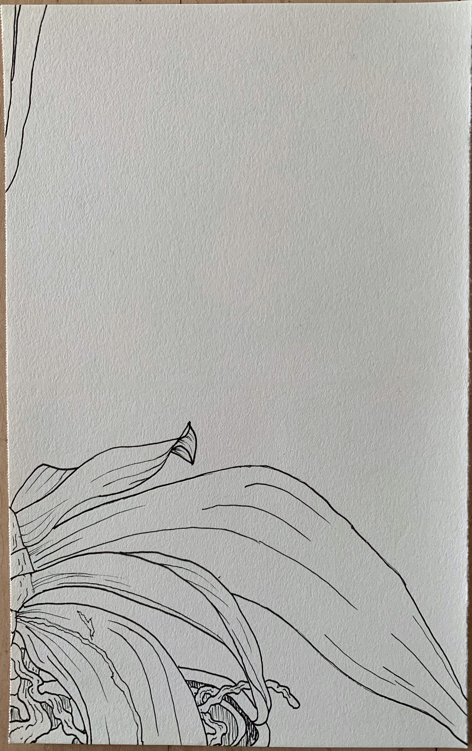
It seems that my materials are still on the way, so I did a black and white drawing instead, looking at flowers through a glass.
X (but retouched to black & white; no color)
Professor Mark Wethli – Spring 2020
It seems that my materials are still on the way, so I did a black and white drawing instead, looking at flowers through a glass.
X (but retouched to black & white; no color)
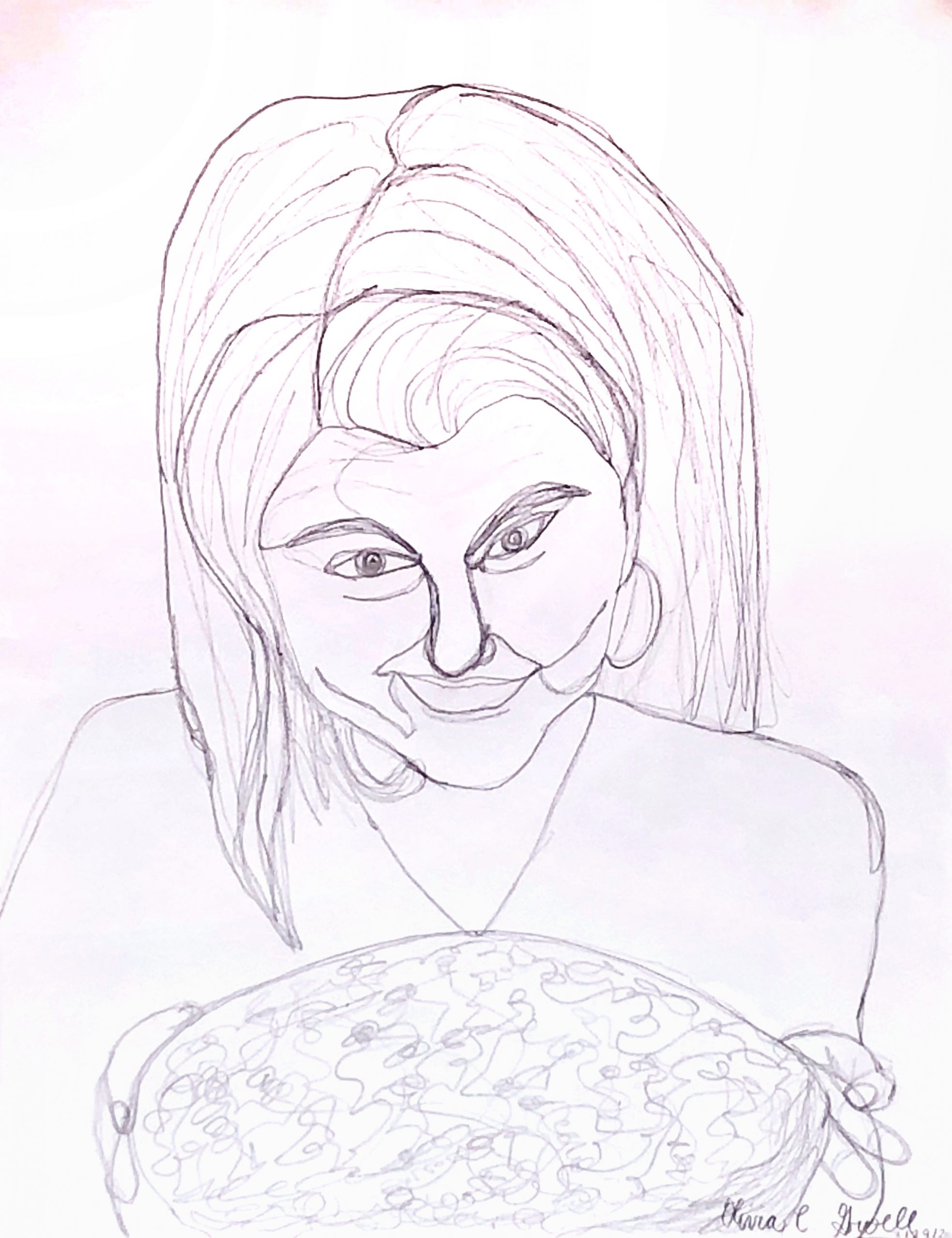
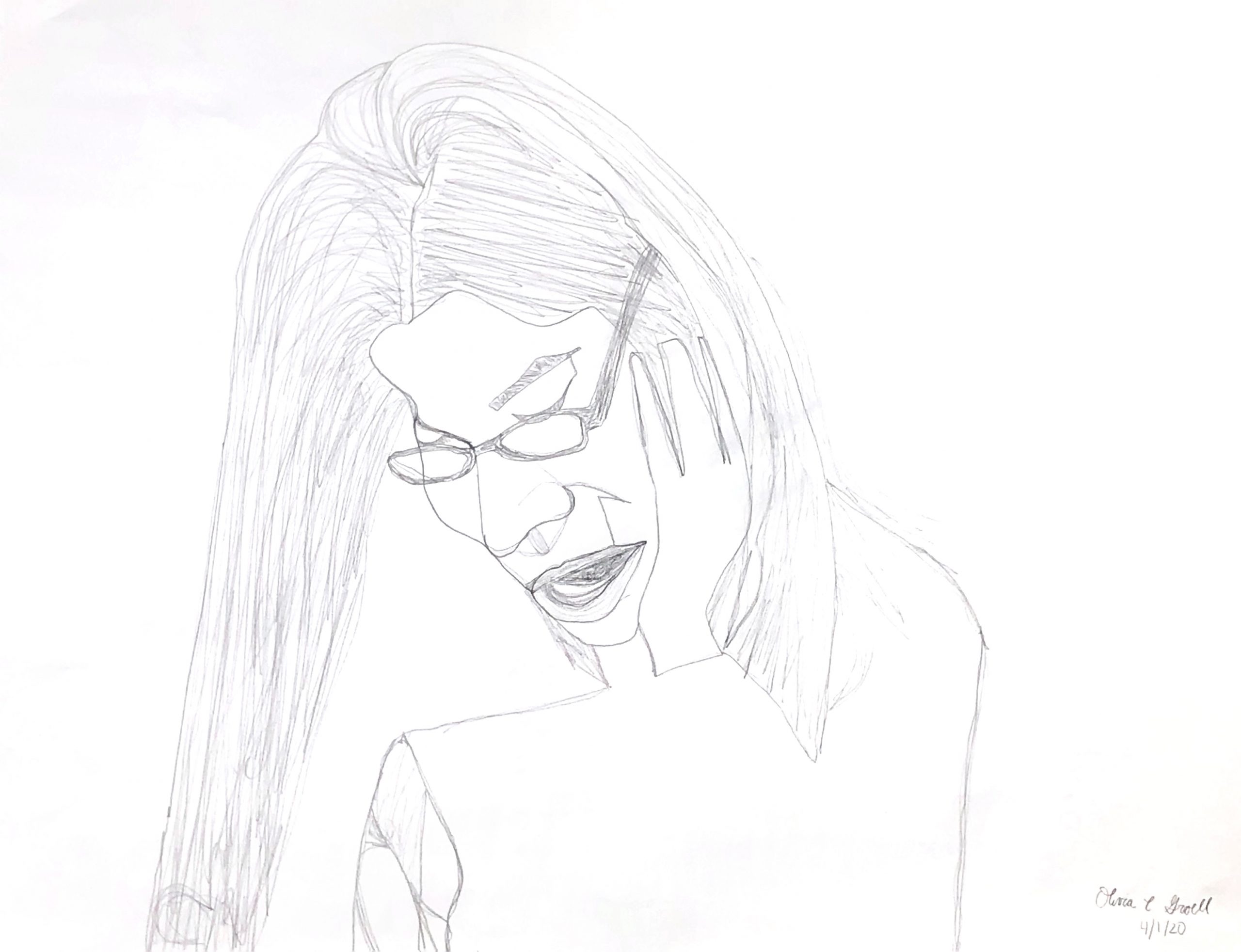
Pencil on paper, 11 1/4 x 8 3/4 inches
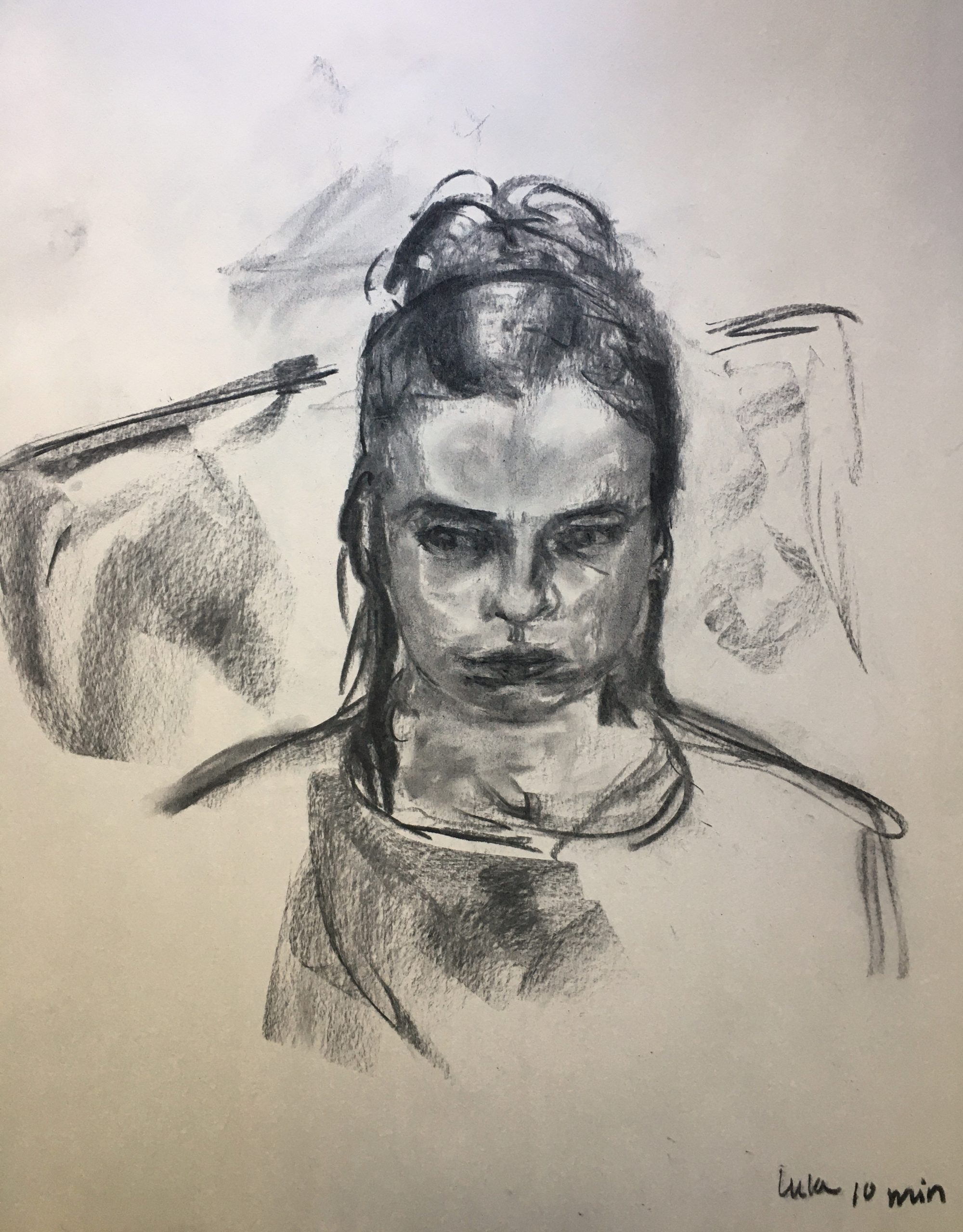
Pencil on paper, 8 3/4 x 11 1/4 inches
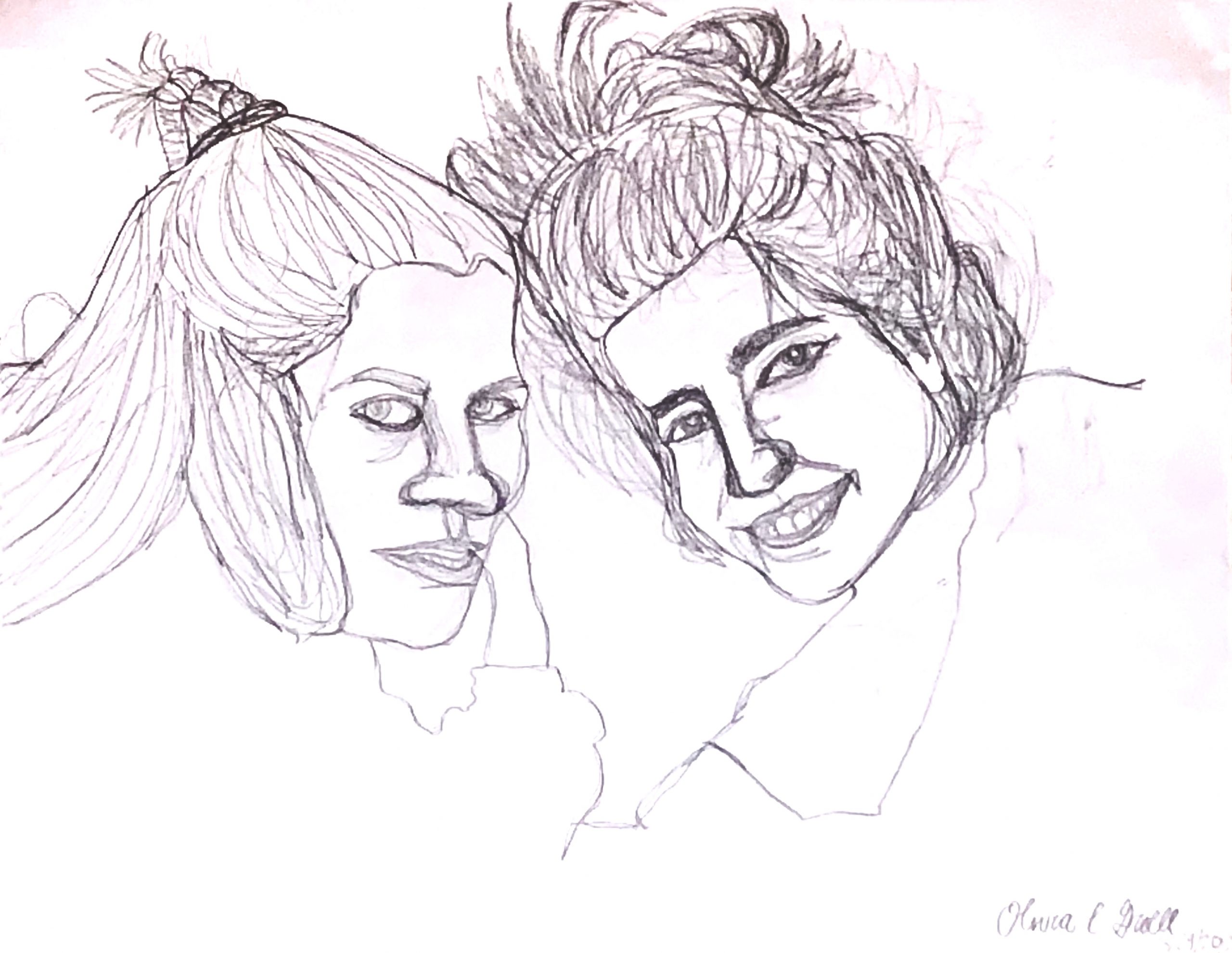
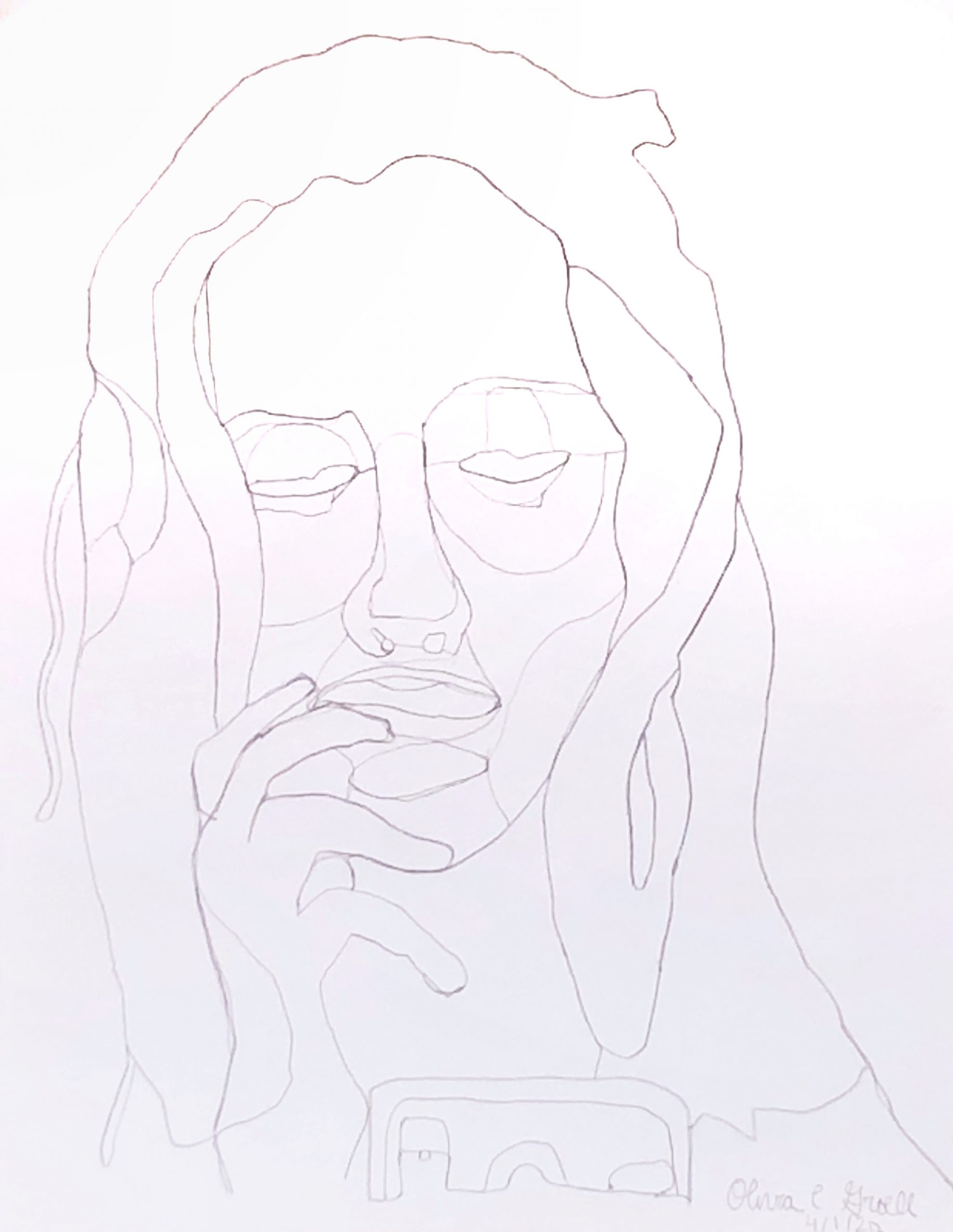
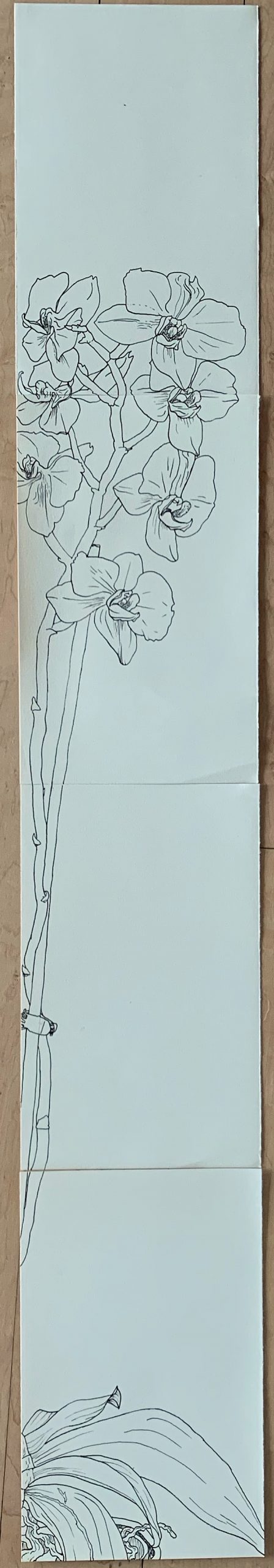
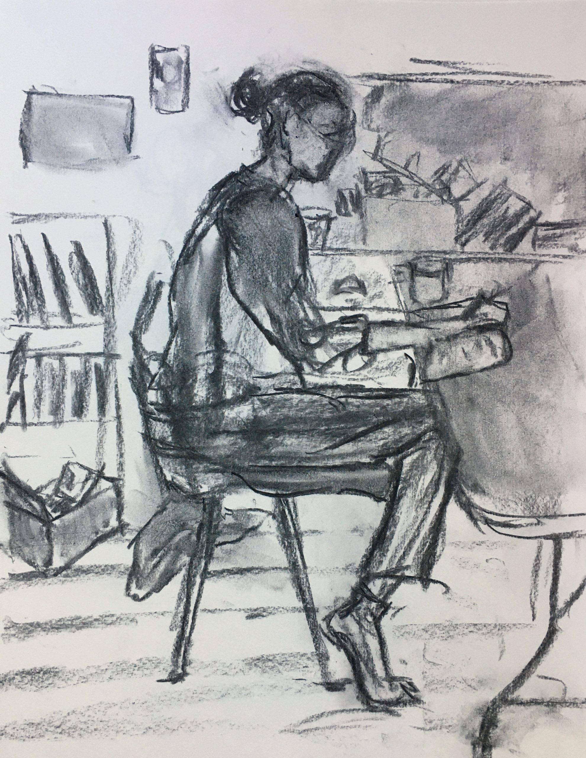
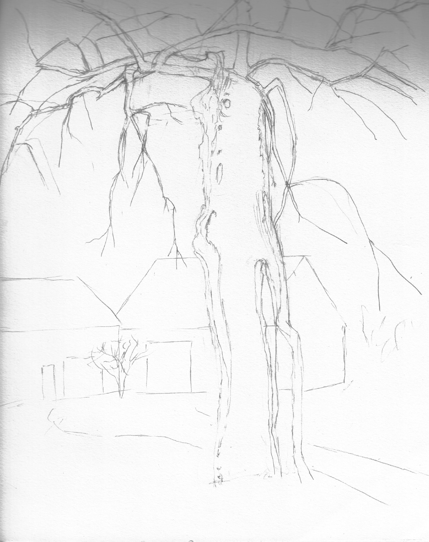
Pencil on paper, 17 1/2 x 22 1/2 inches
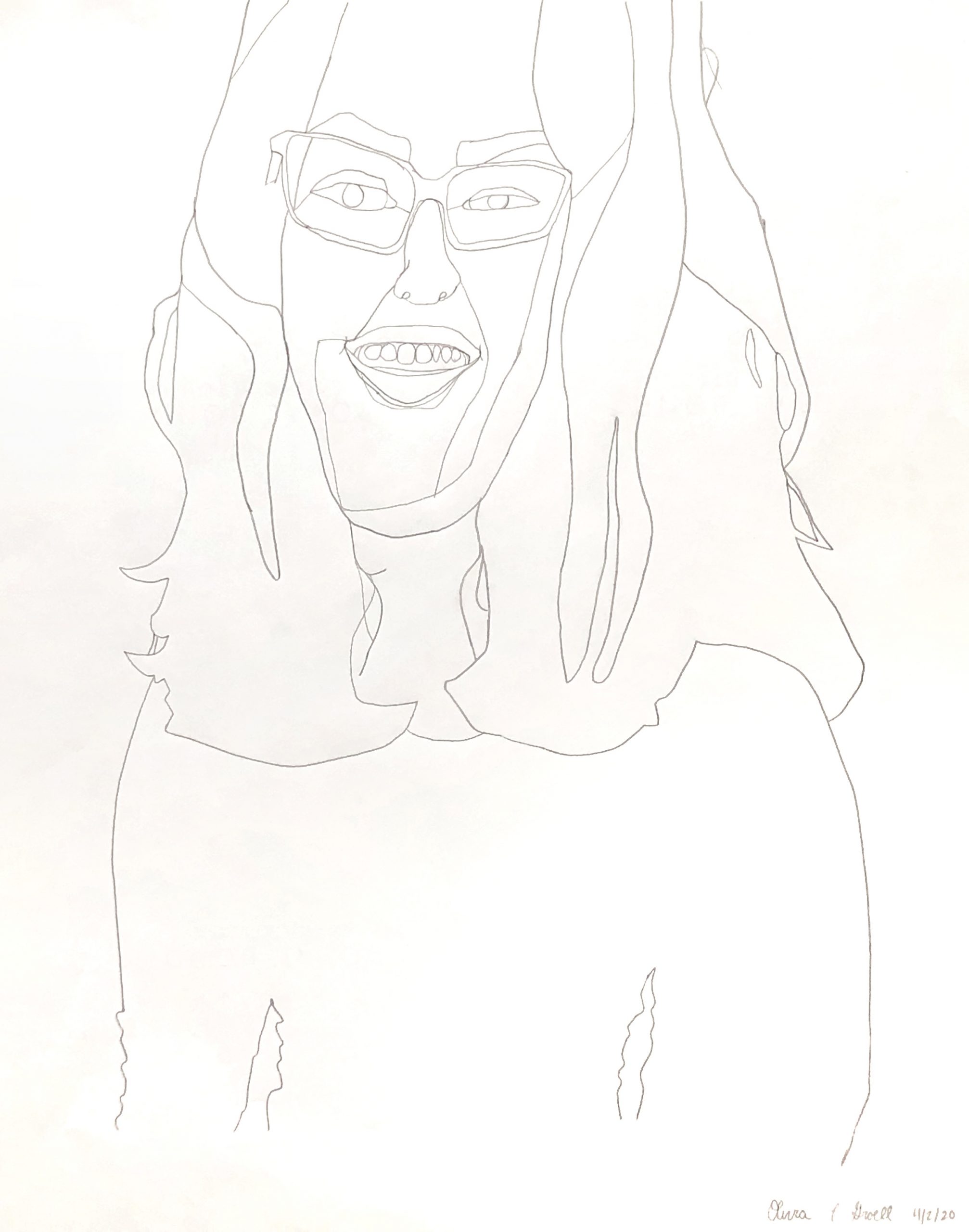
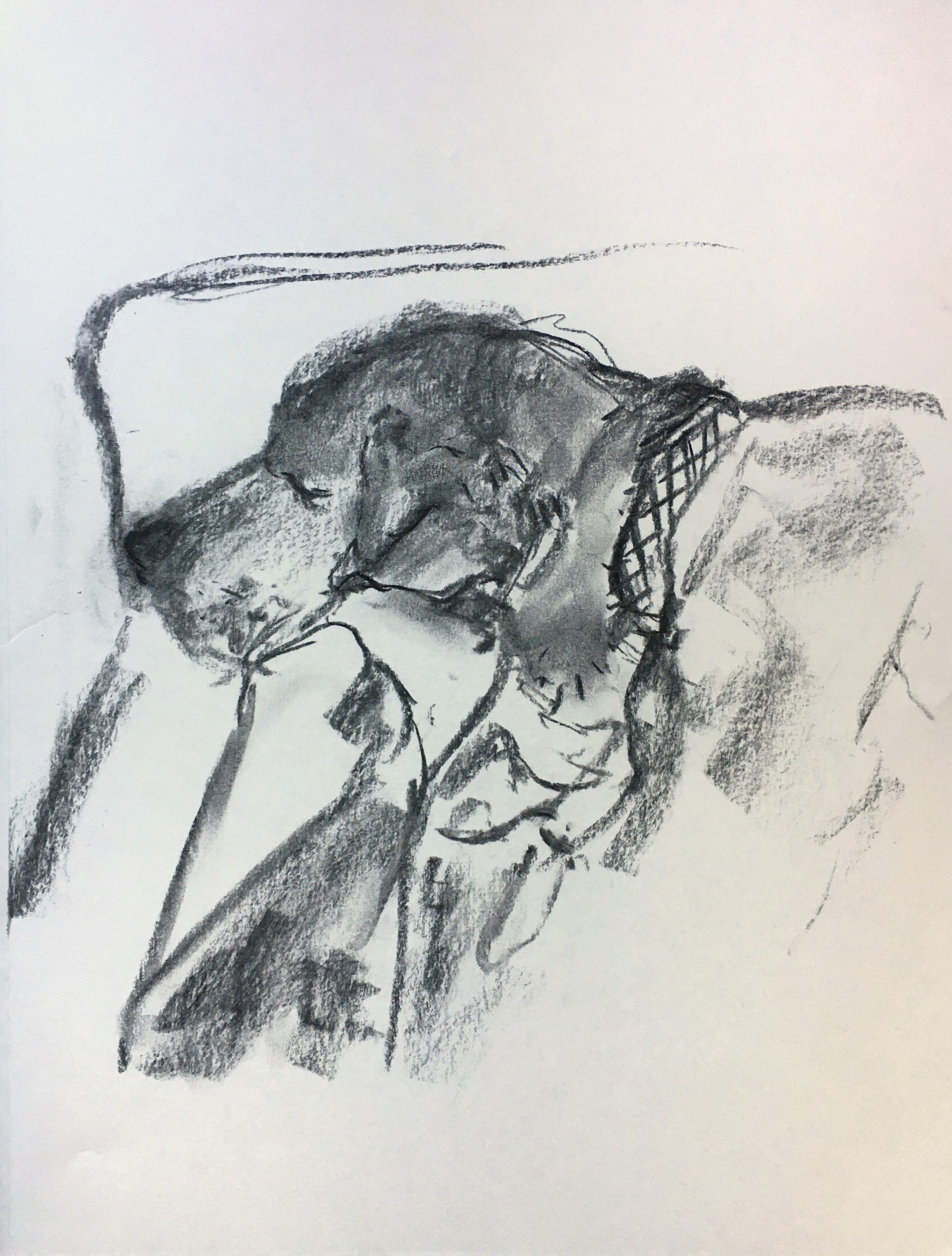
Pencil on paper, 11 1/4 x 8 3/4 inches
X (but only if we can get a better exposure)
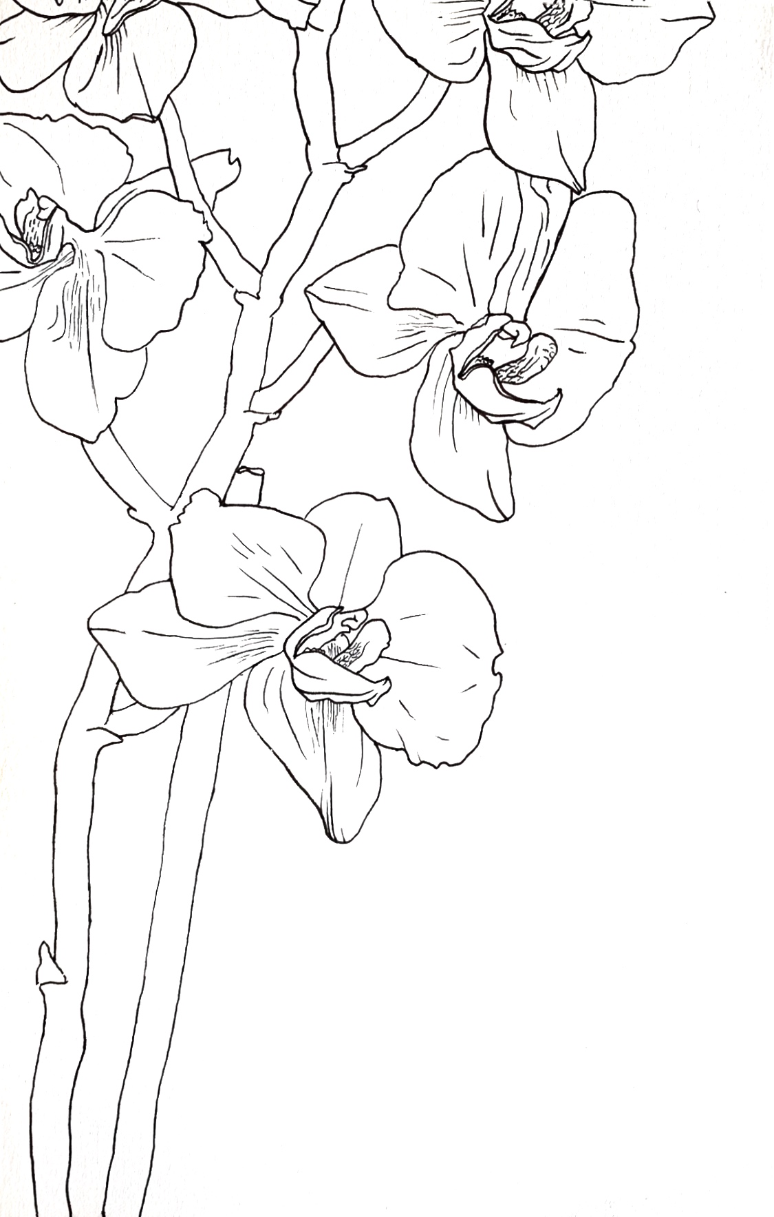
Pencil on paper, 11 1/4 x 8 3/4 inches
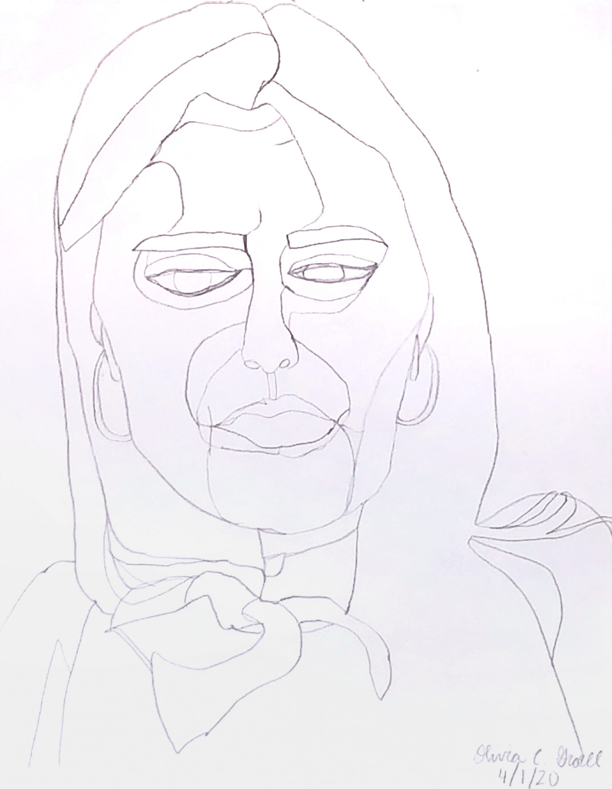
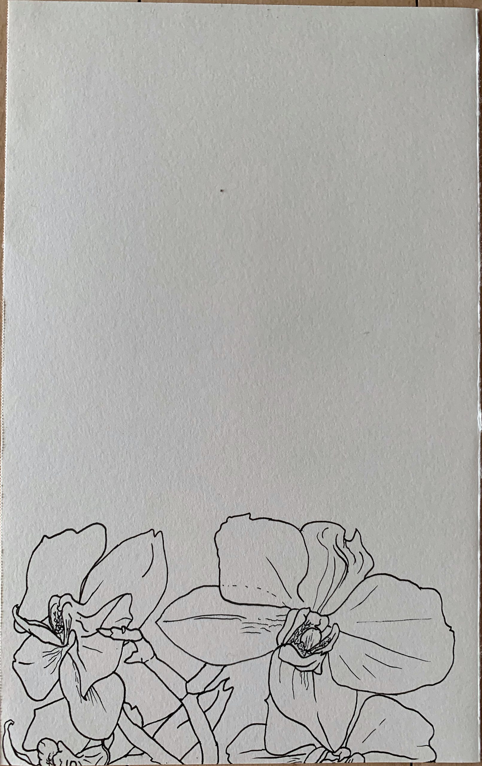
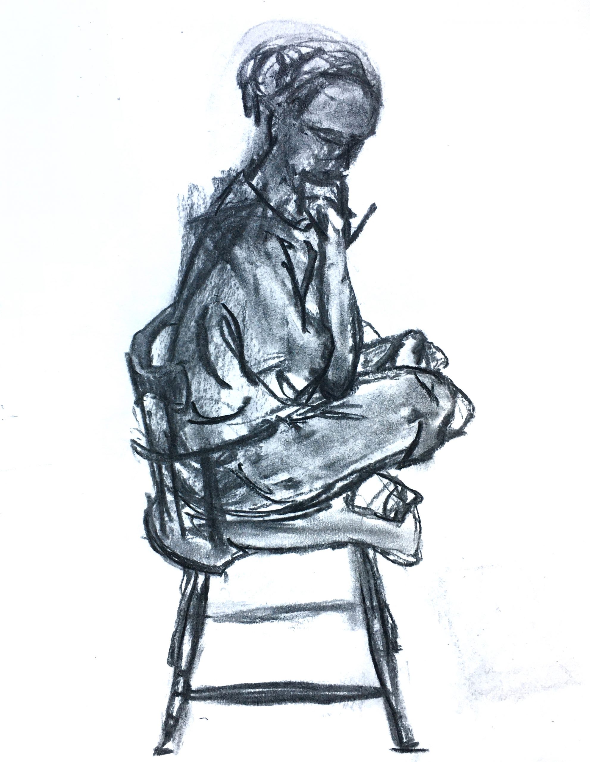
Pencil on paper, 22 1/2 x 17 1/2 inches
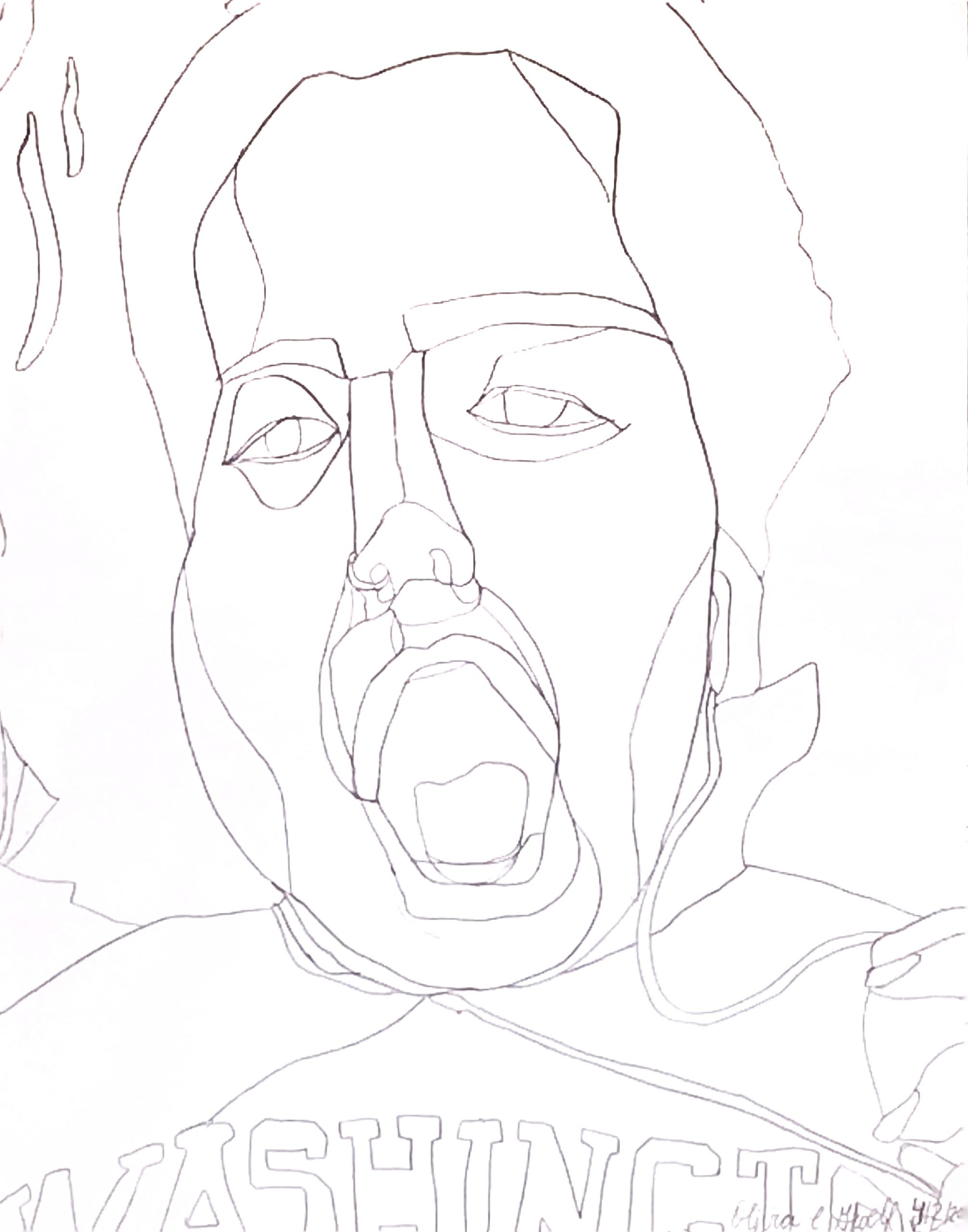
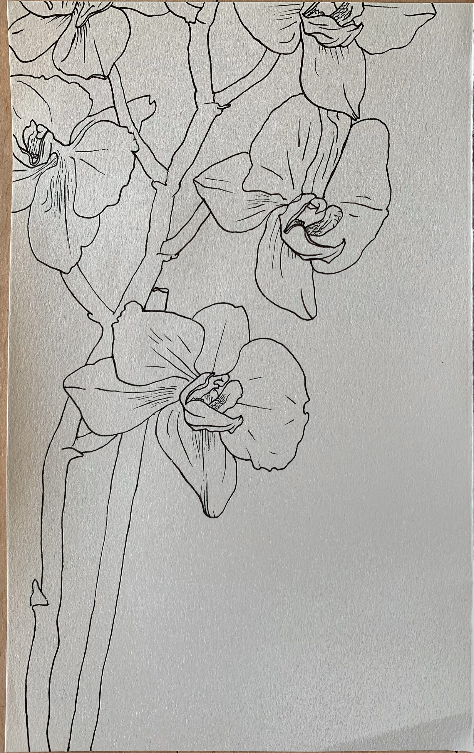
Pencil on paper, 11 1/4 x 8 3/4 inches
X (This one alone)
 You need to clean and straighten these up more thoroughly. I took this back into Snapseed and used the tools outlined in my “cheat sheet.” Be sure to leave some time to practice these techniques for a better outcome and a better representation of your work.

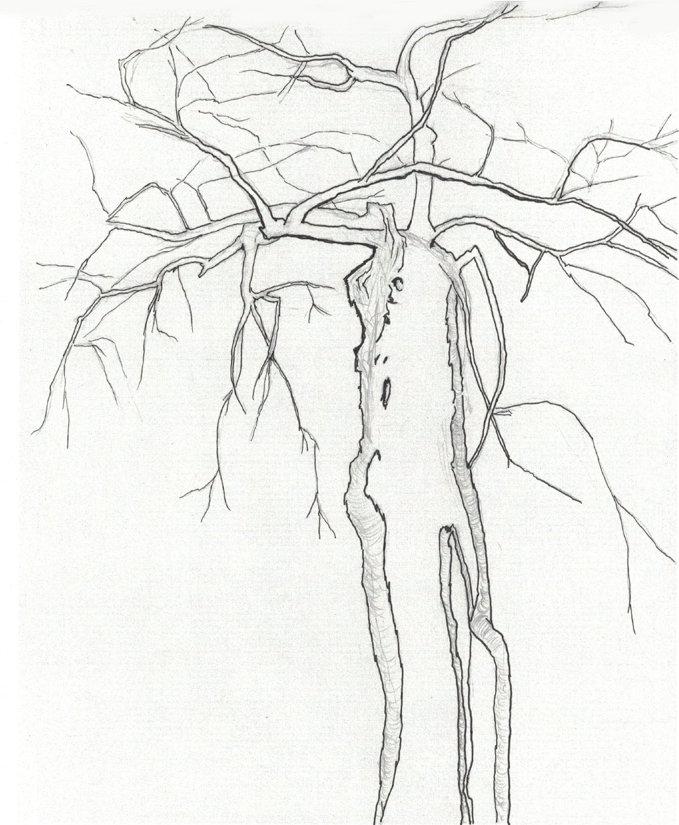
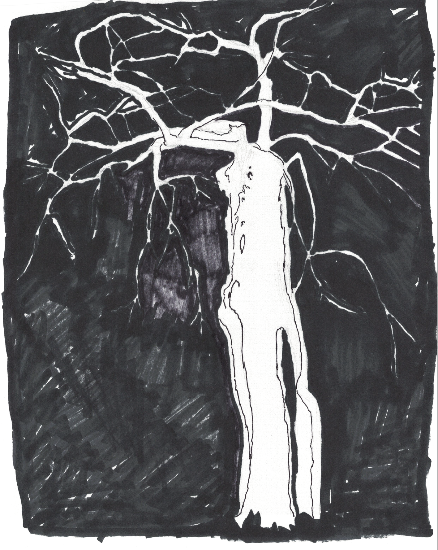
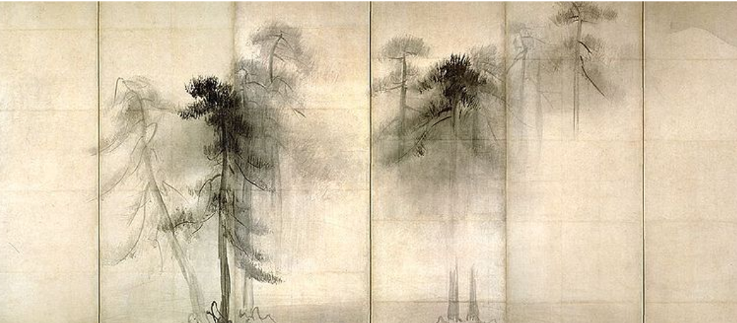 Hasegawa Tohaku, 16th c, ink wash painting, 5 x 11.5 feet
Love the way just a branch or two touch the left panel, and only atmosphere fills the right.
X
 Avigdor Arikha
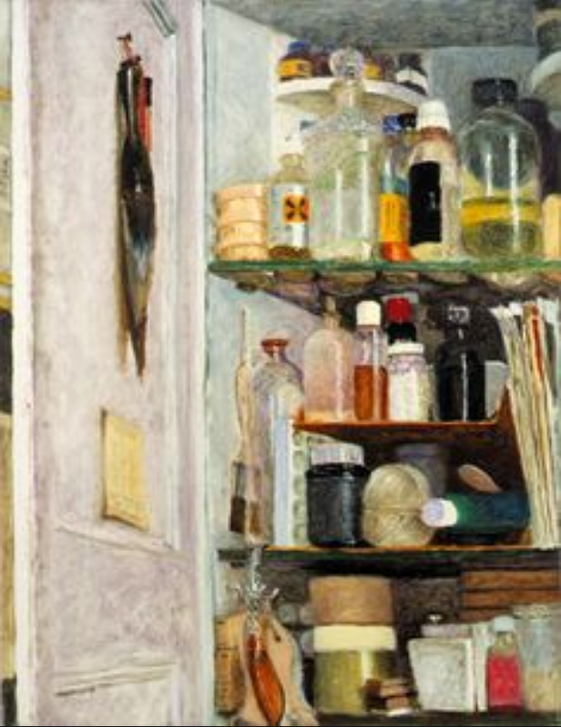
Avigdor Arikha was a master of the found still-life in his home and studio (in Paris). See more of his in Adam’s thread.
 Avigdor Arikha
Google him for more (of course). Note the strong abstract design of his compositions, achieved through his viewpoint and use of cropping.
 11 x 10″
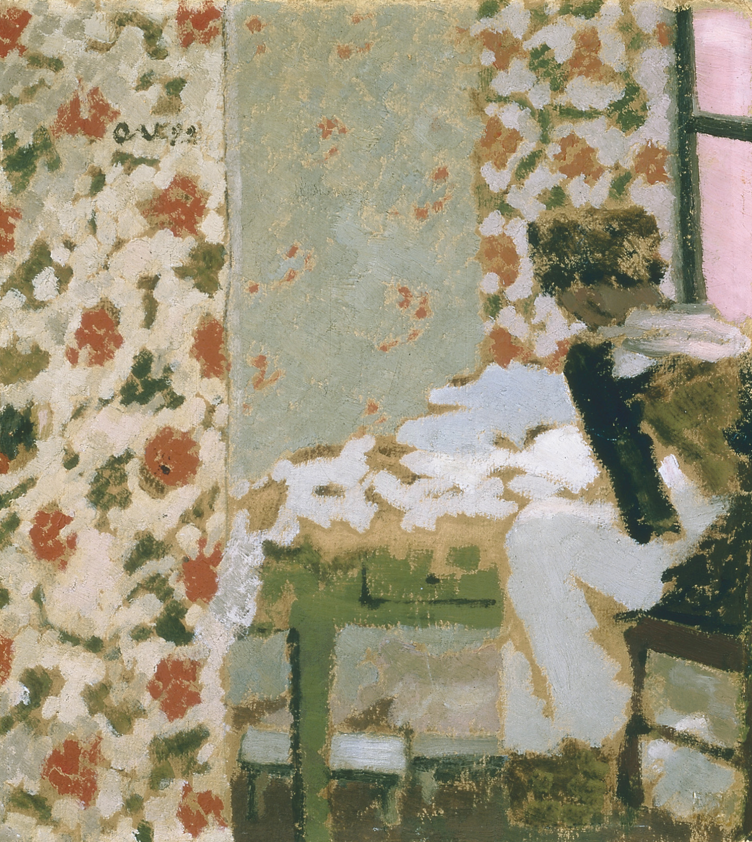
Another master of domestic interiors was Edouard Vuillard. It takes a minute to see the figure on the right (it’s called “The Seamstress”).
And a world that I’m well acquainted with:
 “Simple Gifts,” Oil on canvas, 54 x 48″

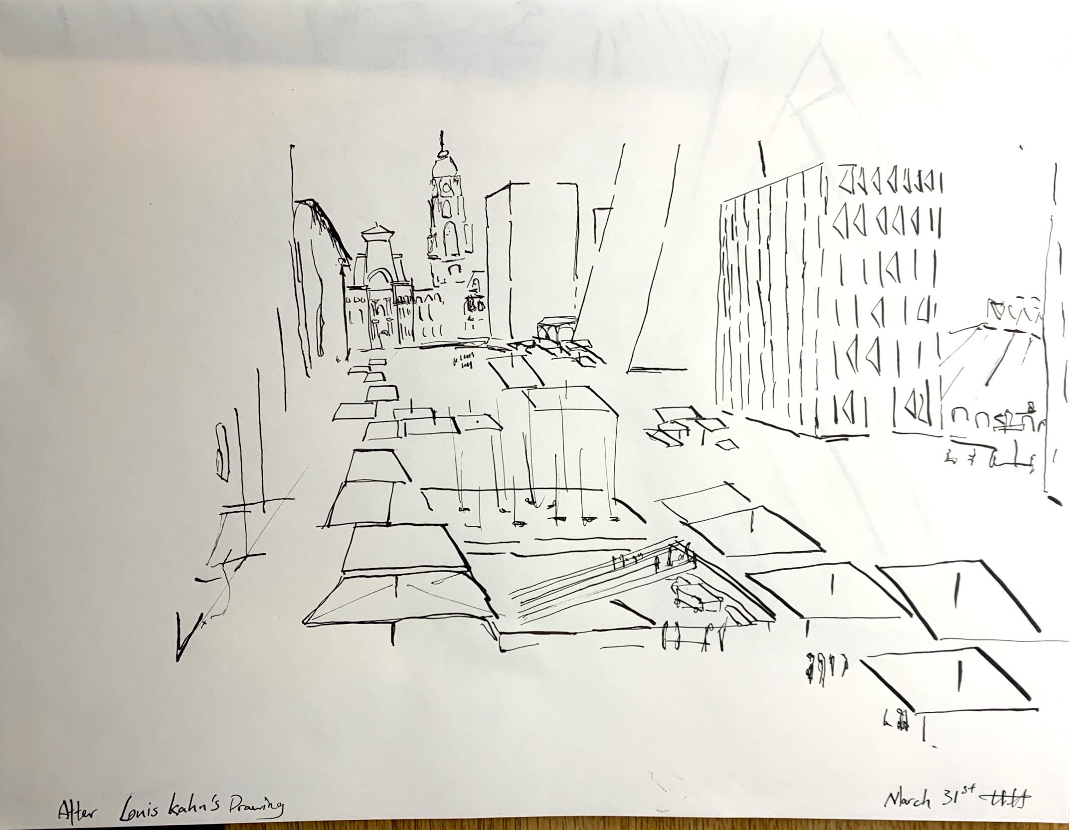
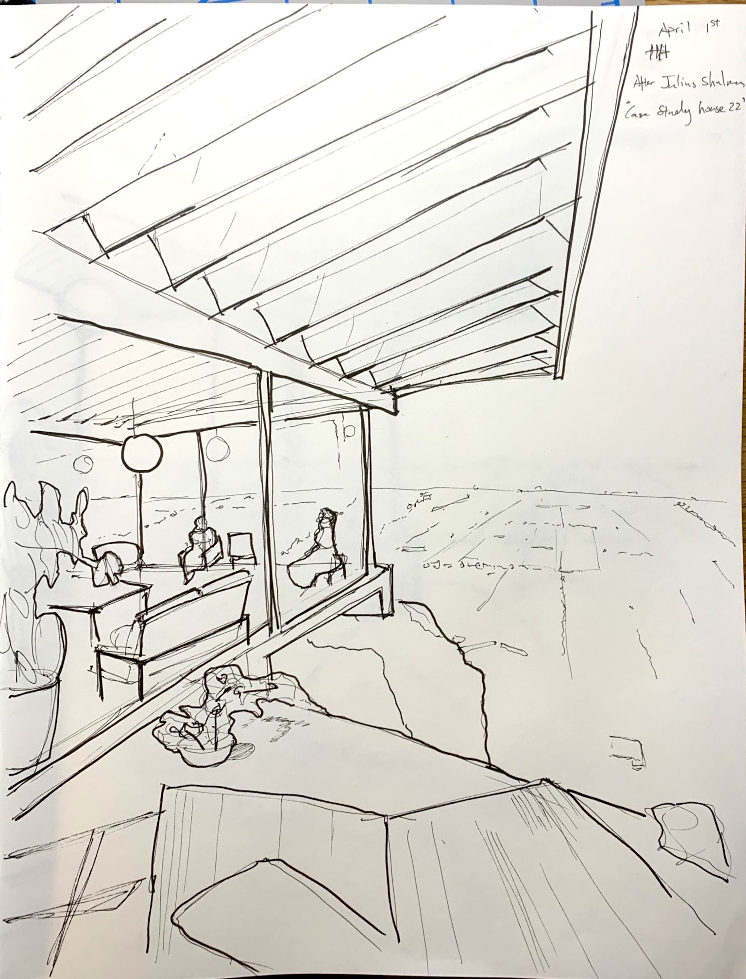
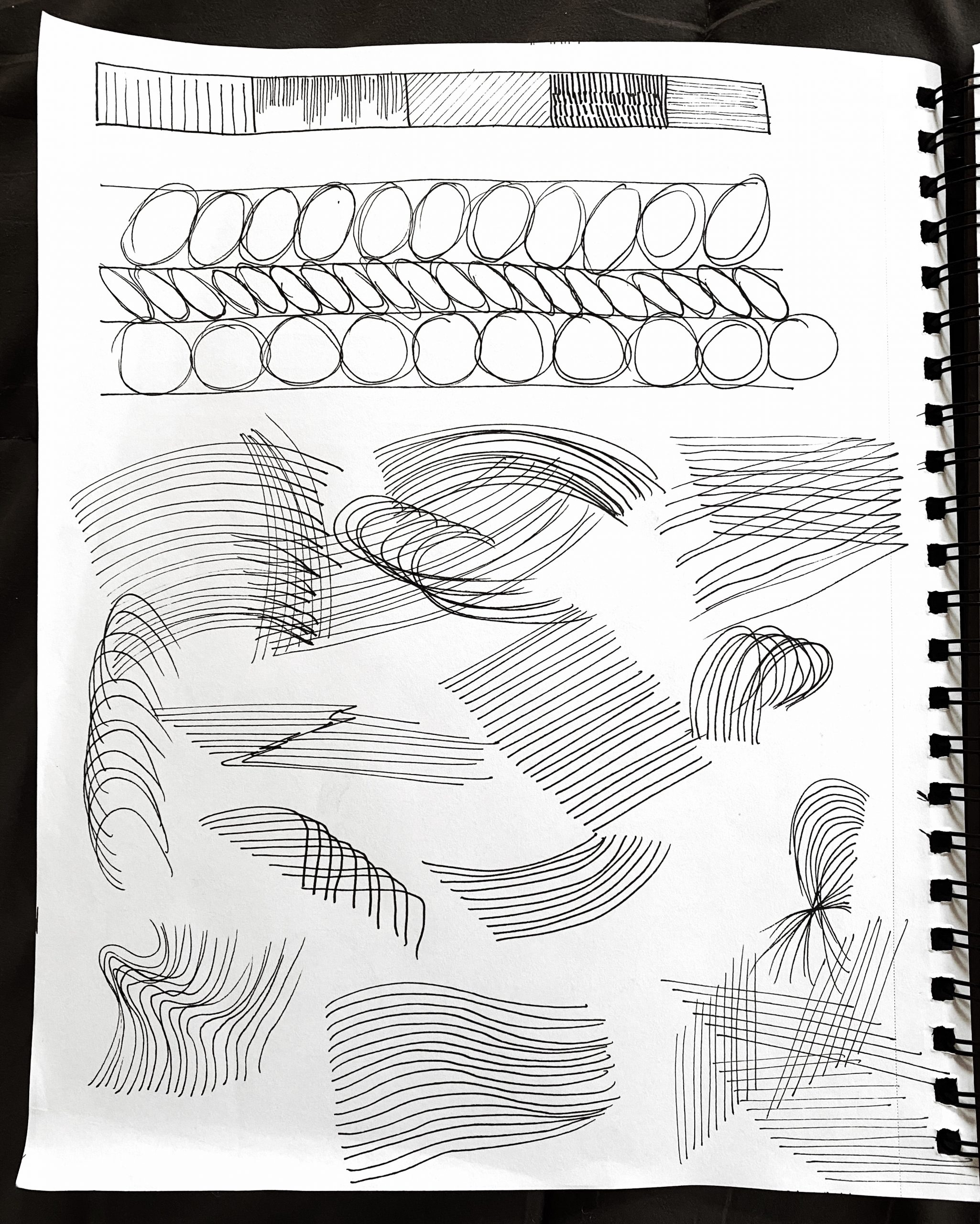
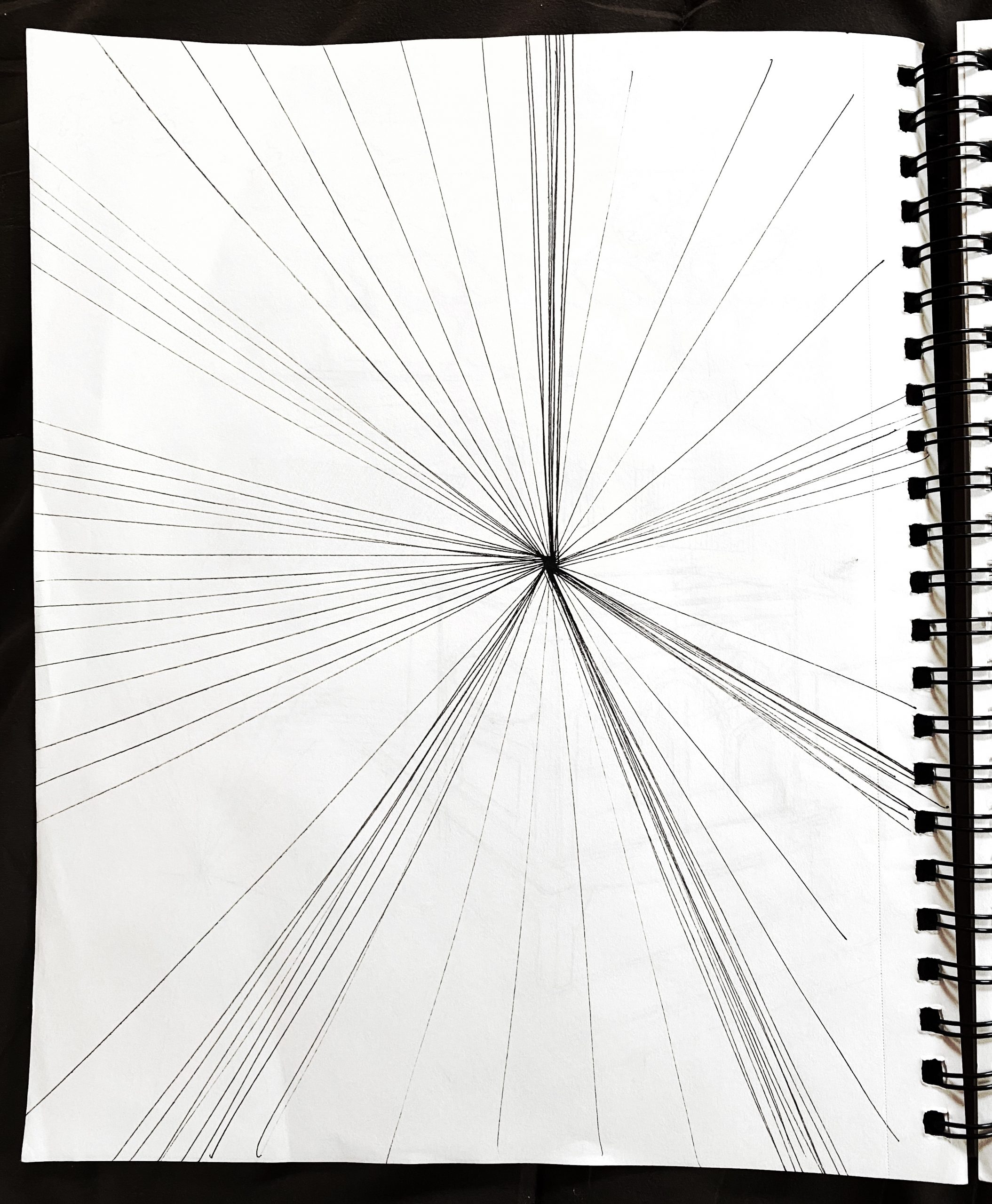
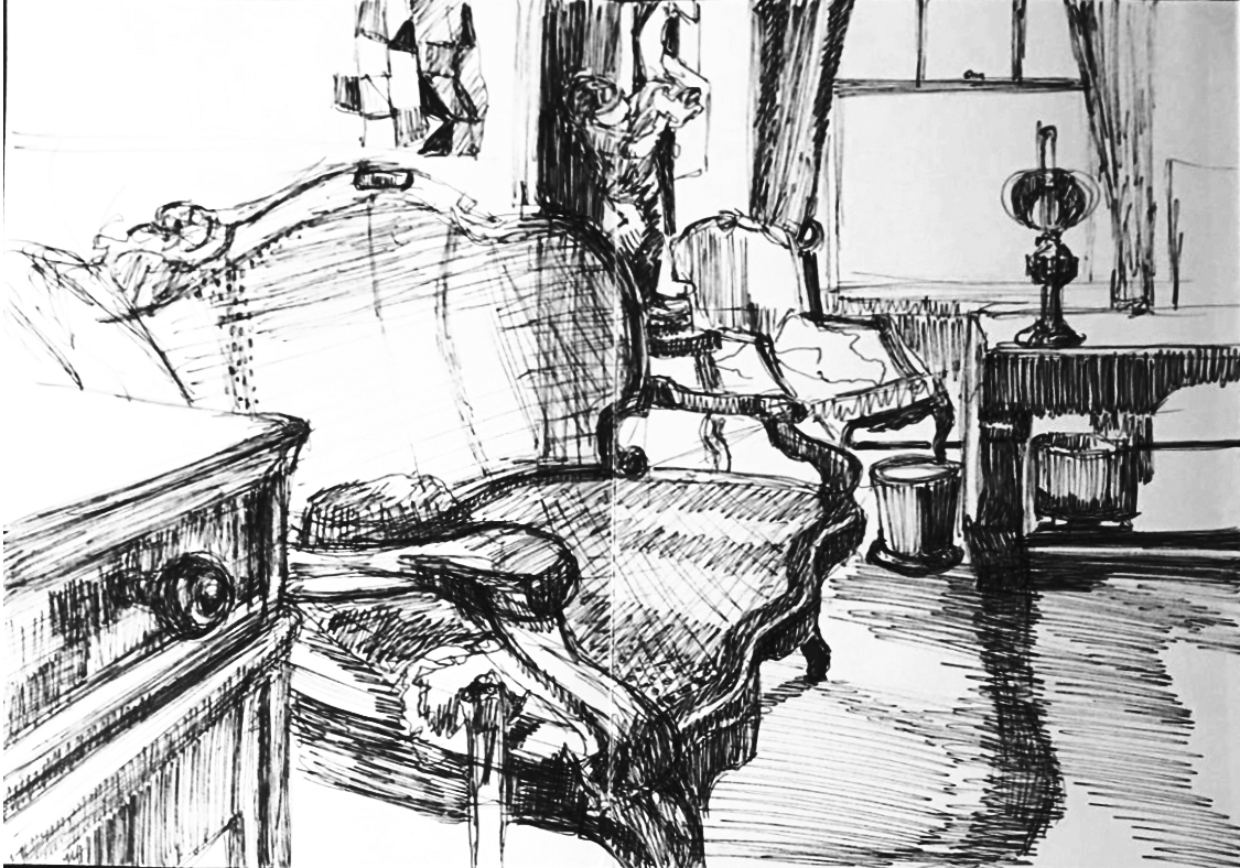
I spend the first few days drawing to get to grips on the medium and the mindset of a perspective drawing. I started with studies of architects’ sketches and drawings, trying to learn how perspective is described, and how line quality helps deliver the depth of field as well as quality and form of the subjects. I then moved on to exercises on trying to describe an image. I started working existing images, for the sake of convenience and accessibility.
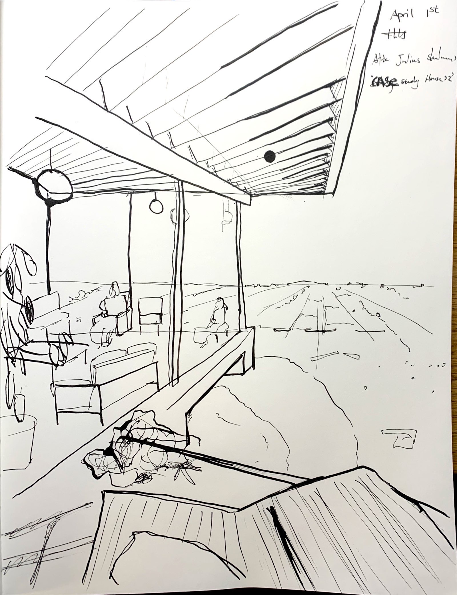
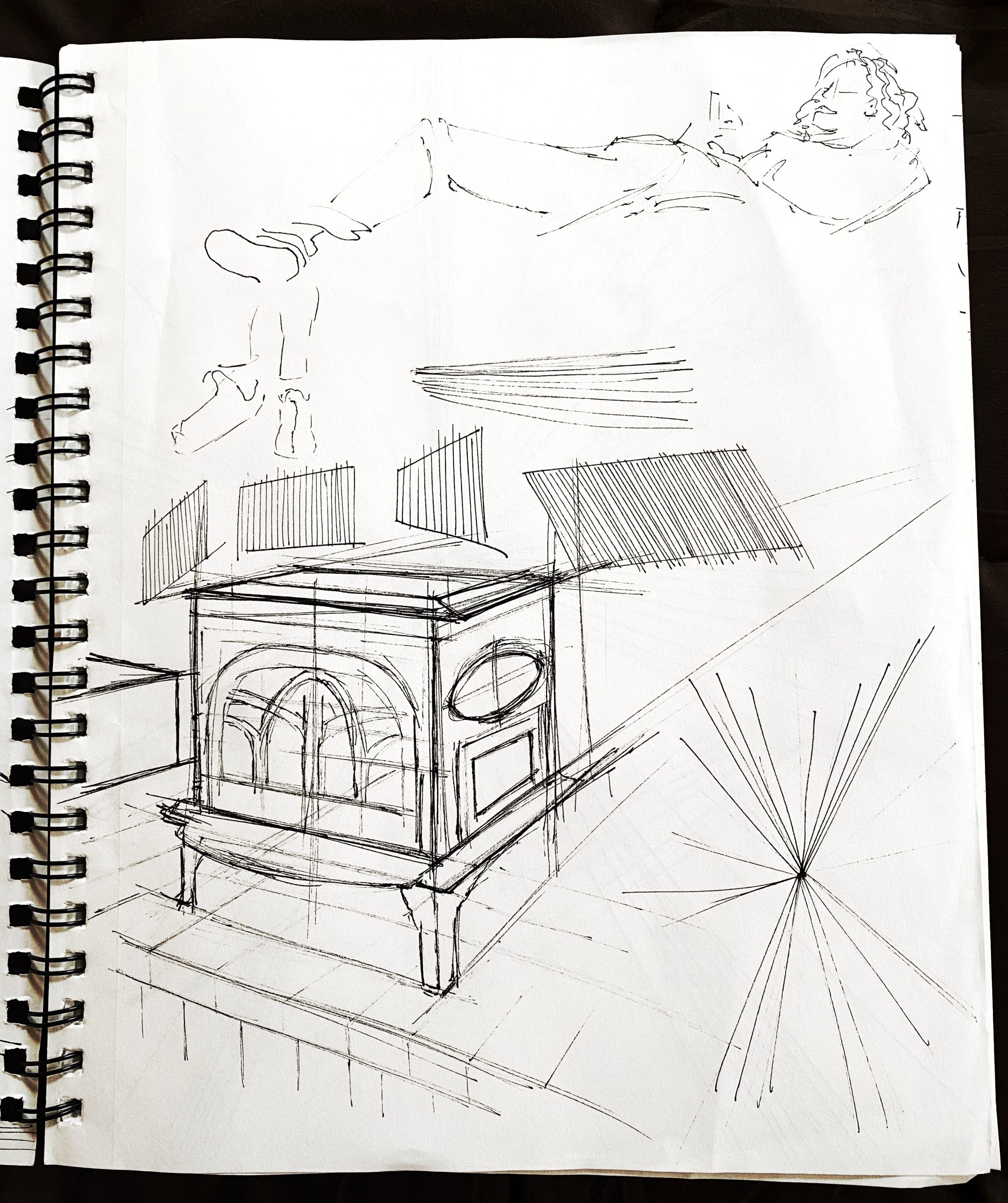
I remembered that Julius Shulman (an architecture photographer) had a photograph of the apparent depth of field and a linear, easy to articulate architecture. This photograph became my starting point of experimentation. I used both micron pens and dipping ink pen. I have to stress how much more satisfying it was to work with pen and ink, given the variety of line quality I’m able to achieve with it.
The next step will be studies of more architect’s drawings as well as making my own drawings from life.
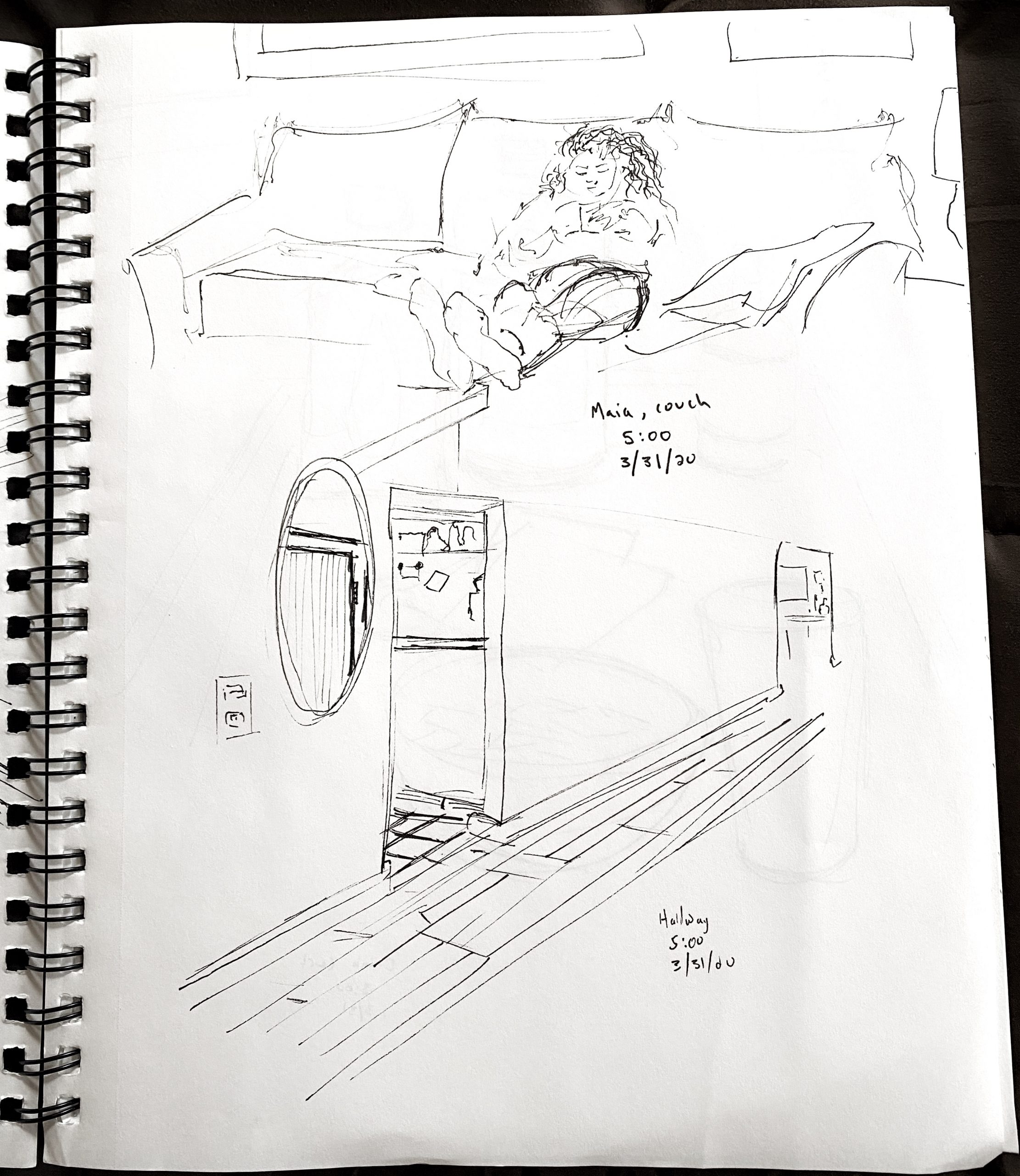
Drawings Are in Chronological Order:
X
X
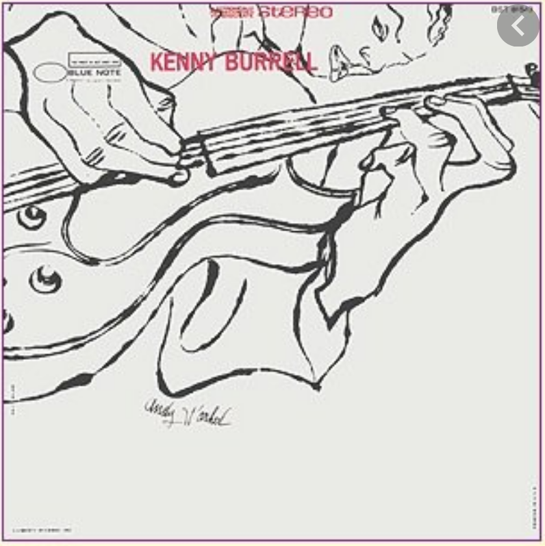 …and how they cropped and rotated it (and moved his signature) for the album cover. Don’t know what he was paid for it originally but it was recently priced at $125,000.
Attached are drawings were copies after Louis Khan and drawings on Julius Shulman’s photograph Case Study House 22 (Stahl House by Pierre Koenig, Hollywood).https://www.moma.org/media/W1siZiIsIjY0OTIiXSxbInAiLCJjb252ZXJ0IiwiLXJlc2l6ZSAyMDAweDIwMDBcdTAwM2UiXV0.jpg?sha=59ea14c058450229
http://blog.dwr.com/wp-content/uploads/2016/03/StahlHouse_Shulman.jpg
April 2nd
Charcoal on Paper, 9″ x 12″
Charcoal on Paper, 9″ x 12″
Charcoal on Newsprint, 18″ x 24″
X
Charcoal on Paper, 9″ x 12″
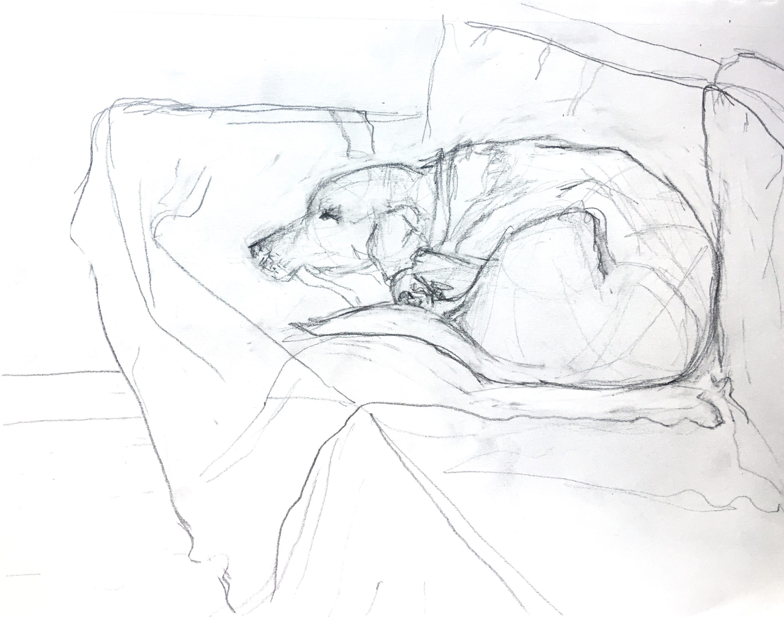
Graphite on Paper, 9″ x 12″
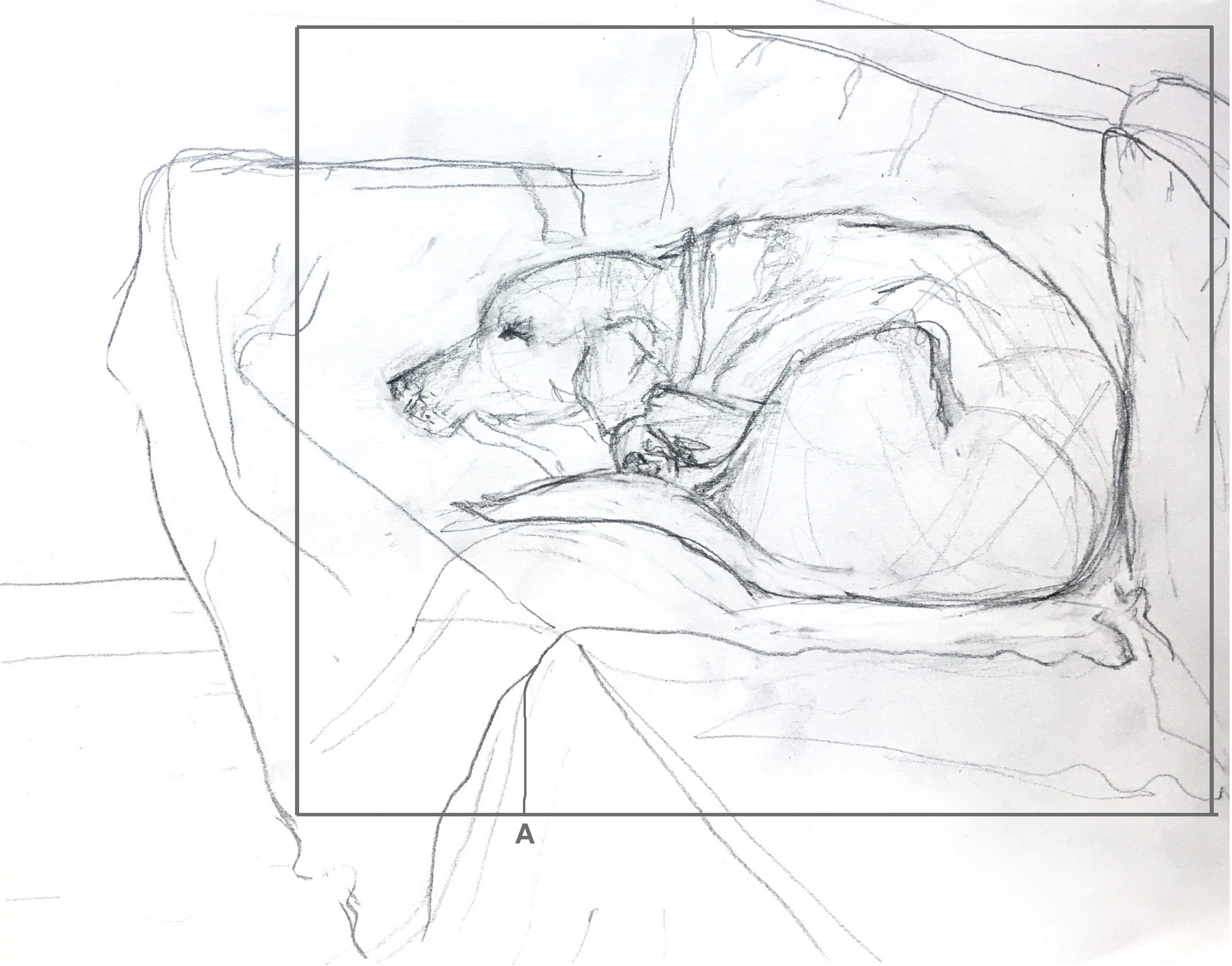 Considering Diebenkorn is one of your inspirations (and a good one), think more about composition. Love the way the dog is in kind of a rectilinear silhouette. Bringing the sides closer emphasizes this (a rectangle within a rectangle) and strengthens the negative spaces. Note also the line I’ve added at “A.” It might not be true but for the sake of composition we have to take matters into our own hands–I did it to echo the verticals of the couch cushions and the dog’s lower spine, his brow, and collar. It also helps to arrest the rapid retreat of the diagonals (perspective).
Pencil on paper, 12 x 9 inches
X
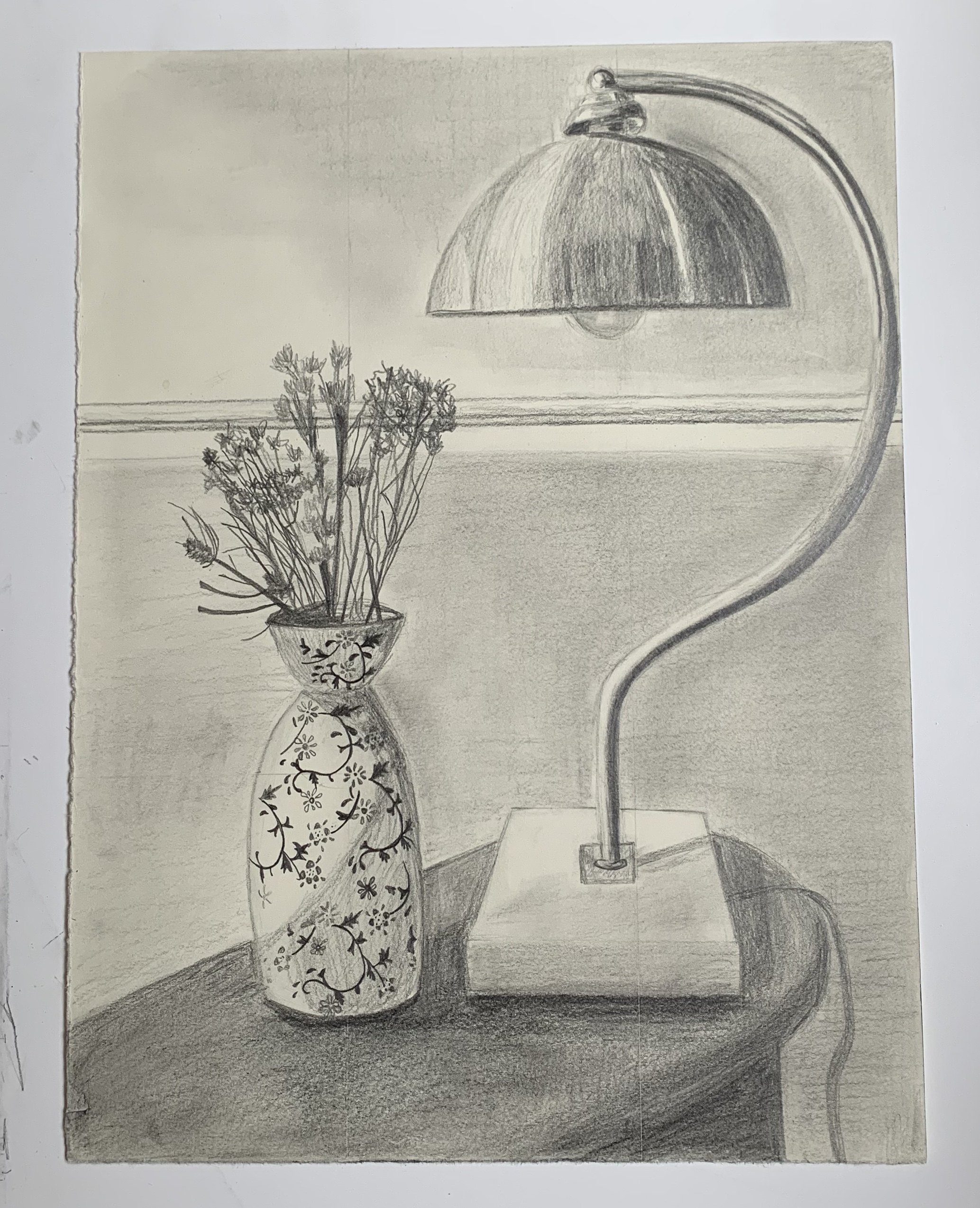
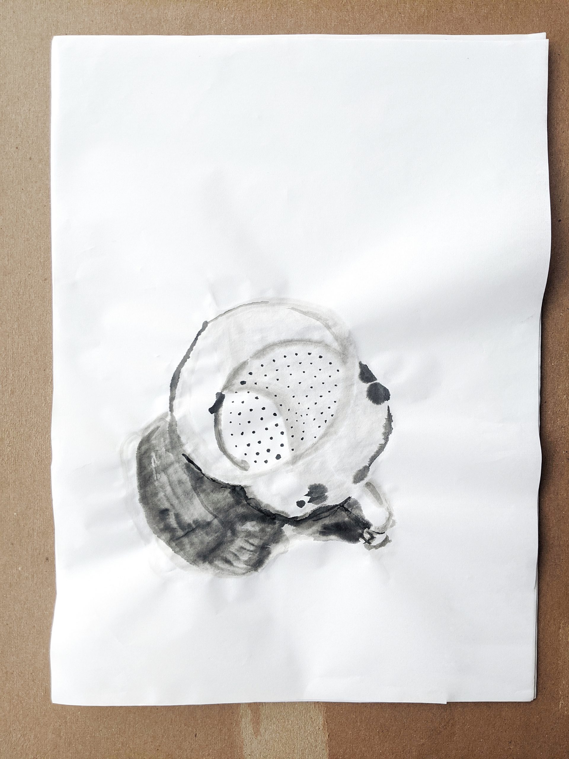
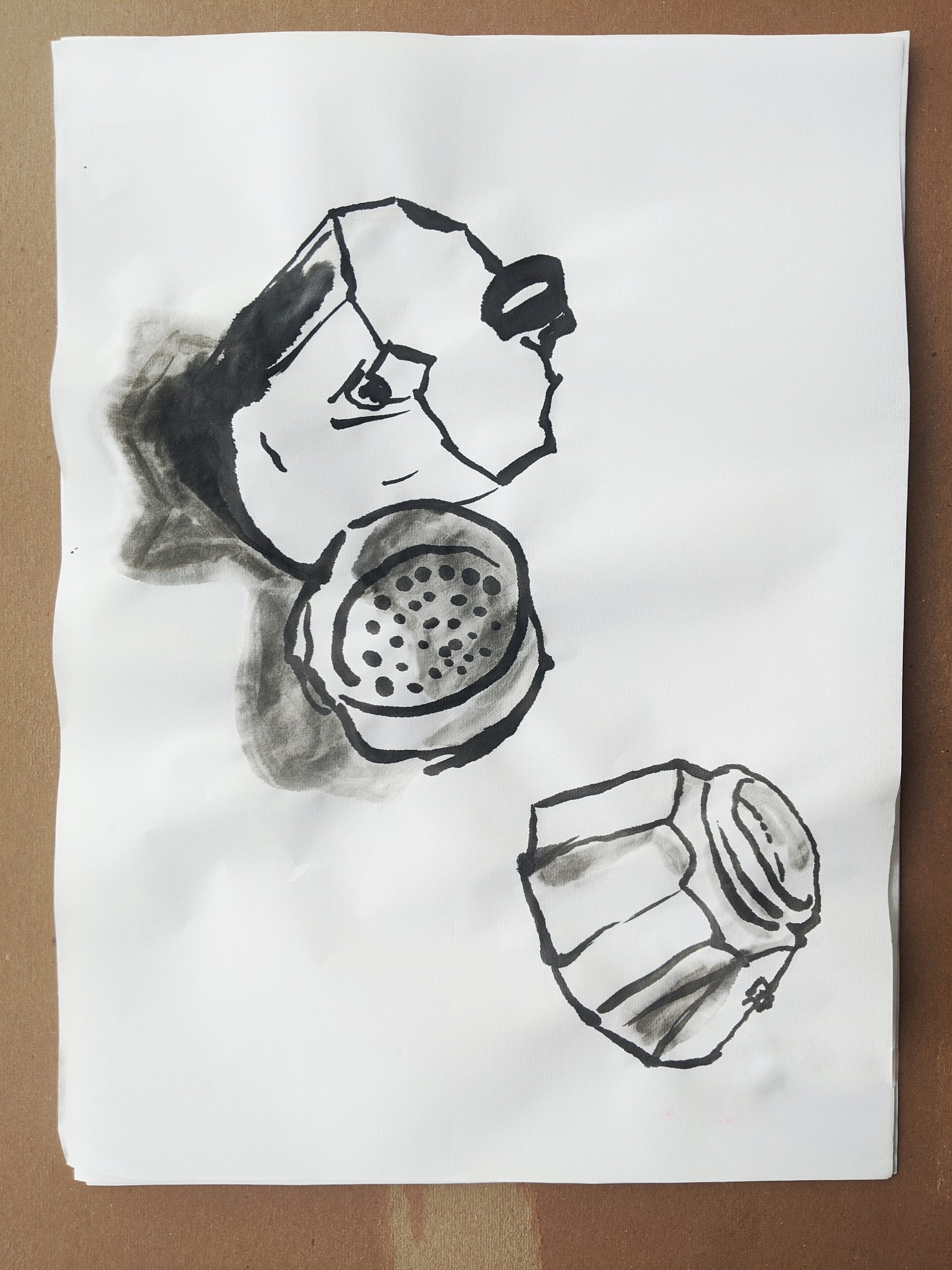
For this first week, I decided to draw part of a side table in our living room because I wanted to draw something on a smaller scale. My intention for this drawing was to produce something photo-realistic. I concentrated on the shading and value of the objects. Throughout the process, I was reminded that I haven’t quite discovered my drawing style and I was disappointed about how I shaded the objects. Because I don’t think it gave me the realistic effect that I was going for. I’m not sure how I can improve this. I also had trouble with drawing the dried flowers. There are more flowers in the vase with infinite amounts of detail. So my question is, how do we approach a highly detailed subject? Is there a certain method I can be using? I also don’t think I successfully captured the depth of the space. The back wall can just as easily be on the same plane as the objects. For my next drawing project, I would like to try a more impressionistic style.
__________
From Mark:
It sounds like you’re not going to stay with this approach, but if you were, the work of Charles Sheeler comes to mind:
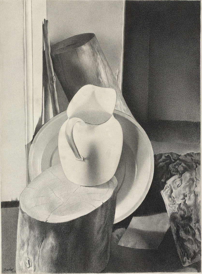 Charles Sheeler, 25 x 19.5″
This was done with conté crayon, keeping a super sharp point to get the finest grain possible. It’s also from a photo, which helped him to lock in the values and simply (so to speak) transcribe them.
I also see the hint of something in that vase that reminds me of the work of Gail Spaien, who teaches at Maine College of Art:
 Gail Spaien
This also connects, for me, with your interest in Frida Kahlo’s work, which is so rich in patterning. Pattern could also be a solution because large flat areas are one of the hardest things to ask a pencil to do.
I should know, having made pencil drawings like this one for years….
 MW, “Grey Rainbow,” 1978, Graphite on paper, 9 x 12 inches
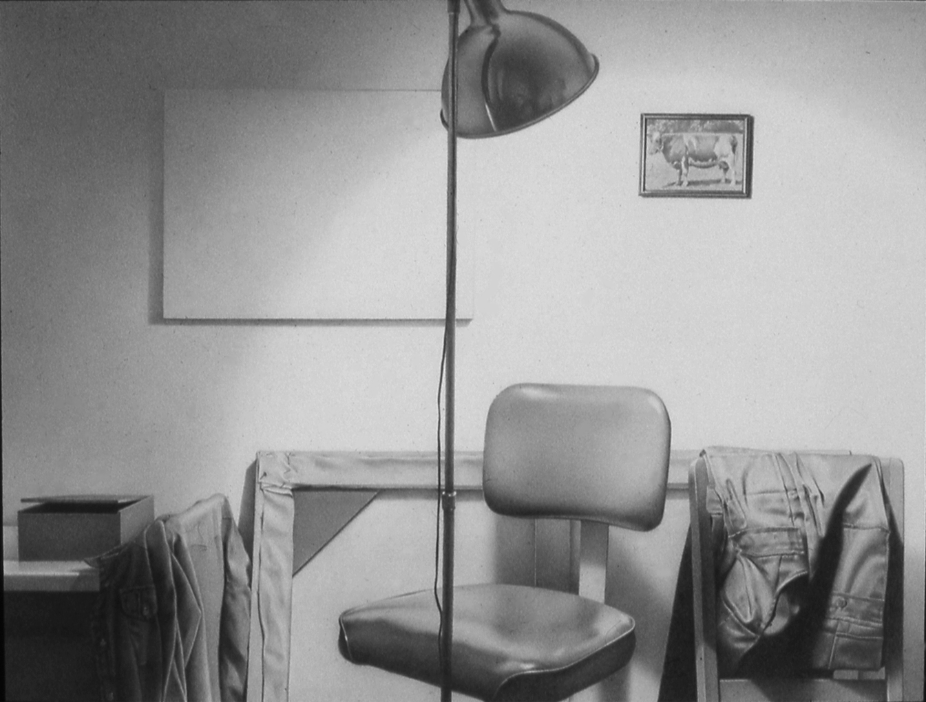
Note the reflector on the lamp, which has a small self-portrait in it.
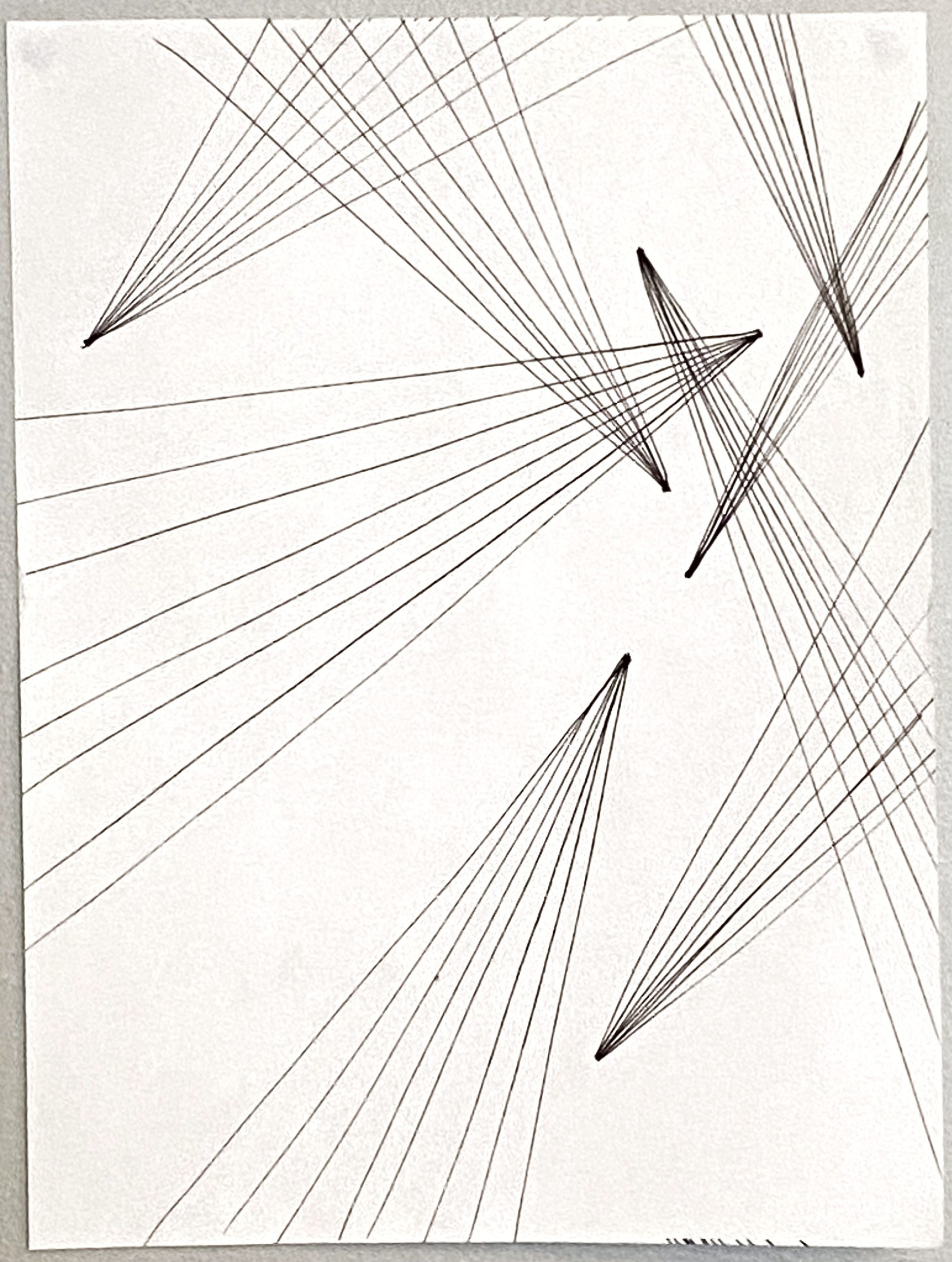
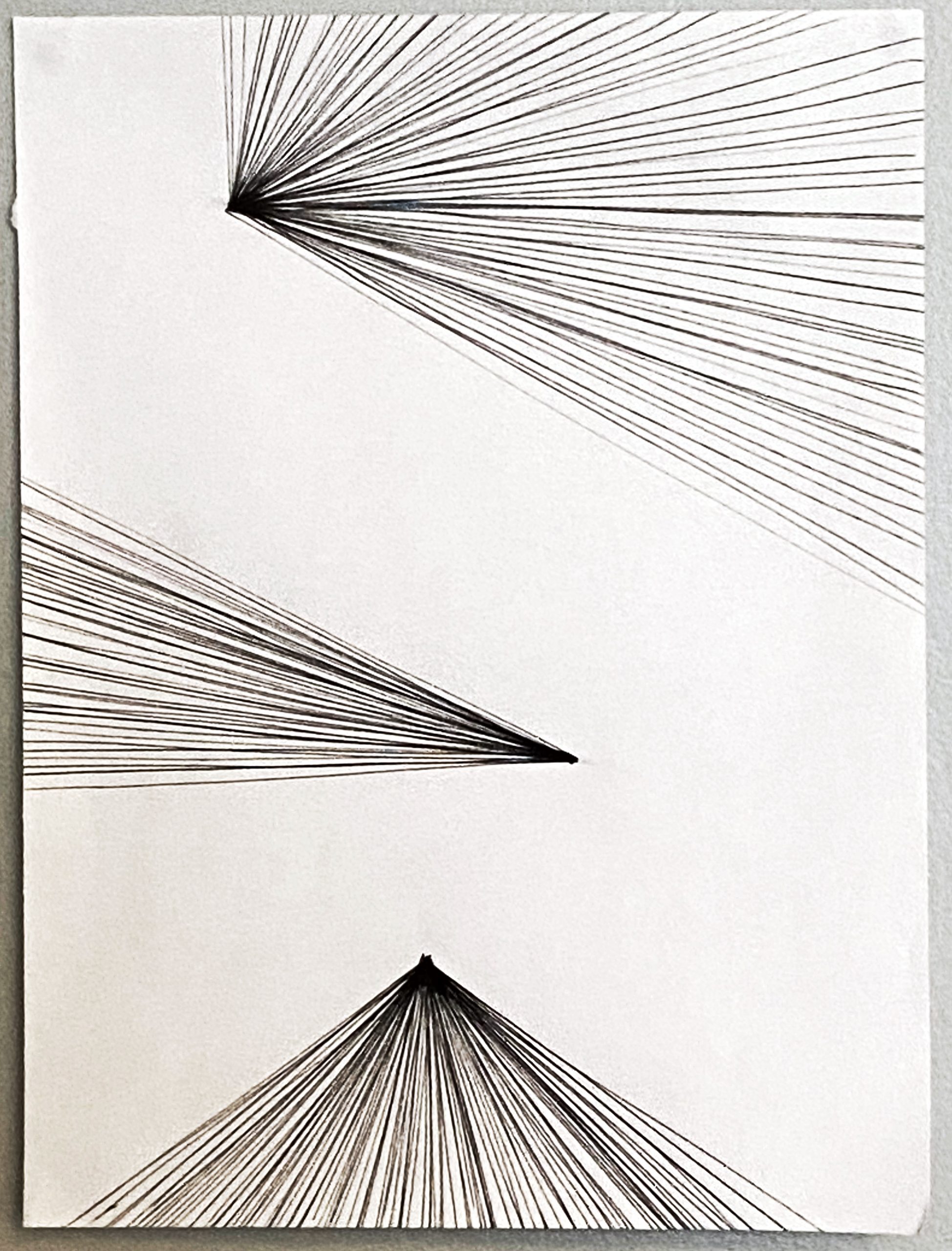
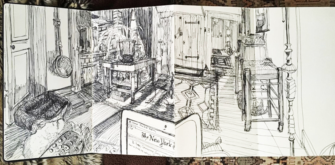
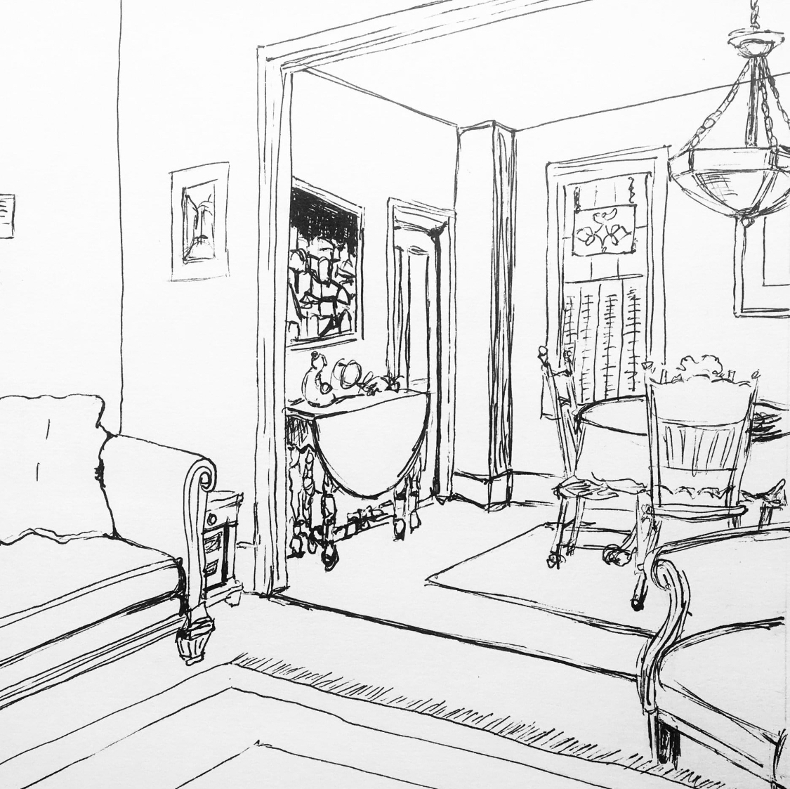
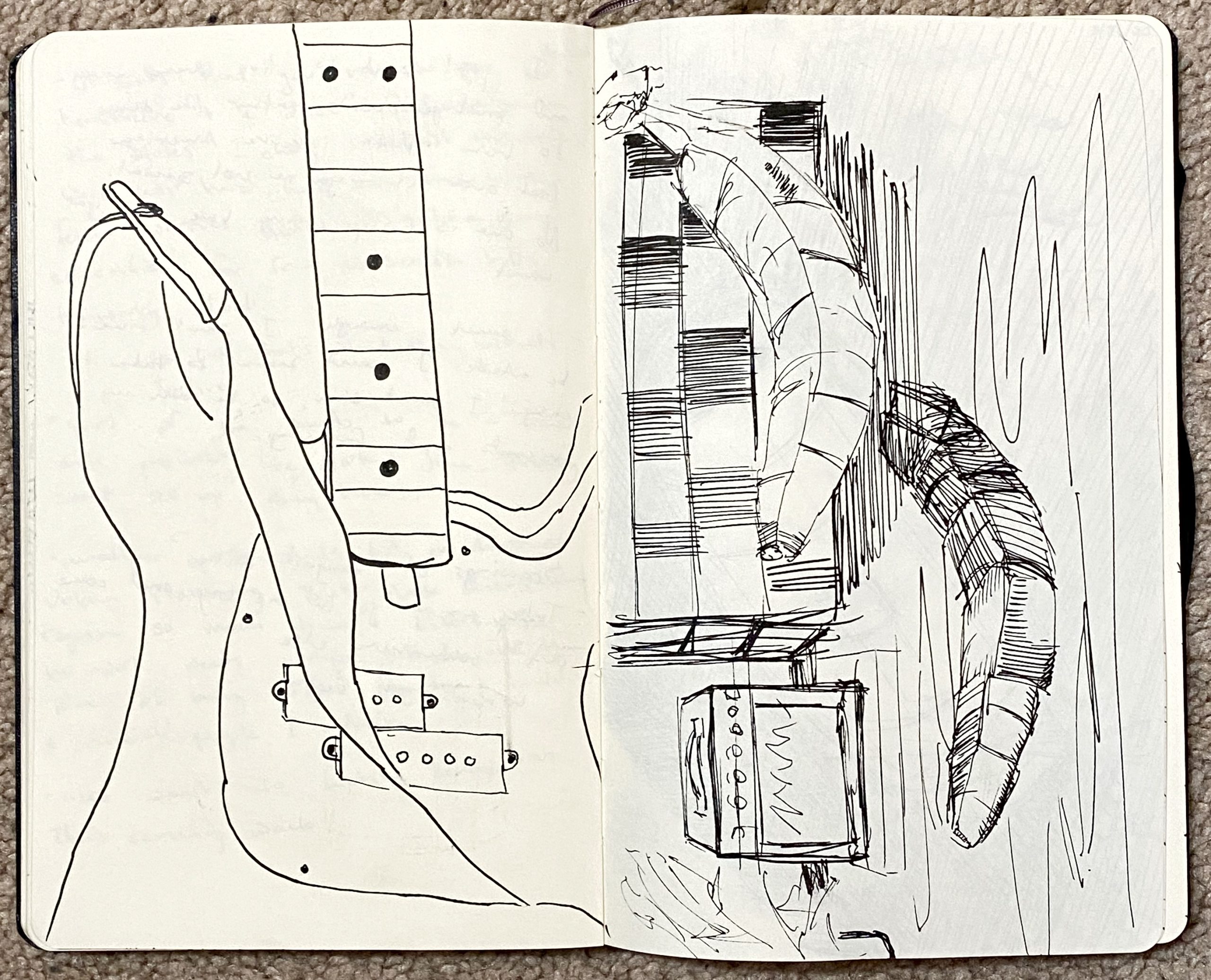
all but last 2: micron* .08 on paper, 9 x 12
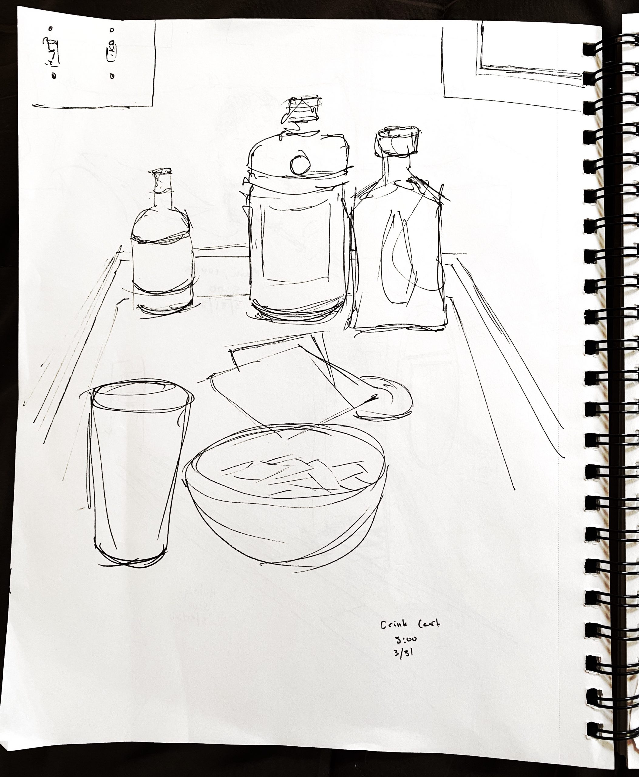
last 2: micron* .08 in medium moleskine
She’s actually doing these as an accordion book, with clever use of the folds in alignment with the architecture to create low-relief spaces.
And one by Maine artist Kim Bernard, who’s doing daily drawing prompts on the Center for Maine Contemporary Art Facebook page:
Like Occhiogrosso, this was drawn in the last few days, in response to being at home full-time. Nice combination of pure contour and a more sketchy line.

X
 Arikha
 Arikha (with more space around the still-life)
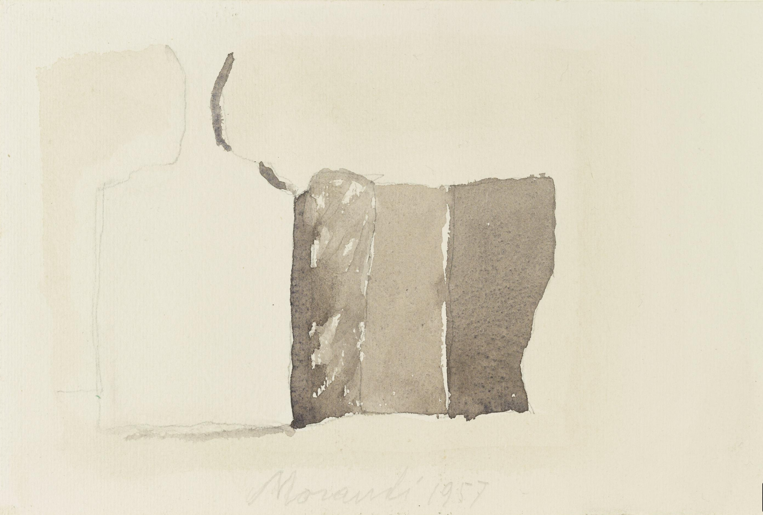 Morandi, “Still life with Square Bottle”
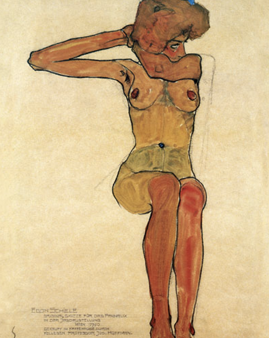 Schiele
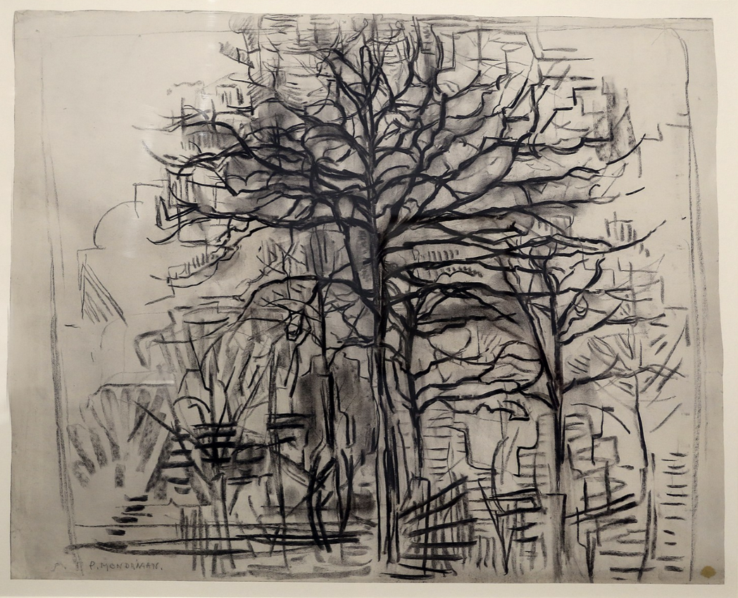 Mondrian
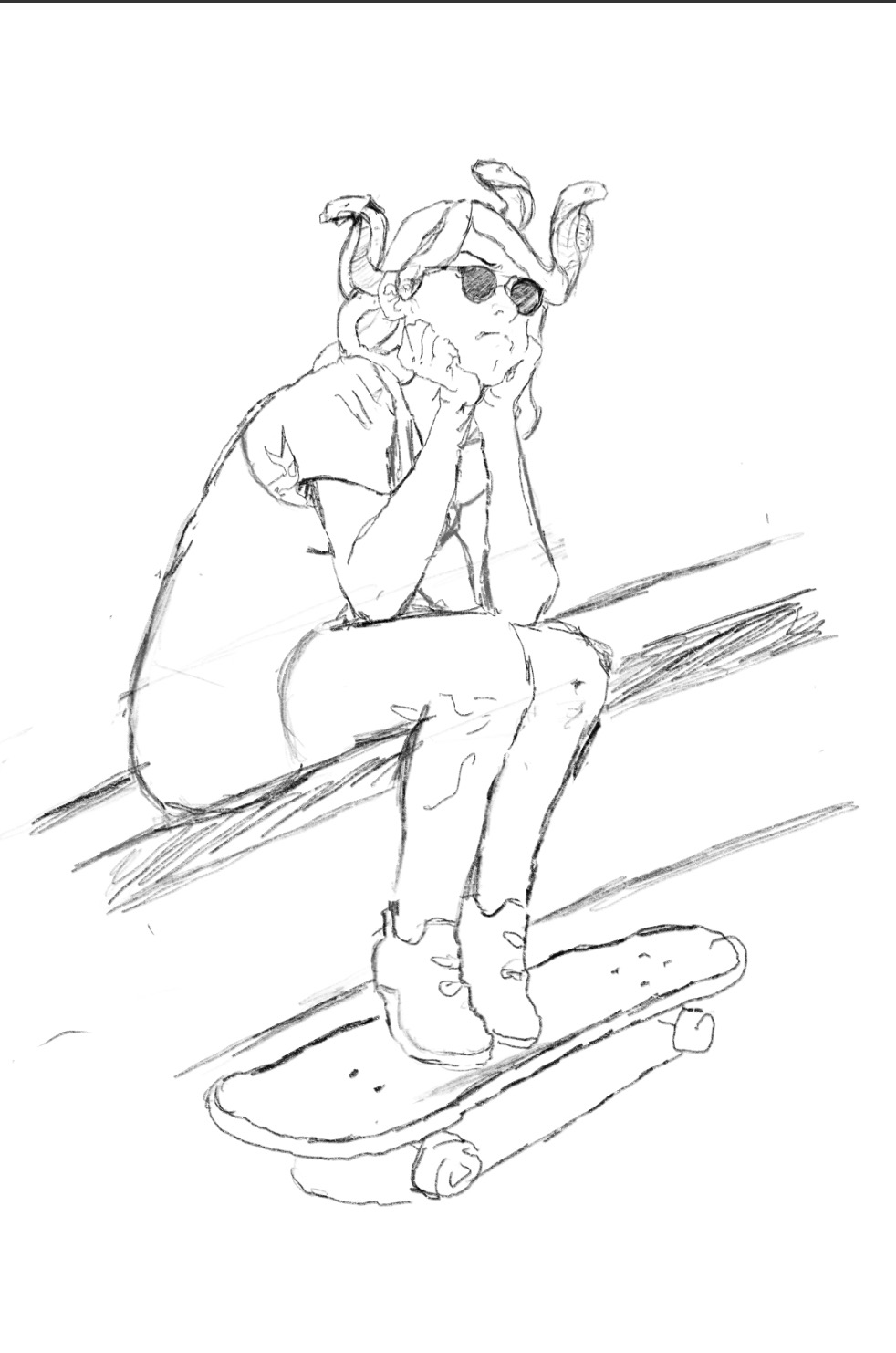
 I think this would look better cropped…
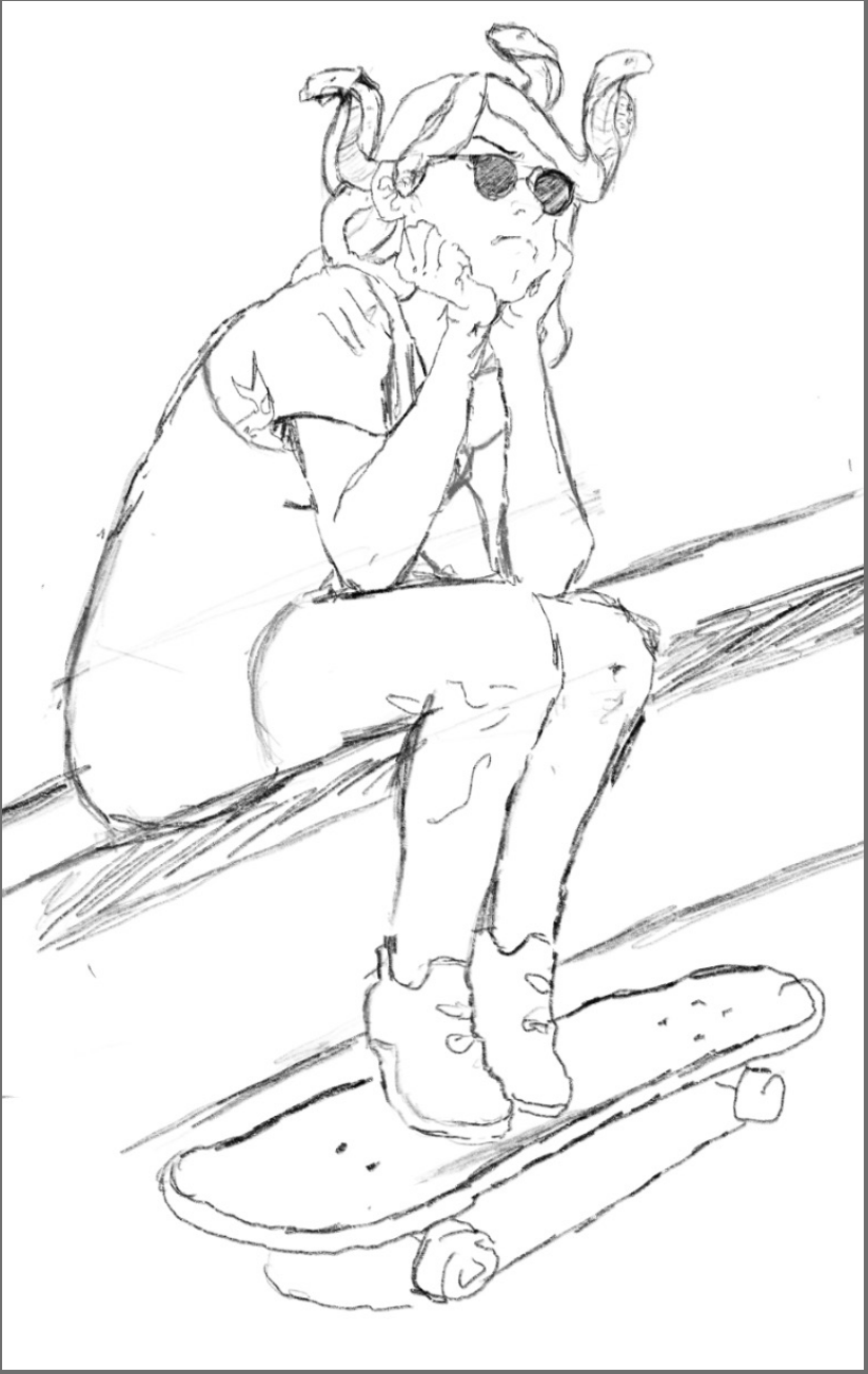
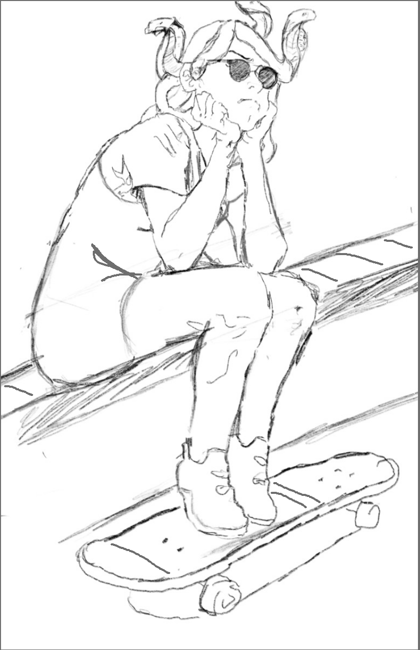 …or better yet cropped just a bit more (note top edge) to activate the negative spaces and hold her in place better. On this one I’ve also added some lines to counterpoint the strong diagonal from lower left to upper right, which threatens to dump her out of the design toward the left. The tilt of her head is a good start, but I’ve added folds at her waist, bricks along the wall, and stripes on the skateboard.
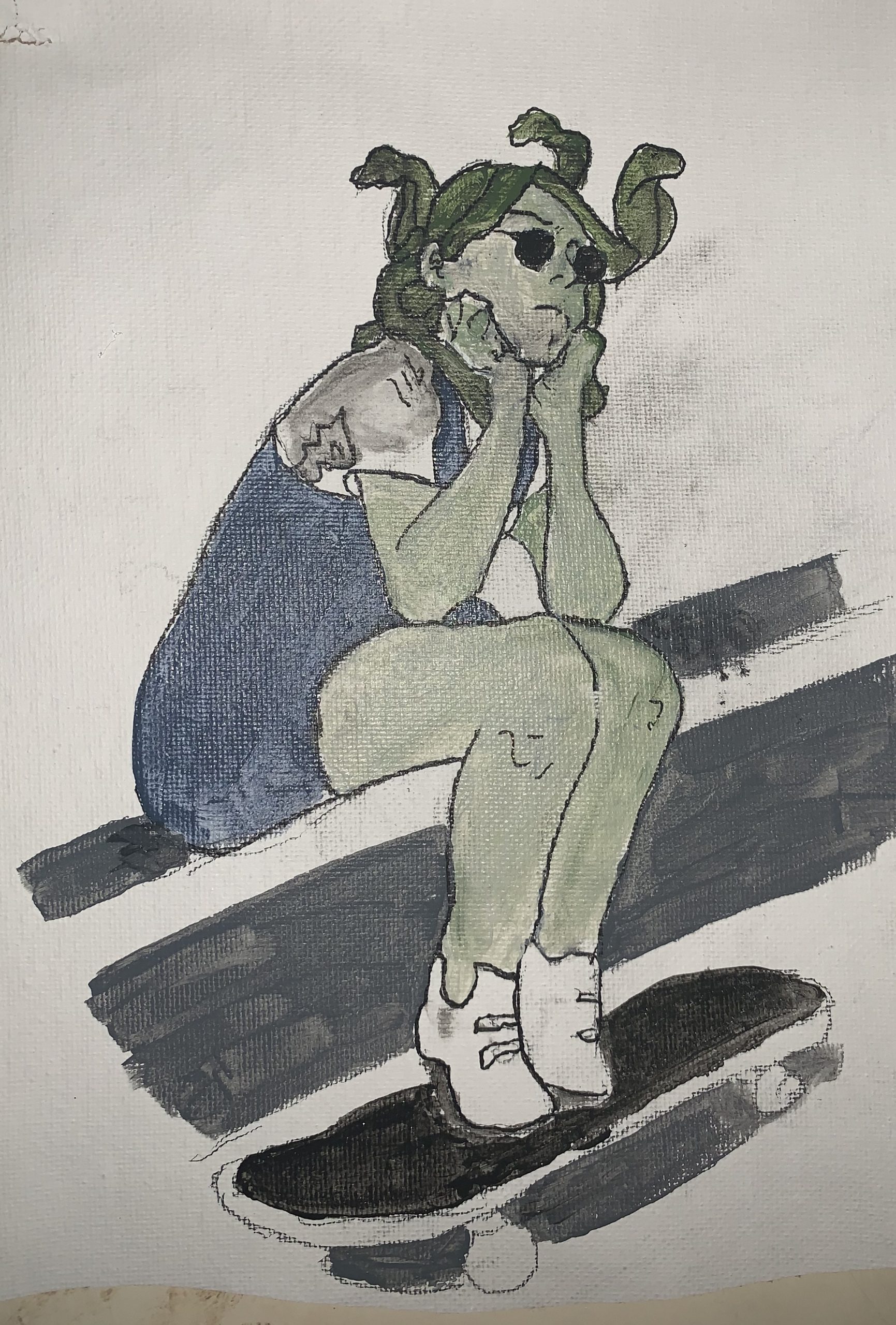
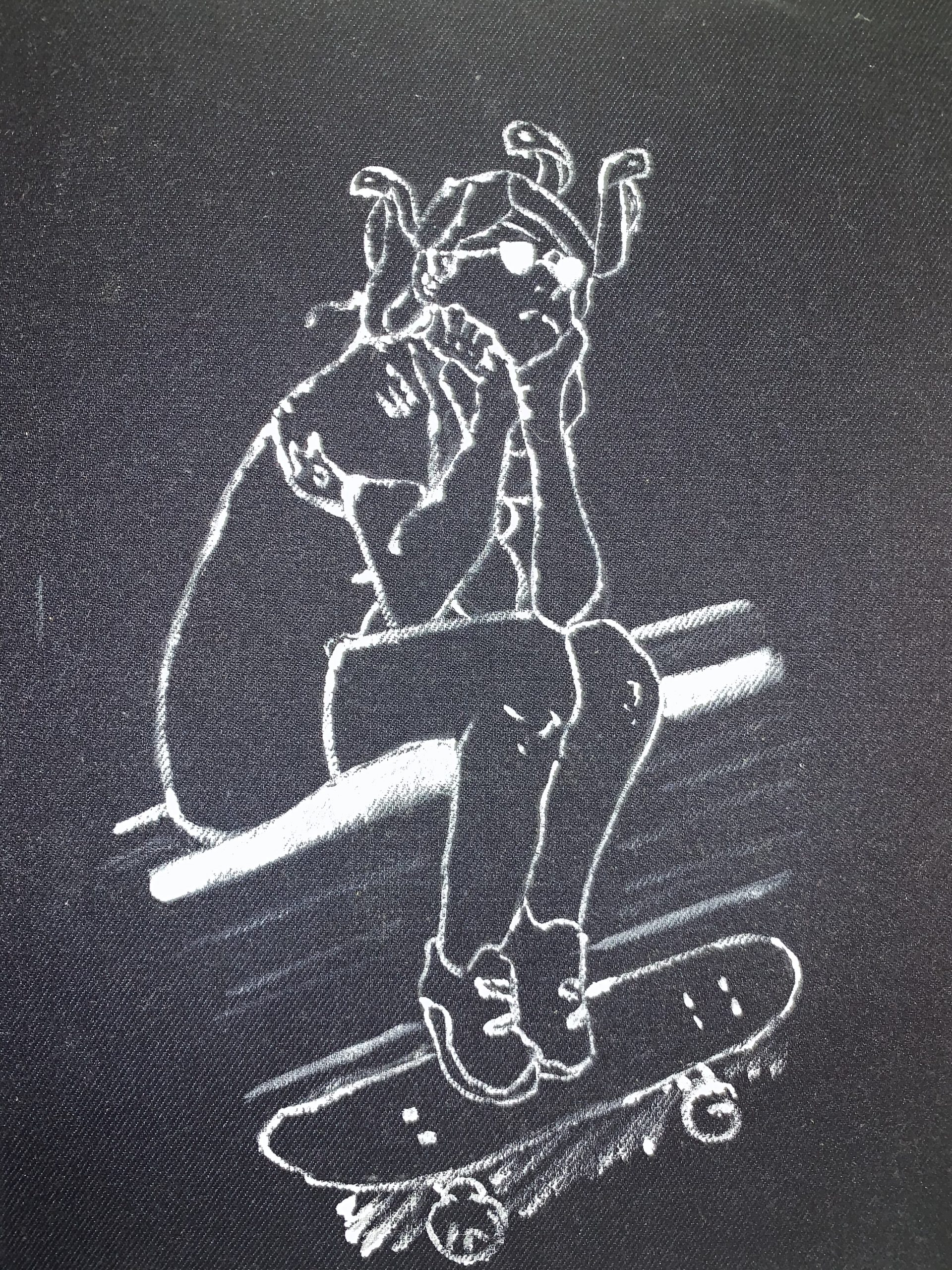
 I suspect this should look closer to this. I took it back into Snapseed and applied the tools I outlined in my “cheat sheet” of shortcuts.
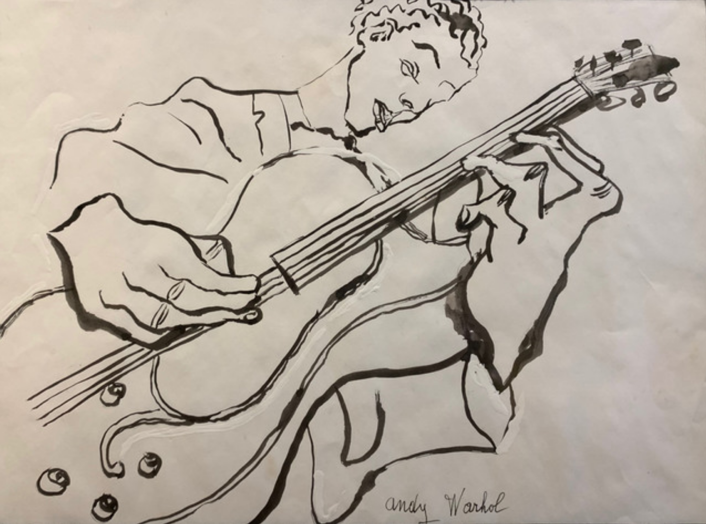
 Gina Occhiogrosso