(Expected dimension 16x20in)
 I think this would look better cropped…
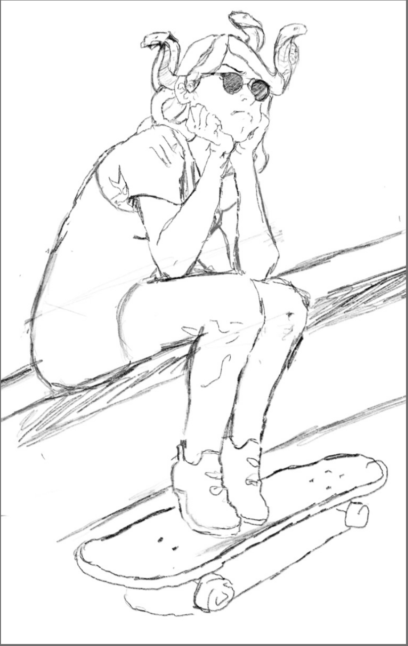
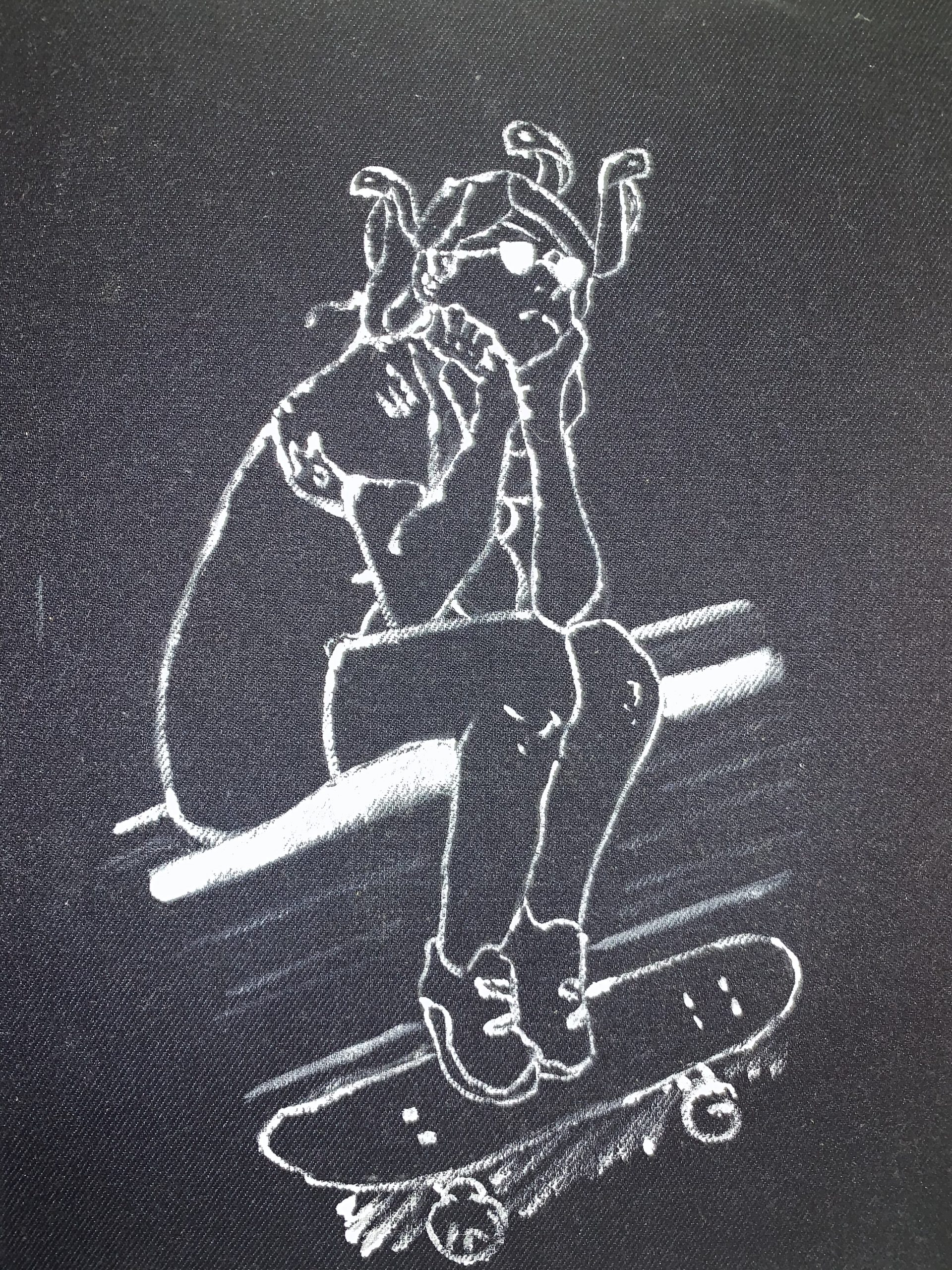
 …or better yet cropped just a bit more (note top edge) to activate the negative spaces and hold her in place better. On this one I’ve also added some lines to counterpoint the strong diagonal from lower left to upper right, which threatens to dump her out of the design toward the left. The tilt of her head is a good start, but I’ve added folds at her waist, bricks along the wall, and stripes on the skateboard.
(Expected dimension 16x20in)
(Expected dimension 16x20in)
Hello!,
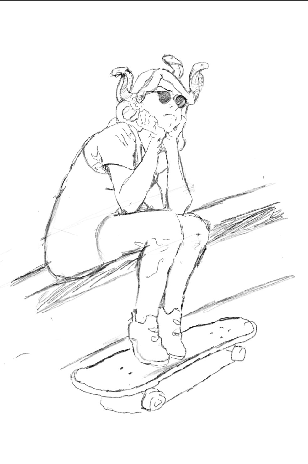
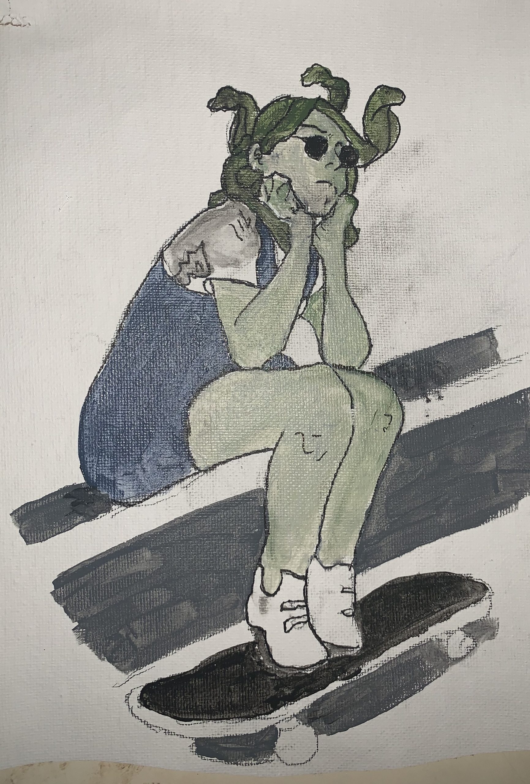
I had a lot of fun doing these sketches. Before moving into a bigger canvas, I decided to make try three different methods using my original idea and the ones suggested during the first meeting with my peers. Even though I really like the three of them, I really one to stick to only one style, and therefore I’m asking for your opinion. I specially leading towards the first and third one because they fit better the idea of contour drawings, compared with the second one, that I feel it’s more than a painting rather than an actual drawing. Let me know your opinions and ideas. Thank you.
Hi Ali!
I’m so excited to see the evolution of a drawing across three media! I think the drawings look great together as a progression although I totally understand why you want to only use one consistent style for each work. The detail applied to the top contour pen drawing on canvas is very descriptive of the subject and their figure. I like the selective shading as well as the composition – it really resembles an illustration out of a book! I would just say to maybe try to draw more continuous lines so there is more of a bold, defined outline around the figure.
I do like the the second drawing, especially the muted colors you used, but agree with you that it does resemble a painting. I really like the way the third drawing came out! The white paint stands out on the dark denim and almost appears like a stencil from the first drawing, as the color of the figure and the background are swapped. The contour lines are drawn precisely and accurately. I do think that it could be interesting to add more background information and context, especially since the denim you will work on will be quite large. This could help tell the individual story of the figure and situate them in a setting. Overall, I really like the way you used denim for this drawing and would suggest to continue with the denim and white paint. I do also think it could be great to do a drawing in micron pen or pencil on paper or canvas before you create the denim drawing, in order to contrast with the final product. I’m excited to see more of your work in this series and great job!
Sorry guys I am late! I have been particularly not great at navigating course structures especially during all this mess.
I think what you are doing currently is very cool.
If you are looking for a focus on the first and third drawing, then I would suggest you focus on the line weight. This first drawing reminds me of black and white sketches produced in the beginning stages of manga/comic production. The line weights could be used to portray different material mediums (for instance, softer lines for hair, darker lines for bulks, like muscles), light and dark (hair again. Heavier strokes on the hair could imply shadows. Lighter strokes could imply ‘disappearing’ hair under the sun), and emotions. You can see an example here: https://i.pinimg.com/originals/be/bf/95/bebf95a70b99530bb777c2e28ee9807f.jpg. I think you are adding sufficient shading on the first drawing, indicating the light and dark parts in the girl. There are some perspective and anatomy mistakes on the drawings, which I suggest you revise them. If you would like to draw complex poses, you can look at pose reference websites or use a program, namely DesignDoll.
I agree with Olivia on the second drawing–the colors gave the series a modern and sharp look. I would suggest you add more background as well. Meanwhile, you can define your focus on the drawing by using colors as decoration/design element than filling all the colors. For instance, you can add some color on your character’s hair and shoes, but leave the flesh part empty. Your final product might look like pop art with this technique.
Good luck on improving the project this week!
Hi Ali,
Great start, and good comments from you, Olivia and Harry.
I’m not as concerned about the second one being too close to painting. The boundary between drawing and painting is a wide one, but one thing I look for is the presence of the ground. Paintings tend to cover the ground while drawings activate and utilize it–and your second one does. It’s more like a colored contour drawing, similar to Egon Schiele, than a painting. So by all means go that way if you’re tempted.
Something I’d like you to pay more attention to is composition, especially the relationship of image to rectangle. We covered this in a big way in Drawing I when we did the negative space drawings and looked at Japanese prints, Van Gogh, etc. I noticed this was a blind spot of yours in our life drawings (especially the last two). Remember the word “disegno”–which means both drawing and design together in Italian, i.e., inseparable in their language. They need to be inseparable in everyone’s work.
Since there’s some connection to manga, note how effectively those artists fill the frame.
Just curious–is she from a photo of yours? Or one you found? I like Harry’s suggestion to look at sites like DesignDoll.
Good start–curious what this week will bring–
Hello!
Thank you so much for your comments everyone.
Answering your question Mark, I look a couple of pictures as references and I started drawing based on those.
Best,
Ali A.