From Nat, who wasn’t on Blackboard until a day or two ago:
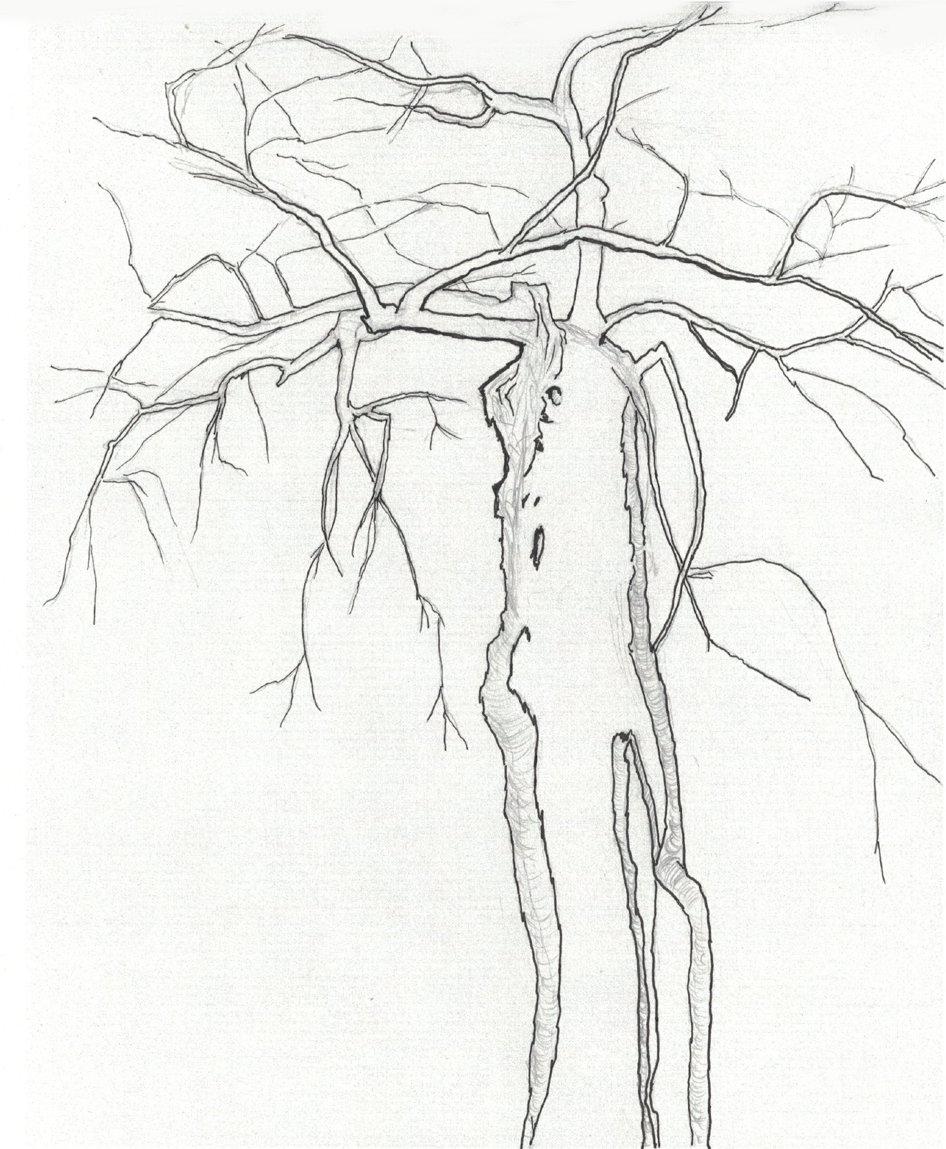
In the spirit of being open to new artistic avenues, I did some preliminary sketches of my “walking tree” from a different angle and experimenting with negative space. The sketch with the barns is a first attempt at trying to make a more interesting composition. My next effort will be to try to make the branches feel more dynamic and “muscular” and work on capturing a sense of branches coming towards the viewer and receding.
In case anyone is confused, note that these are my sketches and text. I don’t want Mark to be blamed for them! I’ve only just now been able to join Blackboard. Thanks, Mark, for posting them.
Great work, everybody! Tomorrow I’ll have more time to post a few comments.
I love the subject of the “walking tree.” This tree seems to have a lot of character. I like how that comes through in your drawings.
I love the sketch of the tree with the barns in the background because the tree has a large presence in that piece compared to its surroundings. I think the trunk in that specific drawing could benefit from slightly darker/heavier line weight. The line weight in the branches reads well and emphasizes which branches are closer to us. I think your rendering of branches is particularly strong in your first drawing. The way some branches block others helps orient our perspective.
The negative space drawing is intriguing. I like seeing the negative spaces/shapes the branches create. This seems like a good study for your other drawings.
I’m curious about what would happen if you created another sketch that went heavy on shading by adding darker values. I think these sketches are a great start for this project!
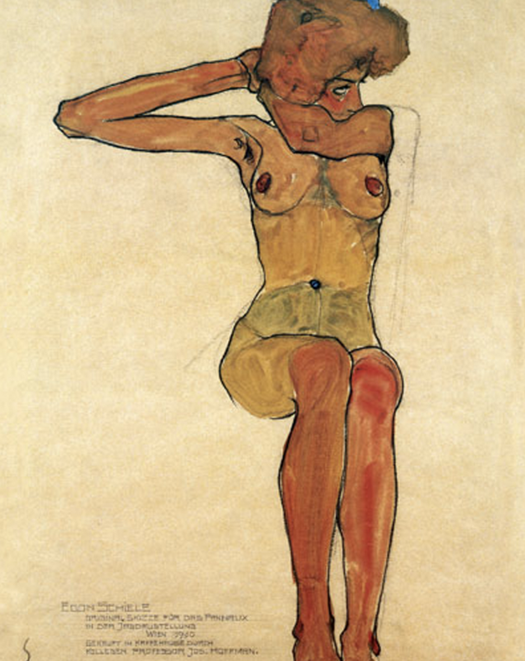
These are terrific. Love the composition you chose for the tree’s shape, with that powerful trunk stretching upward and the branches wonderfully concentrated in the upper quarter. It brings to mind a favorite drawing of mine by Egon Schiele, called “Nu Assis,” which I’ve added above. Yours is also reminiscent of his incisive line quality.
Love that you’re putting the image through its paces with the negative space version and the barn version. I don’t necessarily see the barns as more interesting than the other compositions. They’re great but also more prosaic. The image in isolation heightens its abstract qualities, which is neither good nor bad; just a question of where you want to put the viewer’s attention.
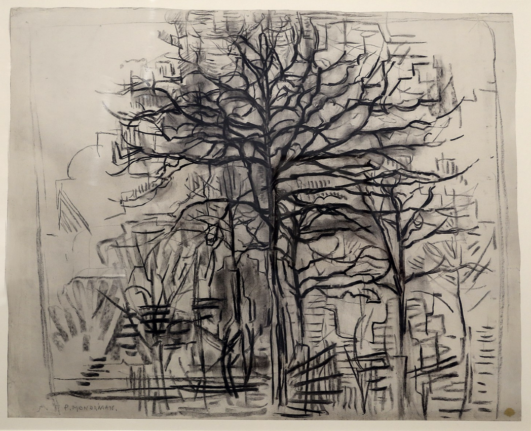
This series of drawings is also reminding me of Mondrian’s early work, which I’ve also included above.
His tree series traces a direct path to his more famous abstract paintings. Google “Mondrian trees” to get an eye full.
I agree with your ambition to bring more foreshortening to the branches but I have to say you’re a long way there already.
Good photos and editing but that last one could be better.
Tremendous start, Nat–looking forward to what the next ones will bring.
My apologies for not commenting sooner- I didn’t understand this post was from you, as the comments are initially hidden on the main page.
I really like the focus in your first drawing of using line weight to push elements of the tree back or pull them forward, I think it’s very effective establishing interesting spacial relationships. I also like the way in which you used pencil to suggest both at the texture of the bark, as well as its value, in addition to letting it function as a kind of cross-contour.
I think your second drawing is my personal favorite, as I am very drawn to the confident tool use in drawing the negative space, and the high contrast.
I think that your third drawing might benefit from a larger range of value in the line weight. The buildings, in particular, compete a little with the tree trunk for the foreground. Perhaps strengthening the trunk a bit would alleviate this. I especially like the lowest branch on the right side- it is abstracted into a single bowing line, which captures the beautiful arc of a lightly weighted tree branch.
What I would be most interested in going forward (I know that I’ve posted this on Wednesday, my apologies), would be focusing on radically different compositions. Differences of scale might be interesting, as well as playing with how the tree can cut up the rectangle of the picture plane.
 Schiele
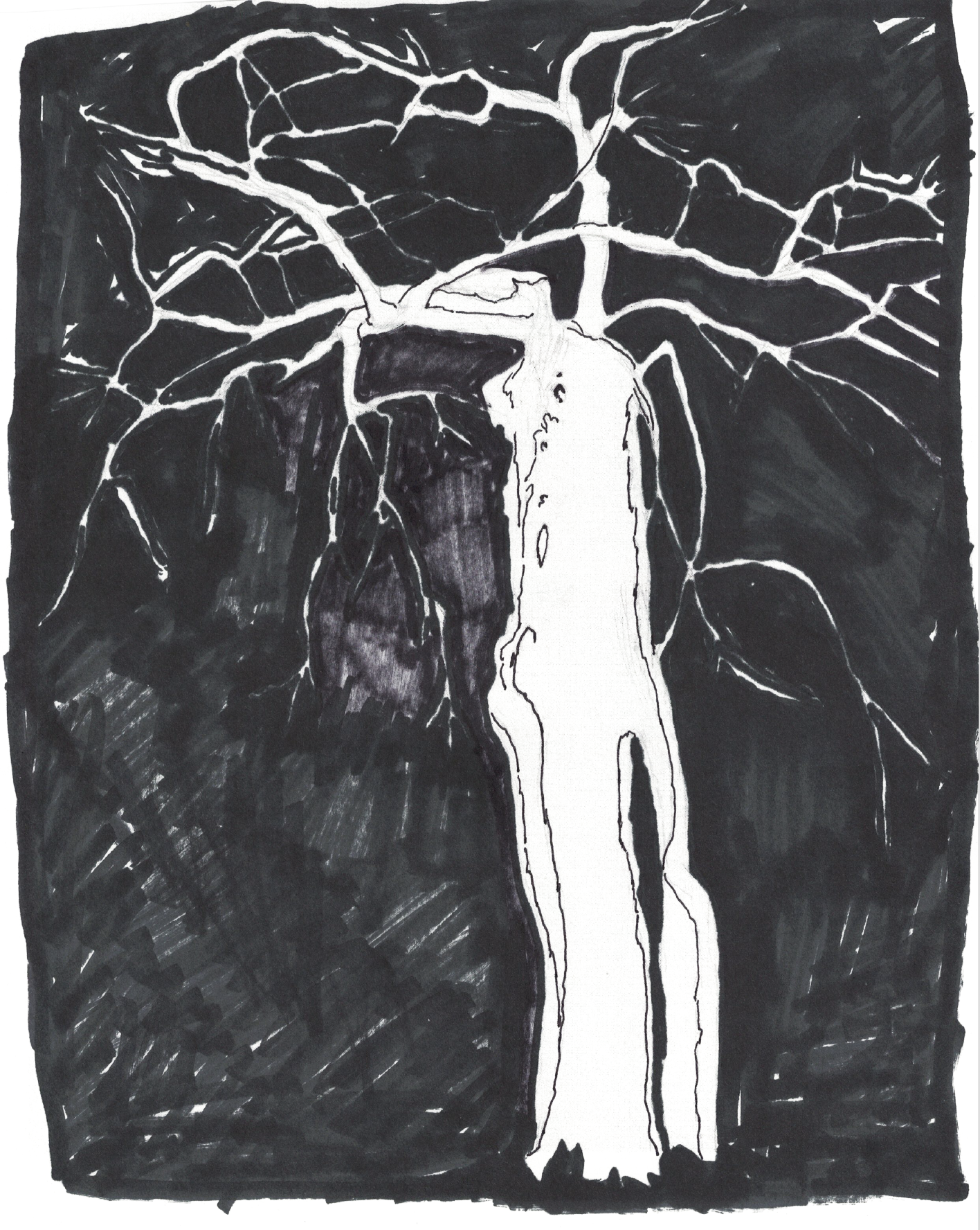
 Mondrian
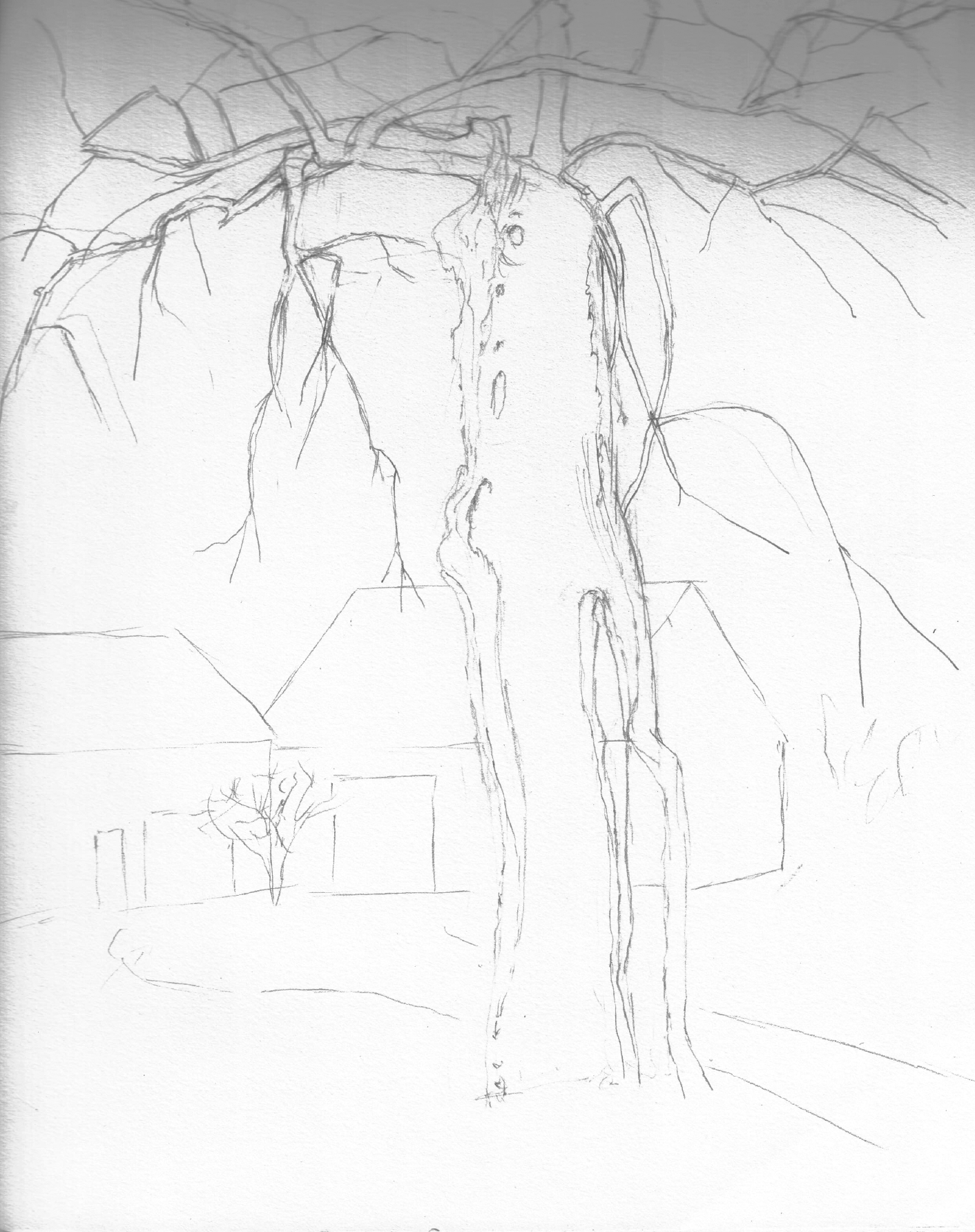
From Nat, who wasn’t on Blackboard until a day or two ago:
In the spirit of being open to new artistic avenues, I did some preliminary sketches of my “walking tree” from a different angle and experimenting with negative space. The sketch with the barns is a first attempt at trying to make a more interesting composition. My next effort will be to try to make the branches feel more dynamic and “muscular” and work on capturing a sense of branches coming towards the viewer and receding.
In case anyone is confused, note that these are my sketches and text. I don’t want Mark to be blamed for them! I’ve only just now been able to join Blackboard. Thanks, Mark, for posting them.
Great work, everybody! Tomorrow I’ll have more time to post a few comments.
Nat
I love the subject of the “walking tree.” This tree seems to have a lot of character. I like how that comes through in your drawings.
I love the sketch of the tree with the barns in the background because the tree has a large presence in that piece compared to its surroundings. I think the trunk in that specific drawing could benefit from slightly darker/heavier line weight. The line weight in the branches reads well and emphasizes which branches are closer to us. I think your rendering of branches is particularly strong in your first drawing. The way some branches block others helps orient our perspective.
The negative space drawing is intriguing. I like seeing the negative spaces/shapes the branches create. This seems like a good study for your other drawings.
I’m curious about what would happen if you created another sketch that went heavy on shading by adding darker values. I think these sketches are a great start for this project!
Hi Nat,
These are terrific. Love the composition you chose for the tree’s shape, with that powerful trunk stretching upward and the branches wonderfully concentrated in the upper quarter. It brings to mind a favorite drawing of mine by Egon Schiele, called “Nu Assis,” which I’ve added above. Yours is also reminiscent of his incisive line quality.
Love that you’re putting the image through its paces with the negative space version and the barn version. I don’t necessarily see the barns as more interesting than the other compositions. They’re great but also more prosaic. The image in isolation heightens its abstract qualities, which is neither good nor bad; just a question of where you want to put the viewer’s attention.
This series of drawings is also reminding me of Mondrian’s early work, which I’ve also included above.
His tree series traces a direct path to his more famous abstract paintings. Google “Mondrian trees” to get an eye full.
I agree with your ambition to bring more foreshortening to the branches but I have to say you’re a long way there already.
Good photos and editing but that last one could be better.
Tremendous start, Nat–looking forward to what the next ones will bring.
Hi Nat,
My apologies for not commenting sooner- I didn’t understand this post was from you, as the comments are initially hidden on the main page.
I really like the focus in your first drawing of using line weight to push elements of the tree back or pull them forward, I think it’s very effective establishing interesting spacial relationships. I also like the way in which you used pencil to suggest both at the texture of the bark, as well as its value, in addition to letting it function as a kind of cross-contour.
I think your second drawing is my personal favorite, as I am very drawn to the confident tool use in drawing the negative space, and the high contrast.
I think that your third drawing might benefit from a larger range of value in the line weight. The buildings, in particular, compete a little with the tree trunk for the foreground. Perhaps strengthening the trunk a bit would alleviate this. I especially like the lowest branch on the right side- it is abstracted into a single bowing line, which captures the beautiful arc of a lightly weighted tree branch.
What I would be most interested in going forward (I know that I’ve posted this on Wednesday, my apologies), would be focusing on radically different compositions. Differences of scale might be interesting, as well as playing with how the tree can cut up the rectangle of the picture plane.