
X
 Arikha
 Arikha (with more space around the still-life)
 Morandi, “Still life with Square Bottle”
Professor Mark Wethli – Spring 2020
X
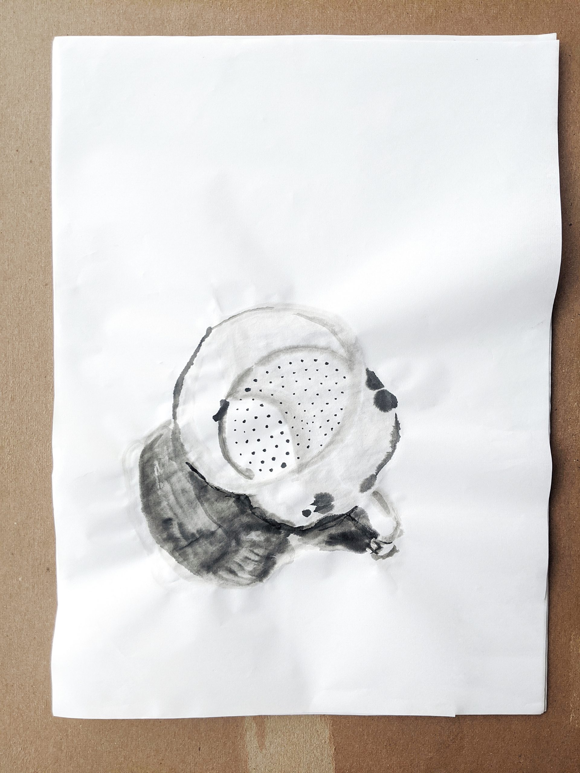
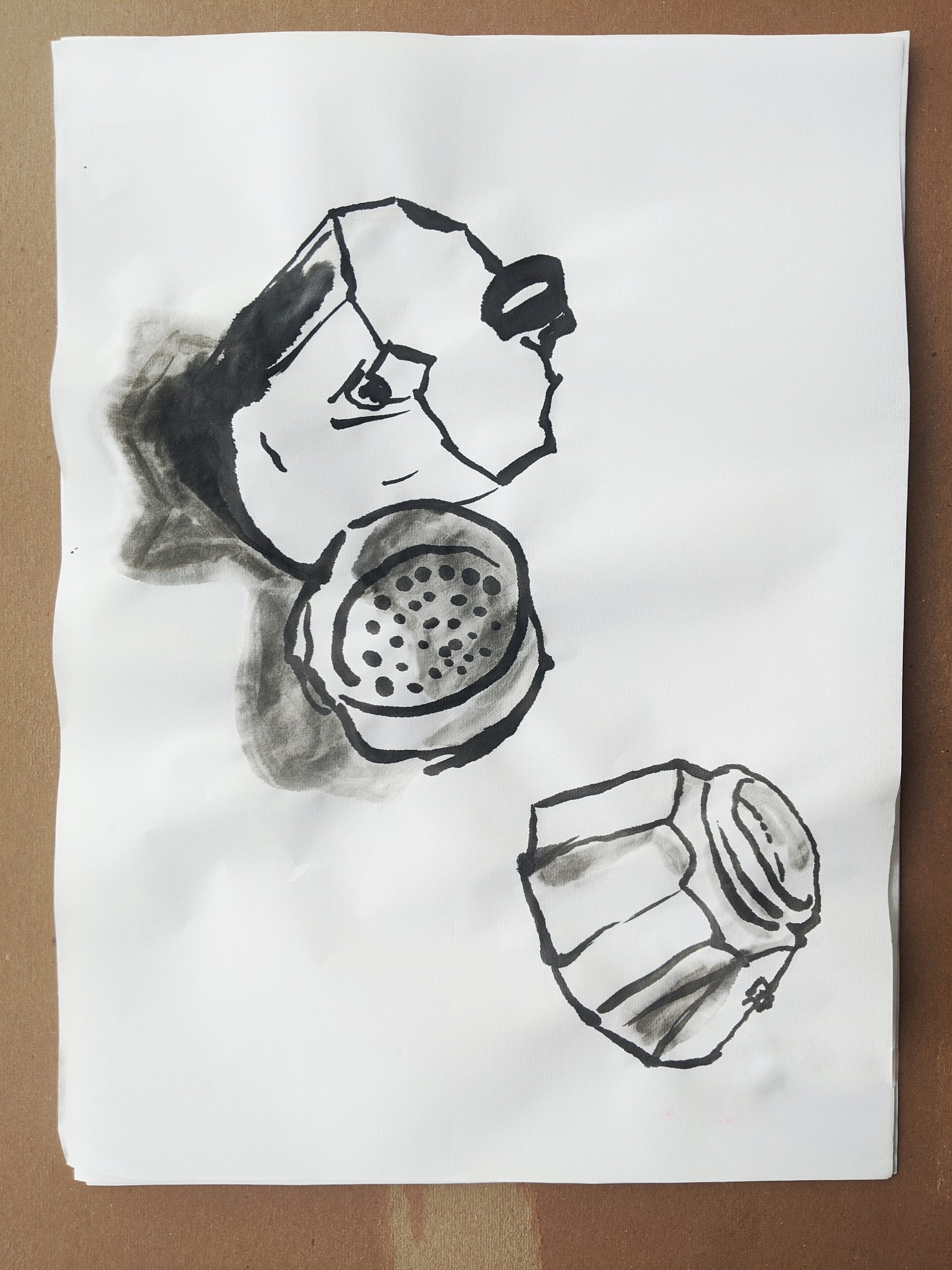
Arikha
Arikha (with more space around the still-life)
Morandi, “Still life with Square Bottle”
You must be logged in to post a comment.
My goal with these works is to get more acquainted with the form of the mock pot, as well as try to use ink wash more effectively. Next time, I want to do a larger drawing using the knowledge of the form which I have been working on. The next suite of ink drawings I hope will have more control in their lines, more confidence, and better tonal range.
Adam, one of the advantages of being the last one to comment is that I can say, “Yeah, what they said.”
I learned a lot from Mark, Claire and Megan’s suggestions that I can apply to my own work. My first impression of your drawings is that the forms are simply beautiful to look at. You are lucky to have a knack for creating an intriguing, appealing form with just a few strokes. As you push the boundaries, it will be neat to see where you end up. Mark made a comment to me that probably applies to all of us, essentially that I should be open to new avenues and approaches. In other words, you may decide that your exploration of this one object leads you somewhere unexpected, that it ignites a curiosity about something quite different. Or perhaps not, and you will dive deeper into a moka pot and introduce us to a new aesthetic realm.
Adam, I love this project and the subject! I think it’s powerful to examine the moka pot from different perspectives, and the ink creates interesting visual effects.
One thing I liked about this series is how you experimented with different compositions. The third image of the coffee pot and its disassembled parts is particularly compelling. I like how the part you fill with grounds is in front of the top of the pot. In all of the pieces, I think you did a nice job choosing which lines to emphasize in the form. In the third image, the top of the pot is created through very few lines, yet the viewer can quickly understand the shape and position of the pot. This is also true of the first image. Your use of wash is also effective to complement the dark lines of ink.
One aspect you may want to think about going forward is how to capture the texture of the pot. I think the ink is a great medium for this subject (or charcoal), and I wonder if experimentation with different washes and brushstrokes could communicate the shininess, reflections, or even surface of the pot. I think you have already successfully done this in moments of the drawings you posted for this week.
I’m not sure what kind of paper you are using, but you may want to experiment with a more absorbent paper to allow the ink and wash to more effectively. I know paper is limited and you could be saving those for later in the project, but just a thought!
Hey, Adam-
I’m glad that you are continuing drawing with ink. I think you definitely have a knack for it!
I like the different perspectives of the Moka pot. I think you successfully portray the form and different planes of the parts. I would have liked to see some suggestion of the table and space around the objects though.
Hi Adam,
Great start, but for a week’s work, for work of this nature, these are too few (unless you’ve edited out some others). This kind of drawing only grows through making a lot of them. It’s when your imagination of what to do next runs out that discoveries start to happen on the page.
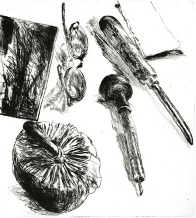
I’m immediately drawn to these for their insouciant qualities and how they walk the line between representation and non-objectivity; that is, they’re as interesting for their pure mark-making and inherent characteristics of image making as they are what they represent. Note I did not say representation and abstraction–they are manifestly parts of a coffee maker but their identity as drawings, in the purest sense of the term–what the Europeans call their “concrete” nature (“concret” in French)–is equally in play.
An artist they bring to mind that you should have a look at is Avigdor Arikha, which I’ve added above. Google him for more. Like yours, he often takes a view looking down in order to identify the table top with the drawing surface (which also goes to my comment above about their simultaneous identities as images and drawings).
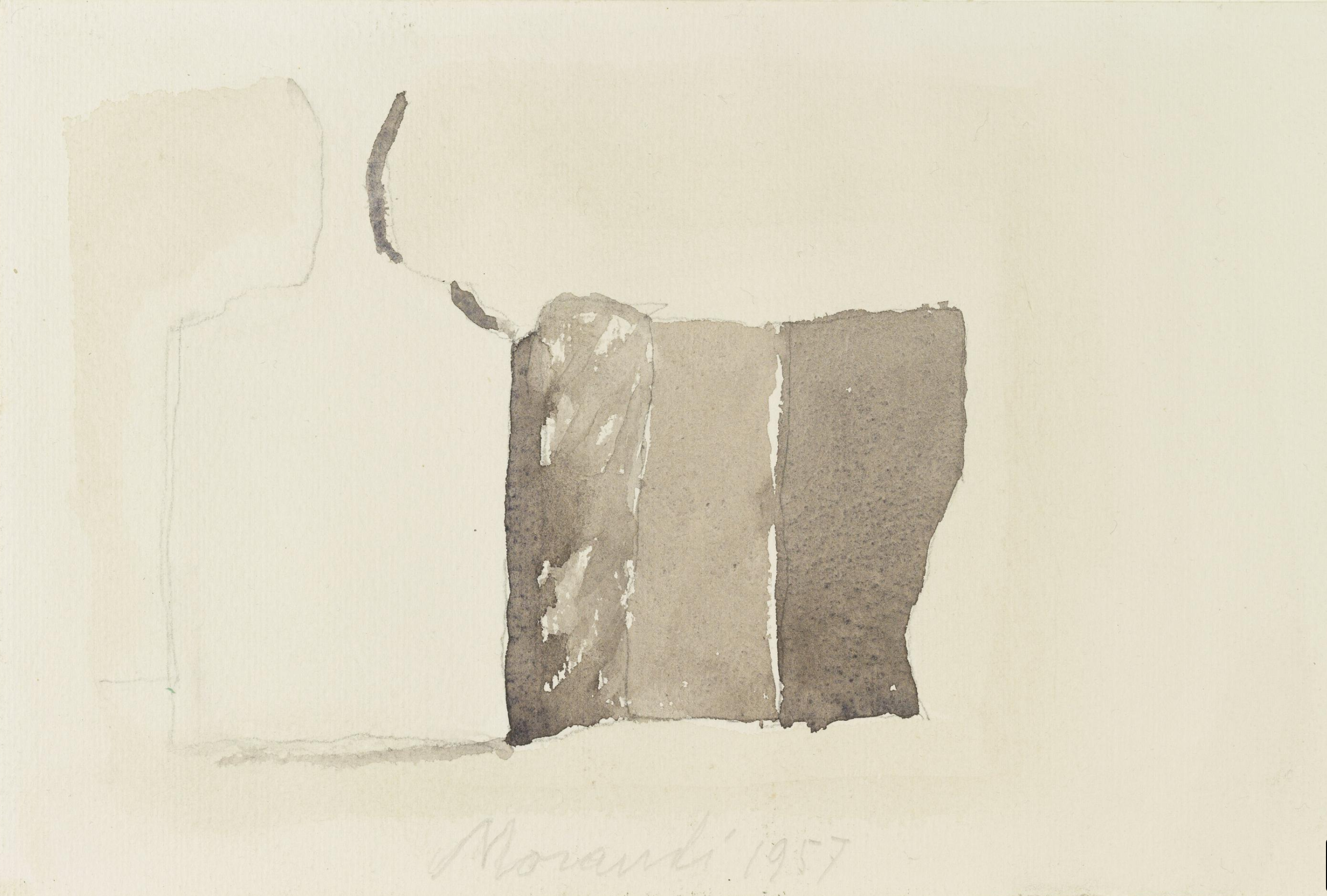
These also bring to mind the drawings of Morandi, which I’ve also added above. Any week where you remind me of two of my all time favorite artists (and I’m not alone) is a good week.
Megan’s suggestion to give us more context is an interesting one, and one you should explore (due diligence) but you’re already on to something that sets these apart (as per my remarks above).
Good comments from Claire as well, I second her suggestion about switching to watercolor paper, or something more stout, if you possibly get hold of some. For online shopping I recommend Jerry’s Artarma for best price and selection.
Not sure I agree with her about making them more specific to their metallic qualities (being drawn to their ambiguous nature as I am) but I agree you should try–no telling what visual structures that might unpack.
Love that you’re focusing on this one object. Can’t wait to see where it will go.