8.5 x 12 graphite on paper
Professor Mark Wethli – Spring 2020
8.5 x 12 graphite on paper
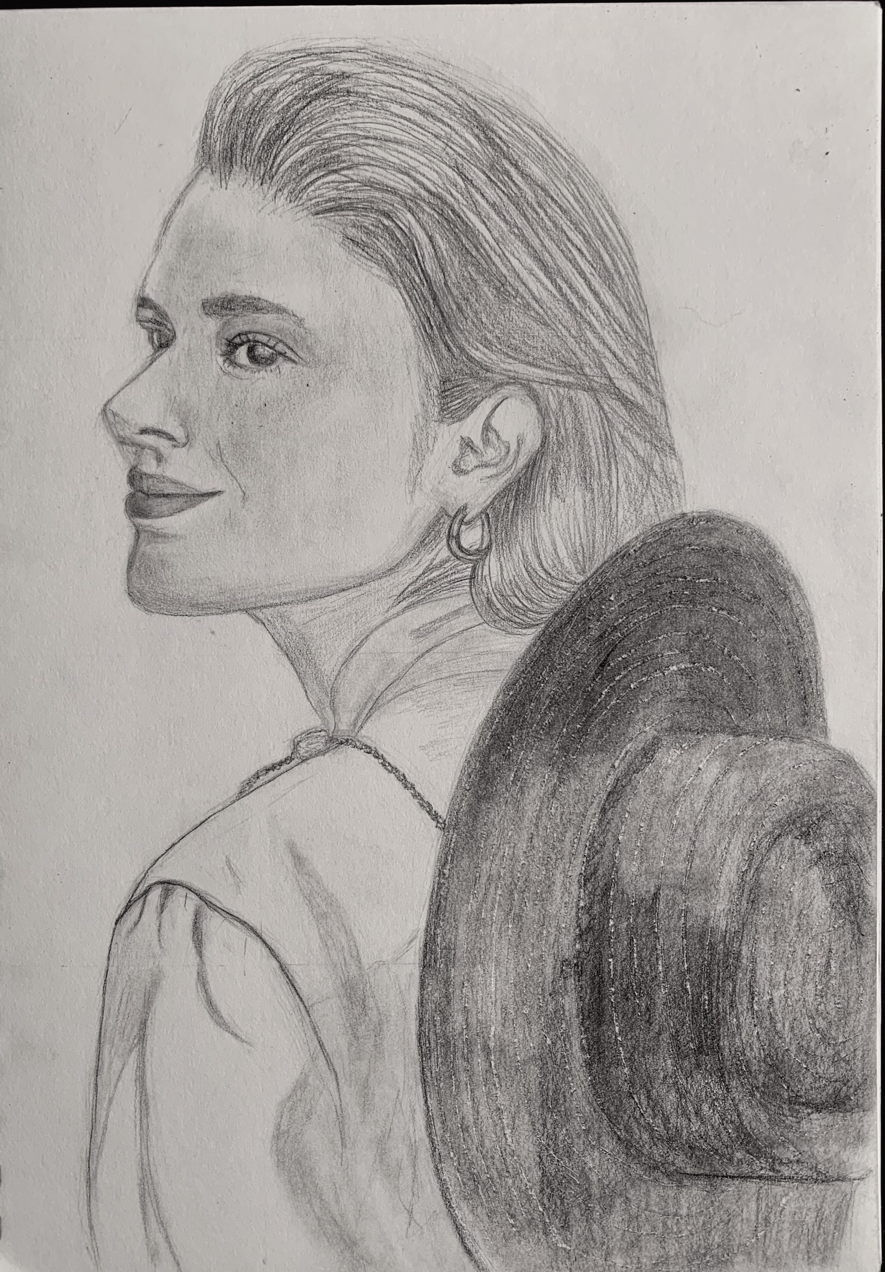
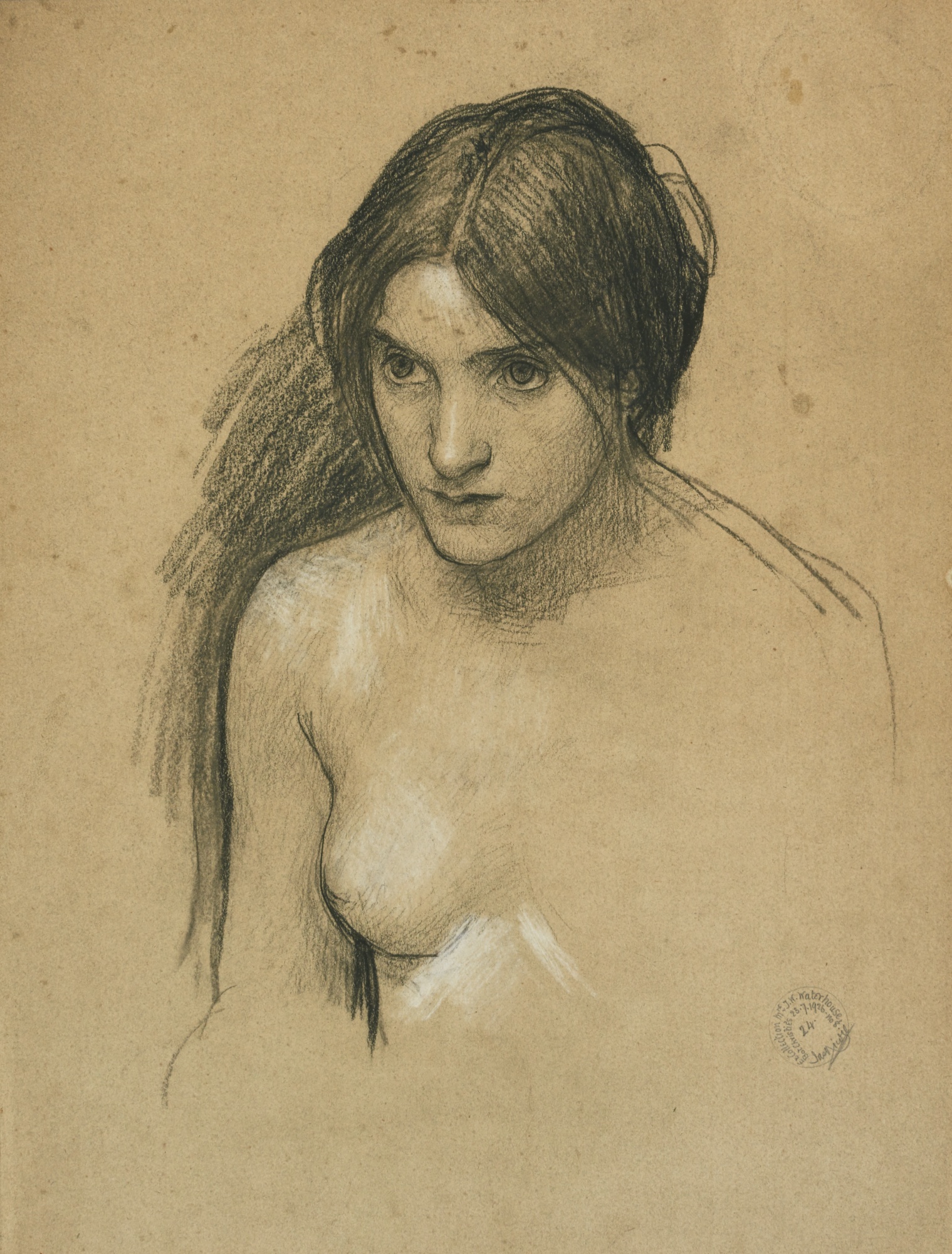
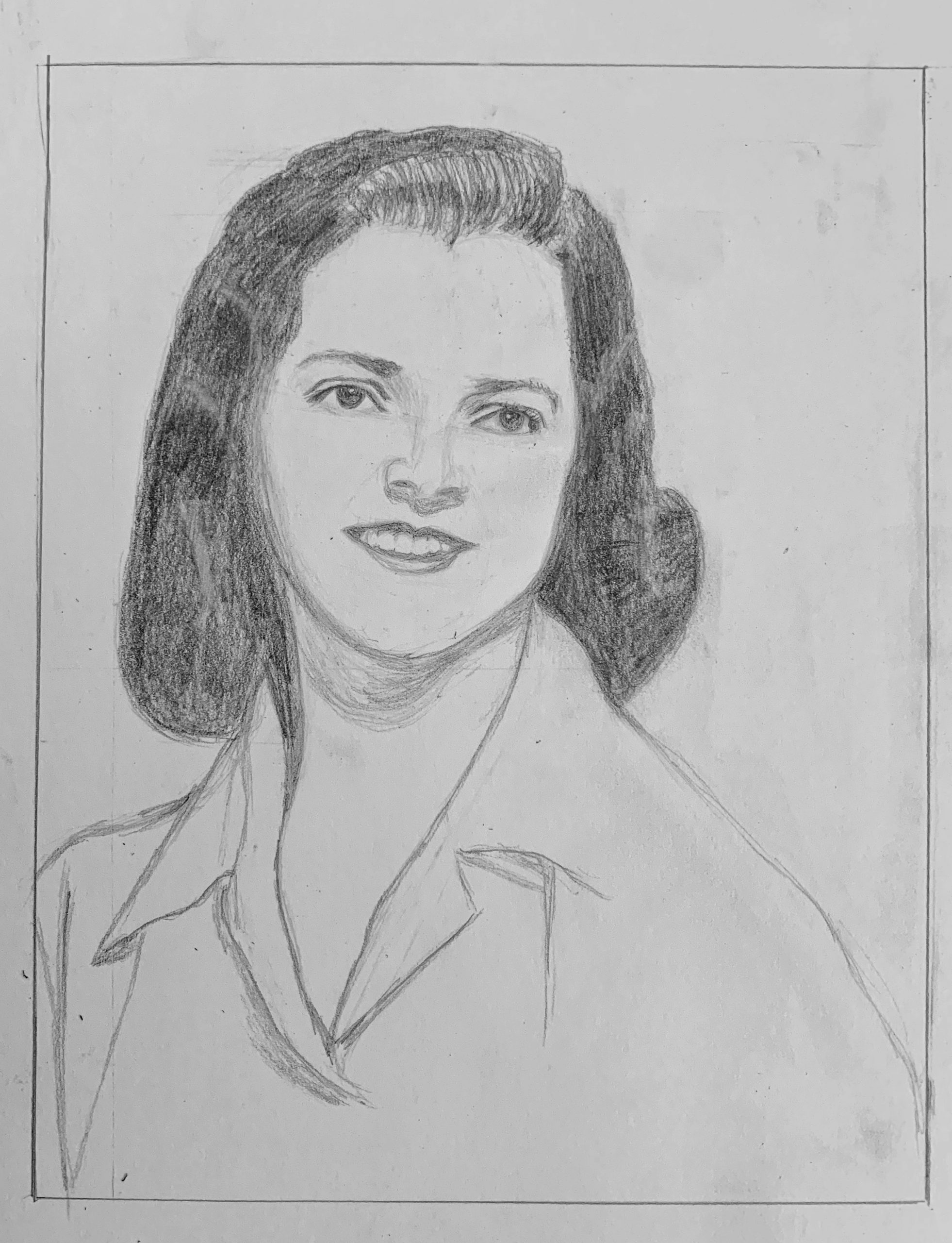
John William Waterhouse portrait
Despite your doubts, this is a fine rendition of the Waterhouse. As I mentioned to you elsewhere, even if he did a second version it would come out differently. Expressions like being pensive and being angry often hang on the slightest of nuances–raising an eyebrow a scintilla, the slightest flair in a nostril.
I notice here, as in your self-portrait below, that you’ve added space above her head. This also has a psychological effect on how we read the image. Composition contributes to meaning as much as (maybe more than) any other element.
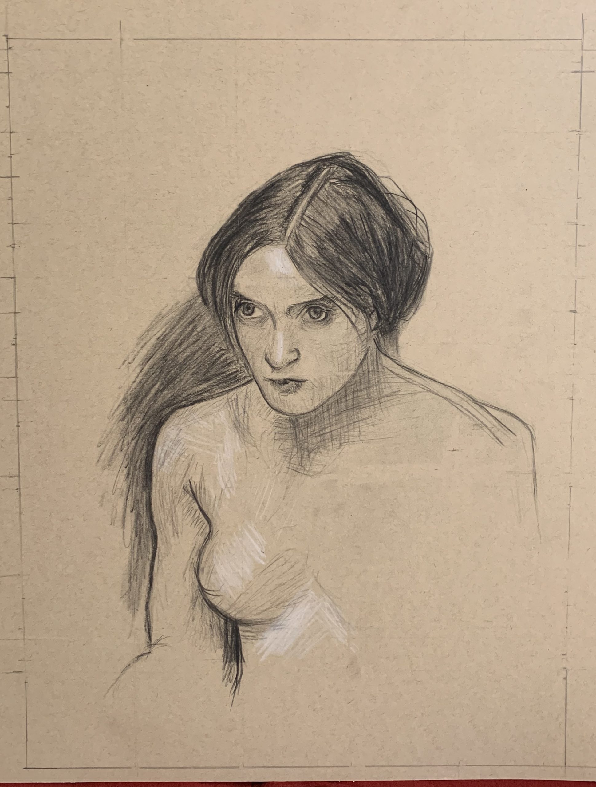
Charcoal pencil on paper. 12.5X16
X (but with a better cropping)
First, I squared up the image (below), gave it an even border (you should leave more than that bottom edge at the start–at least an inch, in case it ever gets matted and framed), removed the tape, and increased the contrast slightly, just to make the drawing more legible….
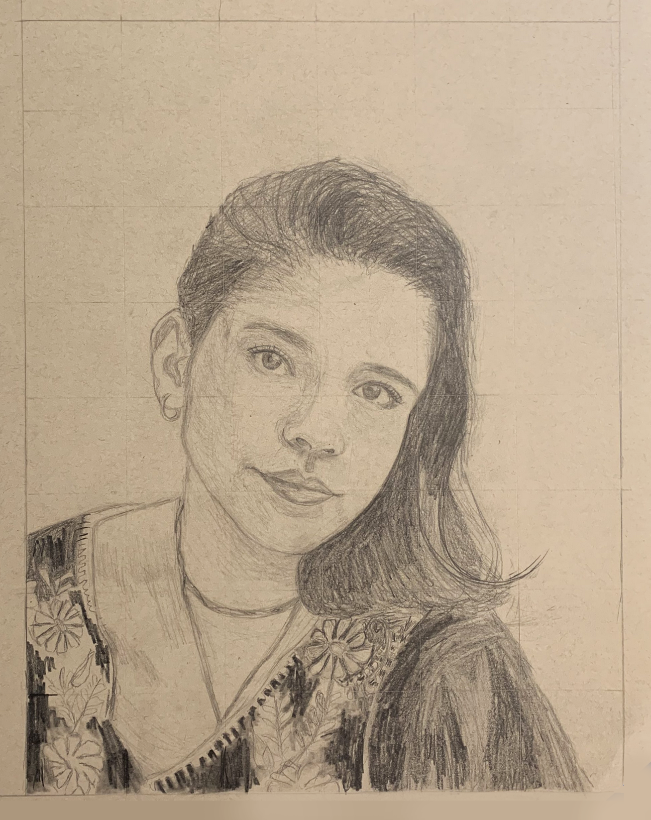
Then I’m suggesting cropping it closer to the top of the head. A rule of thumb in portraiture is to have the eyes in the upper half of the composition. Yours are about half way down, which makes the figure feel more diminutive (both physically and expressively).
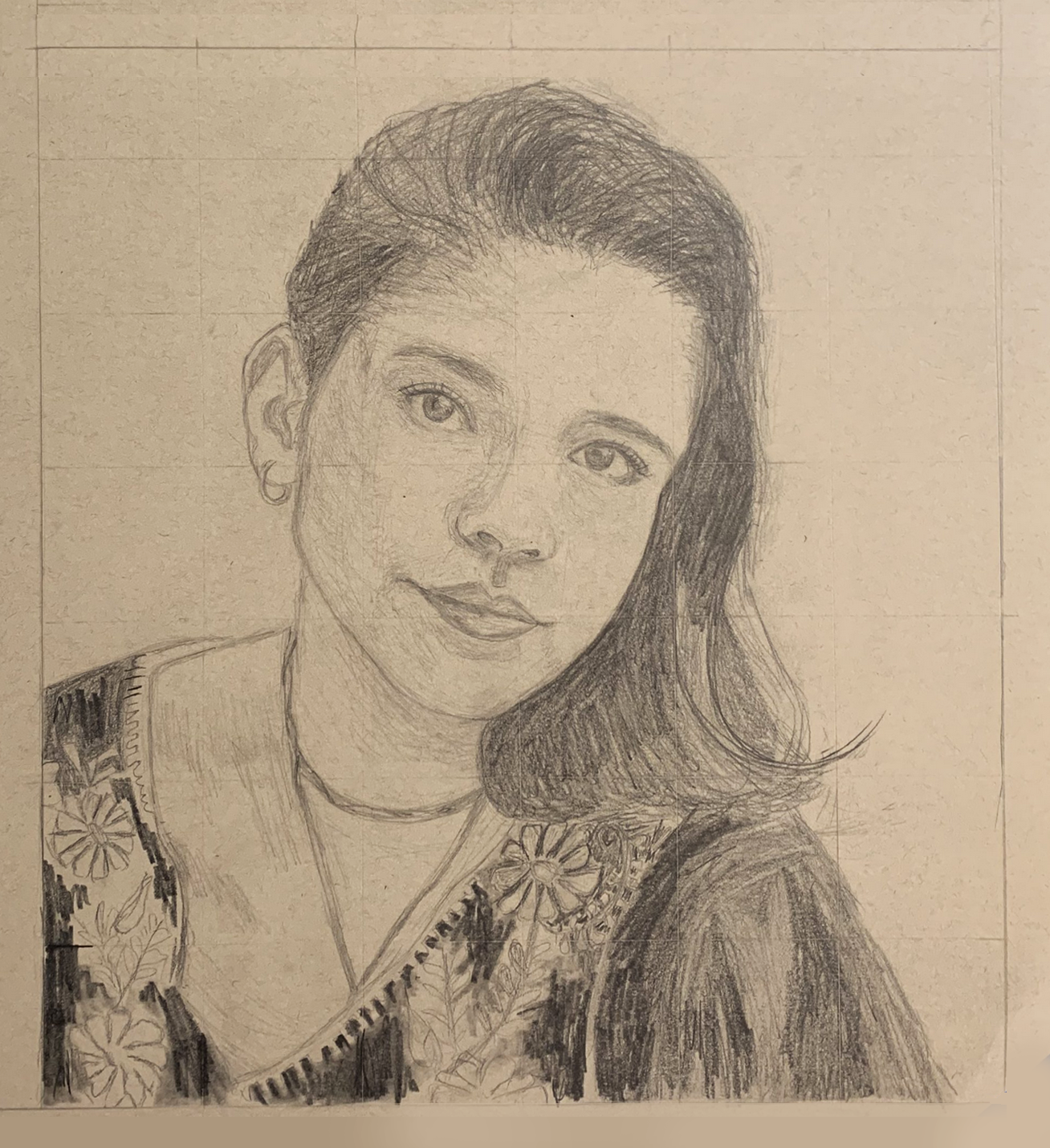
But I’d go so far as to crop into the hair slightly, which activates the negative spaces to either side of the head (and therefore all of your other shapes), and draws more attention to the eyes. It also creates a more uniquely proportioned rectangle rather than the business-as-usual rectangles that paper (and photos) come in.
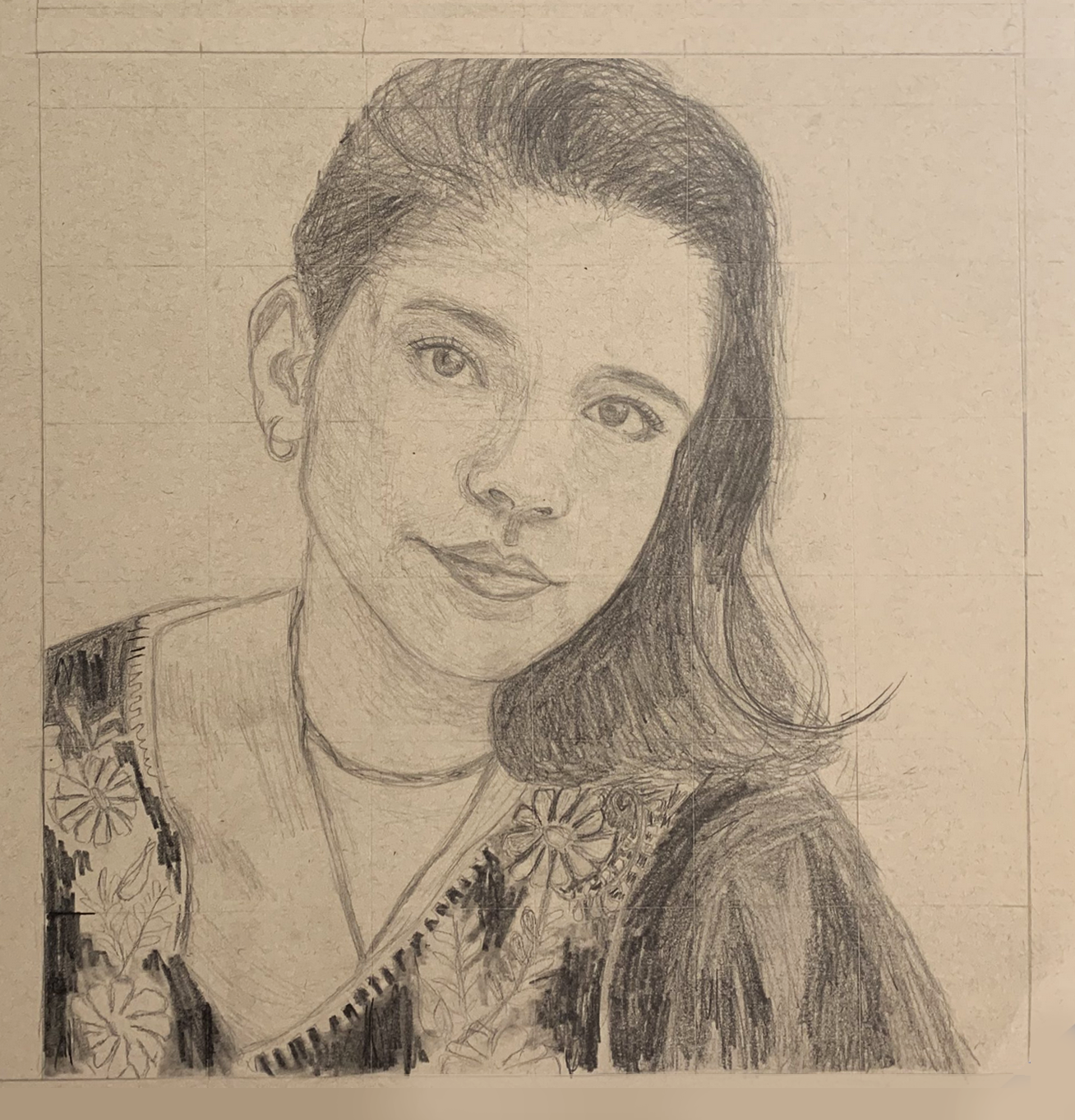
As for the drawing itself–it’s beautiful.
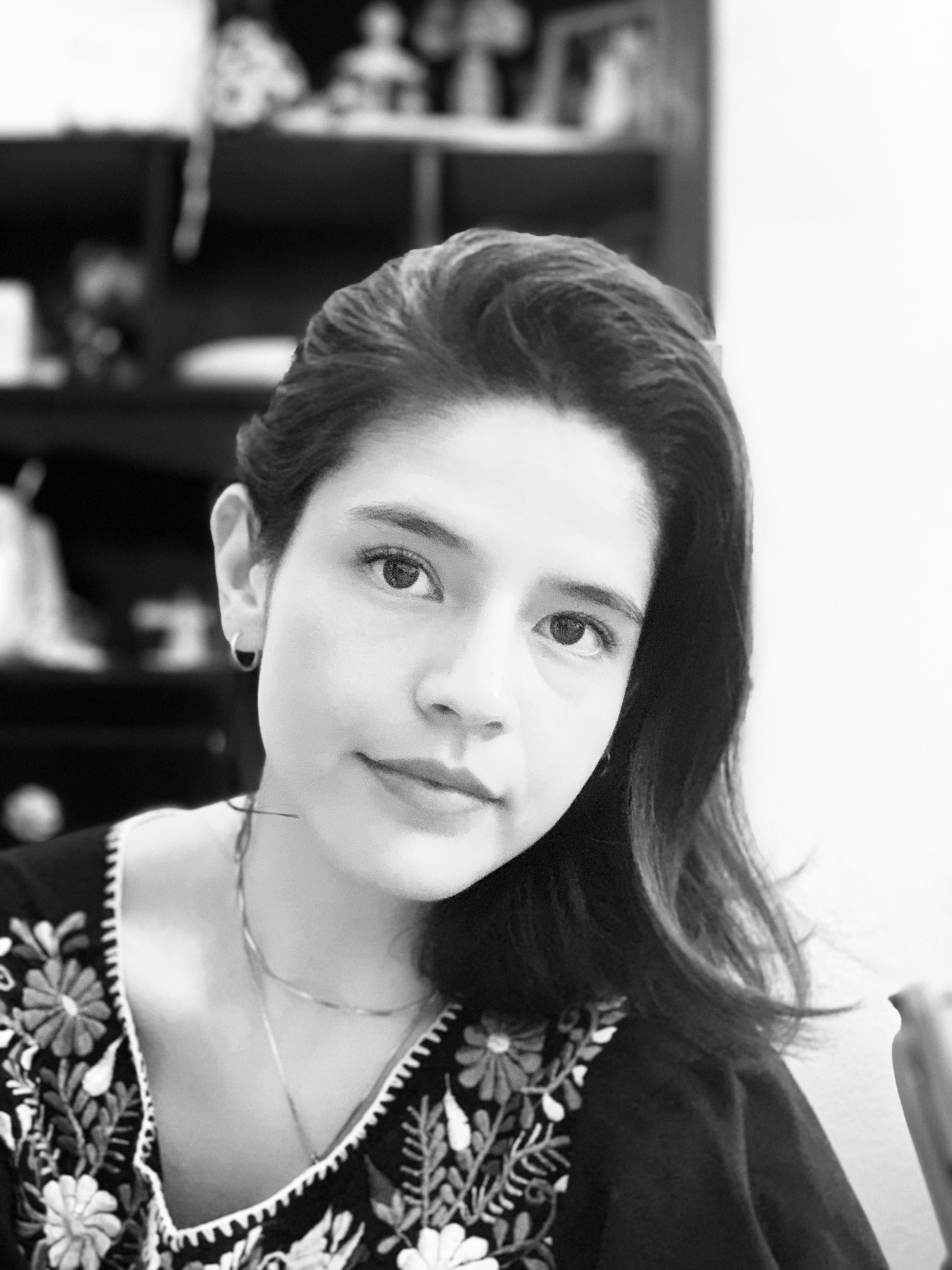
Drawings are like lie detectors–this one is telling us you’re more captivated by the patterns on the dress than the portrait. The portrait is great but drawn with a certain reservation. Punching up the contrast in the eyes alone would help a lot. Also, her right eye (on our left) should be a bit closer to the bridge of the nose. As in the photo, note how the tear duct is directly above the side of the nostril. You nailed this on the other eye.
As in the Waterhouse copy, being on toned paper, this is ripe for some white highlights. They only need to be very delicate but they’d add a lot, especially given the light in the photo–
Pencil on paper 12 X 16
I just not realized that the weekly assignments Mark sent us were just a suggestion and for the Drawing I class. I’ve been more concerned with completing the assignments than with maintaining my thesis. I was so confused why everyone else wasn’t following, and this is why there has been such a disconnect between my works.
ANYWAY
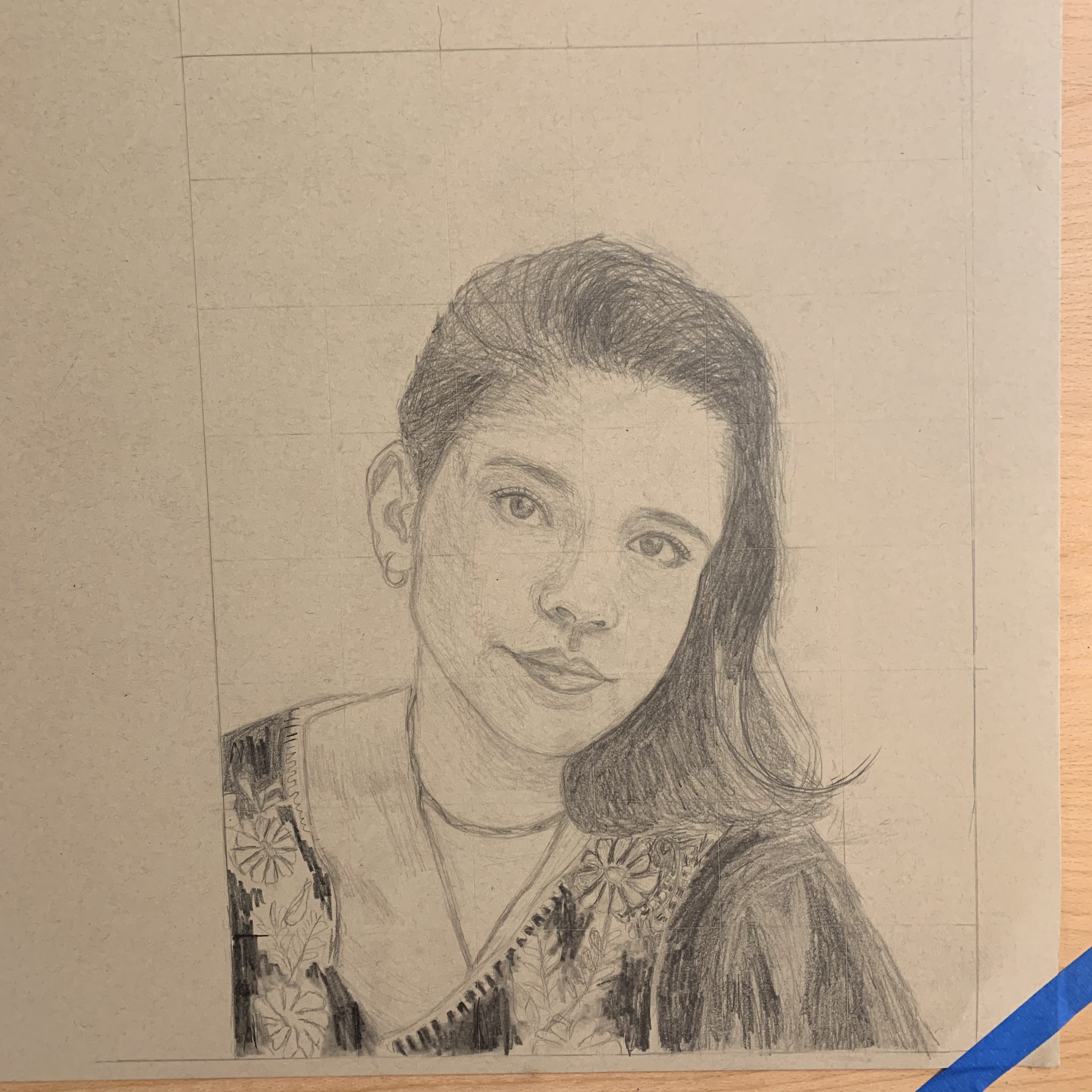
There is some continuity though. Both of these drawings are portraits and from photos. The first is based off of a John William Waterhouse study. And the second is from a photo I took on my phone for the “self-portrait” assignment. (I’m really kicking myself for this) I’m more please with the Waterhouse drawing but I don’t think I successfully captured the look in her eyes. My eyes are more intense while the original’s are not. I also think I made the face shorter than it really is. And the nose more pointy than it should be.
For both of these drawings, I placed a grid on the photo to help with my spacing. I think it was successful in the first but didn’t really help me with the second. The eyes do not align with each other and the shape of the face is off. The forehead is more square than my reference. I don’t know man… I watched the videos mark sent us but I’m still really struggling with drawing the portrait. I’m going to do more studies this week to prepare for a drawing I will do of my sister.
 John Currin (see my comment)
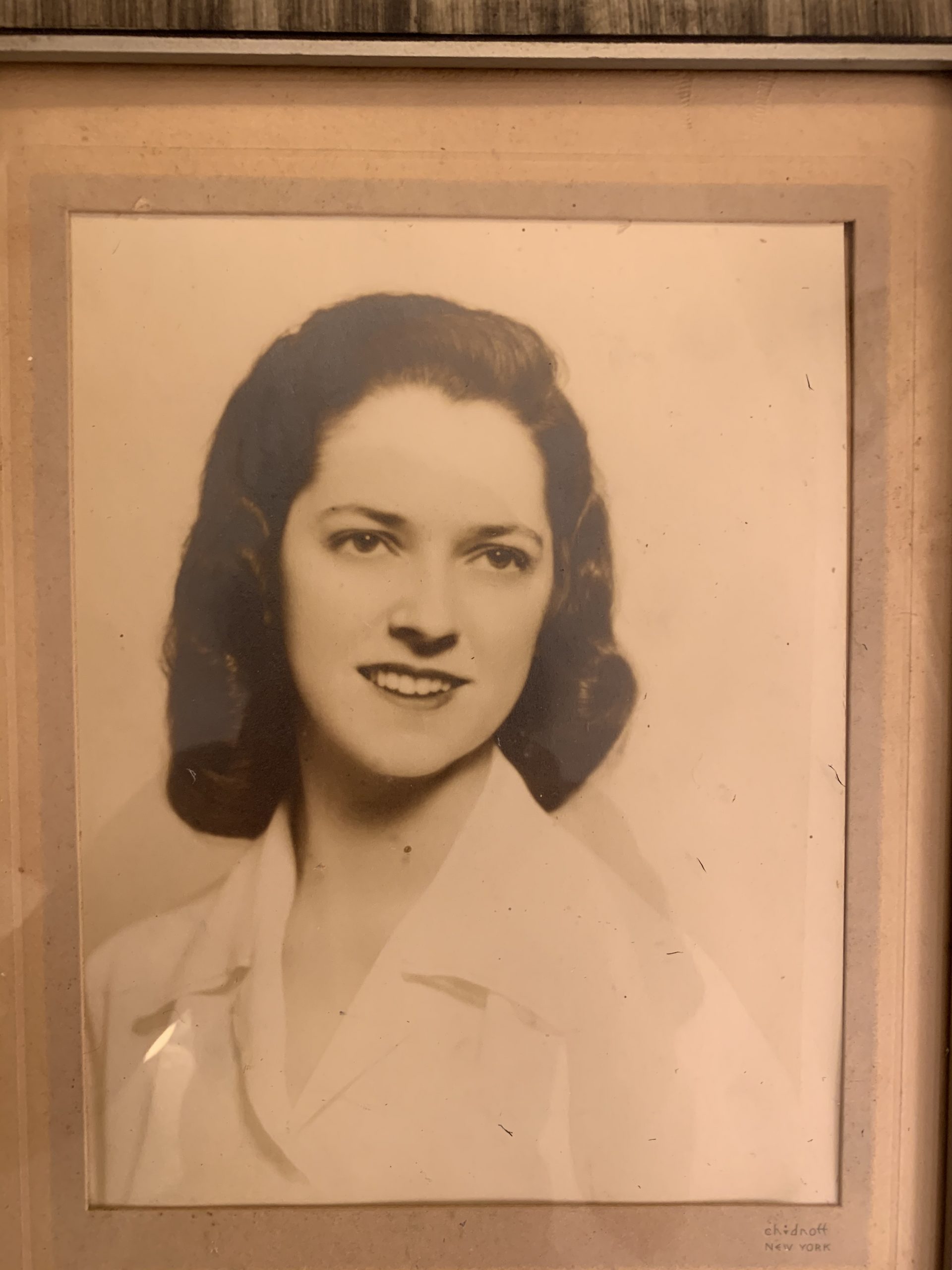
Hi! Sorry for my late post. I was traveling cross country all day yesterday and didn’t have time to work on it. For this week I decided to draw a realistic portrait of my grandmother. I think i had some successes in the features like the eyes, nose, and mouth, but my proportions are off. The head is slightly larger and it’s angled more than it is in the photo. Because she is in a 3/4 pose, I had trouble with the shoulders. Her left shoulder kind of slopes down too much.
20 x 14 inches
Note the slight cropping at the bottom to activate that negative space and “launch” us into the space more strongly. This is also the best rendition of the drawing that I could muster from your photo. You need to start with a better exposure and then follow the editing instructions I’ve posted on Blackboard–it can take a little practice to get right, but the one of your grandmother suggests you’re getting the hang of it.
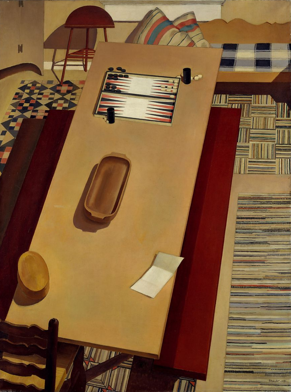 Charles Sheeler
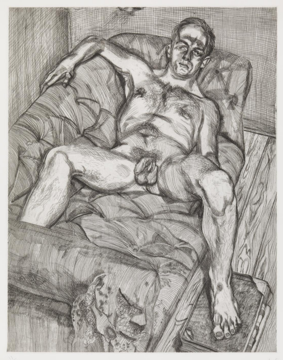 Lucian Freud
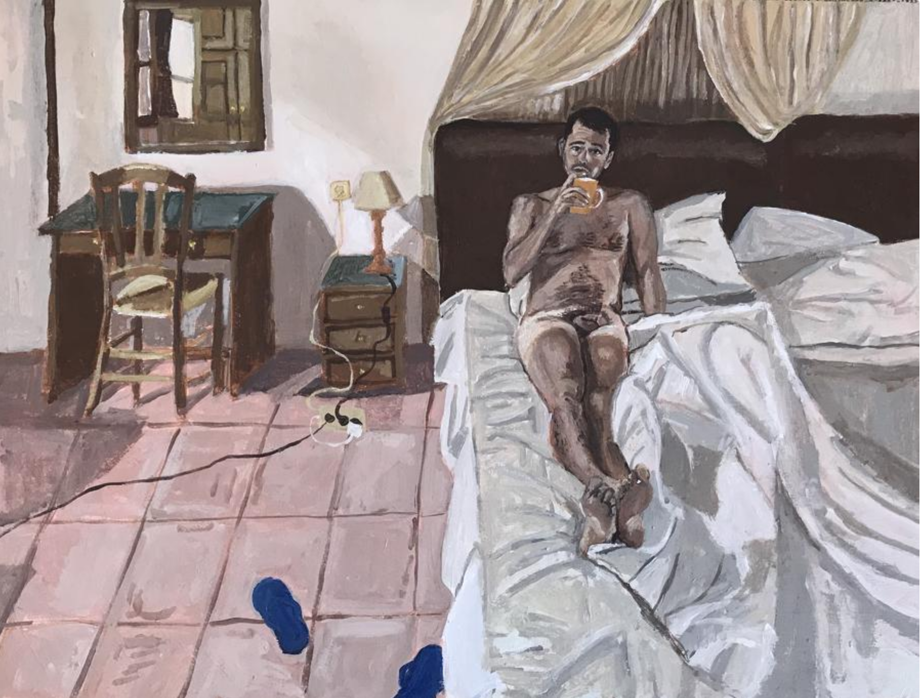 Polina Barskaya
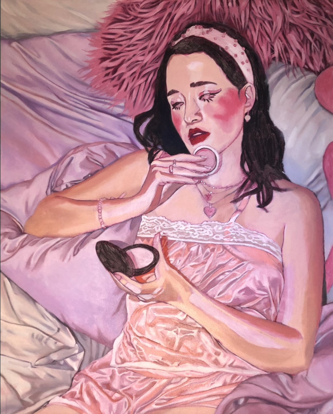 Phoebe Nichols ’20
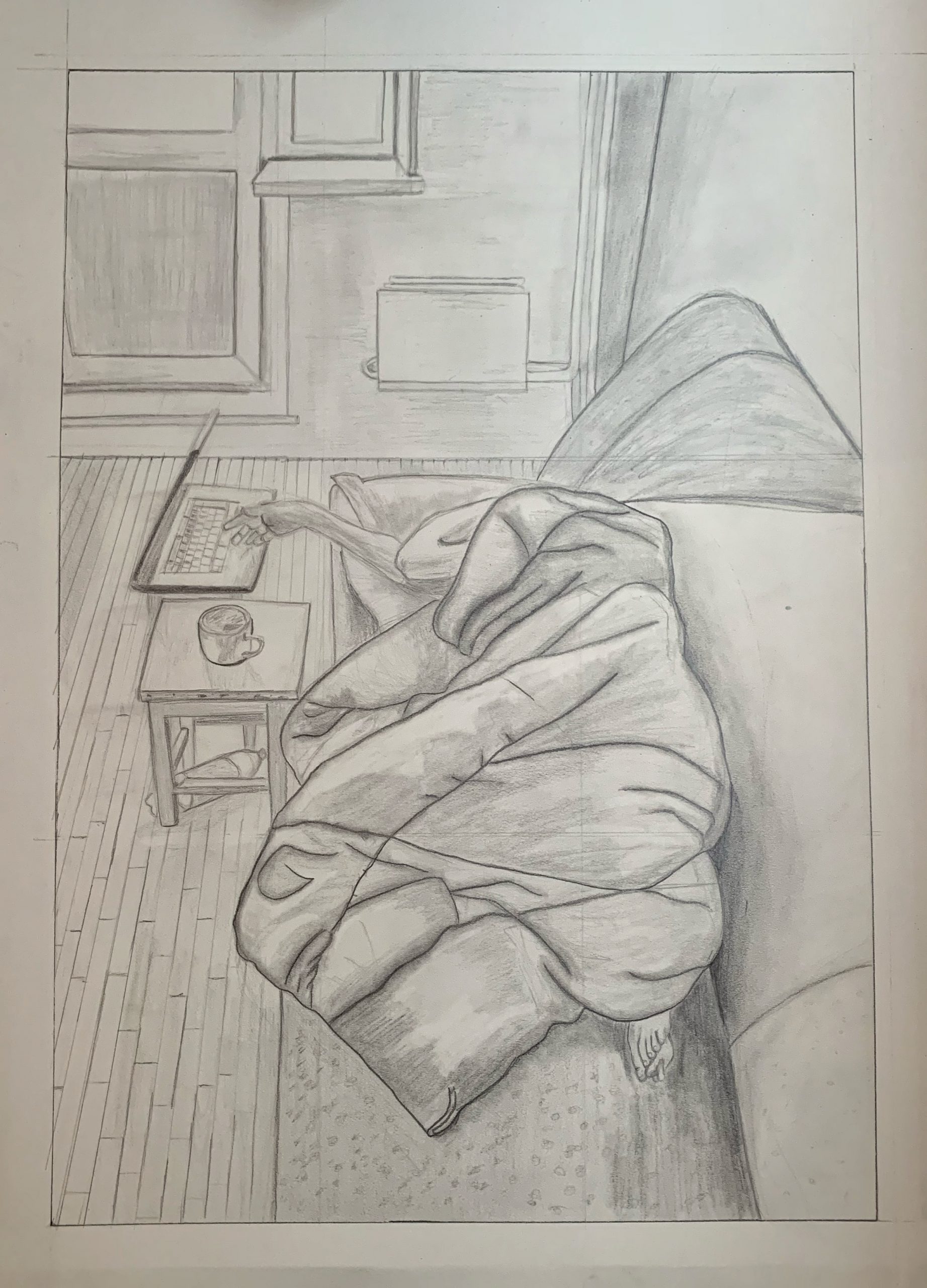
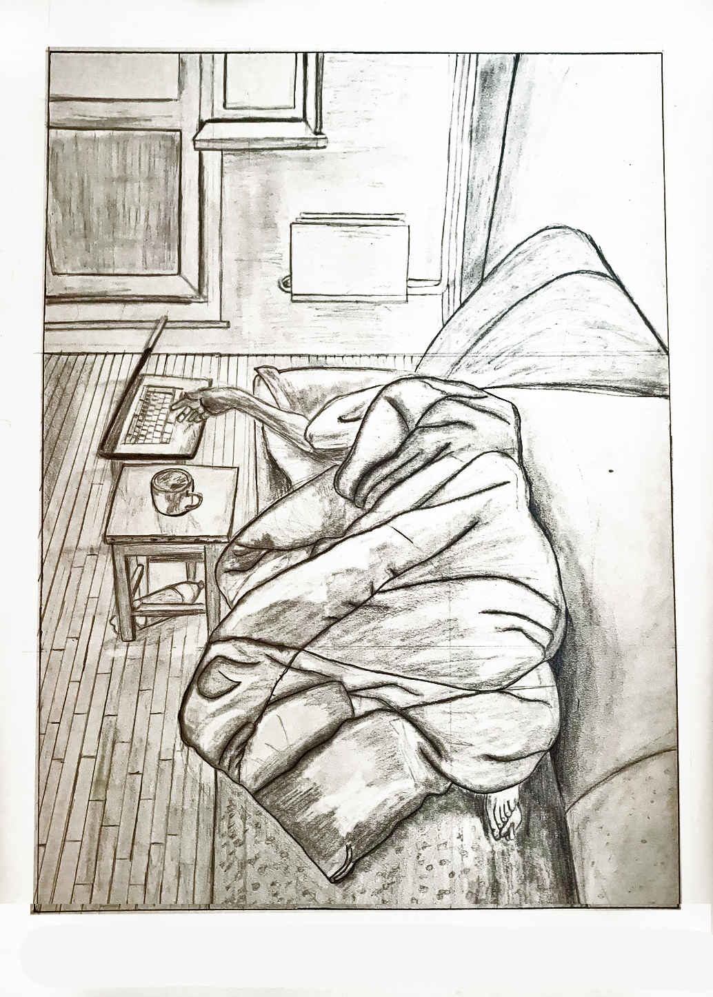
In this drawing, I wanted to continue working on my photo-realistic skills. I realized that in order to do this, I really needed to pay attention to value and making confident lines. I struggled with the amount of content and details of this drawing because of the size of the paper I decided to draw on. I think I began to build values but fell short in differentiating the values of the objects. If I had more time, I would continue to build the values and shading so that my composition would reflect the wide spectrum of lights and darks. I also struggled with the lights and shadows of the bundled blanket. I left out a lot of detail.
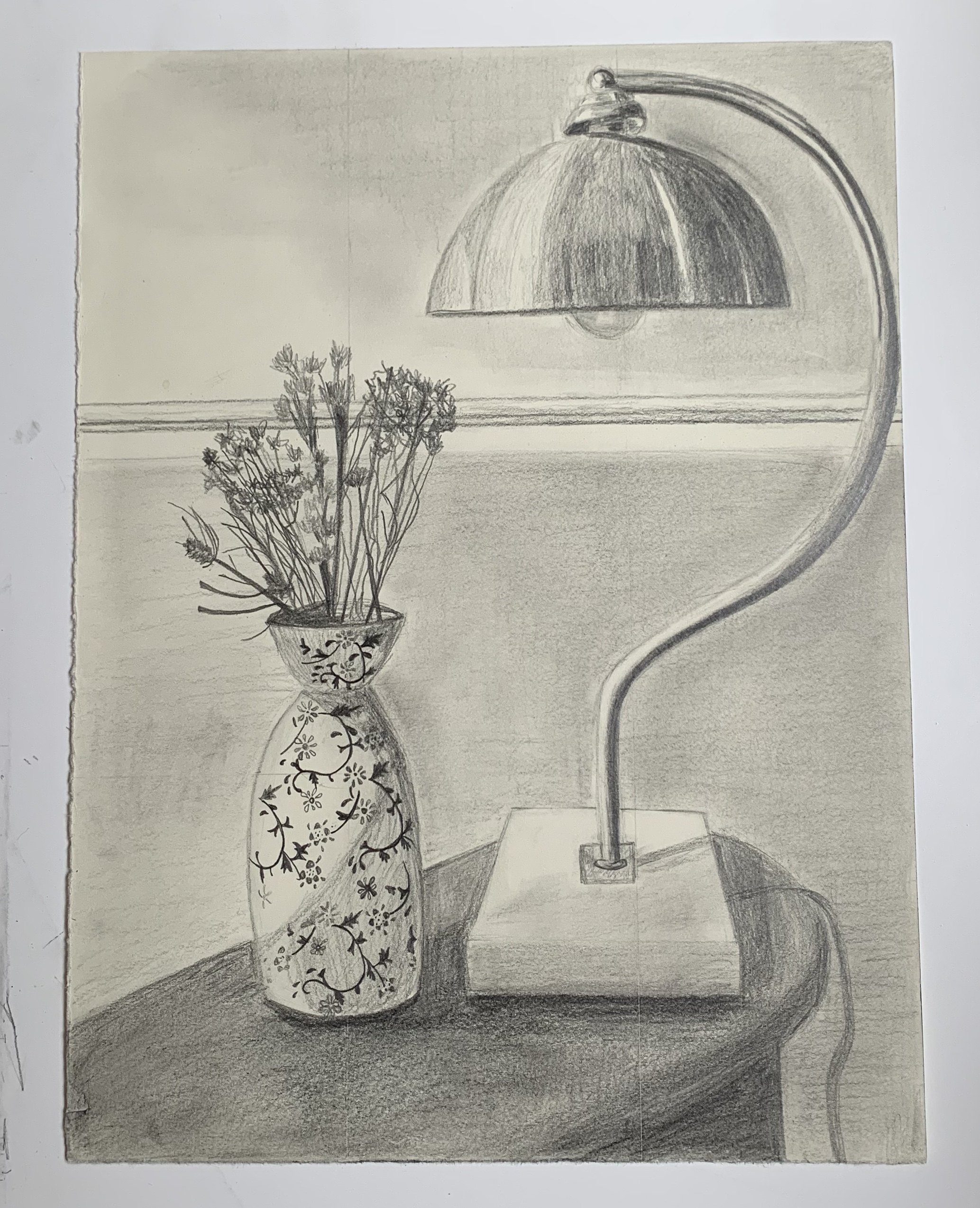
Pencil on paper, 12 x 9 inches
X
For this first week, I decided to draw part of a side table in our living room because I wanted to draw something on a smaller scale. My intention for this drawing was to produce something photo-realistic. I concentrated on the shading and value of the objects. Throughout the process, I was reminded that I haven’t quite discovered my drawing style and I was disappointed about how I shaded the objects. Because I don’t think it gave me the realistic effect that I was going for. I’m not sure how I can improve this. I also had trouble with drawing the dried flowers. There are more flowers in the vase with infinite amounts of detail. So my question is, how do we approach a highly detailed subject? Is there a certain method I can be using? I also don’t think I successfully captured the depth of the space. The back wall can just as easily be on the same plane as the objects. For my next drawing project, I would like to try a more impressionistic style.
__________
From Mark:
It sounds like you’re not going to stay with this approach, but if you were, the work of Charles Sheeler comes to mind:
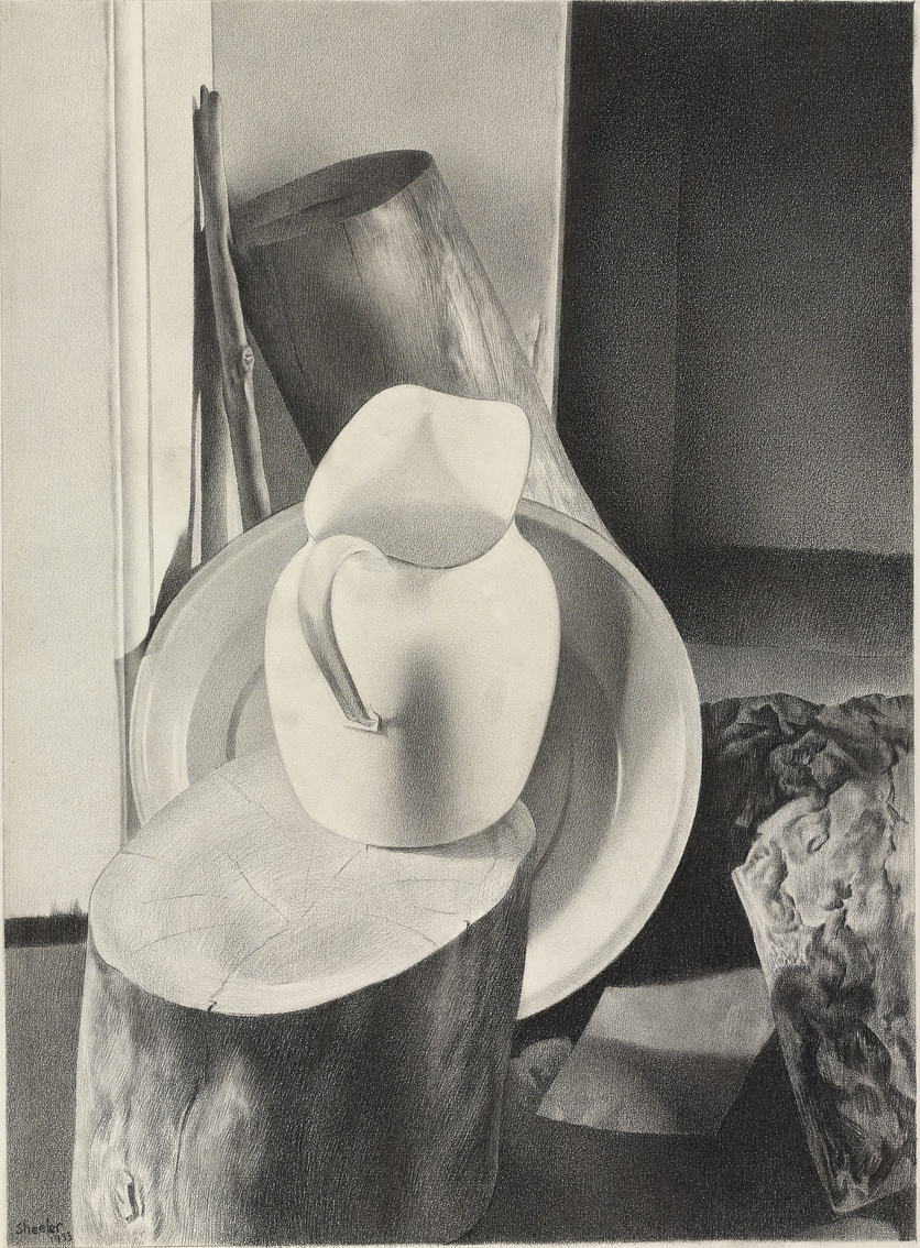 Charles Sheeler, 25 x 19.5″
This was done with conté crayon, keeping a super sharp point to get the finest grain possible. It’s also from a photo, which helped him to lock in the values and simply (so to speak) transcribe them.
I also see the hint of something in that vase that reminds me of the work of Gail Spaien, who teaches at Maine College of Art:
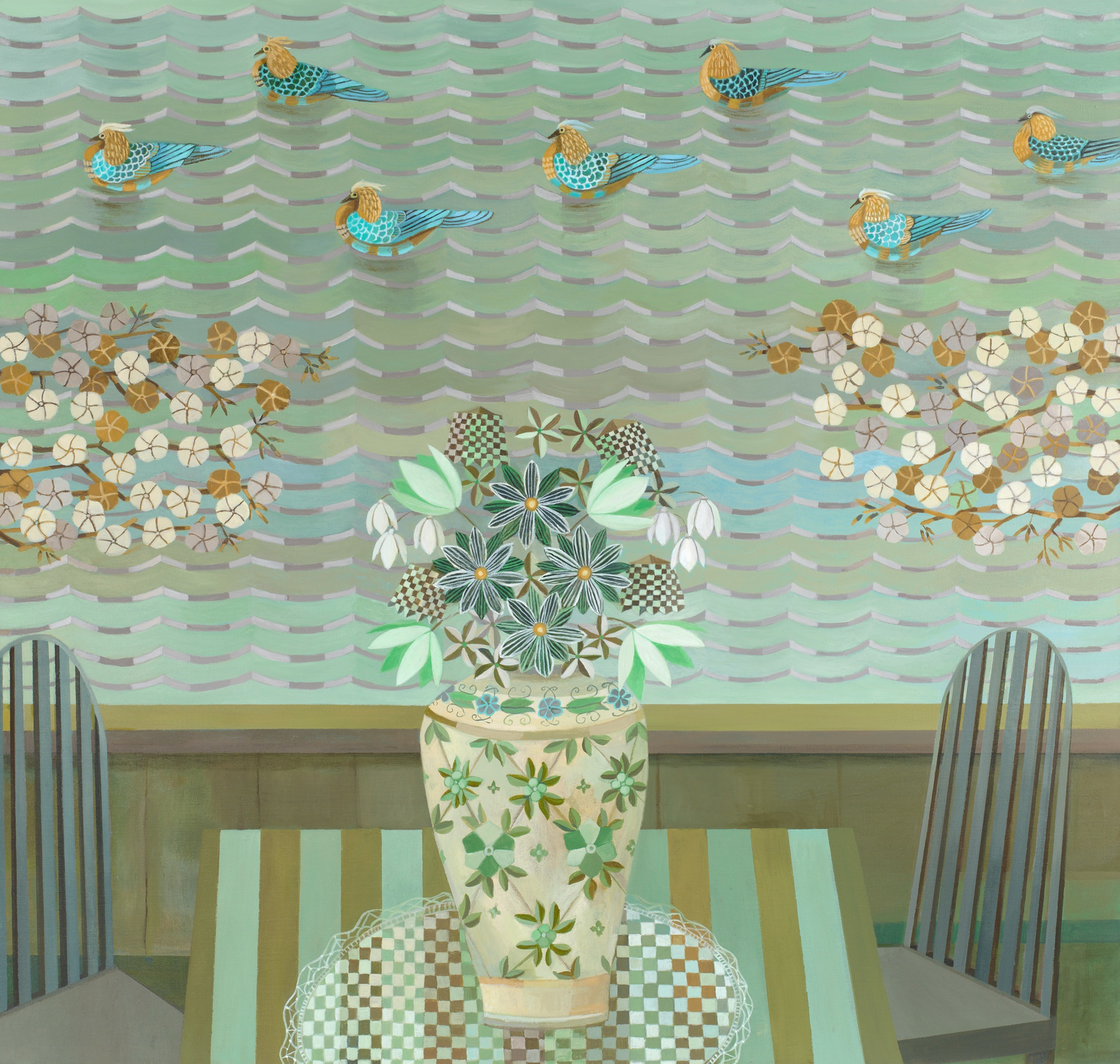 Gail Spaien
This also connects, for me, with your interest in Frida Kahlo’s work, which is so rich in patterning. Pattern could also be a solution because large flat areas are one of the hardest things to ask a pencil to do.
I should know, having made pencil drawings like this one for years….
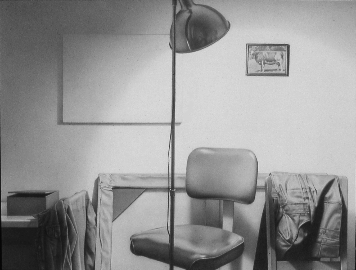 MW, “Grey Rainbow,” 1978, Graphite on paper, 9 x 12 inches
Note the reflector on the lamp, which has a small self-portrait in it.
 Pencil on paper 7×9