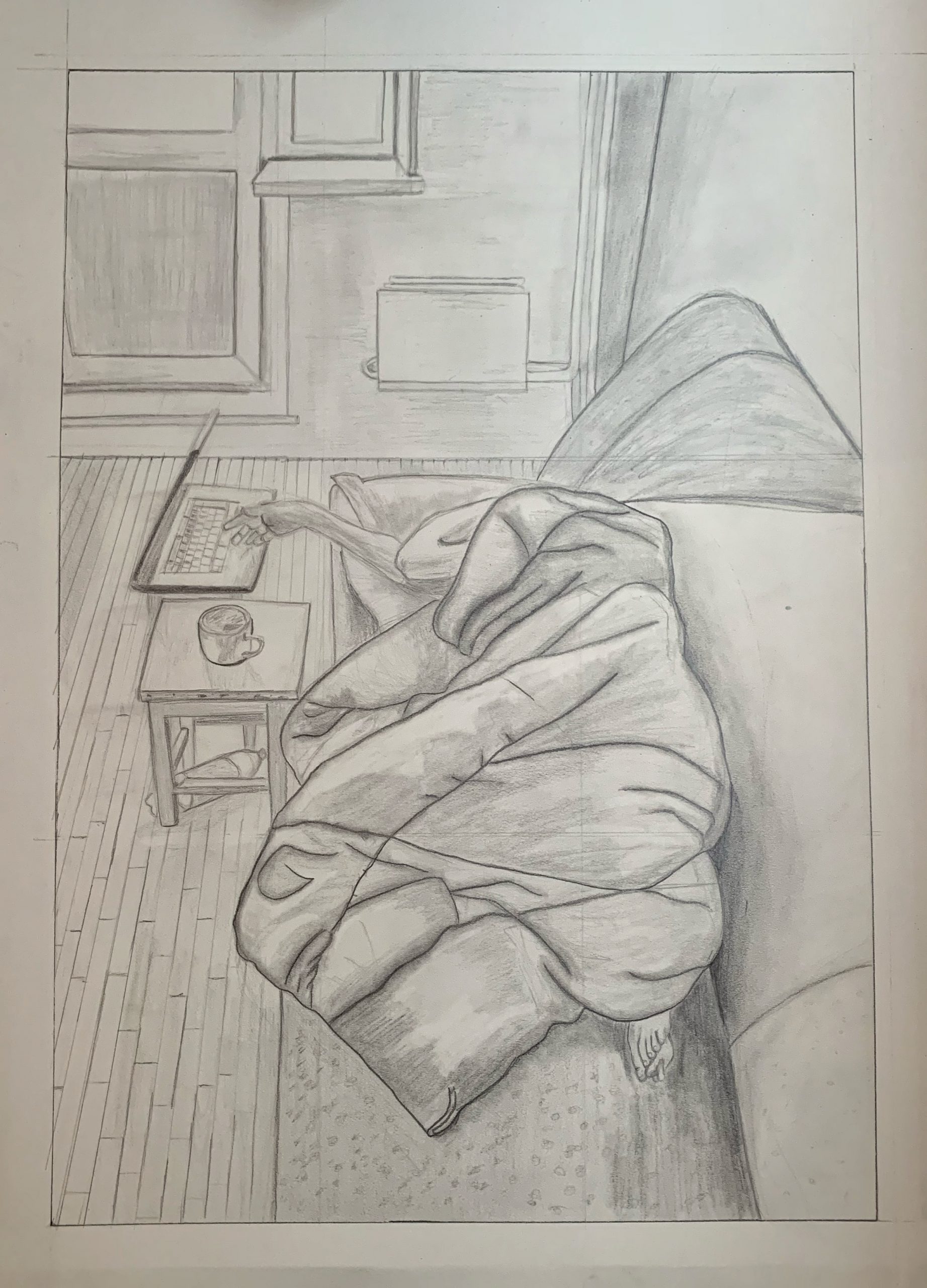
20 x 14 inches
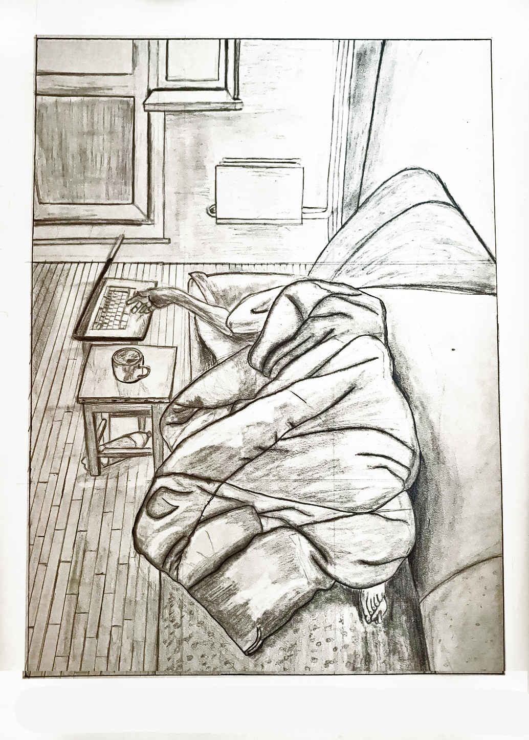
Note the slight cropping at the bottom to activate that negative space and “launch” us into the space more strongly. This is also the best rendition of the drawing that I could muster from your photo. You need to start with a better exposure and then follow the editing instructions I’ve posted on Blackboard–it can take a little practice to get right, but the one of your grandmother suggests you’re getting the hang of it.
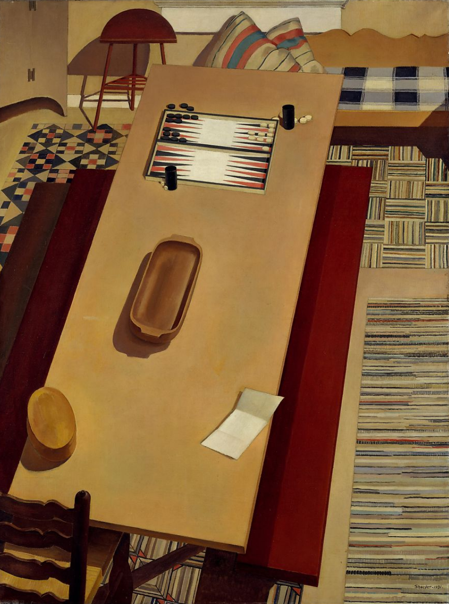 Charles Sheeler
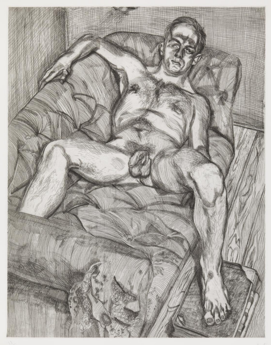 Lucian Freud
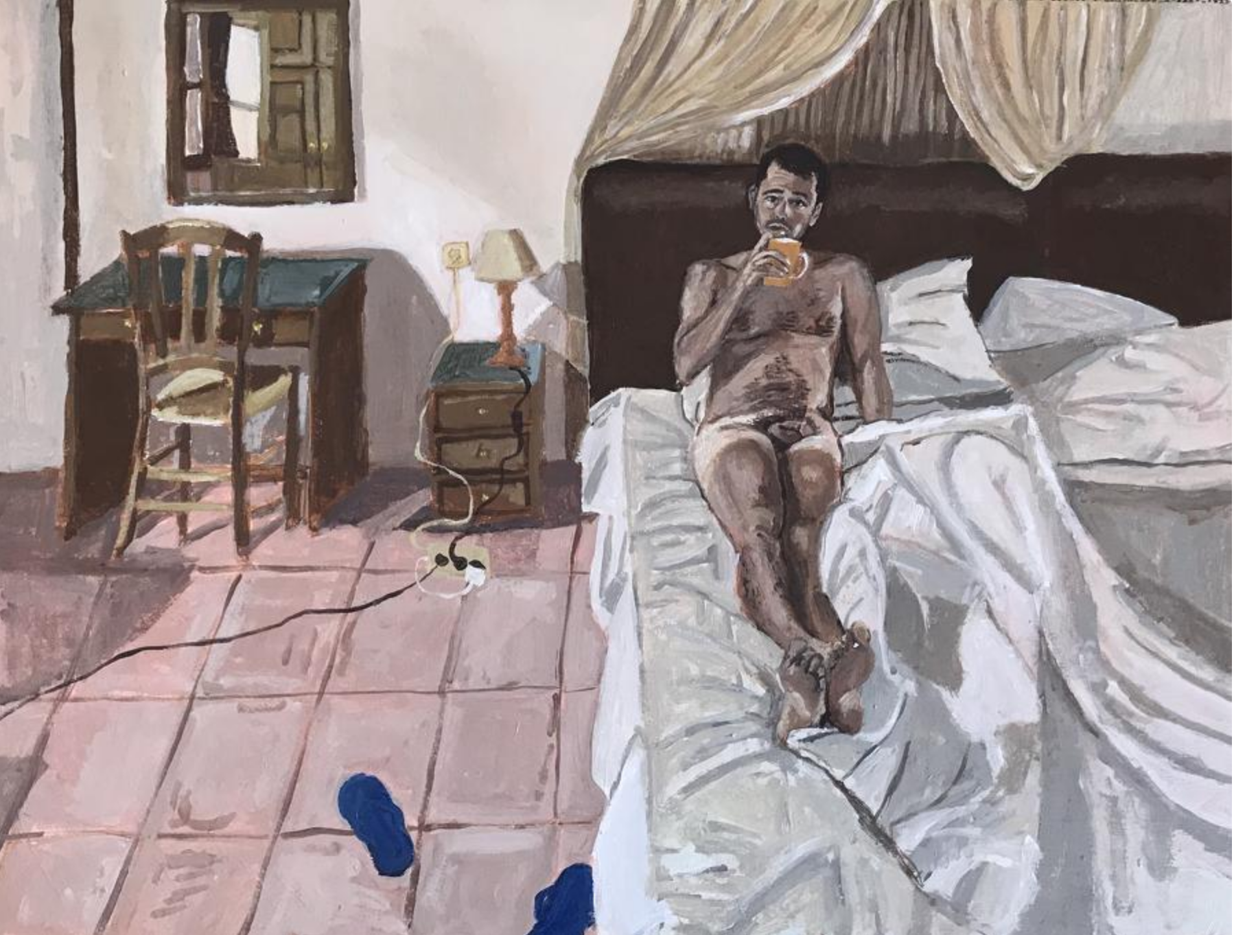 Polina Barskaya
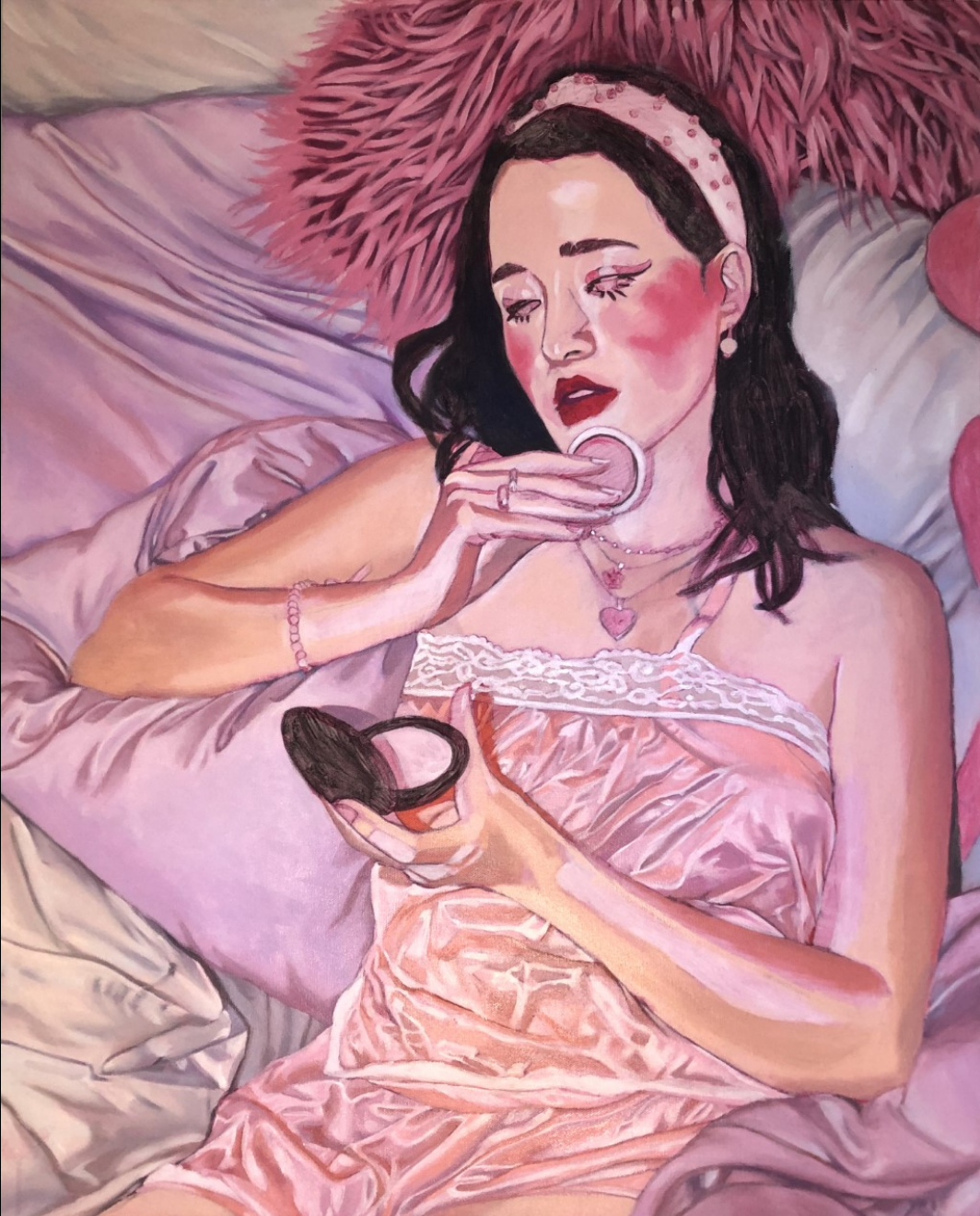 Phoebe Nichols ’20
In this drawing, I wanted to continue working on my photo-realistic skills. I realized that in order to do this, I really needed to pay attention to value and making confident lines. I struggled with the amount of content and details of this drawing because of the size of the paper I decided to draw on. I think I began to build values but fell short in differentiating the values of the objects. If I had more time, I would continue to build the values and shading so that my composition would reflect the wide spectrum of lights and darks. I also struggled with the lights and shadows of the bundled blanket. I left out a lot of detail.
Megan, Your drawing is indeed realistic and skillful, and it absolutely nails what it feels like to be housebound in the digital age during a pandemic. To me, the dropped (soda?) bottle and figure sleeping on a couch create a tension because of all the literary associations (you know, empty whiskey bottles, spouse banished to the couch, discarded “book” [laptop], etc.). As I mentioned to Ali, Mark has remarked that we tend not to be generous enough with the feet. Yours seems a bit tiny to go with the hand, which is farther away. The perspective doesn’t feel quite right on the coffee cup (too wide an ellipse?) and table top (not enough convergence of receding lines?). The blanket is well drawn, I think, with good variation of value to create depth and softness. It stands out from the other objects for its detail and the boldness of lines. Is that deliberate? Nice work!
Hi Megan!
This is such a great drawing! I enjoy looking at the value contrast, as well as the rougher marks on the couch and on the wall. One thing that might be helpful, for you to achieve more with photorealism, even before you start constructing value, is to build a perspective that can be easily read and perhaps more dramatic.
It is quite obvious that you do have vanishing points, somewhere above and below the page I assume, from reading the floor panels and corners of the wall, which is great and helpful. However, your effort of providing the viewer a cohesive, realistic space is interfered by the miss-alignment of the edge of the couch. This is something you might find helpful to tackle on, at an earlier stage.
In addition, I almost hope to see a more dramatic depth of field. This is something you can manipulate by pulling the vanishing points closer to the middle and have the lines converging from a bigger angle, almost like a fisheye lens view. This might help you achieve a more realistic look to your composition.
Hello Megan!
I have to agree with Nat and Harry, this drawing is splendid! I would suggest that if you want to have a more photorealistic drawing don’t be scare to go darker than you are doing now, and then start bringing lights specially from light sources like the computer. I also admire the point of view from which you decided to do this drawing, and I think you nailed it.