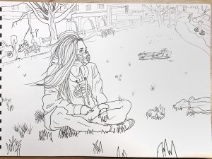
X
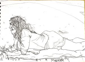
X
X

X
Professor Mark Wethli – Spring 2020
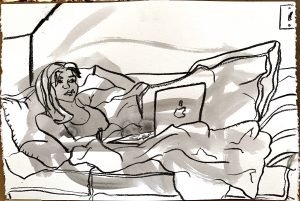
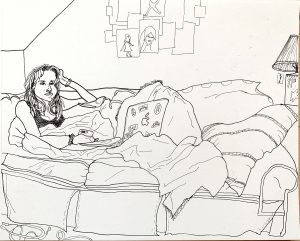
X (If you like my suggestions below, or on the one of your mom–or any drawing you want to “repair”–you wouldn’t be the first artist to carefully paste a piece of paper over any area you want to change and redraw it. Or, do it digitally. Ask me if I can tell you more).
A couple of notes. About the nose, the less said the better, especially in a contour drawing. Get in and get out as quickly and economically as possible. In a pen drawing this size this extends to other contours on the face as well, which you can see I’ve removed.
(and look how much better it looks with the color taken out of it, and increased contrast).
I also took the hatching away from her top. It felt like an outlier (no hatching anywhere else) and it was detracting from the portrait. Easy to say in hindsight, of course, but a lesson for next time.
Great line weights overall but the lamp shows signs you were getting fatigued or running out of time. Those lines are more random and less deliberate. I took them away and left fewer lines but put them down more intentionally. I see them as the call and response to the lines of the hair, so they need to be in the same “key.” You’re so good at this 97% of the time it doesn’t need saying, but this kind of drawing insists on a thorough and consistent performance…like this next one–brilliant.
See below how much better it looks with white paper and higher contrast.
X
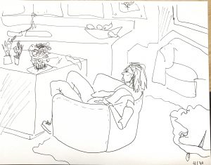
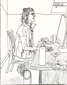
The only thing to improve here is the basket (?) and random papers on the floor at her feet. Like the lamp shade in the one above, these are too “phoned in.” The magic in your contour work all semester has been it’s very selective but unfailing attention to detail. Giving any part of the drawing less than your full attention breaks the spell and undercuts their magic.
There’s a great perspective move here, though–we’re looking down into the basket, then we can see more foreshortened ellipses on the desktop, but then her eyes are clearly at our eye level, or maybe slightly above (driven home beautifully by that line in the background, which meets a line on the left wall inclining downward). The effect is that of a shifting point of view that guides the viewers’ eye up and down the space.
And the woodgrain! Killer!
X
X
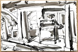
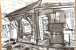
Love these (above)–inspired work.
In no way like what you’re doing, except for the detachment of value from line in your porch drawings–maybe something to push farther.
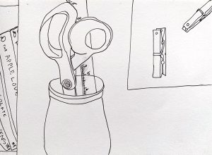
I think you already mentioned his figures; didn’t know if you knew his still-lives.

X
This needs more visual interest on the right, where it trails off a bit, but the immediacy and familiarity of this kitchen scene is winning. Now to make your loved ones not look quite so scary.
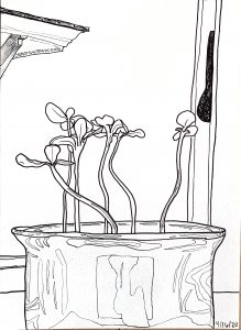
The “when to stop” question–there’s some kind of problem between the right flower and that dark nameless shape. Nice fun with the reflections and good changes in line weight.
X
Great–
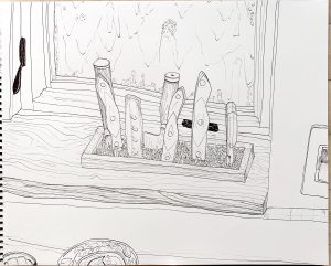
X
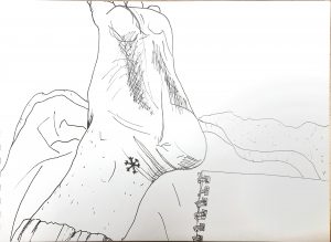
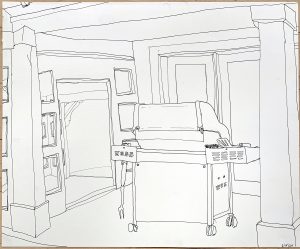
Darkening those latches might have been one of those steps too far–but you never learn about things like that until you try them. They kind of beg for a third (or maybe five) similar accents to establish them as a visual theme and unifying element. Or maybe things would have been better without them.

X
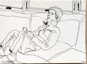
X
Someone suggested otherwise, but I think the slightly off center and unexpected cropping works well in these. It makes them more candid, like something caught at a glance.
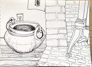
The wood texture opens the door to stippling on the stones and other hatched textures. The cross contours on the interior of the pot would work better if they actually described those planes, rather than being a 2D pattern inside an elliptical shape.

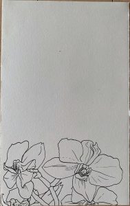
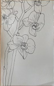
X (This one alone)
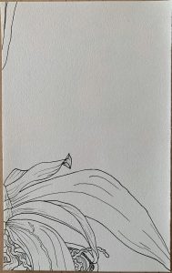
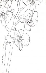 You need to clean and straighten these up more thoroughly. I took this back into Snapseed and used the tools outlined in my “cheat sheet.” Be sure to leave some time to practice these techniques for a better outcome and a better representation of your work.

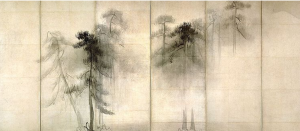 Hasegawa Tohaku, 16th c, ink wash painting, 5 x 11.5 feet
Love the way just a branch or two touch the left panel, and only atmosphere fills the right.
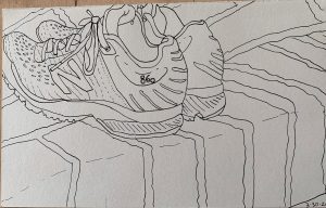
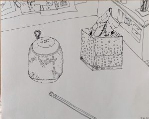
X
Avigdor Arikha was a master of the found still-life in his home and studio (in Paris). See more of his in Adam’s thread.
Google him for more (of course). Note the strong abstract design of his compositions, achieved through his viewpoint and use of cropping.
Another master of domestic interiors was Edouard Vuillard. It takes a minute to see the figure on the right (it’s called “The Seamstress”).
And a world that I’m well acquainted with:
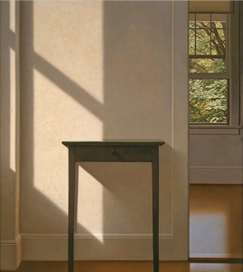 “Simple Gifts,” Oil on canvas, 54 x 48″
