X (This one alone)
 You need to clean and straighten these up more thoroughly. I took this back into Snapseed and used the tools outlined in my “cheat sheet.” Be sure to leave some time to practice these techniques for a better outcome and a better representation of your work.

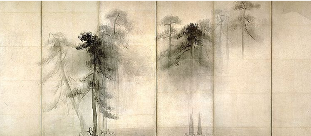 Hasegawa Tohaku, 16th c, ink wash painting, 5 x 11.5 feet
Love the way just a branch or two touch the left panel, and only atmosphere fills the right.
X
 Avigdor Arikha
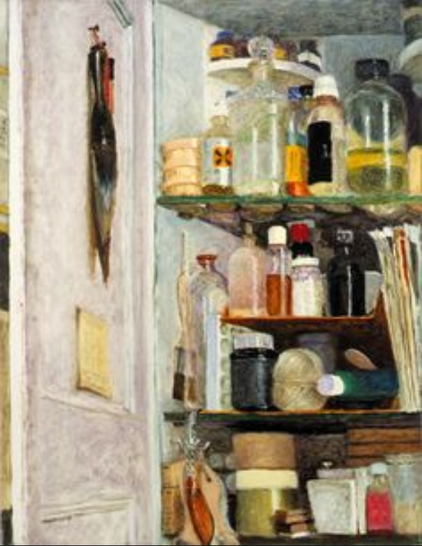
Avigdor Arikha was a master of the found still-life in his home and studio (in Paris). See more of his in Adam’s thread.
 Avigdor Arikha
Google him for more (of course). Note the strong abstract design of his compositions, achieved through his viewpoint and use of cropping.
 11 x 10″
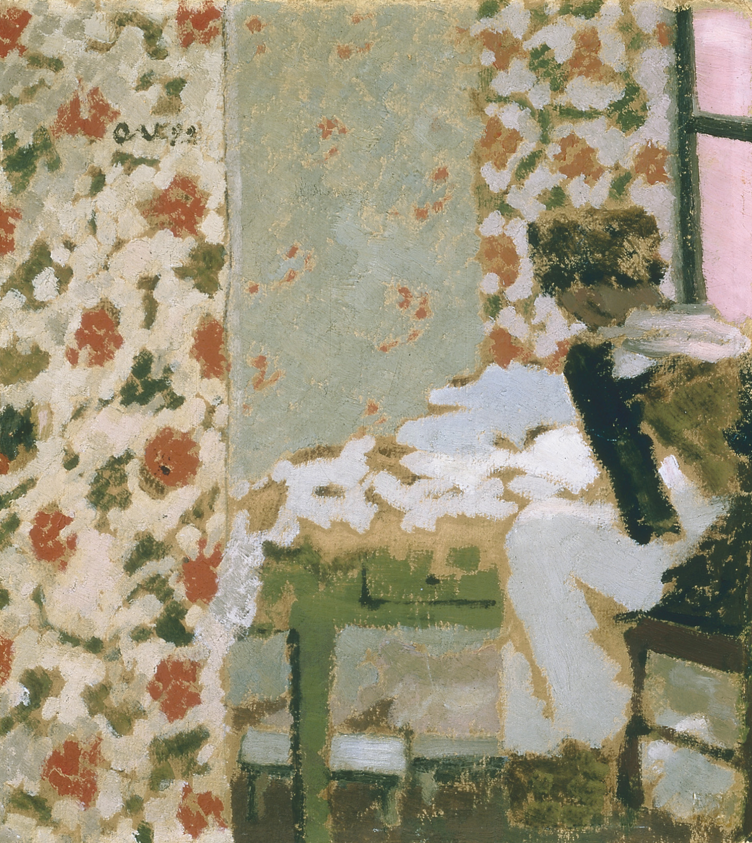
Another master of domestic interiors was Edouard Vuillard. It takes a minute to see the figure on the right (it’s called “The Seamstress”).
And a world that I’m well acquainted with:
 “Simple Gifts,” Oil on canvas, 54 x 48″

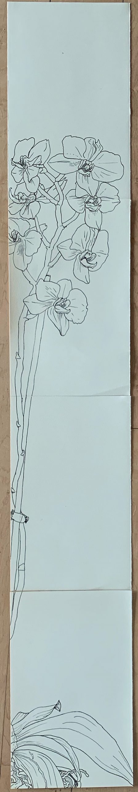
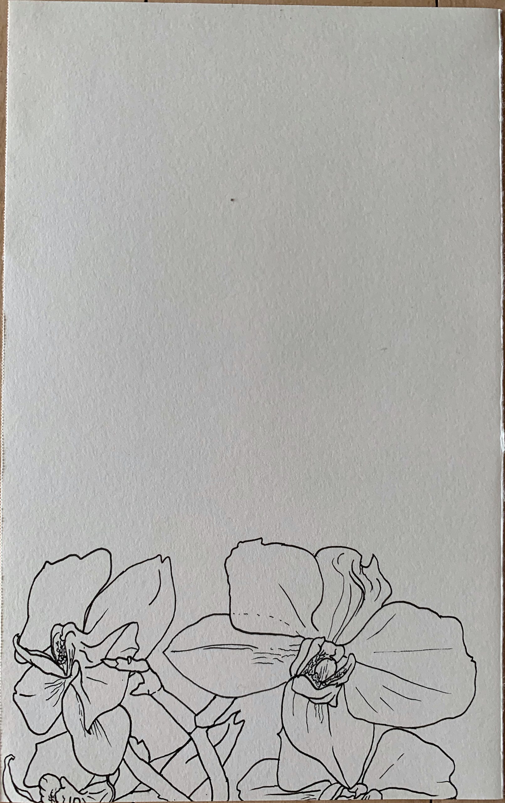
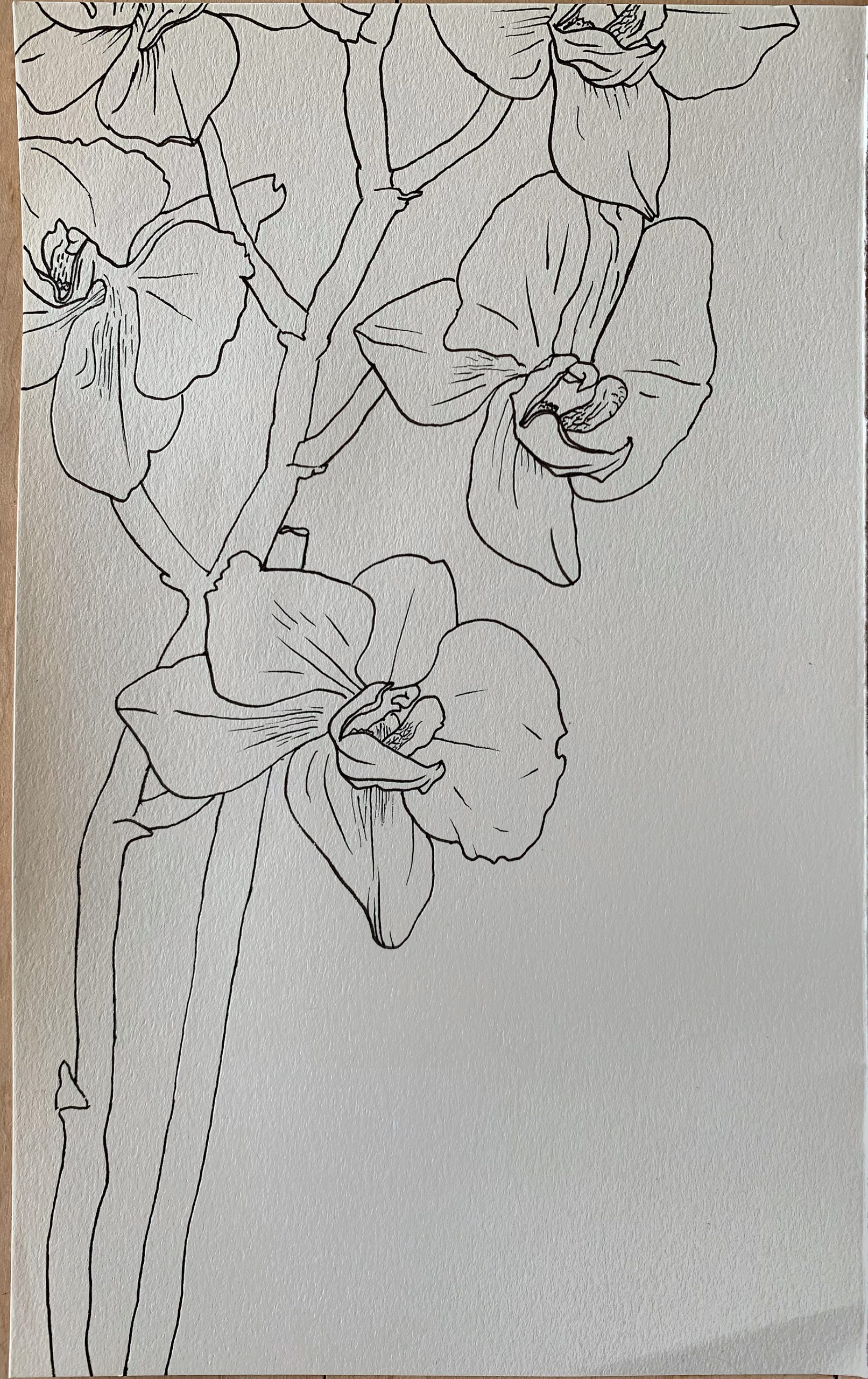
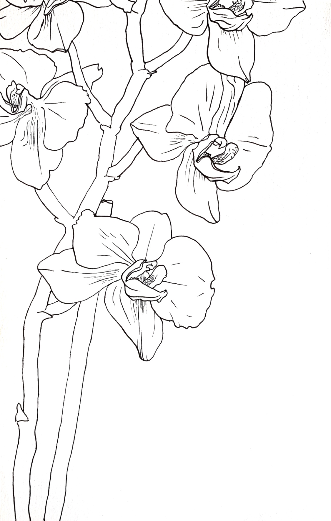
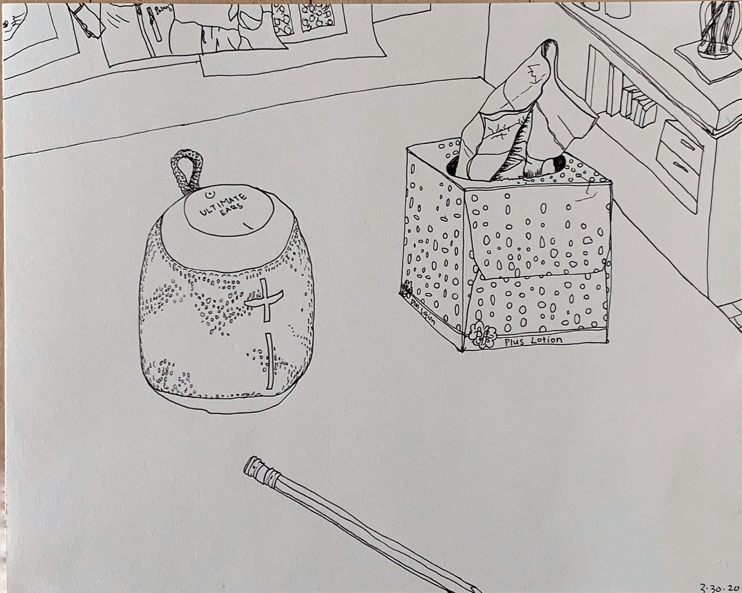
My goal for these drawings were to accurately draw what I see around me. I wanted to simplify them enough to be able to depict them with a thin contour line and little to no shading. I really like how the orchid turned out. I got frustrated with the tedious nature of textures, like the speaker and the pattern on the tissue box. For different drawings I had different levels of accuracy. The perspective in the speaker and tissues one isn’t perfect and the speaker definitely isn’t round like it should be, but I tried to not worry about those things. I would love suggestions on what to draw, and how large of a scene to do. Should I zoom in (like do one individual flower) or should I zoom out and do my whole kitchen? I am also struggling to decide what level of detail to include and how to show depth and position without shadow.
Perrin
There’s a lot to like about this series.
I’m most drawn to the orchid. Beautiful differentiation in line weight. I love how you rendered the orchid petals thick and graphic and the centers more delicately. The contrast between your bold, confident strokes and the gentler, focused marks brings the drawing to life. Also, your keen awareness for the shape and curvature of the stem keeps things from feeling flat. I enjoyed my eye traveling (*mouse scrolling) from the top of the drawing to the bottom. Of course the flowers are the focus, but by tracing the stem downwards you are surprised with only a sliver of pot and leaves. That crop choice is my favorite part of the drawing. Adds a lot dynamism and a sense of curiosity.
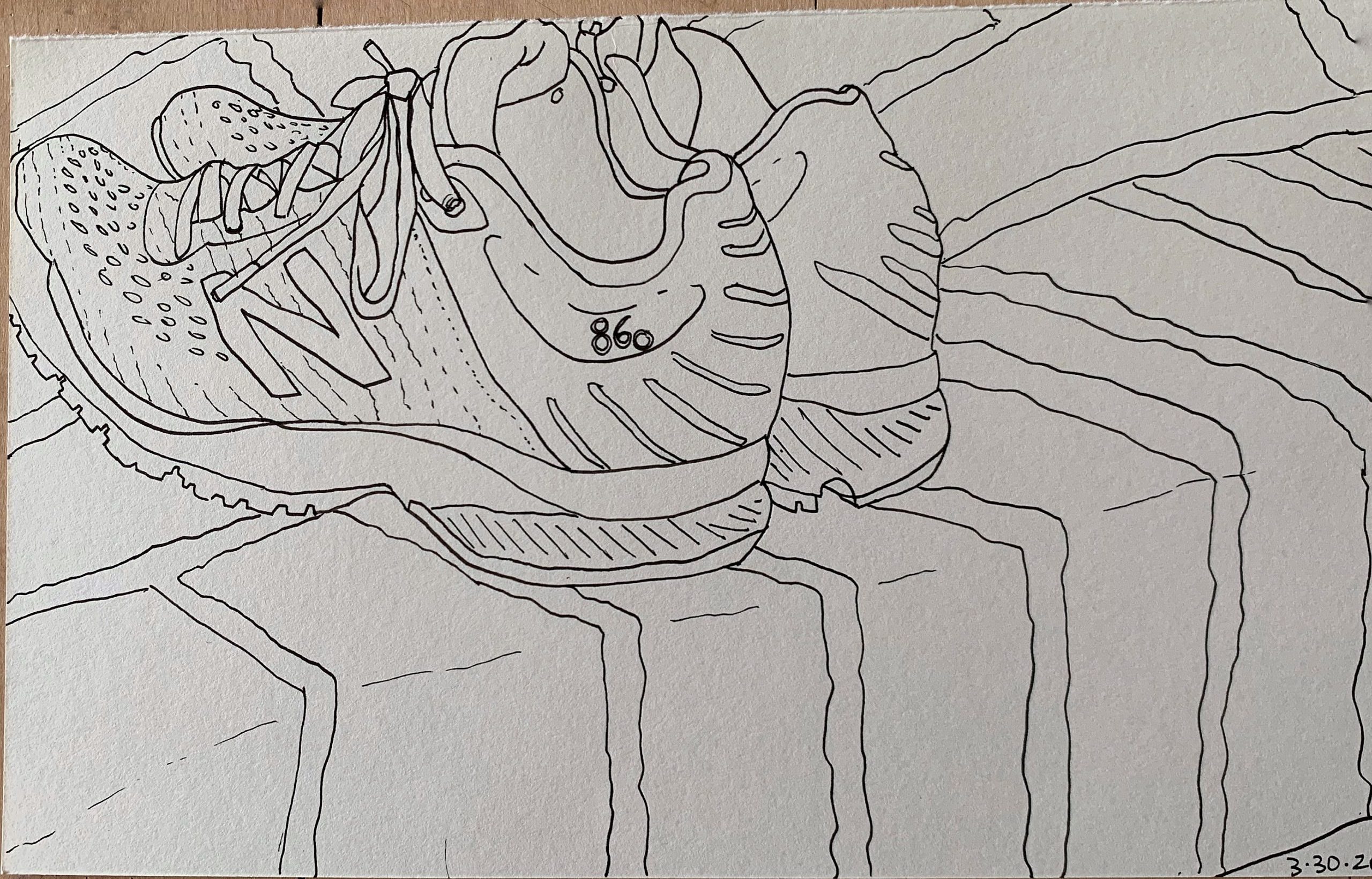
My favorite composition is the running shoes. I like the confluence of different line directions and textures. However, the shoes and the fabric beneath them don’t align as I expected them to from this frame. The new balances seem to be “rolling” towards the direction of the viewer when they should be pointed away. A minor grip–still very accurate overall. Perhaps envisioning the shoes in the environment on the page before laying down a lot of marks could help with translating the view to the page.
Lots of great stuff here. Love the details on the skier. Really nice contour and texture touches on the ski suit.
– Jack
Forgot to address you questions, my b! Also wanna retract my perspective my comments. I was struggling to come up with a point for improvement and landed on that. Not very helpful. Things I should have said instead:
Your question of scale is an interesting one. There are a lot of different ways to draw things around you. Close, far away, from above or below, etc. One thing I really like about your drawings is the level of detail. As a fan, I would love to see more. It could be cool to draw an object up-close with an unrelenting sense of detail. You handle texture really well so maybe drawing something like a rusted bucket or lichen-y tree or something else with lots of crackles and lines would turn out nicely. Big scale could also be cool, of course. Maybe a drawing of your favorite room or corner of your house, a special wall or bookcase. Up to you, but I vote for both because both are interesting in their own way.
Shadow/depth is tricky. I’m not sure. Varying line weight / leaving line out could be helpful, but of course it’s not as convincing of light and mass as str8 up shadow. Another thing I’d try would be to get strategic about my scene composition, placing stuff in front of each other to help convey the space better.
– Jack
Thanks jack! This is helpful!
I’m getting so much information from your personal life! I don’t know if this is intended or not, but I always find it exciting and fascinating to be able to know more of a person through reading his or her art. I guess for you to have decided on your subject matters, you have made the decision to share it with people from an artist perspective.
I love your articulations on the flowers. I like how it is accurate and vividly describing the gesture of the plant, without the need to be a perspective accurate drawing. I do wish to see more variety in line weight if you think having more line quality fits your project rationale. I also understand that it is hard to articulate different line weights with a single micron pen, and thus getting different thickness tips might not be a bad idea. It might be helpful to have lines of different thicknesses to help you bring items more appealing from its surrounding background, or to work on small scale texture and nuances without having to compensate for it being too congested.
I am not a big fan of the addition of watercolor, but only in its current state. This might be because of it not having enough interaction with the line portion of the drawing. More cohesiveness might be able to put the two medium (completely different in their nature, one rigid, the other free) on a leveling ground. A portion of the watercolor might want to fit better within the perimeter of the lines. Again, this is only my approach. I’m excited to see how you will take these drawings onward!
Great idea to get different size pens. Thanks!!
Hi Perrin,
First thing, you need to up your game when it comes to photographing and editing your work. Note the example I added to your images, where I took the same image and worked with it more in Snapseed. Happy to help with this if you’re having trouble, but for work like this especially it makes all the difference.
Great start to your project. The orchid is actually quite different in character than the others–very formal and “aestheicized” (distanced from real life) while the others are more candid and quotidian.
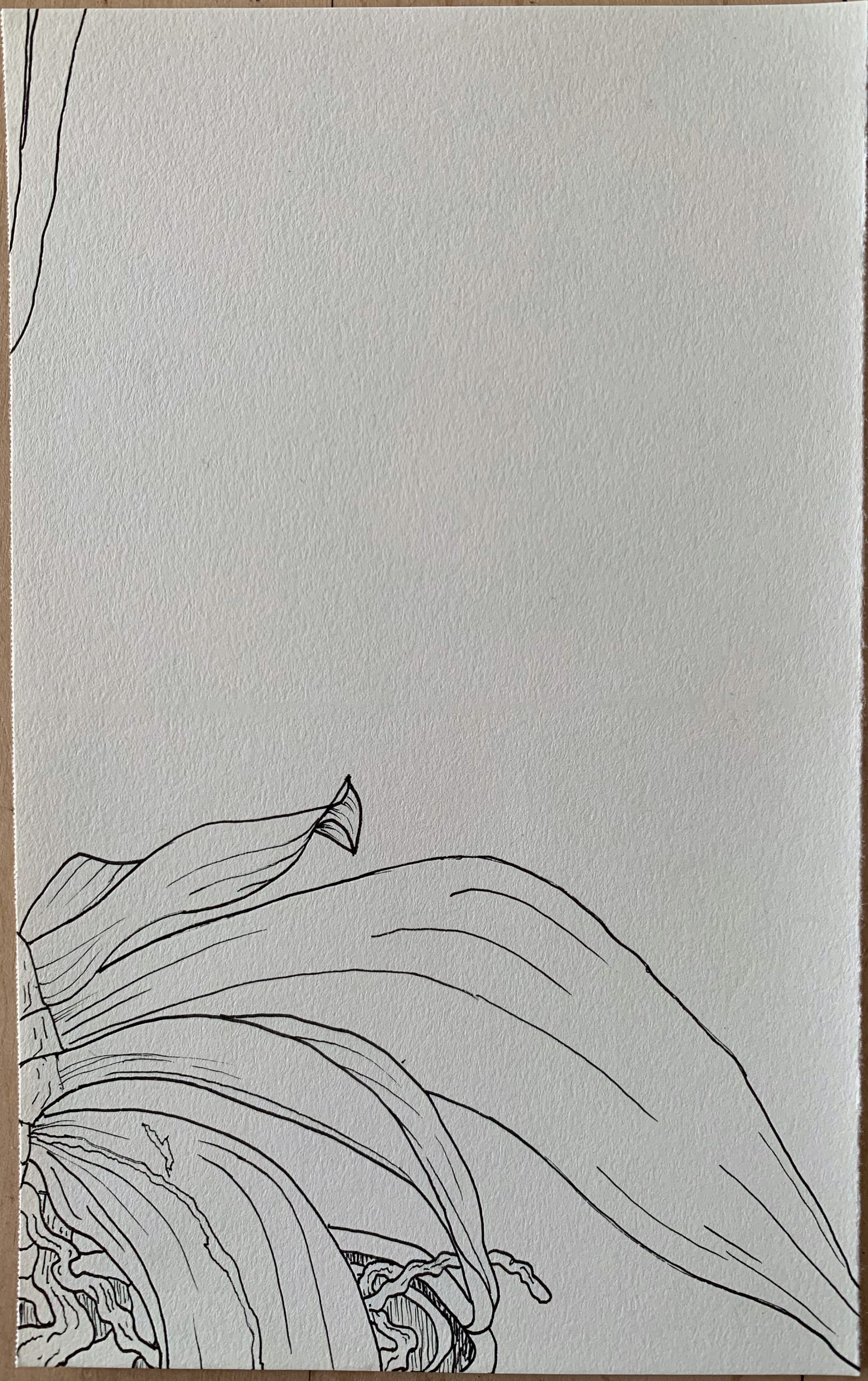
I’m guessing you’re aware of Japanese folding screens, which the orchid reminds me of. Like in this classic example by Tohaku (above), interesting things happen in the panels that don’t contain focal points, and you’ve used that very well. The vertical layout is unusual–I’d be curious to see you make a horizontal one (if this idea interests you further at all).
Love the asymmetry here, but the stems skirt the left edge a little too closely in my opinion–they feel pinched or poorly cropped.
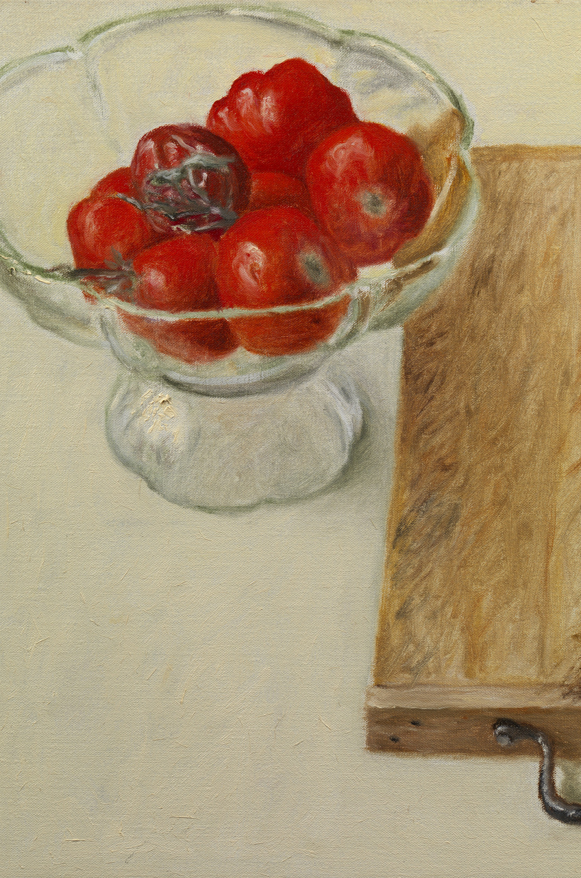
The others are much more down to earth. Hard to argue with the beauty of the orchid piece, but I’m more drawn to the possibilities of documenting the place you are and doing “found” still lives. I’d also vote for zooming out and including more. If rendering details and textures doesn’t appeal to you, this might not be your thing, but I like your willingness to let objects look a little wonky it that’s how they turn out.
They’re much more alive and interesting that way than if they were “right.” I also like your shorthand for the speaker cover. I could tell it was because you didn’t want to deal with all those holes but there’s a charm and honesty in that as well.
The sneaker drawing (like the stems on the orchid) also has compositional problems–they feel jammed into that corner.
Not sure what to make of the skier. It’s well done but doesn’t connect to the others. Mostly a technical exploration? Interesting to detach color from line. I’d need to see another two or three to get my bearings about what you’re after.
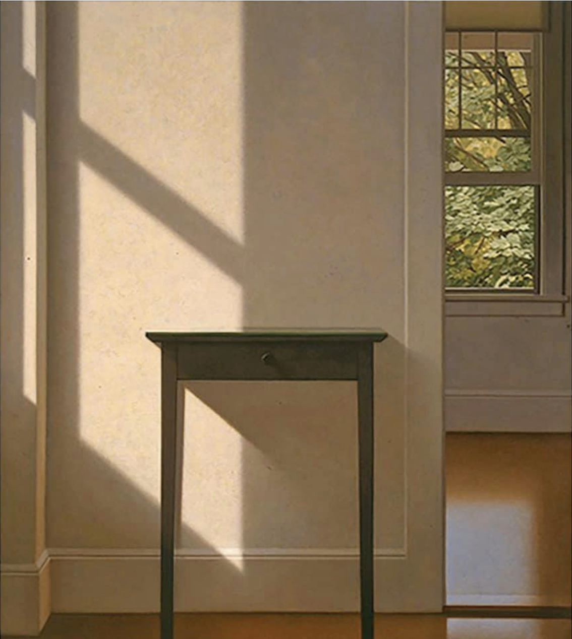
For my money, settling into an exploration of contour drawings of still lives, interiors, and figures–perhaps even venturing into the yard, or looking through a window (interior and exterior) would be time well spent.
See the images I’ve added above, in case they might be of help. See also Jane Freilicher, Fairfield Porter, and Lois Dodd for more domestic interiors (and exteriors).