 X
X
Author: Harry Hu
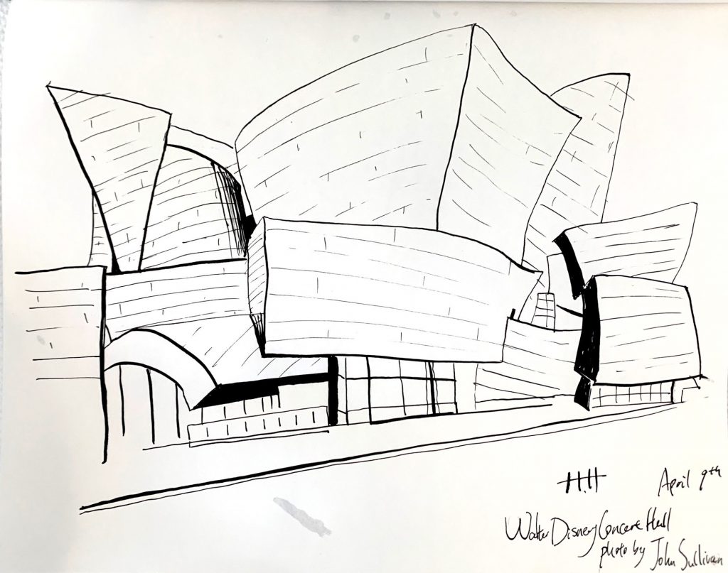
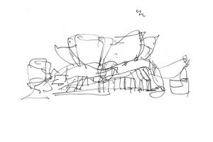
Architecture Drawing
X
Are these washes really brown, or is that the photo? If they’re black and white, use the Saturation slider to remove the color.
And the exposure on this next one…what’s the word? Oh, yeah–SUCKS. Please take a better photo of this one for the class show (no cast shadows and no glare on the ink).
X
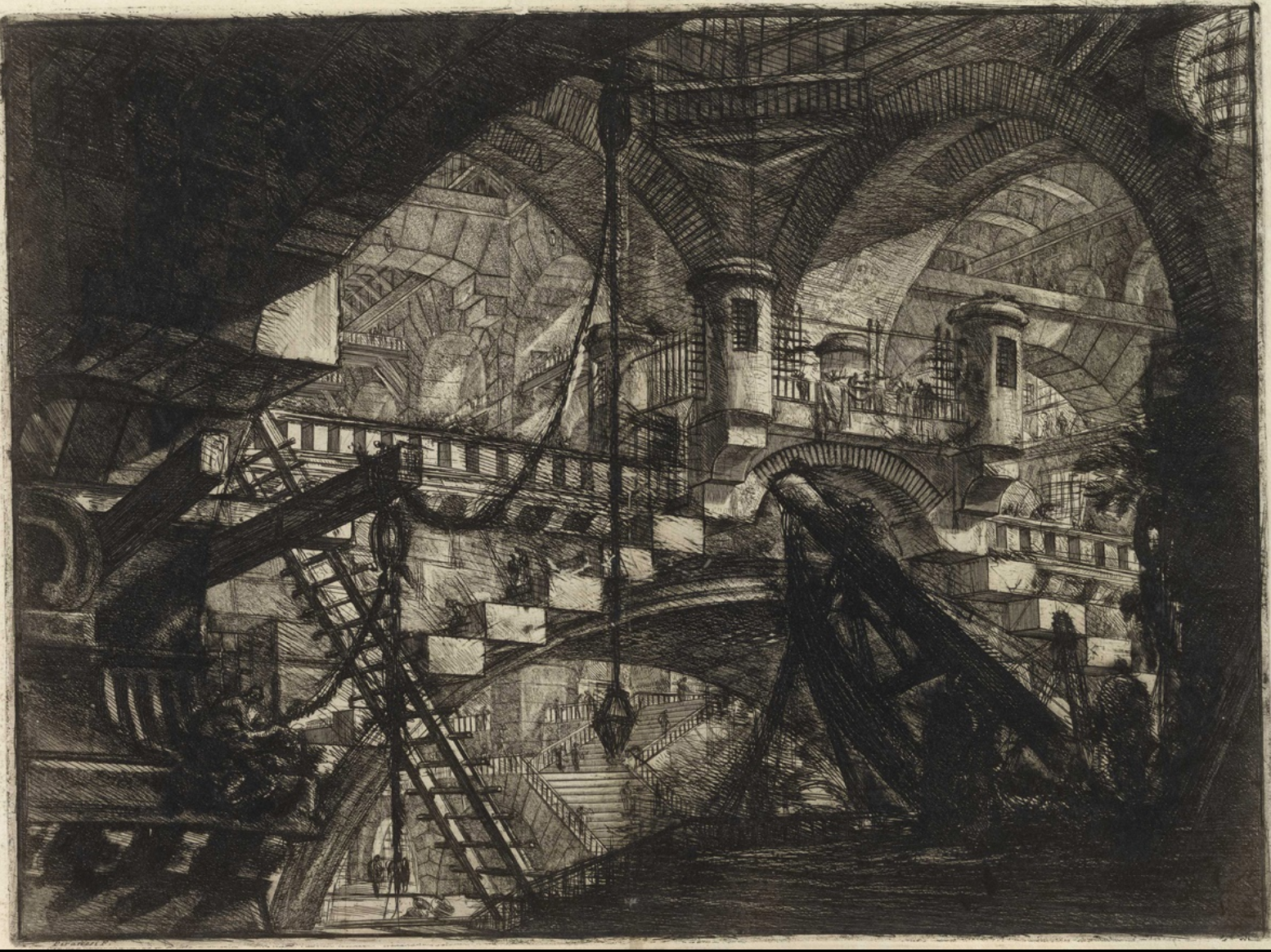
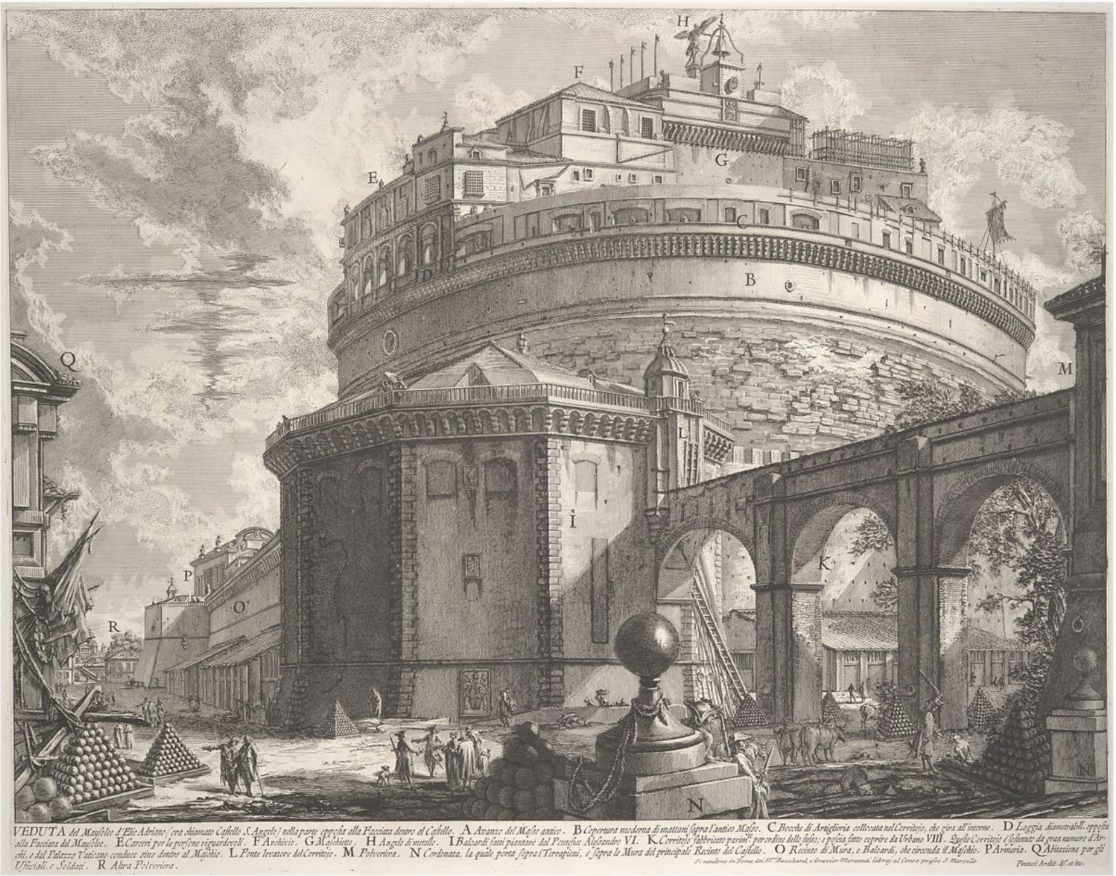
Giovanni Battista Piranesi
He’s most famous in art history for his imaginary Prisons series, above, but his day job was making straight-forward engravings of exisiting buildings–kind of an 18th c. version of a travel souvenir for travelers to take home with them.
This dichotomy reminds me of the two paths I’ve seen you entertaining for the past 5 weeks. Glad you’ve come down on the side of the angels.
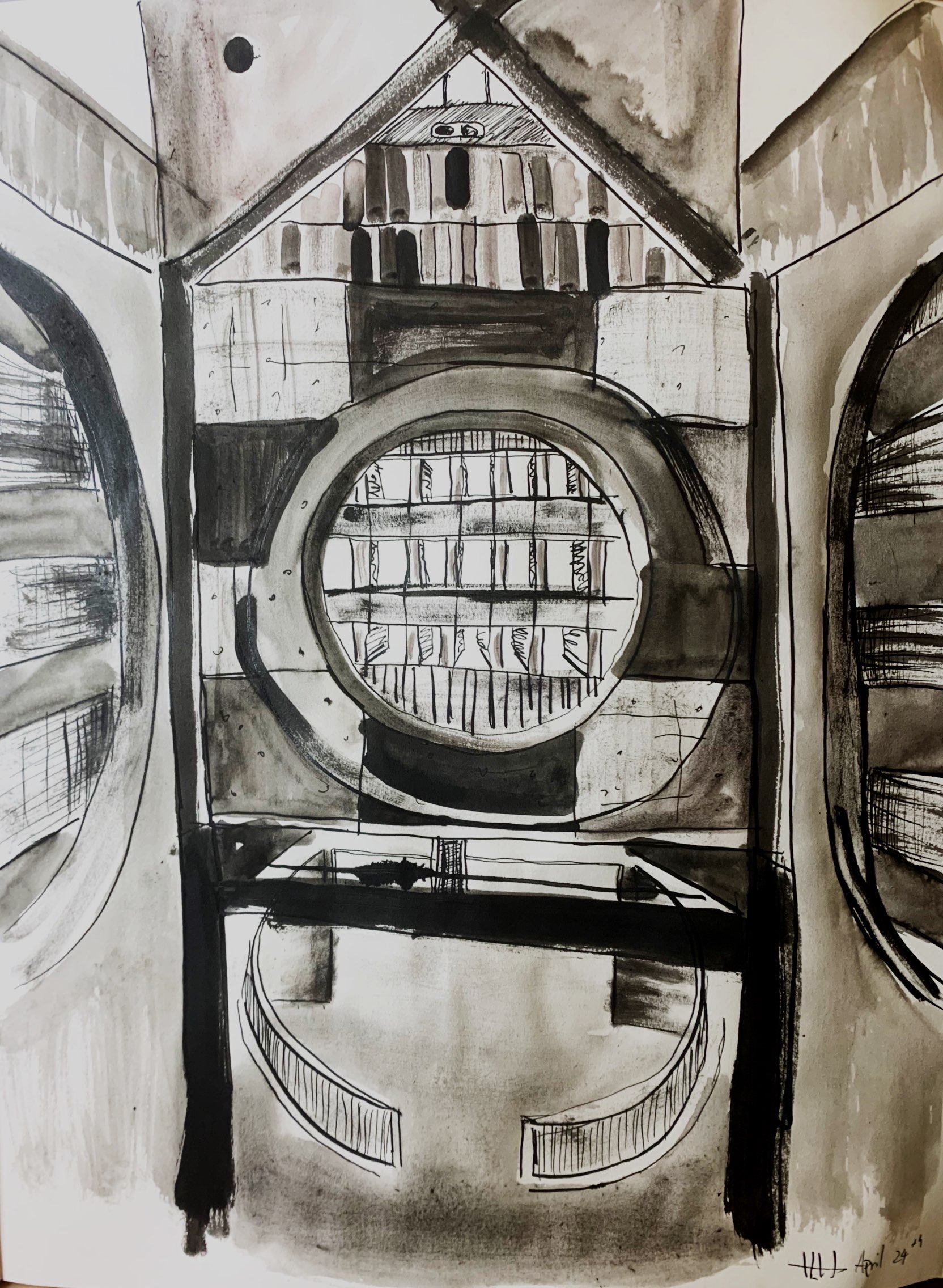
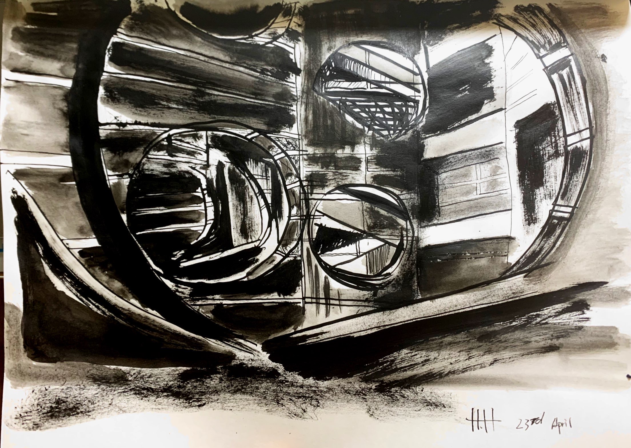
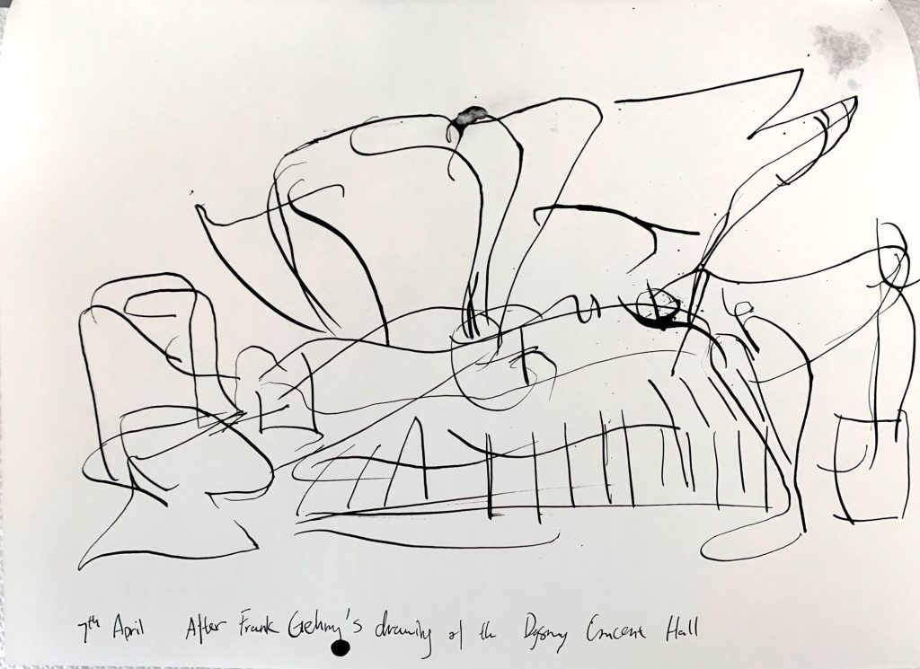
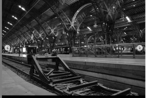
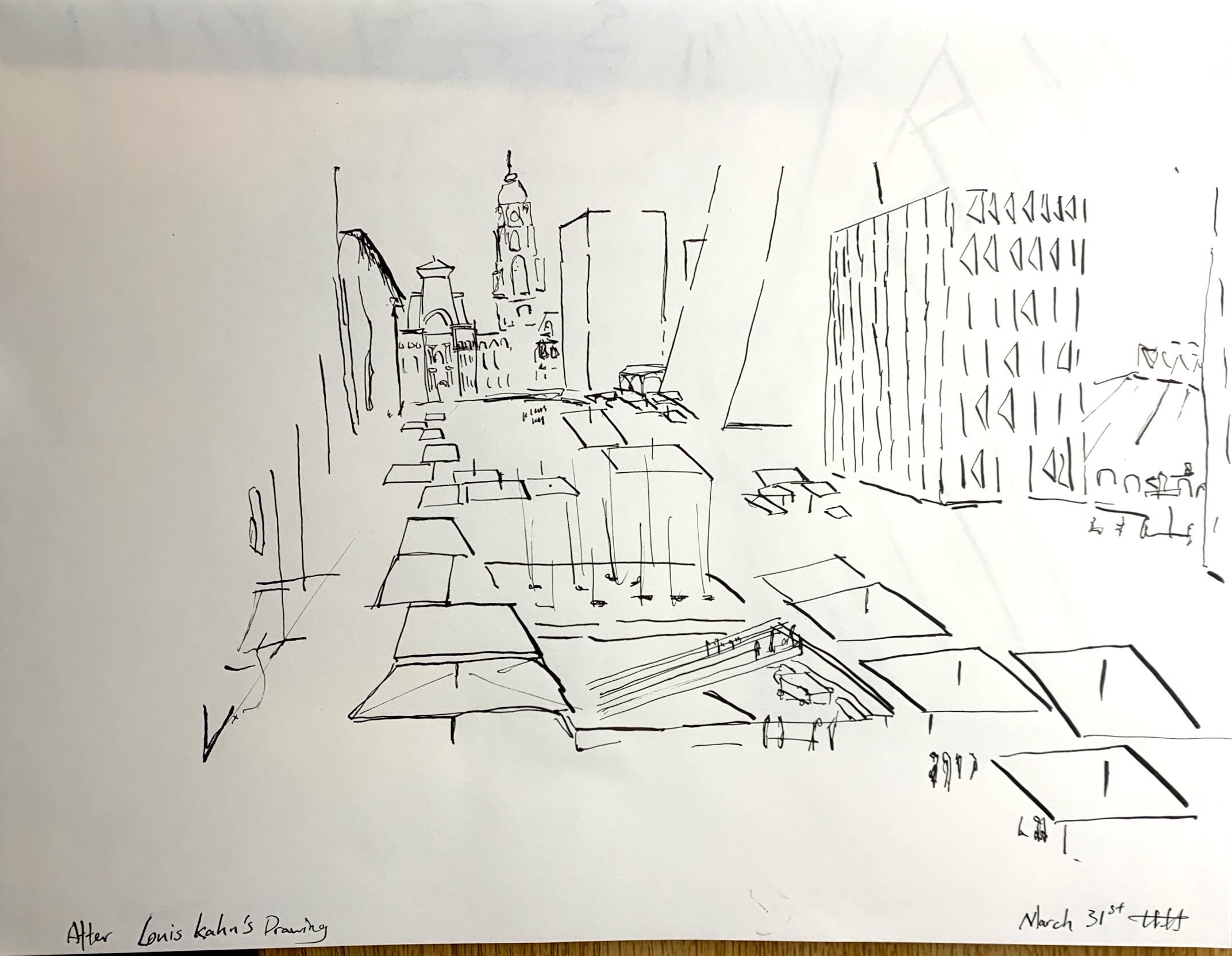
I switched back to pen and ink and added brush and ink wash to the formula. I took myself back to some of Louis Hahn’s architecture and chose some of the photographs that are more geometrical terms of composition. I decided to be more expressive with my strokes.
Compare to my attempts last week, I feel more comfortable with my current approaches of putting my focus on lighting, texture, and especially on geometries and gestures.
I still have some doubts about my methods: 1) Is the amount of texture variation distracting? would the drawings benefit more from simpler use of material? 2) Should I do the next drawings from life?
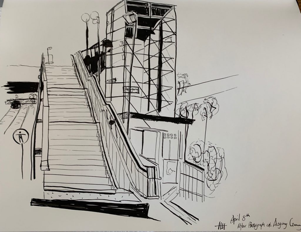
More Buildings
X
See my remarks about this Leon Kossoff drawing in my comment.
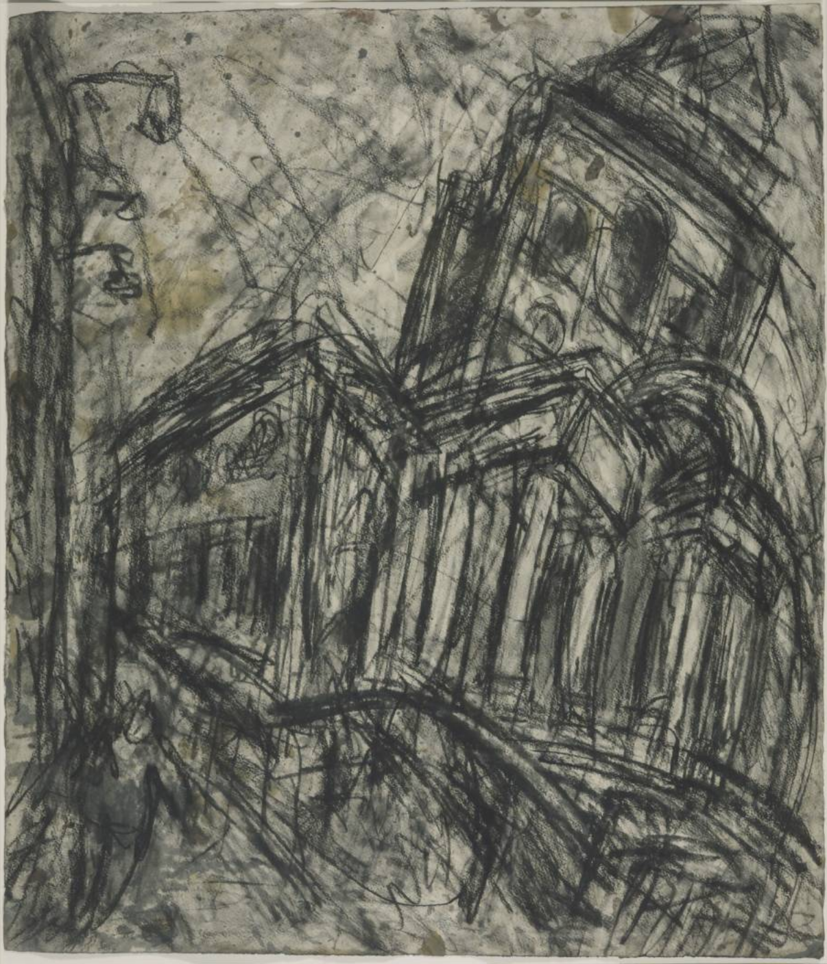 Leon Kossoff
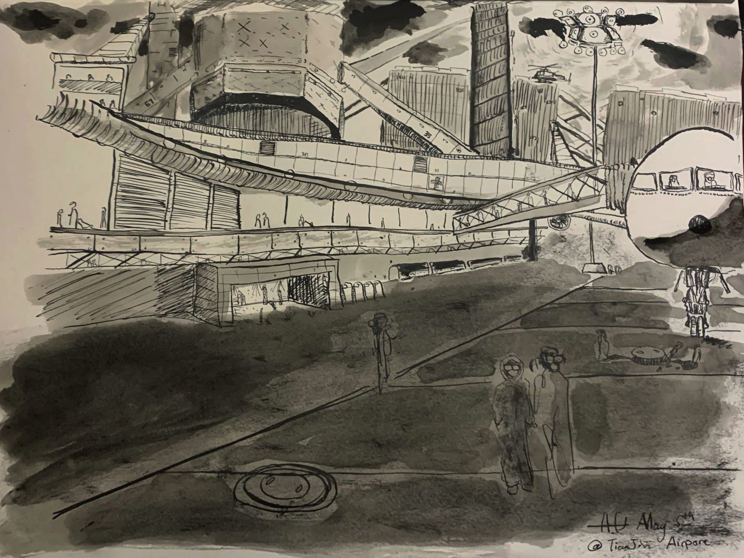
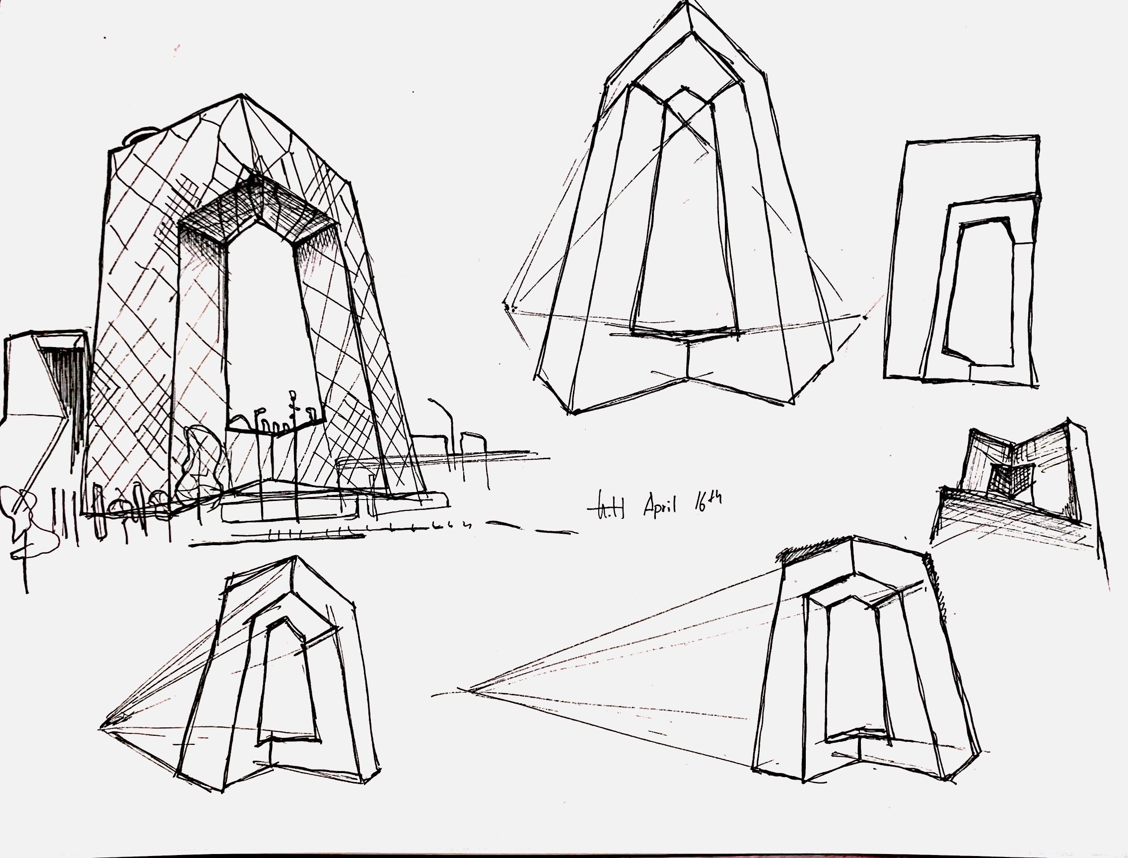
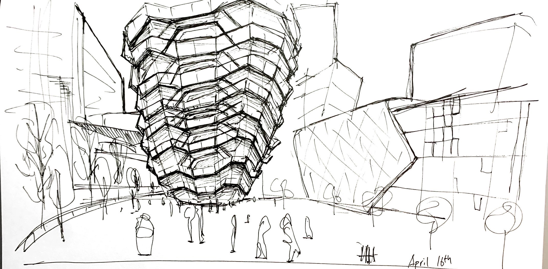
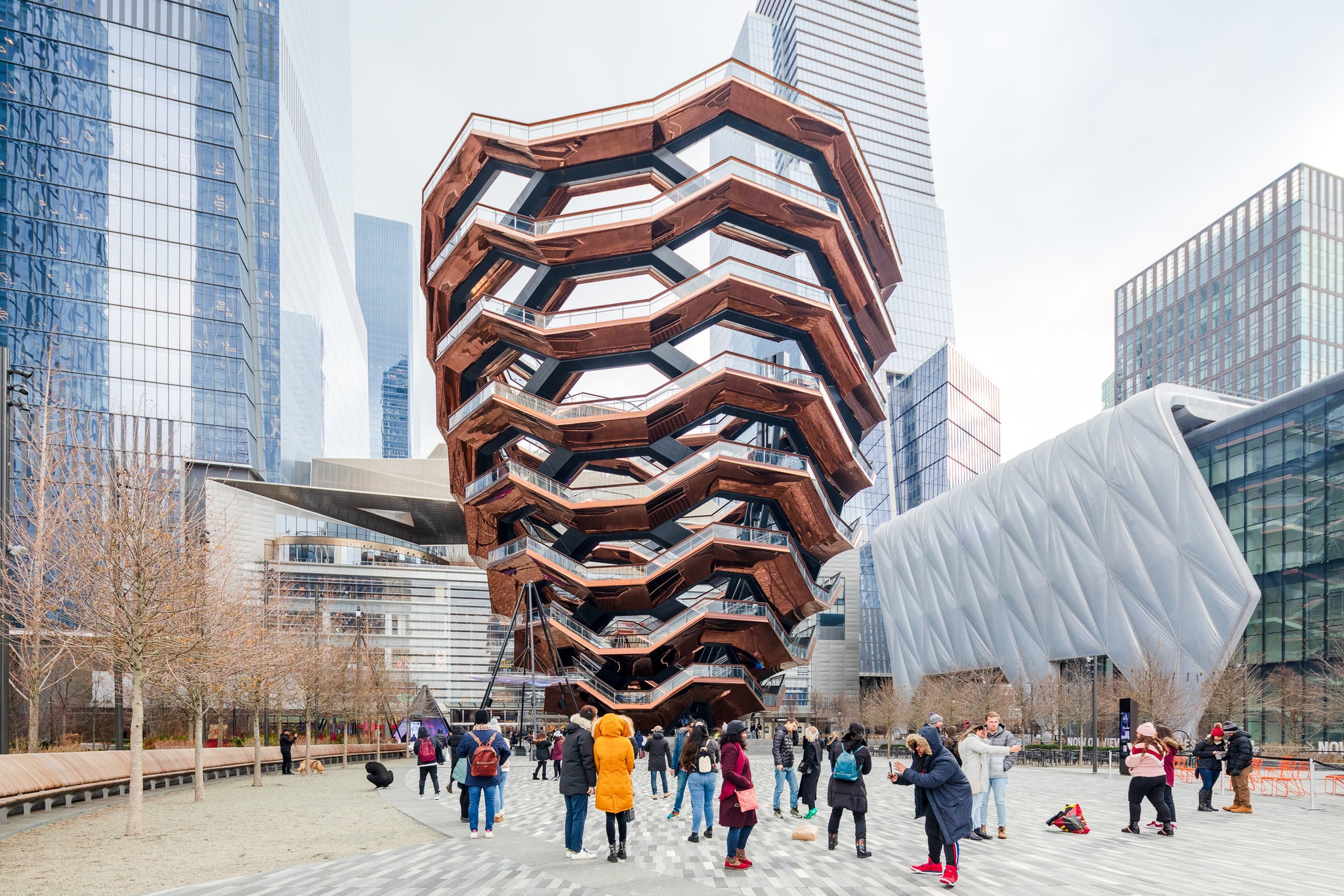
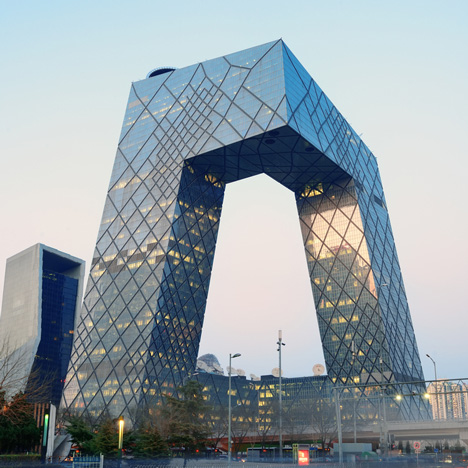
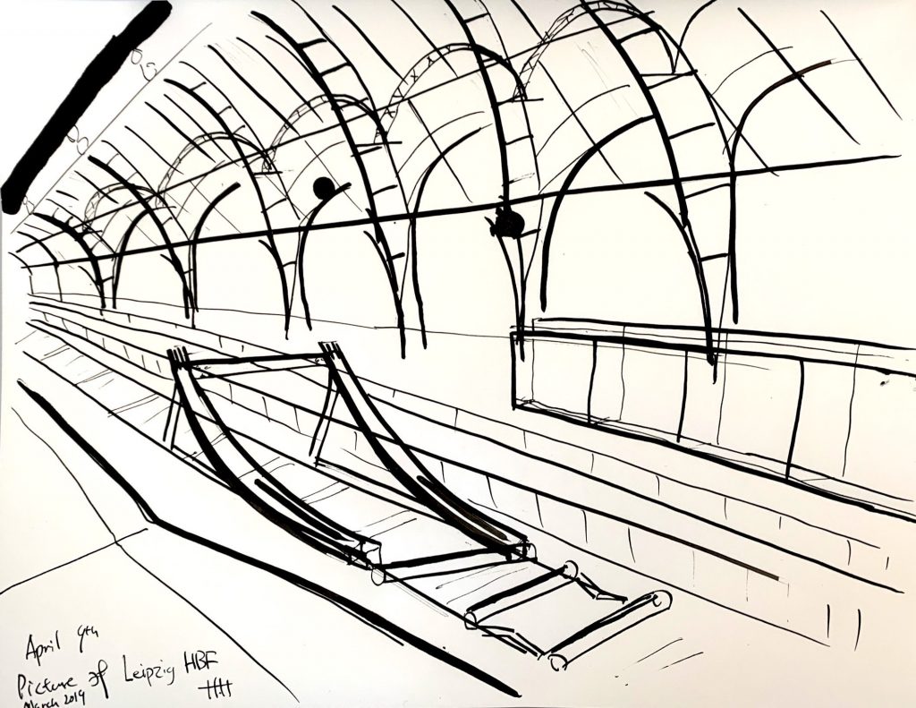
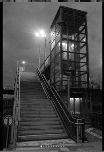
This week I decided to tackle the structure of a building. I switched back to micron to gain finer and smoother control. This comes with the opportunity for me to first make more gentle and suggestive marks at first, to indicate structurally outline, then move in with the bolder and affirmative lines for details and correction. I also included a few prospective studies to help me understand the irregularity of the building’s form. The CCTV tower turns out to be slanted, even before perspective skews it. The vertices had an inclination rather than being perfectly normal to the ground. It turns out even if I used to see it every day back when I lived in Beijing, I have no idea of its exact form unless I make a visual study of it.
I enjoyed this kind of drawing a lot more than I thought I would’ve. The switch of the medium was uplifting since I no longer have to worry about control over ink volume. However, the switch does come with a drawback of less vibrant lines as well as reduced confidence both in line-quality as well as my decision making, inherent to the fast-paced nature of micron.
References:
3D rendering

Architecture Drawing
My prompt this week was similar last week. I got back to studying architect’s drawing and making my own from photographs from both photographers and my own.
I spent most of my time still, getting familiar with the medium. I found myself gaining better control over producing various line qualities. I started to experiment on using thinner lines to describe both structural information as well as texture details. These lines had such small visual weight to them. Thus they could be extremely quiet in an ordered formation, while capable of producing noise and attracting attention if drawn messy and unorganized.
I’m still having trouble with pinpoint accuracy with perspectives. I found it harder without settling down the major structural lines using thin sketch lines. Meanwhile, I do enjoy the decisiveness of tackling the structure right away.
X
X
X
Sources:
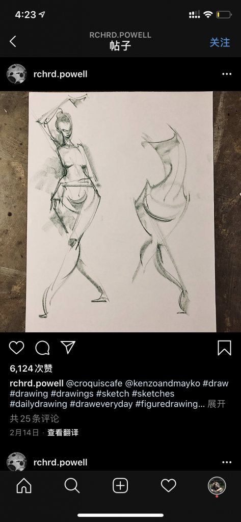
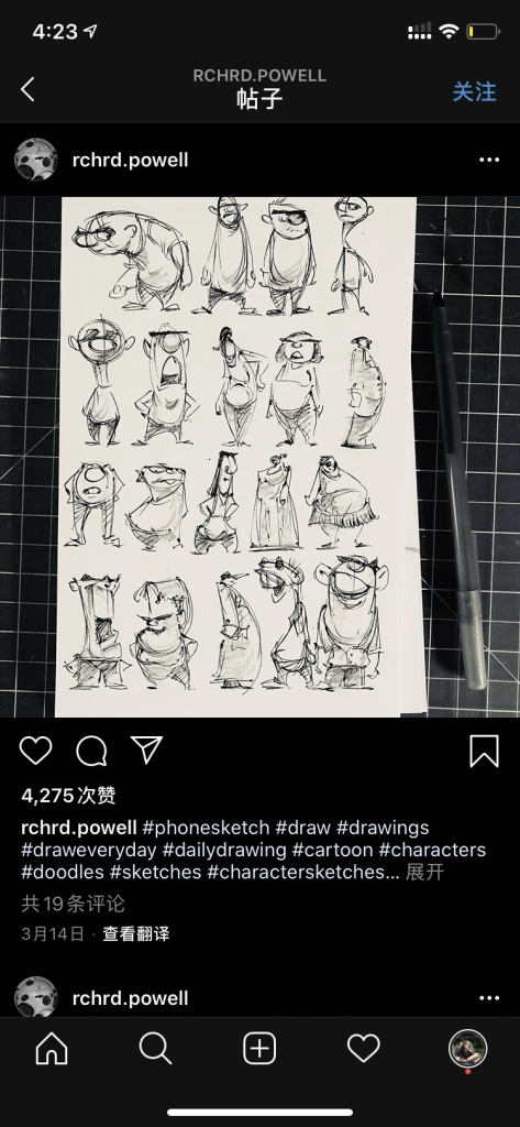
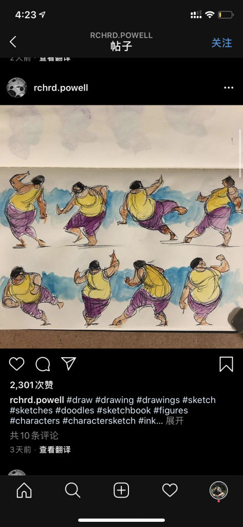
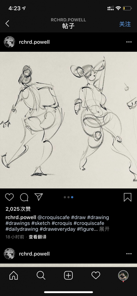
Gesture Drawings
Some Fun Gesture drawings and figure & character designs I came across on Instagram by Richard Powell:
https://www.instagram.com/rchrd.powell/
Architecture Drawings
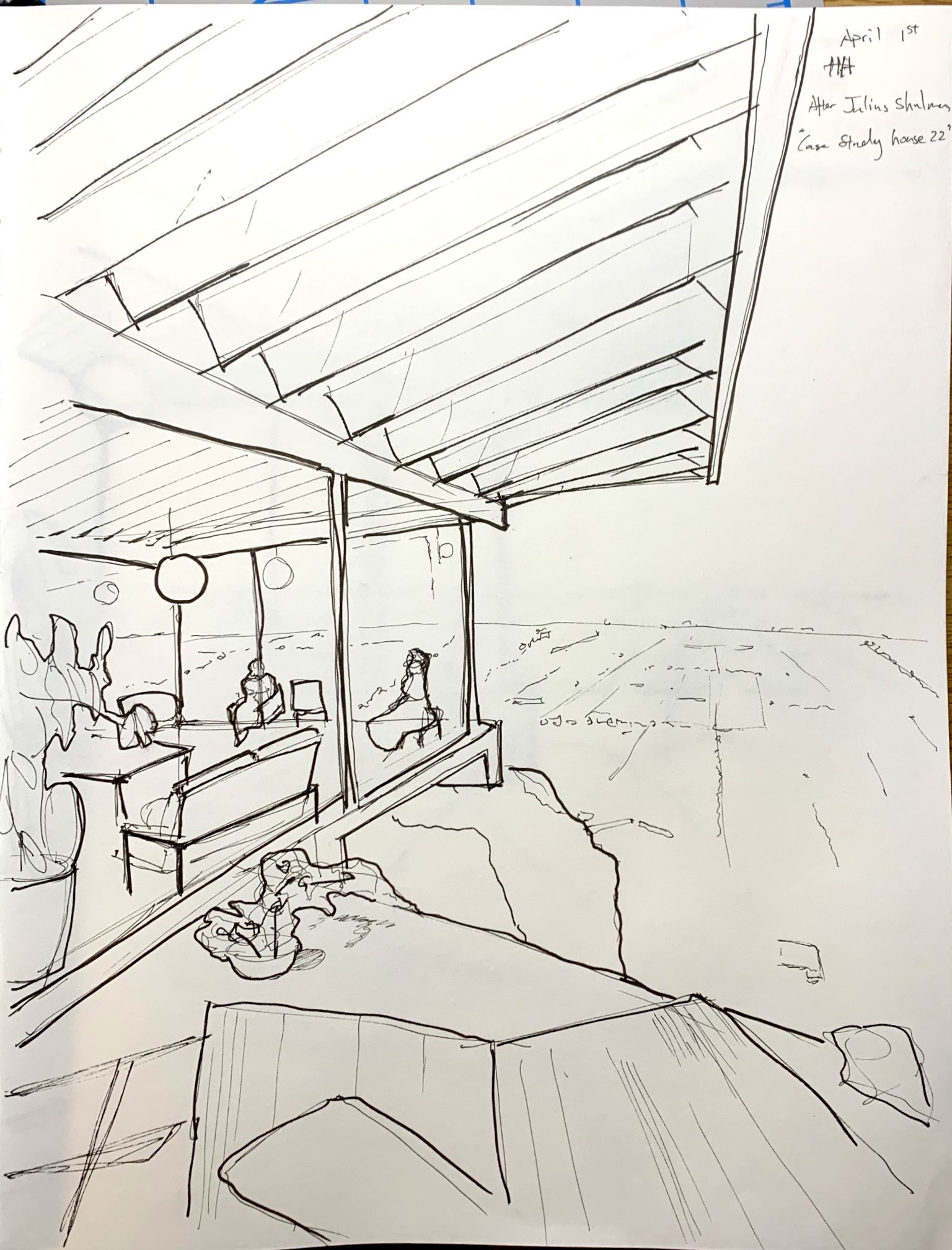
I spend the first few days drawing to get to grips on the medium and the mindset of a perspective drawing. I started with studies of architects’ sketches and drawings, trying to learn how perspective is described, and how line quality helps deliver the depth of field as well as quality and form of the subjects. I then moved on to exercises on trying to describe an image. I started working existing images, for the sake of convenience and accessibility.
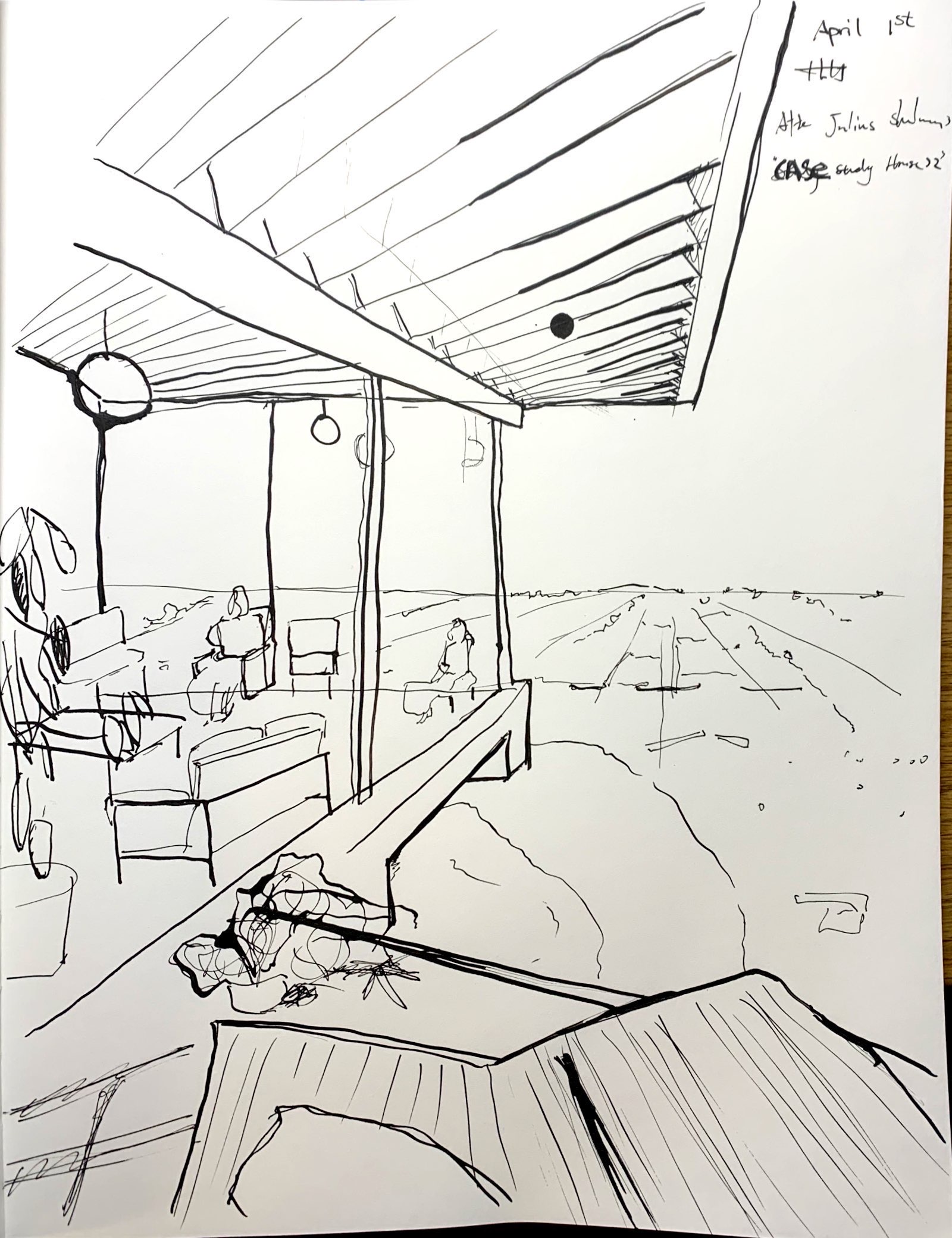
I remembered that Julius Shulman (an architecture photographer) had a photograph of the apparent depth of field and a linear, easy to articulate architecture. This photograph became my starting point of experimentation. I used both micron pens and dipping ink pen. I have to stress how much more satisfying it was to work with pen and ink, given the variety of line quality I’m able to achieve with it.
The next step will be studies of more architect’s drawings as well as making my own drawings from life.
Drawings Are in Chronological Order:
X
X
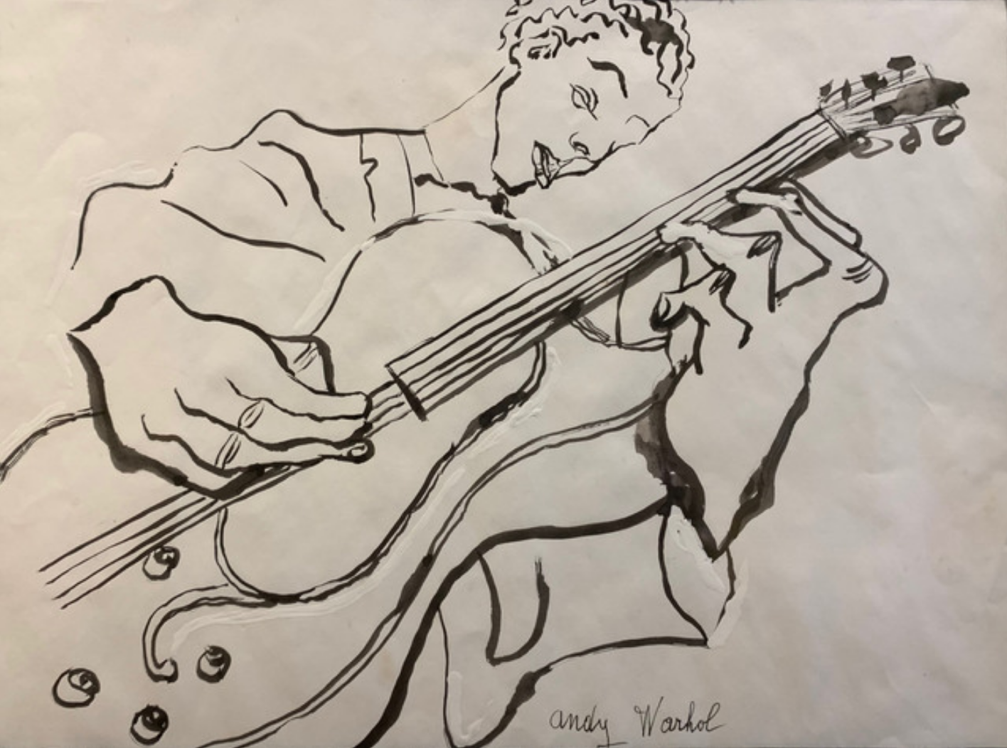
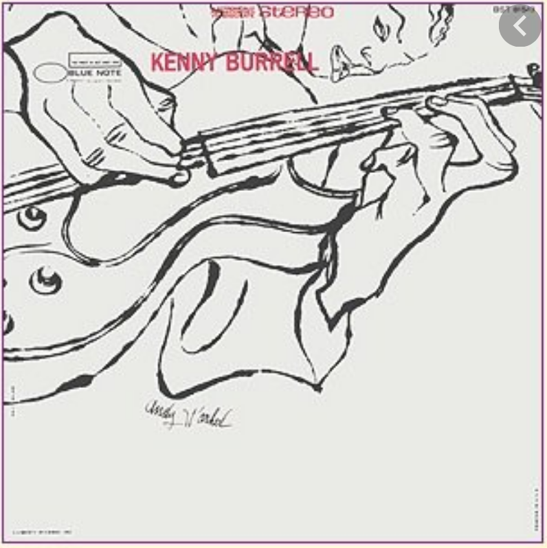 …and how they cropped and rotated it (and moved his signature) for the album cover. Don’t know what he was paid for it originally but it was recently priced at $125,000.
Attached are drawings were copies after Louis Khan and drawings on Julius Shulman’s photograph Case Study House 22 (Stahl House by Pierre Koenig, Hollywood).https://www.moma.org/media/W1siZiIsIjY0OTIiXSxbInAiLCJjb252ZXJ0IiwiLXJlc2l6ZSAyMDAweDIwMDBcdTAwM2UiXV0.jpg?sha=59ea14c058450229
http://blog.dwr.com/wp-content/uploads/2016/03/StahlHouse_Shulman.jpg
April 2nd