X
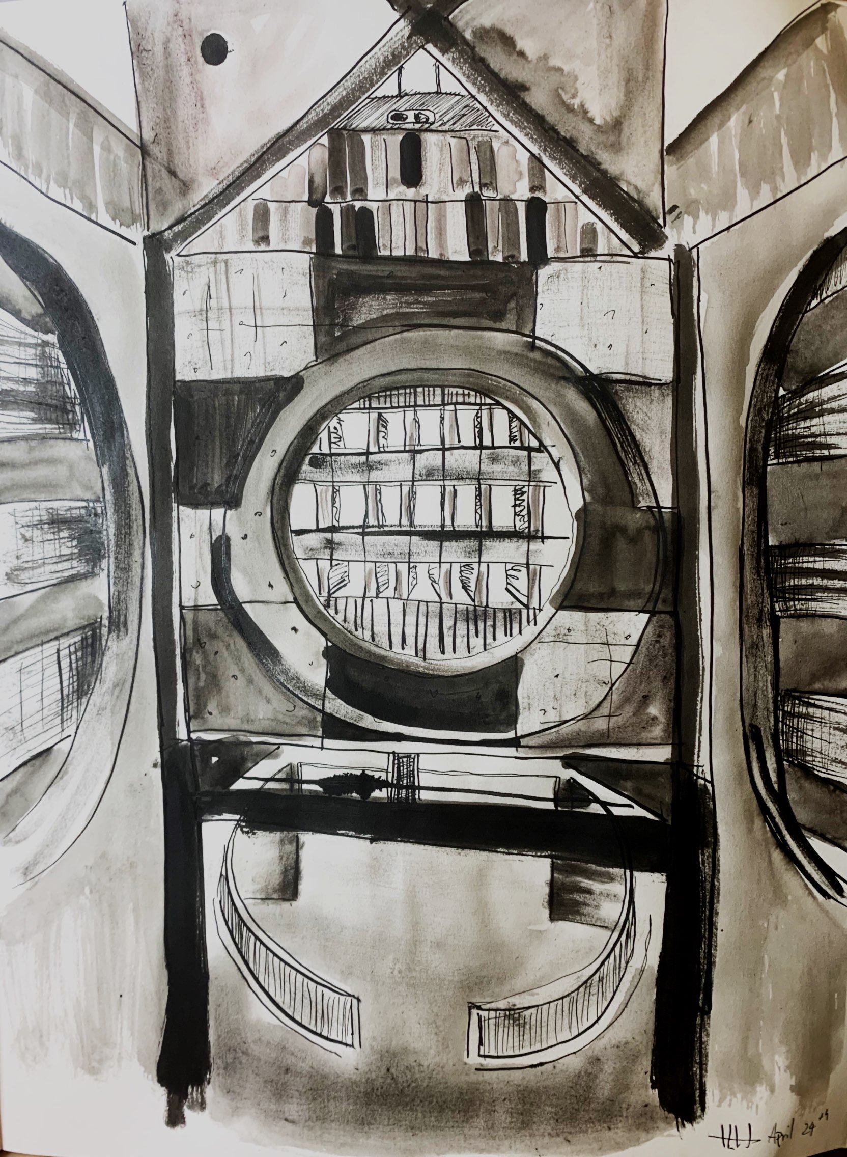
Are these washes really brown, or is that the photo? If they’re black and white, use the Saturation slider to remove the color.
And the exposure on this next one…what’s the word? Oh, yeah–SUCKS. Please take a better photo of this one for the class show (no cast shadows and no glare on the ink).
X
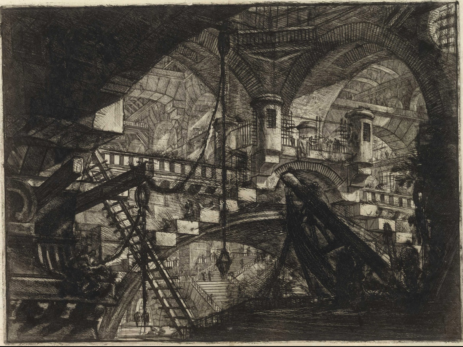
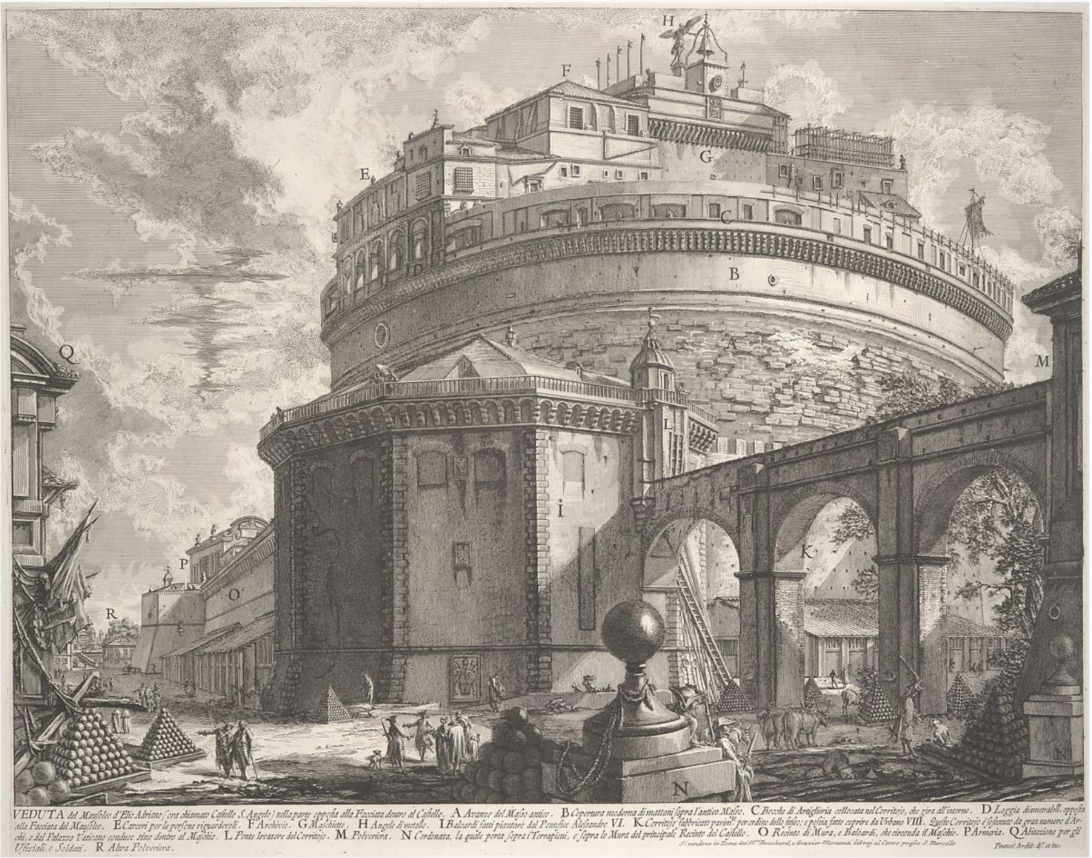
Giovanni Battista Piranesi
He’s most famous in art history for his imaginary Prisons series, above, but his day job was making straight-forward engravings of exisiting buildings–kind of an 18th c. version of a travel souvenir for travelers to take home with them.
This dichotomy reminds me of the two paths I’ve seen you entertaining for the past 5 weeks. Glad you’ve come down on the side of the angels.
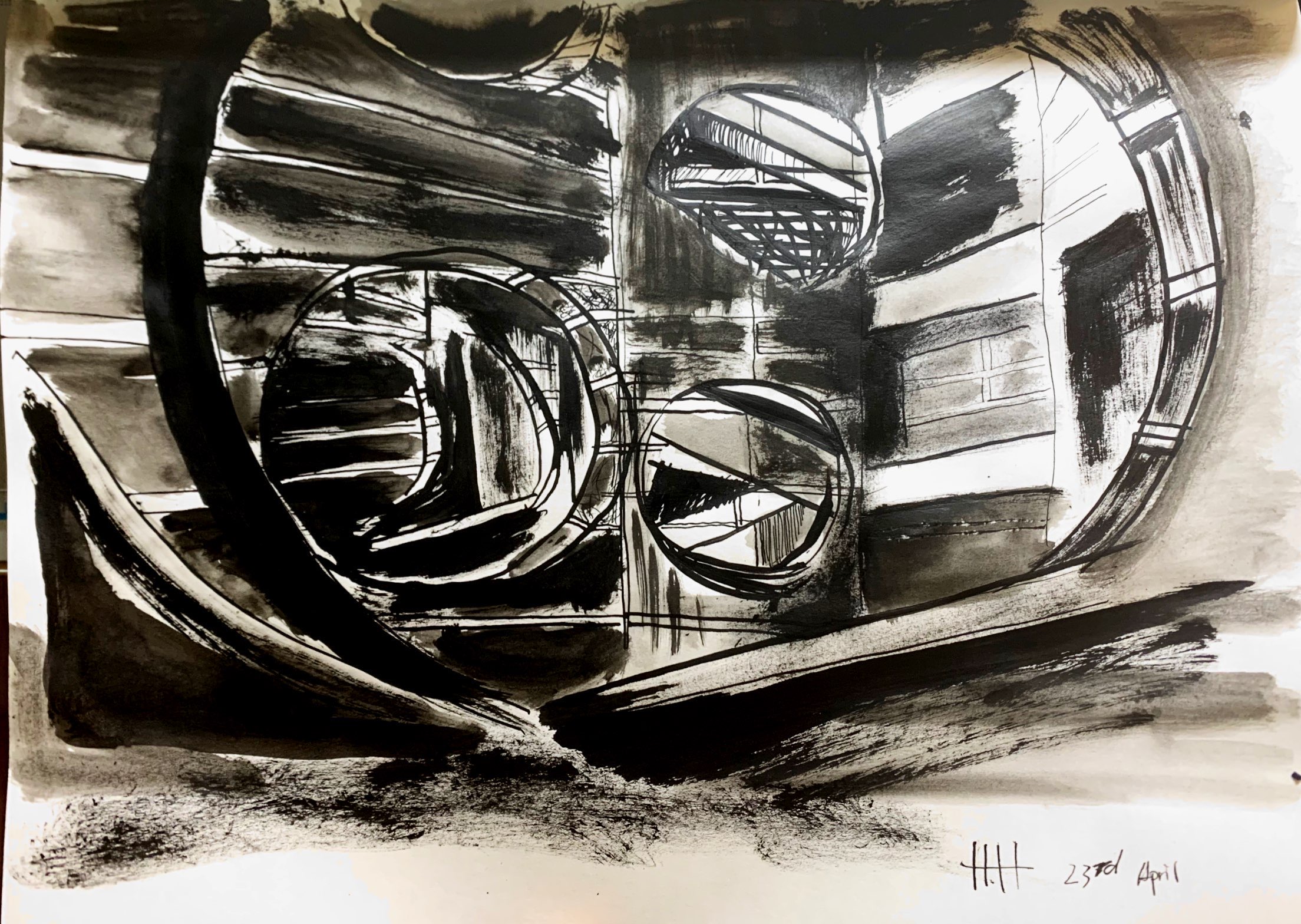
I switched back to pen and ink and added brush and ink wash to the formula. I took myself back to some of Louis Hahn’s architecture and chose some of the photographs that are more geometrical terms of composition. I decided to be more expressive with my strokes.
Compare to my attempts last week, I feel more comfortable with my current approaches of putting my focus on lighting, texture, and especially on geometries and gestures.
I still have some doubts about my methods: 1) Is the amount of texture variation distracting? would the drawings benefit more from simpler use of material? 2) Should I do the next drawings from life?
Harry
This is an interesting set. I really like the second piece you did, the one with darker brush strokes capturing the views of the circular windows. I think the looser expression of your marks here pair nicely with the structure of the building. I feel like the sporadic placement of the windows lends itself to renditions that are more abstract. I also like this richness of the ink.
You asked about texture and material. Personally, I think simplifying would be the wise move here. Particularly with your first, I feel like there’s too much variety to get a good sense of the building itself. While I appreciate your lively attack, I think your marks are generally too loose. By adding more expression, you started to sever your connection to reality. The drawing doesn’t follow any perspective guidelines very rigorously, and as a result it feels pretty flat.
Personally, I really liked your drawings that were done with only ink, especially the ones with the dip pens. I think this is where you should dive deep.
I think drawing from life could be cool, but it would be a departure from what you’ve done so far. However, perhaps now’s a better time to apply your arch rendering skills to the real world than there ever will be during your time at Bowdoin. So, my suggestion to you would be to draw at least one of each–one from a reference, on from life. That way, you can produce something that you’re already confident in making while pushing yourself to try a related pursuit.
Excited to see what’s next!
Jack
Hi Harry!
I like the dramatic feeling of these drawings! It feels like you approached these buildings from an artistic perspective rather than an architectural or design perspective. As a result, they feel much more expressive and dynamic! Louis Kahn’s architecture is amazing.
You ask good questions. I’m not sure I have the answers, but you can read my thoughts below:
1) Is the amount of texture variation distracting? Would the drawings benefit more from simpler use of material?
I love the variation in texture, shape, and size you create. I do think the values could be more thoughtfully placed so that we have a clearer sense of what is highlighted and what is in shadow. This would also prevent the forms from appearing like a pattern and instead make them more three dimensional. I love your variation in use of the black ink, grey wash, and lighter highlights. They make the composition visually interesting, particularly in your first drawing.
2) Should I do the next drawings from life?
Personally, I think drawing from a photo for this subject matter is perfectly fine, and it will continue to give you access to interesting architectural forms like the ones you chose.
Looking forward to seeing your final project!