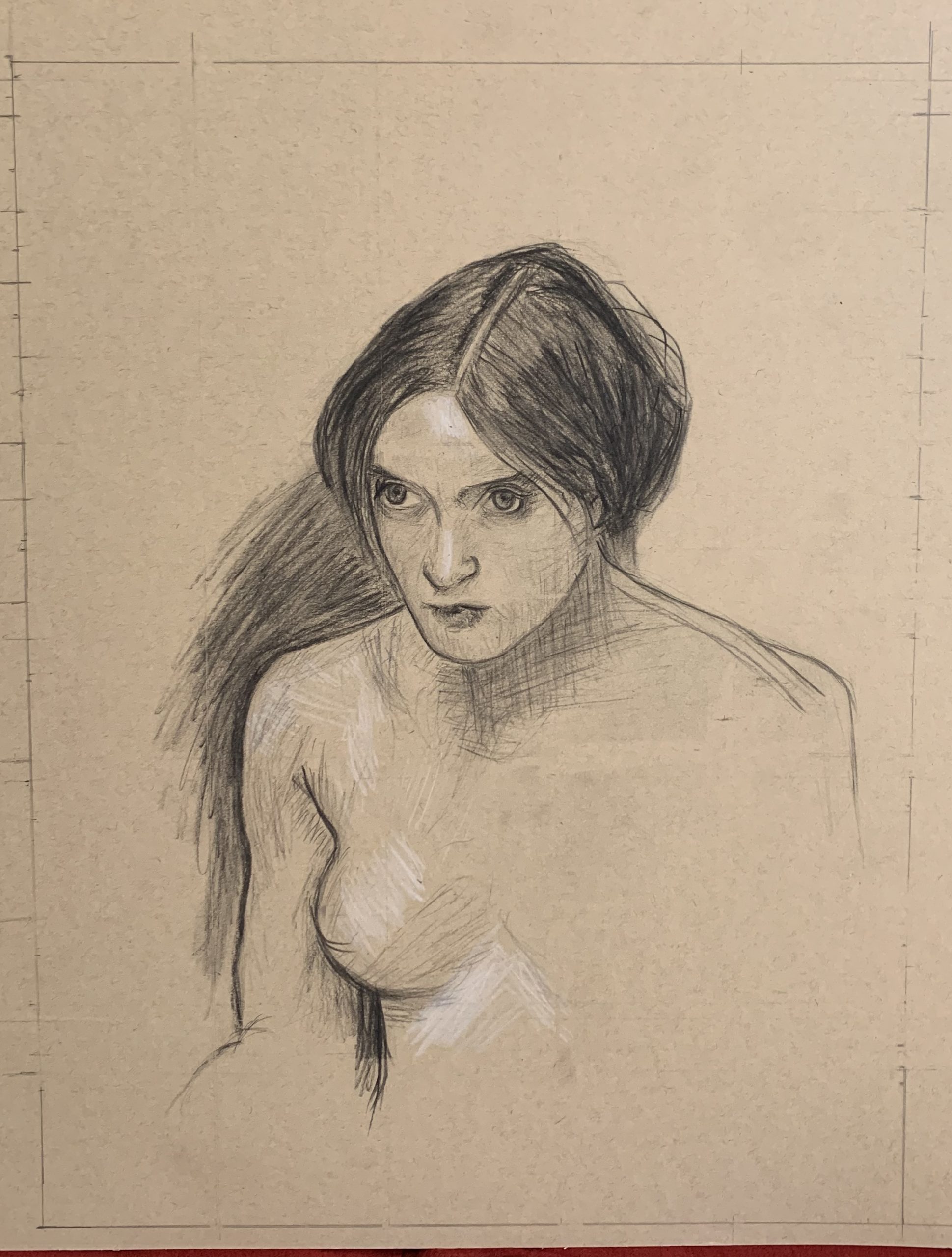
John William Waterhouse portrait
Despite your doubts, this is a fine rendition of the Waterhouse. As I mentioned to you elsewhere, even if he did a second version it would come out differently. Expressions like being pensive and being angry often hang on the slightest of nuances–raising an eyebrow a scintilla, the slightest flair in a nostril.
I notice here, as in your self-portrait below, that you’ve added space above her head. This also has a psychological effect on how we read the image. Composition contributes to meaning as much as (maybe more than) any other element.
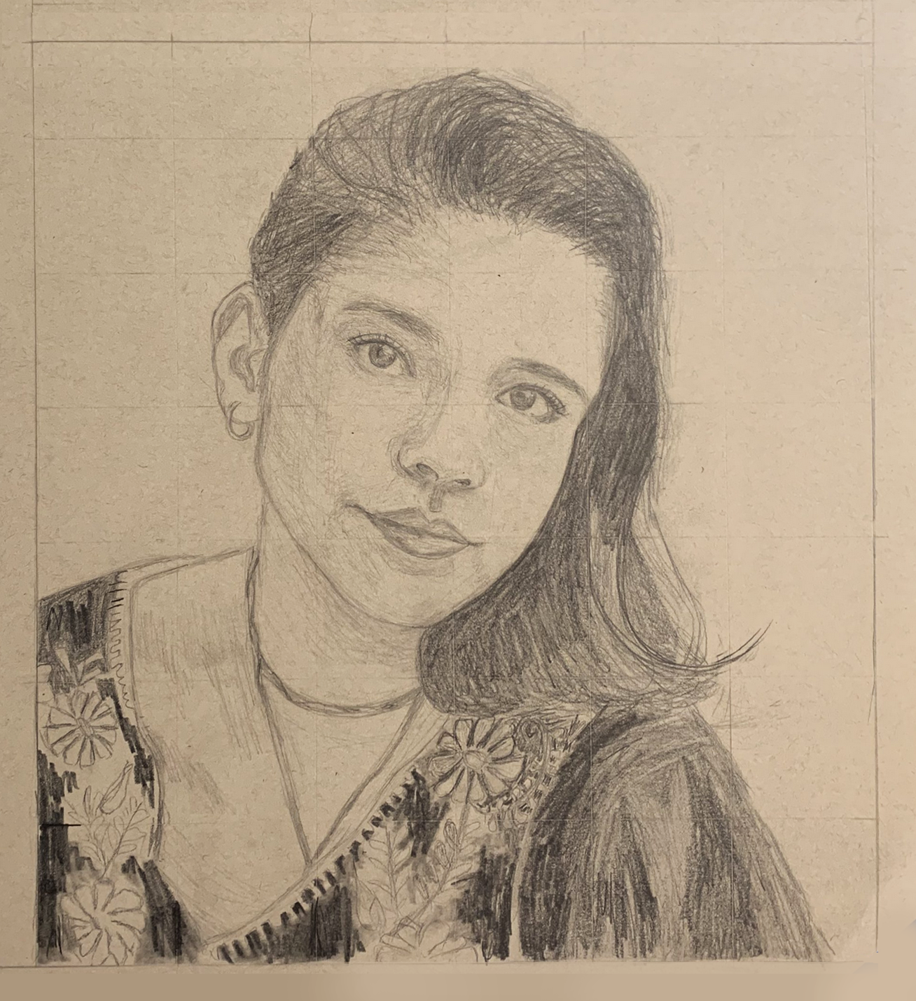
Charcoal pencil on paper. 12.5X16
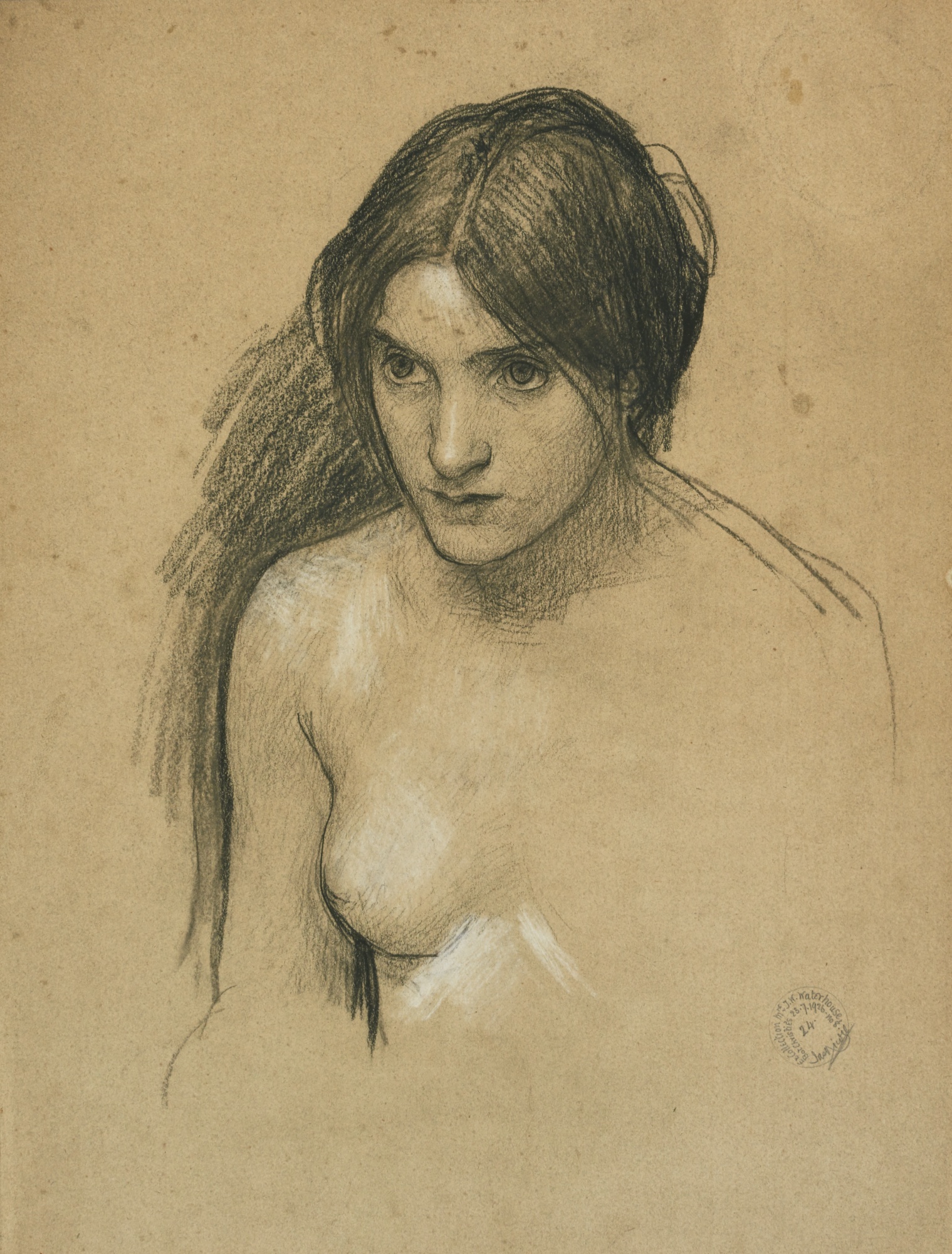
X (but with a better cropping)
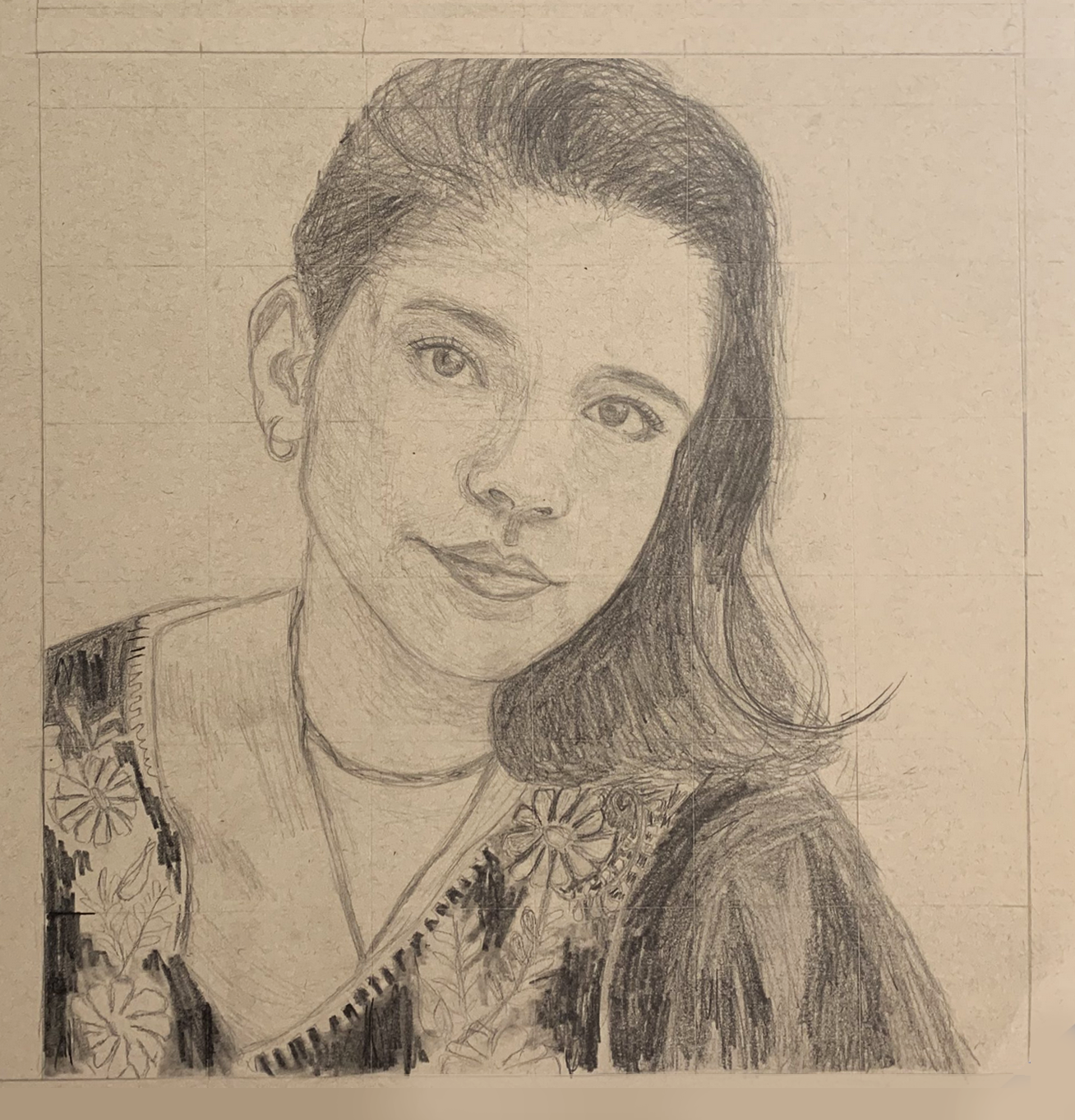
First, I squared up the image (below), gave it an even border (you should leave more than that bottom edge at the start–at least an inch, in case it ever gets matted and framed), removed the tape, and increased the contrast slightly, just to make the drawing more legible….
Then I’m suggesting cropping it closer to the top of the head. A rule of thumb in portraiture is to have the eyes in the upper half of the composition. Yours are about half way down, which makes the figure feel more diminutive (both physically and expressively).
But I’d go so far as to crop into the hair slightly, which activates the negative spaces to either side of the head (and therefore all of your other shapes), and draws more attention to the eyes. It also creates a more uniquely proportioned rectangle rather than the business-as-usual rectangles that paper (and photos) come in.
As for the drawing itself–it’s beautiful.
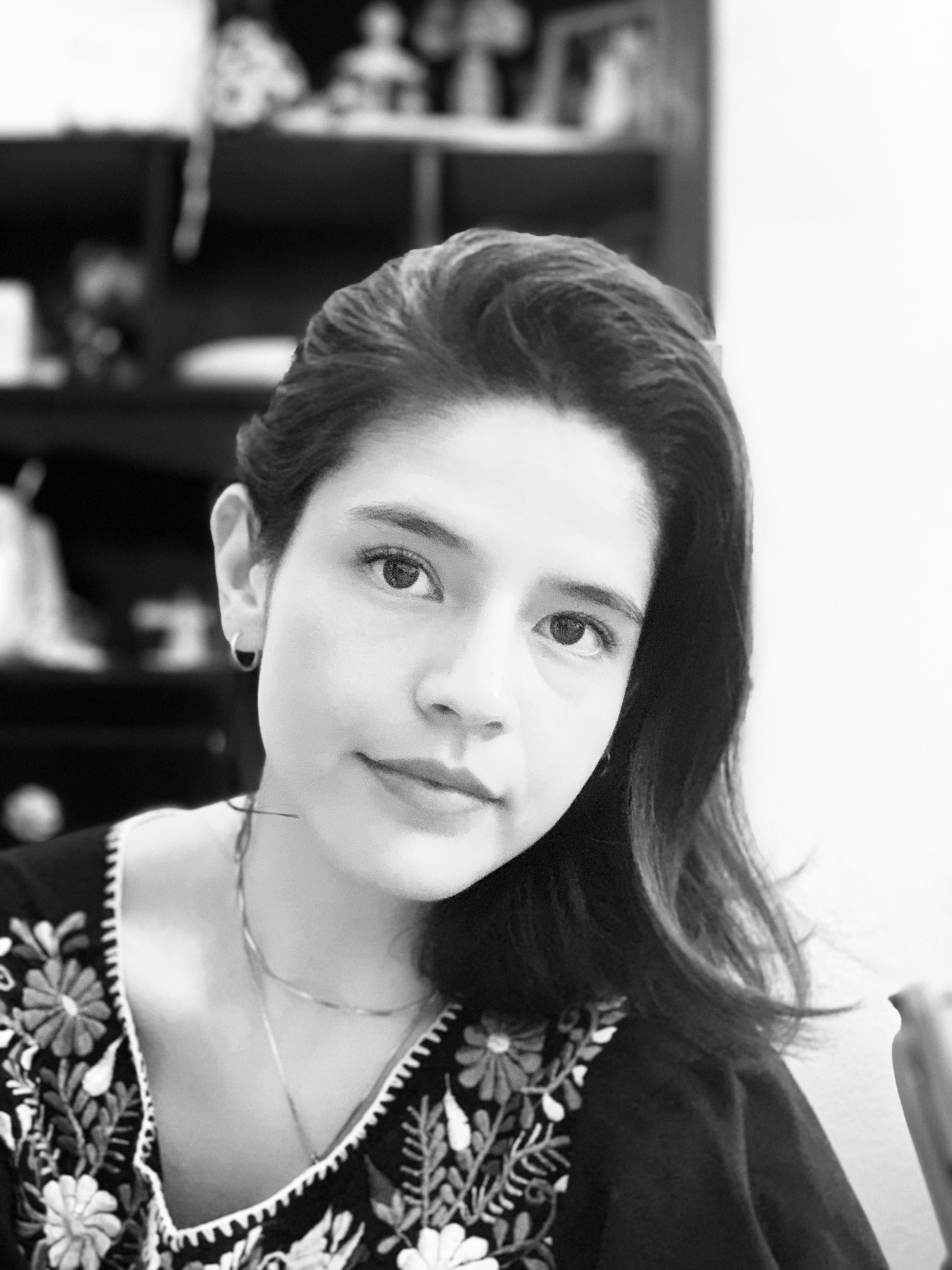
Drawings are like lie detectors–this one is telling us you’re more captivated by the patterns on the dress than the portrait. The portrait is great but drawn with a certain reservation. Punching up the contrast in the eyes alone would help a lot. Also, her right eye (on our left) should be a bit closer to the bridge of the nose. As in the photo, note how the tear duct is directly above the side of the nostril. You nailed this on the other eye.
As in the Waterhouse copy, being on toned paper, this is ripe for some white highlights. They only need to be very delicate but they’d add a lot, especially given the light in the photo–
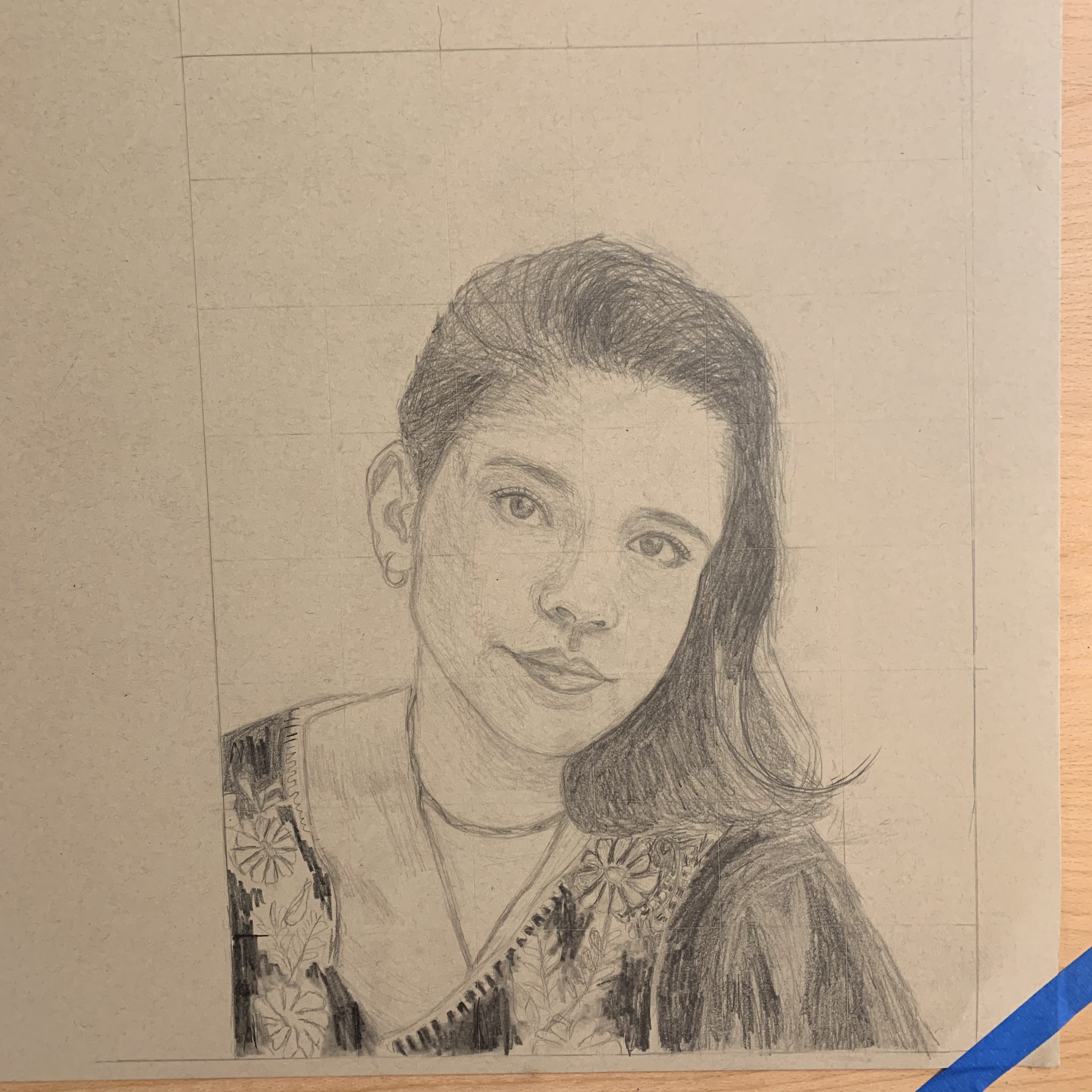
Pencil on paper 12 X 16
I just not realized that the weekly assignments Mark sent us were just a suggestion and for the Drawing I class. I’ve been more concerned with completing the assignments than with maintaining my thesis. I was so confused why everyone else wasn’t following, and this is why there has been such a disconnect between my works.
ANYWAY
There is some continuity though. Both of these drawings are portraits and from photos. The first is based off of a John William Waterhouse study. And the second is from a photo I took on my phone for the “self-portrait” assignment. (I’m really kicking myself for this) I’m more please with the Waterhouse drawing but I don’t think I successfully captured the look in her eyes. My eyes are more intense while the original’s are not. I also think I made the face shorter than it really is. And the nose more pointy than it should be.
For both of these drawings, I placed a grid on the photo to help with my spacing. I think it was successful in the first but didn’t really help me with the second. The eyes do not align with each other and the shape of the face is off. The forehead is more square than my reference. I don’t know man… I watched the videos mark sent us but I’m still really struggling with drawing the portrait. I’m going to do more studies this week to prepare for a drawing I will do of my sister.
Hi Megan!
Oh no! I’m sorry that you were confused about thesis vs assignments! But I think overall I haven’t felt like your drawings have lacked unity. You have a great style with pencil and you’ve stayed true to that throughout. Portraits are so hard and I feel like you did a really good job on these overall. I zoomed into the pictures and each feature is solid, detailed and beautiful. I agree that some things could be tweaked, especially the shape of your face like you said. I think that picture is also hard to use because there is a kind of glow that washes some parts of the photo out.
Your waterhouse portrait is also very solid and the hair is done beautifully. I think going forward, since we have a week or two left, you should choose some more familiar people to draw like your family or a picture of someone in your family (I liked your previous couch lounging ones) and use the skills you have to do those in the same pencil style you have been using. I like the idea of drawing your sister and doing more studies. One suggestion I would have is to be slightly looser in your drawings. Your light pencil ones are loose and lovely and I think you could do this even when you darken your marks. You seem to be a harsh self critic which can make it harder to loosen up with strokes (I feel like my line drawings sometimes suffer from that) but if you practice and then trust yourself I think it will all come together really well! You are a talented artist!!
Thanks for sharing these, they are beautiful,
Perrin
Hi Megan,
These are really great portraits, and I don’t think you should be in your head as much as you are about them. There’s always stuff that can be done better, but for me personally, trying to keep confident about my work and ability has been really important. Once I let things get in my head, and I let a drawing or some doubt or a couple mis-marks get me on the ropes, it’s pretty hard to get myself back to a spot where I feel on top of my game again and am making good decisions.
What I guess I’m trying to say is a) these are really solid, and b) don’t let yourself sweat it too much- just gotta keep going!
Regarding work 1:
There’s definitely something wonky about the proportions. It’s so pervasive in the drawing (even being in the arms it looks like), that I’m betting you actually made a systematic error in setting up the grid to transfer on. I think you made a small error in how you began the drawing, and the image got resized a bit.
Mark’s gonna kill me for saying this, but master studies drive me nuts so I really applaud how attentive you were in this drawing. The errant arm marks, the errant hairs, all really incredible. There’s also some great drawing in the facial features- the right eye is super killer, and the lips feel like there really close to also being there. The left eye I think is a bit wonky tbh.
2nd drawing:
I really really like this one. I tried to do a self-portrait last semester in painting, which I eventually abandoned since I just wasn’t happy with it- I think it’s really hard to draw yourself. There’s definitely a couple things in this drawing which make it different from how you look day-to-day, but they’re actually pretty few. In my opinion, I think it’s that:
-your face below your nose is a little longer
-your ear isn’t so curved, the long side is straighter
-your jaw isn’t so angular, it’s a bit rounder
Idk if these are actually right but they’re things I would check if you’re trying to figure out the small things that kinda went a different way this time.
But this portrait definitely looks a lot like you, and is a fantastic drawing in its own right. My favorite part is the marks on the shirt- there’s a really good energy to them, and I like how they are among the more lightly drawn flowers. I like the eyelashes too.
The thing I’d be really interested in seeing would be if you expanded your value range, and hit things a bit more darkly sometimes, especially to bring it towards the audience.
Keep it up!