X
X
See my comment about the following:
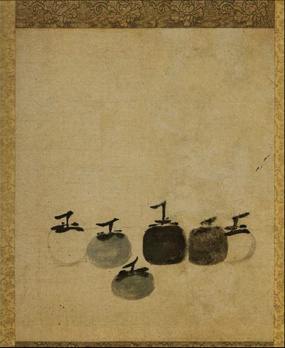
Muqi Fashang, Six Persimmons, Ink wash, 13th century
X
I’m suggesting that the one above and the next one down could be better composed to activate the page. They both feel a little cramped to me. Note the difference in the two revised versions I’ve included. I think it also isolates the objects more in space and makes it a bit more…forlorn?
There’s also something to be said for breaking out of the standard 9×12, 12×16, 16×20 world and working in a proportion that’s as decisive and unique as the images you’re making.
 Suggested composition
X
 Suggested composition
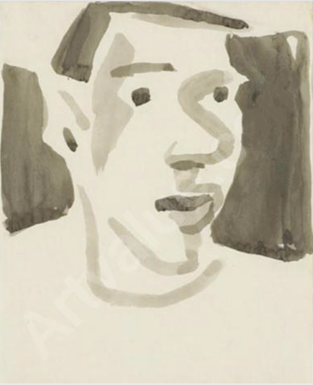
I ran across the following portrait of Richard Diebenkorn, by his friend David Park, and thought of your work. Just a few strokes, shapes, and values, but mostly about activating the white of the page.
Also an interesting hybrid of your two main approaches–insouciant brushwork with an activated ground, but still “tied off” to the sides of the rectangle.
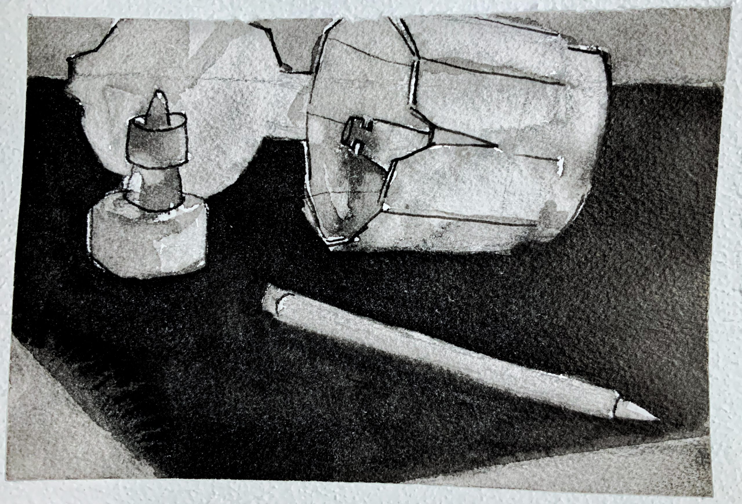
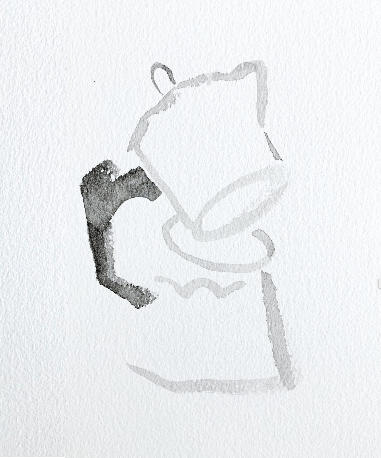
This week I started with the intention of continuing in the same vein as last week- full rectangles of value, close attention to areas of value.
However, it wasn’t going particularly well in my own opinion, which wasn’t helped when I tried to Hail Mary it with a dip pen.
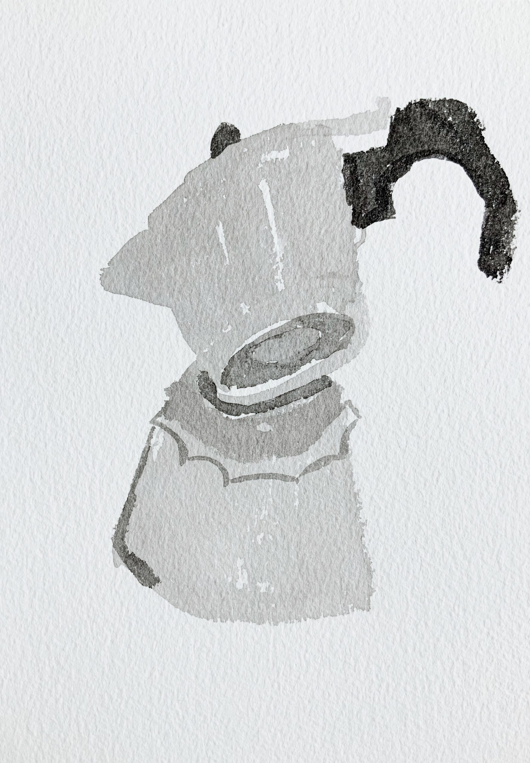
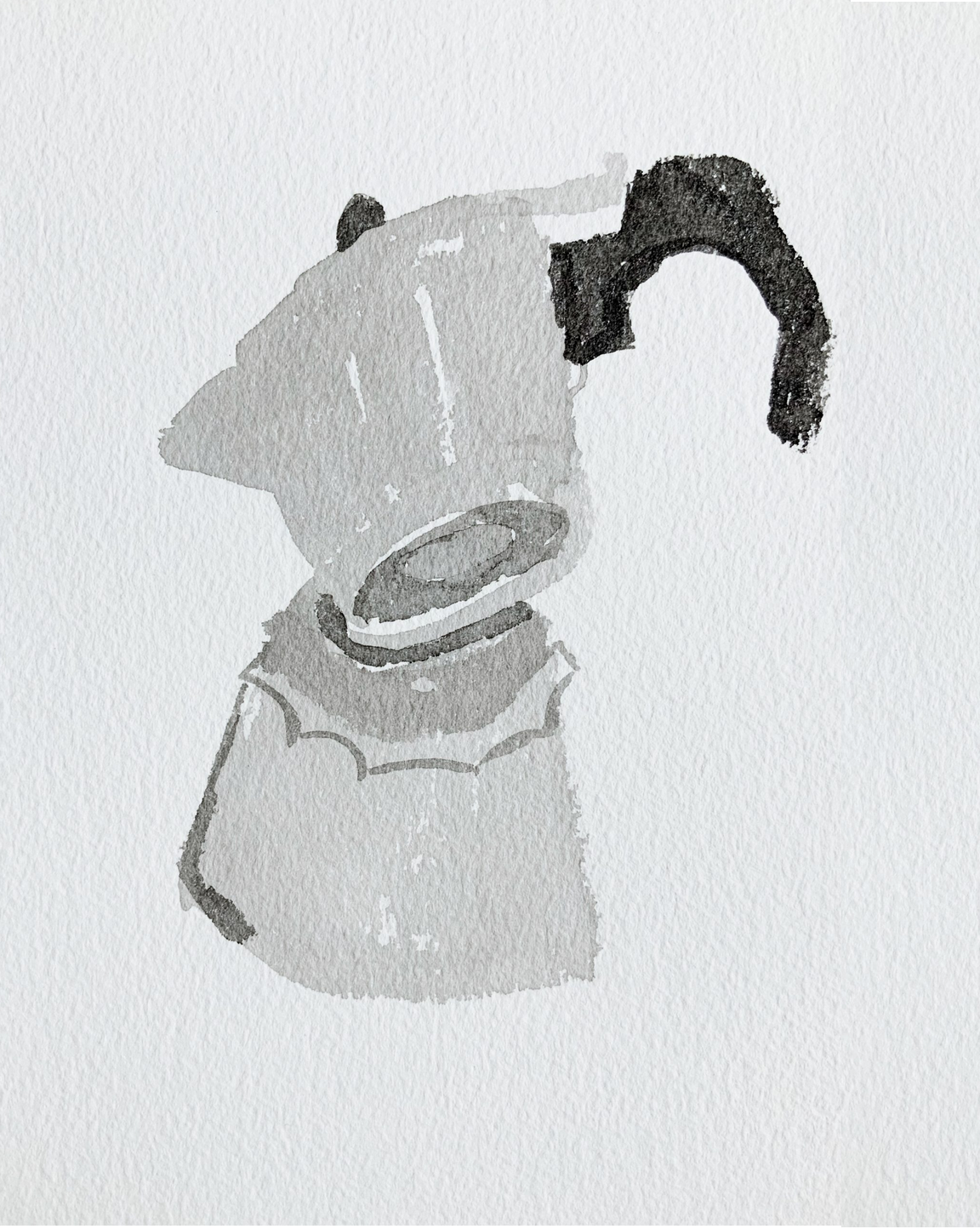
So, I ended up trying to slow things down, and have a more playful relationship with representing the moka pot. This scale was really fun to try and do more calligraphic drawing with, and I’m starting to figure out how to mix the ink to get the right balance of values in an image.
I’m proud of the last two, but especially the last one. I think I found a way to pose the pot in those two which was interesting and new for me personally to look at, and representing it thereby also felt interesting .
I’ve run out of this paper, so who knows what materials I’ll be working with next week. I would like to keep capturing the spirit I started feeling in my last two drawings this week, however.
Adam,
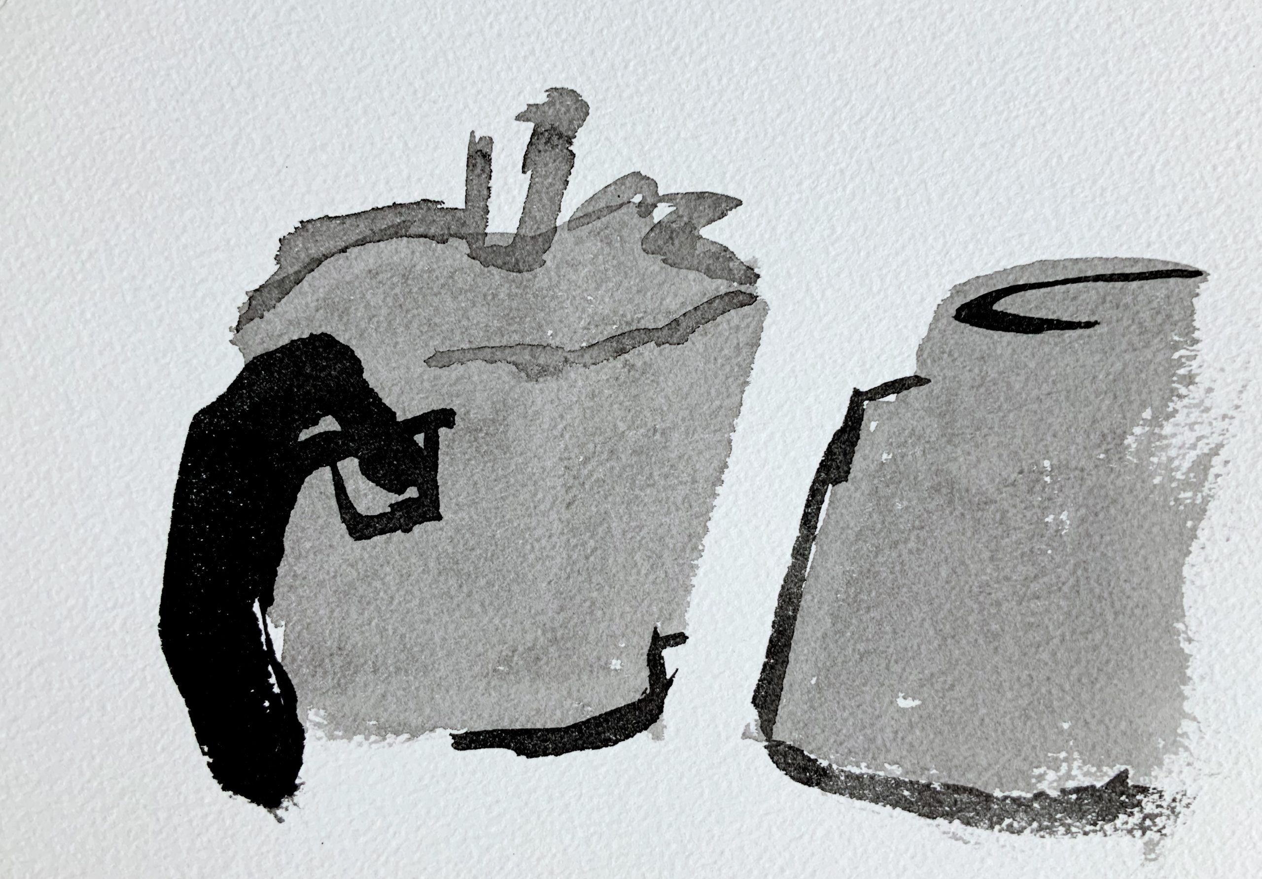
I agree that your last one of these is the best. So simple but effective, and like Jack said, the glints are great. When I look at these compared to last week, I like them, but I think they could used a wider tone range, and some sharper lines to make them jump off the page more. I think it totally depends on what you are going for but you could try doing pen over these washes or deepening shadows in some places.
Your top drawing here:
– I like the pot
– dont love the pencil in front of it
Second one:
– great dark black, smooth stroke for the handle and I also like the little knob on top
– I think it could be more faceted
last 2 again I really like. It could be even cool to do many of these in similar “poses” and same sizes, and display them together as a mini series within your project.
Your project is overall very cohesive and I love the theme. You are extremely talented at seeing what to include and how to do it in the most efficient way possible. I always love the outcomes and am curious to see more!
Great job,
Perrin
These are all sick. Huge fan of how your project has unfolded thus far. The last one is awesome–can’t get over those glints. Exquisite touches (or lack thereof).
Hi Adam,
I’ve really enjoyed your focus on the moka pot throughout this semester. It has showed to me how seemingly simple objects have endless amounts of depth and areas to explore.
I agree with that your last drawing is especially successfully in portraying value. The positioning is unexpected and playful. However, I wouldn’t forget about your first drawing! I am particularly drawn to that one. The open moka put next to the ink and other drawing utensil tells a unique story to me. It has a lot of character and I’m looking forward to the ways in which you can continue to manipulate your objects to tell a story to the viewer. The lines and values from inside and outside the moka pot successfully convey the space and depth, and that’s not easy! Maybe I like this one so much because it’s eye level and its different from your other drawings that are usually from an overhead perspective. It gives it a more intimate viewing and it could be something cool to explore.
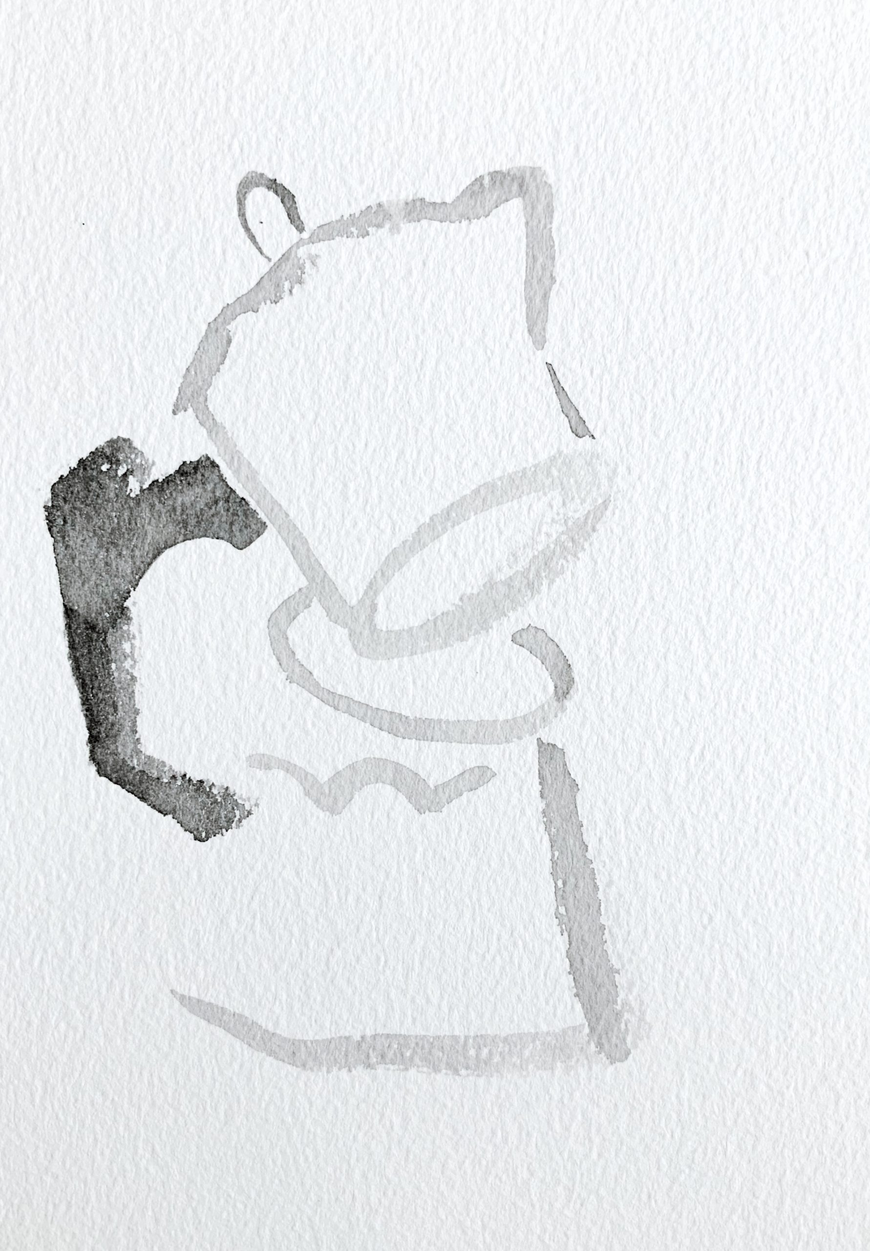
Perrin, Jack, and Megan have done a good job, so there’s not a lot for me to add, except that I have some reservations about everyone’s (including your) favorite. See my note about how it’s composed, next to the images.
And no love for the second one? That one has a spot-on, candid insouciance that reminds me of MY FAVORITE DRAWING BY ANYONE ANYWHERE IN THE UNIVERSE, Six Persimmons (an opinion that’s shared by many artists I know). The fact that you’re this close to a sublime drawing like that one should feel pretty great.
The longer I look, that’s the one I’d like to live with, and keep seeing something new every time.
I’m also a fan on the first one, but then I like all four; it’s just that the last two are less sure-footed compositionally.
The only thing you need to do is to keep making them, on whatever material you can scare up. But I must admit that pebbly texture and deckled edge add a lot.
Great work–