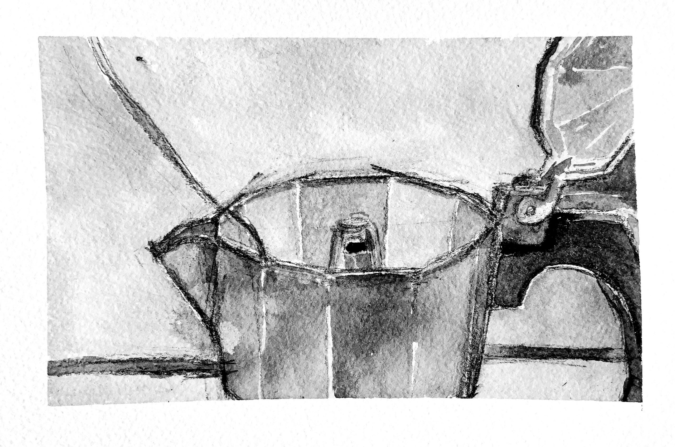
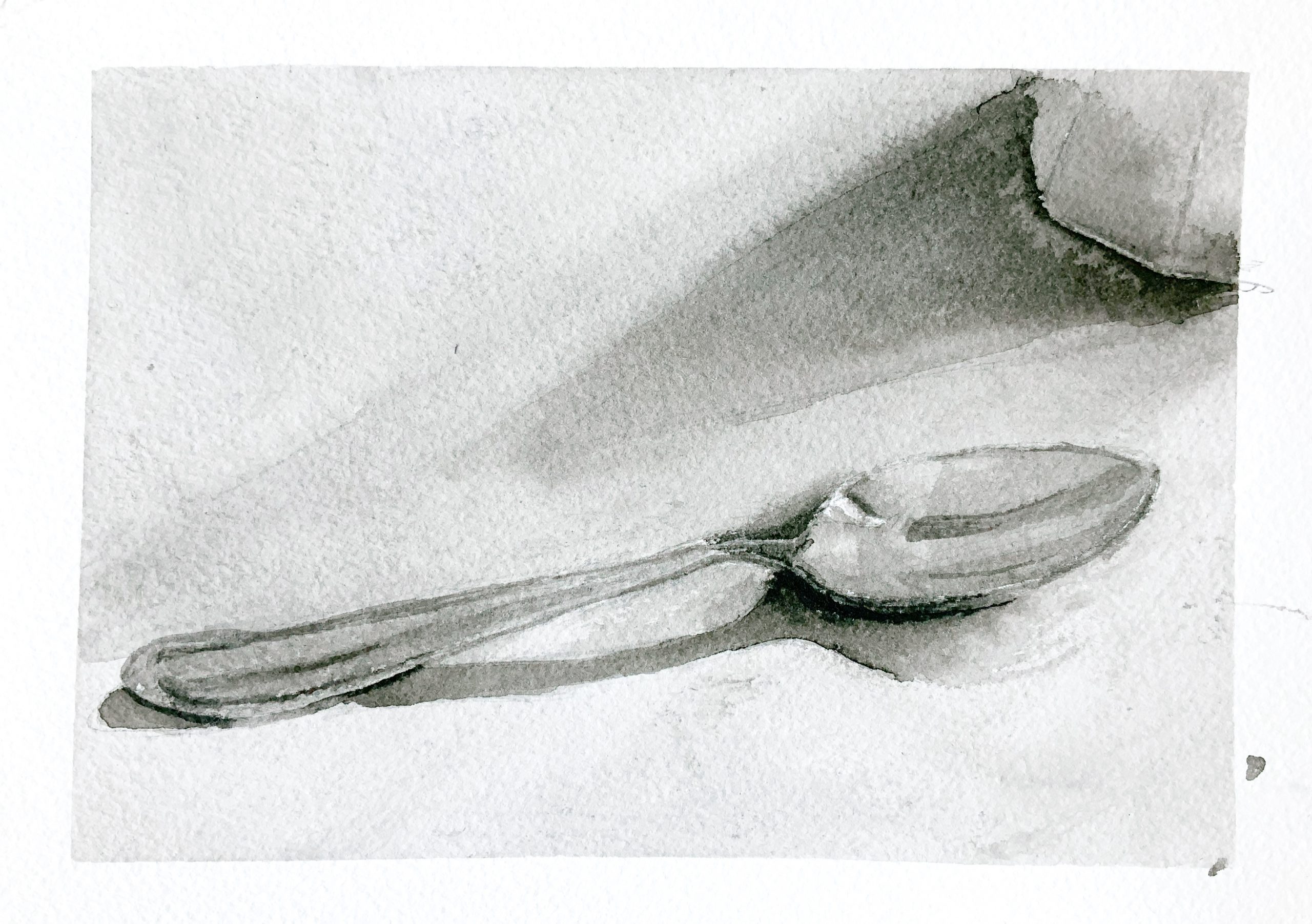
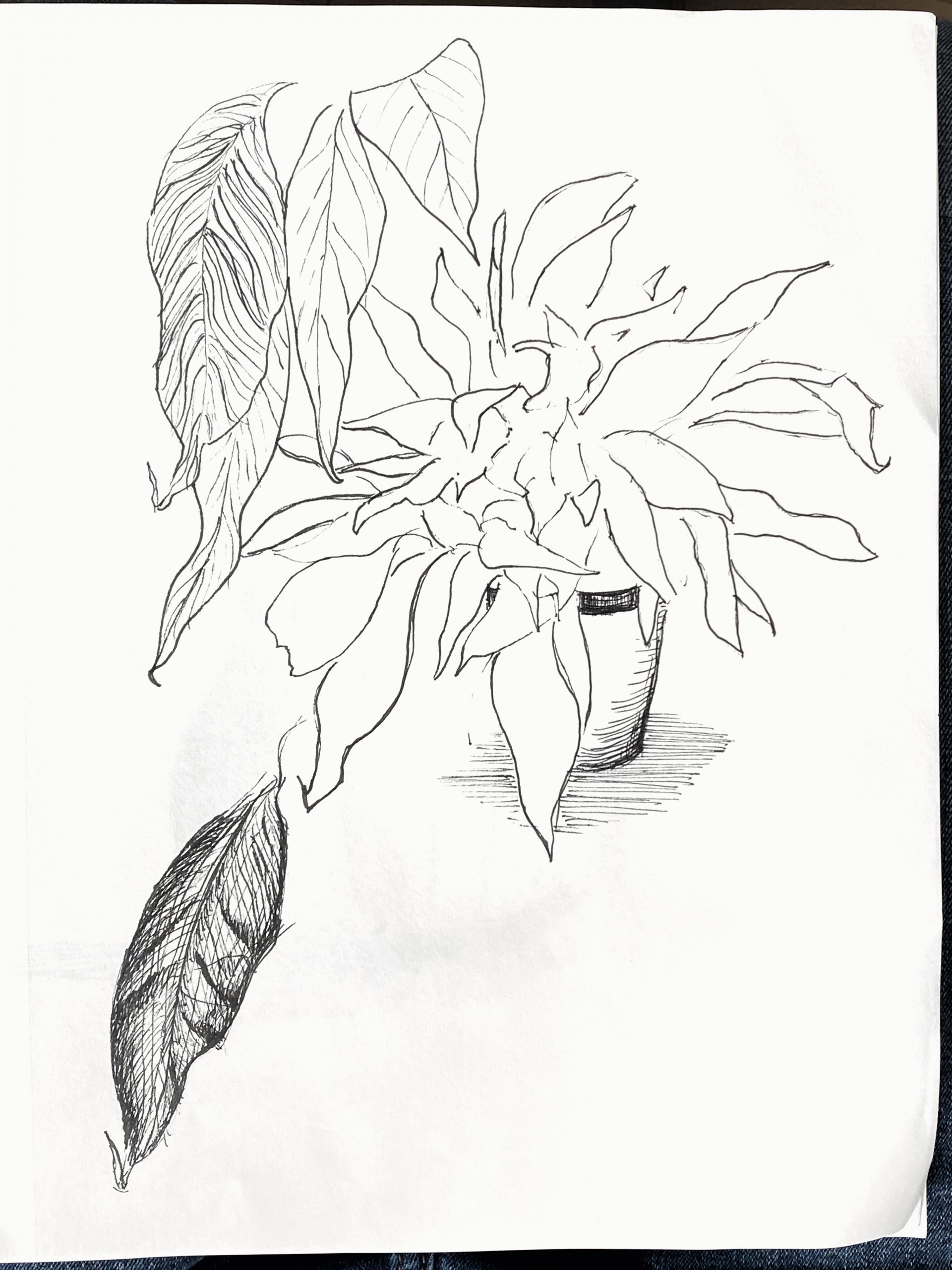
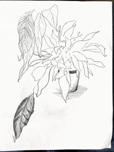
 micron on paper, 8 x 9
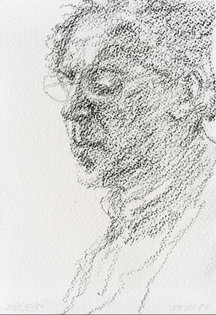
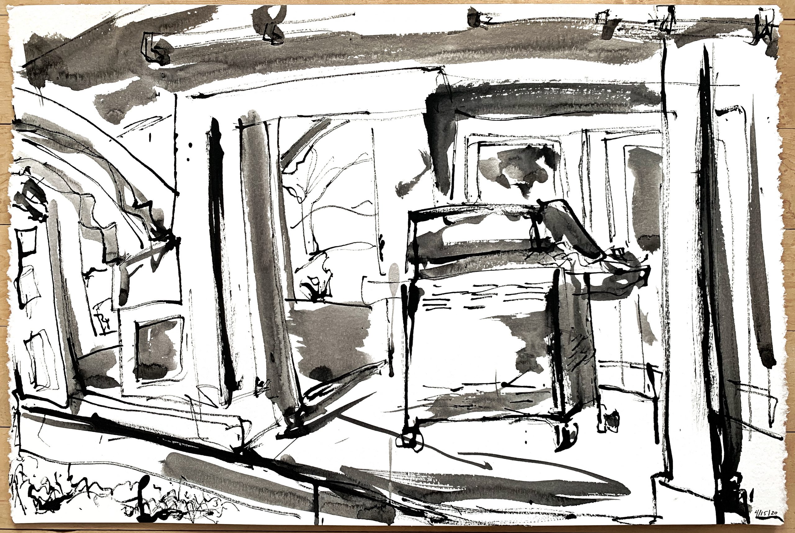
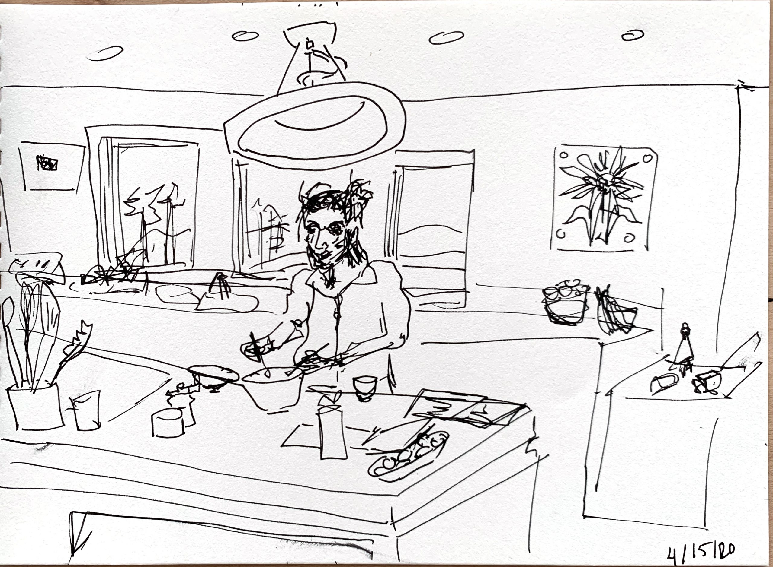
My fave–as my comments will attest. Curious how this would look in a horizontal format.
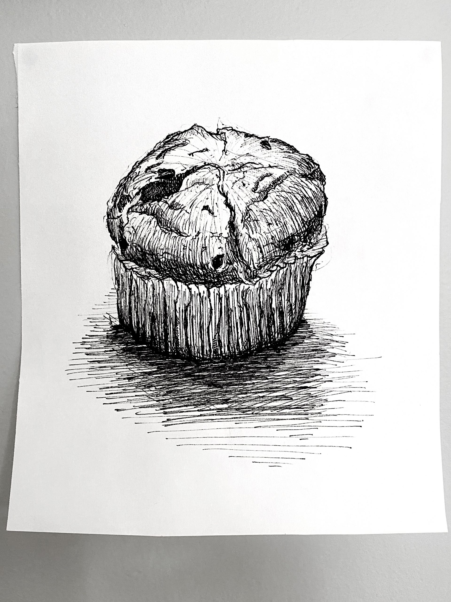
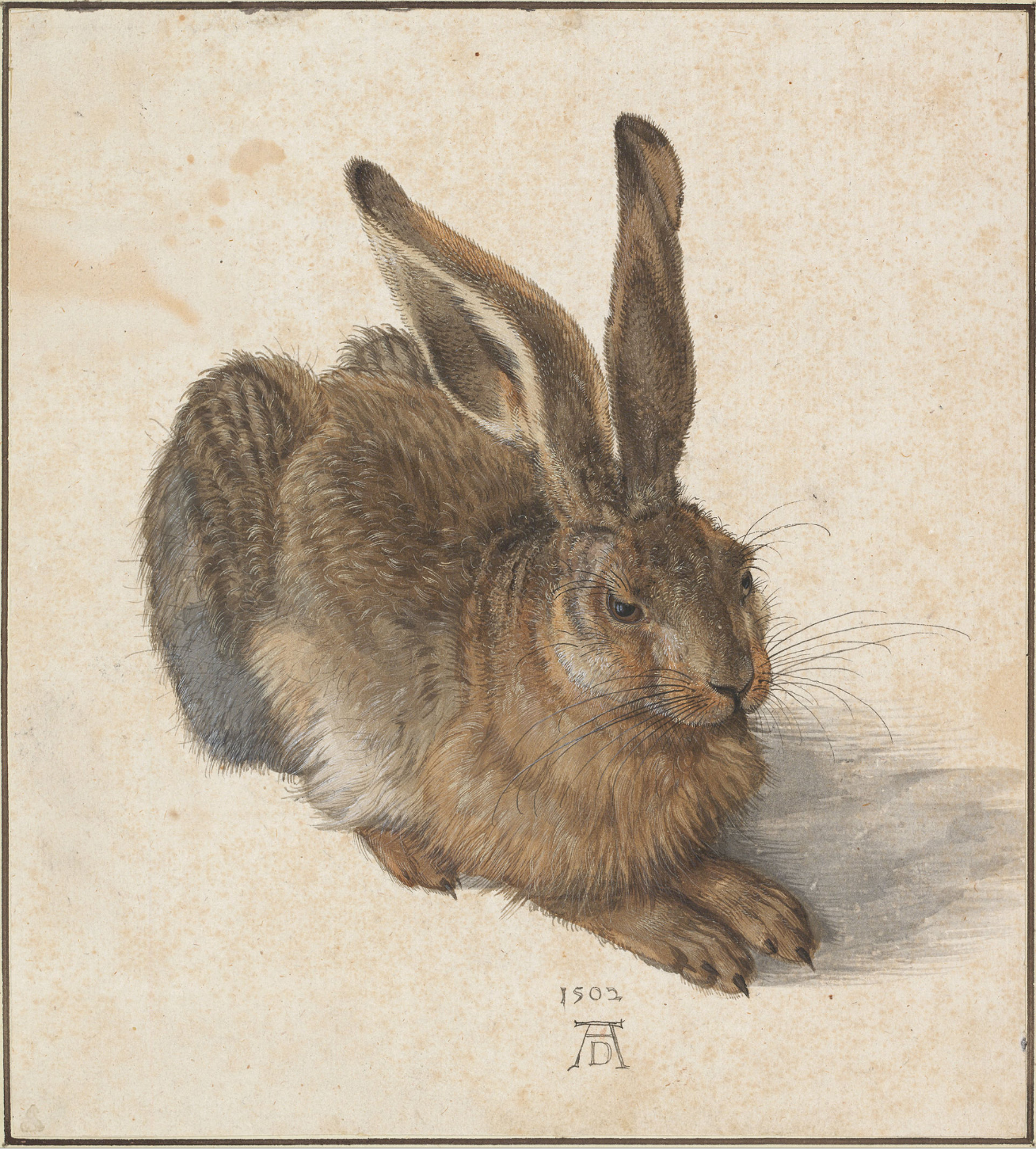
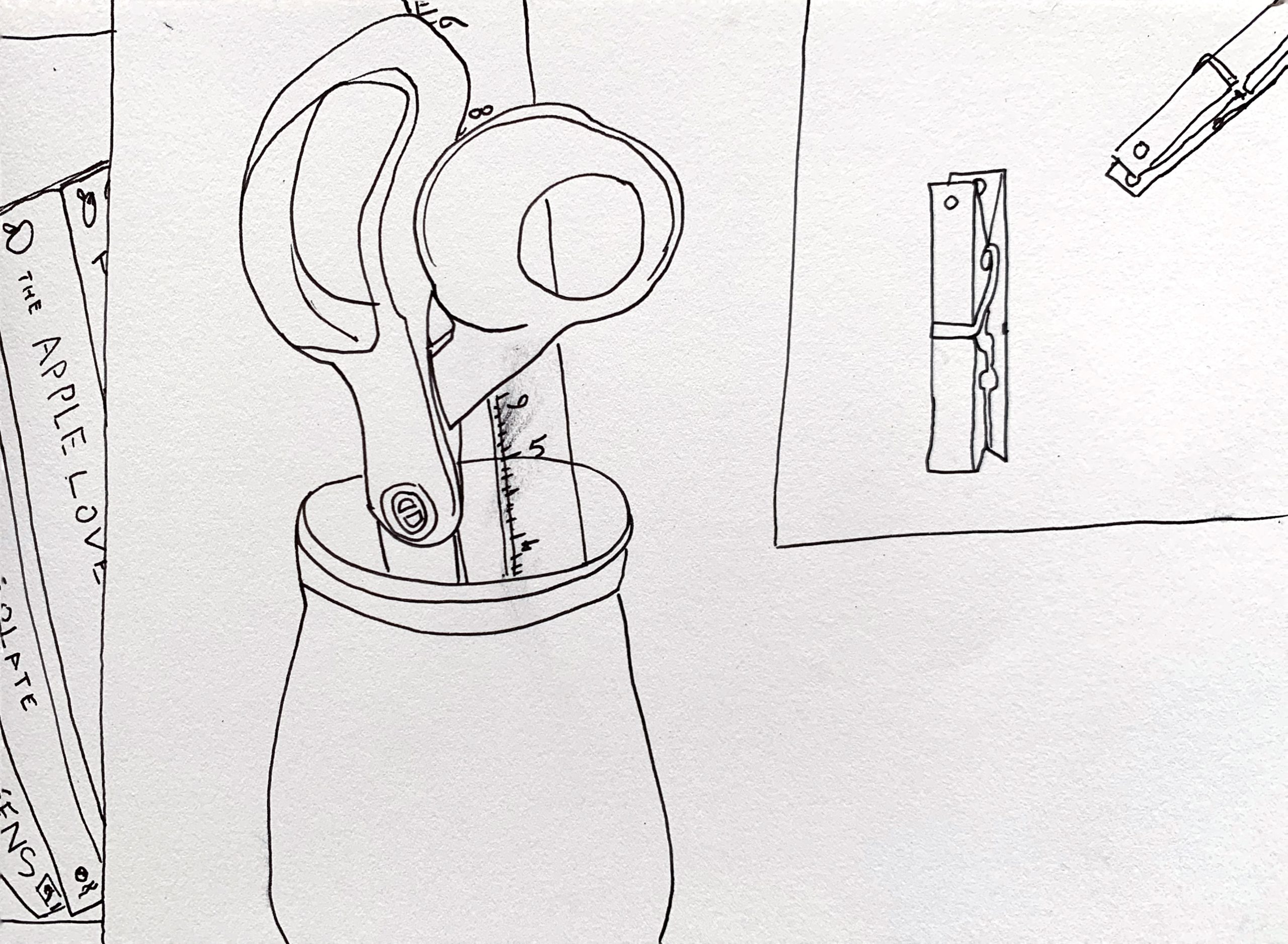
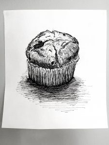
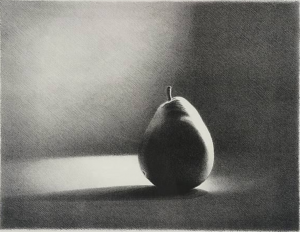
One of the earliest images in this genre–the single, isolated subject–comes from Albrecht Durer. A great part of its power is his clear devotion to what his eyes could reveal. Yours feels like it might be on a similar path, which would be great–maybe one incredible drawing of a chocolate chip muffin between now and May 5th?

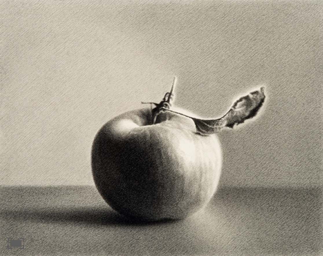
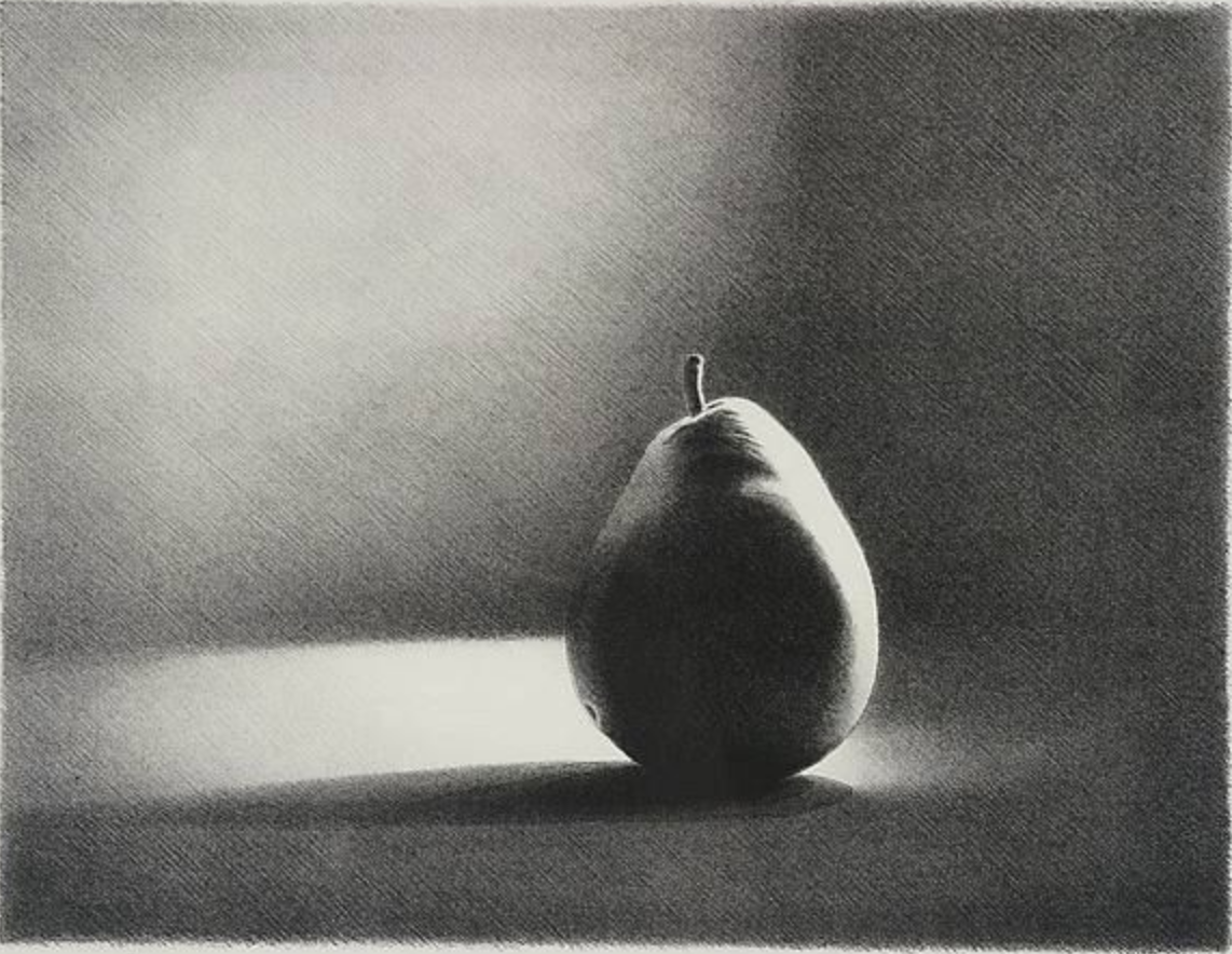
I’ve always loved the work of Los Angeles artist Martha Alf. These are pencil drawings but very finely hatched.

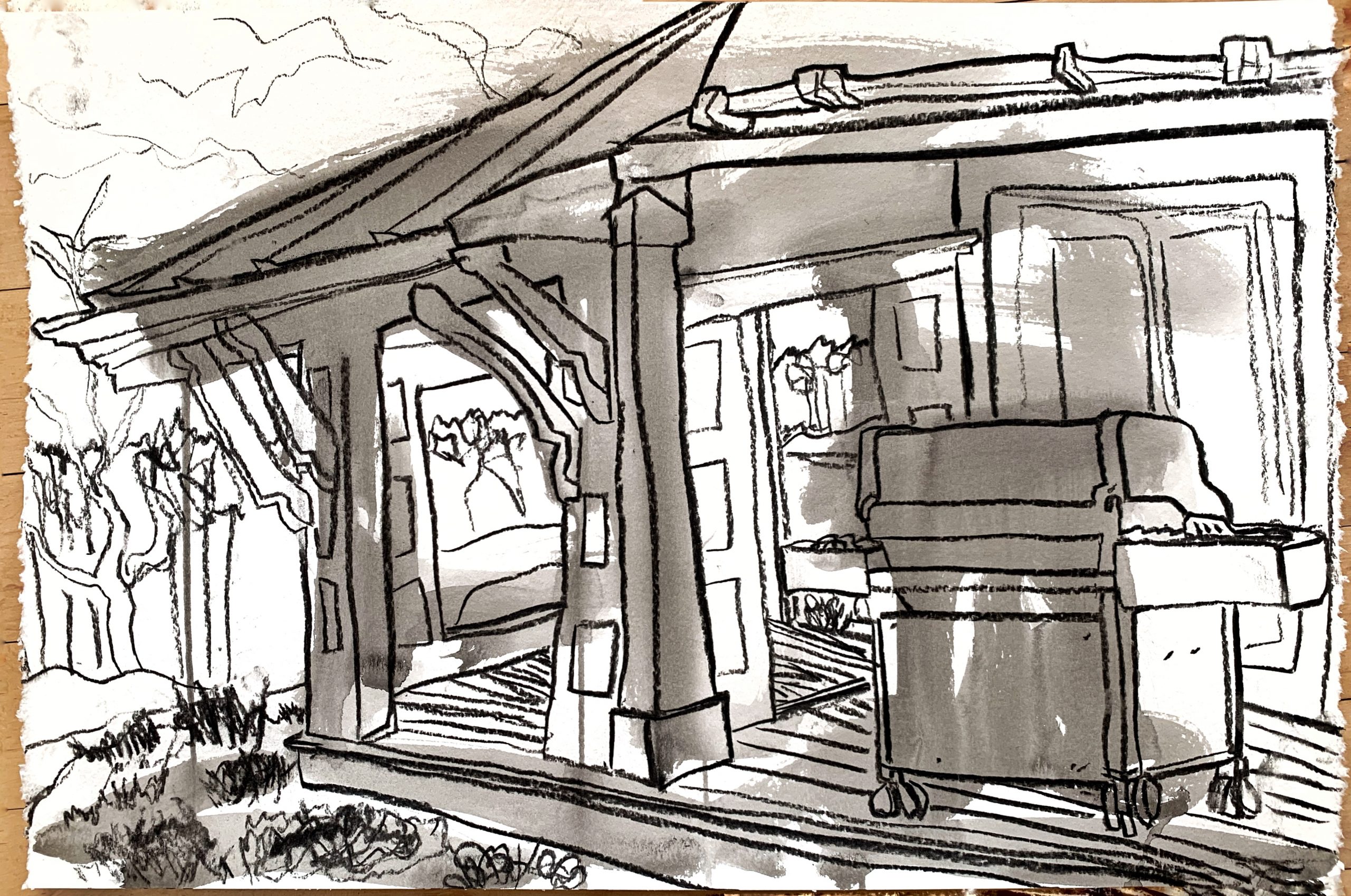
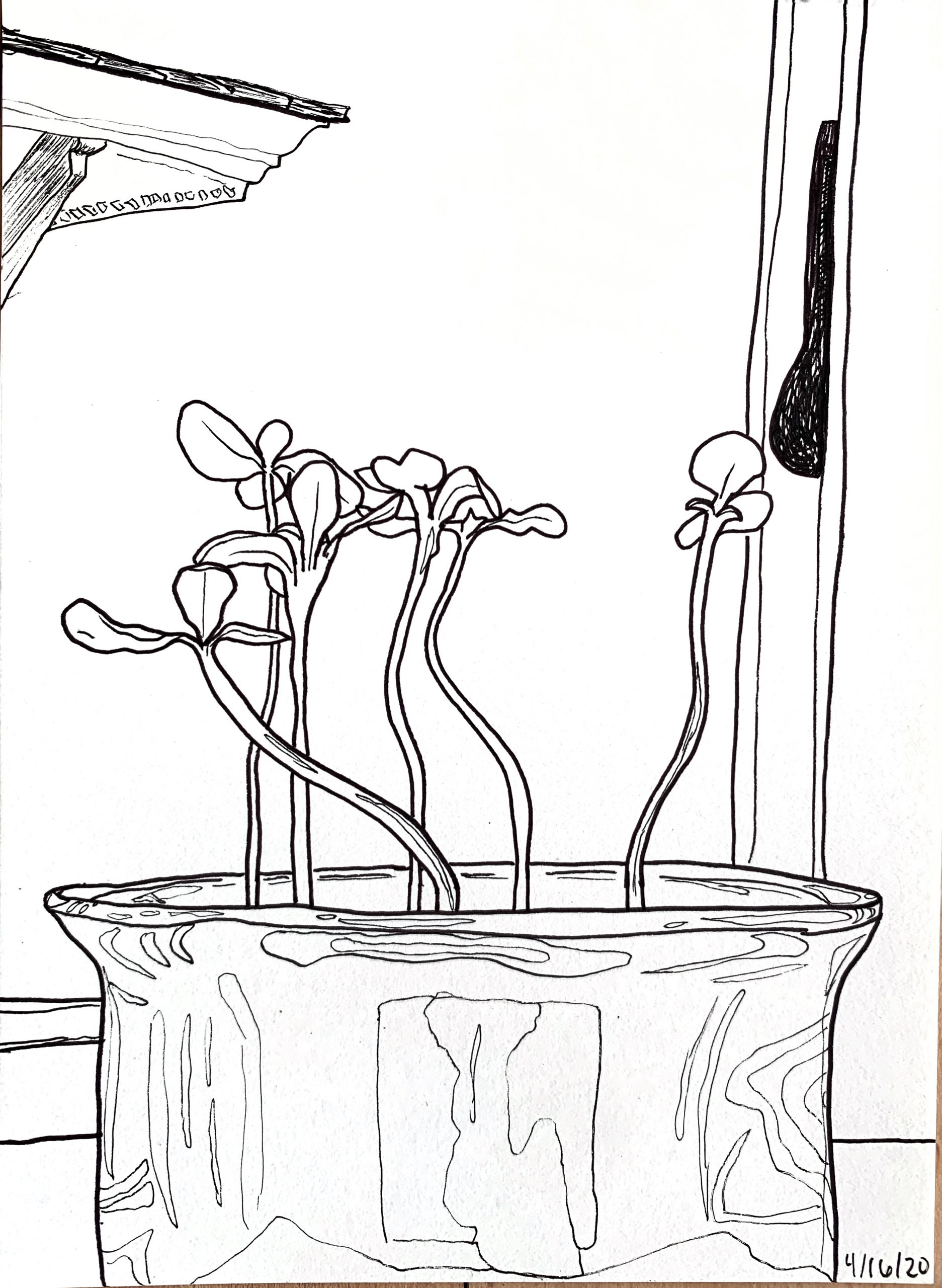
Maybe play even more with the light?
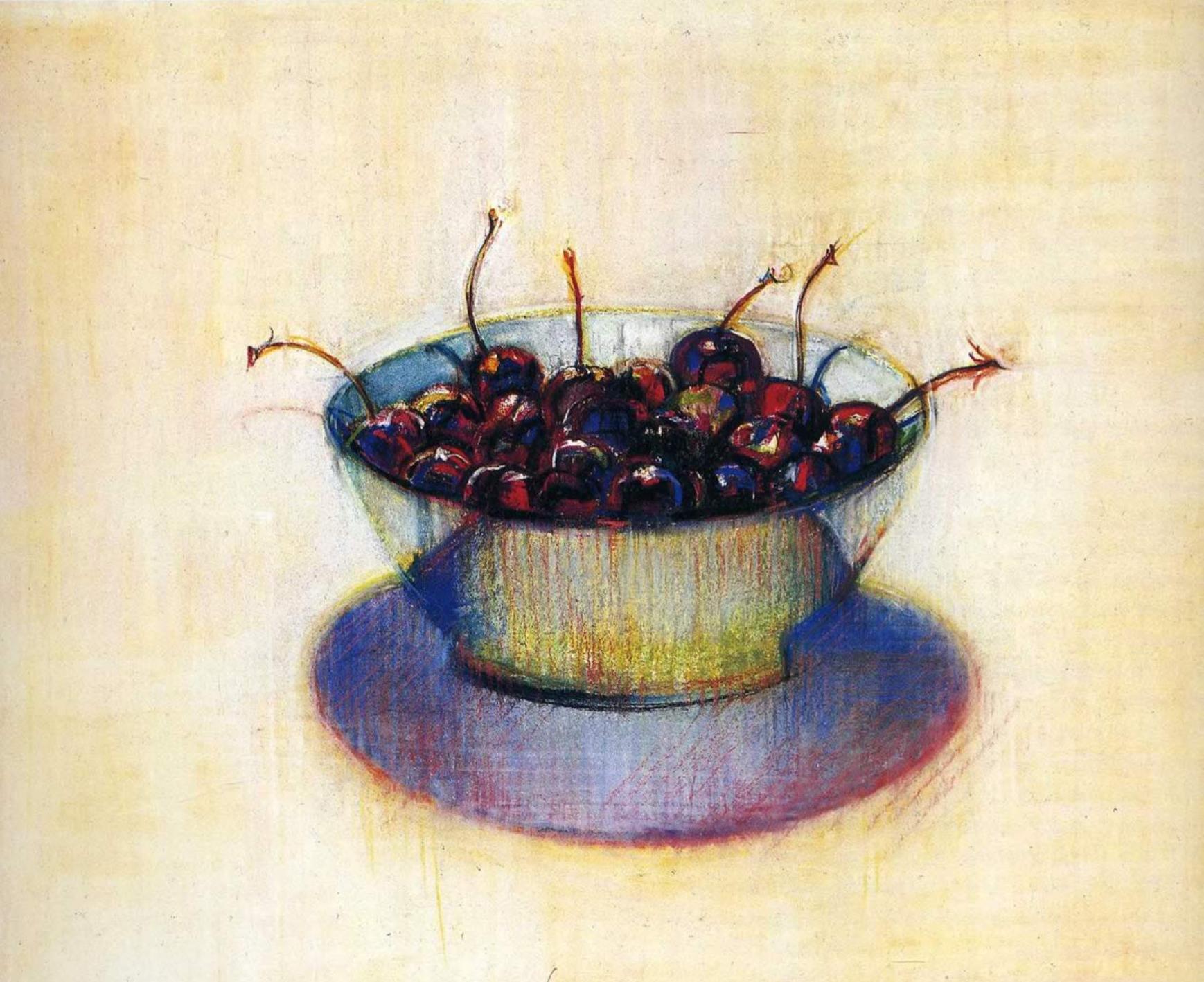
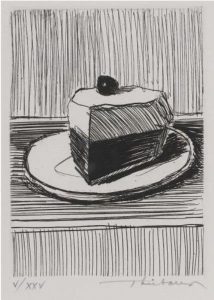
Another California artist, 100 years old this year, Wayne Thiebaud:

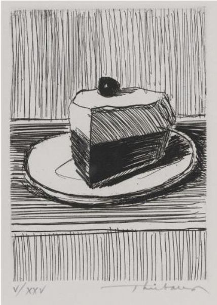
Or, quite different than the artists above, you might prefre a looser, “cooler” hatching style (also by Thiebaud).
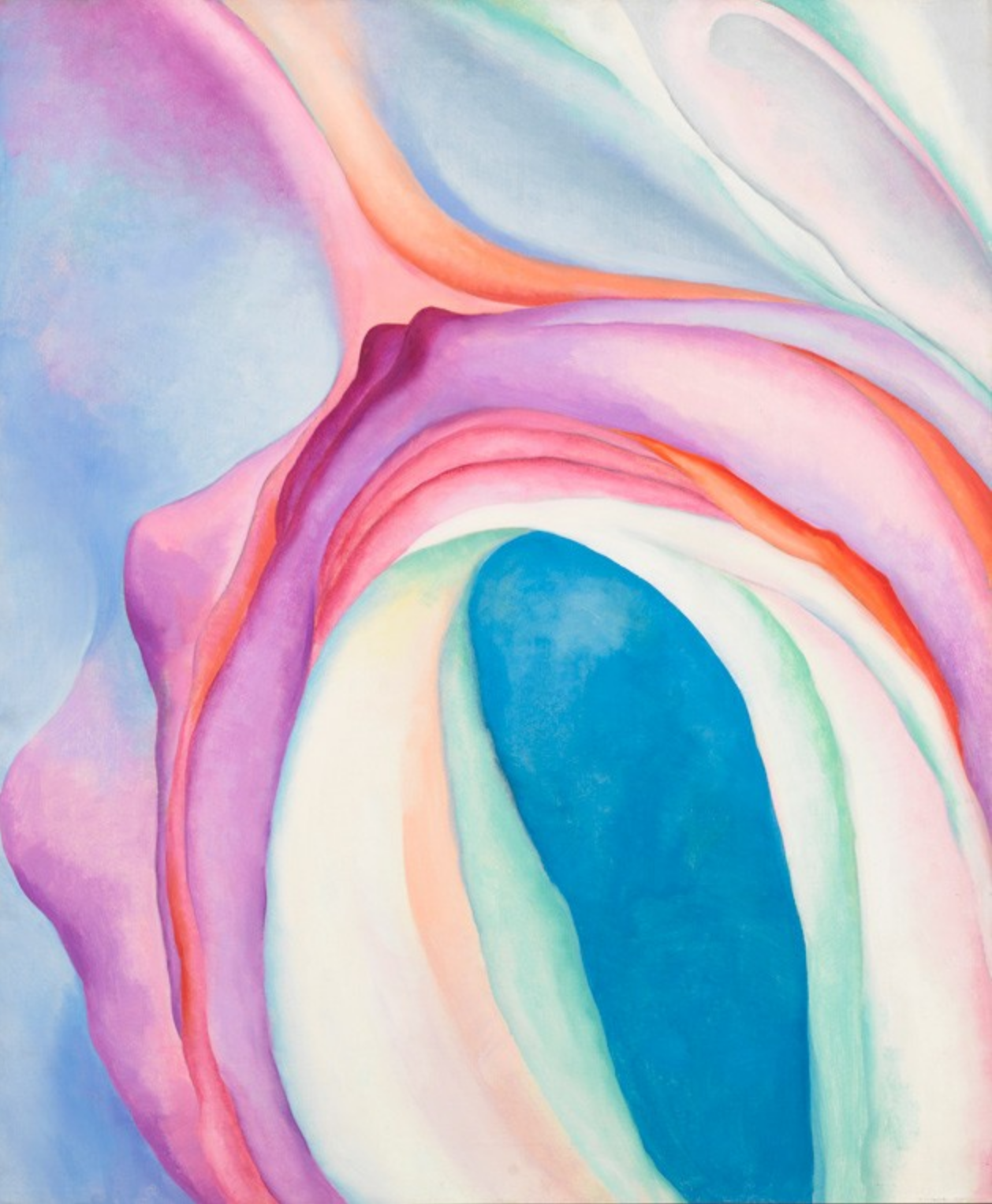
Okay, it’s official. It’s a California thing. Vija Celmins painted these there in 1964, but now lives in New York:
There can be something wonderfully dumb about staring at a single object, front and center, and she captures that feeling perfectly. A lot of people (me included) think that this is one of the best paintings of the 20th century. Not kidding:
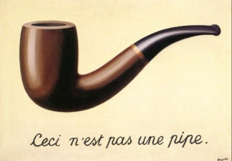
It’s like Magritte’s famous painting, but without the inscription. You just *know* that’s what it’s about.

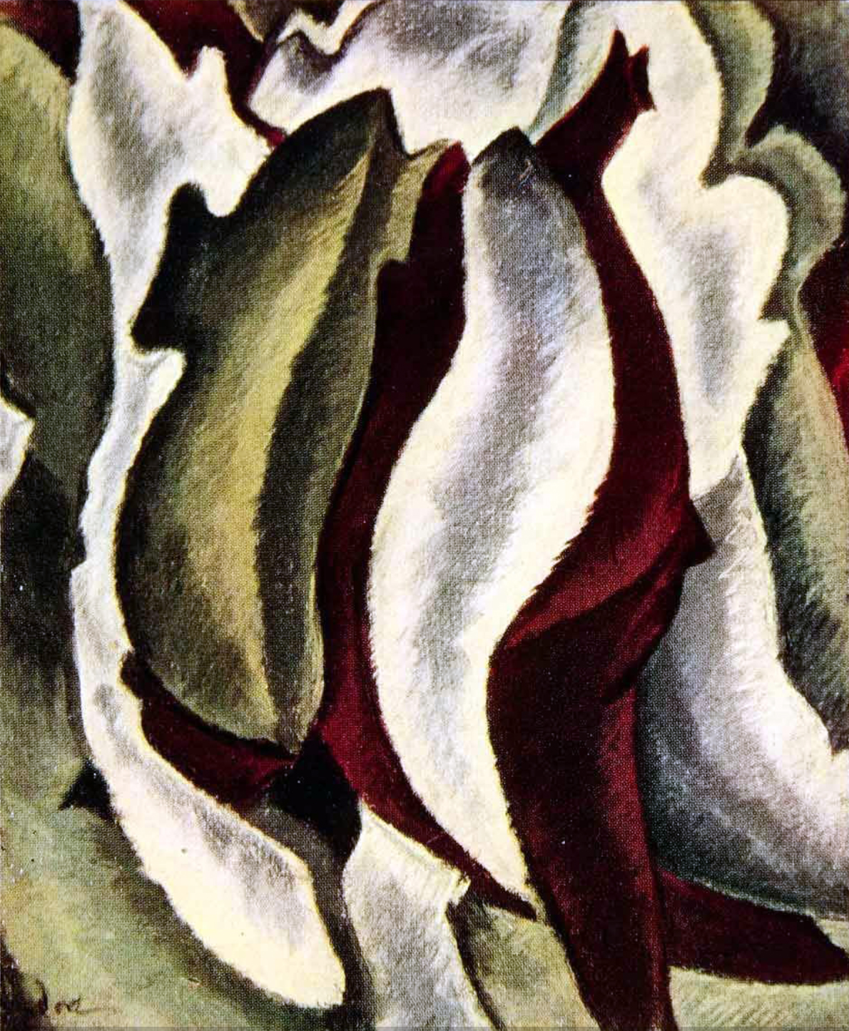
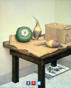
Or, if you look at the rutabaga in this still life by Gregory Gillespie, you’ll see if you look at something long enough and intently enough it can become bizarre and grotesque (what Freud called “The Uncanny,” which we’ve talked about):
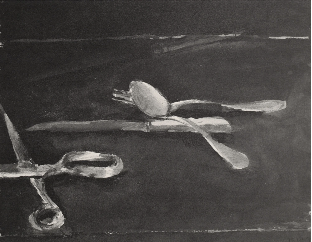
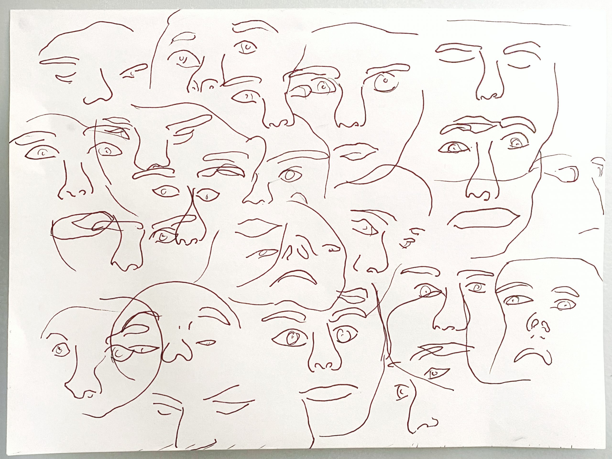
micron on paper, 9 x 12
 micron on paper, 9 x 12
 micron on paper, 9 x 12
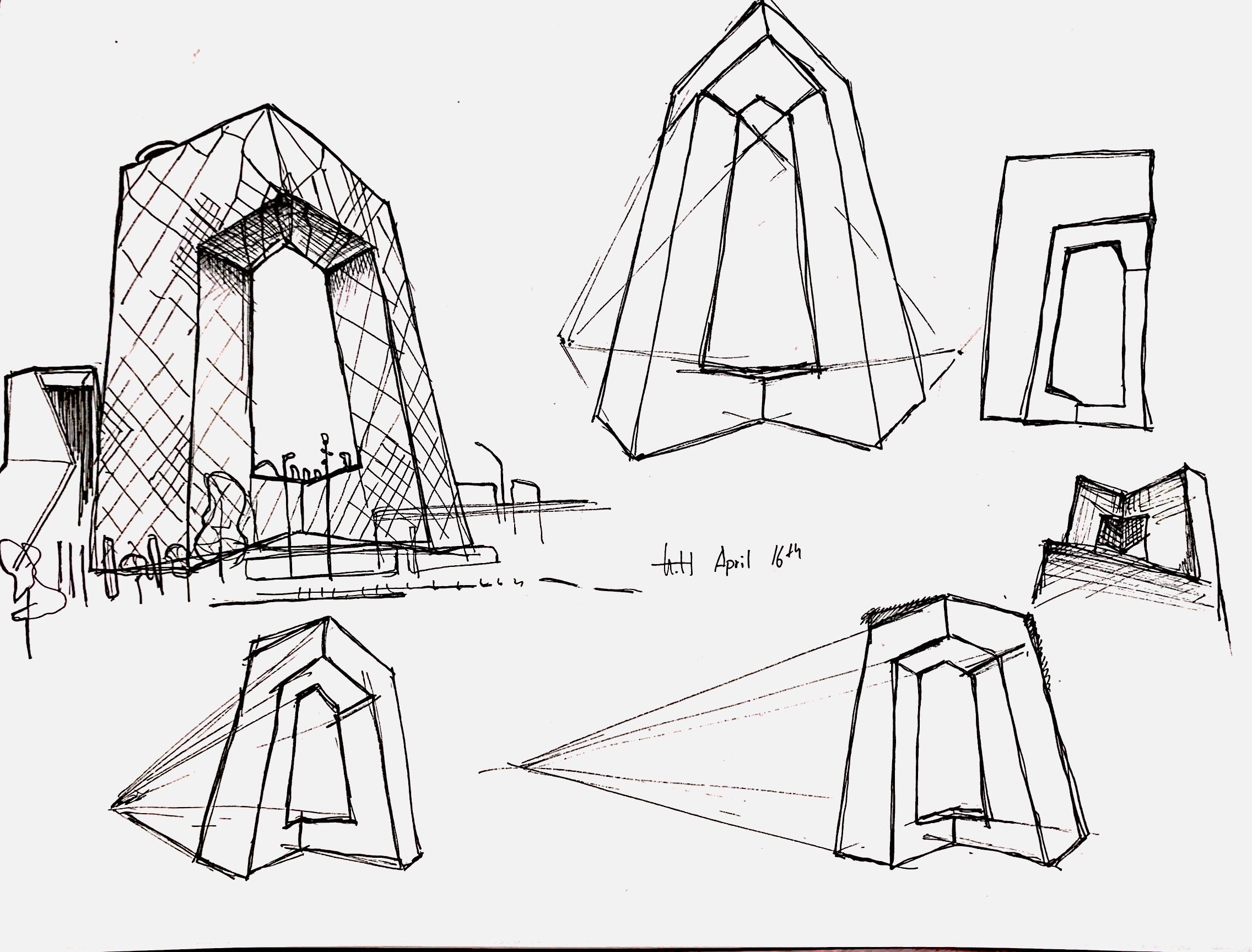
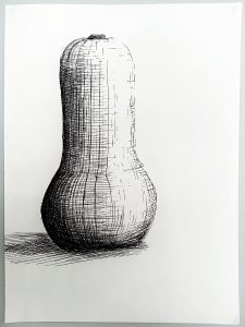
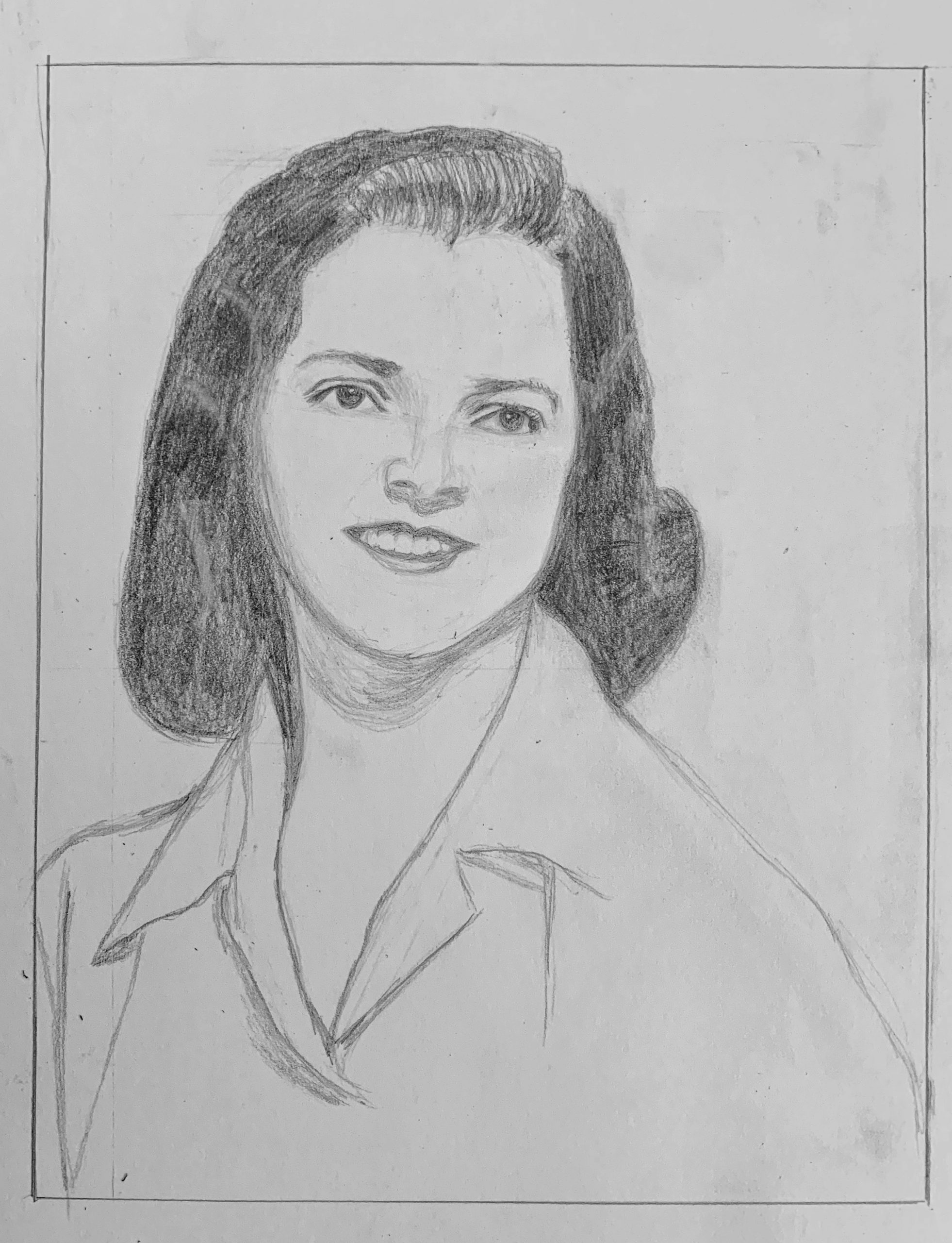 Pencil on paper 7×9
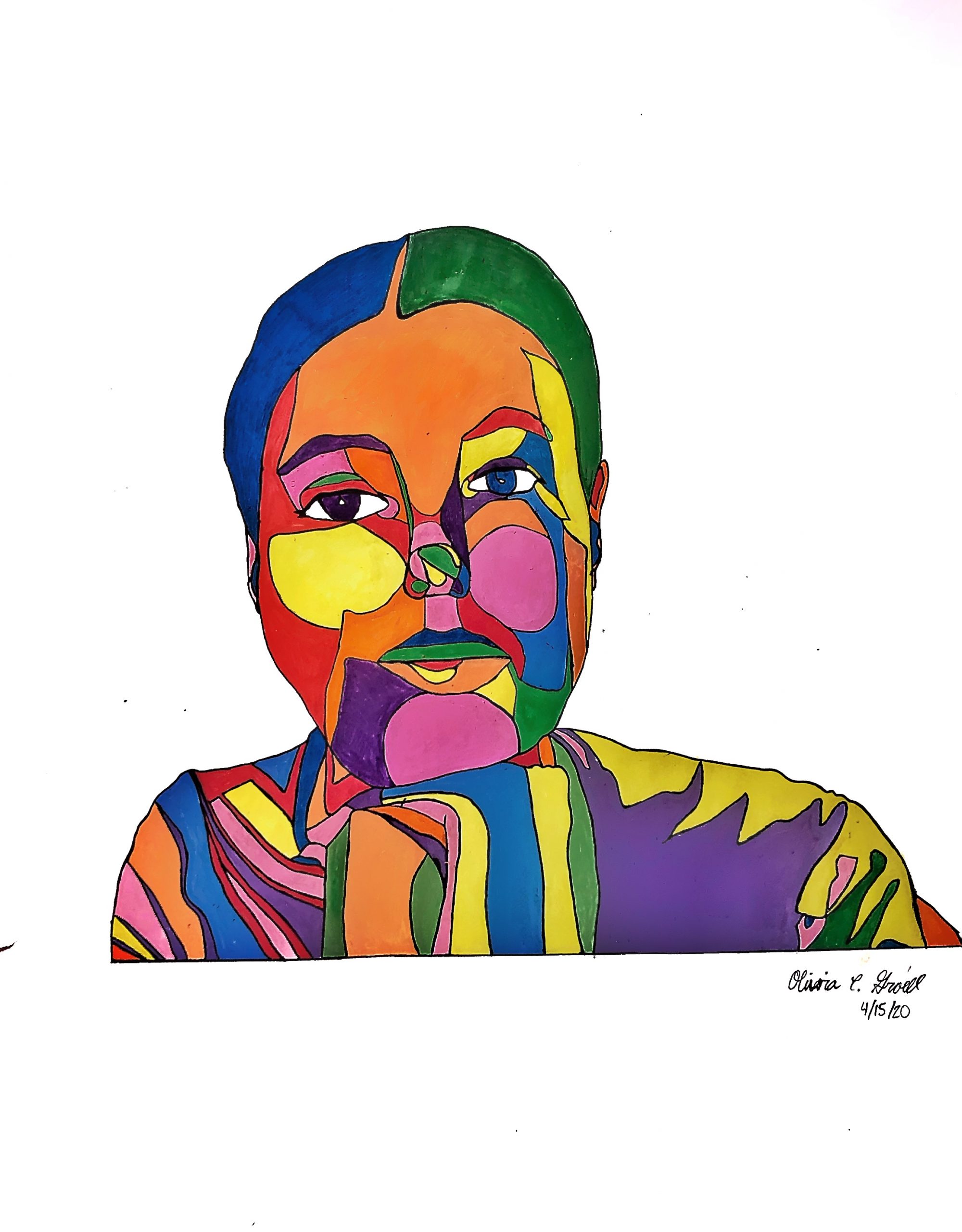
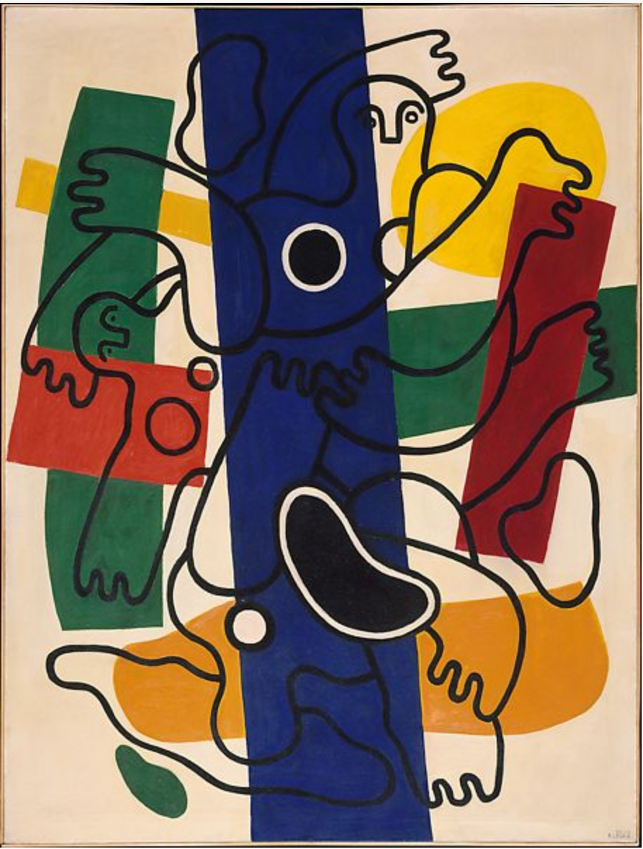
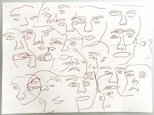
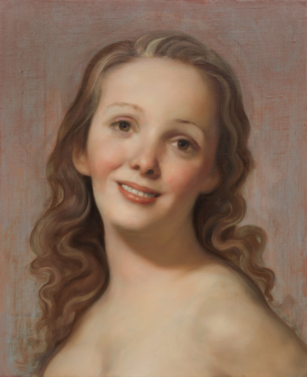 John Currin (see my comment)