This week I tried to pay attention to value gradients, and use more of a ground of a light gray to begin with. I started using watercolor paper, and working much smaller.
This, for me, is the week this project began to blossom. Your self-assessment could be much fuller to help me/us know more about your thinking, but I’m glad your path has led you to these.
Don’t get me wrong–I also like the brush and inks but none of them have quite struck gold. That’s fine–this is the kind of work where you might have to make 30 or more so-so ones to fall into the one you were waiting for. But it does take many more (quantity) to get there. Treasures like that are only uncovered on the fly, when you’re not looking, when you’ve long since gotten bored of the whole thing but you keep making, etc.
I especially like the one with the white out in it. Not the best version of what it could be but great to subtraction and effacement brought on board.
Commendations for stepping up to the watercolor paper. Doing the same with rice paper for the brush and inks would be equally empowering for those images.
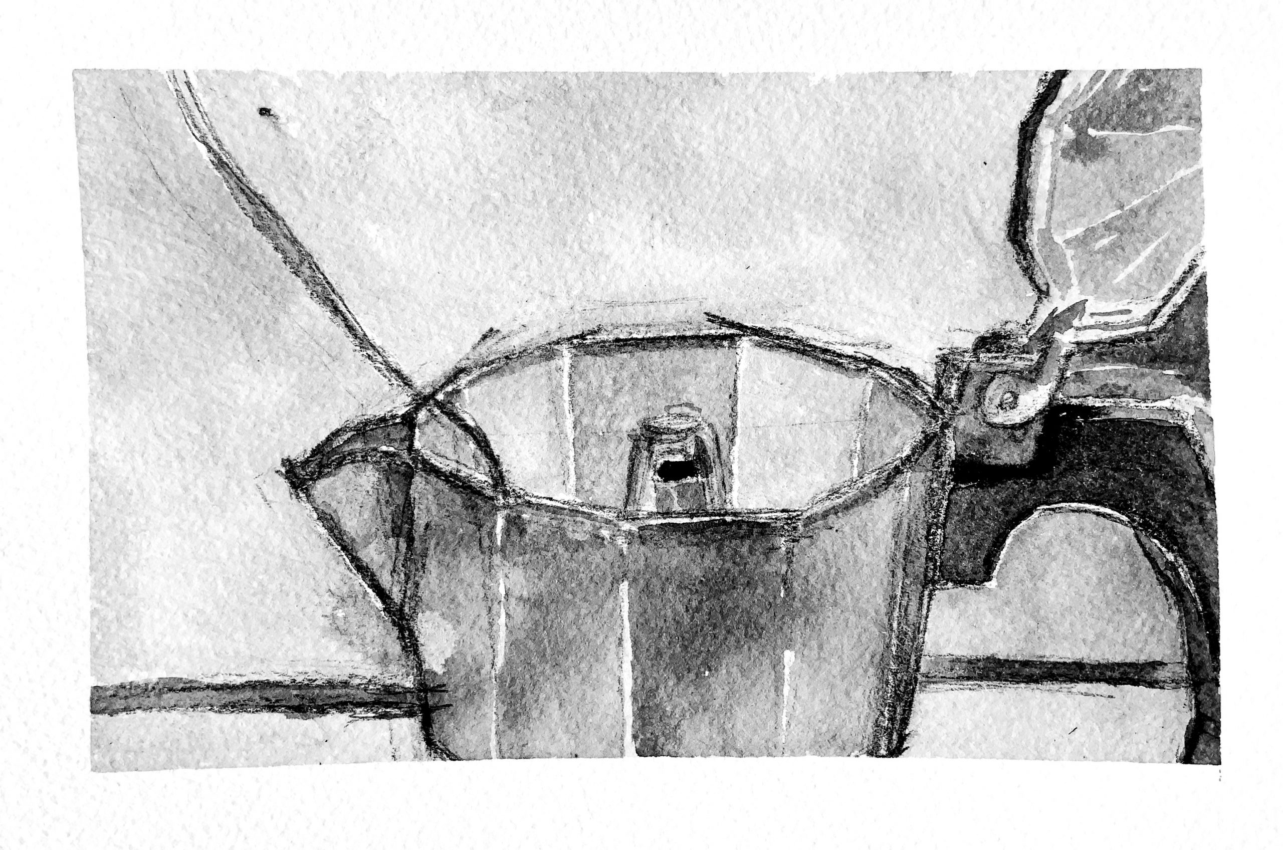
This week’s drawings are different—more deliberately composed and made. Something about the espresso maker really rings the bell for me—especially the firmness of the drawing and the play of lights in that wash. It manages to be detailed without being labored.
Not sure what that diagonal is from the upper left but I don’t entirely care. Love the way it adds to and supports the abstract order.
I’d urge you for the home stretch to put your eggs in this basket. I’d love to see what more might come from this approach, but whatever it is, it’s time to settle in and make a cohesive suite of images.
My main critique is that for a week’s work in Drawing II, at this size and level of making, there should be three times as many. These are one-per-day drawings at the very least. In know you’re under the gun but please do what you can to be more productive.
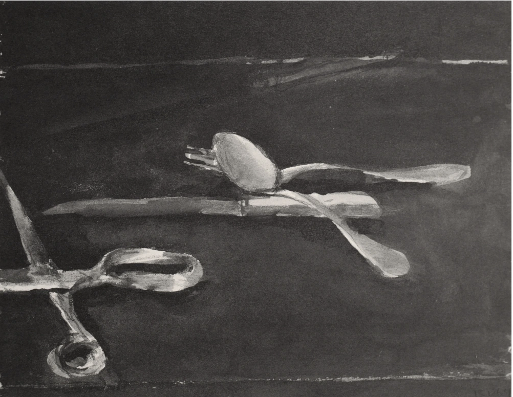
You’re still reminding me of Arikha a lot (who had a firm policy to only work on a drawing or painting for one session; after that the spell was broken and to go back in was disingenuous to him. But also Richard Diebenkorn’s still-lives, which I’ve added an example of.
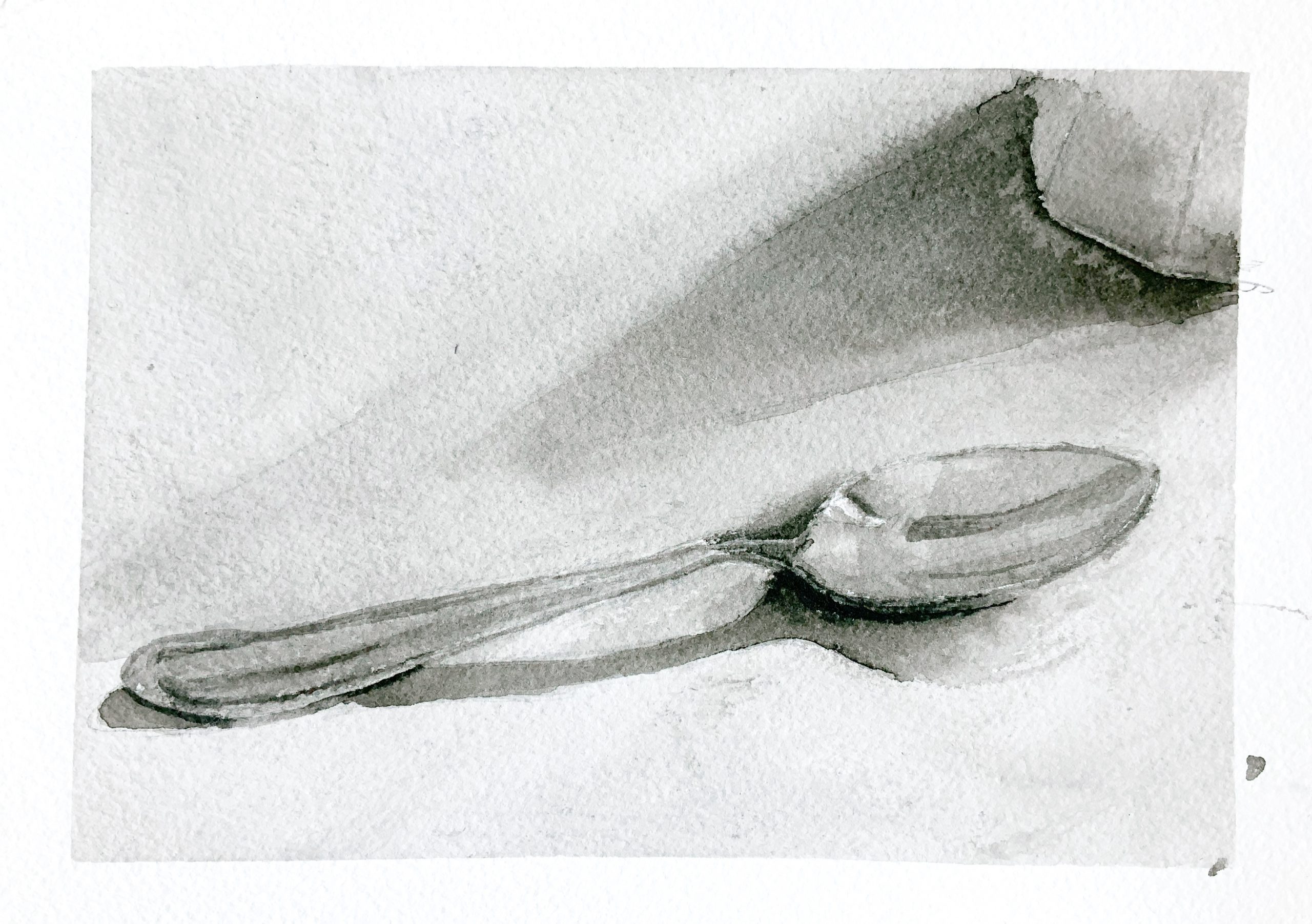
Wow Adam! I can clearly see that your project is taking progress. Think that last week we talked about shading. I especially like the subtle ink-wash shading from this week’s pot drawing and the front, circular part of the spoon. Your use of wash is not too dry or wet, which does not create a lot of unwanted edges nor smear the edges.
In the first image, you have shown the idea of horizon well. However, I would suggest you use a slightly different shade of wash for the wall and the table to make a distinction between the two planes. You also lack a back shadow of the pot on the walls, which I suggest you add it on your drawing to show dimensionality.
The reference photo that you chose is interesting–there is a distinct contrast between the dark and light. In contrast, your works have mainly exhibited grey-scales (especially in the second drawing). Adding more dark areas might help your work to become richer in values.
Hi Adam, your drawings this week have experienced so much development compared to last week. I especially enjoy seeing how you have introduced gradient to these drawings while giving more attention to details. For me, your series of new decisions is a game-changer! The white lines give such an exact description to the material and texture, it almost seems like a glimpse of light eliminates from the paper.
I would love to see where this will take you next, whether you choose to keep working with the same approach or if you want to bring something new. But make sure you keep some of the highlights and nuances from this week’s drawings.
This week I tried to pay attention to value gradients, and use more of a ground of a light gray to begin with. I started using watercolor paper, and working much smaller.
This, for me, is the week this project began to blossom. Your self-assessment could be much fuller to help me/us know more about your thinking, but I’m glad your path has led you to these.
Don’t get me wrong–I also like the brush and inks but none of them have quite struck gold. That’s fine–this is the kind of work where you might have to make 30 or more so-so ones to fall into the one you were waiting for. But it does take many more (quantity) to get there. Treasures like that are only uncovered on the fly, when you’re not looking, when you’ve long since gotten bored of the whole thing but you keep making, etc.
I especially like the one with the white out in it. Not the best version of what it could be but great to subtraction and effacement brought on board.
Commendations for stepping up to the watercolor paper. Doing the same with rice paper for the brush and inks would be equally empowering for those images.
This week’s drawings are different—more deliberately composed and made. Something about the espresso maker really rings the bell for me—especially the firmness of the drawing and the play of lights in that wash. It manages to be detailed without being labored.
Not sure what that diagonal is from the upper left but I don’t entirely care. Love the way it adds to and supports the abstract order.
I’d urge you for the home stretch to put your eggs in this basket. I’d love to see what more might come from this approach, but whatever it is, it’s time to settle in and make a cohesive suite of images.
My main critique is that for a week’s work in Drawing II, at this size and level of making, there should be three times as many. These are one-per-day drawings at the very least. In know you’re under the gun but please do what you can to be more productive.
You’re still reminding me of Arikha a lot (who had a firm policy to only work on a drawing or painting for one session; after that the spell was broken and to go back in was disingenuous to him. But also Richard Diebenkorn’s still-lives, which I’ve added an example of.
Great company to be in.
(So much for concise….)
Wow Adam! I can clearly see that your project is taking progress. Think that last week we talked about shading. I especially like the subtle ink-wash shading from this week’s pot drawing and the front, circular part of the spoon. Your use of wash is not too dry or wet, which does not create a lot of unwanted edges nor smear the edges.
In the first image, you have shown the idea of horizon well. However, I would suggest you use a slightly different shade of wash for the wall and the table to make a distinction between the two planes. You also lack a back shadow of the pot on the walls, which I suggest you add it on your drawing to show dimensionality.
The reference photo that you chose is interesting–there is a distinct contrast between the dark and light. In contrast, your works have mainly exhibited grey-scales (especially in the second drawing). Adding more dark areas might help your work to become richer in values.
Hi Adam, your drawings this week have experienced so much development compared to last week. I especially enjoy seeing how you have introduced gradient to these drawings while giving more attention to details. For me, your series of new decisions is a game-changer! The white lines give such an exact description to the material and texture, it almost seems like a glimpse of light eliminates from the paper.
I would love to see where this will take you next, whether you choose to keep working with the same approach or if you want to bring something new. But make sure you keep some of the highlights and nuances from this week’s drawings.
What a spoon!