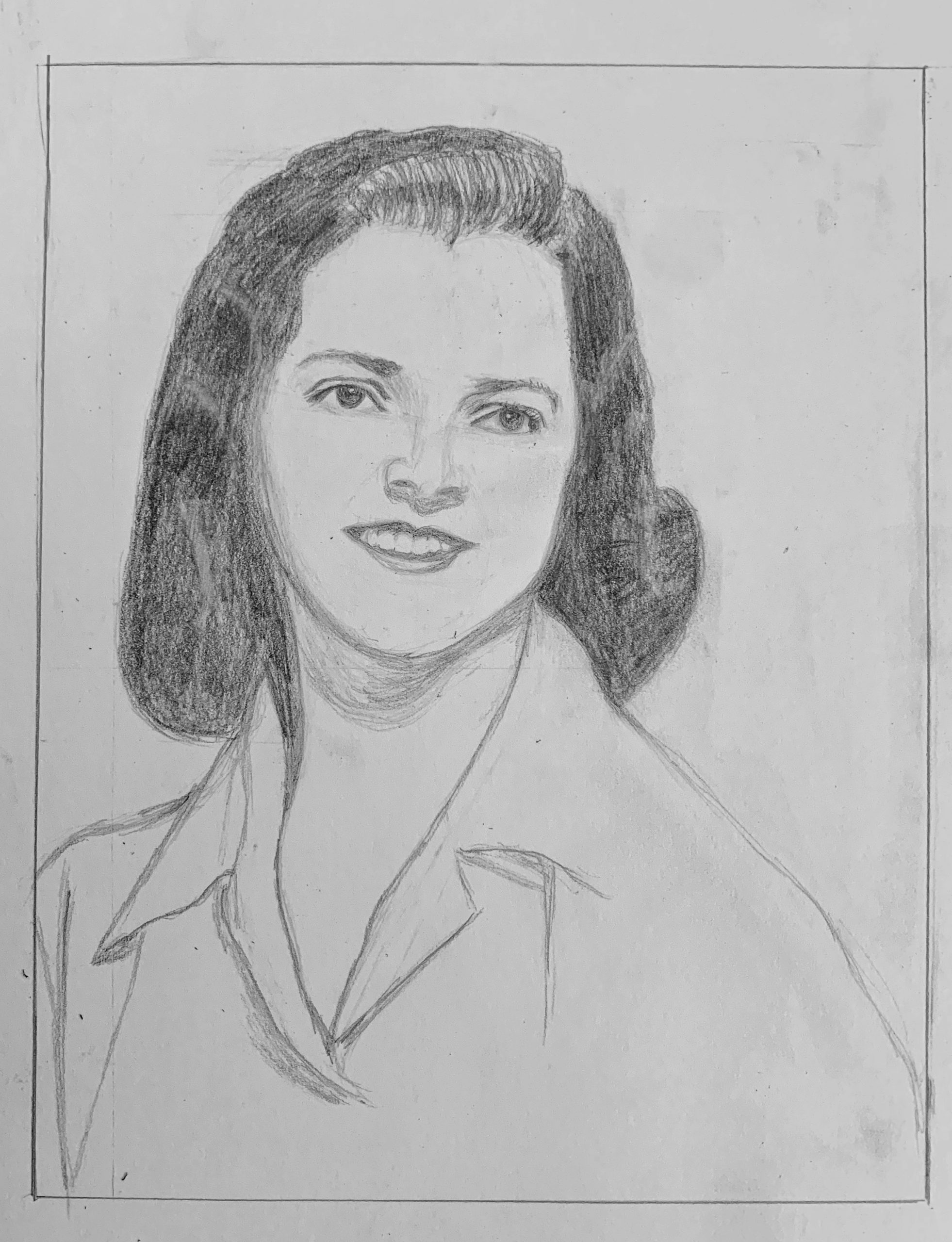
 Pencil on paper 7×9
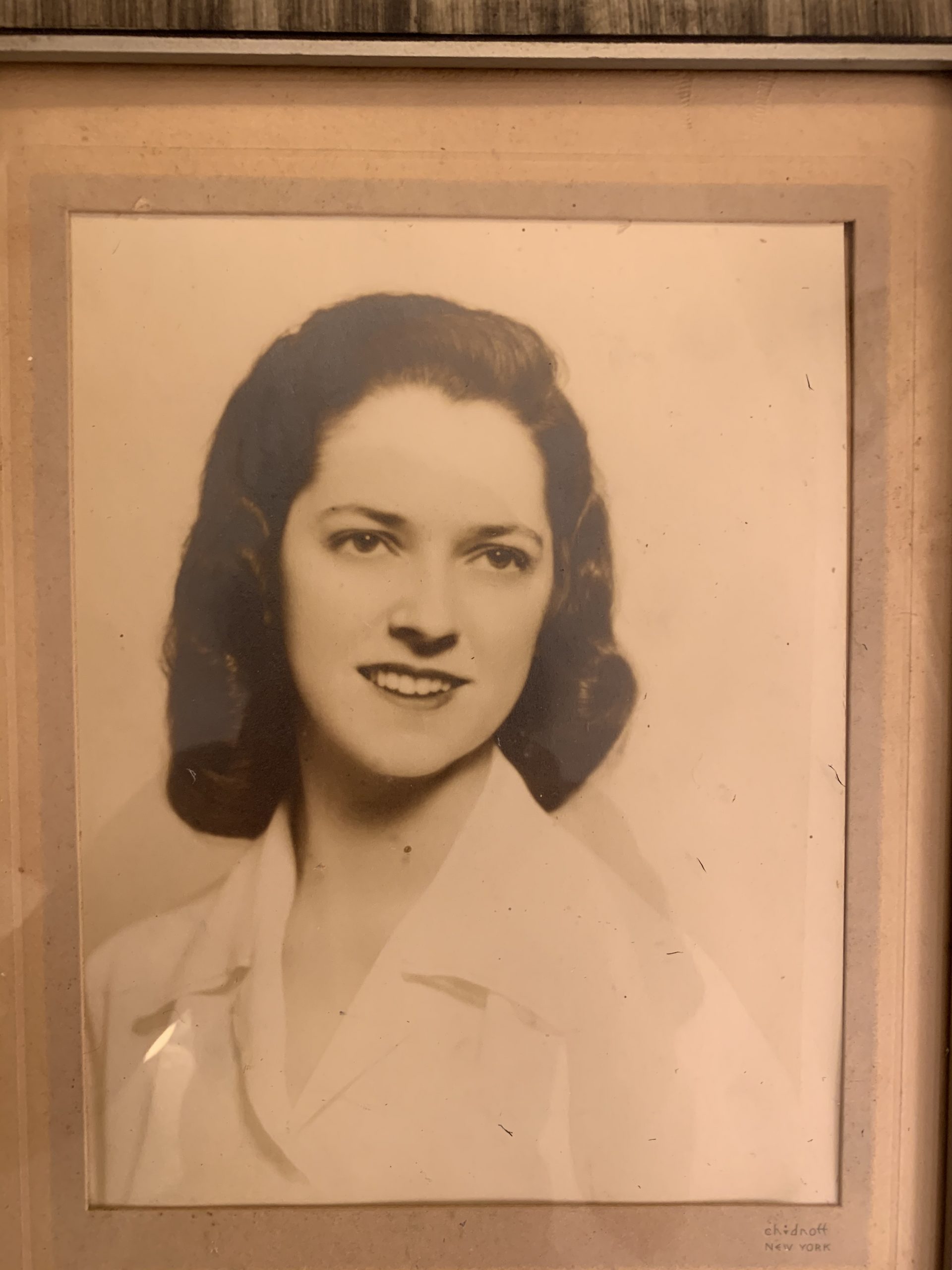
 John Currin (see my comment)
Hi! Sorry for my late post. I was traveling cross country all day yesterday and didn’t have time to work on it. For this week I decided to draw a realistic portrait of my grandmother. I think i had some successes in the features like the eyes, nose, and mouth, but my proportions are off. The head is slightly larger and it’s angled more than it is in the photo. Because she is in a 3/4 pose, I had trouble with the shoulders. Her left shoulder kind of slopes down too much.
Hi Megan,
You’re throwing us a few curves, and I’ve been curious to see how and when your project will settle into its groove. I more than understand the disruptions you’ve been dealing with, but this is the week to gather your ideas and come to some conclusion about what the unifying thread will be.
These past two weeks have given us two intriguing possibilities—and if you choose one of these, rather than some new option, you’ll already have one drawing in the bag. As is, these two drawings, while both good, don’t pull in the same direction. They’re both in pencil (I believe), both realistic, and both people you love, but formally and emotionally they’re worlds apart.
I feel pretty sure the drawing from a photo of your grandmother was an expediency, being on the move this week, but images like this say more about the conventions of that type of photography and representation (photo studio) than they do the individual (at least for those of us who don’t know them). In other words, the faces become interchangeable but the medium remains constant—something that John Currin likes to tackle; the tropes of representation in both art history and popular culture (attached).
For my two cents, I’m more intrigued by the possibilities of the figure on the couch. I think it could benefit by cropping the bottom slightly, to launch us into the scene more effectively, but otherwise it’s a great compositional strategy–“stacking” receding space that way–which reminded me of the Charles Sheeler, attached, but also Lucian Freud (a print from the Bowdoin Museum), or Polina Barskaya (not trying to push the male nudes, just the high angle looking down on the figure).
(Those images are posted with last week’s drawing).
Two things—the Freud print and your wonderful drawings for the Exquisite Corpse—make me wonder if pen might be a better tool. Love the way you took your time with the floor boards (like Freud), and it begs the possibility of other textures. Note how his and the Sheeler leave no surface untouched by either color or pattern. Your drawing could be richer that way.
As is, you contour lines on the sleeping bag are fighting the shading on the sleeping bag. Strong outlines will always flatten the forms (see Egon Schiele); if you want more naturalistic form, avoid contours and say it with value changes. But you’re very good with line—maybe that’s the way to go throughout.
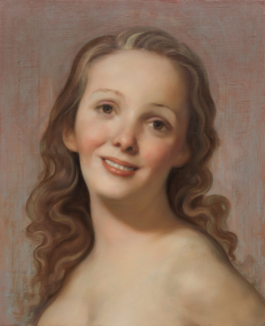
Another suggestion–breathtakingly we’re only 2-1/2 weeks from May 5th. What if you posed someone, took the best photo you can, and put all your eggs in one basket–one amazing graphite drawing (or pen drawing) as your entire project? You might be inspired by this painting that Phoebe Nichols ’20 is finishing as we speak, for an independent study that we’re doing together. (Posted under the figure on the couch).
That’s a lot to chew on but I’d like to hear from you about your plans for this week before you dive in. Please be in touch.
Hi Megan!
I really feel like you captured the essence of this photo of your grandmother! It looks so realistic and accurate. There is high contrast in your line weight and I love the dark of the subject’s features and hair against the stark white of the paper. I think her hair, eyebrows, eyes, the shadow under her nose, and the shadow under her chin could be even darker with more built up shading. You drew the shapes of her eyes, eyebrows, and lips so well – I can tell how closely you were observing the photo while drawing these areas. The shadows in the hair and its texture is also spot on. I agree with what you wrote in your post – I also think that maybe the face could be a little narrower and the nose a little longer. This drawing looks awesome – I’d love to see more realistic portraits drawn from photographs!
Megan
This is a touching drawing. I admire your interest in drawing your grandmother in her younger days. I like the idea of you bringing her in her youth “back to life.” I hope not to be trite, but it’s a nice reminder of how we all begin in the same place, just at different points in time.
The first thing that struck me about the photograph is that there’s not much of a range in value to begin with. It’s an old picture and it has that soft white glow that’s characteristic of old film photography. That makes things harder for you since there’s less value differentiation to work with. Less room for gradation, blending, error. Dark darks and light lights.
I feel as though your drawing might benefit from starker differences in value. It feels graphite-y at the moment. For the most part, her face, shirt, and the background are all the same value. Most of these features are the color of the paper, which is gray. Using a darker pencil to enrich her hair, eyes, lips, and nose might add some dynamism to the drawing. I also might consider using white charcoal to brighten the highlights.
I wonder if changing the tone of the paper would add anything. Maybe sepia paper? Could be a nice little allusion to the fact that it’s an old photo.
Looking forward to next week!
Jack
Hi Megan,
Hope your travels were smooth!
I agree with the points made by Mark, Olivia, and Jack. The portrait of your grandmother is beautiful, and could benefit from greater contrasts in value. I too am curious about what you will ultimately decide on focusing on for your final project. Your work in previous weeks has been compelling—the sleeping bag and the zoomed in drawing of the lamp. I think this could be an interesting route to pursue further. The couch drawing in particular captures a sense of the unique realities of the current situation.
Portraits are another option. For these, I think it may be helpful to think through the question: what can my drawing reveal that other forms of media (such as photographs) can’t communicate? As you have shown in class throughout the semester, you have a wonderful sense of creativity and ability to capture expression and likeness. If you chose to continue drawing portraits, I wonder if moving in the direction of drawing a less “staged” image would allow you to further explore your creativity and develop drawing skills. I agree with Mark that it could be interesting to experiment with pen or a darker medium as well.
Whoops Megan, I don’t think I was assigned you this week 🙂