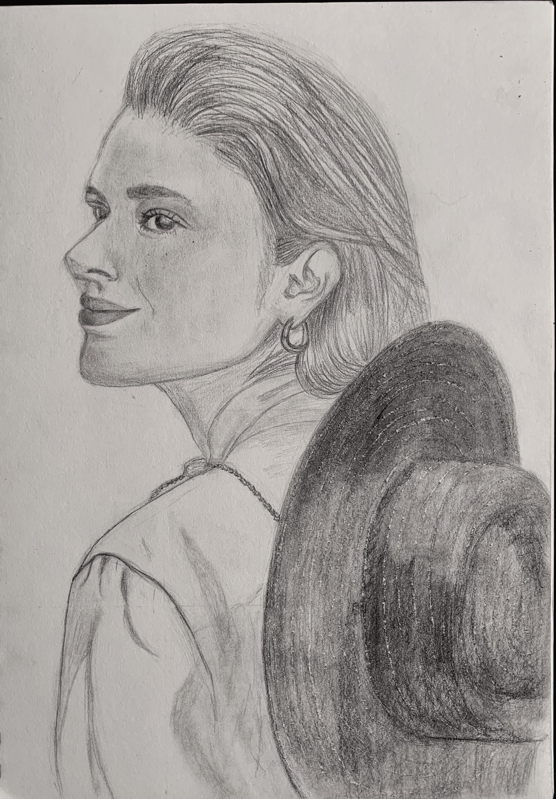
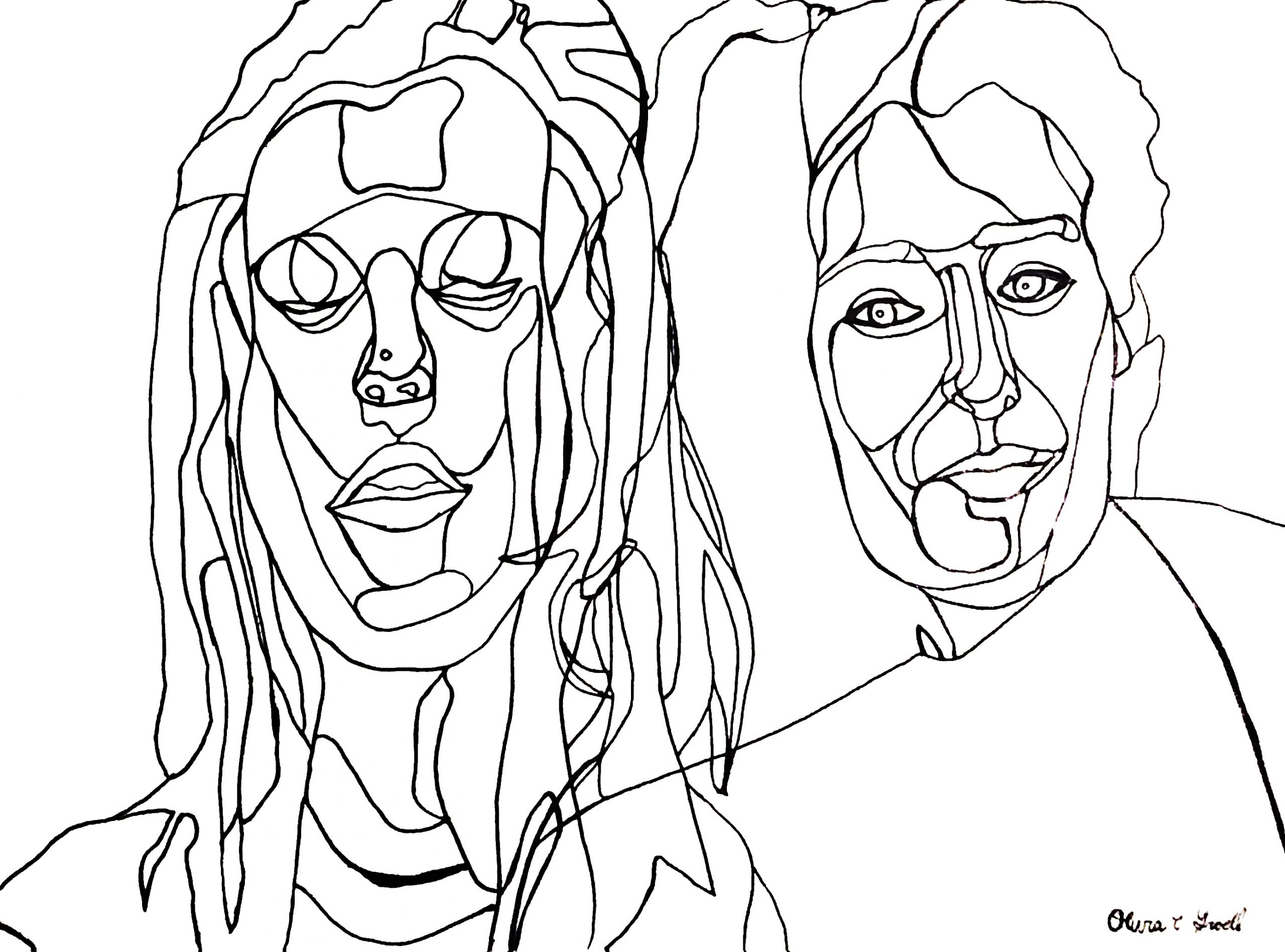
8.5 x 12 graphite on paper
Professor Mark Wethli – Spring 2020
8.5 x 12 graphite on paper
 X
X
X
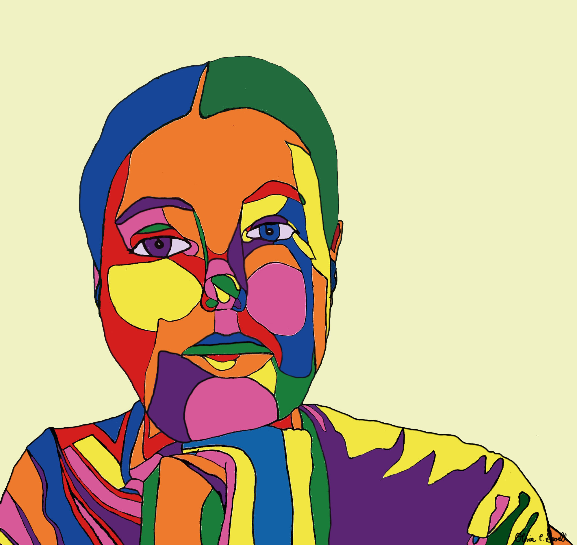
Acrylic Paint Marker on Paper, 24 x 18 inches
X
Acrylic Paint Marker on Paper, 18 x 24 inches
X (like others in the class, I think this is a better drawing than you do, but don’t include it if it doesn’t do the trick for you)
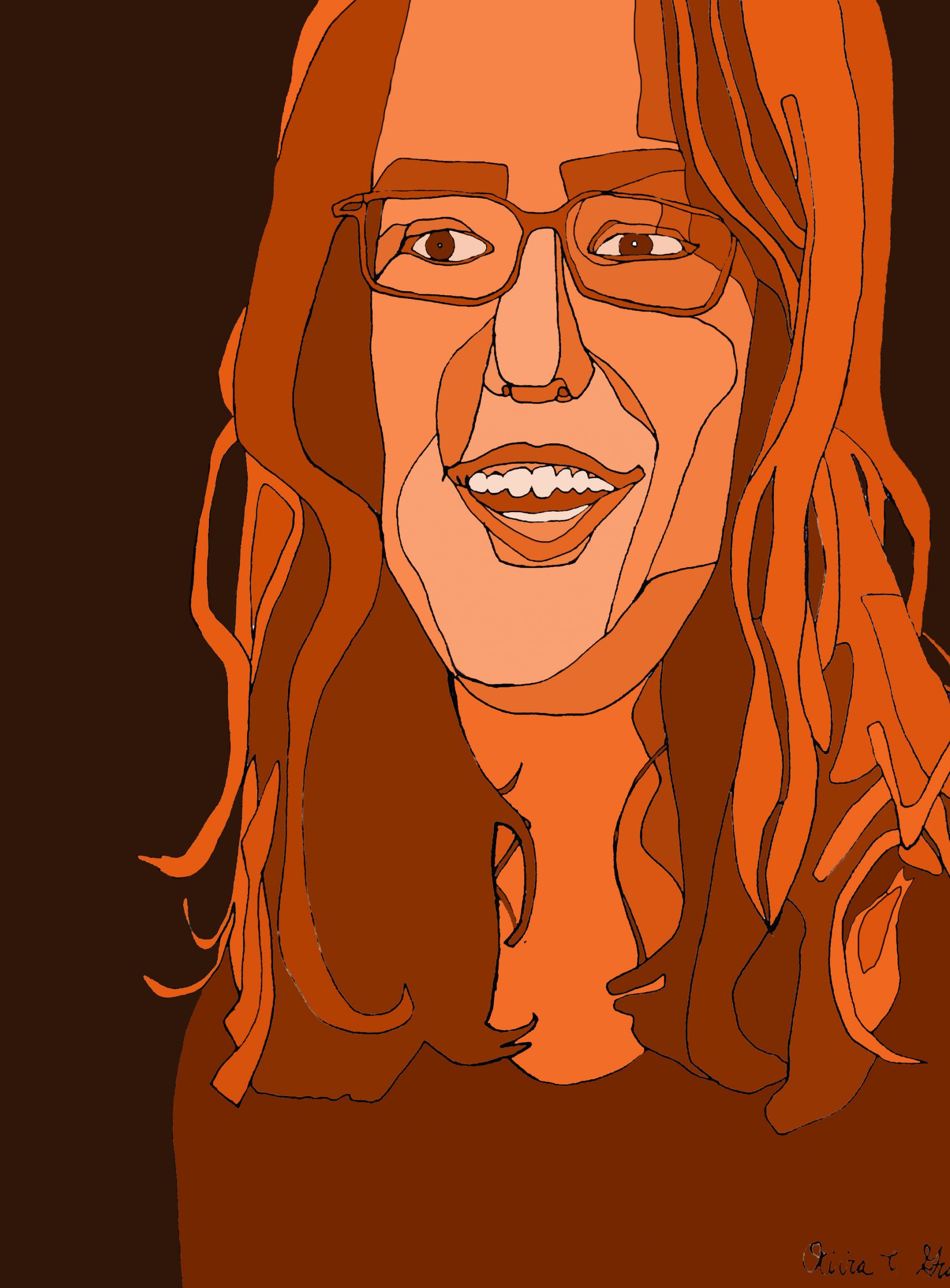
Acrylic Paint Marker on Paper, edited in Photoshop, 24 x 18 inches
X
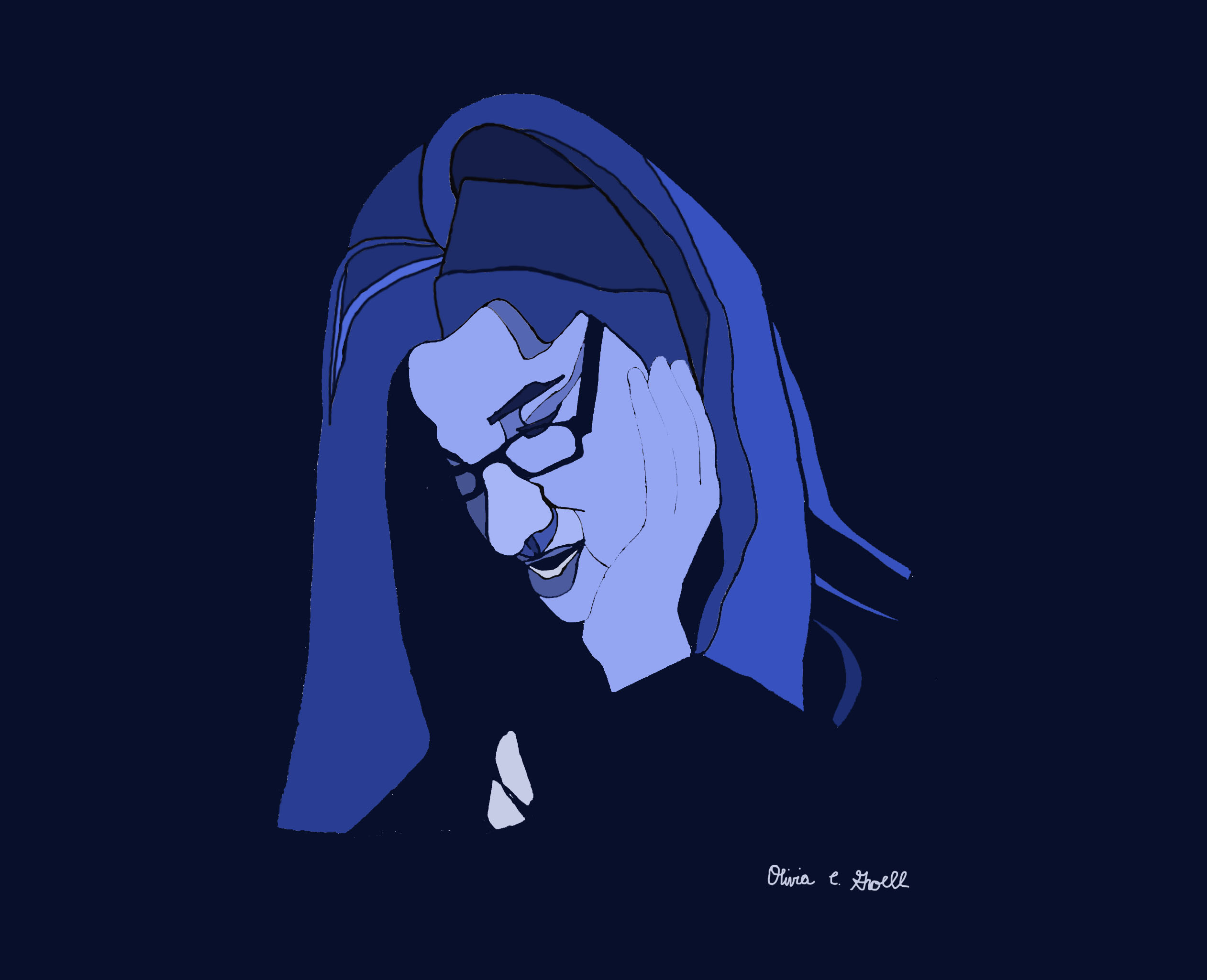
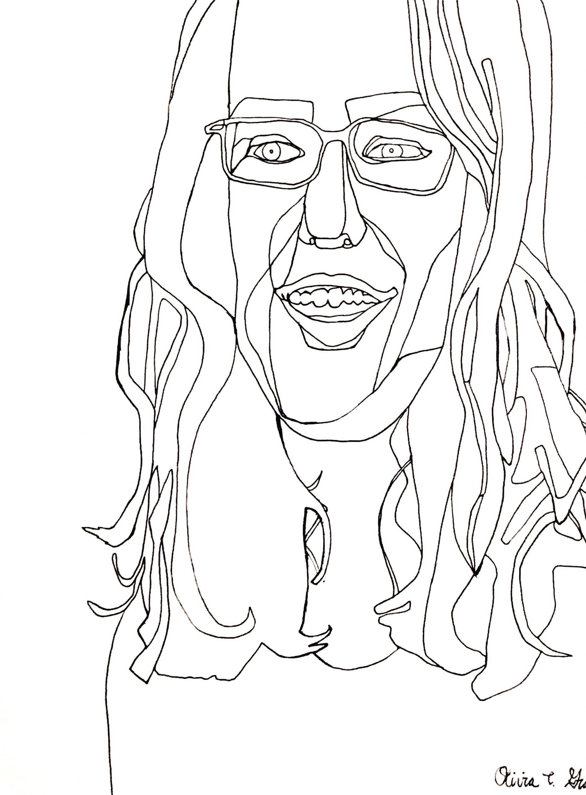
Sharpie on Paper, edited in Photoshop, 17 1/2 x 22 1/2 inches
I think the line drawing of this works better because of its positive/negative space ambiguity. This version pins that down and disrupts the visual play. It might still work by defining what rectangle she’s in (like we talked about) but the line between the hand and the face needs to be stronger as well.
Acrylic Paint Marker on Paper, edited in Photoshop, 17 1/2 x 22 1/2 inches
X
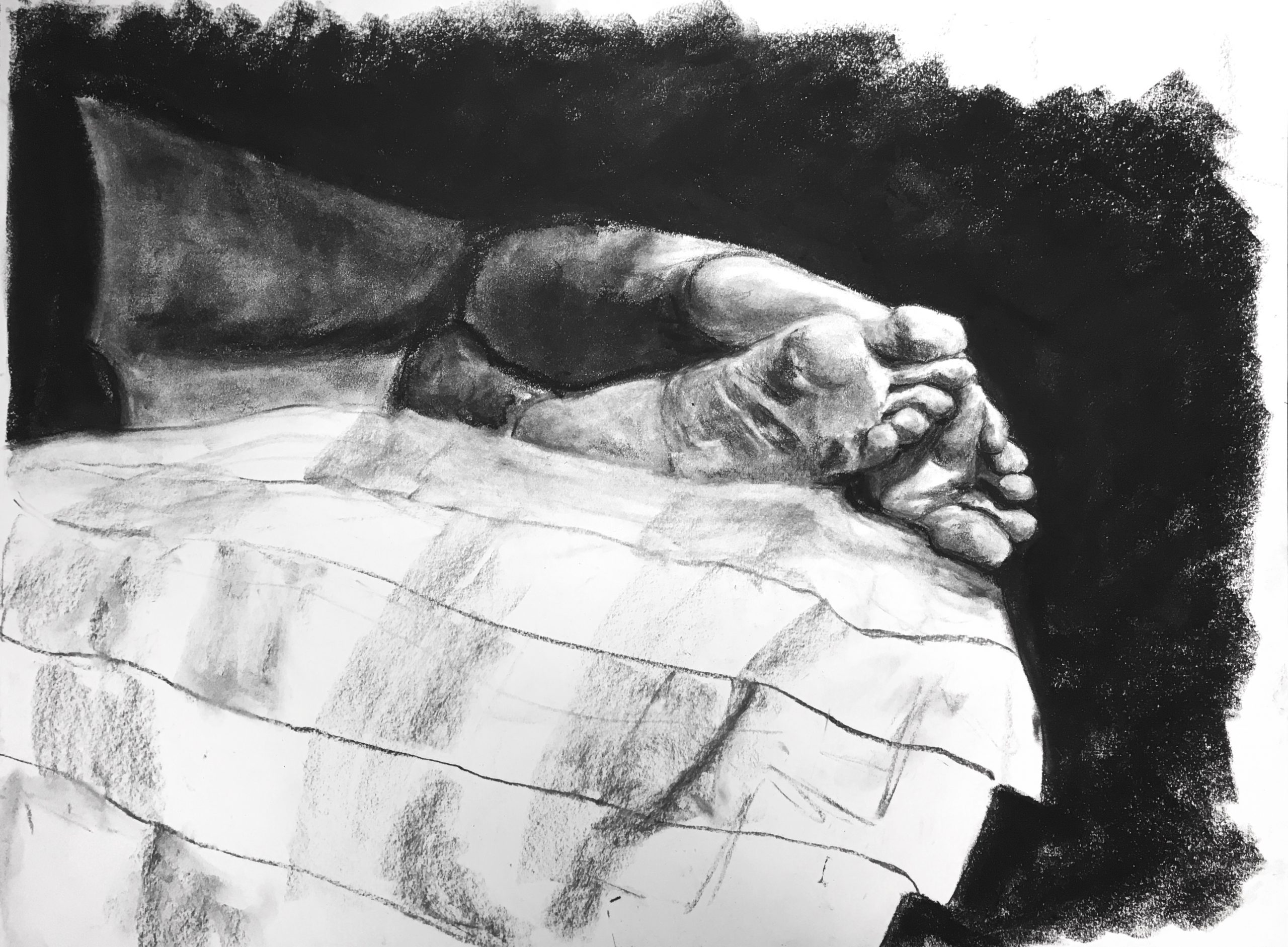
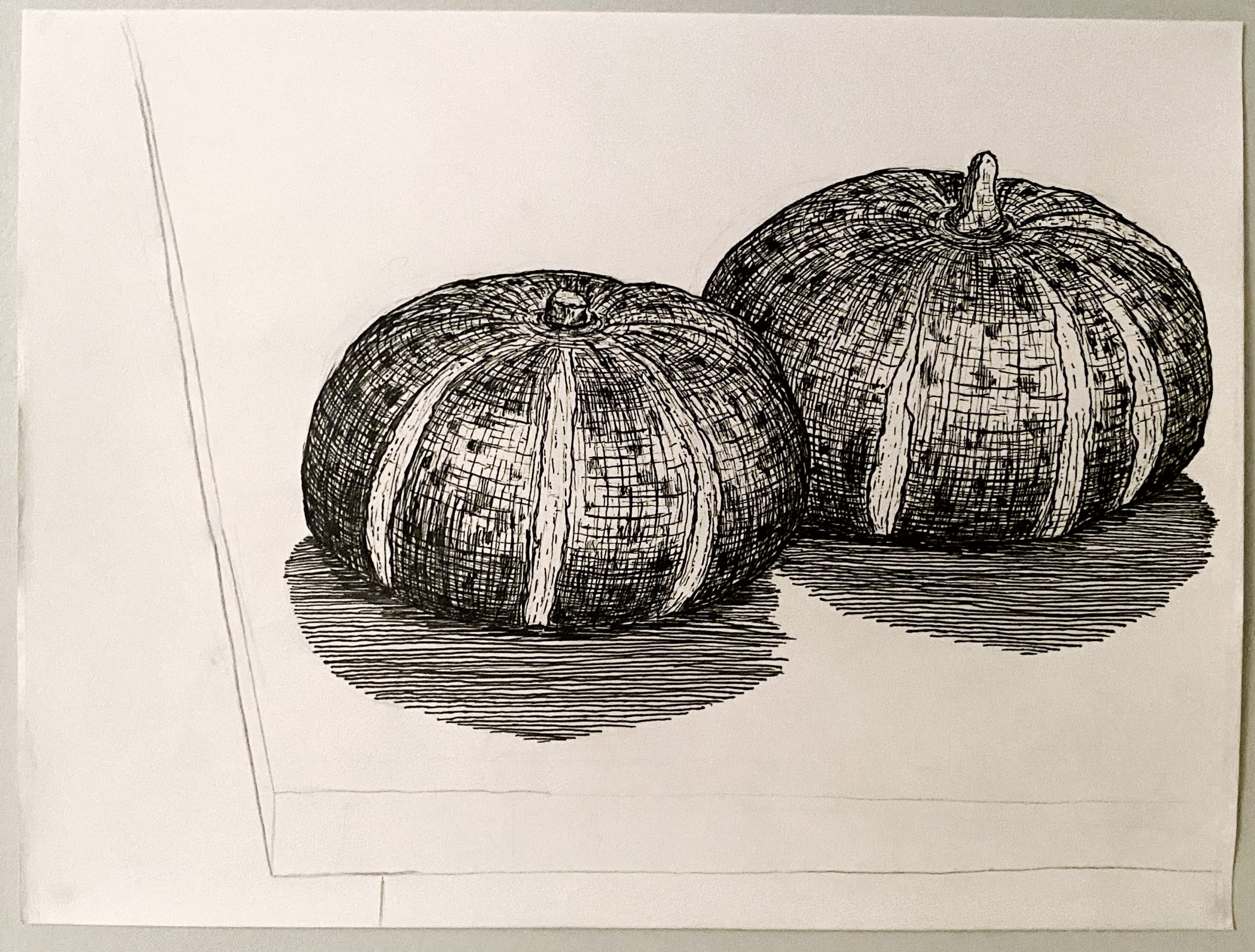
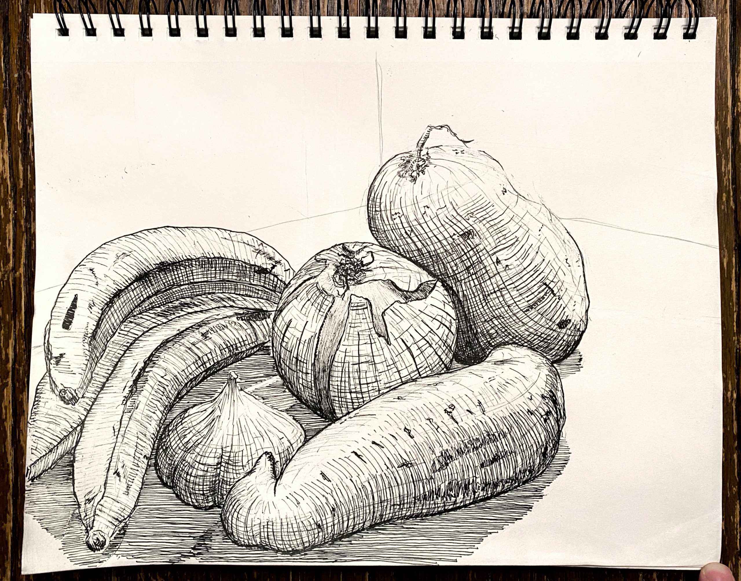 Micron on paper, 9 x 12
X
Suggested cropping and presentation:
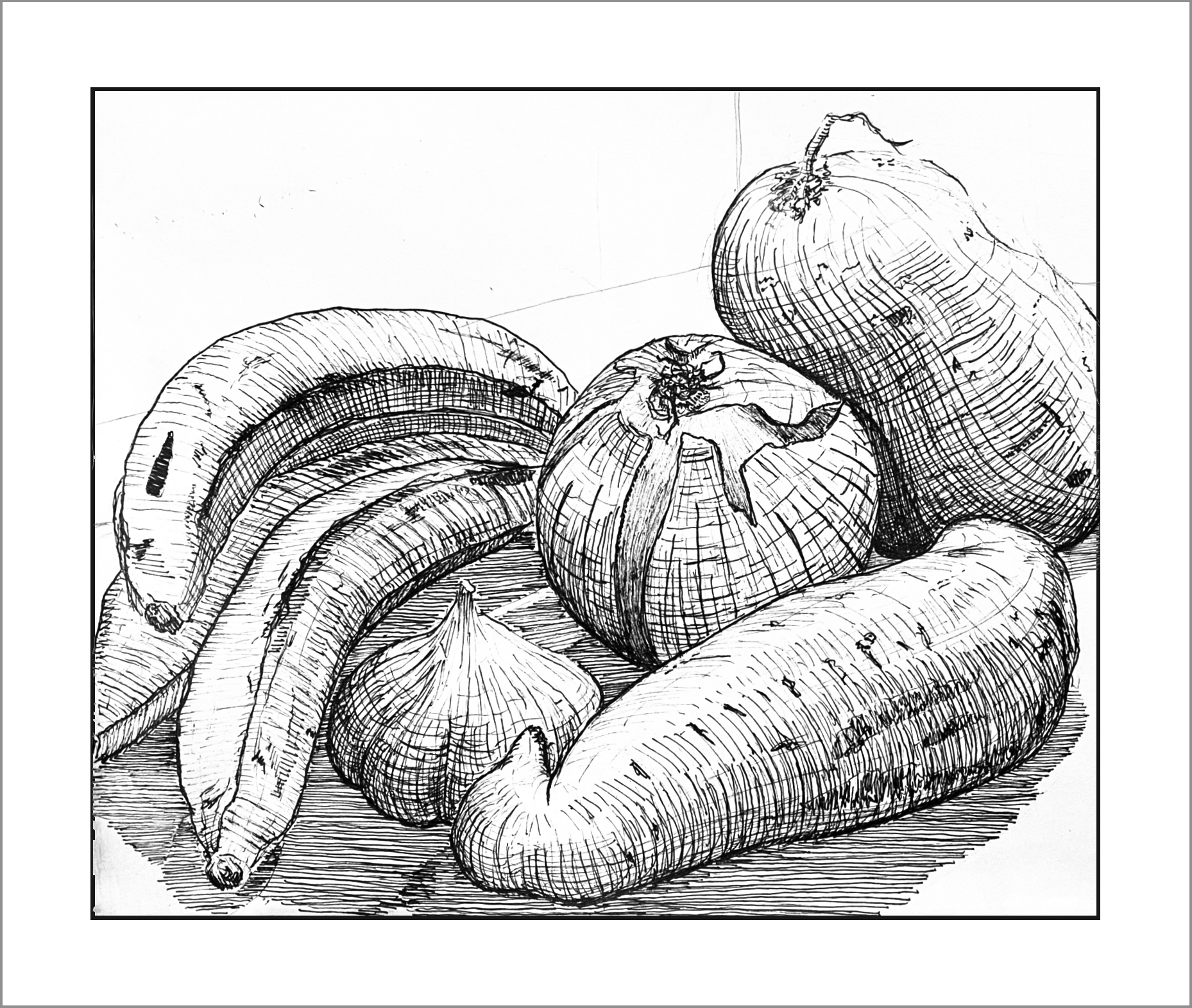
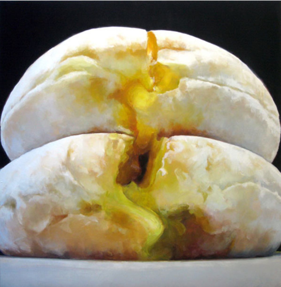
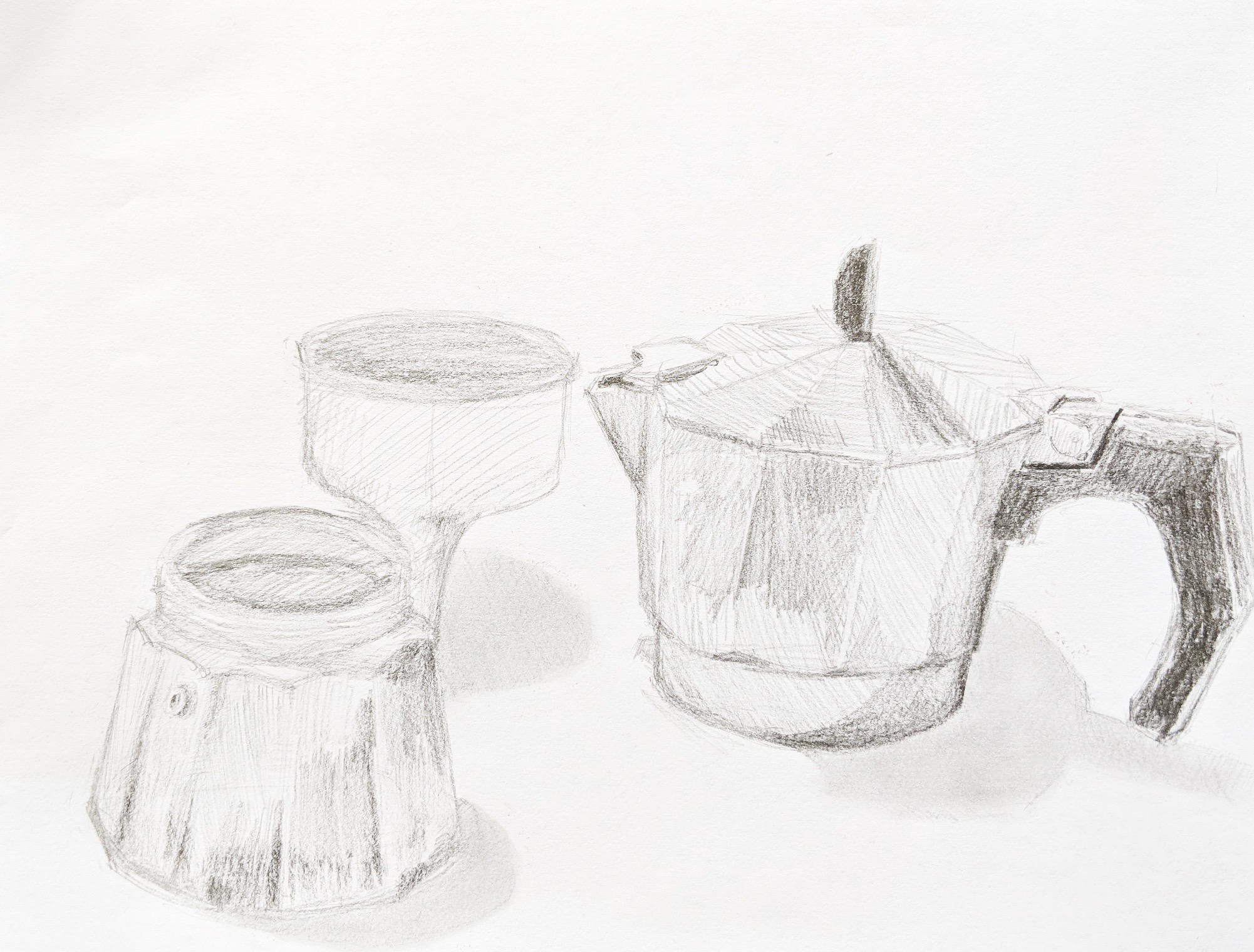
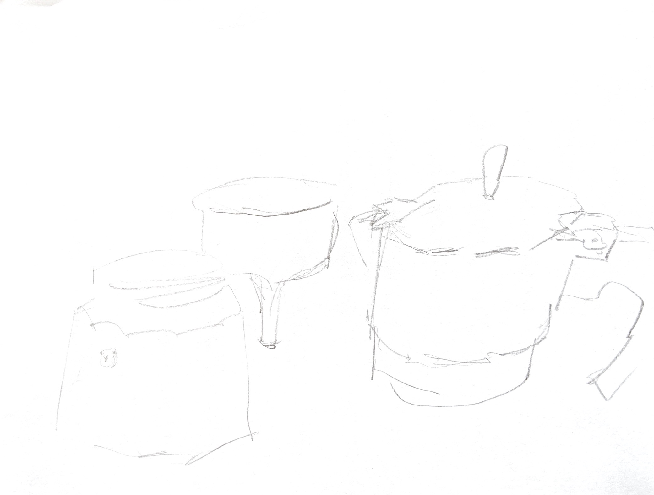
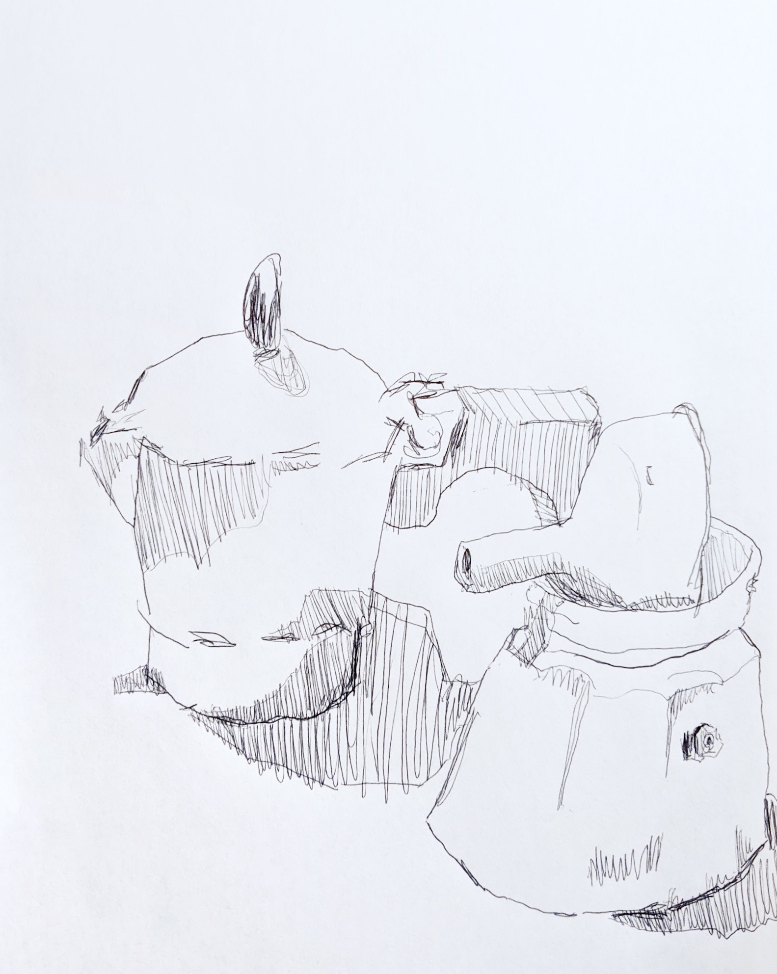
The pleasure in these isn’t the still life or the space its in, its the texture and inventiveness of your hatching. I suggest cropping these so as to zoom in and indulge what they’re best at. A painter who comes to mind this way is Emily Eveleth, who’s famous for her close ups of donuts:
 Micron on paper, 9 x 12
X
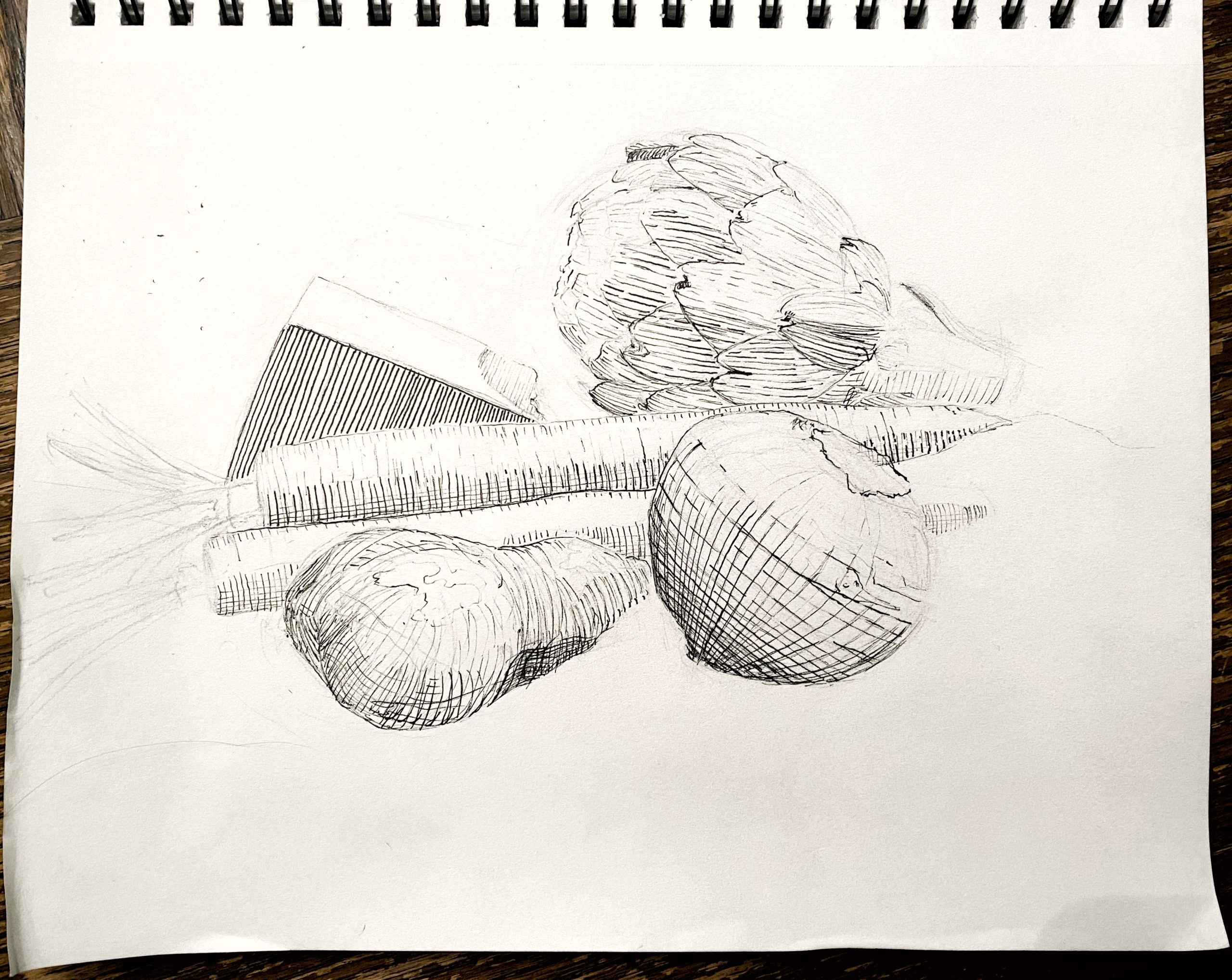
Micron on paper, 9 x 12
——————————————–
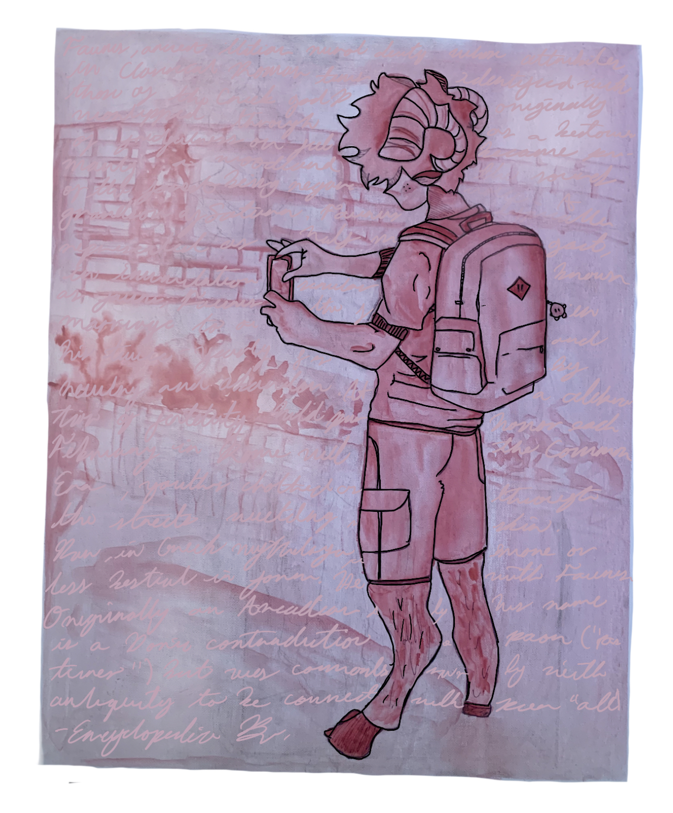
Faunus
X
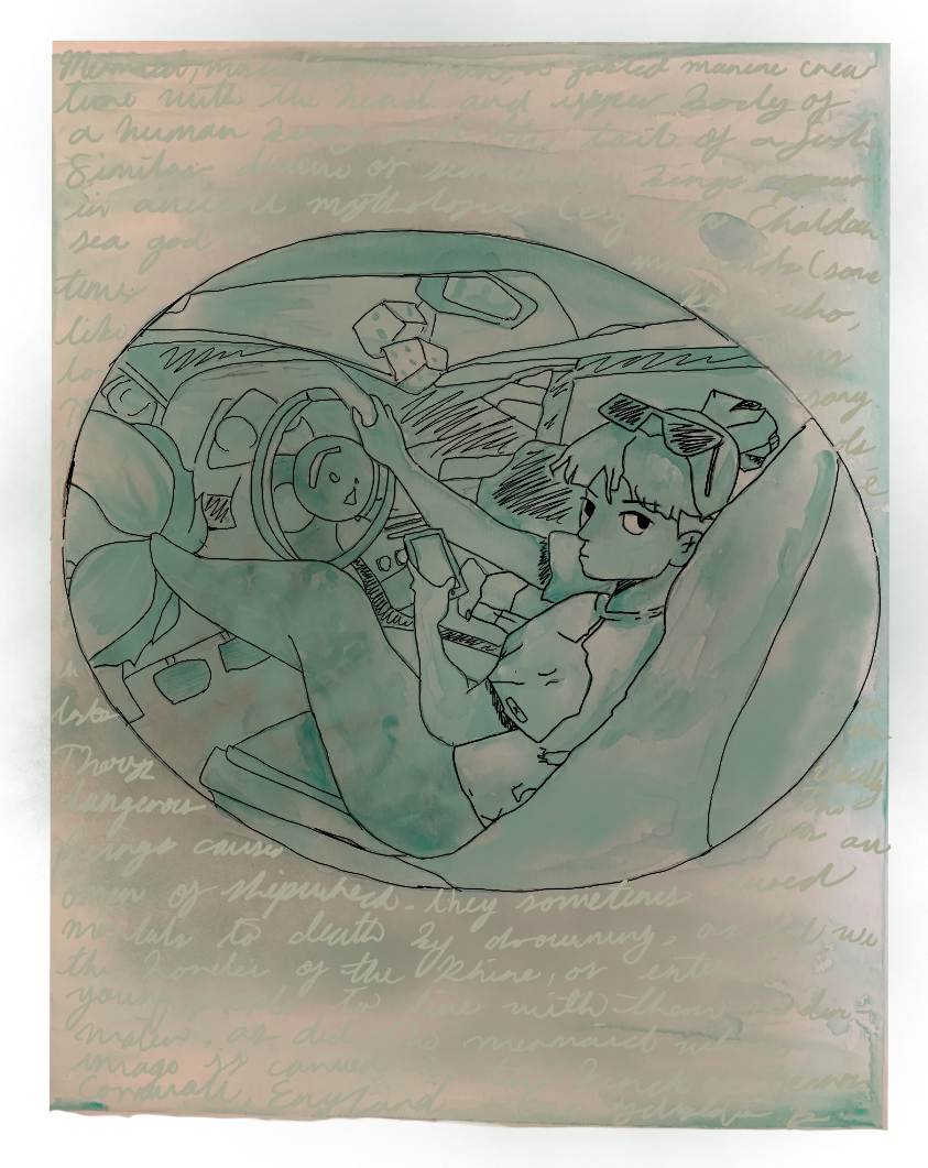
Mermaid
X
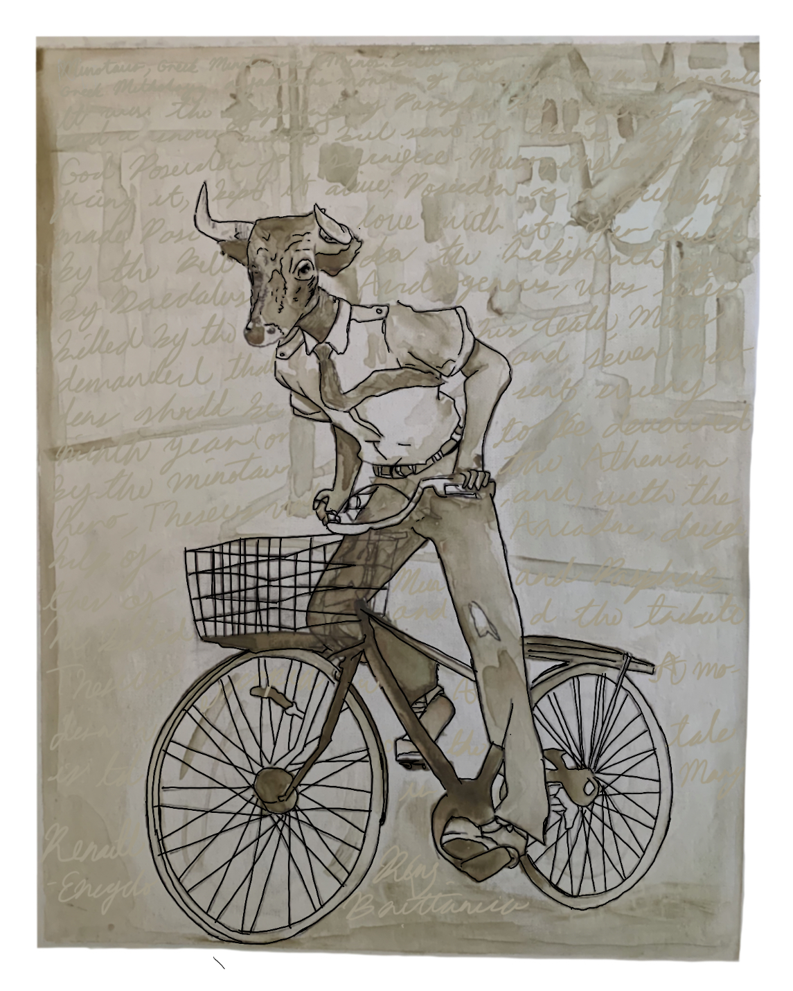
Minotaur
X

X
X
X
X
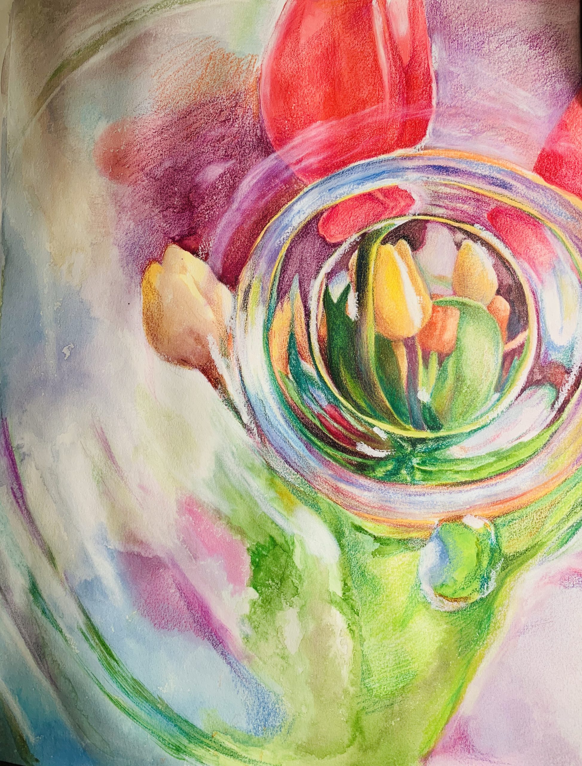
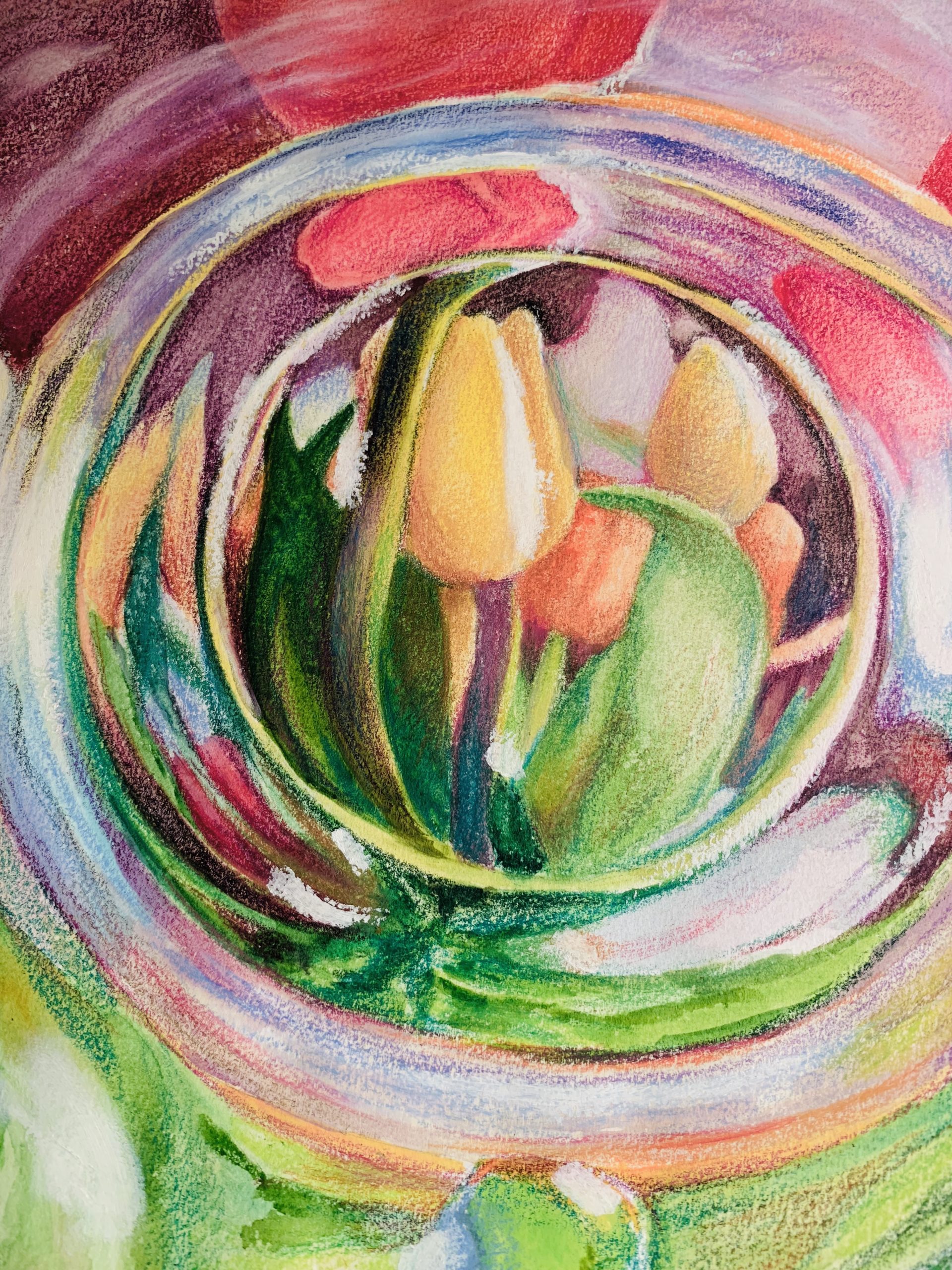
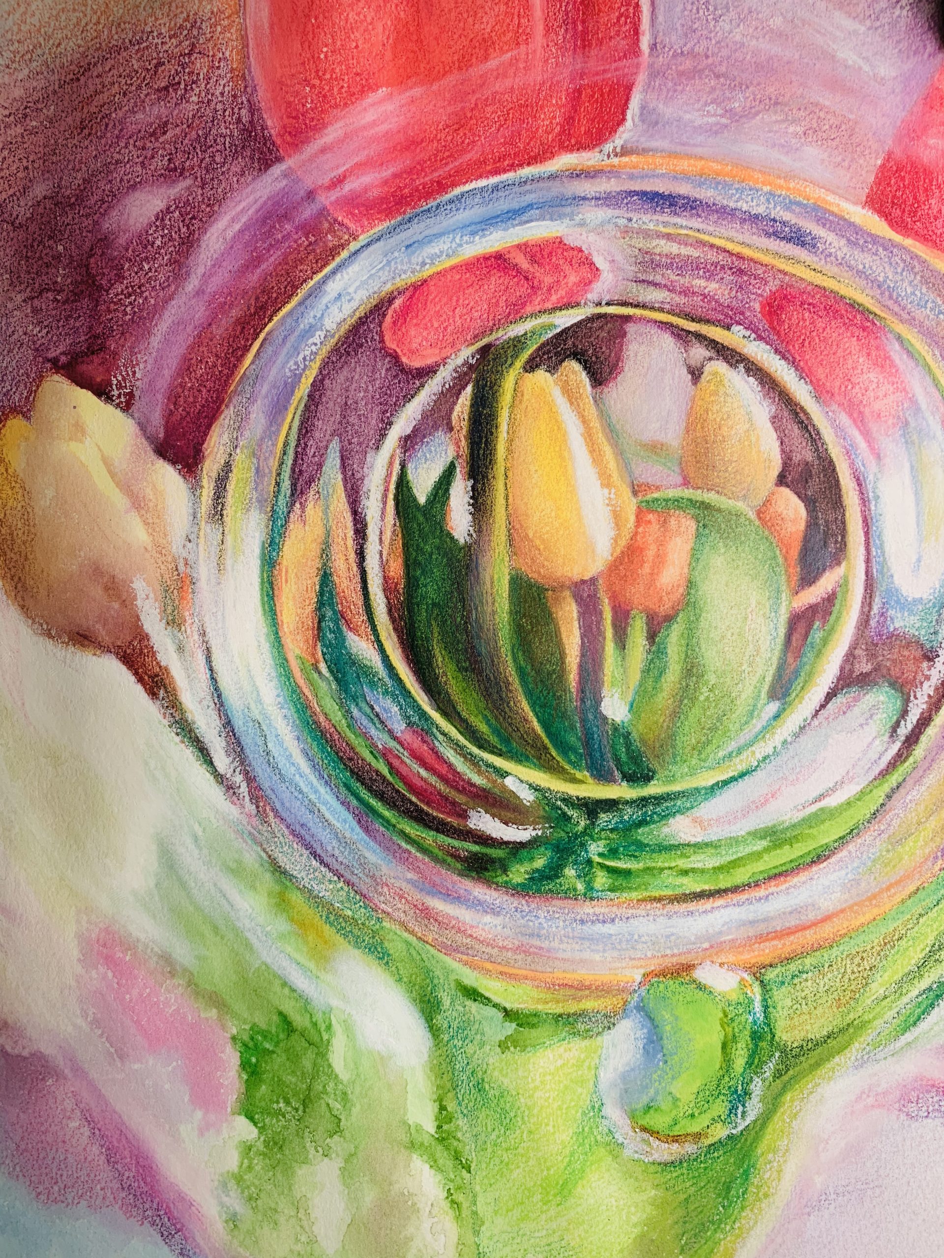
So, emm, think this is the final week. Anyways, I returned to the same objects that I portrayed from my first week–flowers and glass. Summer is slowly appearing in Maine for now, and thanks for the suggestion from Mark about O’Keeffe, I decided to portray a wide range of colors in this drawing. The drawing was done with water color, colored pencils, and white pastel. While the middle of the drawing has a clear reflection, the edges of the drawing are portrayed with meshed together color. Enjoy!
X
Here are two close-ups:
Some notes:
I would have gone for better editing (squaring and lighting) as the first step.
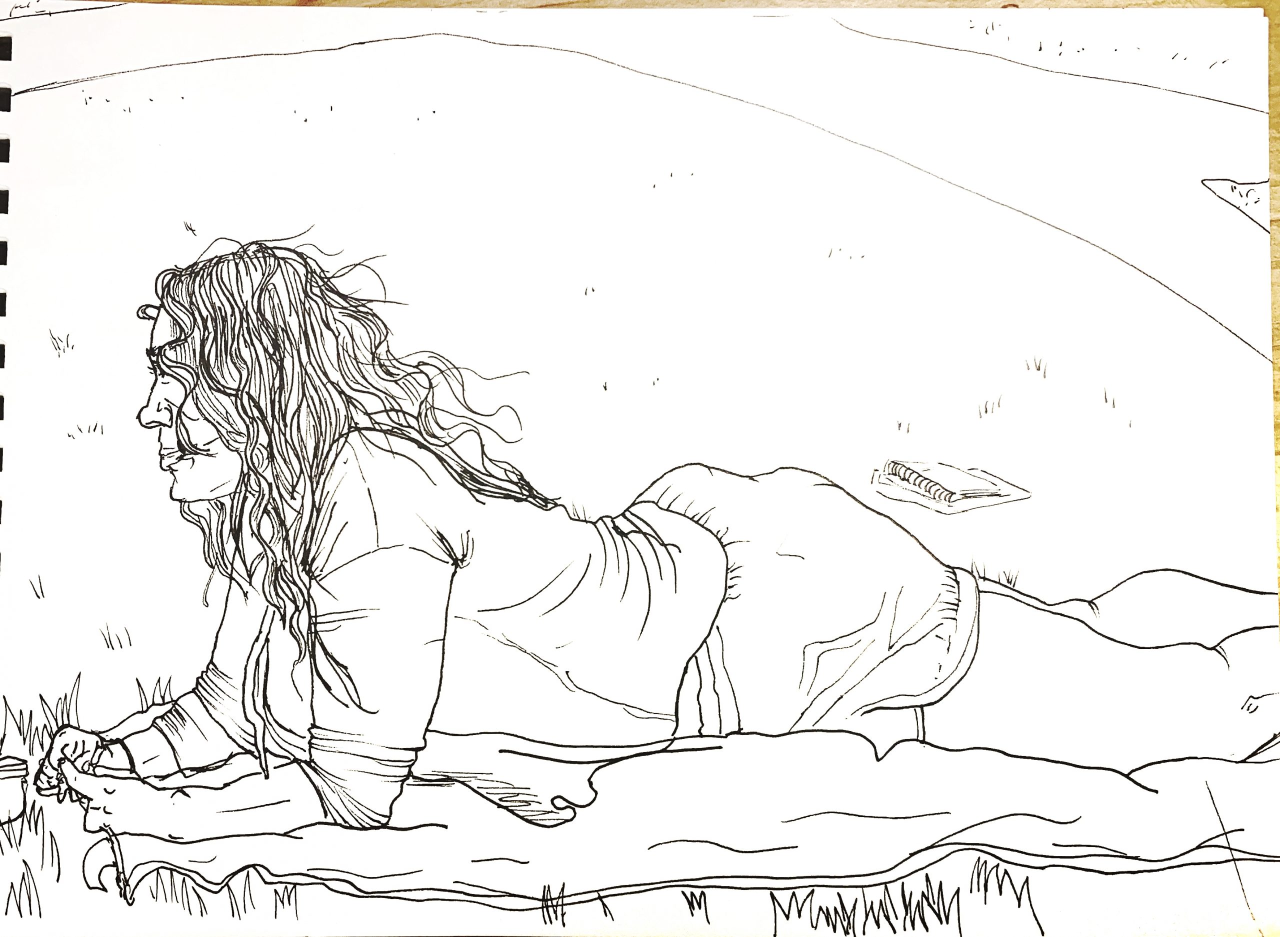
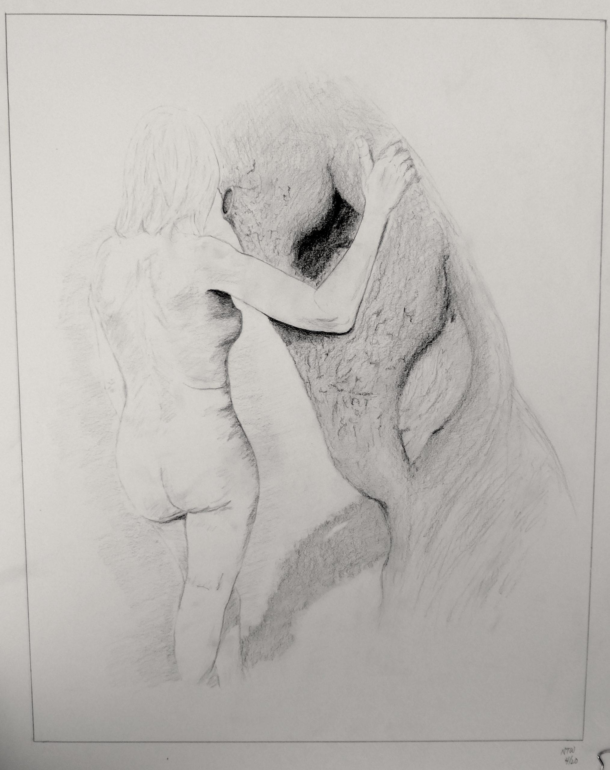
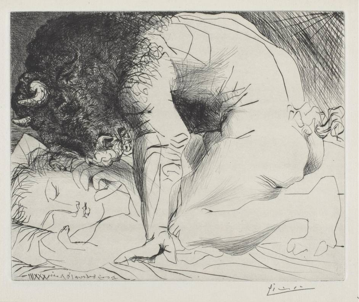
Loved your comments about beauty and the beast. That’s the first step in that “conductor” analogy I made last time–in addition to the facts of the piece, an idea or a vision for it. Then comes finding the best way to bring that about. For me (only one answer among many, but where this seems to be pointed) that would be to find the graphic metaphor for these contrasting figures. My thoughts go to the Picasso etching, below, “Minotaur caressing a sleeping woman,” in which he contrasts the characteristics of his subjects with a fitting graphic style for each (intense hatching vs. graceful contours).
Yours is part way there but needs to refine, amplify, and drive your point home much harder. I haven’t done this either in this example but just to suggest the idea of making her the most elegant contour drawing you can muster, and the tree, likewise, the gnarliest you can come up with.
(By the way, the back of her knee is too high on her leg)
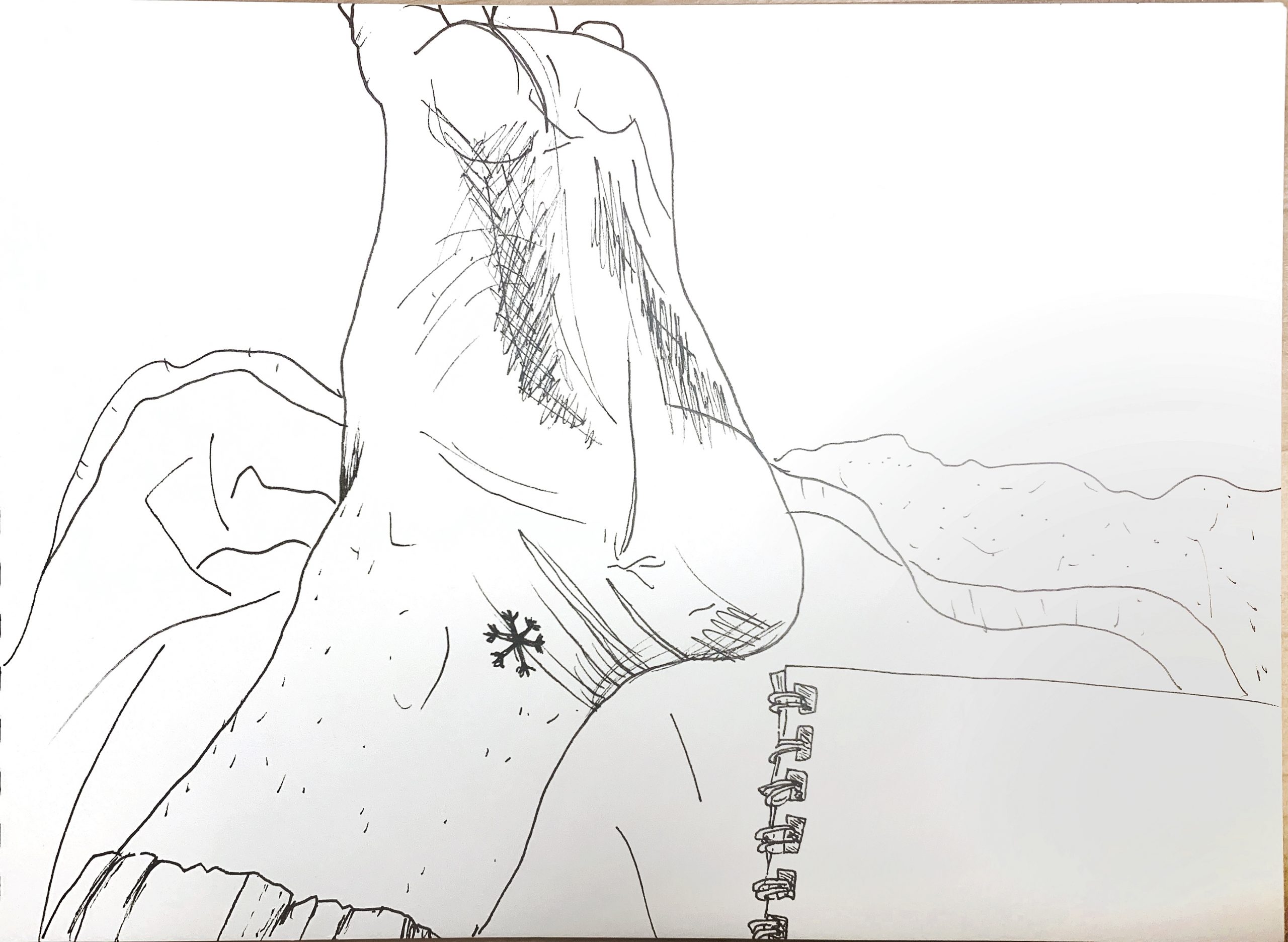
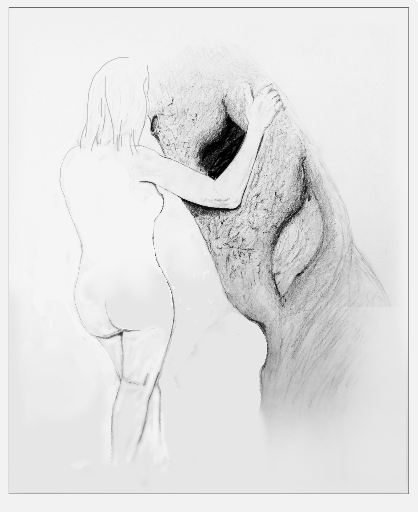
I eliminated what I took to be a cast shadow (since it was unclear and gumming up the works) and of all things discovered an echo of the silhouette of her torso–I knew there was something going on with that negative shape but this opens that up–which takes it into Dali/Magritte territory. I also intuited there was some surrealism at work here.
(Ignore the tonal shifts in the background, which are vestiges of the camera exposure).
Another “sticky” relationship is her arm and the scar on the tree–they also echo one another’s shapes, but with such a small space between them that they become jumbled. I solved this by letting her arm overlap it, making the arm and the black shape more intimate (like she’s cradling it), and silhouetting the arm.
Although it’s factual, the next problem for me is the two scars on the tree. They’re so specific and so similar that it feels like you’re trying to say something when in fact you’re just being journalistic–they were there and you’re reporting them–but for me they’re dominating the beauty and the beast motif. They also stand out too much. And journalism and symbolism (since you mentioned beauty and the beast) are difficult partners, pulling us in two directions at once.
The two scars remind me of the way uncertain or nervous beginners over-emphasize the nostrils in a portrait (or the way a kid will sing the words they know louder than the rest)–you’re clinging too much to those elements and it shows, undermining your confidence (and therefore ours) in the image.
More important about the tree should be its bark, which seems to get just passing attention.
Not saying this is the only way through this drawing but whichever way your choose to “conduct” this symphony it needs to be more thorough and more convincing.
There was a larger question you posed about combining the figure (from the first half of the semester) with your trees. Not a bad idea but it is a “thesis breaker.” Artists need to be free to pursue their impulses but our “contract” (I mean that lightly) was for a more cohesive body of work. After that drawing that I flipped out over the first or second week (and assuming you did as well), a series of the same tree from the same angle but a step to the left and then a step to the right, or no steps at all but placing the visual emphasis in different places, or making no conscious changes at all (just drawing it three more times to see what would happen) would be closer to the mark (hoping everyone is reading this).
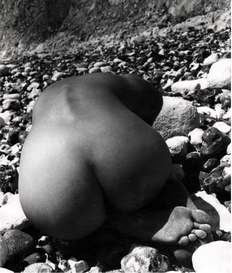
Just as an aside, this also brought to mind the work of British photographer Bill Brandt (1904-1983), who liked to juxtapose nudes in nature, and smooth skin against rough textures.
X
X
X
X