Watercolor, ink pen, graphite on watercolor paper, 5 1/2 by 7 inches
Bernini, Apollo and Daphne
5 thoughts on “Walking Tree From North, Nu Assis”
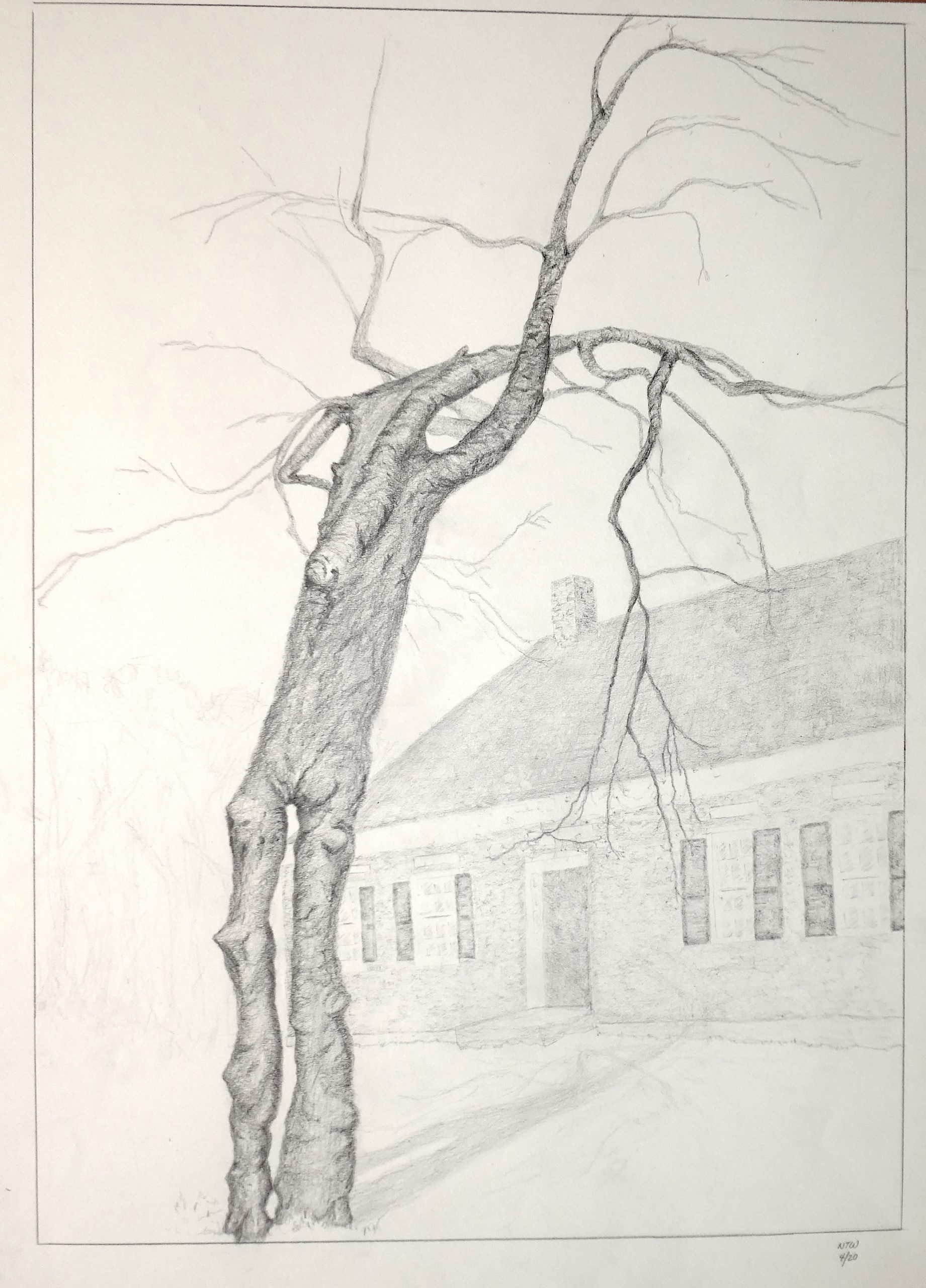
This week I focused on drawing the same apple tree (“Walking Tree”) but from the opposite side. In contrast to last week’s drawing, I wanted to follow explore including the background, which from this perspective was our house, to give it scale and context.
I learned a huge amount this week. First, the comments of several classmates were very helpful in suggesting techniques for creating a sense of depth, movement and grounding (thank you, Claire, Perrin, Megan, Ali and Olivia!). As always, Mark’s comments were extraordinarily perceptive and instructive, and he provided several magnificent drawings that I plan to study (and steal from). As it turned out, I had finished the piece before reading his comments, which probably turned out for the best because it forced me to figure a bunch of things out on my own. How to draw bark, bricks, windows? How to include our house in the background without making it distract from the tree, which was meant to be the central focus? How to balance realism and imagination?
One approach that turned out to be useful for me was to make several traced copies of my initial drawing so I could experiment with textures, ways of holding the pencil, strokes, emphasis, backgrounds. I benefited a lot by watching Mark’s “High Resolution Pencil Value Drawing Demo.” I also discovered the value of kneaded erasers: after drawing the house too dark and conspicuous, I was able to tone it down.
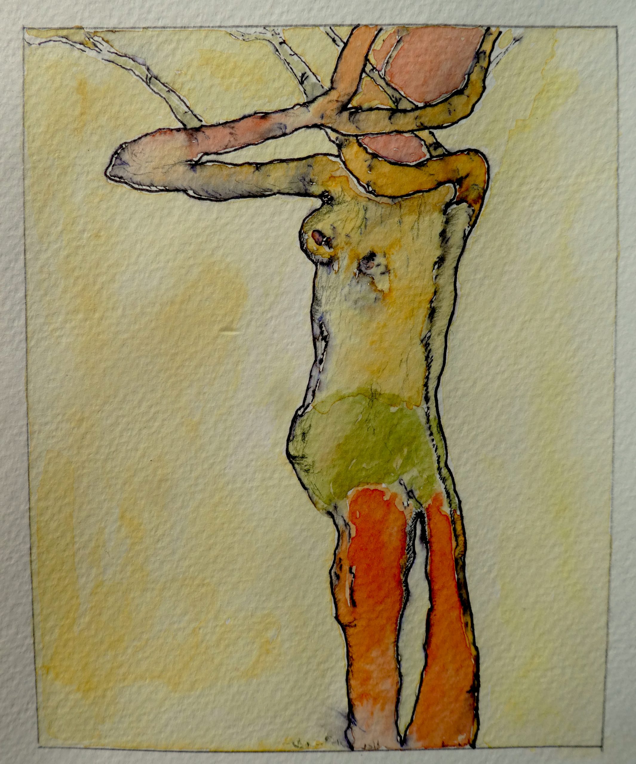
Inspired by the Egon Schiele painting Mark introduced me to, I decided to do a small second project, returning to last week’s drawing and splashing a little water color on it.
Amazing job! I feel like you really took the next step from last week to this week. The tree really holds its own, and I love the addition of the background. I am so impressed with the delicacy and detail of both the tree, and the very light background. The shadow of the tree especially keeps the image grounded. The tree again seems very human, this week especially like bones draped in skin. I think for your next one, make the whole image a little darker to increase the range of tones. If you make the tree bark and inlets darker, you can use more mid tones to explore texture, and also the background.
I almost skipped past the color drawing you did because I thought it was an example image posted by Mark! So cool that you experimented with that! It is eye catching and fun. I think next time I would put as much dark red at the top of the tree/human because the form is already so complex there. Beautiful work! Can’t wait to see what is next!
Hi Nat,
This week’s drawings are great! I can see that you pushed yourself in new directions, and the results are exciting and interesting.Tracing your original drawings is a great way to work and experiment.
I love the graphite drawing you made. The tree really “speaks.” I think you have done a nice job with the branches—choosing which ones to include, and expressing their character. Maybe the house could benefit from slightly greater variation in value, but I know it is in the background and you want the emphasis to be on the tree. Right now the tree and the house almost look like two separate drawings because the value range is treated differently for the two objects. I don’t think it would take much (just a slightly darker outline of the roof maybe) to pull the house into the same world of the tree. Is the shadow of the tree darker in reality than you drew it? Maybe not, just might be worth checking.
I also liked seeing your experimentations with Schiele’s painting. So interesting! Personally, still think your pencil drawings are best for this project, but I like the experimentation and I do think it’s a good study of how you can add more “muscle” to your trees, as you were striving for in previous weeks.
I’m learning about Schiele for a paper in another class…did you know he passed away from the Spanish Influenza? Sad that these epidemics have taken the lives of so many artists!
Hello Nat!,
Both drawings are amazing, the colors, the values, there are on point! In both drawings I can clearly see both human figures. I really love how in the second piece, you used different colors, that help the viewer see the full body (literally) of the tree. In the first drawing I don’t feel that the drawing is distracting at all, I can even dare to say that makes the three pop up more, as well gives a chance to see dimensions. I would love to see the first drawing would look with watercolors on it. I’m so impress with how you are able to see the human figure on those trees, and draw them, without losing the true essence of the tree. Stunning work.
I’ve somehow gotten 2 weeks behind commenting on your work—my apologies.
The drawing of the tree and the house is gorgeous and very powwerful, and answers perfectly the questions you were asking about putting the two together. Claire suggests bringing some of the lines of the house into the same value range as the tree, to bridge the two. Not a bad idea but I’m not sure I agree. I like the way those very delicate tips of the branches actually achieve this by approaching the same line weight as the window frames, bridging the two in a different way.
I’m even slightly intrigued by the notion that the house is ghostly—that it’s come and gone during the life of the tree. I know this wasn’t on your agenda, but that for me is a very tempting reading—their relative temporality.
There’s also a palpable and wonderful sense that they’re like an old married couple. Love the way the tree inclines toward the house, which doesn’t return the gesture but seems happy to receive it. Not at all an easy thing to achieve, and I suspect its because the artist is “married” to both. The cast shadow from the tree to the house adds to this effect but somehow looks forced or unnatural in this light, which otherwise appears overcast, making it almost surreal.
The high degree of observation, your very sensitive touch, and the intensity of your drawing process are in some ways the real subject here, and very commendable.
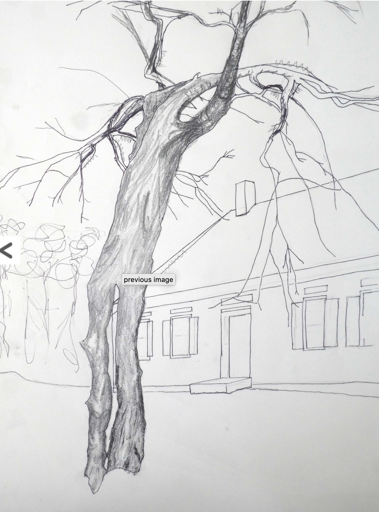
My only slight reservations are two compositional ones. I wish the base of the tree was either cropped, or there was a small space between the tree and the border. Being tangent, as they are, is indecisive. The tree looks like its stumbling over its own feet (or the border) in an effort to reach the house, rather than sitting comfortably in its place (which either solution would resolve).
Your drawing of the same scene from the week before, which I’ve attached, handles this issue better, and the top of the drawing as well for that matter, “welding” the tree to the rectangle more securely.
The space to the left looks vacant. I think I see the faintest hints of some trees, which might be brought out a bit more. Because the house ends behind the tree it leaves me with the desire for the other shoe to drop. It would be nice if there was something to gently bring our eye back to the left side—also as a counterweight to the leaning tree and the slope of the roof, which incline to the right.
The tree is disturbingly anthropomorphic, at least for this viewer, which tells me you’ve done a good job. That lower part especially is all pelvic bones and bony knees-—more aged human than tree.
I have less to say about the Schiele/tree hybrid. I suppose I’ve always found these kinds of equations facile (save for Bernini’s sculpture of Apollo and Daphne, attached). This one would work better if it weren’t for the breast, which tips the scale from botany to biology and breaks up any productive kind of ambiguity. You and Ali seem to be sharing notes (in a good way) when it comes to this technique. I think Claire encouraged you to stay with the pencil. Based on these two examples I would agree, but having had a peek at next week’s drawing there will be more to say about that….
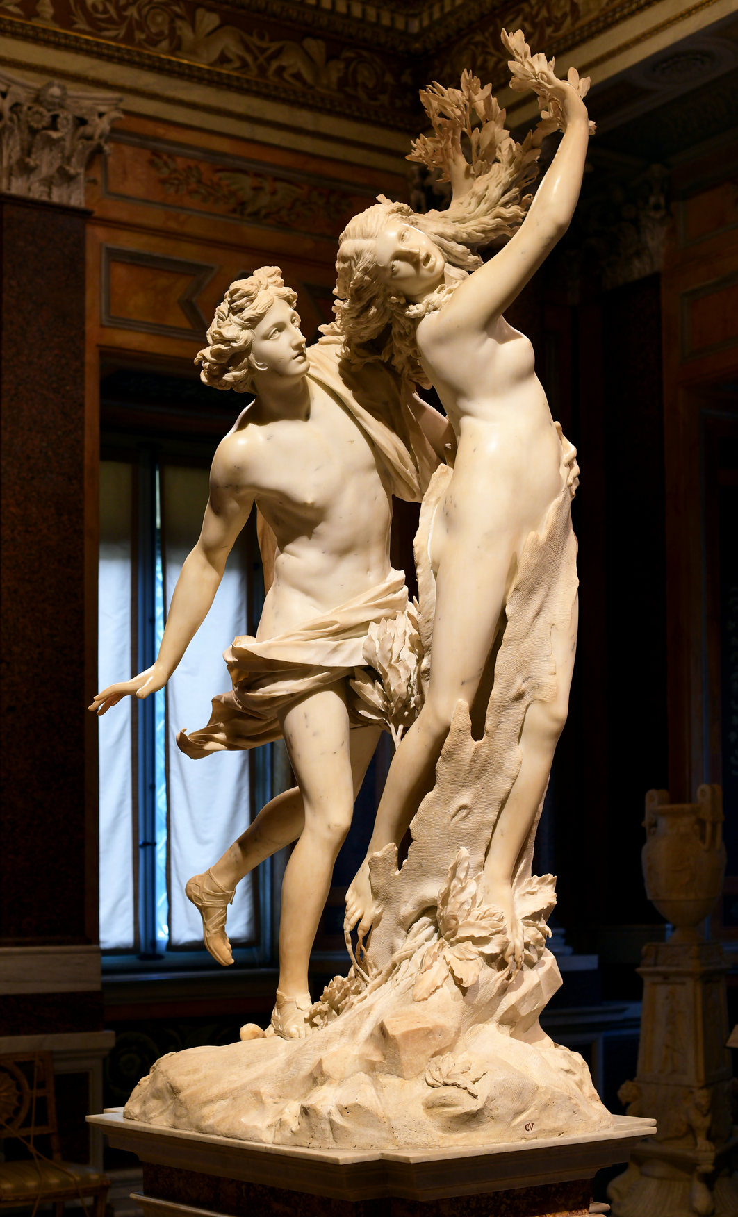 Bernini, Apollo and Daphne
This week I focused on drawing the same apple tree (“Walking Tree”) but from the opposite side. In contrast to last week’s drawing, I wanted to follow explore including the background, which from this perspective was our house, to give it scale and context.
I learned a huge amount this week. First, the comments of several classmates were very helpful in suggesting techniques for creating a sense of depth, movement and grounding (thank you, Claire, Perrin, Megan, Ali and Olivia!). As always, Mark’s comments were extraordinarily perceptive and instructive, and he provided several magnificent drawings that I plan to study (and steal from). As it turned out, I had finished the piece before reading his comments, which probably turned out for the best because it forced me to figure a bunch of things out on my own. How to draw bark, bricks, windows? How to include our house in the background without making it distract from the tree, which was meant to be the central focus? How to balance realism and imagination?
One approach that turned out to be useful for me was to make several traced copies of my initial drawing so I could experiment with textures, ways of holding the pencil, strokes, emphasis, backgrounds. I benefited a lot by watching Mark’s “High Resolution Pencil Value Drawing Demo.” I also discovered the value of kneaded erasers: after drawing the house too dark and conspicuous, I was able to tone it down.
Inspired by the Egon Schiele painting Mark introduced me to, I decided to do a small second project, returning to last week’s drawing and splashing a little water color on it.
Nat,
Amazing job! I feel like you really took the next step from last week to this week. The tree really holds its own, and I love the addition of the background. I am so impressed with the delicacy and detail of both the tree, and the very light background. The shadow of the tree especially keeps the image grounded. The tree again seems very human, this week especially like bones draped in skin. I think for your next one, make the whole image a little darker to increase the range of tones. If you make the tree bark and inlets darker, you can use more mid tones to explore texture, and also the background.
I almost skipped past the color drawing you did because I thought it was an example image posted by Mark! So cool that you experimented with that! It is eye catching and fun. I think next time I would put as much dark red at the top of the tree/human because the form is already so complex there. Beautiful work! Can’t wait to see what is next!
Hi Nat,
This week’s drawings are great! I can see that you pushed yourself in new directions, and the results are exciting and interesting.Tracing your original drawings is a great way to work and experiment.
I love the graphite drawing you made. The tree really “speaks.” I think you have done a nice job with the branches—choosing which ones to include, and expressing their character. Maybe the house could benefit from slightly greater variation in value, but I know it is in the background and you want the emphasis to be on the tree. Right now the tree and the house almost look like two separate drawings because the value range is treated differently for the two objects. I don’t think it would take much (just a slightly darker outline of the roof maybe) to pull the house into the same world of the tree. Is the shadow of the tree darker in reality than you drew it? Maybe not, just might be worth checking.
I also liked seeing your experimentations with Schiele’s painting. So interesting! Personally, still think your pencil drawings are best for this project, but I like the experimentation and I do think it’s a good study of how you can add more “muscle” to your trees, as you were striving for in previous weeks.
I’m learning about Schiele for a paper in another class…did you know he passed away from the Spanish Influenza? Sad that these epidemics have taken the lives of so many artists!
Hello Nat!,
Both drawings are amazing, the colors, the values, there are on point! In both drawings I can clearly see both human figures. I really love how in the second piece, you used different colors, that help the viewer see the full body (literally) of the tree. In the first drawing I don’t feel that the drawing is distracting at all, I can even dare to say that makes the three pop up more, as well gives a chance to see dimensions. I would love to see the first drawing would look with watercolors on it. I’m so impress with how you are able to see the human figure on those trees, and draw them, without losing the true essence of the tree. Stunning work.
Hi Nat,
I’ve somehow gotten 2 weeks behind commenting on your work—my apologies.
The drawing of the tree and the house is gorgeous and very powwerful, and answers perfectly the questions you were asking about putting the two together. Claire suggests bringing some of the lines of the house into the same value range as the tree, to bridge the two. Not a bad idea but I’m not sure I agree. I like the way those very delicate tips of the branches actually achieve this by approaching the same line weight as the window frames, bridging the two in a different way.
I’m even slightly intrigued by the notion that the house is ghostly—that it’s come and gone during the life of the tree. I know this wasn’t on your agenda, but that for me is a very tempting reading—their relative temporality.
There’s also a palpable and wonderful sense that they’re like an old married couple. Love the way the tree inclines toward the house, which doesn’t return the gesture but seems happy to receive it. Not at all an easy thing to achieve, and I suspect its because the artist is “married” to both. The cast shadow from the tree to the house adds to this effect but somehow looks forced or unnatural in this light, which otherwise appears overcast, making it almost surreal.
The high degree of observation, your very sensitive touch, and the intensity of your drawing process are in some ways the real subject here, and very commendable.
My only slight reservations are two compositional ones. I wish the base of the tree was either cropped, or there was a small space between the tree and the border. Being tangent, as they are, is indecisive. The tree looks like its stumbling over its own feet (or the border) in an effort to reach the house, rather than sitting comfortably in its place (which either solution would resolve).
Your drawing of the same scene from the week before, which I’ve attached, handles this issue better, and the top of the drawing as well for that matter, “welding” the tree to the rectangle more securely.
The space to the left looks vacant. I think I see the faintest hints of some trees, which might be brought out a bit more. Because the house ends behind the tree it leaves me with the desire for the other shoe to drop. It would be nice if there was something to gently bring our eye back to the left side—also as a counterweight to the leaning tree and the slope of the roof, which incline to the right.
The tree is disturbingly anthropomorphic, at least for this viewer, which tells me you’ve done a good job. That lower part especially is all pelvic bones and bony knees-—more aged human than tree.
I have less to say about the Schiele/tree hybrid. I suppose I’ve always found these kinds of equations facile (save for Bernini’s sculpture of Apollo and Daphne, attached). This one would work better if it weren’t for the breast, which tips the scale from botany to biology and breaks up any productive kind of ambiguity. You and Ali seem to be sharing notes (in a good way) when it comes to this technique. I think Claire encouraged you to stay with the pencil. Based on these two examples I would agree, but having had a peek at next week’s drawing there will be more to say about that….
Fine work, Nat.