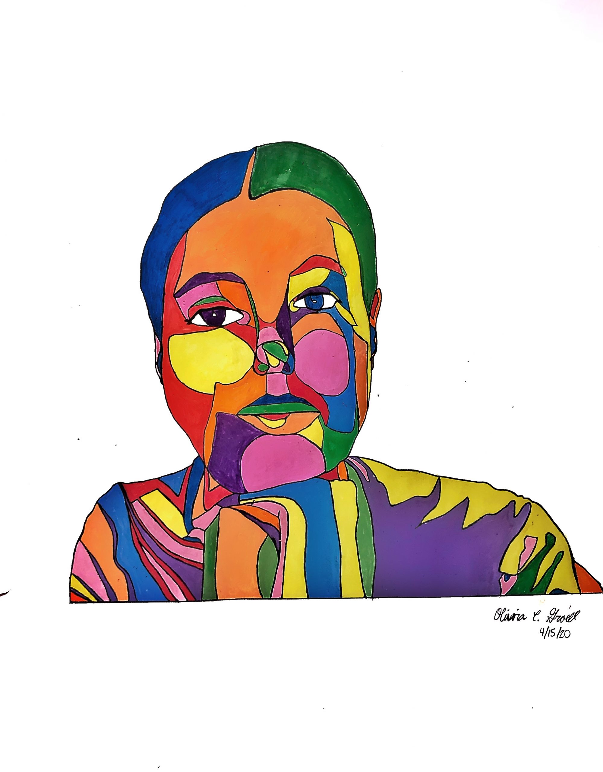
Acrylic Paint Marker on Paper, 17 1/2 x 22 1/2 inches

Notes:
1. The whites of the eyes are never white, and in this context they look unfinished. Most people’s “whites” are actually a pale grey-violet, which I’ve added here, but you could make them any color you want (of course). I think you want something there, though, to soften and deepen the eyes.
2. The eyes will look much more dramatic and alive if you include the black iris and a serious glint of white highlight (which in fact is white). You have white highlights but keep in mind that’s a reflection of the light source, coming from a specific angle (the same in both eyes) and falling on a sphere. Getting that “rivets” the eyes much more.
It’s also the confluence of the lightest spot in any portrait and the darkest spot in any portrait that help make the eyes “the windows on the soul.”
3. I’ve modified the cheek shapes on 0ur left to make them simpler and more anatomically correct (location of cheekbone, especially judging by the other side.
Another way to color in shapes:
Matt Phillips makes the “filling in” marks–thoughtfully applied–part of the work, as does muralist Sol Lewitt, with his mottled paint application:

Fellow Travelers:
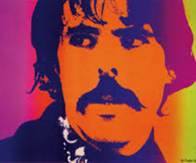
Peter Max
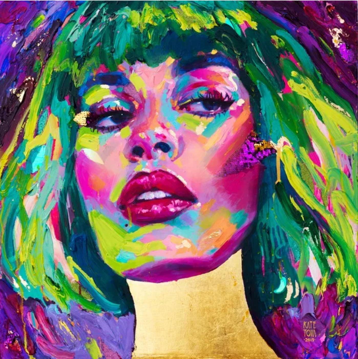
Kate Tova
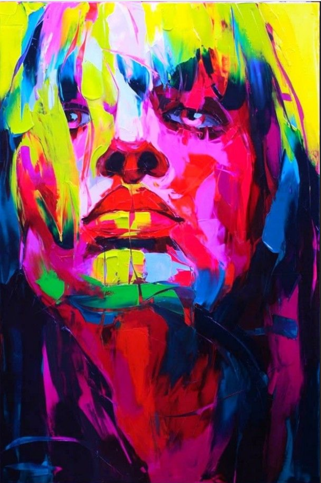
Francoise Neilly
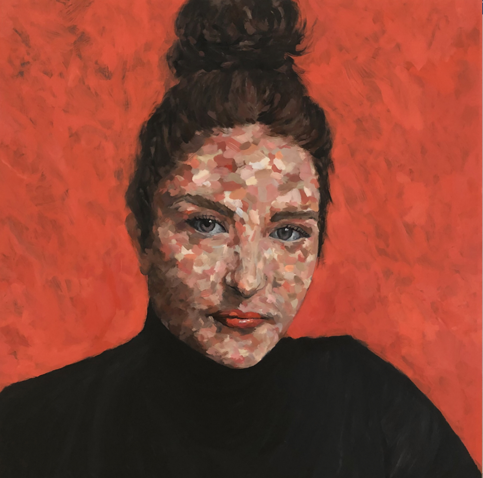
Sarah Austin ’21 / Painted directly on a photo
This week I branched out to use only acrylic paint markers on paper, the same markers and colors I used to make my aleatory drawings. I liked using sharpies in the previous week, however, they had some flaws. Perrin gave me great advice last week to use faster motions when drawing the contour lines and try to experiment with a new pen/marker, as the sharpie left spots when I stopped moving my pen forward. Additionally, she noticed that the colored sharpie lines were noticeable in areas where I drew a lot of color. I also noticed this when I photographed my work last week. I hoped that the acrylic paint markers would help solve these problems and it mostly did! I tried not to pause while drawing my black contour lines and noticed that even when I did stop briefly, the markers did not leave a blot. Also, there are still streaks in the colored areas, but they are much less noticeable, and each abstract colored shape looks uniform. I really like the look of the paint markers on paper, especially the luminosity and shine. The downside of this technique was that the colored paint pens slightly covered up the black contour lines I drew, so I needed to go back over them with my black marker (not continuous). Because I was applying paint, I had to be very careful with my coloring, which took quite a long time, so I only created one drawing. Any suggestions welcome!
Olivia
I like how your drawings have developed so far. I think this one is an improvement from the drawings in last week’s series, particularly with regard to sharpie streaks.
I also wonder: what next? A few ideas came to my mind.
One is to explore more “specific” color gradients. By this, I mean using colors that vary less dramatically from one another. For example, I wonder what one of these drawings might look like using only blues and greens, or perhaps floral color palette. Just something with a bit more unity. While I enjoy this drawing’s color variety, it also feels a little drastic. Purple to yellow to green to orange to blue to pink–there’s a lot going on here. I think being more selective with your hues could go a long way. Exploring how the mood of your drawings change with limited color options could be a really cool and fun way to experiment.
I also wonder how these drawings might look if you used darker tones for dark spots and lighter tones for light spots. One moment I really like in this drawing is your left shoulder. I really like how you’ve handled (what I assume to be) the texture of shirt folds. Here, you’ve already done what I’m suggesting, which is where I got the idea. It looks like the light source is hitting your shoulders pretty strongly. You use brighter yellow there and darker purple and green for the folds and shadowy forms beneath. It could be cool to see what happens if you explore this principle on an entire drawing.
Lastly, I think your drawings might benefit from a background. Not necessarily of anything in particular–could just be abstract shapes akin to the ones on you’ve been using on people thus far. I just find that these portraits in color on a blank white expanse feels a little unfinished. I really like what you do with the portraits and I can’t help myself from wanting to see more. This might be another cool way to explore color. Like, what would a green portrait look like in a brown environment? Or vice versa. Or all green. Or all brown. You get the idea. I think there’s a lot of potential here and that has me excite for you, should you decide to go that route.
Excited for next week!
Jack
Big breakthroughs in the last two weeks and sorry I didn’t get back to you (and everyone) sooner—but you’re clearly doing great on your own (and with the help of your great discussion partner).
I agree with the concerns that you and others have expressed about the application of color (from a technical standpoint—they look great artistically). I might recommend painting them in with gouache or Flashé acrylics, but that would be a big investment for this many colors. I’d also suggest coloring them digitally in whatever app you might have access to (I like Photoshop). You could import the line drawing into digital space, color away, and the print them out if you ever want to put one on the wall.
Then again, you might turn your wheels into the skid (as the saying goes) and make that effect a part of them, like the abstract paintings of Matt Phillips, above.
Speaking of Photoshop, you could take one of your photos into Filters (top menu) and go to Cutouts, to break the image into similar high contrast patterns to work from.
I left some notes above. If you’re drawing this straight with a pen, impressive, but you might also consider a very light pencil under drawing to ensure basic locations and proportions even better. But I also like the very slight variations from nature that happen naturally when you’re drawing freehand, and make them so much more than technically “perfect” renditions—much more expressive.
Artist you might like to know about are included above.
As far as the remaining 2-1/2 (!!) weeks are concerned, I hope you’ve found your groove—I’d love to see more of these (and nothing else). I’m still more inclined to using photos (like the one this week) who’s implicit sense of time is closer to that of your process (i.e., no grimaces or fleeting expressions) but those are my two cents.
Very exciting work, Olivia. Can’t wait to see what comes next–