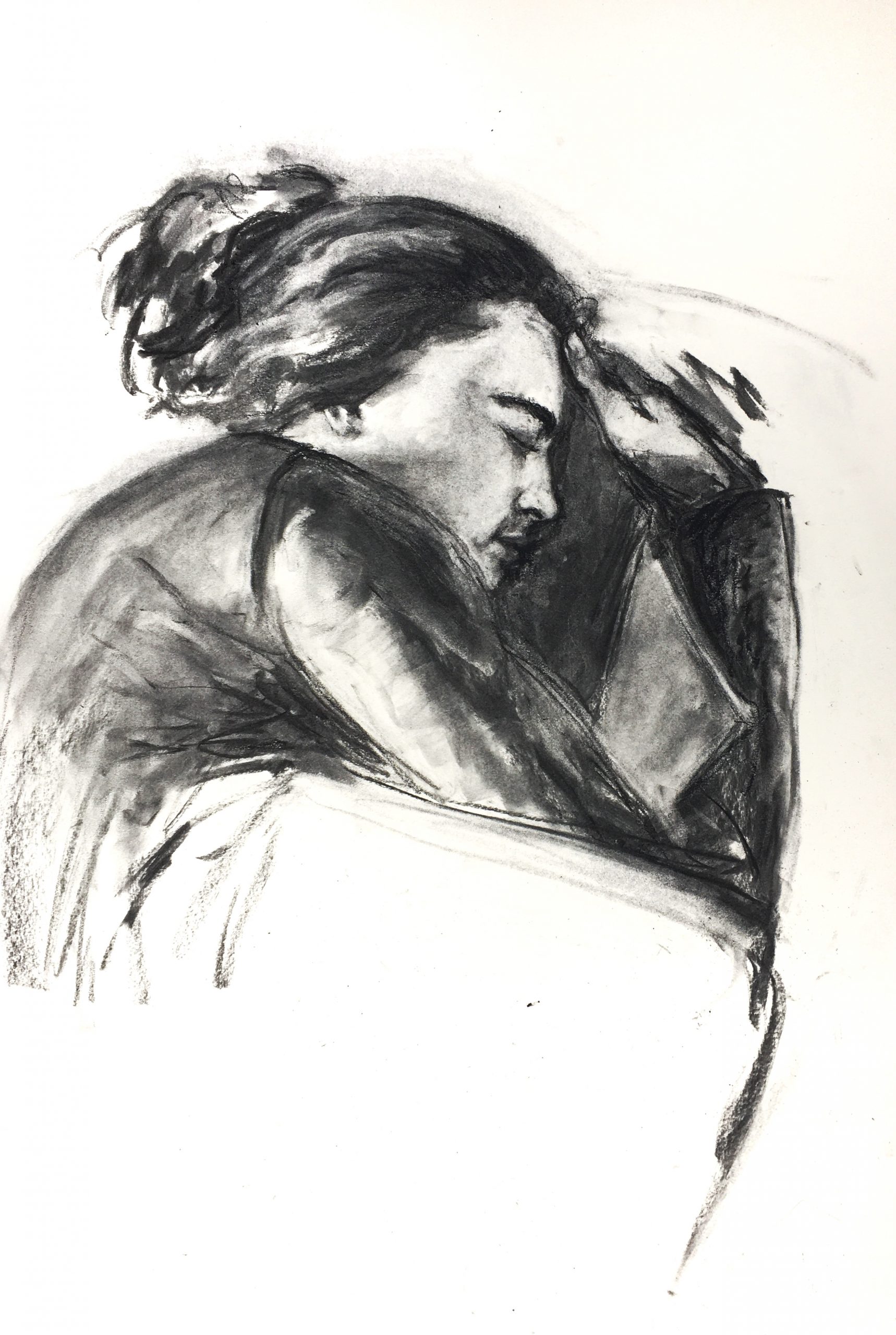
I tried to create a slightly more finished drawing this week. The comments I received last week were helpful in thinking about how I can make portraits look more realistic. I tried to blend more and make marks less focused on line and more focused on value. I’d like to hear your thought on whether I should keep making these types of portraits. I’m thinking I could do a series. Do you have any suggestions about how I could improve this portrait in particular?
I’m happier with the face in this piece than some of my previous posts, however I want to dedicate more attention to the surrounding features such as hand, arm, and pillows. I realized when I photographed my drawing that the figure is floating and many of the areas surrounding the face could be improved.
I’m down to my last stick of vine, so I hope I can order more in time for next week. I have plenty of compressed charcoal, and while I used some in this piece, I think future drawings would benefit from more compressed charcoal.
Claire, I have always been stunned by your ability to leave out most of a figure but leave the viewer feeling, without even being conscious of it, as if he or she has seen the whole thing. Of course this is a young woman asleep on a couch… but wait, there are no legs, no couch, no arms! That is a special skill, an intuition about line and value, about what to include and what is not necessary, that is quite amazing to me. Although I can imagine a softer-looking pillow, personally I wouldn’t change a thing. It really is a very beautiful drawing. The only suggestion I would make is to keep honing your special style but, while you are on a roll, see if you can make it work for different models (a young child, an old man, etc.) or different emotions (laughter, surprise, etc.)
This is beautiful Claire! I love the delicacy yet groundedness of it. I agree that the face is really great, and I also love the thumb. I also agree that you could work on the pillow more, and also add more to the couch and body to anchor the image. The hair and the shadows of the face are amazing. I am impressed by your use of both vine and compressed charcoal, and think that you might want to add more deep black in the shadows to give the drawing even more depth. You are already doing this well, but I think the vine doesn’t get dark enough. Then in some places I would actually lighten them, like on the arm, so that the lights and mid tones pop and the darks push the image into the page.
I think a series of portraits sounds wonderful! I would continue doing people that are in interesting poses like this one instead of just formal portraits. Your charcoal drawings are just so comforting:) They make me happy.
Hello Claire!
This drawing is STUNNING! You have really nice values that demonstrate the different shapes on your composition. I would suggest to put a small amount of charcoal on the blank spaces so the figure doesn’t look like it’s floating, or even cropping the paper would help. Because I enjoyed a lot this composition, I would love to have a series of portraits like this. And I will have to disagree with Perrin, I don’t think is necessary make the dark darker, because it’s giving me the impression that you decided those values from the light direction. Take care!
Two more drawings that I can’t say enough good things about. You’re right–you really have taken the relationship of the image and the paper more into account and you’re really using the rectangle as an active player in the drawing. (My Drawing I students, and maybe all of you as well, have heard my bit about the Italian word “disegno,” which combines the English words “drawing” and “design.” The fact that we have two words for them reveals a philosophical weakness in my view, as if one can draw without designing and visa versa; and yet people do, as reflected in our language).
These, on the other hand, are the embodiment of “disegno.” The thing she’s snuggling, to me anyway, is the paper itself, or at least the space of the paper, which is holding her like a snug bed. Likewise the dog, which is light years beyond the last time we saw her/him, “couched,” once again, in the paper itself.
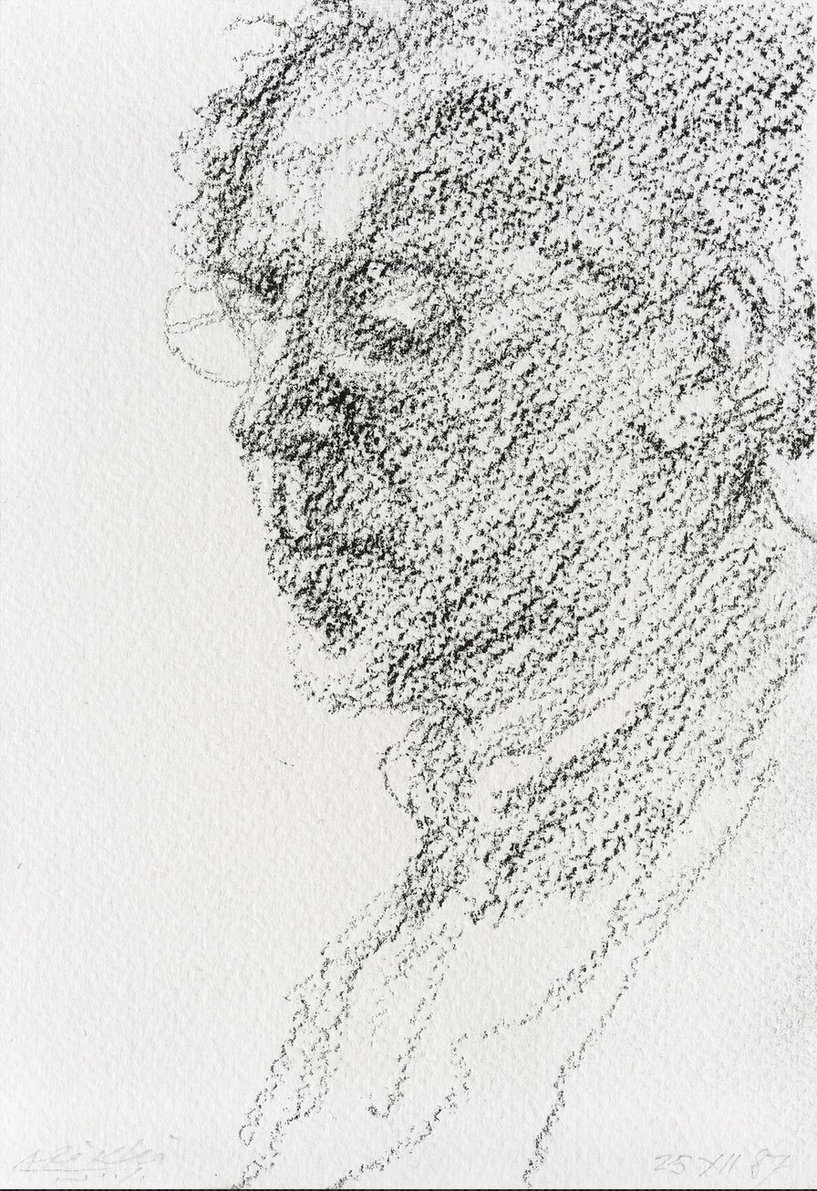
And your mark-making is right there as well–free and yet decisive, descriptive but putting on a show of its own–just great. It reminds me of how John Singer Sargent drew (attached).
You talk about making a “more finished” drawing, but I’d be wary of that. The drawings have a natural arc, and an inherent sense of time and attention. An obligatory dotting of i’s and crossing of t’s is not what they’re about. Please keep following your hunches about where to leave off. There’s a rightness there, as if you’re telling the viewer you don’t have anything more to say about that, that perceptions are fragmentary and held together by the thinnest of threads.
Odd how he keeps coming up in this class (I’ve mentioned him to Adam and Perrin as well) but Avigdor Arikha‘s work comes to mind (I’ve added a couple above). He would never return to a work once a session was over, and if it was interrupted or simply ran its course before an image was finished, that was the truth of the drawing–much more important than some a priori idea about “finish.” It also suggests the role of time and consciousness in a drawing, and how they can actually be the real subject of a drawing (like no other medium)–and this is what I see in yours.
You’ll see in his too a kind of mark-making that’s as much the subject of the drawing as the image itself, making us simultaneously aware of what we’re seeing and how we’re seeing it.
 John Singer Sargent
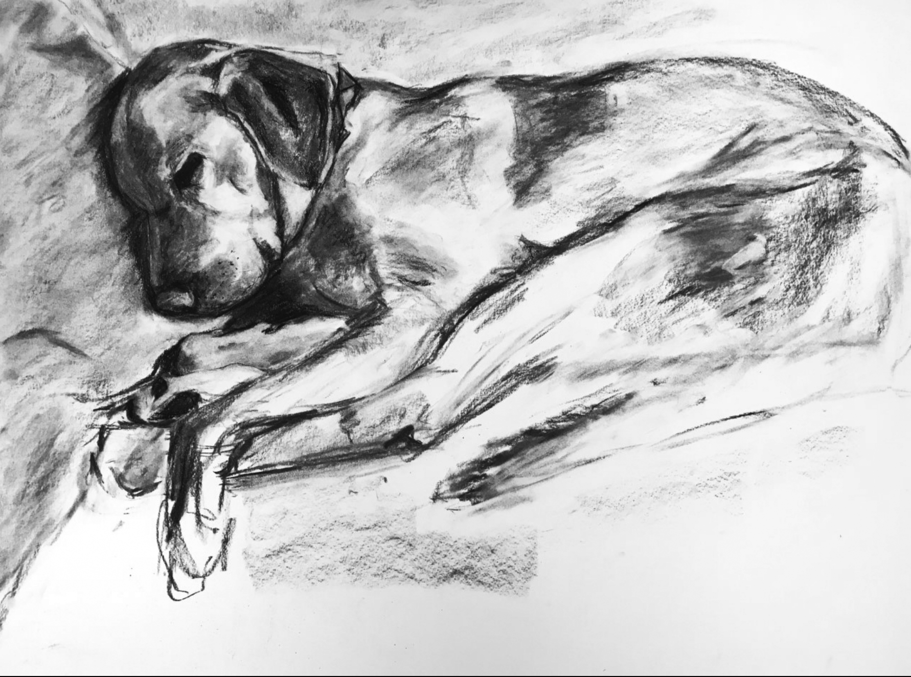

I tried to create a slightly more finished drawing this week. The comments I received last week were helpful in thinking about how I can make portraits look more realistic. I tried to blend more and make marks less focused on line and more focused on value. I’d like to hear your thought on whether I should keep making these types of portraits. I’m thinking I could do a series. Do you have any suggestions about how I could improve this portrait in particular?
I’m happier with the face in this piece than some of my previous posts, however I want to dedicate more attention to the surrounding features such as hand, arm, and pillows. I realized when I photographed my drawing that the figure is floating and many of the areas surrounding the face could be improved.
I’m down to my last stick of vine, so I hope I can order more in time for next week. I have plenty of compressed charcoal, and while I used some in this piece, I think future drawings would benefit from more compressed charcoal.
Thank you!
Claire, I have always been stunned by your ability to leave out most of a figure but leave the viewer feeling, without even being conscious of it, as if he or she has seen the whole thing. Of course this is a young woman asleep on a couch… but wait, there are no legs, no couch, no arms! That is a special skill, an intuition about line and value, about what to include and what is not necessary, that is quite amazing to me. Although I can imagine a softer-looking pillow, personally I wouldn’t change a thing. It really is a very beautiful drawing. The only suggestion I would make is to keep honing your special style but, while you are on a roll, see if you can make it work for different models (a young child, an old man, etc.) or different emotions (laughter, surprise, etc.)
This is beautiful Claire! I love the delicacy yet groundedness of it. I agree that the face is really great, and I also love the thumb. I also agree that you could work on the pillow more, and also add more to the couch and body to anchor the image. The hair and the shadows of the face are amazing. I am impressed by your use of both vine and compressed charcoal, and think that you might want to add more deep black in the shadows to give the drawing even more depth. You are already doing this well, but I think the vine doesn’t get dark enough. Then in some places I would actually lighten them, like on the arm, so that the lights and mid tones pop and the darks push the image into the page.
I think a series of portraits sounds wonderful! I would continue doing people that are in interesting poses like this one instead of just formal portraits. Your charcoal drawings are just so comforting:) They make me happy.
Hello Claire!
This drawing is STUNNING! You have really nice values that demonstrate the different shapes on your composition. I would suggest to put a small amount of charcoal on the blank spaces so the figure doesn’t look like it’s floating, or even cropping the paper would help. Because I enjoyed a lot this composition, I would love to have a series of portraits like this. And I will have to disagree with Perrin, I don’t think is necessary make the dark darker, because it’s giving me the impression that you decided those values from the light direction. Take care!
Hi Claire,
Two more drawings that I can’t say enough good things about. You’re right–you really have taken the relationship of the image and the paper more into account and you’re really using the rectangle as an active player in the drawing. (My Drawing I students, and maybe all of you as well, have heard my bit about the Italian word “disegno,” which combines the English words “drawing” and “design.” The fact that we have two words for them reveals a philosophical weakness in my view, as if one can draw without designing and visa versa; and yet people do, as reflected in our language).
These, on the other hand, are the embodiment of “disegno.” The thing she’s snuggling, to me anyway, is the paper itself, or at least the space of the paper, which is holding her like a snug bed. Likewise the dog, which is light years beyond the last time we saw her/him, “couched,” once again, in the paper itself.
And your mark-making is right there as well–free and yet decisive, descriptive but putting on a show of its own–just great. It reminds me of how John Singer Sargent drew (attached).
You talk about making a “more finished” drawing, but I’d be wary of that. The drawings have a natural arc, and an inherent sense of time and attention. An obligatory dotting of i’s and crossing of t’s is not what they’re about. Please keep following your hunches about where to leave off. There’s a rightness there, as if you’re telling the viewer you don’t have anything more to say about that, that perceptions are fragmentary and held together by the thinnest of threads.
Odd how he keeps coming up in this class (I’ve mentioned him to Adam and Perrin as well) but Avigdor Arikha‘s work comes to mind (I’ve added a couple above). He would never return to a work once a session was over, and if it was interrupted or simply ran its course before an image was finished, that was the truth of the drawing–much more important than some a priori idea about “finish.” It also suggests the role of time and consciousness in a drawing, and how they can actually be the real subject of a drawing (like no other medium)–and this is what I see in yours.
You’ll see in his too a kind of mark-making that’s as much the subject of the drawing as the image itself, making us simultaneously aware of what we’re seeing and how we’re seeing it.