 micron on paper, 8 x 9
My fave–as my comments will attest. Curious how this would look in a horizontal format.
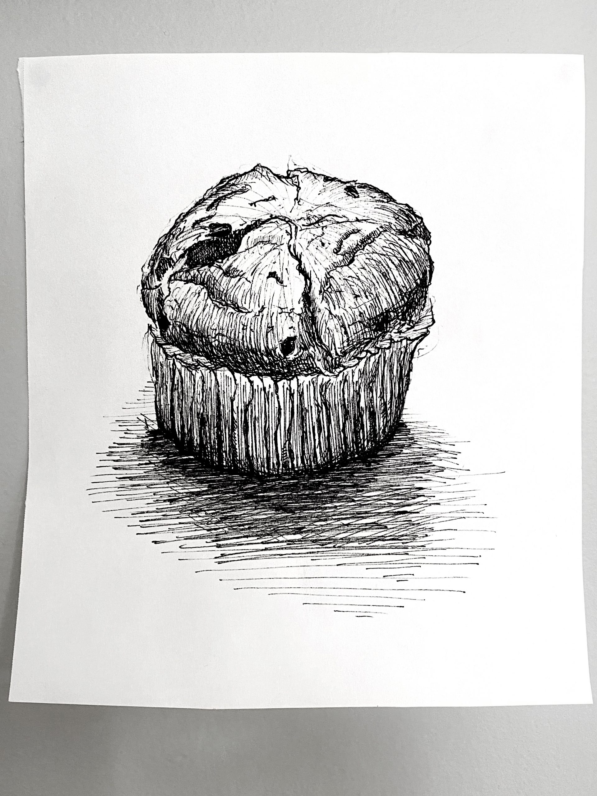
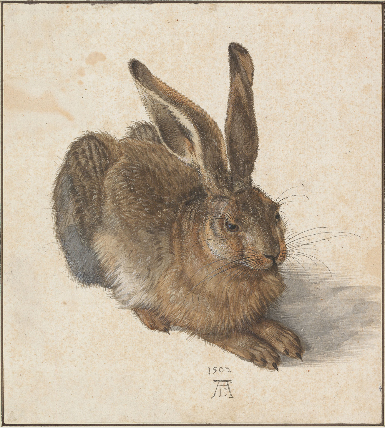
One of the earliest images in this genre–the single, isolated subject–comes from Albrecht Durer. A great part of its power is his clear devotion to what his eyes could reveal. Yours feels like it might be on a similar path, which would be great–maybe one incredible drawing of a chocolate chip muffin between now and May 5th?
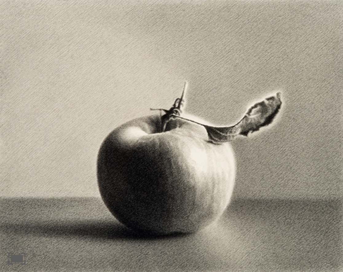
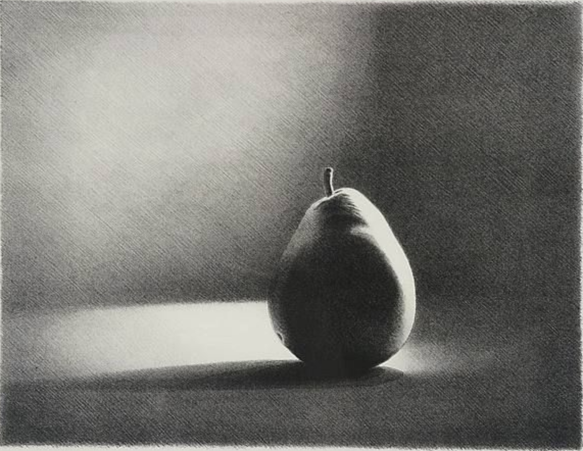
I’ve always loved the work of Los Angeles artist Martha Alf. These are pencil drawings but very finely hatched.
Maybe play even more with the light?
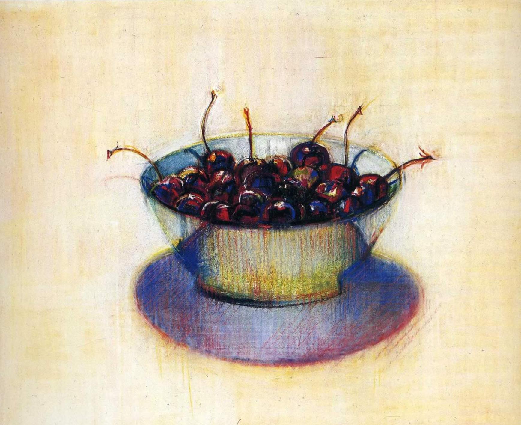
Another California artist, 100 years old this year, Wayne Thiebaud:
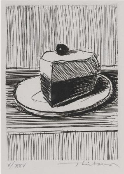
Or, quite different than the artists above, you might prefre a looser, “cooler” hatching style (also by Thiebaud).
Okay, it’s official. It’s a California thing. Vija Celmins painted these there in 1964, but now lives in New York:
There can be something wonderfully dumb about staring at a single object, front and center, and she captures that feeling perfectly. A lot of people (me included) think that this is one of the best paintings of the 20th century. Not kidding:

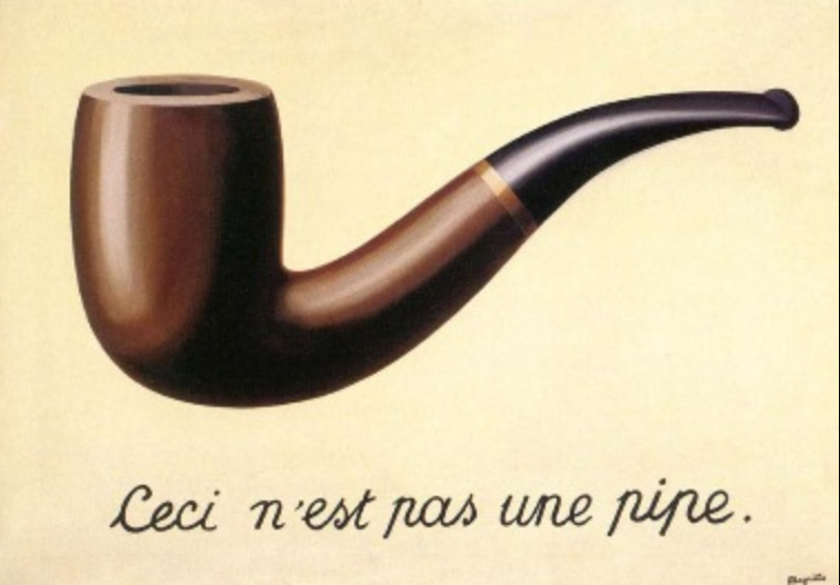
It’s like Magritte’s famous painting, but without the inscription. You just *know* that’s what it’s about.
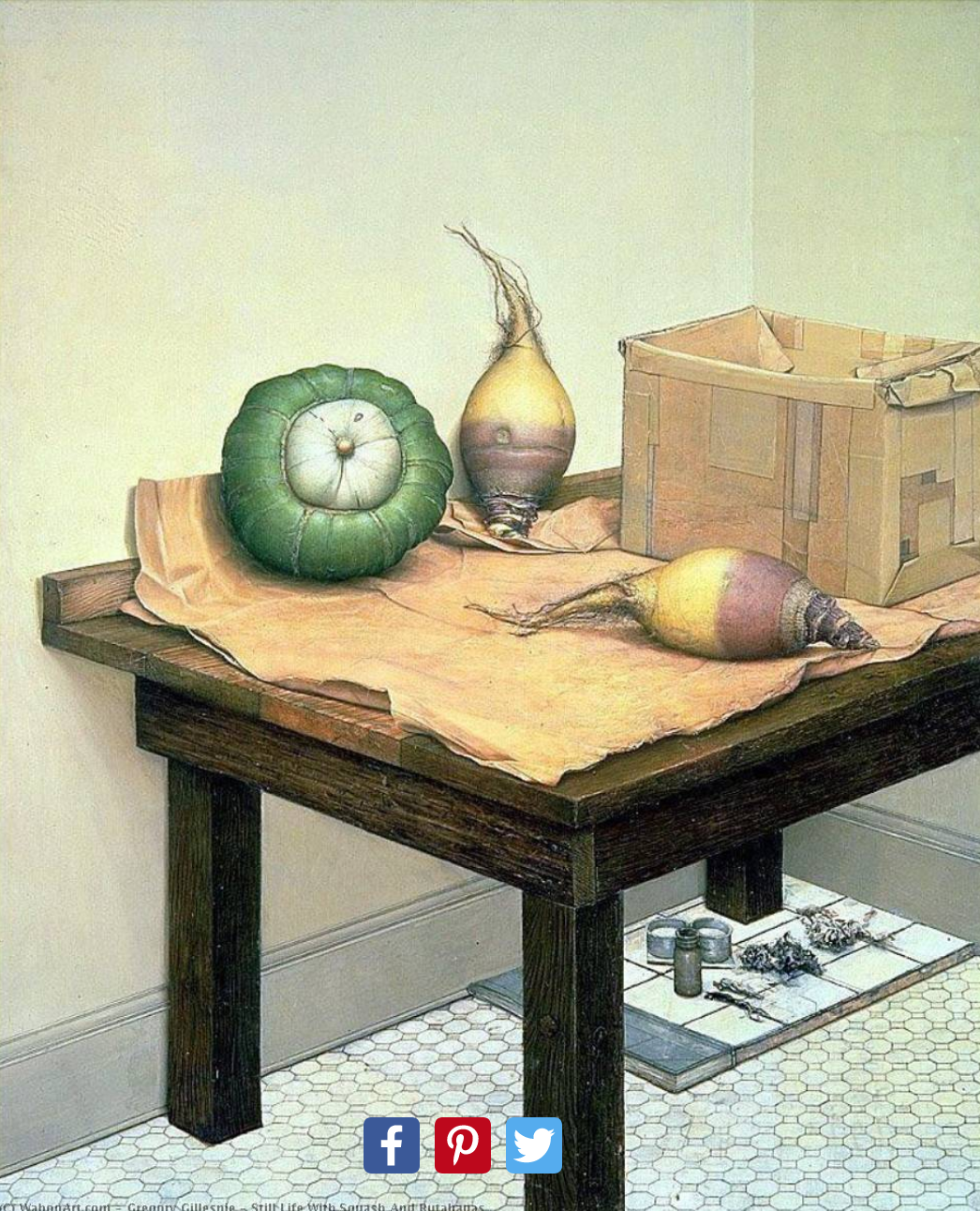
Or, if you look at the rutabaga in this still life by Gregory Gillespie, you’ll see if you look at something long enough and intently enough it can become bizarre and grotesque (what Freud called “The Uncanny,” which we’ve talked about):
micron on paper, 9 x 12
 micron on paper, 9 x 12
 micron on paper, 9 x 12
Hey folks,
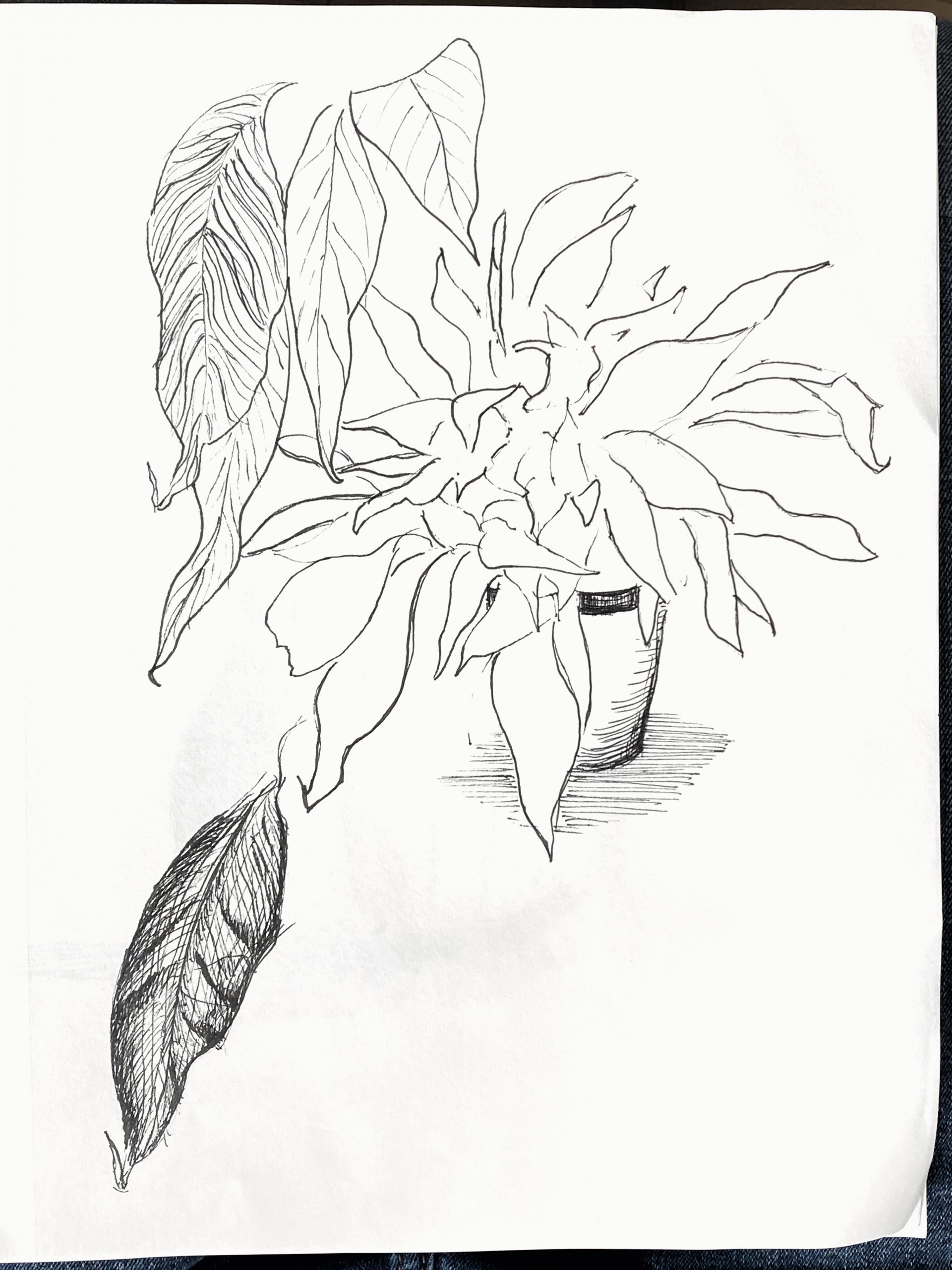
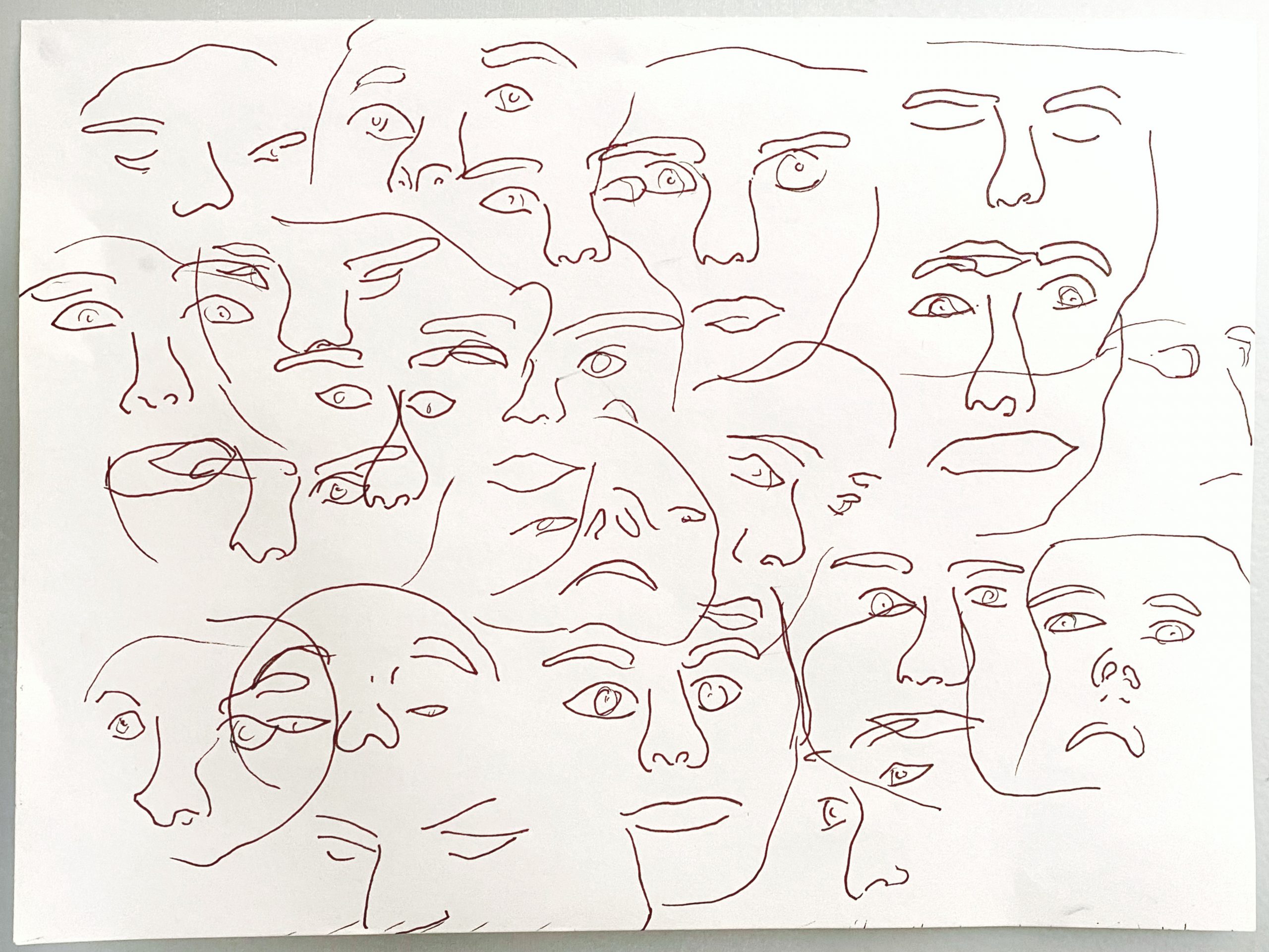
This week I focused mostly on still life, with the exception of the faces sheet and some sketches from life which I haven’t included here.
Up until the squash, which I drew today, I avoided drawing objects with regular and smooth shapes. Organic and irregular forms, like the muffin, are less intimidating to subjects of study since you can mess up the hatching without anyone knowing. The marks all blend and no one can tell you that the marks are wrong.
With, say, a mug or lamp (or squash in my case), there is little room for error with hatching. If the marks are inconsistent, the drawing looks shoddy and the object’s consistency of form is broken. The stakes are high. Marks have to be clean and virtually the same in terms of size, length, and weight. It’s hard to do.
The squash has some good moments, but ultimately I’m not super pleased with it. The range in value is too large. I find that the darks are too dark and and the lights are too light. I like the abbreviated marks on the sunny side that hint at form, but the long strokes on the dark side don’t sit well with me. The base of the squash in particular seems off. It doesn’t feel like an organic fruit rather a mediocre orb from an amateur geometry study. Dislike.
It’s tricky to keep value in order with hatching. If you overdo it in one spot, you have to compensate all over. I’m now finding that it’s prob best to build up the marks all over slowly, instead of focusing on one area at a time, which is what I did with the squash.
I like the muffin and the face sheet is a promising start. The plant study was inconclusive.
– Jack
Just want to add: I eat one or two of those muffins everyday. I bring them with me as I stroll around the block after I wake up in the morning. Chocolate chip from Hannaford. Really quite good. I couldn’t go on with covid times without them, truly.
Hi Jack!
I really want a chocolate chip muffin right now! I really love the overlapping lines that you used on that top drawing to build up value on the muffin itself and the shadow it leaves. The attention to detail also emphasizes the bumpy, crumbly texture of the muffin. It is drawn realistically giving it the appearance of being 3D and almost popping off of the page.
I like the contours you drew of the leaves in the plant drawing and you do a great job with making them look like they are coming forward. I am a little confused by the leaves that have detail and some value as they don’t seem attached to the rest of the plant. There are no well defined, attached stems nor are they drawn in the same contour style as the rest of the leaves. I also feel like the dark leaf in the bottom left corner draws the eye away from the focus of the plant in the top half of the page. One idea is to stick to either detailed line drawings of still lifes or contour drawings of these still lifes, using these two techniques in separate drawings? Just a thought – I totally understand why you incorporated them together.
I actually really like the squash! The cross-hatching is very precise and shows the viewer where the lights and darks of this object are. I like how geometric and symmetrical you drew the object – I could envision exactly how this squash looks. I do also love the face drawing but feel like this piece is a little inconsistent with the other three drawings you drew this week, as they are studies. This third piece is much more abstract and looks looser. The rest of the pieces are methodical, detailed drawings with many lines building up value. I have really enjoyed looking at the progression of your micron pen still life drawings! I look forward to seeing more of your work with this pen!
It’s interesting that the chocolate chip muffin plays such an important and beloved part in your day (and thanks for sharing that) because it’s the only drawing in the two weeks since I was last in touch (and my apologies about that) that has some feeling to it. Why not the squash as much? Not sure, but it’s funny how one’s affection communicates through the tip of a pen.
The squash is fine—I think it would be better centered or perhaps even one beat closer to the light, to make the looong cast shadow more of a thing—but the muffin feels to me like the doorway to where you want to go.
Time has run out for plants or people (unless you opt for one of those to the exclusion of the others)—it’s food for you, bub, and even more than that, chocolate chip muffins (but a variety of foods is okay). Liked your remark about suitable subjects for pen and hatching. Hatching likes old people more than young people, tree bark more than car fenders, and kale or a muffin more than squash. But it can be made to do anything if the drive is there.
If you haven’t already, see the Powerpoint I sent about value and hatching. (“Taut and gripping!” wrote the Kansas City Star Ledger).
Not kidding—devoting the next two weeks to hatched ink drawings of that muffin would be tremendous, getting even further under the skin of what you can see and/or your hatching style. It’s only 2-1/2 weeks. Not like a prison sentence or anything.
Above all—at least up until the muffin—you’ve been skimming the surface, when our goal is to get well beneath it. To dive in deeper.
Some artists who come to mind, and some notes, are attached above. What they all have in common, and what your work needs most, is a purpose, an angle, an affect, whether its the sincerity of your feelings towards the object you’re drawing or the method you’re using (like being a hatching fanatic), a sense of drama (or acute lack of drama), irony, and so forth.
As is, and except for the aforementioned muffin, these are too academic, that is, little more than exercises. Nothing wrong with exercises but we’re in this for something more for our Drawing II cotillion.