X
X
Love these (above)–inspired work.
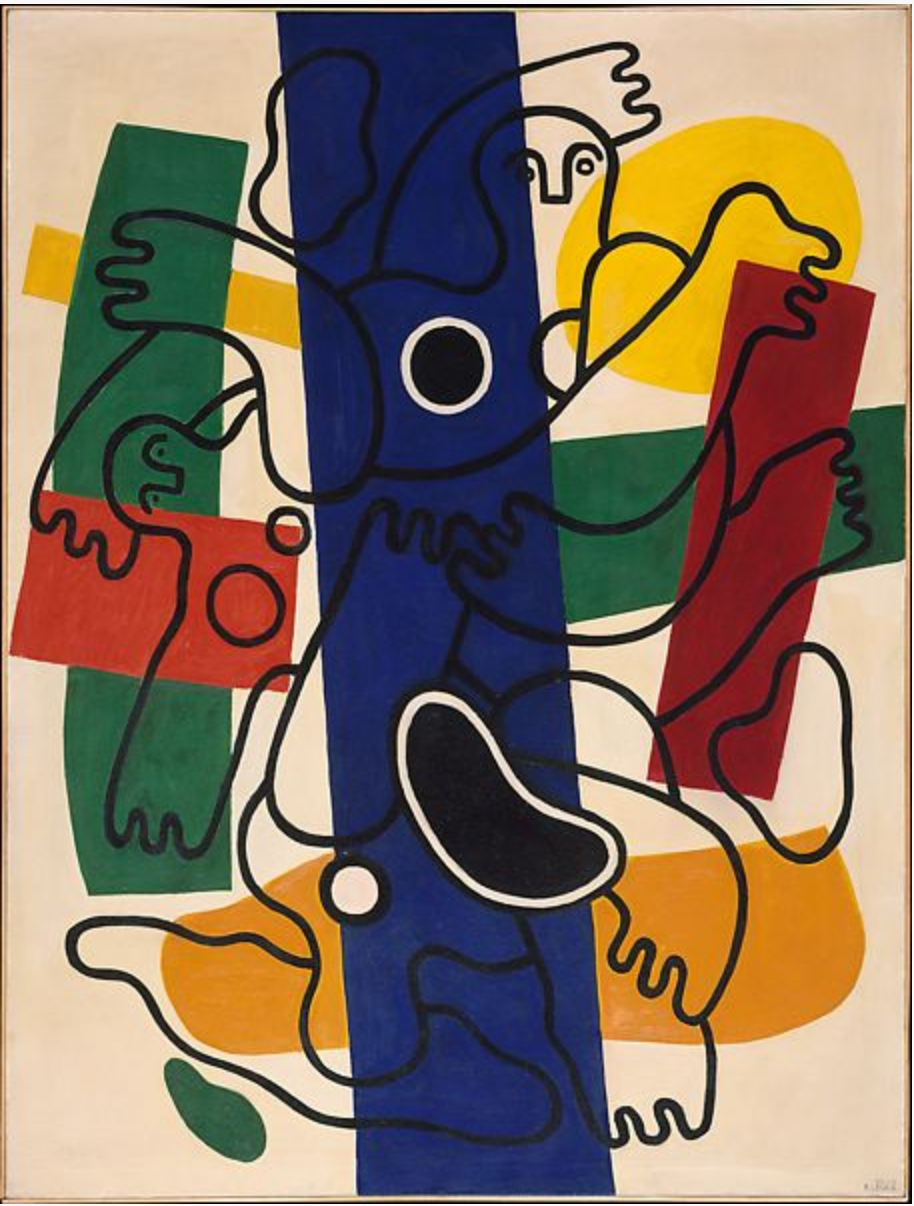 Ferdinand Leger
In no way like what you’re doing, except for the detachment of value from line in your porch drawings–maybe something to push farther.
 Richard Diebenkorn
I think you already mentioned his figures; didn’t know if you knew his still-lives.
X
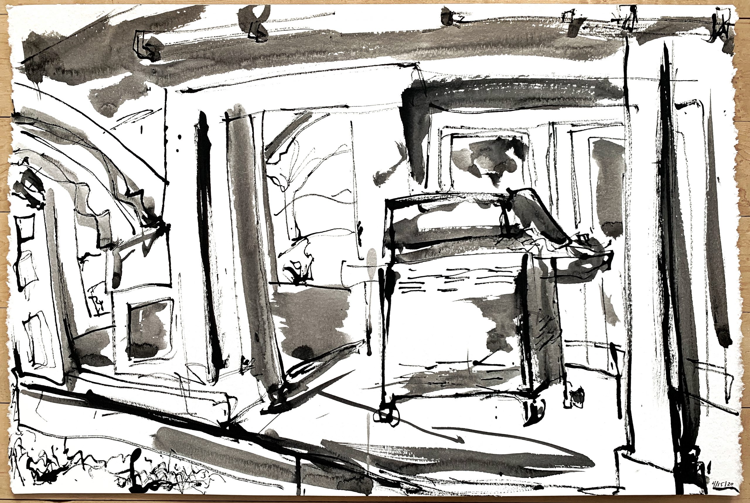
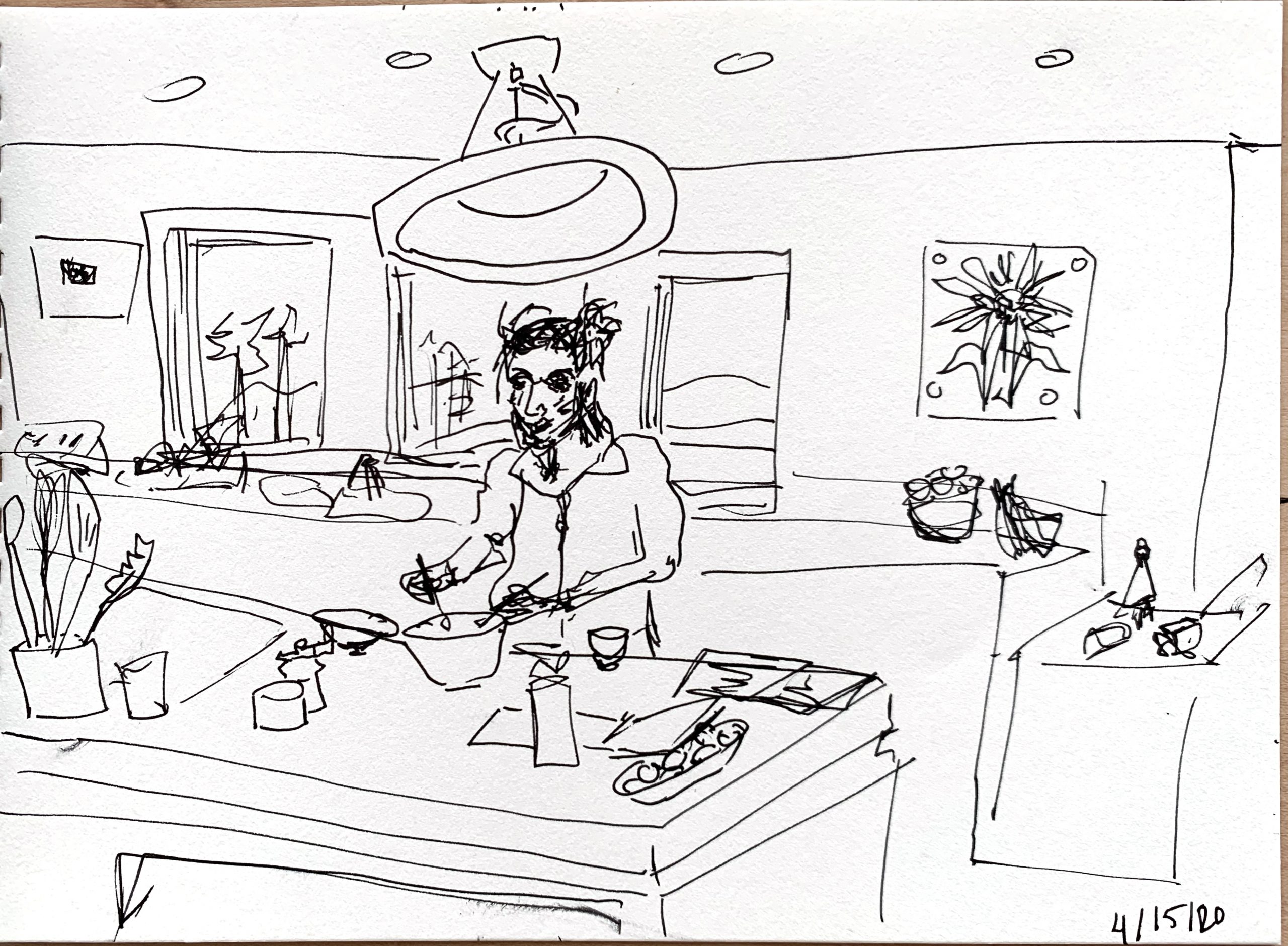
This needs more visual interest on the right, where it trails off a bit, but the immediacy and familiarity of this kitchen scene is winning. Now to make your loved ones not look quite so scary.
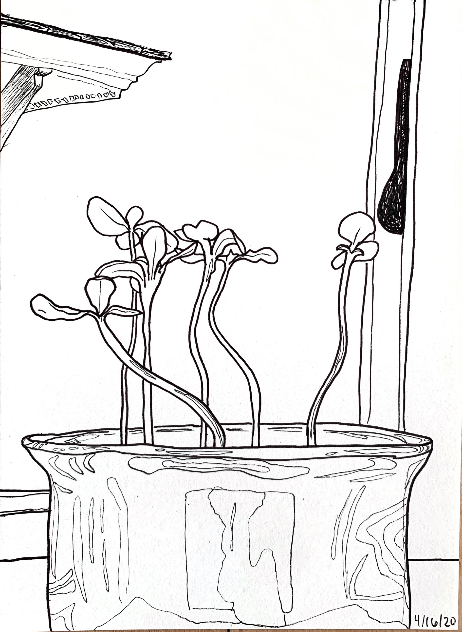
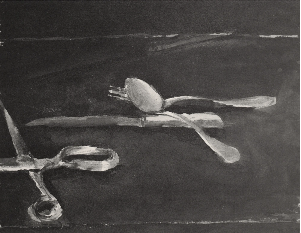
The “when to stop” question–there’s some kind of problem between the right flower and that dark nameless shape. Nice fun with the reflections and good changes in line weight.
X
Great–
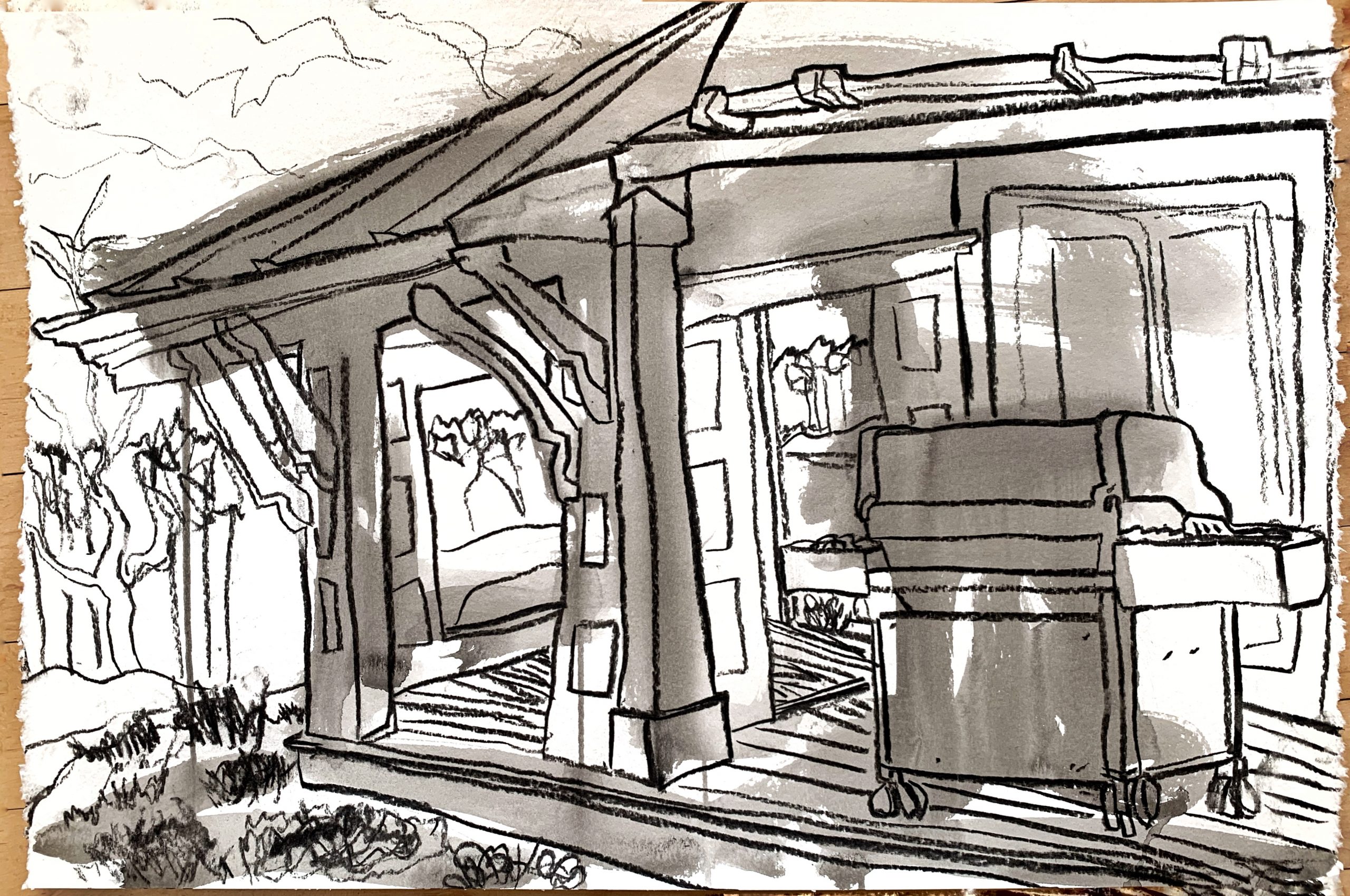
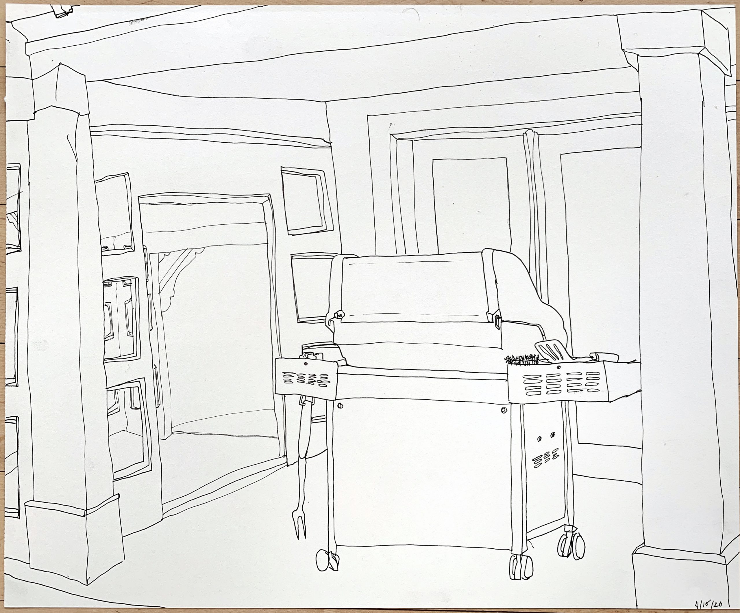
This week based on some conversations on Tuesday, I decided to play around with ink. I didn’t have a dipping pen so for my first one I used a stick. I decided to do it outside because of the mess. After I did one loose one with the stick and a few brush strokes, I did another one with an ink wash and vine charcoal on top like we did in class. I like this one the best. Then I did one with pen. I wanted to explore one scene in more depth with different medium. I also did some smaller drawings with just pen. I experimented with doing a fast messy one, and then did a few like I normally do. I would love feedback on whether I should just stick to contour pen drawing or keep trying ink and washes. Also does anyone know if there is a way to do fixative at home?
Perrin, I love these! Really! The first and second drawings of the grill with ink are my favorite because they are expressive and they have a fun energy. The wash you added makes the drawing more dynamic and visually interesting. I also like the way you cropped the scenes and filled the page.
I still love your contour drawings too. Your project could be very successful if you pursued either track. You also do a nice job with cropping your ink contours and zooming in on a specific moment. They communicate a clear sense of environment through very few lines and simple composition! It’s nice to see that you experimented with faster drawings too. I like your drawing of the kitchen, but I think your drawings of small, somewhat still moments are even more effective at describing a place and details.
There seems to be overlap between your two styles of drawing, especially in the second piece you posted with the ink wash and charcoal of the grill. It seems like you could take another week to experiment and then decide. I also wonder what would happen if you combined ink and pen? Instead of charcoal?
I’m also curious about a fixative for charcoal. I’m considering using hairspray, but I’m not sure if that will ruin the piece…let me know if you find a good solution.
Hello Perrin!
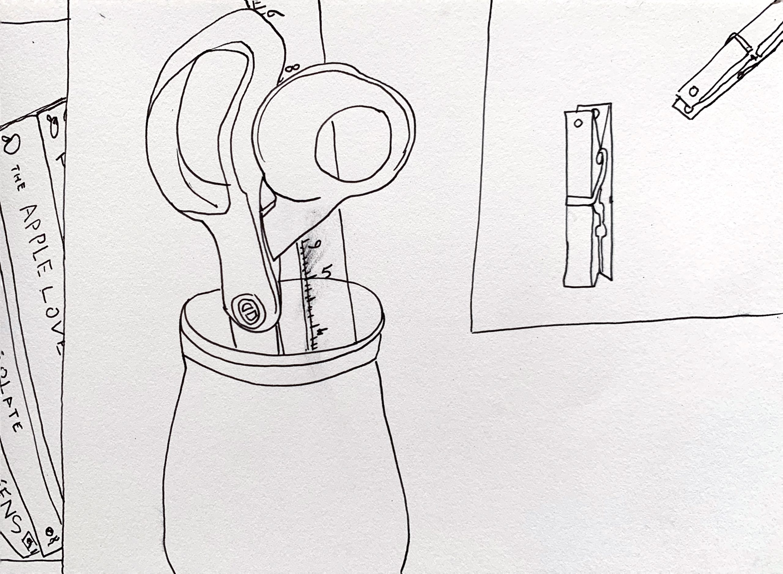
First of all, all your drawings are fantastic! They demonstrate line weight, as well depth. I found the drawing with the plant particularly interesting and beautiful, it looks digital. I also really enjoy your drawings with ink and charcoal, which makes a difficult decision to choose one. I think it would be also interesting to do a more “detailed” wash, and then do a quicker pen/ charcoal drawing on the top.
About using hairspray as a charcoal fixative, as Claire mention, is actually a really good idea, just take in consideration that it can change the charcoal values a little bit.
Perrin, how is it possible that you can experiment with four or five quite different styles of drawing — and nail them all?! Even though your lines are simple, the compositions are thoughtful, dynamic, internally consistent, intriguing. I’m drawn to all of them but for different reasons, the first for its energy and pleasing abstraction, the second for its balance and perspective, the third for the clean lines of an everyday scene, the fourth (my favorite) because it reminds me of Quentin Blake’s drawings of characters in Roald Dahl’s books, the fifth because I’m partial to the plant kingdom, and the sixth because it’s so skillfully done and is able to capture depth with just a few lines. I have a feeling that Mark will encourage you to decide on one style and/or theme, and I’m absolutely certain that you could go in any of these directions and will produce magnificent work.
I’m intrigued that your commentators seem to think you still have to choose one path over another. For my money every drawing you’ve made over the past two weeks are all part of a continuum. And my apologies (to you and everyone) for missing last week’s round.
It’s a curious thing what constitutes a unified, cohesive body of work or artistic inquiry. One artist can draw the same object 30 times in the same light with the same composition and the same drawing tool and no two are alike and another can draw everything under the sun in a variety of media and they are unmistakably the product of the same vision and the same line of inquiry. That’s why it’s so hard to describe what this goal is in these closing weeks, but you know it when you see it.
Be that as it may, it’s my view that these are working together beautifully because of their overall subject matter (scenes in quarantine) and the use of a very economical and distinctive style of contour drawing. Claire is—respectfully–not correct that you have another week to sort this out (it’s time for everyone to gather around their respective campfires), but no matter; you’re already there (as long as contour drawing is in the mix).
Even the ink washes don’t change the essence of this work, and there’s definitely room for that. I like that you kept the washes loose and open (but interesting to try Ali’s suggestion too). They remind me of the Leger I’ve added above. An émigré from Europe in the 1940’s, he was struck that people walking down the street in NYC would have different colors from the city lights and neon signs splash across their bodies, not limited by their contours—which liberated him to let line and color lead separate but related lives in his paintings.
I sympathize with your question about when to stop, but that decision is of the essence in this kind of drawing. The Picasso quote that you’ve heard from me before, no doubt: “Drawing is the art of omission.” One of the unifying themes to this body of work is the tacit but strongly felt omissions, something you do very well.
Your decision not to include those branches in the knife drawing—good call. See my notes with some other thoughts with the work.
Tight drawing, loose drawing, ink washes are all fair game, because the real subject of your work in all cases is line, space, and composition, all in the same “corral” of domestic life.
Going back a week, I’ve included an early drawing by David Hockney (have we talked about these?)—someone to look at—and I encourage you to see the Diebenkorn still life I posted with Adam’s work.
Be sure to go back to Week #2 to see the Hockney and some other notes.
As far as the pens, all you can do is experiment. Not a good time to visit the art store but pick a few (archival) things on line and give them a spin. In the meantime, you’re somehow making beautiful drawings with whatever it is you’ve got.