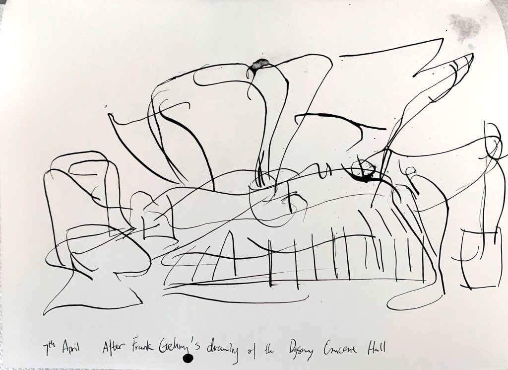
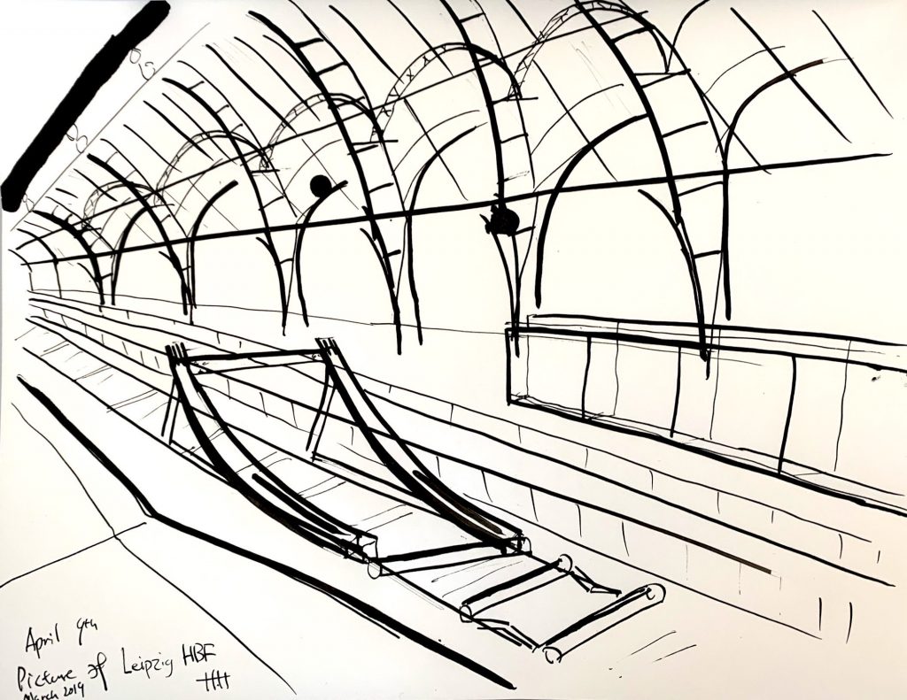
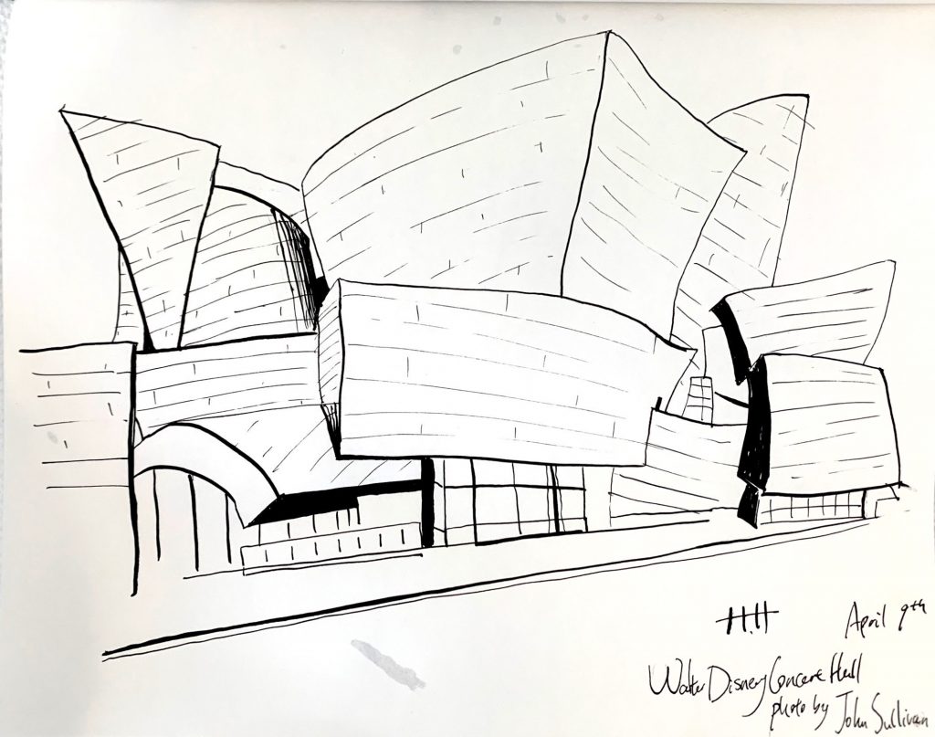
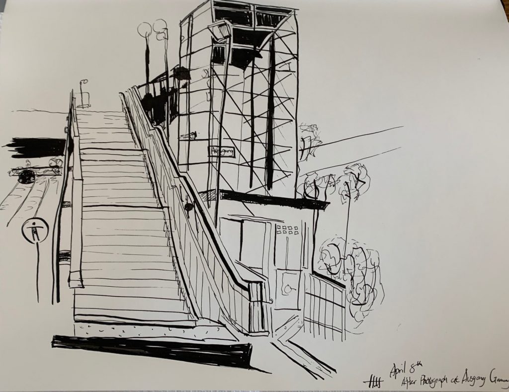
My prompt this week was similar last week. I got back to studying architect’s drawing and making my own from photographs from both photographers and my own.
I spent most of my time still, getting familiar with the medium. I found myself gaining better control over producing various line qualities. I started to experiment on using thinner lines to describe both structural information as well as texture details. These lines had such small visual weight to them. Thus they could be extremely quiet in an ordered formation, while capable of producing noise and attracting attention if drawn messy and unorganized.
I’m still having trouble with pinpoint accuracy with perspectives. I found it harder without settling down the major structural lines using thin sketch lines. Meanwhile, I do enjoy the decisiveness of tackling the structure right away.
X
X
X
Sources:
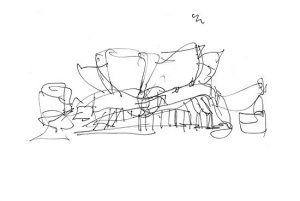

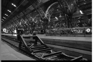
Harry, Bold and beautiful work! I like how you’ve followed Mark’s suggestion (following Ingress) to “learn perspective, then forget it” — but then remembered what you need to to convey a realistic urban landscape, like your second and fourth. Those of us who are detailed oriented appreciate having just enough structure that we’re not distracted from the beauty of the lines and deliberate distortions — unless the point is to be provocative and break the rules, as in your first drawing, which is a different and equally wonderful thing! Anyway, I like all four but especially the last two, which feel to me more complete for some reason.
Incidentally, don’t forget to click the setting that allows the viewer to enlarge each picture and have a slide show.
Hey Harry!
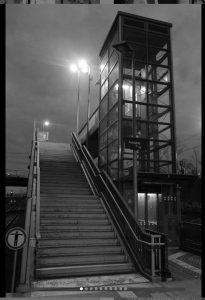
I think you are nailing the perspective in your drawings. You mentioned your process with working with the medium. Are you using ink and a brush? I admire your control of using thin and thick lines. I think your last drawing of the stairs at the train station shows that you are getting to the other side of some of the issues you are dealing with. I am particularly drawn to the dark places in the drawing. They show the darkness of the bridge in the back but also bring the front of the stairs forward. I also like that you didn’t try to line every single step of the stairs. You give the right about of information and the line weight works.
I think your drawing of the Walt Disney Carnegie hall can benefit from some of the techniques you used of the stairs drawing. The outlines of the major structures of the building are pretty uniform and the surfaces do not reflect the shadow. Maybe you could experiment with diluting the ink with water so that you can convey values more effectivtly. I don’t recommend doing a wash necessarily, because I know you are primarily focused on lines, but maybe you could incorporate some cross-hatching with dilluted ink to convey the values.
Hello Harry!
These drawings are amazing! I love the weight of the lines and the spaces were you decided (or maybe by accident) to fill with ink. I think you have a great sense of perspective, and this is specially shown in the third drawing. The spaces filled of ink can also being read as shadows and therefore the viewer can deduce the time of the day this drawing was made. If you are looking for more accuracy I will suggest to use different sizes of brushes (or sticks), as well take your time in order to make lines and shapes more straight.