X (If you like my suggestions below, or on the one of your mom–or any drawing you want to “repair”–you wouldn’t be the first artist to carefully paste a piece of paper over any area you want to change and redraw it. Or, do it digitally. Ask me if I can tell you more).
A couple of notes. About the nose, the less said the better, especially in a contour drawing. Get in and get out as quickly and economically as possible. In a pen drawing this size this extends to other contours on the face as well, which you can see I’ve removed.
(and look how much better it looks with the color taken out of it, and increased contrast).
I also took the hatching away from her top. It felt like an outlier (no hatching anywhere else) and it was detracting from the portrait. Easy to say in hindsight, of course, but a lesson for next time.
Great line weights overall but the lamp shows signs you were getting fatigued or running out of time. Those lines are more random and less deliberate. I took them away and left fewer lines but put them down more intentionally. I see them as the call and response to the lines of the hair, so they need to be in the same “key.” You’re so good at this 97% of the time it doesn’t need saying, but this kind of drawing insists on a thorough and consistent performance…like this next one–brilliant.
See below how much better it looks with white paper and higher contrast.
X
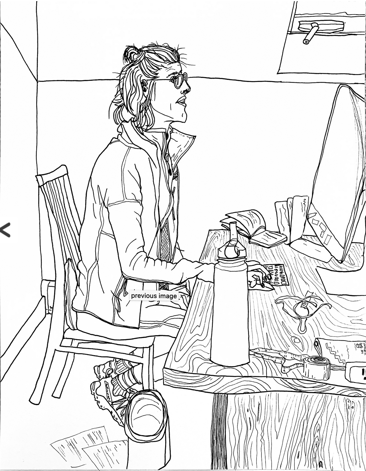
The only thing to improve here is the basket (?) and random papers on the floor at her feet. Like the lamp shade in the one above, these are too “phoned in.” The magic in your contour work all semester has been it’s very selective but unfailing attention to detail. Giving any part of the drawing less than your full attention breaks the spell and undercuts their magic.
There’s a great perspective move here, though–we’re looking down into the basket, then we can see more foreshortened ellipses on the desktop, but then her eyes are clearly at our eye level, or maybe slightly above (driven home beautifully by that line in the background, which meets a line on the left wall inclining downward). The effect is that of a shifting point of view that guides the viewers’ eye up and down the space.
And the woodgrain! Killer!
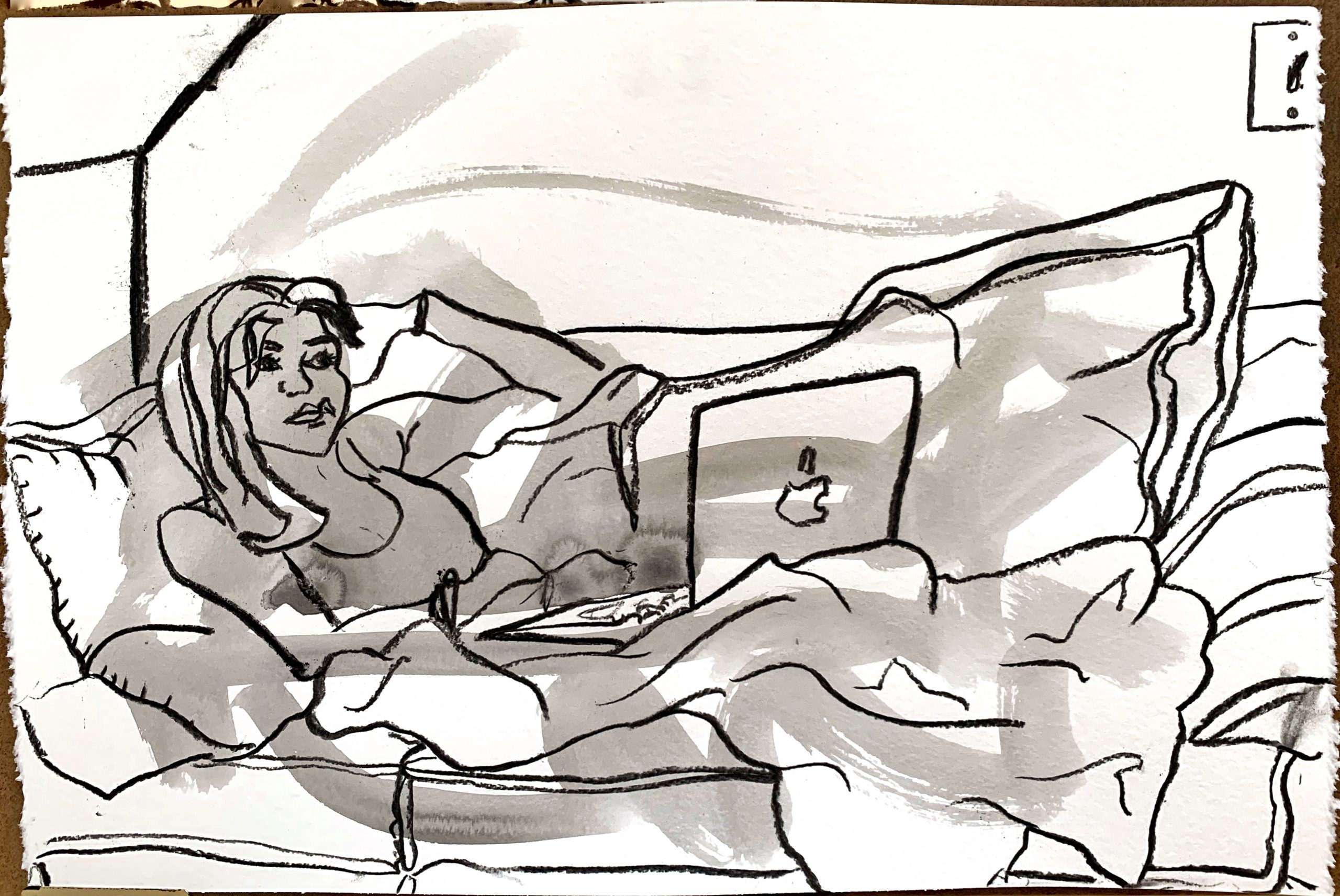
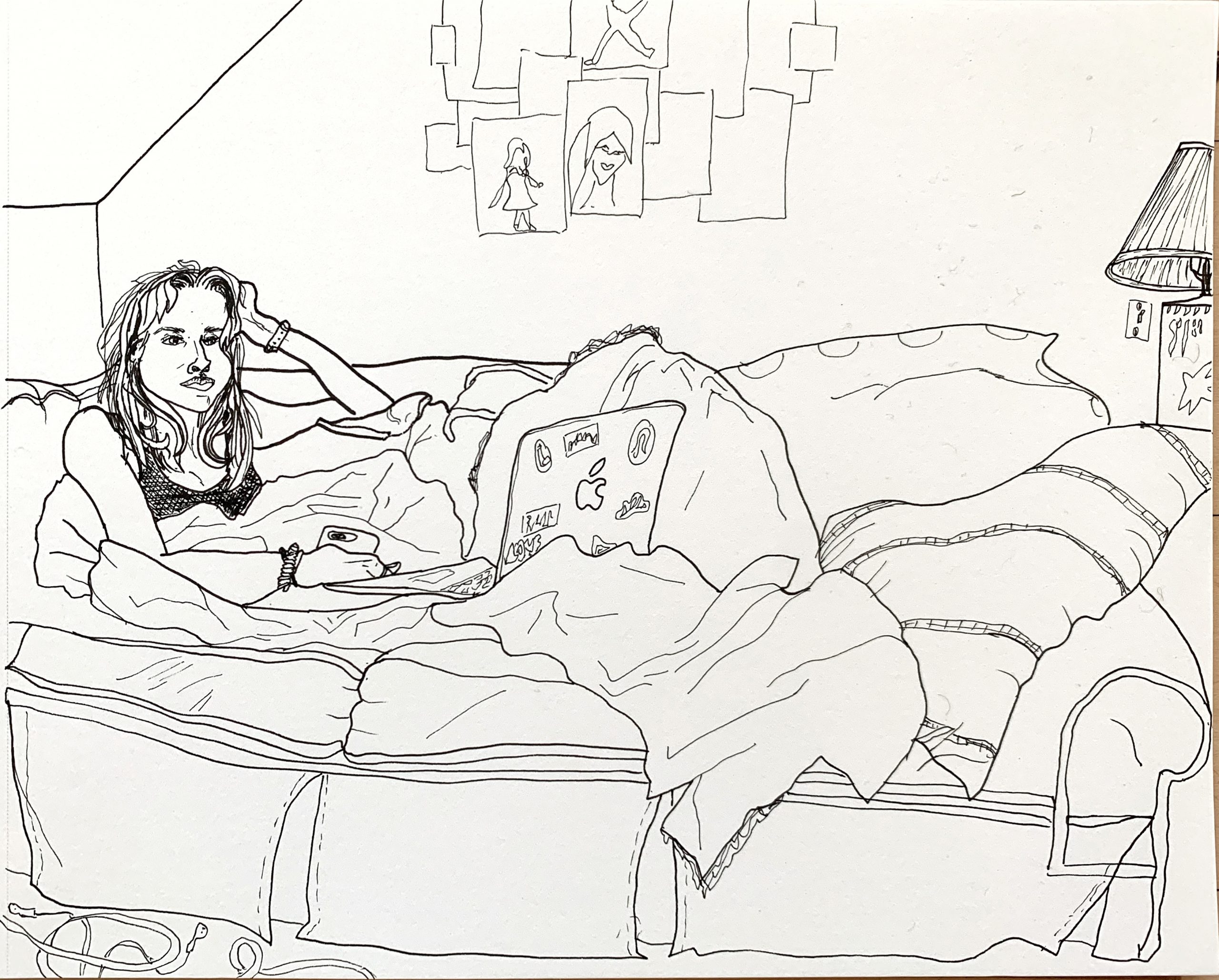
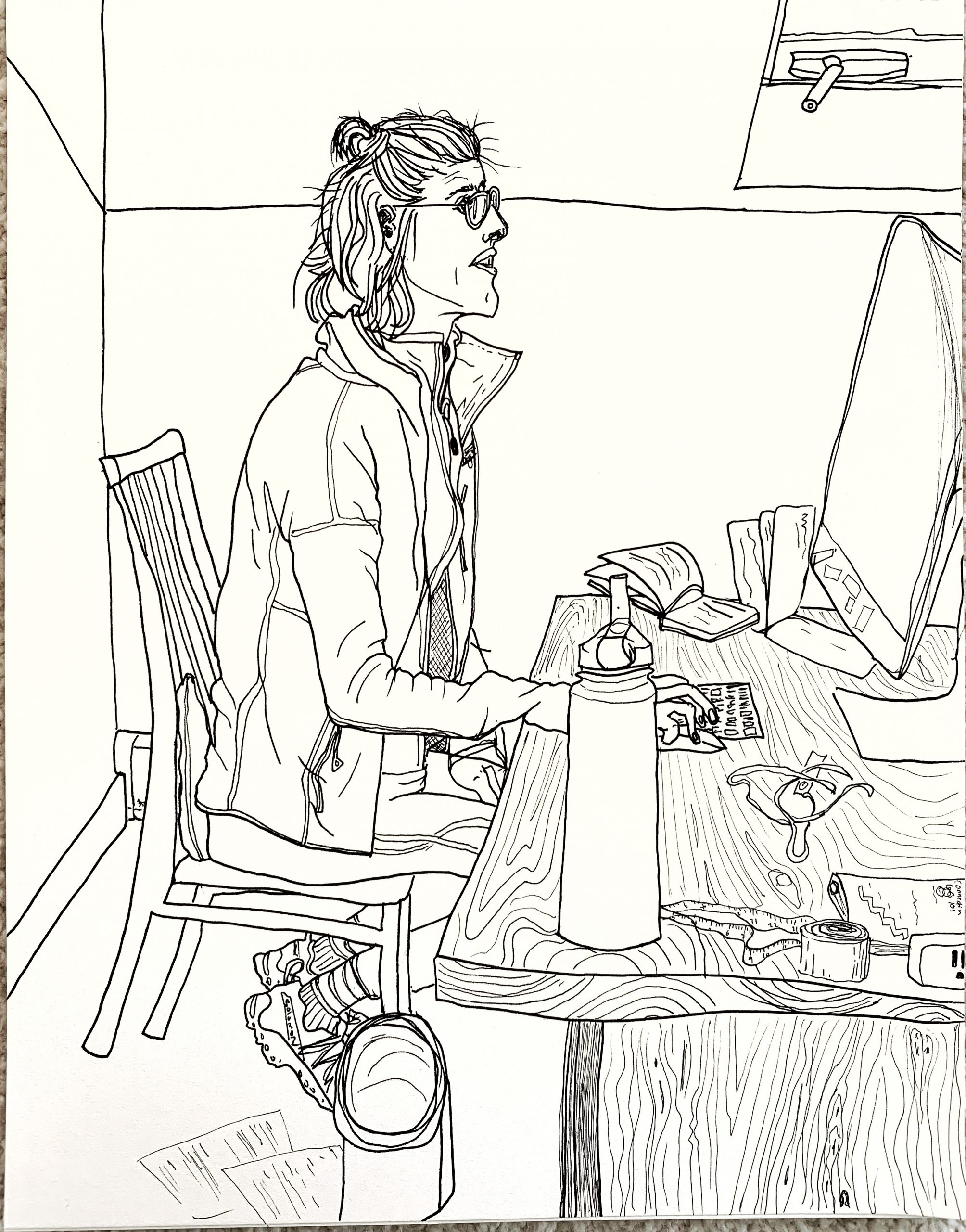
This week I asked my sister if I could draw her and she kindly agreed. I did two of the same scene with her on her couch watching a very dumb Netflix show. She had blankets and pillows all around her so she was kind of buried in the couch, which is what I like about this scene. I first did the ink wash, then the pen drawing, and finally went back and did the vine once the ink had dried. The last one is my mom working in a bedroom from her at home desk.
Overall I think all of these drawings are okay, but neither face came out how I wanted them to. I keep making people look creepy. To work on this I want to do the optional assignment from this week but I had a lot to do this week so didn’t have time. I am hoping to that assignment soon and get better at faces. I also think I want to get back to doing simpler scenes with fewer lines. The more I draw the more I see, so I keep adding more and more, but I want to distill it again which I will work on next week by both choosing simpler subjects and by leaving out more detail. However often I like the drawings more if I add texture like the wood on the table etc.
I also sort of experimented with different micron thicknesses as you can see in the pen one of my sister where I started with thick lines near her left shoulder and then switched back to thinner. The method in which I draw is not very conducive to switching pens because I move across the drawing instead of from foreground to background, so it is hard to decide when to do thicker and is easier just to lighten my touch on a medium pen when I want thinner lines. However the very thin pen worked well for the wood design of the desk. Any suggestions about these or what to do for next week are welcome! If you have thought of any classic quarantine activities or signs to draw let me know!
Hi Perrin,
I personally think you’ve captured something which is pretty unique to this time. I can’t speak for everyone, but I know I’ve been going screen-crazy. It’s hard to not look at a screen, but being glued to a screen has been completely messing with my attention span and head.
The qualities of the faces you’ve drawn read to me as reflecting this distorted headspace of spending so much time interacting with the world through screens.
However, if you want to try to draw it straighter, have you been laying out groundwork in pencil? If you’ve been trying to just go with the contour, I think it would be really hard to get a “correct” looking face.
I like the different thicknesses of the microns a lot, and how you’ve used it to highlight two different levels of importance to things described in the image- say, people and things, and then auxiliary textures on some things.
Some specific small things I really like that would take too long to talk about:
On the second image:
-Lightswitch
-Stitching on couch
On the third image
-Sneakers
-Absolutely wonderful tape measure
I think the 2nd and 3rd images do a really good job of setting people into a physical and emotional environment, especially with regard to their engagement with a screen (Or in the case of the 2nd image, screens, as there’s also a phone).
To me, the first image reads as a great jumping off point for the next two (it seems like it was done first). However, it doesn’t read like a fully realized work. I think that vine charcoal might be a hard material to get the more precise contour look that you’ve been working with. The scale seems a bit too small for the charcoal, but that’s a very personal opinion.
I’d be interested in seeing what would happen if you lay down that kind of brushwork, then put micron on top of it? Or maybe used the brush to shade on top of the micron, since I think it’s waterproof.
I also think the composition of the last two works really well. Nice line by the eyeline on the 3rd.
Keep it up! I’m excited to see what you’ve got next week!
Hi Perrin!
I just wanted to start off by saying that I’ve really enjoyed looking at your work this semester. You Really have a talent for contour drawing. (And that shit is so hard!!!) The detail and character of each piece is just so good!
Your assessment was helpful in pointing out some of the things you have been struggling with and I kinda see what you mean. On one hand, the details are what I like most about the drawings. Especially all of the objects on the table where your mother is working. The tape measure, the books and that water bottle. I don’t think this drawing as too much detail. The blank walls and floor balance is out.
However I do see what you mean in your second drawing. There is a lot of information though it isn’t necessarily overwhelming. Although the lines to indicate the creases in the blanket seem accurate, maybe it would help to isolate fewer and most important creases. But this is a minor adjustment.
I’m sorry I don’t have any suggestions about your pen issue and line weight. Maybe you could experiment with ink washes underneath your contour drawings to indicate value. (I.e. between the couch and the blanket)