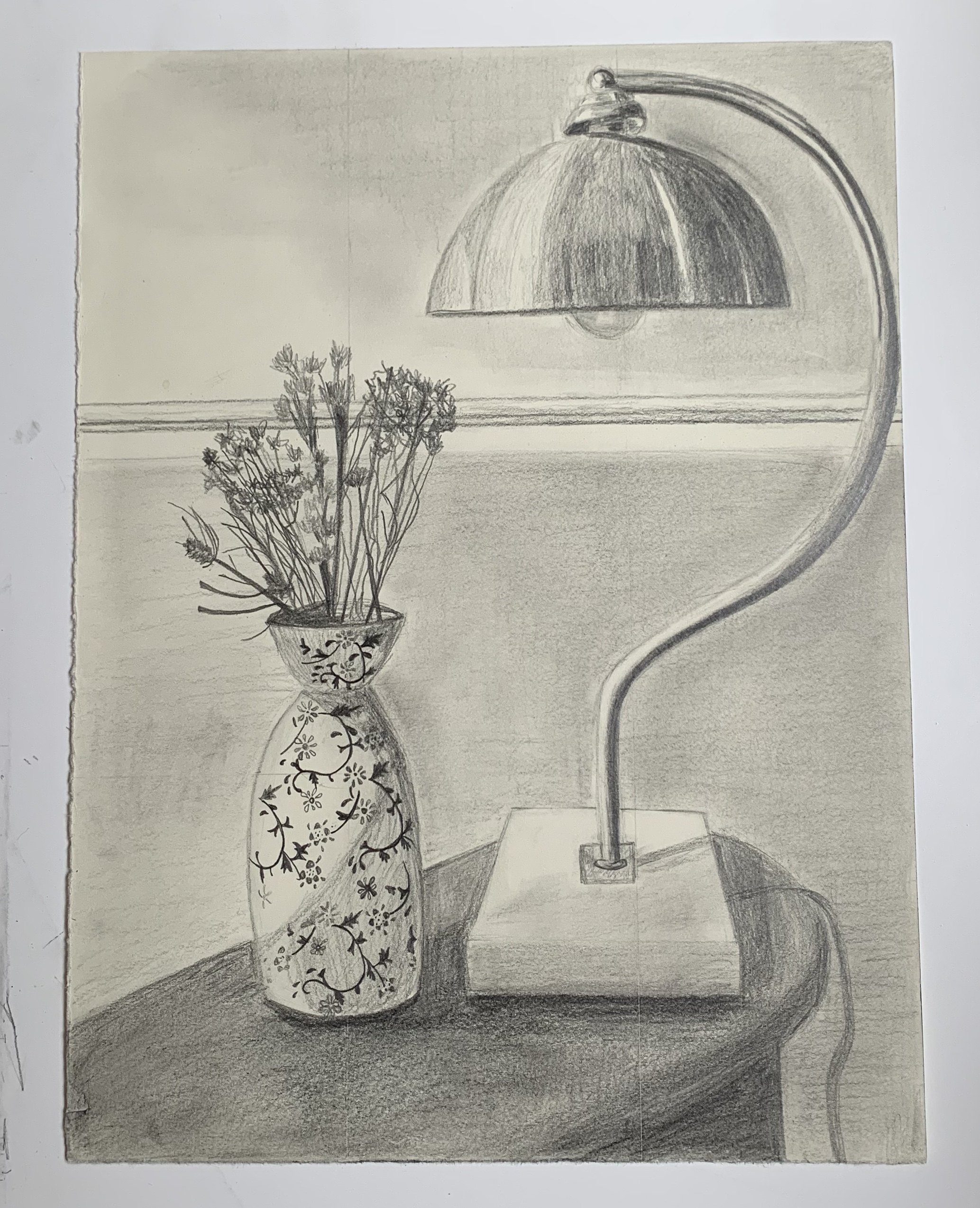
Pencil on paper, 12 x 9 inches
X
For this first week, I decided to draw part of a side table in our living room because I wanted to draw something on a smaller scale. My intention for this drawing was to produce something photo-realistic. I concentrated on the shading and value of the objects. Throughout the process, I was reminded that I haven’t quite discovered my drawing style and I was disappointed about how I shaded the objects. Because I don’t think it gave me the realistic effect that I was going for. I’m not sure how I can improve this. I also had trouble with drawing the dried flowers. There are more flowers in the vase with infinite amounts of detail. So my question is, how do we approach a highly detailed subject? Is there a certain method I can be using? I also don’t think I successfully captured the depth of the space. The back wall can just as easily be on the same plane as the objects. For my next drawing project, I would like to try a more impressionistic style.
__________
From Mark:
It sounds like you’re not going to stay with this approach, but if you were, the work of Charles Sheeler comes to mind:
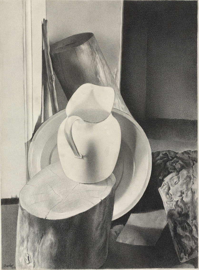 Charles Sheeler, 25 x 19.5″
This was done with conté crayon, keeping a super sharp point to get the finest grain possible. It’s also from a photo, which helped him to lock in the values and simply (so to speak) transcribe them.
I also see the hint of something in that vase that reminds me of the work of Gail Spaien, who teaches at Maine College of Art:
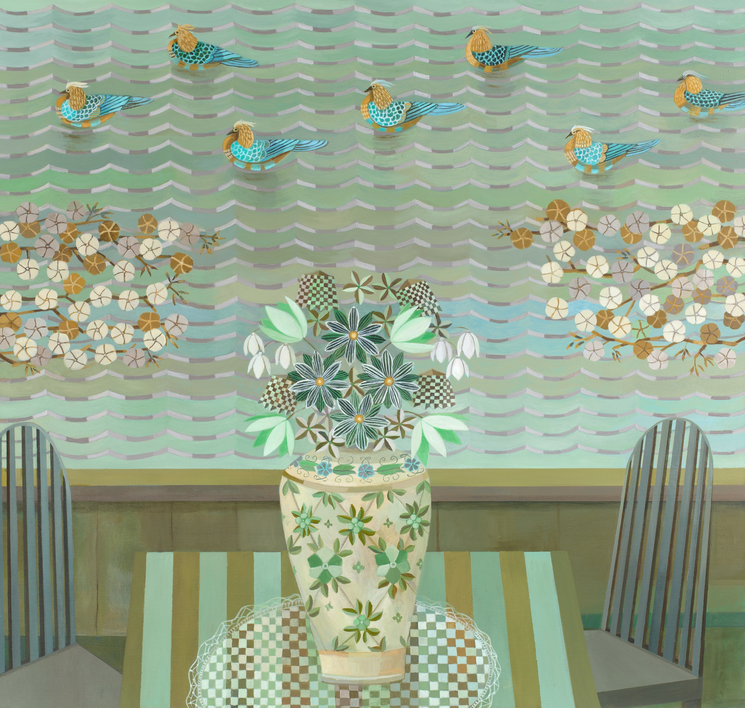 Gail Spaien
This also connects, for me, with your interest in Frida Kahlo’s work, which is so rich in patterning. Pattern could also be a solution because large flat areas are one of the hardest things to ask a pencil to do.
I should know, having made pencil drawings like this one for years….
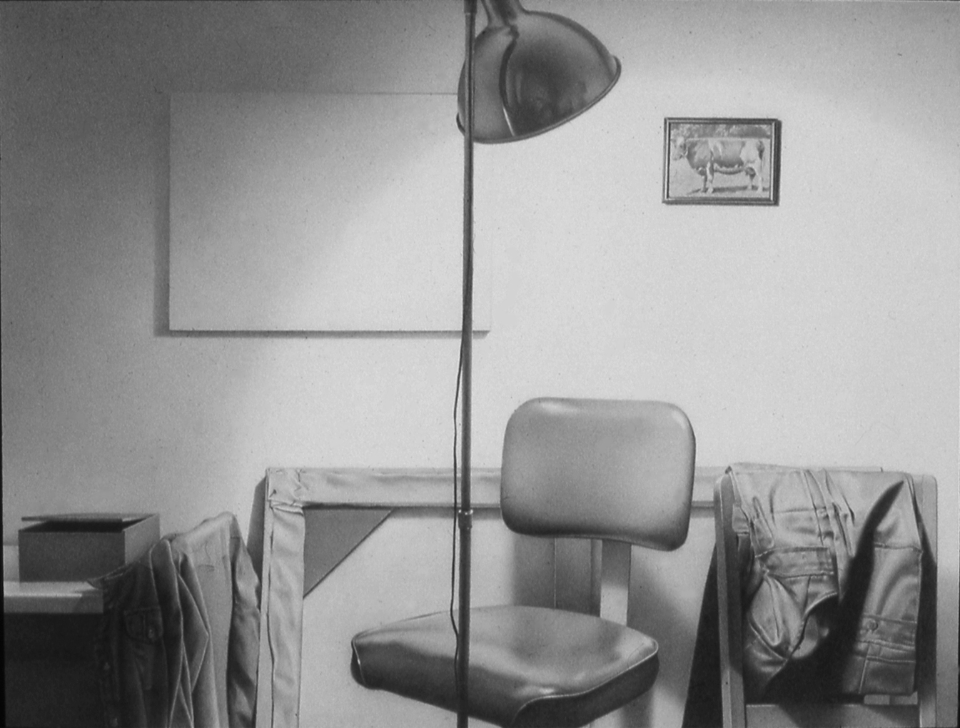 MW, “Grey Rainbow,” 1978, Graphite on paper, 9 x 12 inches
Note the reflector on the lamp, which has a small self-portrait in it.
For this first week, I decided to draw part of a side table in our living room because I wanted to draw something on a smaller scale. My intention for this drawing was to produce something photo-realistic. I concentrated on the shading and value of the objects. Throughout the process, I was reminded that I haven’t quite discovered my drawing style and I was disappointed about how I shaded the objects. Because I don’t think it gave me the realistic effect that I was going for. I’m not sure how I can improve this. I also had trouble with drawing the dried flowers. There are more flowers in the vase with infinite amounts of detail. So my questions is, how do we approach a highly detailed subject? Is there a certain method I can be using? I also don’t think I successfully captured the depth of the space. The back wall can just as easily be on the same plane as the objects. For my next drawing project, I would like to try a more impressionistic style.
The two parts of this drawing that I think are especially successful are upper right (the upper part of the support for the lamp), and the base of the lamp. The support for the lamp feels really confident, and captures some value notes on both the dark and light ends of the spectrum in convincing and exciting ways. The base of the lamp gives a fantastic sense of dramatic foreshortening. One thing that I think might help with the feeling of the table being a little askew under the lamp would be to focus on darker notes as an integral way of orienting the closer edges in space, helping to situate the entire plane. I also wonder if on your next work leaving a margin around the drawing for the paper to let it breathe a bit might be helpful. Also to your point about drawing style, I personally feel like style should ideally be in whatever you decide to make, and so it should naturally just crop up on its own.
I think that this is a really successful first drawing for the project, and has areas of beautiful soft tone that were really eye-catching as I scrolled!
Megan, I love the softness and zoomed-in quality of this piece! Similar to what Adam pointed out, I love the upper right corner of the piece that pictures the top of the lamp. The slightly off-kilter position of the metal top gives the lamp character. The shadow it creates on the shade is really well-done. You mentioned that you weren’t satisfied with how you shaded forms, but I think you did a nice job with shading. This is especially true in the lamp because your marks to show direction. Your piece could be even more powerful or consistent in style if you continued this in other aspects of the piece. For example, the table could be shaded with lines flowing in a single direction, not multiple. I think the table could also benefit from a stronger outline to make it pop out from the background. Overall, I think you did a great job differentiating lights from darks. The composition stands out!
I also like the vase and flowers. You did a nice job differentiating texture between the designs on the vase and the flowers themselves. You were successful in making them look dry! I am impressed with the level of detail you included in the vase. I think extending those designs to the edges of the vase and trying to show them “wrap” around the curved form could make those forms even more convincing as designs on a curved surface. Again, I think this is a wonderful piece that is well-executed and captures a feeling of home.
I remember you were considering drawing portraits of your mom and sister for your project—are you still considering that idea? I think you could apply many of the techniques you used in shading to portraiture!
Megan, as with my comments on Claire and Adam’s work, I’m the slow one to contribute here, and their comments (and, of course, Mark’s) were so on target that I feel they have mentioned the key points. I would very much agree that you should follow your initial inner urge to do realistic drawings. This one is really good, genuinely eye-catching. The composition is intriguing and pleasing, and there are moments of what seems to me very skillful and confident drawing. Interestingly, you seem to be pressing harder on the pencil and producing stronger lines than earlier in the semester, no? To take your drawings to the next level (e.g., towards the highly realistic work of Charles Sheeler or Mark), I’m guessing you will have to spend a lot of patient time on each element in your drawings. For example, your vase decorations are highly precise and lovely, whereas it seems as if you lost patience (or ran out of time) with the shading on the vase. Given your interest in detail (which, as you know, I share), I would think you would want to stick with smaller drawings, rather than 18×24″! As for tiny flowers, maybe that’s a subject to save for a more impressionistic drawing? I think you’re heading in great direction.
Hi Megan,
You’re off to a great start, and once again (I’ve read and written a few of these now), you have great feedback from Adam and Claire.
I’d underscore Adam’s comment about style–it should arise naturally from your own temperament and visual curiosity–not chosen like a filter on Instagram. This drawing exudes a love for this way of working (or at least an abiding curiosity)–no one could have gotten this far with it and done this well if this way of making wasn’t a part of them.
Not to say there aren’t other languages of drawing for each of us to explore (no saying we’re only entitled to one), but be careful about the potpourri approach to this overall project. If this kind of imagery (intimate still lives) is going to be the constant you have room to explore facture (a $5 word meaning how something is made; the root of the word manufacture, which means “hand-made”).
But I digress….
In other words I’d rather not see an expressionist portrait this coming week, unless you decide the final weeks will be portraits. The goal here is to pursue something–a technique and/or type of imagery–in depth. But an expressionist still life would be fine, especially to test the waters after this one.
I for one would love to see you stay with this. It sounds like you’re unfairly discouraged. Like Adam and Claire this drawing stopped me in my tracks. Beautiful tonalities and an arresting composition.
My only critique of the composition is that the neck on the lamp is tangent to the right edge, which is a space-killer (flattens the image by attaching an object to the frame).
Another way to achieve more depth is to lighten the values on the chair rail–those dark lines bring it forward.
You ask about how to tackle the infinite detail of the dried flowers. No answer other than what you’ve already done–put your head down and keep drawing them one bit at a time. If they’re more than you want to deal with just leave them out. But these are great.
You ask about technique. There are things I could share about your pencil technique by recording a demo and sending it out, but I won’t take the time if you’re moving on. Otherwise say the word and I’d be more than happy to (or for anyone else who’s still reading). In the meantime I’ve added a drawing by Charles Sheeler and a couple of others for you to look at. I have examples of other artists as well–you’re in a rich territory–just let me know if you’re still interested.
Long story short, this is a lovely drawing, with some lessons to teach the next one like it, if you choose. Let me know, either here or in an email, how you might want to proceed after the feedback you’ve gotten and I’d be happy to help–