Charcoal on Paper, 9″ x 12″
Charcoal on Paper, 9″ x 12″
Charcoal on Newsprint, 18″ x 24″
X
Charcoal on Paper, 9″ x 12″
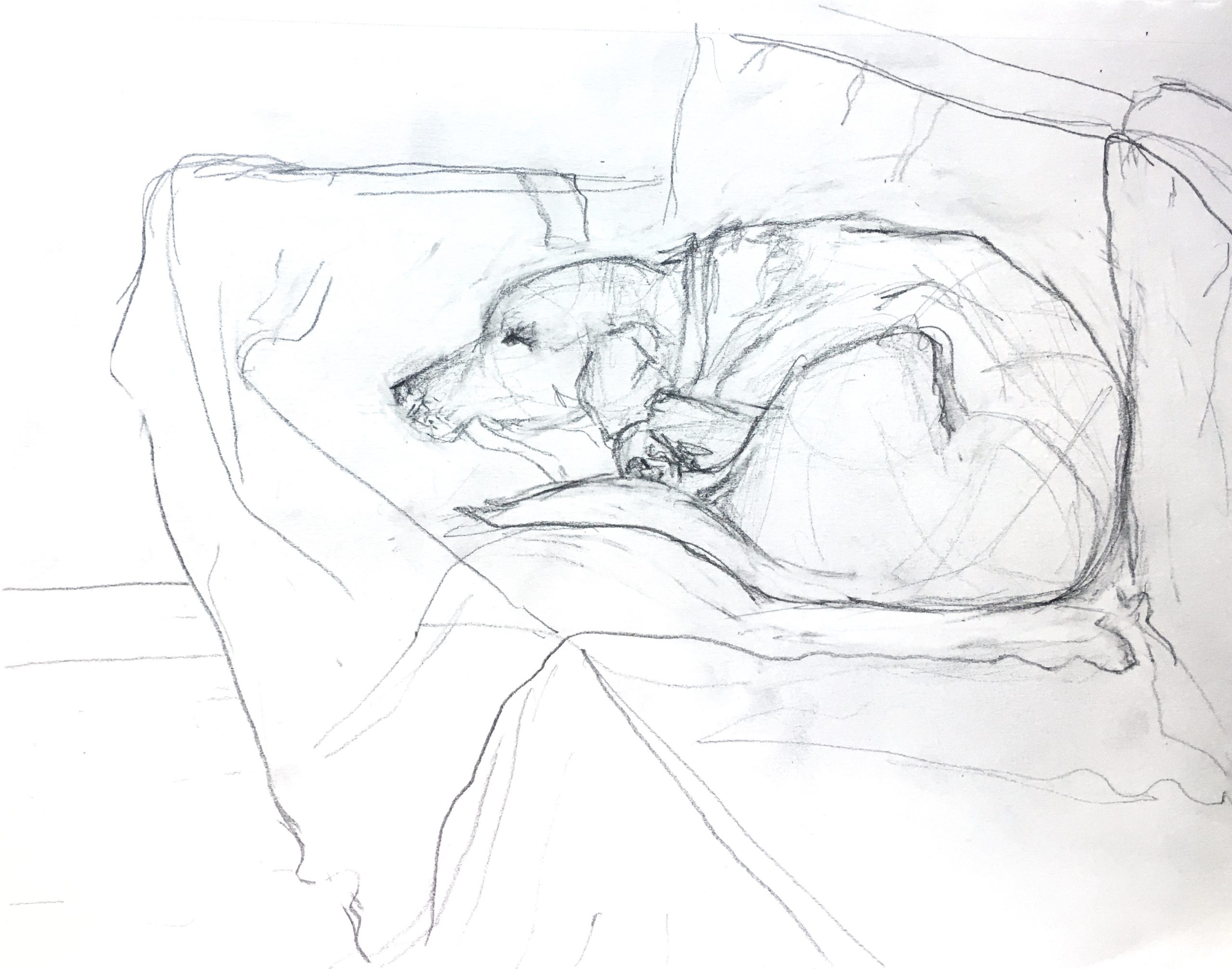
Graphite on Paper, 9″ x 12″
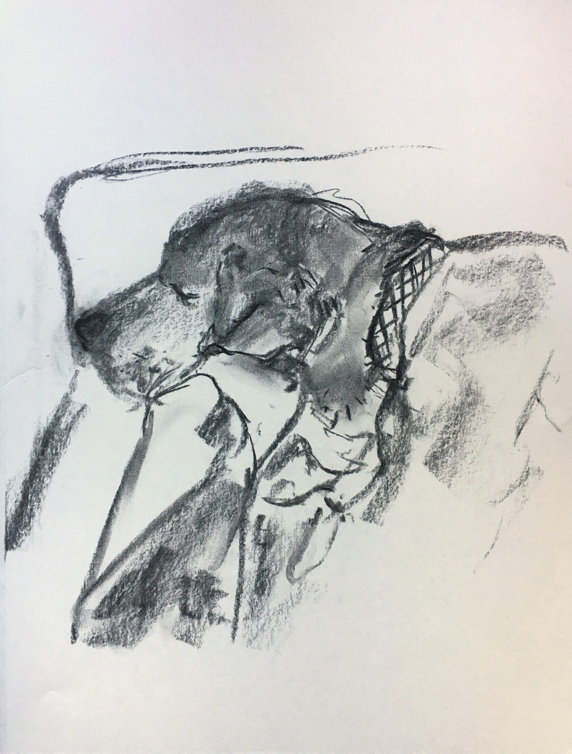
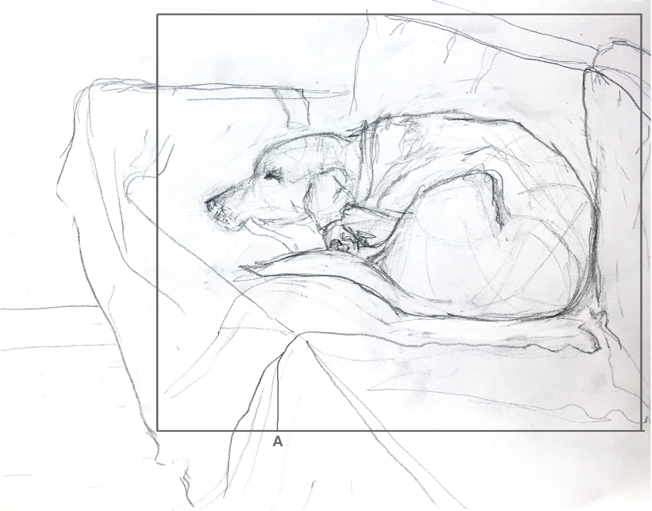 Considering Diebenkorn is one of your inspirations (and a good one), think more about composition. Love the way the dog is in kind of a rectilinear silhouette. Bringing the sides closer emphasizes this (a rectangle within a rectangle) and strengthens the negative spaces. Note also the line I’ve added at “A.” It might not be true but for the sake of composition we have to take matters into our own hands–I did it to echo the verticals of the couch cushions and the dog’s lower spine, his brow, and collar. It also helps to arrest the rapid retreat of the diagonals (perspective).
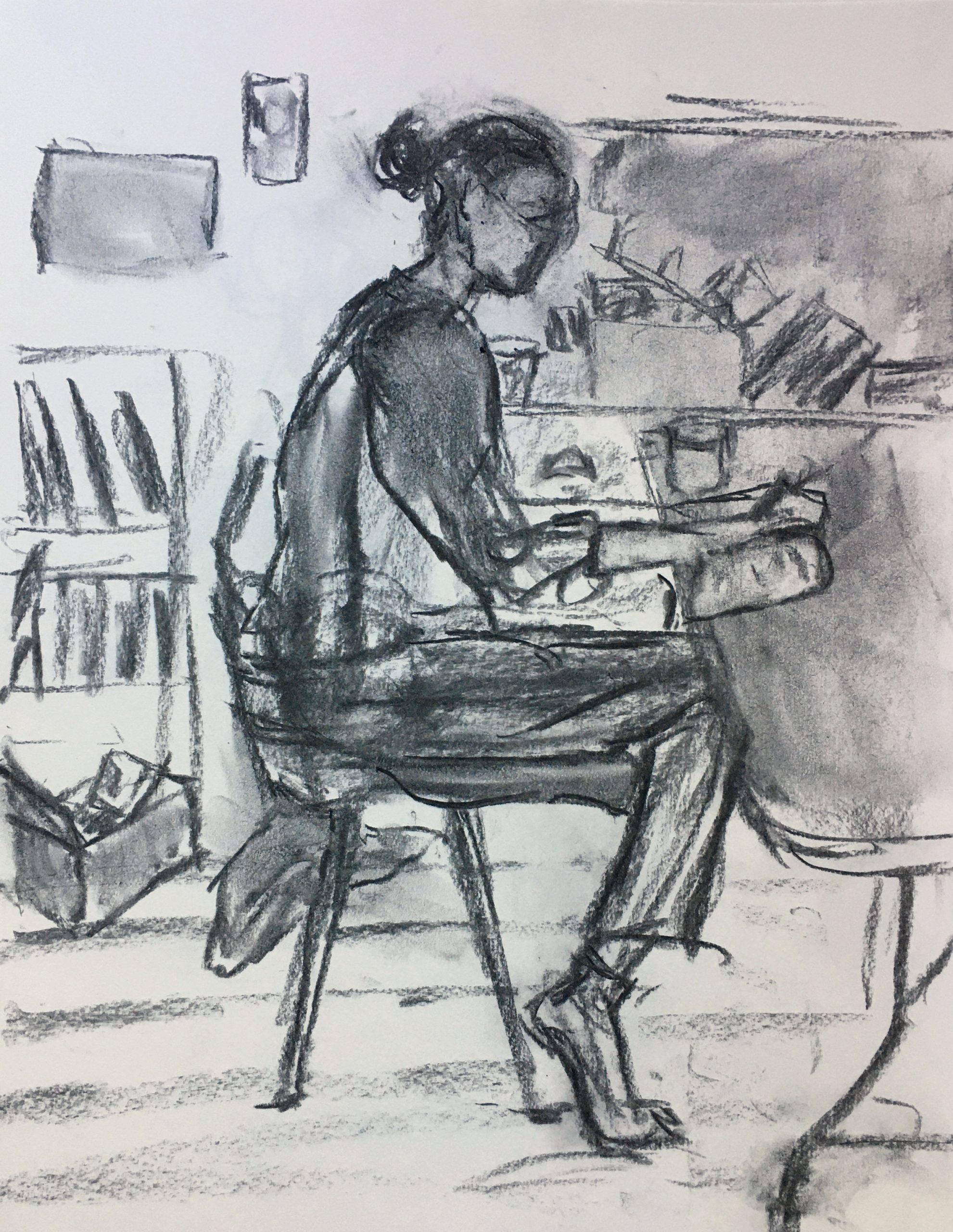
It took me a while to “warm-up” to drawing again after taking some time off over break. I experimented with making fast drawings using charcoal and pencil. I made quite a few more drawings than I uploaded–my goal was to get back into the drawing mindset and to experiment with drawing from life in an expressionistic manner. I also wanted to test out subjects/locations in my house.
As I move forward, I would like to work on situating figures in their environment. I think my drawings that include background are more successful in communicating a feeling of place. I’m enjoying working with charcoal, but I think I need to learn more about the medium. I’d also like to work on proportions. I’m interested in trying more portraits, but I definitly need to work on proportions of the face and some technical drawing points.
My absolute favorite drawing from this suite is the (vine?) charcoal of (your?) dog. It does a great job of setting an emotional scene by including all the important things, but also not focusing too hard, and letting the moment remain a little vignette. I really like how the texture of the charcoal remains (especially on the dog’s shoulder), and is such an important part of the feeling of the piece. I do agree with Megan that some of the marks on the couch/collar being lighter would probably help to star the dog in this scene.
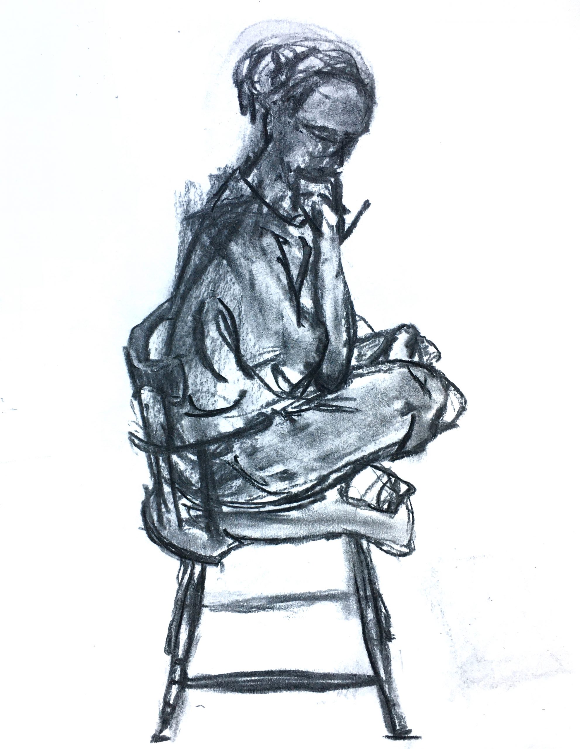
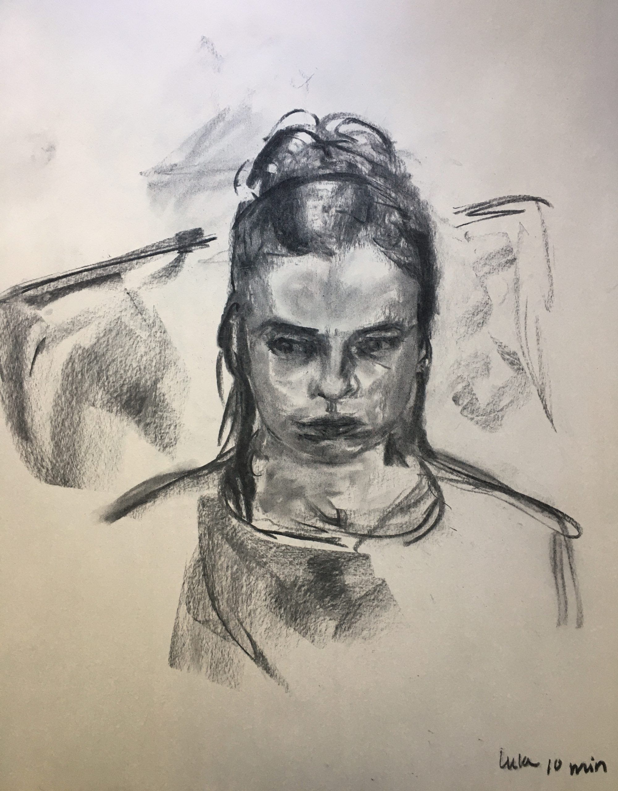
This group of drawings seems like a really strong point of inquiry for the rest of the semester. I think the first two portraits are a little stiff in how the weight seems to be supported by the figures, I think here too, lightening some of the marks which don’t carry weight might help. I think that one drawing you really nail this sort of decision-making is the frontal portrait. The marks delineating the eye-sockets do a really good job of focusing attention there.
Claire, what a stunning set of drawings! You warmed up fast. I like you how you are fearless in exploring different techniques and topics. How interesting that your most expressive (to me) drawing was the one you did in 10 minutes. (I’m reminded of Adam and Jack’s sketch of Harry during a short break, which they included in their exhibition before the break.) I agree with many of the other comments and don’t have a lot to add other than keep gaining inspiration from the fabulous artists that you’ve studying and keep doing what you’re doing!
Hi, Claire-
I’ve always admired your impressionistic style in class so I’m excited that you want to continue doing more of that. With this series of drawings, I am particularly drawn to the last two of your dog- and for different reasons.
I’ll start with the last one. I see that it’s not purely a contour drawing because there are some erase marks but it definitely has that feel. I think you were successful in conveying your dog’s weight on the couch. I also admire your use of lines on the fabric to suggest the shape of the couch and the perspective. The darkest point of the drawing is your dog’s closed eye and I support that decision. It immediately brings my gaze to your subject matter but is subtle enough to not be distracting.
I also like the charcoal portrait of your dog. The texture successfully suggests fur and fluffiness. However, because the head is pretty dark, the other dark markings on the quilt or couch distract me from the focal point and I can’t quite make out what I’m looking at. perhaps you could use lines similar to the ones you used on the couch for your other drawing.
Hi Claire,
You own comments, as well as those of Megan and Adam, don’t leave me a lot to add. I agree with Adam–an auspicious beginning and good to see you settling in. You touch on this but an art practice has so much to do with inertia and momentum. They each tend to reinforce themselves, and the best things happen when the work is rolling out.
My first thought when I went through these was “Oh no–the best one is on newsprint!” It’s not going to last, as you know (first it will darken and then it will rot–I have some in my college portfolio that look they were made in 1790). That is a gorgeous drawing. I agree about Adam’s comment about the eye sockets, and this one also counters your own doubts about your charcoal technique. You have a great feeling for it already, also apparent in your first drawing and the charcoal of your dog. Just keep making more.
You also did some great ink and ink wash drawings before break, if you’re tempted.
Back to the portrait of your sister (I’m guessing)–the weights and tensions of the background, her pose and her side eye all work great together, as do your decisions about where to place emphasis.
On that topic, I wish I agreed more with Megan’s comment about the emphasis on your dog’s eye in the pencil one–it’s a good point but for me it leans too much toward standing out. It could use some subtle balancing marks elsewhere around the head.
In that same drawing, see my annotated version and notes just below that drawing, above. Read my comments to Ali about composition. I think you might also share an interest in Avigdor Arikha’s work, which I shared with Adam–especially his figures in interiors (his whole portfolio centers on scenes from his home and studio).
Great start–can’t wait to see more–