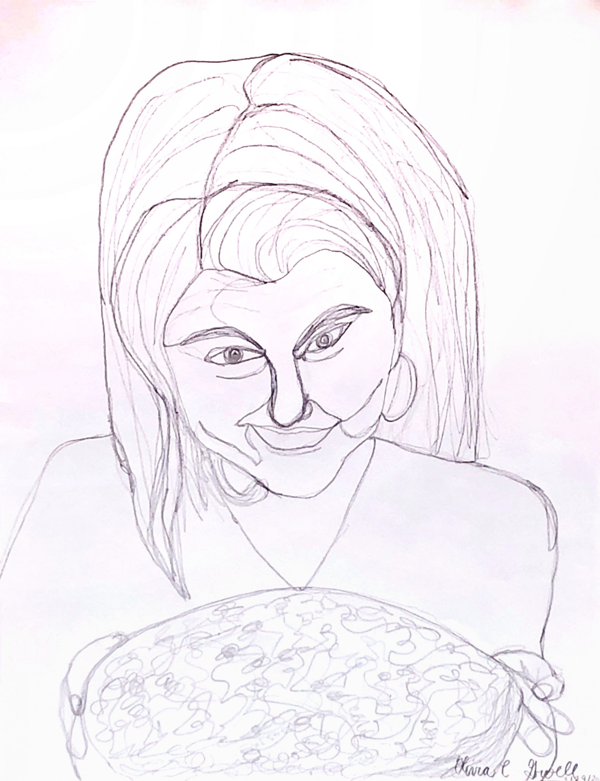
Pencil on paper, 11 1/4 x 8 3/4 inches
 I suspect this should look closer to this. I took it back into Snapseed and applied the tools I outlined in my “cheat sheet” of shortcuts.
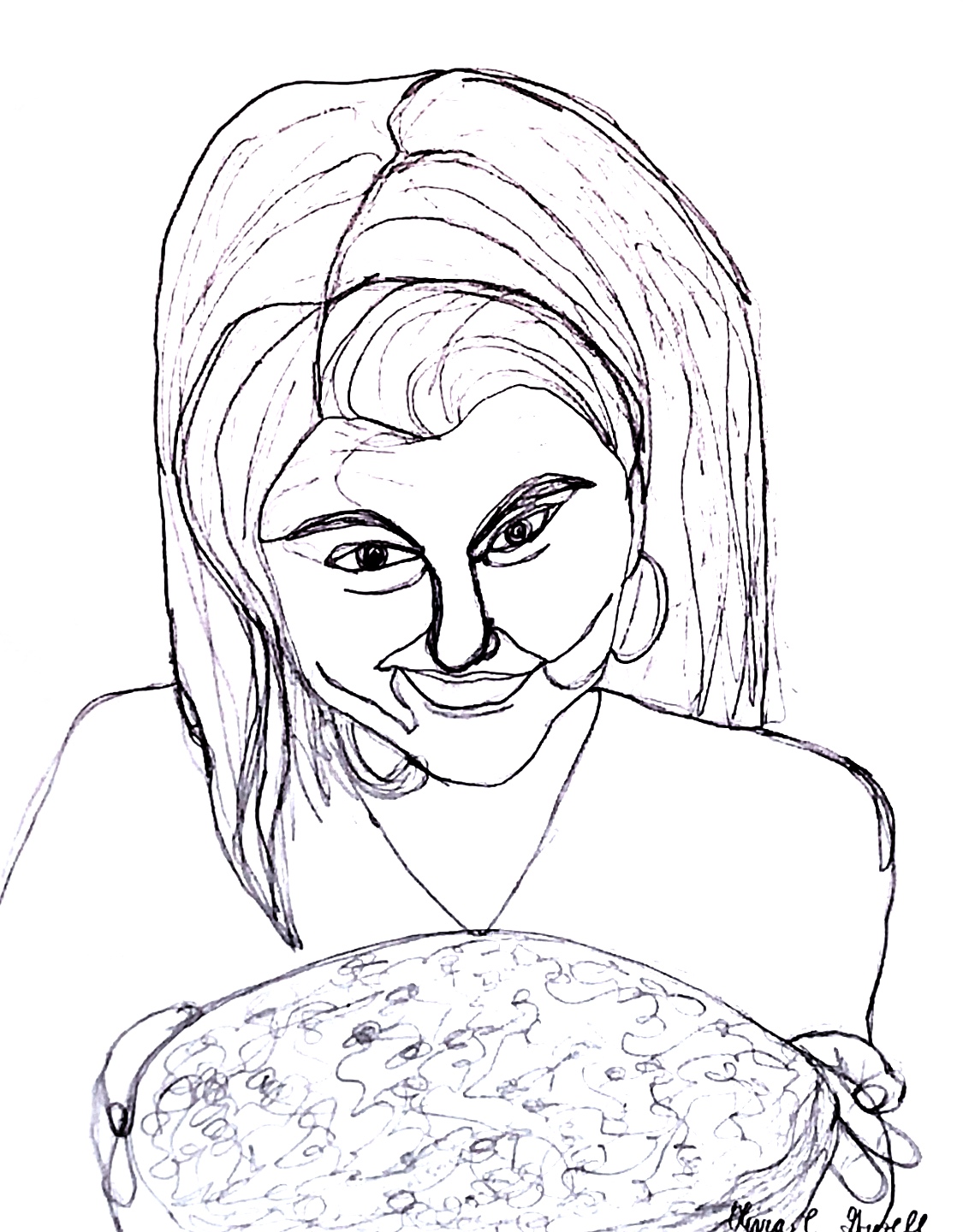
Pencil on paper, 8 3/4 x 11 1/4 inches
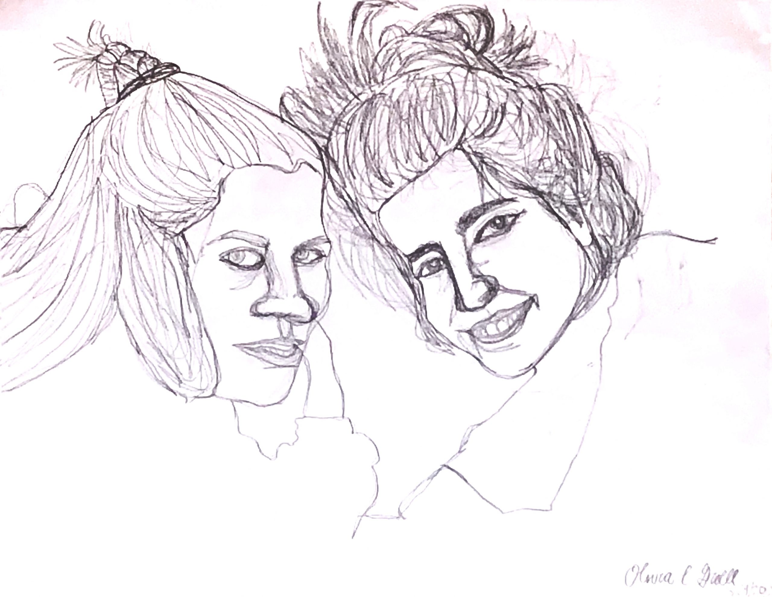
Pencil on paper, 17 1/2 x 22 1/2 inches
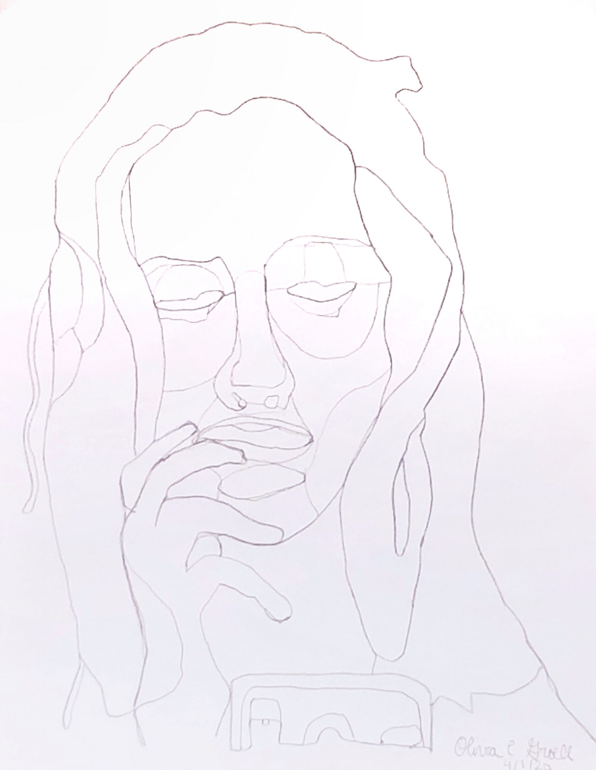
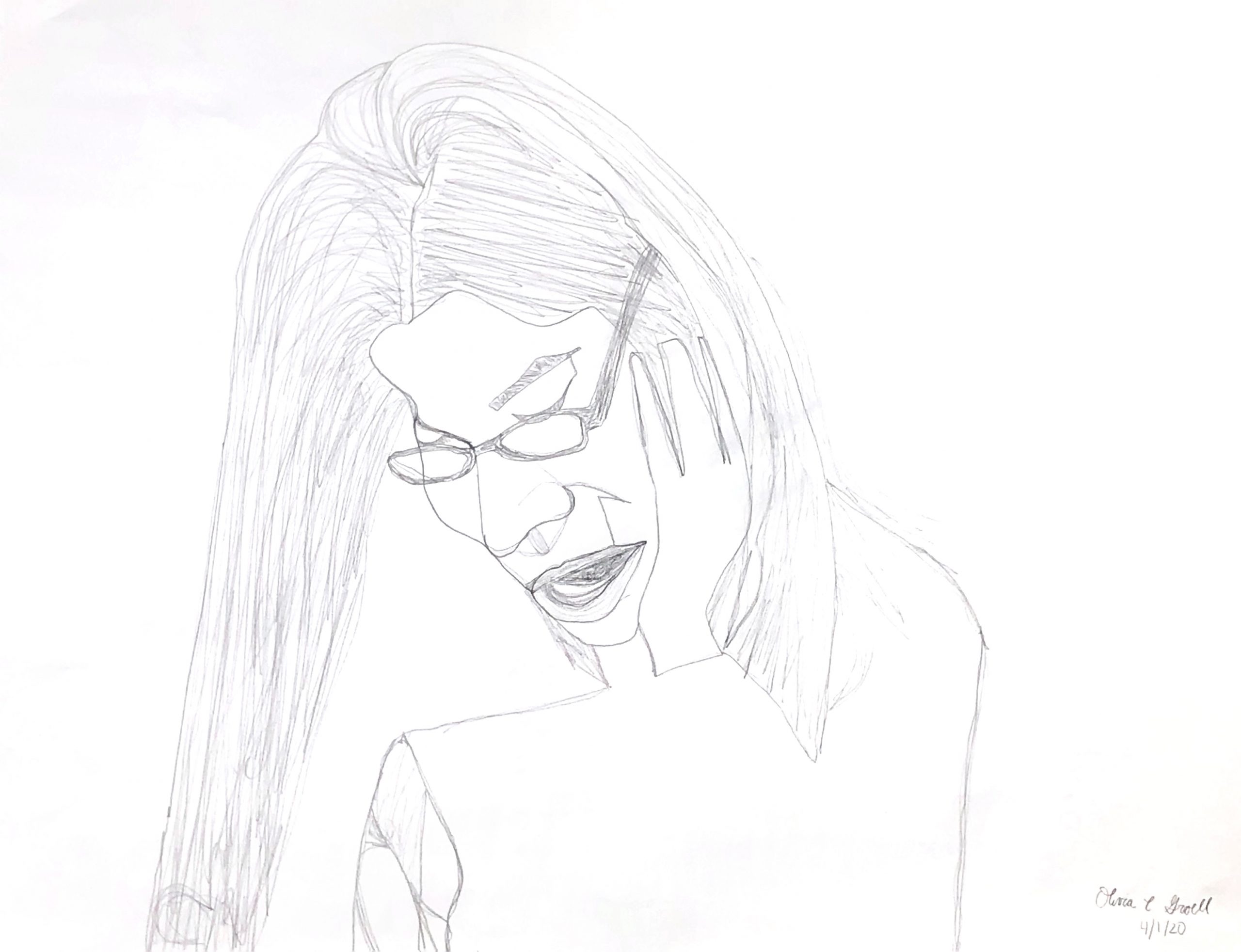
Pencil on paper, 11 1/4 x 8 3/4 inches
X (but only if we can get a better exposure)
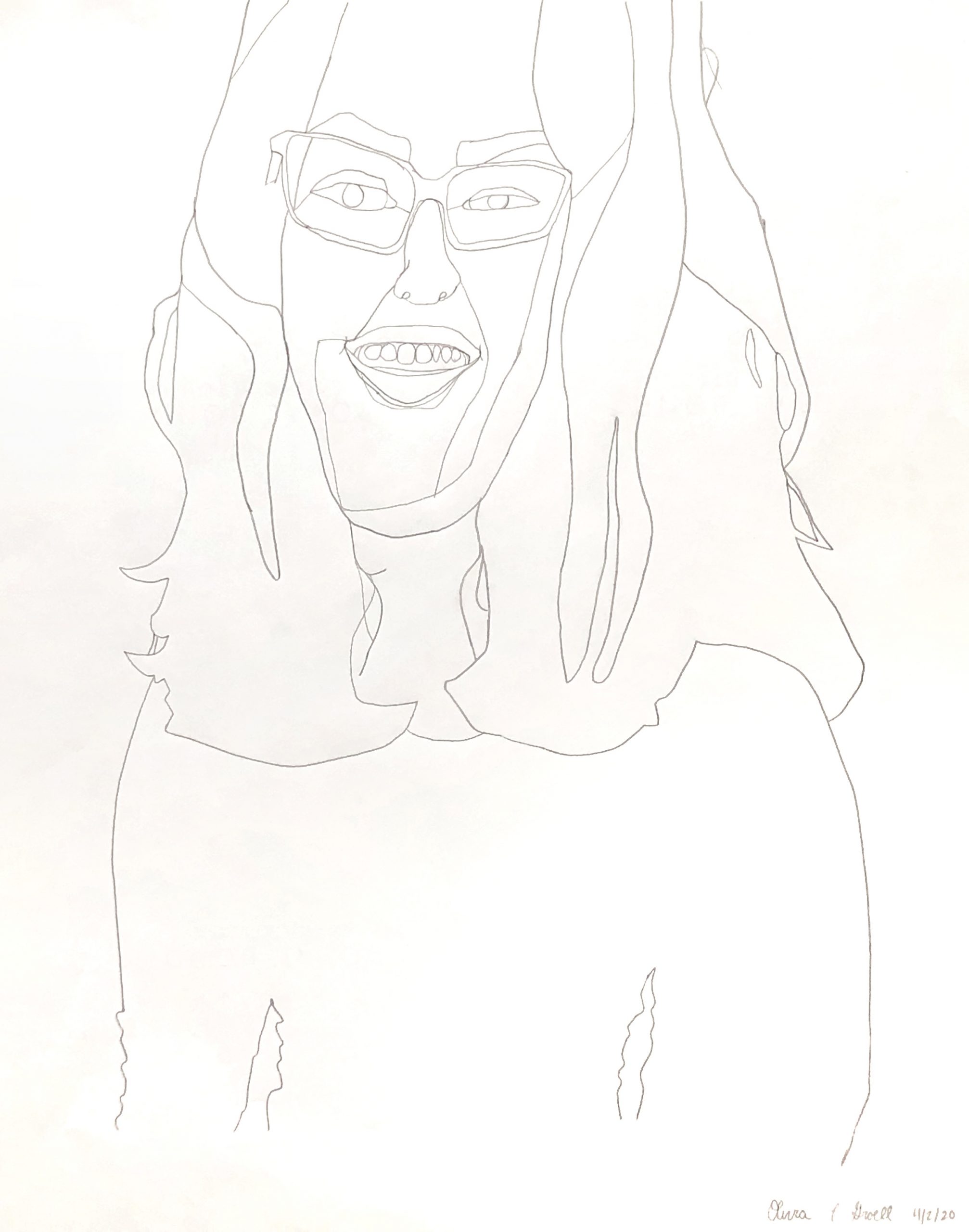
Pencil on paper, 11 1/4 x 8 3/4 inches
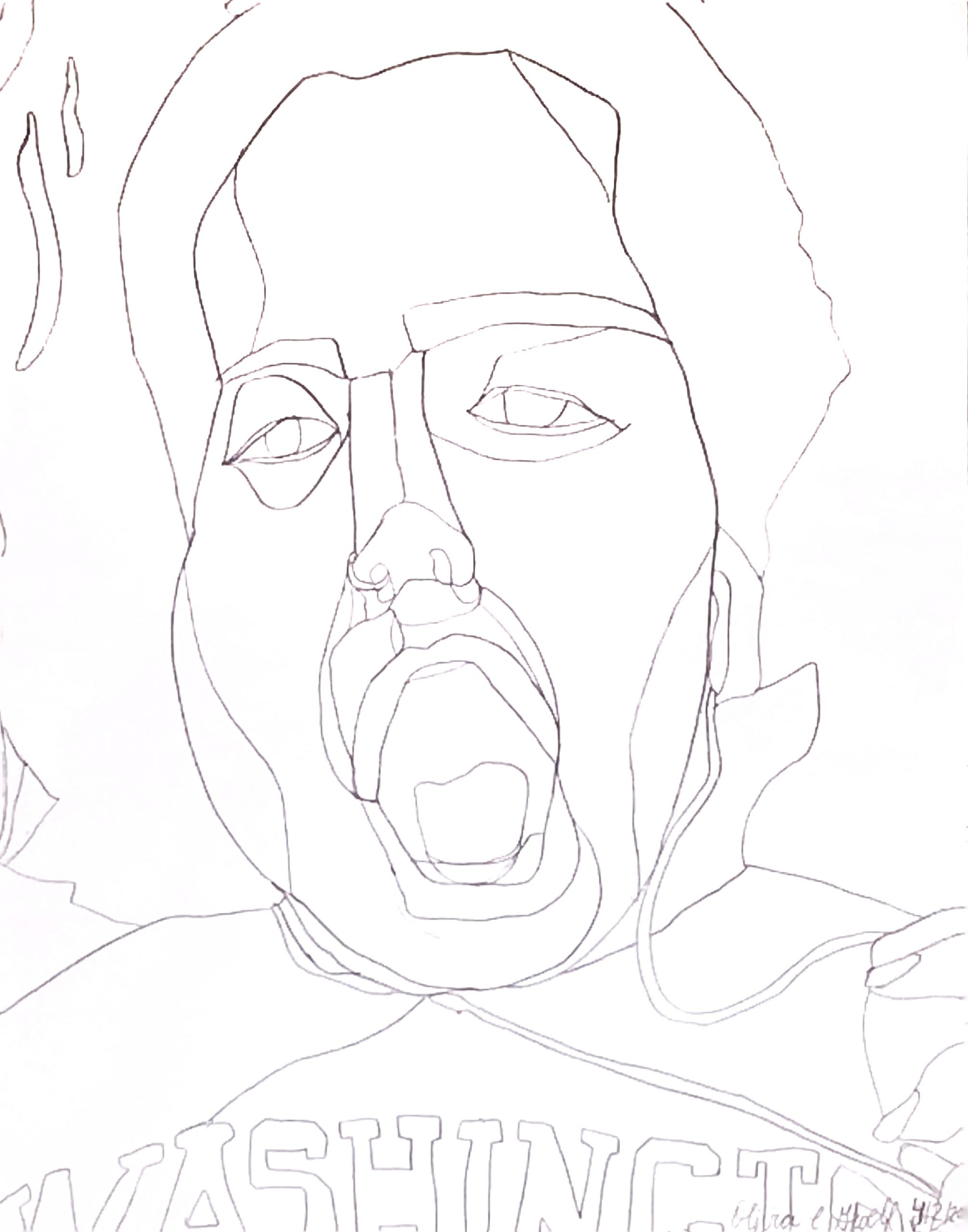
Pencil on paper, 22 1/2 x 17 1/2 inches
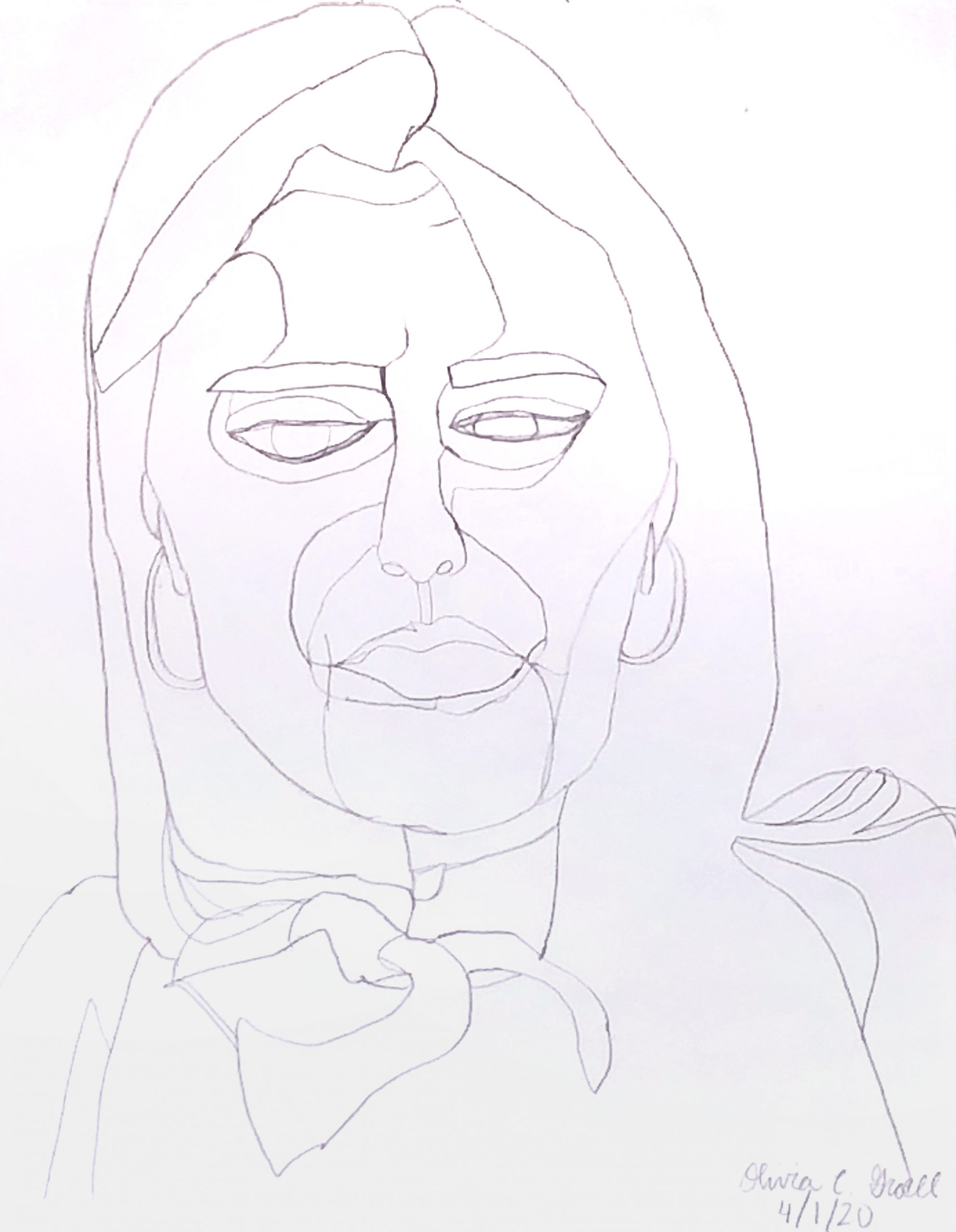
Pencil on paper, 11 1/4 x 8 3/4 inches
This week was experimental for me, as I explored different methods and styles of drawing as well as new techniques. I drew from candid images I took of my friends from home; I drew four friends and each friend appears twice across this week’s seven drawings. I created the first two drawings from pictures I took on January 11, 2020 and November 26, 2019, respectively. I created the remaining five drawings from pictures I took during a Zoom call this past Sunday, March 29th, 2020. Five of my friends and I spoke over a video call to celebrate one of my friends’ 20th birthday. The drawings are expressionistic portraits, drawn in a “continuous contour line drawing” style, which I had stumbled upon when viewing this image on Google (http://rebloggy.com/post/minimal-mywork-model-drawing-contour-drawing-continuous-line-drawing-drawingpeop/126038006053). I used the drawings by artists Boris Schmitz and Kris Trappeniers as inspiration. In the first three drawings I created, I tried to shade using continuous lines. I did go back and erase/fix a couple areas on a few of my drawings, however, I did my best to just accept mistakes and move on. This was very difficult for me – to let go of the need to go back to adjust proportions and line accuracy in my final four drawings of the week. These drawings had no shading and are purely expressionistic contour line drawings. I am currently trying to determine if I should continue to create drawings of my friends in this style or if I should incorporate shading or color.
Hello Olivia!
I really love these drawings! I don’t think it would be really necessarily to add shading or color, because you are already are creating dimension and contrast with the different thickness of the lines. You made a great use of the lines to create the shapes of the face, as well putting them on the correct places, and just enough of them to know how this person looks like. I also really like that you decided to keep the mistakes and move on, because it makes the drawings even more experimental. I also really enjoy that you exaggerate the proportions of the face, because this helps the viewer to imagine the person with those facial features. I feel more attracted towards the last 4 drawings, and I would love to see more of them. Also have you consider to draw a self portrait as well?
Hi Olivia! Those are very pretty drawings! When I was looking at them, I instantly thought about those colorful portrait graphics that are made of colors and shapes (based on the shapes that you created with your lines): https://i.pinimg.com/564x/17/76/6f/17766f536f58f5fc720f630ed6a12629.jpg
https://www.deviantart.com/edhoartwork/art/Girl-in-WPAP-by-Edho-472510709.
Your project can work well by either leaving them like contours or getting the drawing colored. Personally, I have a suggestion for you. For the second drawing, you can try drawing hair continuously so that the movement and structure of hair is shown. Now the hairs look like individual lines on the head. The last drawing is well done, especially the perspective of the head and the mouth. It seemed that your friend might be tilting her head up slightly.
Hi Olivia,
This is a great week’s work (quantity and quality) and good for you for getting off to such a strong start.
Ali and Julie have each given you some very good feedback. The essence of this project (not through May 5th) is to find something and explore it in depth, but the first week or two is the right time to experiment (as you mention). I could see this going either way–settling into an exploration of line alone and what it can do (and you’re off to a good start, with plenty left to explore), or trying some with value or color this week (I’d vote for color if you go this way at all–those examples that Julie shared are pretty tempting, but I’d love to see where you take straight up line drawing).
I also encourage you to try different width pen tips for different line weights, maybe even in the same drawing. Curious what these would look like with a Sharpie, for instance.
Small matter, but I really miss the irises in the 4th and 5th drawings. The eyes are our access to so much information and emotion–an odd place to be pulling your punches.
One thing those examples also have going for them is implied shapes and forms, which is why the most exciting piece of your for me is the third one. Love the way it plays with positive and negative spaces, almost in an M.C. Escher kind of way (but much better since it focuses on much more than playing games with these effects–you’ve captured an individual here, and an individual expression.
One suggestion even here though–in drawings like these every line should count, but your treatment of the hair is too generic. Every strand of hair you chose to include should have the same attention and line quality as your contour lines, not just “filler” lines. This is true of any drawing, but especially ones like these which are about an economy of line.
Fine working from photos, but some photos will always work better than others. The pose in the second drawing is so familiar from everyone’s instagrams (i.e., the snapshot look) that it makes the drawing feel irrelevant and wanting compared to the original. I’m likewise (for one) not a fan of drawings that try to capture extreme gestures (like in the last one). Even photos do a marginal job of capturing fleeting expressions, but there’s an inherent disconnect between an object/drawing that clearly took 30 minutes to make trying to capture something that happened in less than 1/125th of a second. I encourage you to stick to photos like the others.
Finally, you need to up your game in photographing and editing your work. I’ve added a revised version of your first one to show how much better these could do. Follow the guidelines I sent and work at this more–we’re missing a lot in these reproductions.
Great start–looking forward to what comes next.