This week, I focused more on using color to portray my objects. I did a glass bird and a glass with orange juice with hard colored pencil. Unfortunately, the pastel pencil order got canceled, so I couldn’t use blend-able pastel colors. Any advice are welcome!
For my self-reflection, I found that coloring with colored pencil was not as hard as I had thought, though I have never used colored pencils much. Drawing approximate ‘areas’ that divide the different colors before adding in the colors helps me with mastering the general look of the objects. The gradient effect and shades could be made with layering colors on top of each other (just like mixing colors in oil painting). It took me a little while to get used to blending colors in this manner. However, though layering dark colors over light colors was not difficult, it was a different story for doing the reverse. It was impossible when I was trying to add white highlights to the bird and the glass, so I did the highlights in eraser instead. I would like to add more touches of pastel pencil onto the colored pencil drawing to make better blends in the colors for next week. (If my pastel pencils arrive!)
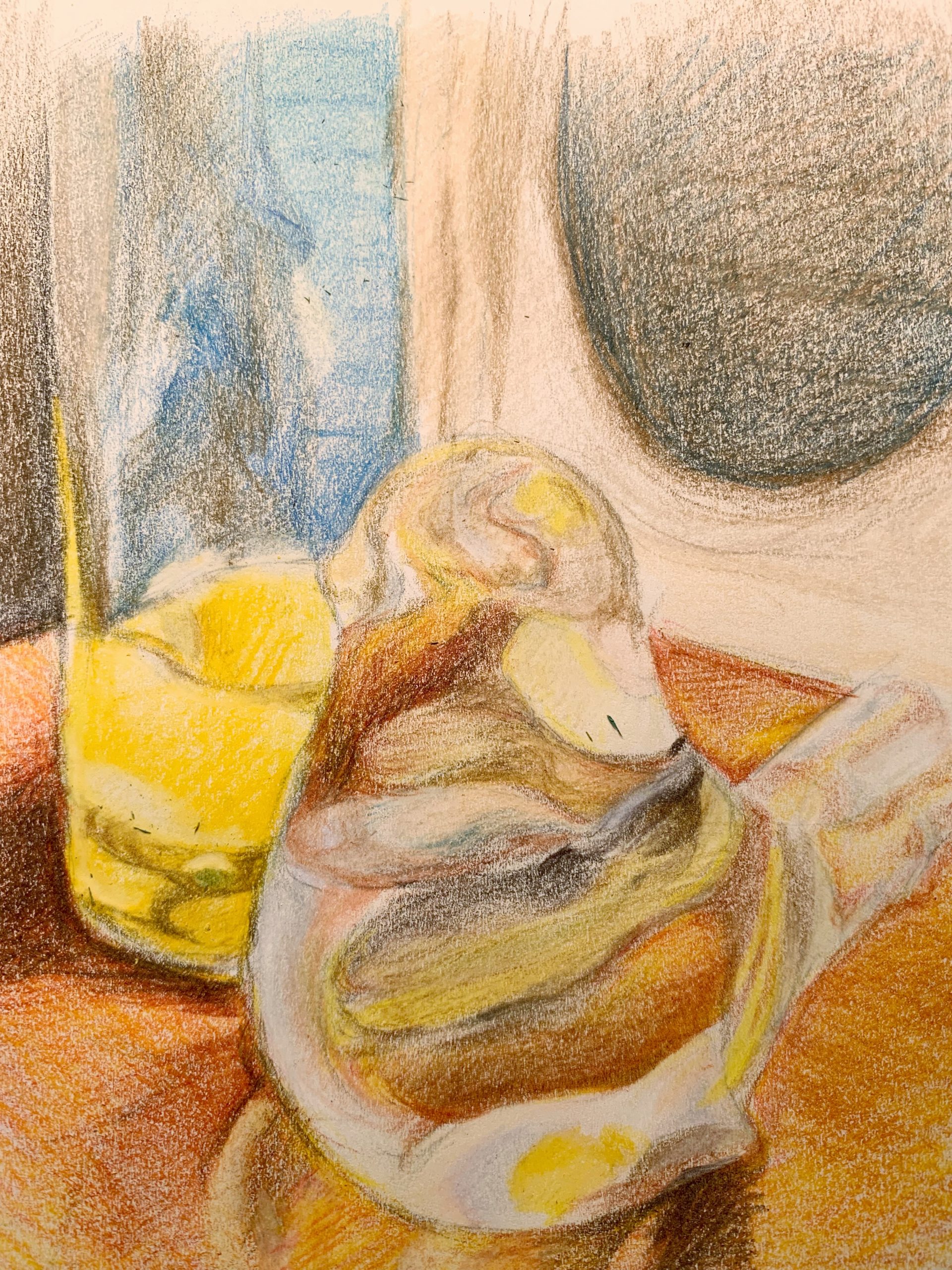
5 x 8 1/4, white sketch paper with colored pencils
X
Hi Julie,
This is a great drawing. I’m especially impressed with the way you drew the orange juice. The base of the glass looks convincingly solid, probably because of the saturation of the yellow juice and the dark reddish shadow you included on the left. The way you used white and dark colors to show the glass material is very strong!
I can’t see the image zoomed in, but I think the way you colored the table also enhances the drawing. Your pencil marks seem to flow in one direction, as if following the grain of the wood. Your shadows hatched on top stand out too.
I also like the way you handled the bird. The colors are compelling. I can’t quite understand what material the bird is made out of (while I could easily tell for the glass of orange juice), but the bird is a beautiful and interesting object nonetheless. Maybe you could include more hints as to how the bird’s head/body is turning in space? I understand that blending wasn’t working with the materials you were using, but I think you did an excellent job. I don’t have many suggestions as to how to improve this piece because it appears very successful to me.
-Claire
Julie,
This is a beautiful drawing. I love the soft color palette and sense of fluid light.
I find that working from glass is scary. There’s a lot of bending and reflection and refraction. That you have decided to work with it on a consistent basis says a lot about your patience and critical drawing skills. I admire your fearlessness.
For me the bird is the highlight. I like the way the colors seem to float around inside the body, mixing and swirling. What’s most impressive to me is that I can easily make out the shape of the bird in spite of the abstract light shapes. You do a good job of keeping the edges crisp and making clear the distinction between subject and setting.
I find that the glass could benefit from a similar level of crispness. Near the top of the glass, particularly on the right, I am less sure of where the edges begin and end. Tightening up here might bring it further into the picture.
I also think it might be worthwhile to draw all the way to the top of the page. With so much blended light in the composition, having a soft top of the page adds more visual uncertainty. I think defining the space completely would really help the drawing come to life.
For next week, I might consider including other objects in the frame that aren’t seen through glass. You’ve done that with the juice here, but it’s also in a glass. I think it would be especially cool if you had a non-glass object in plain view AND seen through glass. This might help provide context for the composition and also be an interesting juxtaposition.
Jack
Julie,
I would echo a lot of what Jack’s saying. I also think fully developing a rectangle of drawing would help. I think glass had a real crispness to it, which I think that you can drive home with some harder boundaries on things.
I only lead with those comments however, because this is an obviously beautiful drawing. Really incredible proportions and sense of perspective, beautiful distortions and subtly defined changes in volume via how the light is bent, and doing that all with color is adding an incredible amount of complexity.
I want to really celebrate the table which the objects are on- there’s a richness to the brown, and a subtle color variation which is gorgeous. The way the lines fill up the table emphasizes its wood-ness to me. Also, how the brown of the table launches into the darker browns of the shadows is really beautiful.
Some other things which might be considered:the tail of the bird ends up just dropping us into space, as there’s not really a defined end to the tail. I really want the beak on the bird to be a very crisp moment, to make it come forward from the glass. There’s something a little wonky about the oval made by the juice sitting in the glass.
You’re doing some really wonderful work with color, and color gradients, and building on top of an incredibly strong technical drawing base!