X
Jack’s comments on the one and below parallel my own and are very well expressed. Likewise Adam’s remarks. This is quite an extraordinary drawing, what I might call a “drawer’s drawing” (like when we speak about an “actor’s actor”). It’s so much about the inside game of drawing, about mark-making, and planes, and a meditation on seeing. And at the same time a very telling and convincing portrait of an individual. And so solid and self-assured.
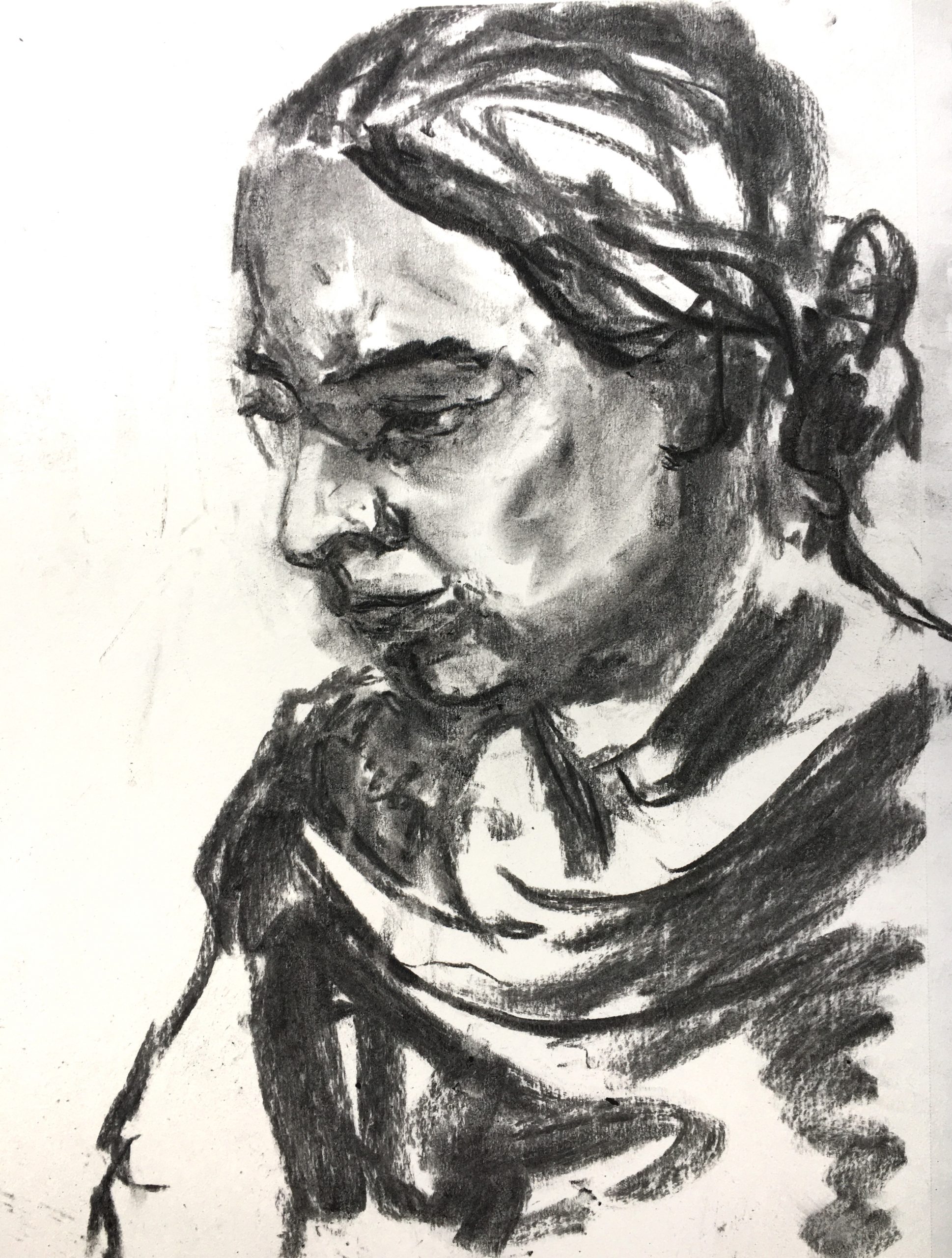
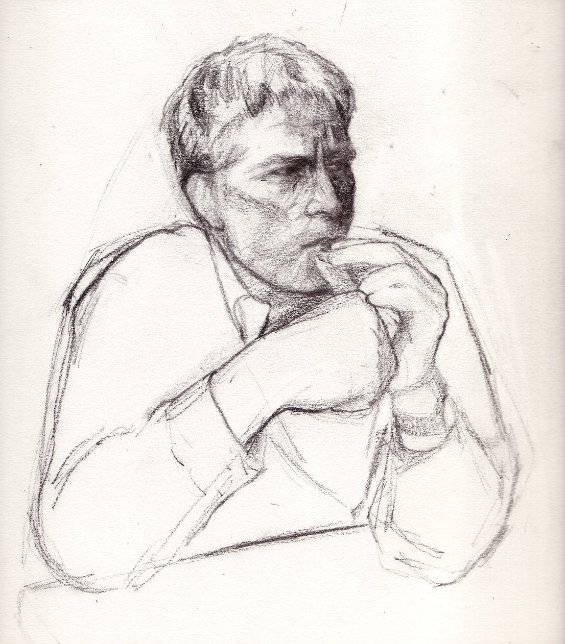
When I teach portrait drawing I make a big point about the importance of attire, and this is a textbook example. Love the way the sweep of that scarf (?) frames the portrait. Then something about that far arm being just an outline.
X
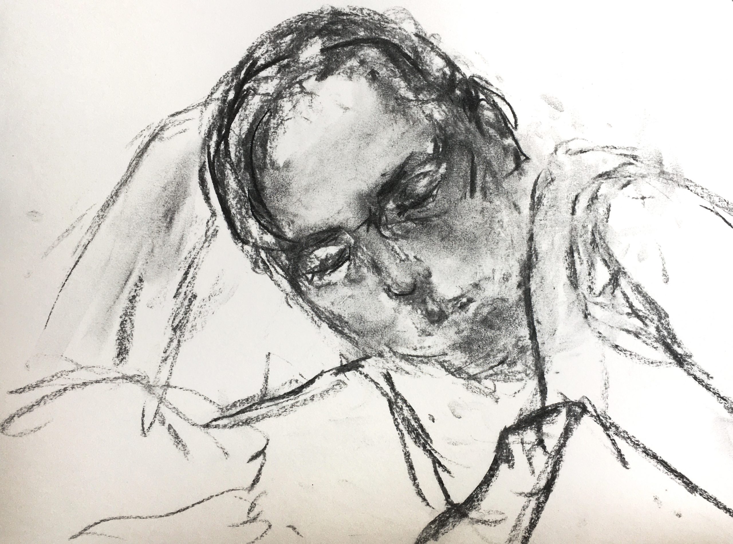
As enthusiastic as I am about the one above it (and by the way, not so terribly much about the 2 first ones), this one is next level. I don’t take it to be unfinished at all. Jack says it best: “It’s almost like you can see the model thinking and feeling in real time, not yet having reached any conclusions. This visual uncertainty seems like a fitting parallel to the uncertainty of covid times.”
It reminds me of an artist that I think you would like, R.B Kitaj.
Find out more about him—
And take very good care of these last two drawings of yours. There’s something very special at work in them.
I tried to focus more on cropping this week. This involved taking photos of people in the house and cropping the images on preview to see how they would look. I didn’t draw all of them, but it’s useful to have those images on my computer now.
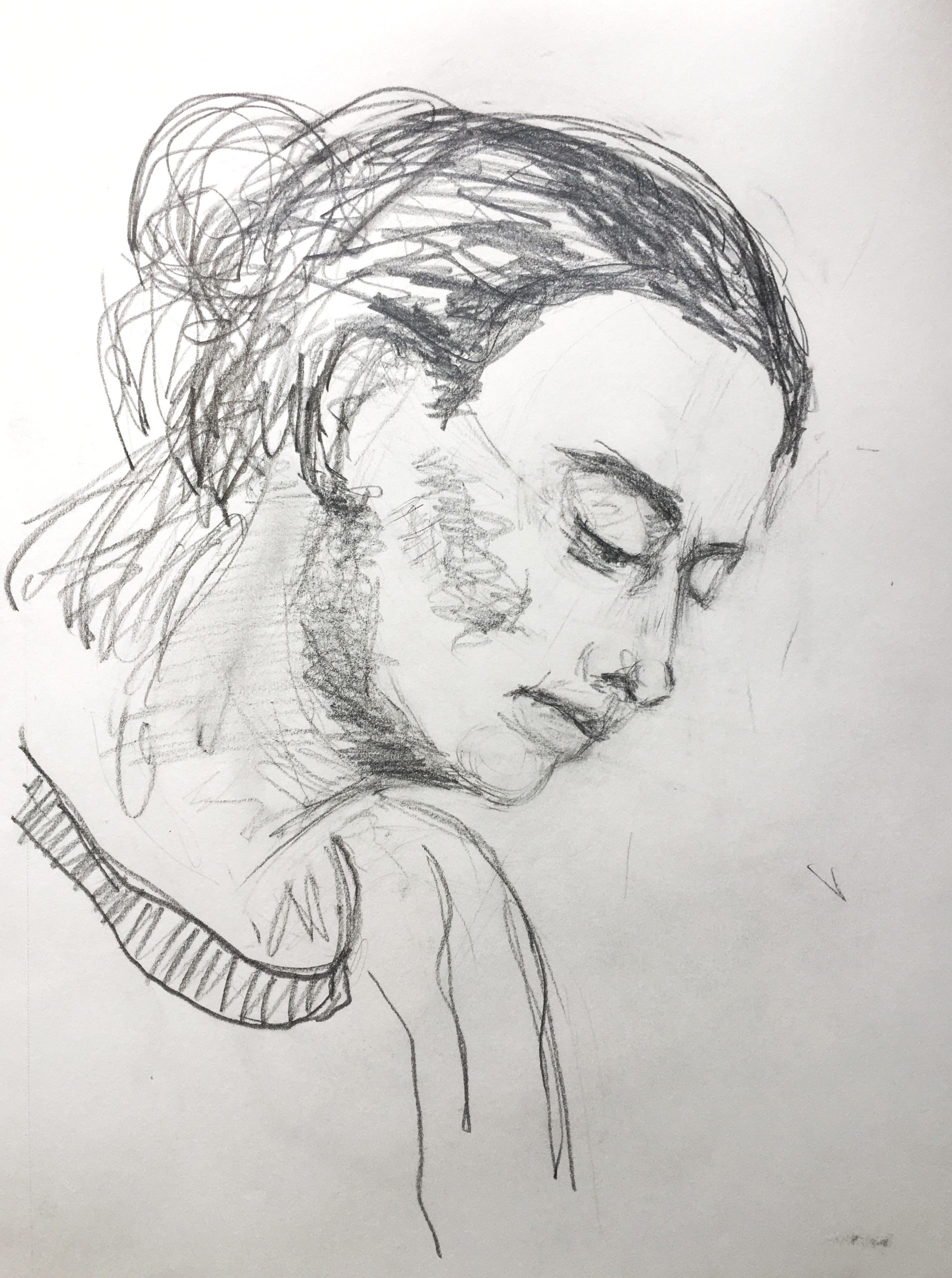
I find myself gravitating to faces. I drew the 3rd and 4th portrait (sister and mom) from life. The 2nd pencil drawing is from a photo. The last one is unfinished and I generally feel like all my portraits make the person look very different (or sader, or older) than they actually are. I want to work on likeness, especially when drawing family. I think I need to decide soon about whether I just want to focus on portraits, or use these as studies for larger figure drawings with surroundings.
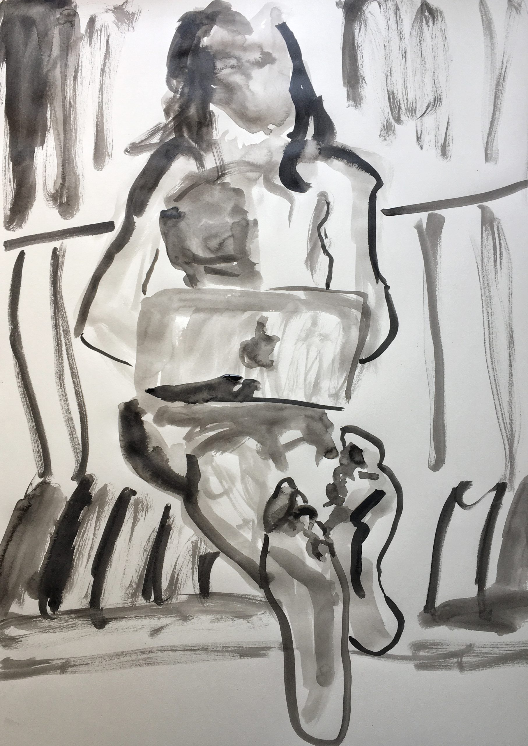
I also tried ink again. I liked working on a bigger sheet of paper, but finding a good set up in my house is a challenge. I had to work from a photo for that reason, even though I think ink drawings really benefit from live models. One thing I liked about using the ink was how it captures place in an interesting way. I wish I was bolder in keeping this ink drawing simple because many parts look overworked. I think the feet in the photo I was referencing were great forms to draw, and I want to attempt them and the figure again with bolder and more selective brushstrokes.
Lots to work on! I want to make drawing a priority this next week so that I can really dial in on a subject and medium. My goal is to start working on my larger sheets of paper next week.
Claire,
The first thing I need to say is that I love your portraits. I would love to see more.
As someone who hasn’t seen your family (except for a brief sister cameo on zoom), I have no idea whether these portraits look right or wrong. Unlike you, I’m a blank slate, so I focus more on your markings on the page, the expression on their face, and the feeling of the drawing instead of the likeness you capture.
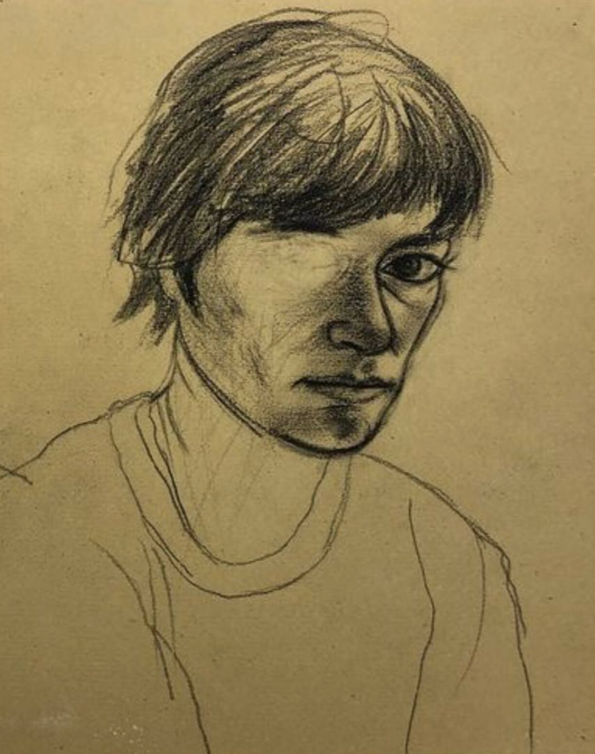
I really like the contrast between your looser general marks and your tighter, detail-oriented marks. I think this is most evident in the third drawing. First of all, beautiful. What a somber moment of intimacy. Second, I would love to see you develop this style further. You have done a great job making different and dynamic marks, using the materials to your advantage. I say keep it up.
I also really like your last drawing. I like that there’s a loose framework for the drawing, kind of like a scaffolding or blueprint, and a more focused moment in the face. What’s interesting here, though, is that the face is also loose but in a different way. It’s almost like you can see the model thinking and feeling in real time, not yet having reached any conclusions. This visual uncertainty seems like a fitting parallel to the uncertainty of covid times.
Moving forward, my personal vote is portraits. Do what you want, but this series has me craving more.
I really admire your commitment to using one kind of tool and pushing it in different ways.
The drawing which leaps out at me is your first- which you say features a tomato, but I would argue features an eggplant. In my mind, this does seem more like a page in a sketchbook with 3 different drawings, though perhaps that’s how they were approached. If that’s not what you were going for, I think establishing a unifying tone to unite the objects, or a table edge, or composing them on the table to be more in conversation with one another would all help. The tomato really is beautifully drawn, composed of different sections, and two overlapping shadows, but to me there’s a heaviness to the lines cleaving the sections which drives it a bit into garlic territory. The eggplant I think is incredible- the shadows are very simple (ie not gradient) and which serves to flatten it a bit, but the cross-contours, and patch of highlight, and areas of real shadow all help me believe in this eggplanty-ness. The secondary highlight does a lot for me too.
The second drawing feels a bit too in-between contour and value for me.
I very much admire the third, my only critical comment might be making more use of line weight to emphasize nearness. I bet it’s hard with a micron, so I have no idea about how to actually do that.
The fourth seems like it demonstrates what you detailed as a weakness of the micron- that it doesn’t do turning, nuanced lines well.
I think the eggplant suggests where you might take this project- turning everyday objects into architectural structures. This kind of drawing seems to be where the micron works best for you, as it details not the organic nature of a relatively complex structure, but rather translating it into the language of more technical design drawing. (seems also like a good way to fuse exercise 3 with veggies as well)
Damn how did I leave Jack’s comment on your post…. My bad
I really admire your commitment to using one kind of tool and pushing it in different ways.
The drawing which leaps out at me is your first- which you say features a tomato, but I would argue features an eggplant. In my mind, this does seem more like a page in a sketchbook with 3 different drawings, though perhaps that’s how they were approached. If that’s not what you were going for, I think establishing a unifying tone to unite the objects, or a table edge, or composing them on the table to be more in conversation with one another would all help. The tomato really is beautifully drawn, composed of different sections, and two overlapping shadows, but to me there’s a heaviness to the lines cleaving the sections which drives it a bit into garlic territory. The eggplant I think is incredible- the shadows are very simple (ie not gradient) and which serves to flatten it a bit, but the cross-contours, and patch of highlight, and areas of real shadow all help me believe in this eggplanty-ness. The secondary highlight does a lot for me too.
The second drawing feels a bit too in-between contour and value for me.
I very much admire the third, my only critical comment might be making more use of line weight to emphasize nearness. I bet it’s hard with a micron, so I have no idea about how to actually do that.
The fourth seems like it demonstrates what you detailed as a weakness of the micron- that it doesn’t do turning, nuanced lines well.
I think the eggplant suggests where you might take this project- turning everyday objects into architectural structures. This kind of drawing seems to be where the micron works best for you, as it details not the organic nature of a relatively complex structure, but rather translating it into the language of more technical design drawing. (seems also like a good way to fuse exercise 3 with veggies as well)
Lmao I think this website has been linking Jack’s page here
Yes–I haven’t been able to figure out how to get to my post, either. Comments here work fine.
Claire,
I think you’re really on the verge of something this week. There’s this thing that I think you’re coming at from two sides of.
You’re making some really great marks qua marks- see image 1, feet (especially toes on left-side foot, shadow on left-side foot, black squiggle on right-side foot, curtain M shape mark to the right of that). Also see image 2, collar lines.
Yet, you’re also finding and pushing those modeled planes in space, which requires (at least when I try to do it) a technical scaffold to launch from, and a different kind of attention. I’m especially talking about image 3- that path from cheek to cheekbone to eye socket to eye to side of nose is really stunning. There’s a great range of tonality, as well as a feeling of trueness to the representation.
I definitely think your cropping is going somewhere really good as well, I say to just keep experimenting with it.
To me, image 3 is really the standout in this suite. I think using your eraser near the mouth on the face to save the contour would help, and to reserve those darker darks like on the top of the lip and the hair framing the face for when you really need it spatially. That tiny dark mark under the eye does this kind of job beautifully, as I would argue the note under the chin.
To that end, I would also lighten up on some the markmaking around the face, to let it hold its own a bit more. (Love the scribble in the bottom middle though).
This is really headed somewhere great, and I’m stoked to see what you make next week!
Lmao I agree with Adam. This websites sometimes does weird things…
Hi Claire! I enjoyed seeing your drawings with a variety of media and technique in here. You are really dedicated in your work this week. When I rolled down all of your works, I found myself particularly drawn towards the first drawing and the last drawing. The feet that you drew in the first picture is very vivid–the shape of of the feet is very curvy, and you have portrayed the changing planes of the feet well with your slightly lightened paint stroke. However, the person in the drawing looks as if she is floating on the sofa. For this drawing, I would suggest using less brushstrokes for the background, and use your wash to paint a ‘plane’ where the person is sitting.
The cropping of the 3rd and 4th image are pretty well. I can see that the portrait was your primary focus on the two drawings. The 4th/last image beautifully combines the shaded face, hair, with the contour body. The shading around the eyes area clearly conveys the depth of the eyes in comparison to the other parts of the face.
You mentioned that your drawings made your sister and mom look ‘sadder’. I noticed that they indeed look stern. This might be due to your use of shading (the faces don’t look smooth; you used a lot of shading to portray the bulging cheekbone), and the enlarged nose and lips on the two people. In the third picture, the lips look a little flat as well. You might make more modifications for next week.
Good luck!
Jack—
I’m also having trouble getting to your comment page, so I will leave my thoughts here!
These drawings are so interesting to look at! I like the dark value of the pen and hatching lines. I can see a clear connection between the work you created last week that emphasized lines and this week’s use of line to show form. I think you did a nice job keeping your lines informative, energetic, and observational. For example, the spiral forms of the onion in your second piece don’t flatten. On your first sheet, every form feels very real, like you could pick up the object and feel its curves and textures. Well done!
Your sketch of roommates has great energy too. From afar, some of the forms are a bit to light to see, but when you zoom in, the line quality and the specific details you choose to include are appealing. I wonder if some of the darkness was lost in photo editing? The figure sitting with her hands in her lap is incredibly strong, especially in the face and hands. It seems like you have figured out what lines are essential to communicating a person’s stature and character.
Exciting work!
OMG this is weird lmao. I am leaving my comment for Jack here as well.
Hello Jack!
Your work this week looks very cool. The fruit drawings resemble the printed scientific illustrations in the old textbooks. It has both a sketch-work and ink-work quality. The hatching lines on the bottom of the fruits look like volumetric lines that indicates the volume and change of planes on the fruits. They are not so crowded together, but they also look very good as shadings. Some of the fruits and vegetables were a little out of shape (for instance, the pepper). I suggest that you draw a slight geometric shape of the vegetable before you use your microns.
By the way, I agree that you could develop your fruits into a project that explores the architectural structures of daily objects. If you enlarge your fruits, you can portray the details more precisely.
Your last drawing of the scene where you use micron pens to draw non-continuous lines look very interesting and aesthetic. Wonder how you did that.