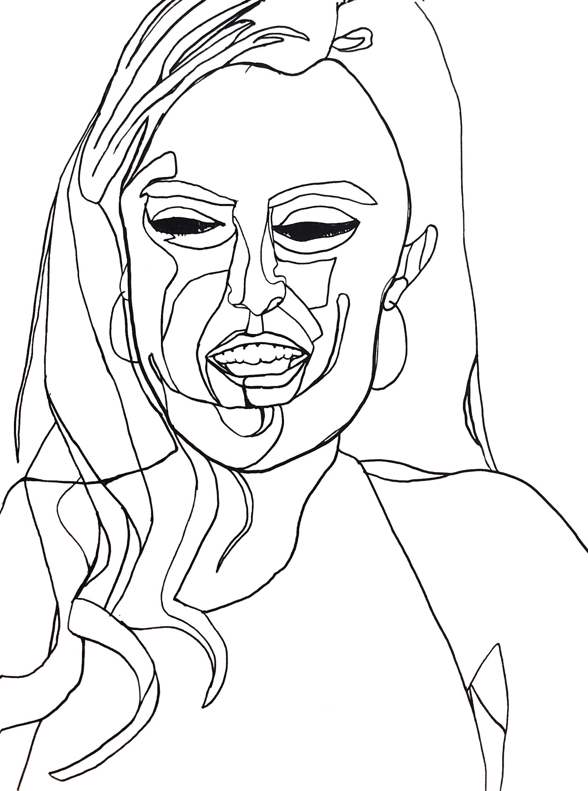
Acrylic Paint Marker on Paper, 24 x 18 inches
X
X
These are great. Love the color and the color background. The only thing I don’t understand is your interpretation of the planes described by the U-shaped line A-B, which cuts through and disrupts some major plane changes.
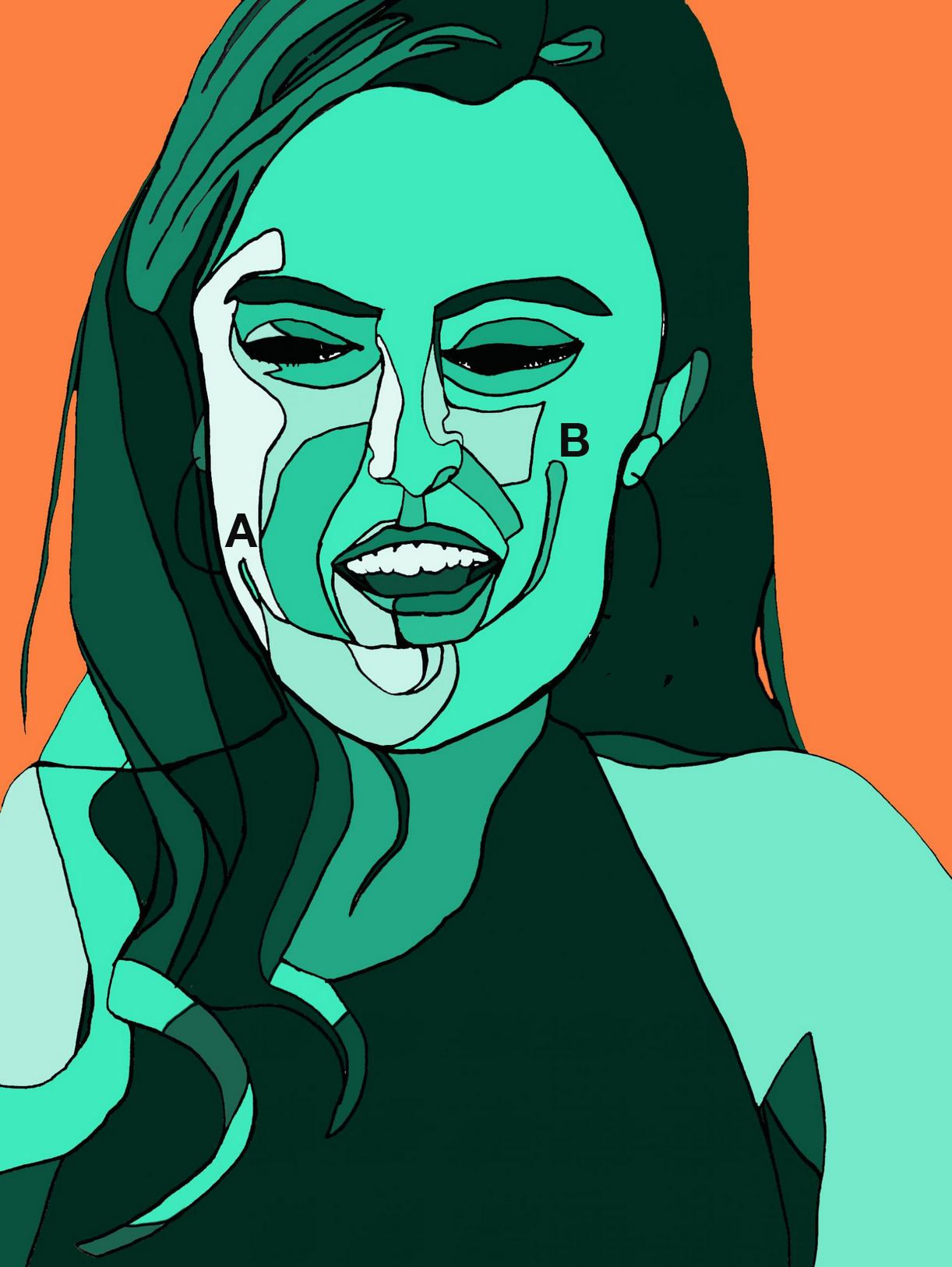
The area below the mouth seems unduly complicated. Be careful to maintain the same degree of abstraction throughout–it feels like you got caught up trying to show us nuances when this isn’t about that (or at least that’s the way the majority of the piece, as well as your previous work seems to be pointing). This needs greater simplification–here’s my suggestion, based on the degree of simplification everywhere else in the image:
I made these changes in Photoshop. Now that you’re coloring there you could also revise the drawing there if you like–or start with a pencil drawing before you ink to get the best possible breakdown. The Cut-out filter in PS could also be a helpful ally.
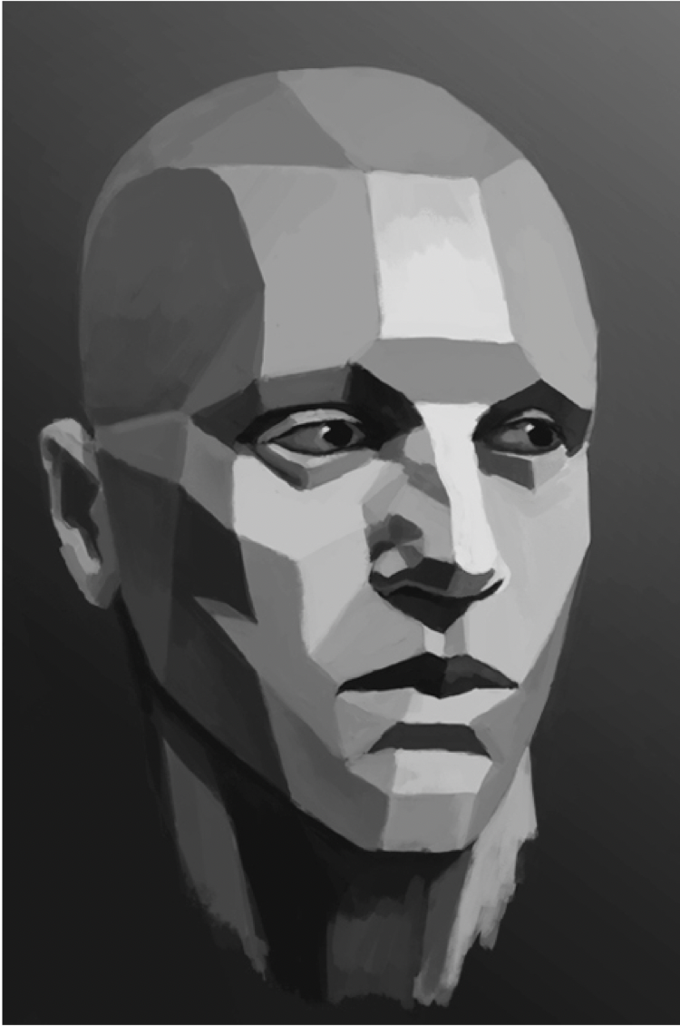
You might benefit from studying renderings like these of the planes of the face (this were in the Powerpoint I sent, with some others, including my drawing of Patrick Steward in planes):
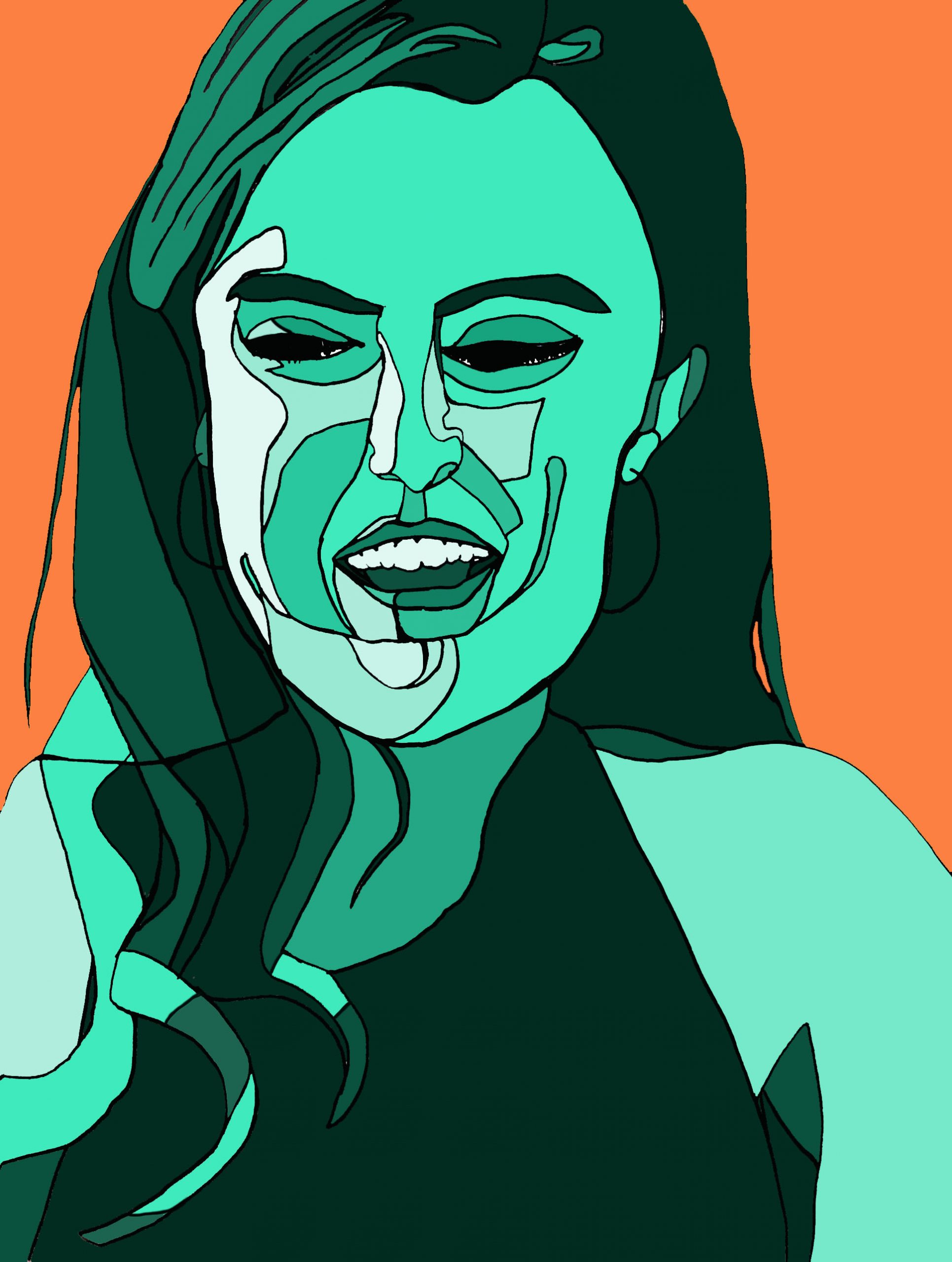
Acrylic Paint Marker on Paper with Photoshop Editing, 24 x 18 inches
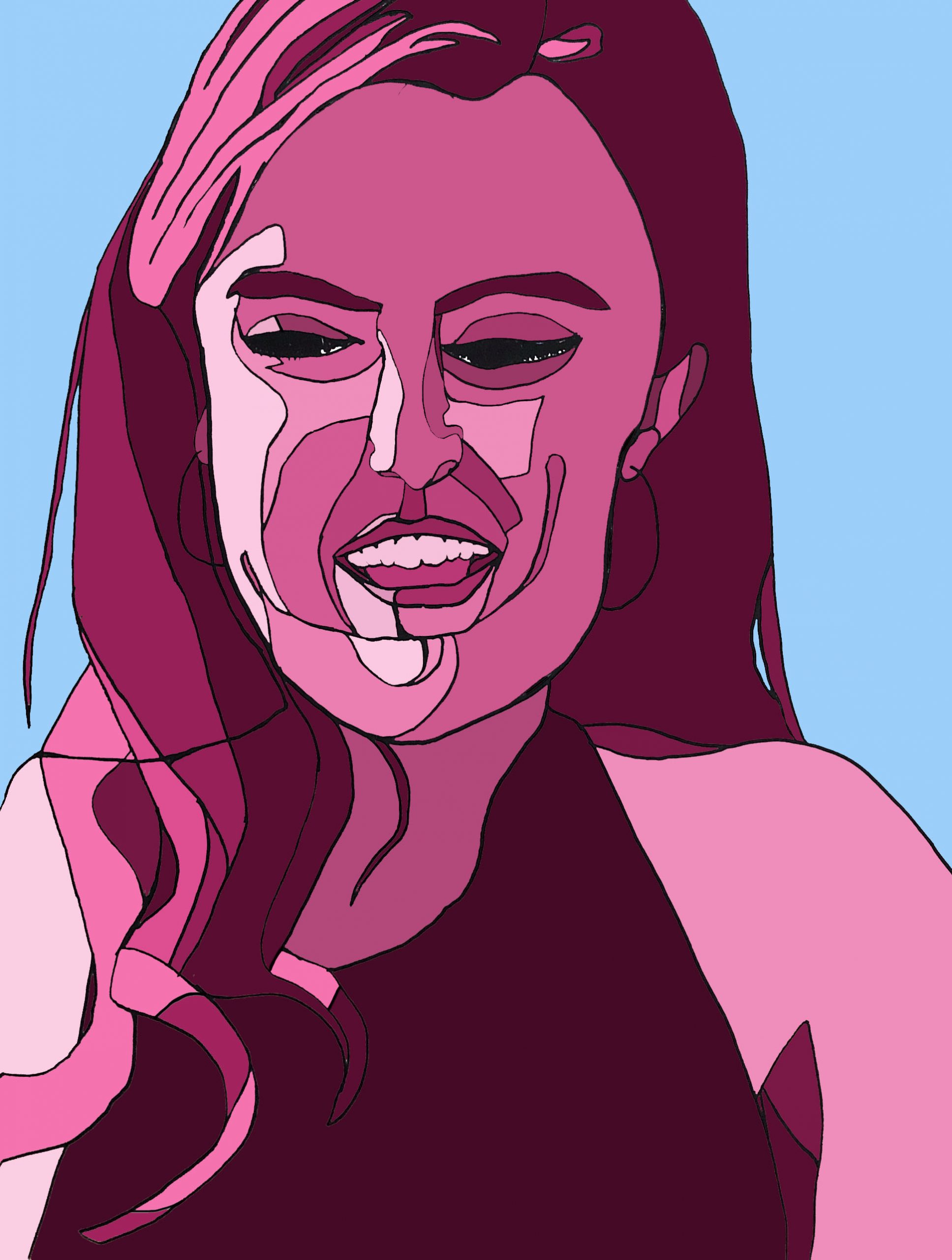
Acrylic Paint Marker on Paper with Photoshop Editing, 24 x 18 inches
X
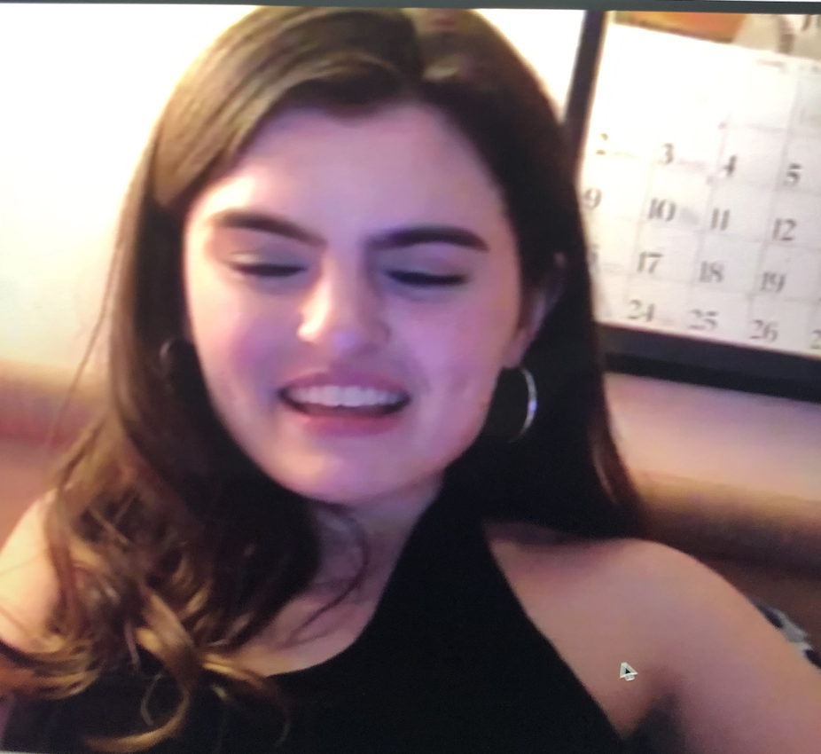
Reference Photo
This week I utilized the suggestions of my peers and Professor Wethli to develop my project more. Jack and Perrin have given me great advice the past two weeks – both suggesting using darker and lighter colors to represent value. I really liked Jack’s suggestion to try a monochrome color scheme, where I stick to variations of one color within the portrait. Additionally, I agreed with Jack’s suggestion to add a background – this week I kept it simple and only used one shade of color in the background. Something I might want to try next week is adding some sorts of colored shapes behind the portrait, maybe abstract or realistic? I just don’t want the drawings to have too complex a composition. Please let me know if you think it is something I should pursue or how you think it could work! My process this week was very different because I used Photoshop to add the color to the drawing, as Professor Wethli recommended. I first created the contour drawing with a black acrylic paint marker on heavier Strathmore drawing paper. I then put the drawing into Photoshop and picked a color to create variations of within the portrait. The portrait drawing was not really a continuous contour line drawing – I edited the lines slightly before I put it into Photoshop and then added a few lines within Photoshop. It still stays very true to my drawing and I’m happy with the way each version came out. All feedback appreciated!
Love these, the photoshop worked so well!
These are so cool!
I think the smooth patches of color you’re getting with Photoshop really help to let the lines say their piece, nice use of your tools!
I like the red and blue scheme especially.
Hello Olivia!
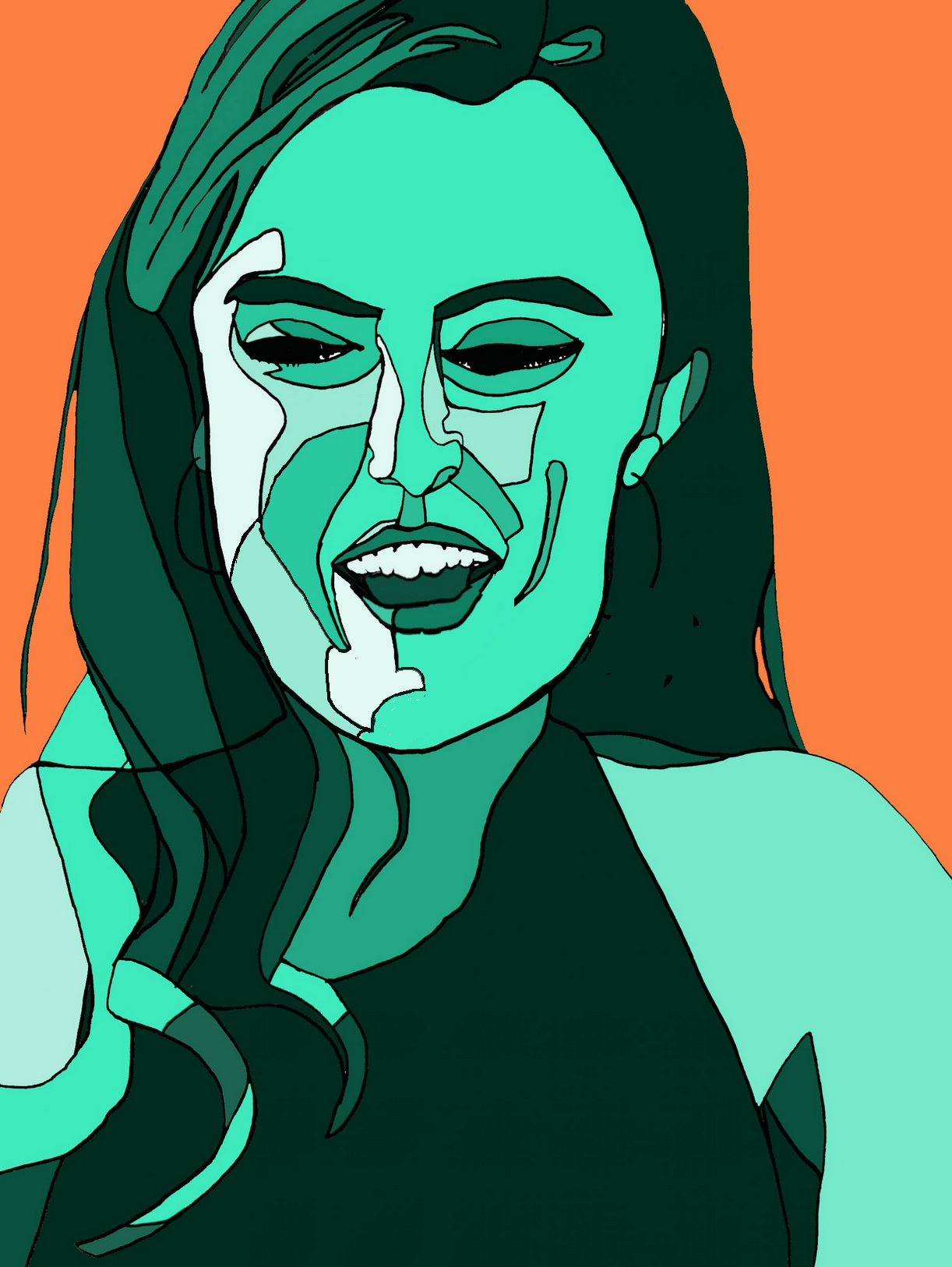
These drawings look fantastic! I specially love how the orange background highlights the different tonalities of green, and how you left the side where the light is coming in a whitish shade. Great work!
Olivia, the direction you’ve taken your work this week attests to the value of feedback from your peers and Mark — and of applying it with your own creativity. It was interesting to me to look at your reference photo, then your contour drawing breaking the model’s face into planes, and then the reconstructions using color. Like Adam, I like the red and blue scheme best. Or maybe it’s that the two colored versions, despite identical lines, convey different emotions (the orange and green creating more tension?). In these drawings, where there’s so much going on in the face and hair, I actually appreciate having a simple background. On the other hand, I could imagine something simple and symbolic in the background (a calendar with crossed off quarantine days?). Nice work!
These works are impressive! Good color choices (interesting contrast of color that also look aesthetically comfortable). I especially love the third one, where you have a pink version of your photo and a blue background. Overall, the color blocks conveying light and shade are done correctly (with the left side lighter and the right side darker). The color blocks (of different shades of pink) you have on your hair make the hair very three-dimensional looking.
As an extension, I suggest you make versions of the picture without the contour lines (only the color blocks). You can make your photo in photoshop into black and white. Then, you can create color blocks on the greyscale, and color them pink (or whatever color) later!