
 Charcoal and Vine 18×24
X (but the desaturated version)
Small matter, but look how much better this looks with the (incidental) color removed. You can do this by moving the Saturation slider in Snapseed all the way to the left.
Terrific drawing, and what feels like a very individualized portrait of your friend. Great expression in that foreground paw as well, and how it goes from fairly high def to a brief flourish of schematic lines in just a heartbeat.
Something you wrote to me about in an email is also in full evidence here–great disegno–the dog is a creature of the couch and of the rectangle at the same time. That dark emphasis on the tail is also doing major work supporting the whole design.

Having some technical difficulties this week–for some reason all my image captions are showing up as links in my post:
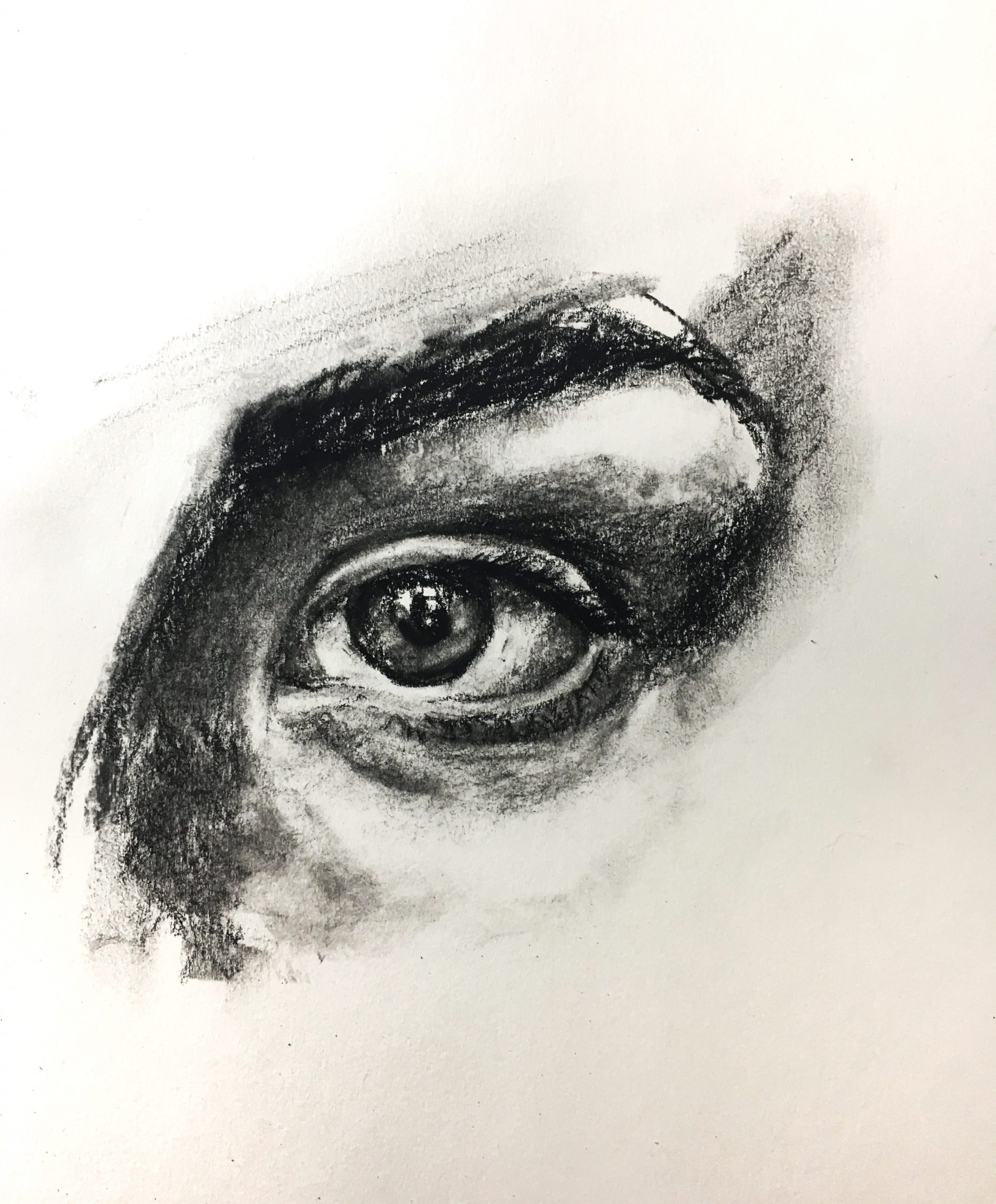
1) practice drawing eye
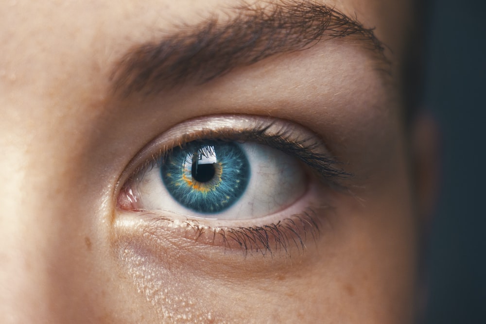
2) random image from internet of the eye I drew
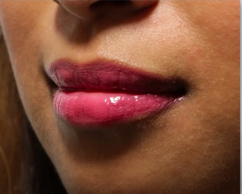
3) Proko’s image of lips
4) my attempt at lips (hard, looking forward to working on this more!)
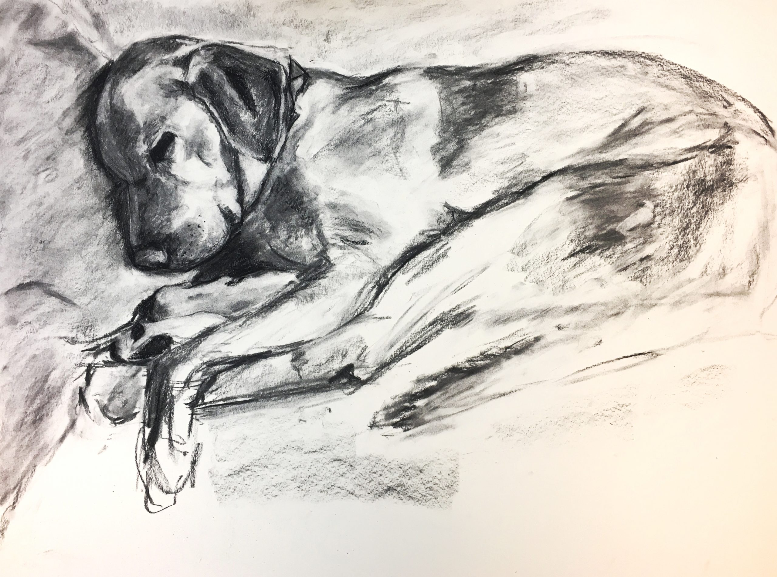
5) second addition to snuggle series
This week I created another drawing (my dog) that I think I will include in my final “snuggle” series. I have good feedback about how I can use more charcoal and make some tweaks to the forms. More suggestions are welcome. I’m debating going back and working more on the right side of the piece- What do you think of the tail and legs?
I spent the rest of the week watching videos and practicing facial features. Super helpful. Moving forward, I am going to keep practicing with charcoal. I want to apply more of the “value” mentality in practicing specific features because this is how I have enjoyed approaching my bigger charcoal pieces.
Any feedback and technical suggestions are welcome!
Claire
First let me say this: happy quad day.
Also wanted to express thanks for your comments on my recent set. Appreciate your thoughts and insight. I hadn’t really thought about using blank + negative space to contrast with the hatched subjects of the drawing. Your comments are helping me reconsider my approach to drafting compositions.
Regarding a revisit to the tail and legs, I think it could be a cool experiment. Just went and rechecked your first Snuggle piece and the rest of your drawings.
Overall, I feel your drawings have varied in graphic completion throughout your project. Some are filled completely with value and charcoal marks, others have moments of specificity while the rest you omit. It’s been fun watching you play around.
What I first noticed about the Snuggles is that they’re pretty similar. And lemme be clear, I like them both a lot. But I do wonder if you might gain some insight by really throwing down with the charcoal on one of them. Could be cool to see if that takes you in an exciting direction, perhaps more akin to the portrait you did of the scarfed person looking down (which is still baller).
I also wonder how Snuggle 2 might look with a fully fleshed out environment, similar to your drawing of the seated piano(?) player. Like, where is this dog? On a couch? On the floor w/ its head resting on a dogbed? Could be something worth thinking about, not sure tho. Ultimately up to you. But look at it this way. If you decide to radically alter one of them and it turns out to be whack or trash, you’ve still got one that’s already in the bag.
Also really liking your facial features. Both the eye and lips combo are rich in detail and have an acute awareness of subtle value changes. It’s cool and useful to see them beside their source as well. I mean it when I say that looking at your drawings and their reference photos are helping me better understand value. Huge help.
If you wanted to keep pushing facial features, one quick touch that I imagine would be useful to your study of them would be to loosely sketch a face or some facial context around your the features of focus. You’d run a potential “risk” of making the study sheet less attractive (but also it could turn out better looking), but it could be helpful to start thinking about these features IN a face, or “facial atmosphere” if u will (lol)
From the backyard,
Jack
Hi Claire,
These are great studies and awesome depiction of your dog. I think you did quite a good job depicting how light cast on to the facial structures. They quite accurately represent what the pictures show. However, I do agree with Jack, that perhaps incorporating a study of the entire face can help you learn not only how to draw eyes our mouths as single components, but instead how they situate on the face. I would also like to suggest, that if you wish to learn how to draw facial features, any live sources (this could be yourself in front of a mirror or a family member) could potentially bring much more details and liveliness to your study compare to online image sources.
The drawing of your dog does a great job of capturing how beautifully it settles in lights. Your mark-making from both the charcoal as well as erasing leaves intriguing texture of the skin and fur, especially around the region on the head and the front leg. I also enjoy looking at some of the suggestive lines you use to describe the paw. Regarding the composition, I almost wish to see something solid on the bottom half of the page, so that your dog could sit more firmly into the environment.
When I first opened your page last week I was disappointed there wasn’t at least one more. These are all terrific but the count feels light. Not saying this in terms of academic requirements but simply momentum and striking while the iron is hot.
Here’s a bit of advice to everybody–you can only make your 22-year-old drawings when you’re 22. In other words there are moments, above and beyond your native talent, that only come around once. They’re the product of your recent work, what art you’ve been looking at, the world you live in now, and an intangible sense of zeitgeist (the spirit of the age; trust the Germans to have a unique word for it).
You have great comments from Jack and Harry. Love Harry’s note about erasure–great point and one to keep exploring.
I disagree with both of them about contextualizing your studies of the features. They’re simply a specific genre. Studies in context are called…portraits. But I do like the sense that we can’t really tease these things apart. Where does one end and the other leave off? Still, there’s value in zooming in and focusing on them one at a time.
And these look great.
And the dog is strong enough to carry the week. See my notes about that drawing above.