X
Suggested cropping and presentation:
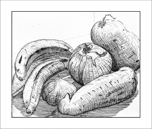
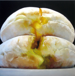
The pleasure in these isn’t the still life or the space its in, its the texture and inventiveness of your hatching. I suggest cropping these so as to zoom in and indulge what they’re best at. A painter who comes to mind this way is Emily Eveleth, who’s famous for her close ups of donuts:
X
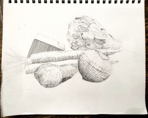
Micron on paper, 9 x 12
——————————————–
Hi folks,
Not quite done, but getting there. I plan to finish the third tomorrow or Wed.
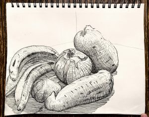
Claire’s comments regarding prioritizing the food in the composition helped me move past my inertia. I was reminded of my second-week work, when I grew tired of thinking and just drew and eggplant. Here, I set up my food front + center and got to work.
The first one I’m very pleased with. I think there’s a good balance of value and texture. It has a good mix of looser hatching and tighter f0rm-hugging marks. I also think I did a nice job capturing the essence of those ripe bananas.
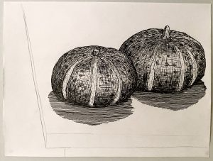
For the second, it has good and bad moments. I like the sheen, spots, the stem on the right squash. The problem is I got a little carried away with the shadows. Main problem is that they’re situated oddly, extending toward the primary light source, and that they are very dark. Not that I made up these shadow ups–they were there and I’ve got a pic to prove it–but the *main* shadows extend behind the squashes. I haven’t added them in yet. The darkness of these squash shadows has me worried. I’m not sure how to remedy the situation. I might have to bite the bullet and do long lines of value for the WHOLE thing in order to offset the those thick dense marks 🙁 if you have any ideas on how to hack this, please pass them along.
Last one is coming along. Excited about the artichoke, even though drawing it makes me feel like I’m back in Drawing I.
I’d love suggestions on how to situate these foods. Right now it’s pretty bare bones. I don’t think that’s a problem with the first, but I do think that the squashes need some tinkering. I’m drawing the third on a chair. Worth including? Or just a plane/table to provide a contextual surface?
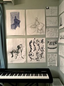
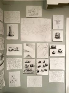
P.S. – Since this is the “final,” I figured I share the walls in my house where I’ve been posting all my drawings. Thankfully I’ve got some artsy roommates (one of whom has a painting wall of her own) who don’t mind me doing so. It’s been fun watching the walls grow, curating them “live” as I produced more things. Lots of fun. If you’ve got space for it, I recommend making your own little exhibition at home.
Jack