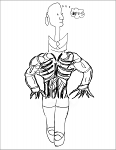
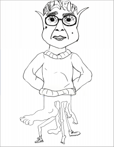
For this project, invented by Andre Breton and the Surrealists about a hundred years ago, the class–augmented by Mark and Cassie to make an even 12–was randomly ordered using an online random generator to ensure the aleatory aspect of the exercise. This list was divided into four groups of three, in the same order as the generator. To simulate the real life practice of drawing in a round robin, the order of the three players (head-torso-legs) was also based on the generator.
A few drawings, which did not line up with the transitions (hash marks) between one section and the next, were modified very slightly to enable these transitions to work. Because even the sleep-deprived, absynthe-drinking, rule-breaking, libertine, convention-defying Surrealists stuck to the hash marks in order to make this work.
Team 1 / Claire, Mark, & Nat
Something that’s often noted about Exquisite Corpse drawings is how, despite coming together by chance, they often make some kind of sense, either formally or thematically. I was struck, in the one above, that all three artists chose to use the entire width of the space.
George and an eagle (?) with upraised wings. Two familiar American symbols that somehow found one another. And is that him crossing the Delaware on foot?
I was struck here with how well the gesture of her arms and the gesture of her legs are in sync, and how the dots on her dress carry from one drawing to the next. Also, do those fingers look vaguely like webbed duck’s feet?
Team 2 / Ali, Perrin, Olivia
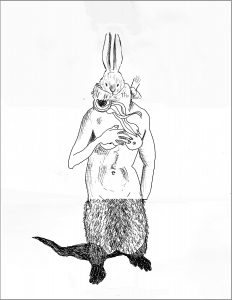
Love how the gesture of the torso and the lower body work together–a great foil and set up for the incongruous storybook rabbit head.
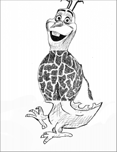
The stride of the dragon is nicely wed to Olaf’s goofy expression. He looks like he’s strutting even before you see the feet.
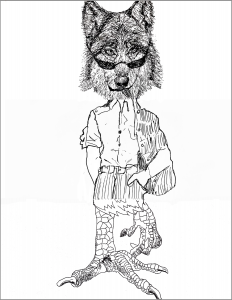
Great how the louche pose goes with the “S-up?” expression (and shades) on the wolf.
Team 3 / Cassie, Megan, Jack
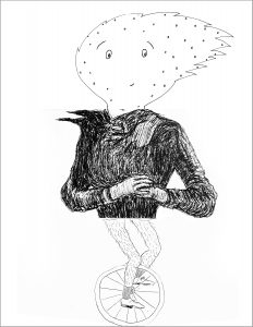
I like the way the head and lower body are in a similar style (and how the head echoes the circle of the wheel), giving the impression that if the jacket came off the torso would be in the same style. Also the right facing / left facing / right facing twist that you’d expect to see on a unicycle.
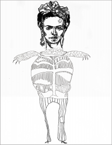
The graphic language of the torso and lower body are in remarkable agreement, which makes the juxtaposition of Frida’s head even more striking.
Like the first one, a happy marriage of the top and bottom sections going full width, but then a formal similarity in the multiple arms and legs.
Team 4 / Julie, Adam, Harry
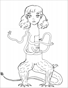
Wonderful how this character is built on a unified column or stack of cylinders that’s all Adam’s but which all three drawings fell in line with.
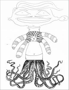
Just something about the mincing step of the feet and the slightly taken aback look on the face, with a body building monster in between. Lots of gender bending in this one.
The oddest thing about this one is how the graphic styles and types of imagination at work are so unified–like it could have been drawn by one artist playing this game alone.
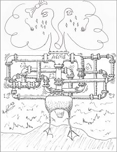
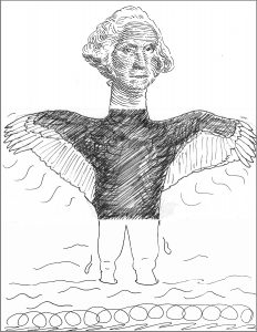

 Julie, Adam, Harry