X
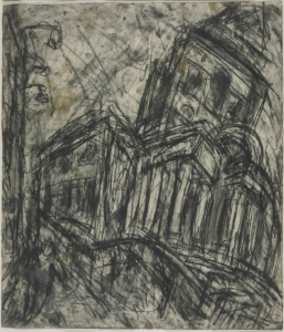
See my remarks about this Leon Kossoff drawing in my comment.
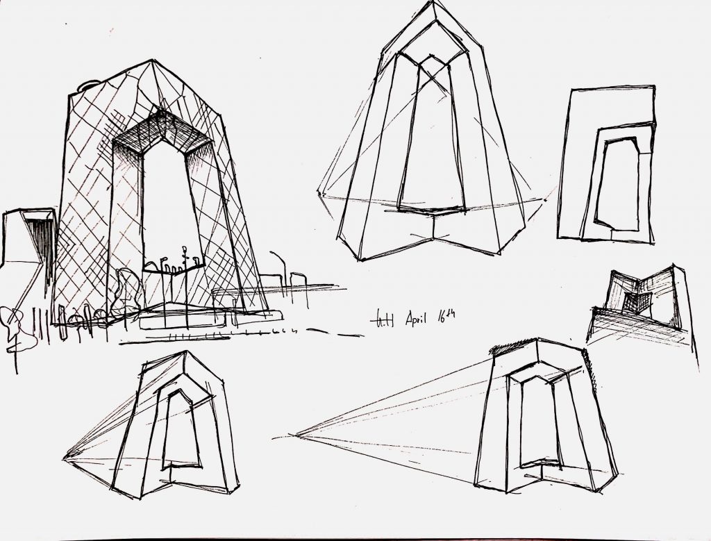
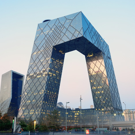
This week I decided to tackle the structure of a building. I switched back to micron to gain finer and smoother control. This comes with the opportunity for me to first make more gentle and suggestive marks at first, to indicate structurally outline, then move in with the bolder and affirmative lines for details and correction. I also included a few prospective studies to help me understand the irregularity of the building’s form. The CCTV tower turns out to be slanted, even before perspective skews it. The vertices had an inclination rather than being perfectly normal to the ground. It turns out even if I used to see it every day back when I lived in Beijing, I have no idea of its exact form unless I make a visual study of it.
I enjoyed this kind of drawing a lot more than I thought I would’ve. The switch of the medium was uplifting since I no longer have to worry about control over ink volume. However, the switch does come with a drawback of less vibrant lines as well as reduced confidence both in line-quality as well as my decision making, inherent to the fast-paced nature of micron.
References:
Hi Harry,
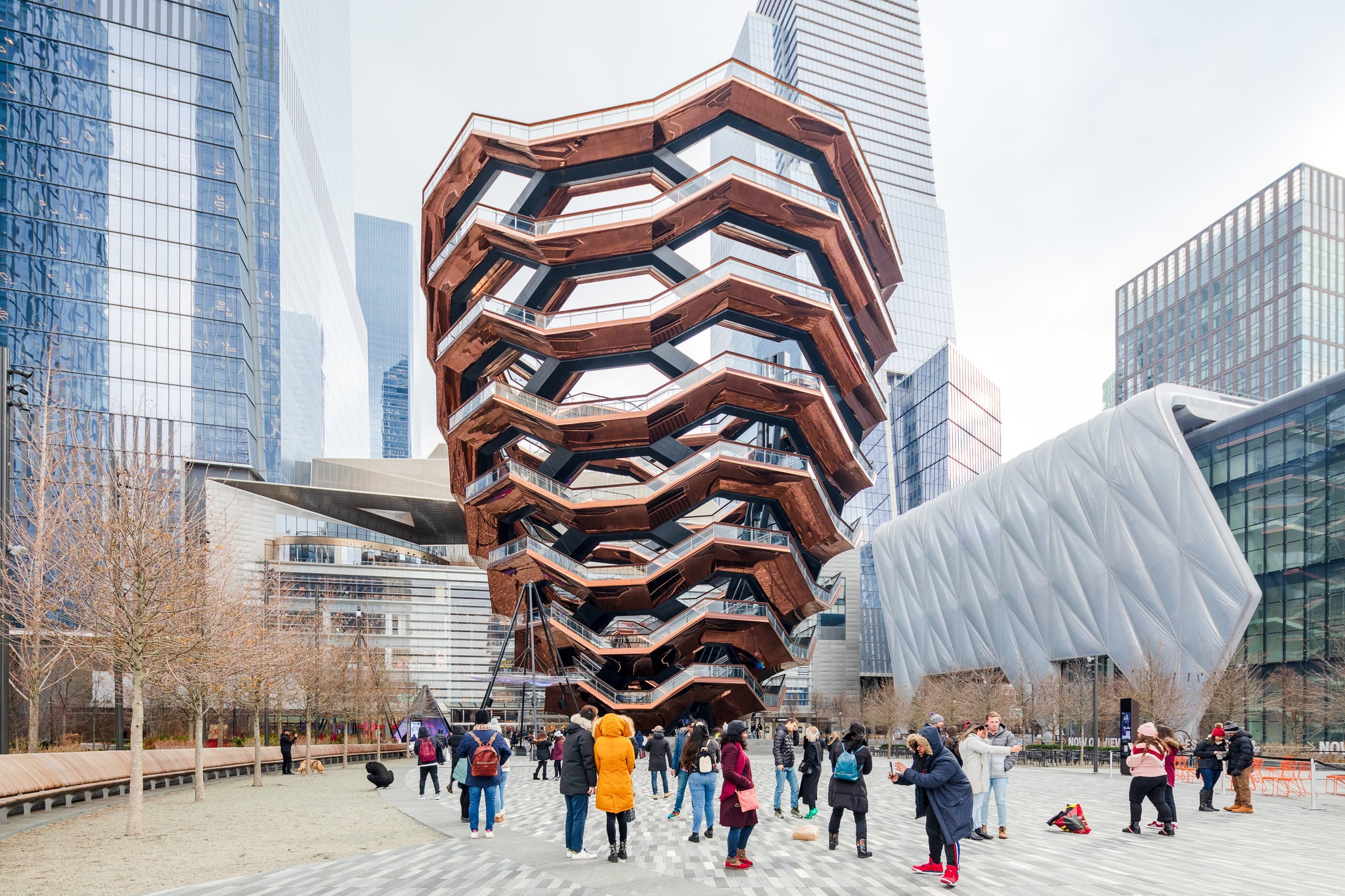
Before I start, the Vessel has taken a lot of flack from critics and artists alike, but the last line of the review in The New Yorker was an especially cold burn—it said the reason there were such nice views of Manhattan from the roof was because it was the only place you could stand and not see the Vessel.
From the time you proposed this project and embarked on it I haven’t been clear about your relationship to architecture and to these drawings. I understand that it’s to gain a kind of familiarity with the built environment but toward what end or what purpose is still unclear, at least to me.
I was hoping 2-3 weeks in, the drawings themselves would provide the answer, but despite some very good drawings along the way, they have not. I’m still not sure if you’re a student of architecture, an architecture fan-boy, or using architecture as a subject and a foil to produce some strong drawings in their own right. I’ve seen hints of each but none have come to the fore or been borne out.
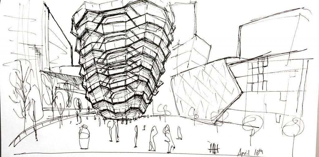
This week the Vessel drawing is wonderfully spirited and spatially sound, but the CCTV tower, while fine, is much more pedestrian and analytical, but perhaps without the tools or training (i.e., architecture school) to make sense of what you’re after.
I apologize for not replying to last week’s drawings sooner, but they also include some very exciting ones—essentially the idea of gesture drawings of buildings as a great vehicle for the dipping pen—especially the first one.
The approach in these that you’re best at, in my opinion, is in capturing the spirit of the buildings, like in last week’s drawings of the Gehry buildings, and even that exterior staircase. This is the vein I would encourage you to commit to and explore for our brief remaining time—perhaps even expanding into the brush or who knows—fingerpainting?
An artist who comes to mind in this vein is Leon Kossoff. I’ve attached one but look up his others. Not a formal match for you but another artist anthropomorphizing the built environment.
But whatever your choice, and as I’ve been telling others, it’s time to commit and create a cohesive body of drawings during our final push.
Harry,
For me, I also don’t really think that the idea of these as fully realized architecture drawings is really as the strength of these. That’s not to say you couldn’t sit down and bust some out, and these are definitely better renderings than what I could do. But, I think the really beautiful moments in these drawing reside in parts with different focuses.
In the first one, I’m really drawn to treating the CCTV tower not as a building, but rather as a form. The top two drawings on the right are what I personally find most interesting in this suite of sketches. The interrogation of a form in space, in different perspectives, seems really interesting, in the style that you’re working in currently.
I think that the architectural drawing in of itself needs more time to be fully realized, and to be done at a bigger scale, or perhaps with tonality, or more sensitive contour lines. It reads as a thumbnail, rather than a visual environment I could really get lost in.
On your second drawing, you have a really well modeled rendition of the vessel, but once again what I’m most intrigued by personally are the more off-the-cuff moments. The building to the vessel’s right has a wonderful quickness and dictionary of different line-styles that I find more appealing. The trees on the right side are beautiful in their representation as gestural pirouettes.
I think if you want to take the next suite of drawings in the way it seems you want to, rather than sketches, you might need a bigger piece of paper, a ruler, and pencils to really knock home a fully fledged technical drawing.
If you’re more set in the size and visual language you currently are in, I would argue for letting a more gestural, playful understanding of space and form come through, like in those moments I’ve highlighted.
I think the drawing of the vessel is a really beautiful sketch, something I can imagine spending a couple of hours on a bench working into a notebook. The darkness under the stairs, the heaviness of the entity in relation to its surroundings, make it a really attractive sketch. But, in terms of it being a work that can stand on its own, I think it needs to find a different point of focus.
I’m excited to see what you make next week! I certainly self-identify as a plaza fan-boy if not a true architecture fan-boy, so seeing spaces like this from you has been a wonderful way to imagine being outside of home, with other people around doing their thing.
Hello Harry!
I enjoyed seeing your work from this week! You are really exploring your specific medium in respect of your works. Four your first drawing, I your attempt on integrating perspectives into the CCTV tower is a very good start. For the difficulties in portraying the distortion I would suggest you check out some three or four-point perspective drawings, here: https://www.pinterest.com/pin/818318194763253432/, https://www.pinterest.com/pin/709668853768733506/.
Don’t know if you intentionally did different line weights in your second drawing with the vessel and background (or it’s just the microns not drawing continuous lines). I think you should carry on having different line weights in your objects (heavier line weight for important buildings and buildings in the front. Vise versa) to showcase the difference in spacial orders of them.