X (especially if any of my suggested revisions make sense to you)
See my version (below). It seems to me the star of this drawing is that gaping hollow. Yours is too sharp-edged and reads very flat as a result. I’ve tried to soften those edges (based on memory of similar things I’ve seen), but even so the interior of that space needs more volume (it will have to do with the modeling). It has farther to go, but this is the direction I recommend.
I’ve darkened the negative space to the right of the trunk to highlight the light along its edge (and throw the hollow into greater relief). I’ve also softened and lightened the opening in the tree in the background which was competing for attention–especially since the edge of its hollow was much too sharp and graphic. I don’t see this as a duet, as your title implies, but a soloist with a back-up singer. Just as darker notes and advance and lighter ones recede, sharper edges advance and softer ones recede.
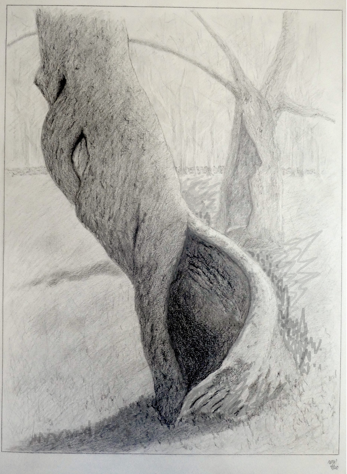
I also darkened the shadow side of the foreground tree and started to let that shadow overtake the hollow, to pull it around to that side of the tree. Then I added vaguely grass-like hatching to the shadow rather than the more generic diagonal hatching.
I often liken the second half (or last quarter) of a drawing to what a conductor does–the music has been written and the players know their parts, but it’s up to the conductor to “mix” the sound, to bring up this and subdue that in order to capture the essence of the whole–the same thing that recording engineers do with the parts in recorded music.
The best way to develop an eye for this, besides experience, is emulating how others have done it–today’s recommendation is Seurat—
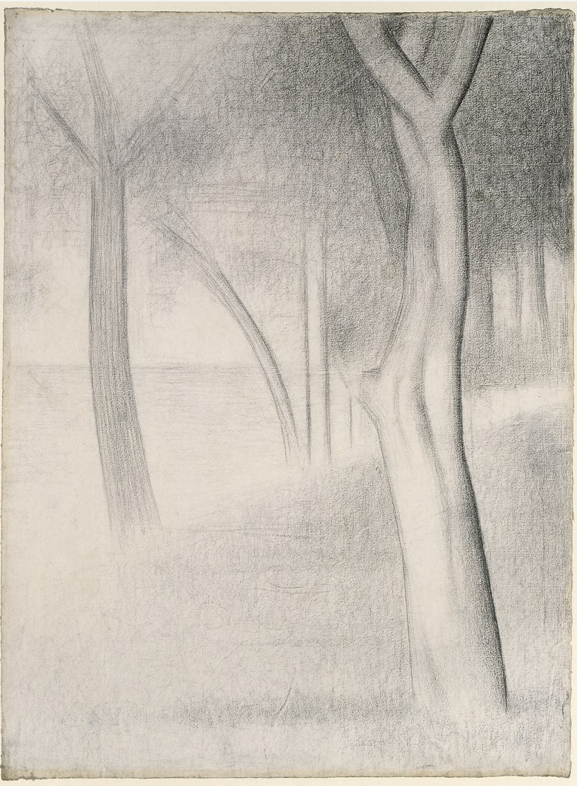
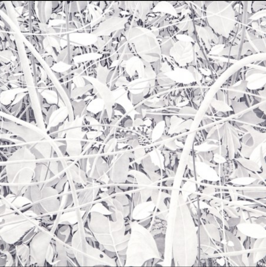
I went looking for a Seurat drawing like this one to demonstrate simultaneous contrast–the way adjoining values exaggerate one another a bit, and how he likes to play this up, subtly but definitively, but…
…I came across this one, below, which is such a great example of what you’re doing in terms of balancing and integrating foreground and background (ultimately dissolving into the paper), establishing focal points and hierarchies of value. Even his touch–note how he draws the shadow of the tree to evoke a grass texture without resorting to cartoon-like blades of grass. A great drawing for you to study (and once again, your answers seem to be found c. 1890-1910).
Just as an aside (less relevant) you might also enjoy the work of my friend Bill Richards, who gets a very silvery light out of his low-contrast graphite drawings:
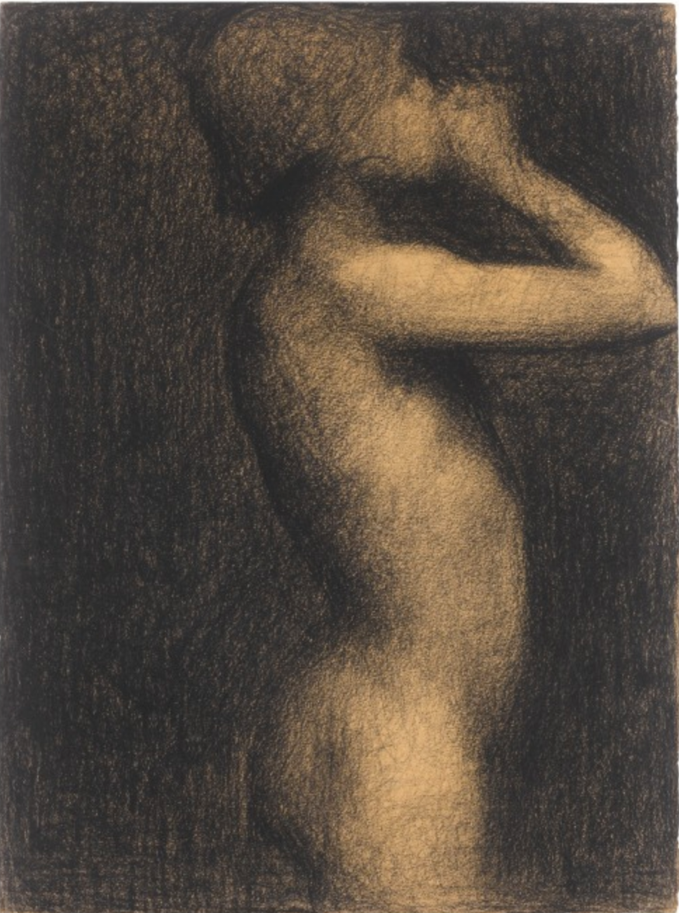
But your drawing of the hollow also brings to mind O’Keeffe–
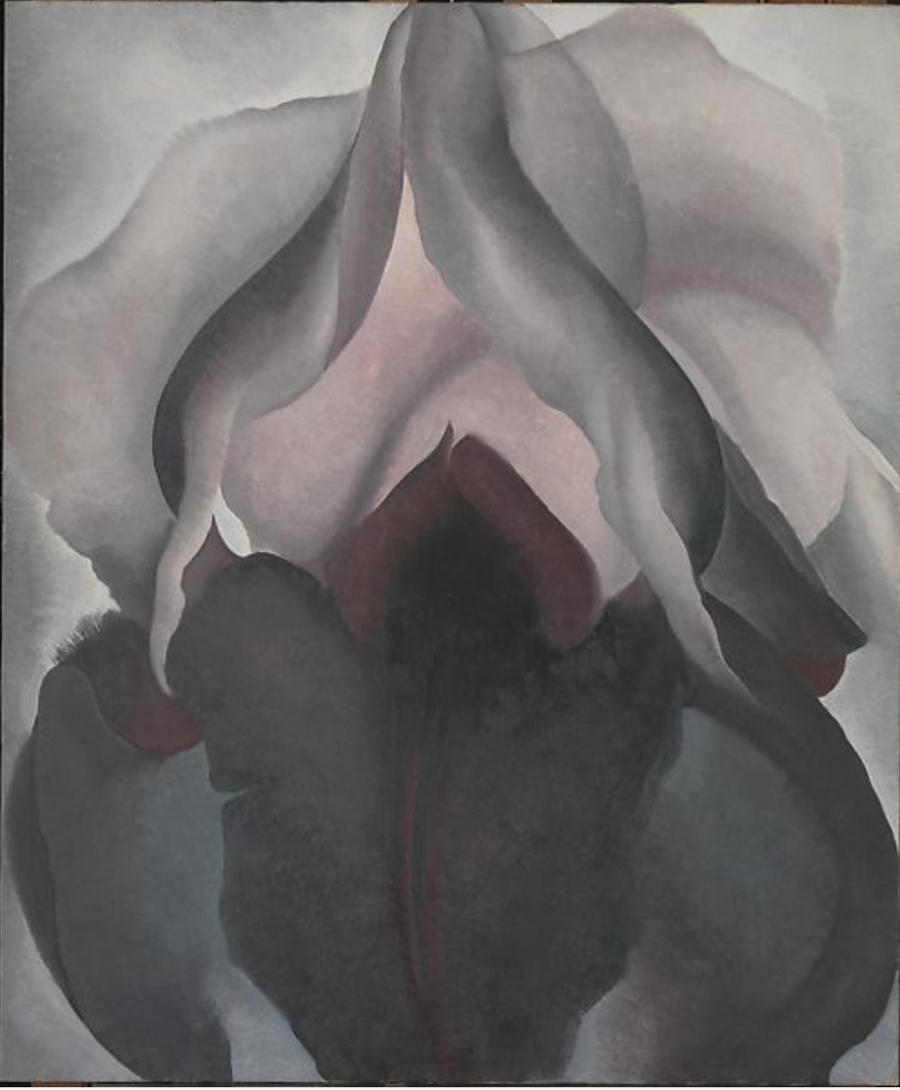
Love the way she keeps one foot firmly planted in the natural world but allows the other one to amplify, refine, and distill the elements of the image–contrast, hard and soft edges, etc.–to greater effect.
In short, that’s what this drawing needs–a more confident and authorial “conductor” to push the image further (an ability you certainly have if this drawing is any indication):
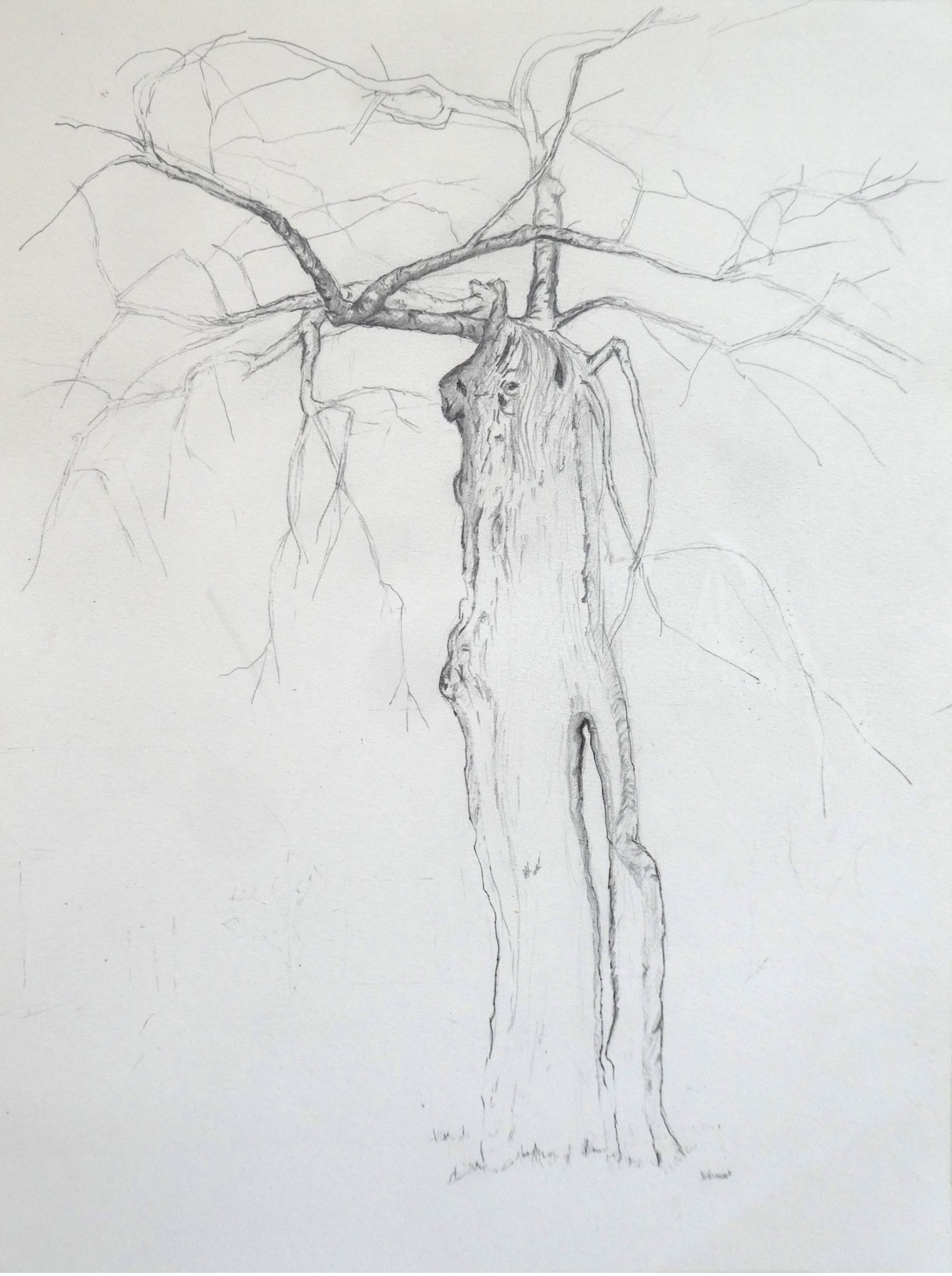
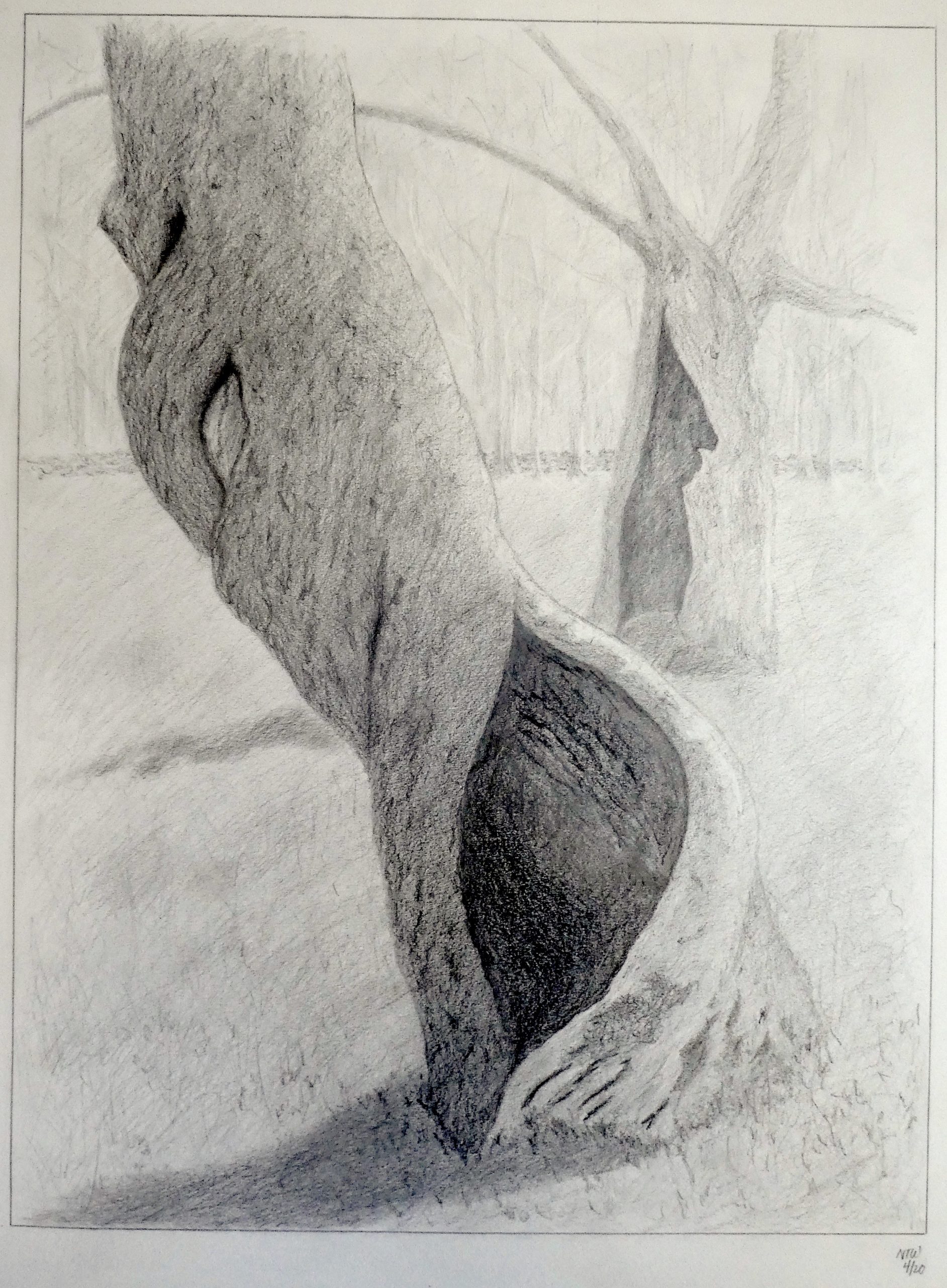
This week I focused on an apple tree whose twisted, hollow trunk catches my eye every time I pass by it. Thinking about the comments on last week’s drawing, I decided to try to create a sense of depth by relying mostly on value, rather than cross-contour lines. I also wanted to follow the suggestion of darkening my darks, to be able to produce a wider range of tones. I had a bit of trouble getting the shadow inside the trunk as dark as I wanted because I seemed to be reaching the limit of how much more graphite I could add without simply adding to the shine of the paper. It was also a bit daunting to fill an 18×24″ sheet with lines. Hard on the pencils, pencil sharpener and wrist. But I feel I know and appreciate my spiral apple and its neighbor behind it much better.
Hello Nat,
This drawing is gorgeous! I was actually reading about the reason of why when you draw something with pencil it gets shiny, the reason of this is because we continuing adding more and more pressure to the pencil at the same spot in order to make it darker. A thing that might help, is built the color with a light handed and experiment with different pencils, sometimes different companies have different graphite saturations even if they are the same number. Keep going with this wonderful work!
Hi Nat!
This a beautiful drawing! I am so impressed by your attention to detail and careful line work. This drawing looks very realistic. This is especially evident in the apple tree in the foreground. I do think that the lines showing the grass could be a little more detailed, as you can’t really see the texture until you zoom into the drawing. I really like the way you drew the faint outline of the trees in the background and how the second apple tree is lighter than the first one, in the foreground. The sense of depth and space in this drawing is impressive. In regards to darkening the value, I agree with Ali and, furthermore, suggest experimenting with charcoal. I mainly use charcoal for my value drawings because I think it is much easier to build up value and get the darkest darks. It is especially useful to use charcoal on large pieces of paper because it is easier to cover space and you can blend to portray changes in value. I remember the week you used charcoal to draw three apple trees alongside each other and I really liked the contrast in value. Overall, you did a wonderful job building up value with pencil and charcoal can just maybe simplify the process. I have really enjoyed watching your drawings progress each week and am excited to see your drawings next week!
I love the tonal richness, especially in the shadows!