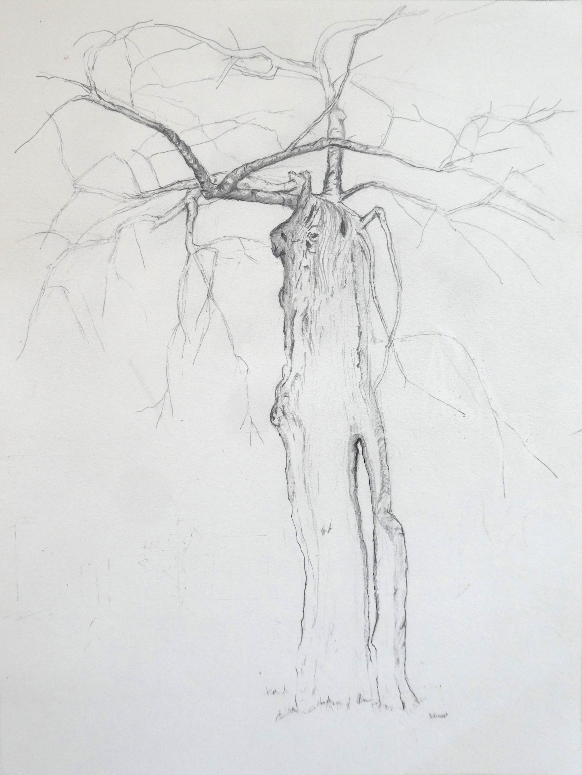
After experimenting with a few different ways of drawing the “Walking Tree” in our front yard, the one I like best is this version, using a #2 pencil. I was aiming for a combination of realism with a sense of human form, movement and personality (inspired by a painting Mark suggested, Egon Schiele’s “Nu Assis”). I plan to return to this subject later, once I develop my skills and figure out techniques to express several features. The one I feel most challenging is giving a sense of branches moving towards the viewer. I also want to find a way to use branch and trunk form to take the eye on a ride across the drawing.
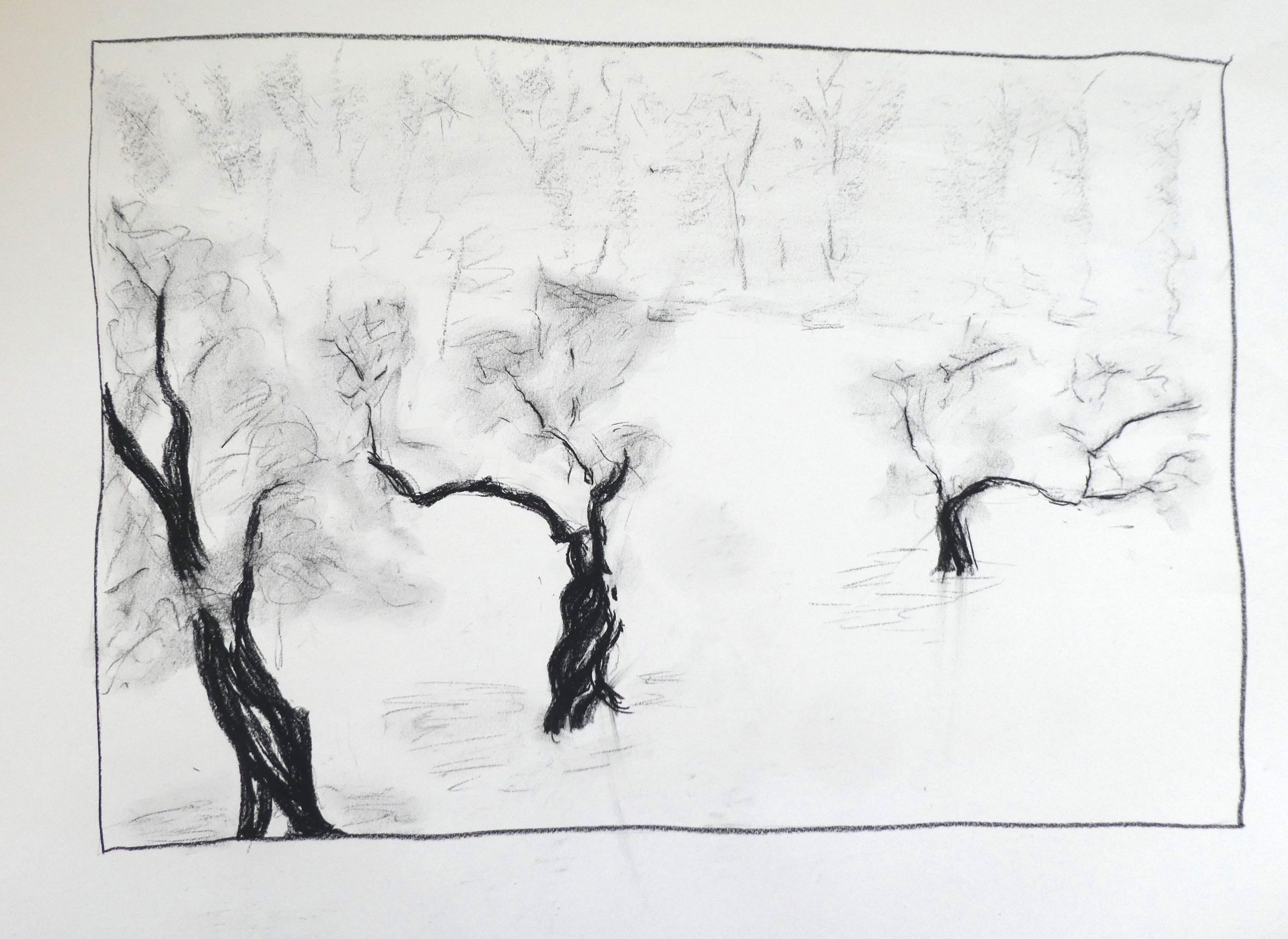
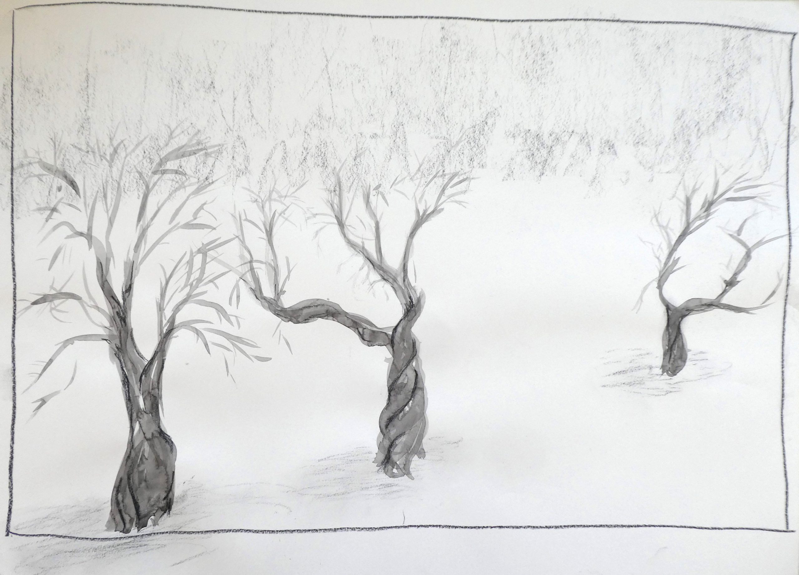
In our backyard are three other apple trees. The pair of drawings of them are more abstract, and I wanted to experiment with different media (ink wash, charcoal). They’re quicker to do and definitely satisfying. In real life, the three trees are in a row, equidistant from the house. To improve the composition (?) I took the liberty of rearranging them on a diagonal. I hope I can incorporate what I’ve learned doing them into more realistic drawings.
Thank you for your informative assessment. I especially like your idea of wanting to draw the branches so that they appear to be moving towards the viewer. I know I’ve mentioned this before but I really admire your touch with the pencil and I can see that in your first drawing that your lines have become more confident.
The composition and perspective in your first drawing are really successful. I see that you started to build value near the top of the tree but I’m curious as to why you stopped. The darkness of the single branch distracts me from all of the other branches. Maybe you could gradually build the value starting from the bottom of the tree and work your way up- making the ends of the branches the darkest. I think this could give you the desired effect of the branches moving towards the viewer. The proportions, detail, and lines of the tree are impeccable.
Hi Nat!
I am struck by how much these trees look like they are walking and moving about! I really like the perspective and composition of the first drawing – it looks like a tall, looming giant above. You are doing a great job with realism, also, as the detail in the top of the tree is quite representational. I look forward to seeing how you build the detail up in the rest of the drawing. Also, do you plan to add a background? I think it might be good to add a simple horizon line and a few light lines to give perspective in space, however, the tree is the focus of the drawing and I like the way it stands alone. I also really enjoy the two drawings of the three apple tress. The simple composition with the faint suggestion of trees in the background and ground around the trees on the foreground is quite compelling! The twists of the trees remind me of the way Van Gogh painted the tree in the Starry Night. You successfully demonstrated the movement and figure/form of the apple trees. I think it would be quite interesting to fuse this technique together with the realistic, detailed drawing technique, however, I also really like how they individually look on their own. The contrast, to me, symbolizes the ways in which trees, like humans, can be still at times but also rapidly dancing at other times. I really am impressed by these drawings!
Hi Nat! First of all, I love the idea of focusing on trees, and in particular, anthropomorphizing them. I just finished the book The Overstory and it also, like you are doing, brought trees to life. Your pencil drawing this week has a lot of great detail. I enjoyed it a lot more when I zoomed in. I think something that would improve the drawing is thinking about the density of marks across the page. It feels top heavy to me, which creates tension in the drawing because trees are seen as grounded. If this was your intention (which it may have been, so the tree can walk) then it worked! I also think that adding more bark detail would help. I love the texture you have created at the top and in the contour, so I would just extend that to more of the tree.
I feel like you have started to do this, but to get the branches to come towards the viewer, I think you need to exaggerate the foreshortening, and also decide about line weight . Will the heavy dark lines come forward and the back branches recede (you have done this already and I like it!), or the opposite? I would also make the bottom of the trunk darker.
I love how you decided to experiment with the apple trees. You have achieved great movement with minimal detail and I especially love how you depicted the twisted trunks. I think it is very necessary to open up and experiment like you are doing here, and sometimes you come out with some great drawings!
Hope you are doing okay! I enjoyed watching your new nature moment video:)
Hello Nat!
I love the sense of movement on your trees. The second drawing is specially beautiful, I can see the leaves moving, and it reminds me of Japanese ink drawings, which is pretty impressing knowing that you made these drawings only with pencil. I think, if you want to give the sense of branches moving towards the viewer you can always make the lines thicker and darker to give the sense of depth. I have a question about the borders, did you made those before or after you finish the drawing? I think having the borders made with ruler would help to the viewer to even appreciate more the movement of the drawing, as well would help to give a more “bomb” presentation.
To include anyone else who might be interested, I’m going to paste these questions from your email to put my following remarks in context, and also to centralize these images for easier reference:
________
First, the issue of the house. I would like to include it in the background but the focus will definitely be on the tree. Do you have thoughts about how to treat it, or drawings from which I can borrow ideas? As you can see from the photo (taken last April), our house is brick with a dark roof. Possibilities that occur to me are:
(a) a light charcoal wash on the brick and roof, perhaps fading on the right side
(b) just a light pencil sketch (as in “WalkingTreeFromNorth”), perhaps fading on the right side
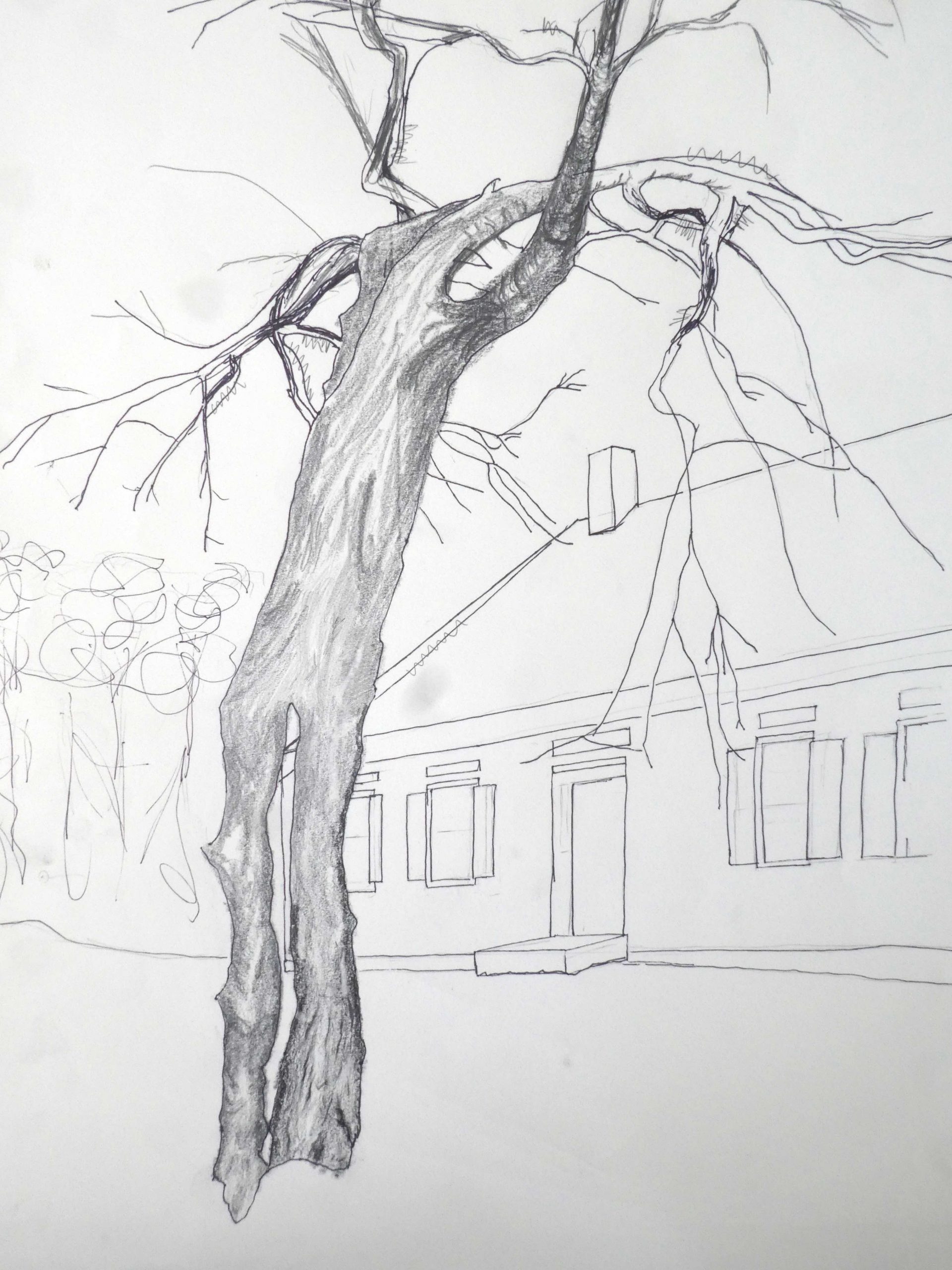
(c) a stronger contour line drawing (as in “WalkingTreeFromNorthSketch,” which I’m using to experiment with different techniques)
Second, the issue of the bark. The Pre-Rafaelite in me wants to make it look realistic. Although I’m just starting “WalkingTreeFromNorth,” I like the horizontal pencil lines, which seem to make it feel more rounded, although the effect at this point is more like a birch than an apple.
That said, the vertical lines at the bottom of “WalkingTreeFromNorthSketch” capture the shadows and muscularity of the tree better. Perhaps I should combine the two? Your thoughts?
__________
1) For starters, the first drawing you posted in this group is as good as it gets. That is a marvelous drawing by any measure. The spare accents and their placement lift the eye into the upper branches of the tree and the upper part of the page. Your touch in this exquisite. If you’re looking for a thesis you need look no further. But I also understand that you want to examine other approaches as well. In the meantime, anyone who can draw like this is a summa cum laude graduate of Drawing II.
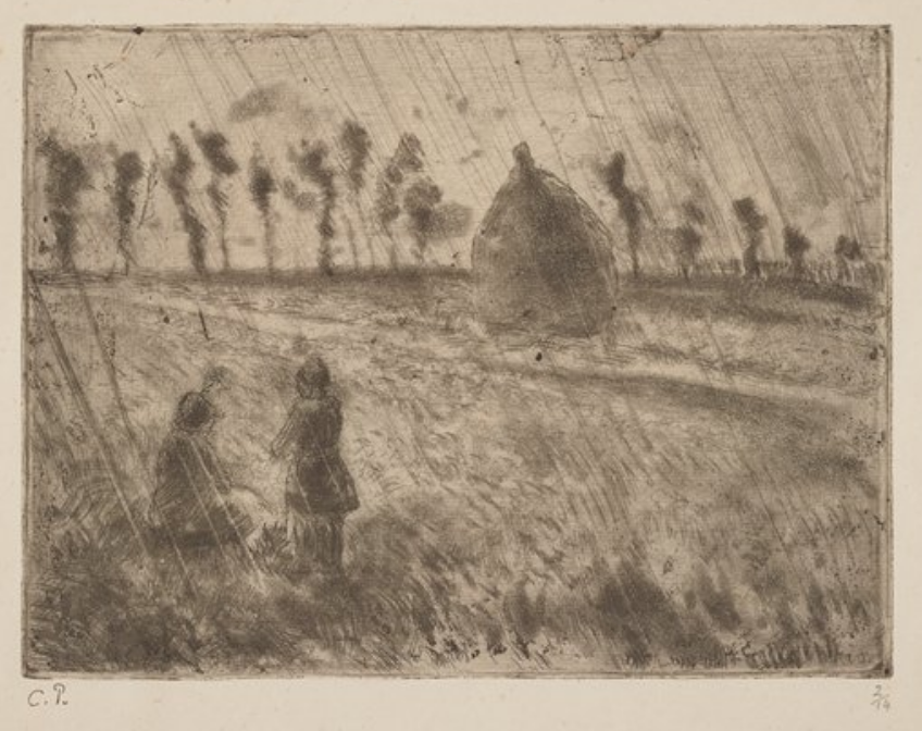
2) But before your head gets too swollen, the studies with the three trees (and the irregular border you mentioned) are not nearly as convincing.They’re oddly graphic (the tree trunks) and impressionistic at the same time. They remind me of a print we have in the Bowdoin Museum called “Rain Effect” by Camille Pissaro, which I’ve added above. To be honest they left me wondering what you were getting at.
They also remind me of Van Gogh’s many paintings in the olive and fruit groves of Arles–your compositions of multiple trees could learn a lot from his. As extraordinary as your single tree is in filling the rectangle, these are not nearly as effective.
3) On to the house. Here again I think you’re answering your own question–the tree with the house suggested in outline only works very well, save for the other trees. I could imagine some very selective shading on the house–the same kind of selectivity you used in the first tree drawing on this post–in short, closest to option “b” in your list above. a and c also have possibilities, and I wouldn’t forego them–it’s all part of the trial and error that attend this project.
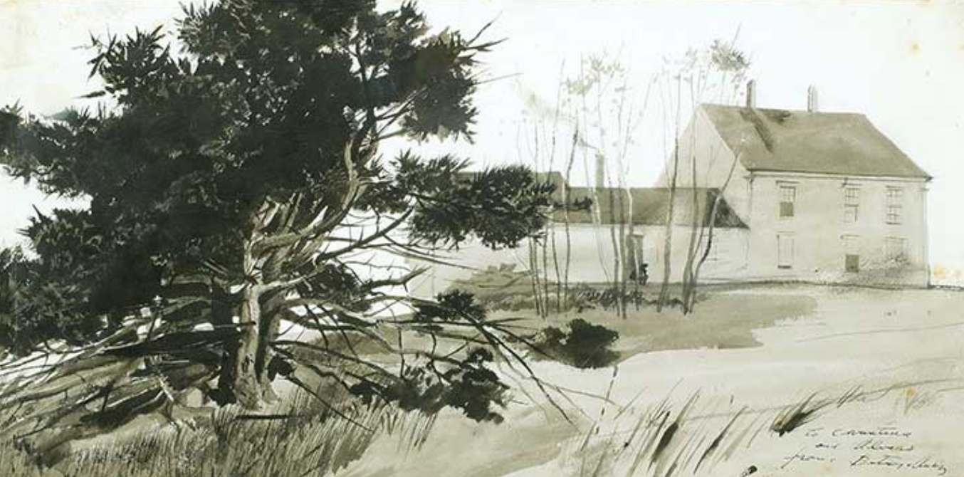
The other artist who comes to mind here is Andrew Wyeth, who I’ve added here, with some old fashioned atmospheric perspective–full value but soft pedaling (lower contrast) the background. Look at his watercolors; he’s very good at selective emphasis, including things that dissolve entirely from view.
His son Jamie offers another answer–going full bore over every square inch. It can all work; it depends on what you’re after.
4) About those trees in the background of the house. I’ve seen this in other drawings of yours. On a scale from high fidelity recording (I’d use your single tree at the top of this post as a sterling example), to cartoons of trees, which at their best are deeply informed summaries of their subject, your scribbles of trees aren’t on this spectrum. When you let go of what’s in front of you, you really let go, retaining almost no trace of a responsive interpretation.
There are many artists I could name, but somehow Corot leaps to mind. Note his shorthand for trees. Hardly more than a scribble but one that channels his deep knowledge and empathy for his subject. I’m surprised that someone who can draw so wonderfully in a more scrupulous way can’t transition (so far) to a similarly informed sketching style–something for you to study in others and practice.
5) Finally, about the cross-contour hatching on the tree trunks. I think the modeling in the tree with the contour house in the background is much more effective. The cross-contour hatching only is telling just one story about the form, and not the most interesting one in this case. And yes, combining elements of cross-contour with other kinds of modeling is always a good idea.
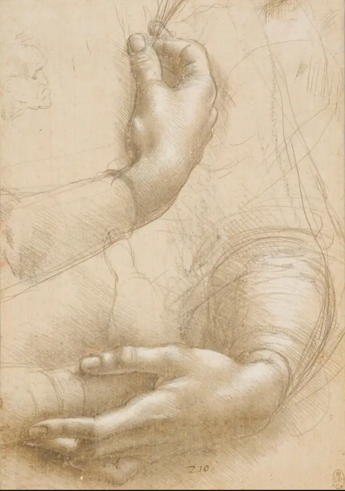
Note in the Leonardo drawing that I’ve added how his dominant shading method is a diagonal hatching, but accented with cross-contour lines as needed to drive home his point.
By comparison have a look at the Henry Moore, which is all about cross-contour lines. Both very powerful–a choice we each make for ourselves.
 Camille Pissaro
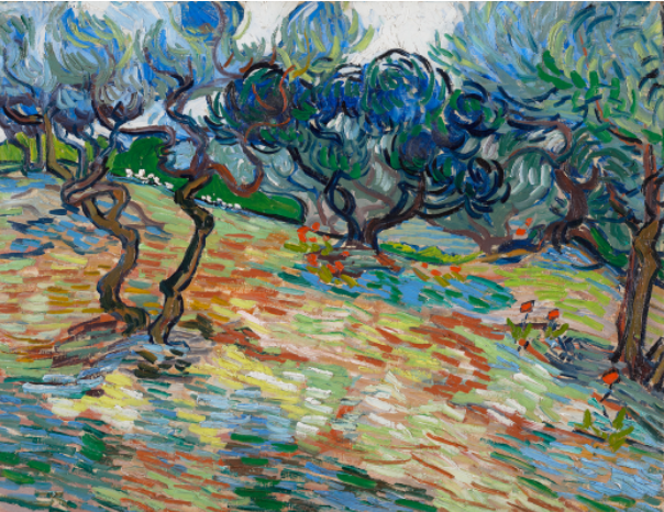 Van Gogh
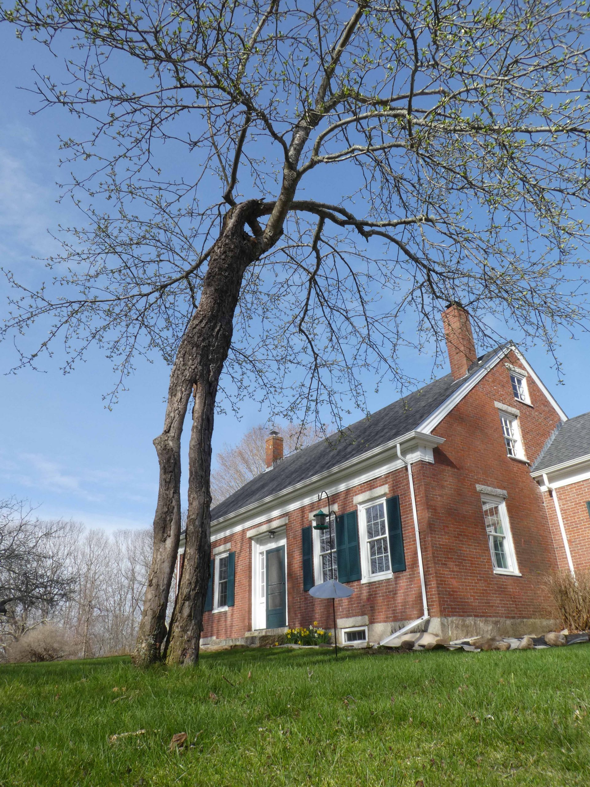
 Andrew Wyeth
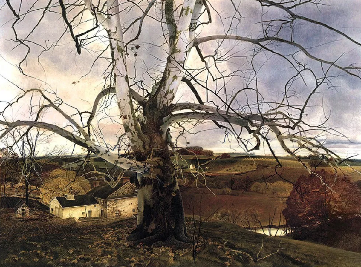 Jamie Wyeth
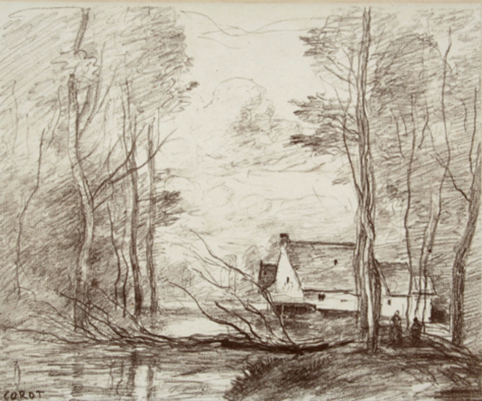 Camille Corot
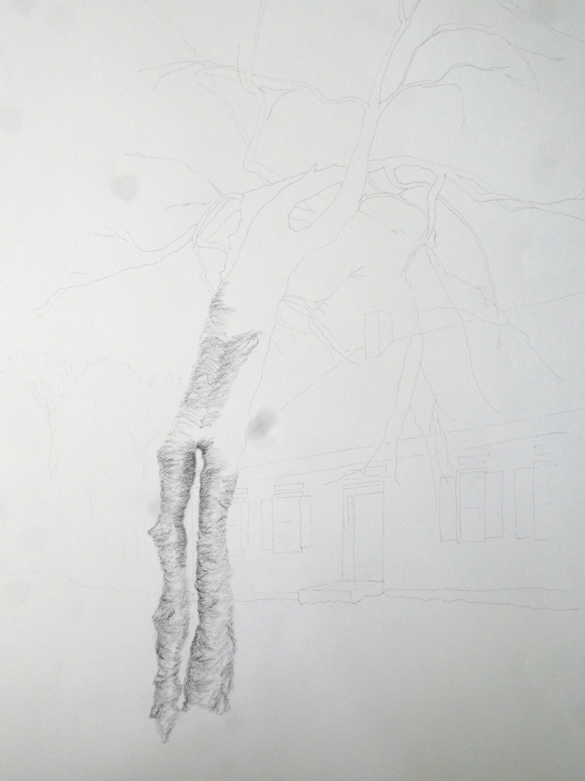
 Leonardo
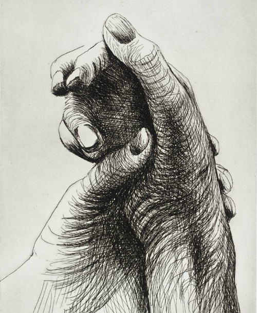 Henry Moore
After experimenting with a few different ways of drawing the “Walking Tree” in our front yard, the one I like best is this version, using a #2 pencil. I was aiming for a combination of realism with a sense of human form, movement and personality (inspired by a painting Mark suggested, Egon Schiele’s “Nu Assis”). I plan to return to this subject later, once I develop my skills and figure out techniques to express several features. The one I feel most challenging is giving a sense of branches moving towards the viewer. I also want to find a way to use branch and trunk form to take the eye on a ride across the drawing.
In our backyard are three other apple trees. The pair of drawings of them are more abstract, and I wanted to experiment with different media (ink wash, charcoal). They’re quicker to do and definitely satisfying. In real life, the three trees are in a row, equidistant from the house. To improve the composition (?) I took the liberty of rearranging them on a diagonal. I hope I can incorporate what I’ve learned doing them into more realistic drawings.
Hey Nat!
Thank you for your informative assessment. I especially like your idea of wanting to draw the branches so that they appear to be moving towards the viewer. I know I’ve mentioned this before but I really admire your touch with the pencil and I can see that in your first drawing that your lines have become more confident.
The composition and perspective in your first drawing are really successful. I see that you started to build value near the top of the tree but I’m curious as to why you stopped. The darkness of the single branch distracts me from all of the other branches. Maybe you could gradually build the value starting from the bottom of the tree and work your way up- making the ends of the branches the darkest. I think this could give you the desired effect of the branches moving towards the viewer. The proportions, detail, and lines of the tree are impeccable.
Hi Nat!
I am struck by how much these trees look like they are walking and moving about! I really like the perspective and composition of the first drawing – it looks like a tall, looming giant above. You are doing a great job with realism, also, as the detail in the top of the tree is quite representational. I look forward to seeing how you build the detail up in the rest of the drawing. Also, do you plan to add a background? I think it might be good to add a simple horizon line and a few light lines to give perspective in space, however, the tree is the focus of the drawing and I like the way it stands alone. I also really enjoy the two drawings of the three apple tress. The simple composition with the faint suggestion of trees in the background and ground around the trees on the foreground is quite compelling! The twists of the trees remind me of the way Van Gogh painted the tree in the Starry Night. You successfully demonstrated the movement and figure/form of the apple trees. I think it would be quite interesting to fuse this technique together with the realistic, detailed drawing technique, however, I also really like how they individually look on their own. The contrast, to me, symbolizes the ways in which trees, like humans, can be still at times but also rapidly dancing at other times. I really am impressed by these drawings!
Hi Nat! First of all, I love the idea of focusing on trees, and in particular, anthropomorphizing them. I just finished the book The Overstory and it also, like you are doing, brought trees to life. Your pencil drawing this week has a lot of great detail. I enjoyed it a lot more when I zoomed in. I think something that would improve the drawing is thinking about the density of marks across the page. It feels top heavy to me, which creates tension in the drawing because trees are seen as grounded. If this was your intention (which it may have been, so the tree can walk) then it worked! I also think that adding more bark detail would help. I love the texture you have created at the top and in the contour, so I would just extend that to more of the tree.
I feel like you have started to do this, but to get the branches to come towards the viewer, I think you need to exaggerate the foreshortening, and also decide about line weight . Will the heavy dark lines come forward and the back branches recede (you have done this already and I like it!), or the opposite? I would also make the bottom of the trunk darker.
I love how you decided to experiment with the apple trees. You have achieved great movement with minimal detail and I especially love how you depicted the twisted trunks. I think it is very necessary to open up and experiment like you are doing here, and sometimes you come out with some great drawings!
Hope you are doing okay! I enjoyed watching your new nature moment video:)
Best,
Perrin
Hello Nat!
I love the sense of movement on your trees. The second drawing is specially beautiful, I can see the leaves moving, and it reminds me of Japanese ink drawings, which is pretty impressing knowing that you made these drawings only with pencil. I think, if you want to give the sense of branches moving towards the viewer you can always make the lines thicker and darker to give the sense of depth. I have a question about the borders, did you made those before or after you finish the drawing? I think having the borders made with ruler would help to the viewer to even appreciate more the movement of the drawing, as well would help to give a more “bomb” presentation.
Hi Nat,
To include anyone else who might be interested, I’m going to paste these questions from your email to put my following remarks in context, and also to centralize these images for easier reference:
________
First, the issue of the house. I would like to include it in the background but the focus will definitely be on the tree. Do you have thoughts about how to treat it, or drawings from which I can borrow ideas? As you can see from the photo (taken last April), our house is brick with a dark roof. Possibilities that occur to me are:
(a) a light charcoal wash on the brick and roof, perhaps fading on the right side
(b) just a light pencil sketch (as in “WalkingTreeFromNorth”), perhaps fading on the right side
(c) a stronger contour line drawing (as in “WalkingTreeFromNorthSketch,” which I’m using to experiment with different techniques)
Second, the issue of the bark. The Pre-Rafaelite in me wants to make it look realistic. Although I’m just starting “WalkingTreeFromNorth,” I like the horizontal pencil lines, which seem to make it feel more rounded, although the effect at this point is more like a birch than an apple.
That said, the vertical lines at the bottom of “WalkingTreeFromNorthSketch” capture the shadows and muscularity of the tree better. Perhaps I should combine the two? Your thoughts?
__________
1) For starters, the first drawing you posted in this group is as good as it gets. That is a marvelous drawing by any measure. The spare accents and their placement lift the eye into the upper branches of the tree and the upper part of the page. Your touch in this exquisite. If you’re looking for a thesis you need look no further. But I also understand that you want to examine other approaches as well. In the meantime, anyone who can draw like this is a summa cum laude graduate of Drawing II.
2) But before your head gets too swollen, the studies with the three trees (and the irregular border you mentioned) are not nearly as convincing.They’re oddly graphic (the tree trunks) and impressionistic at the same time. They remind me of a print we have in the Bowdoin Museum called “Rain Effect” by Camille Pissaro, which I’ve added above. To be honest they left me wondering what you were getting at.
They also remind me of Van Gogh’s many paintings in the olive and fruit groves of Arles–your compositions of multiple trees could learn a lot from his. As extraordinary as your single tree is in filling the rectangle, these are not nearly as effective.
3) On to the house. Here again I think you’re answering your own question–the tree with the house suggested in outline only works very well, save for the other trees. I could imagine some very selective shading on the house–the same kind of selectivity you used in the first tree drawing on this post–in short, closest to option “b” in your list above. a and c also have possibilities, and I wouldn’t forego them–it’s all part of the trial and error that attend this project.
The other artist who comes to mind here is Andrew Wyeth, who I’ve added here, with some old fashioned atmospheric perspective–full value but soft pedaling (lower contrast) the background. Look at his watercolors; he’s very good at selective emphasis, including things that dissolve entirely from view.
His son Jamie offers another answer–going full bore over every square inch. It can all work; it depends on what you’re after.
4) About those trees in the background of the house. I’ve seen this in other drawings of yours. On a scale from high fidelity recording (I’d use your single tree at the top of this post as a sterling example), to cartoons of trees, which at their best are deeply informed summaries of their subject, your scribbles of trees aren’t on this spectrum. When you let go of what’s in front of you, you really let go, retaining almost no trace of a responsive interpretation.
There are many artists I could name, but somehow Corot leaps to mind. Note his shorthand for trees. Hardly more than a scribble but one that channels his deep knowledge and empathy for his subject. I’m surprised that someone who can draw so wonderfully in a more scrupulous way can’t transition (so far) to a similarly informed sketching style–something for you to study in others and practice.
5) Finally, about the cross-contour hatching on the tree trunks. I think the modeling in the tree with the contour house in the background is much more effective. The cross-contour hatching only is telling just one story about the form, and not the most interesting one in this case. And yes, combining elements of cross-contour with other kinds of modeling is always a good idea.
Note in the Leonardo drawing that I’ve added how his dominant shading method is a diagonal hatching, but accented with cross-contour lines as needed to drive home his point.
By comparison have a look at the Henry Moore, which is all about cross-contour lines. Both very powerful–a choice we each make for ourselves.
Hope this helps–happy drawing–