PencilPencil, vine charcoal, colored pencil, acrylic paintBrush and ink
X
6 thoughts on “Moka Pot”
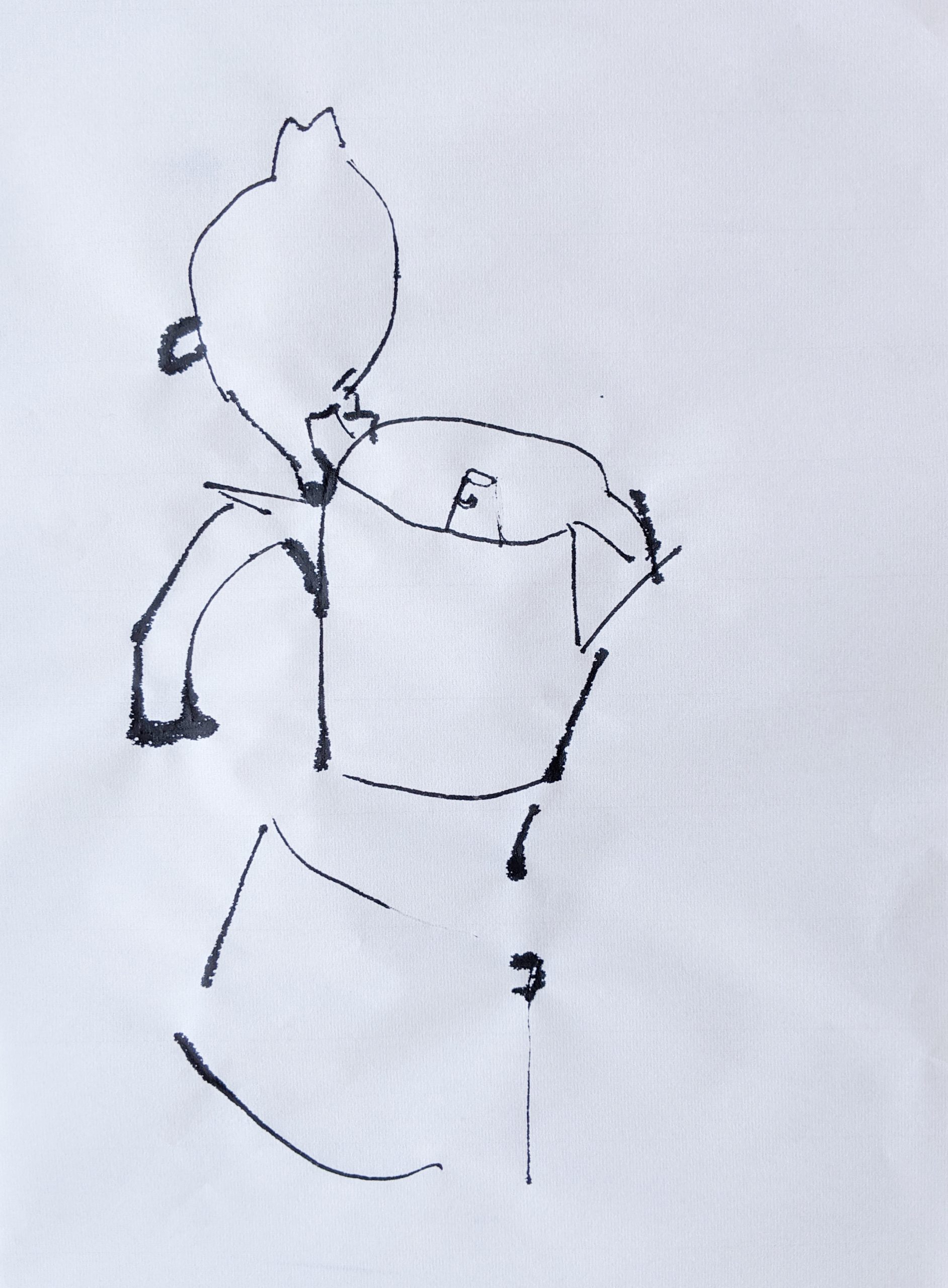
This week I experimented more with using graphite, as well as vine charcoal. I also tried using ink wash on thicker paper, which was very successful for a first attempt and a technique I’d like to drive further. This week, my goals were to continue learning about abstraction with line, via my quick brush and ink drawings, as well as trying to nail down some tighter proportion, seen with the more detailed graphite drawings. I started thinking more about planes and values of planes, which I would like to continue thinking about.
You produced a lot of drawings this week! I agree with you that the ink experimentation on heavier paper was successful and worth developing further.
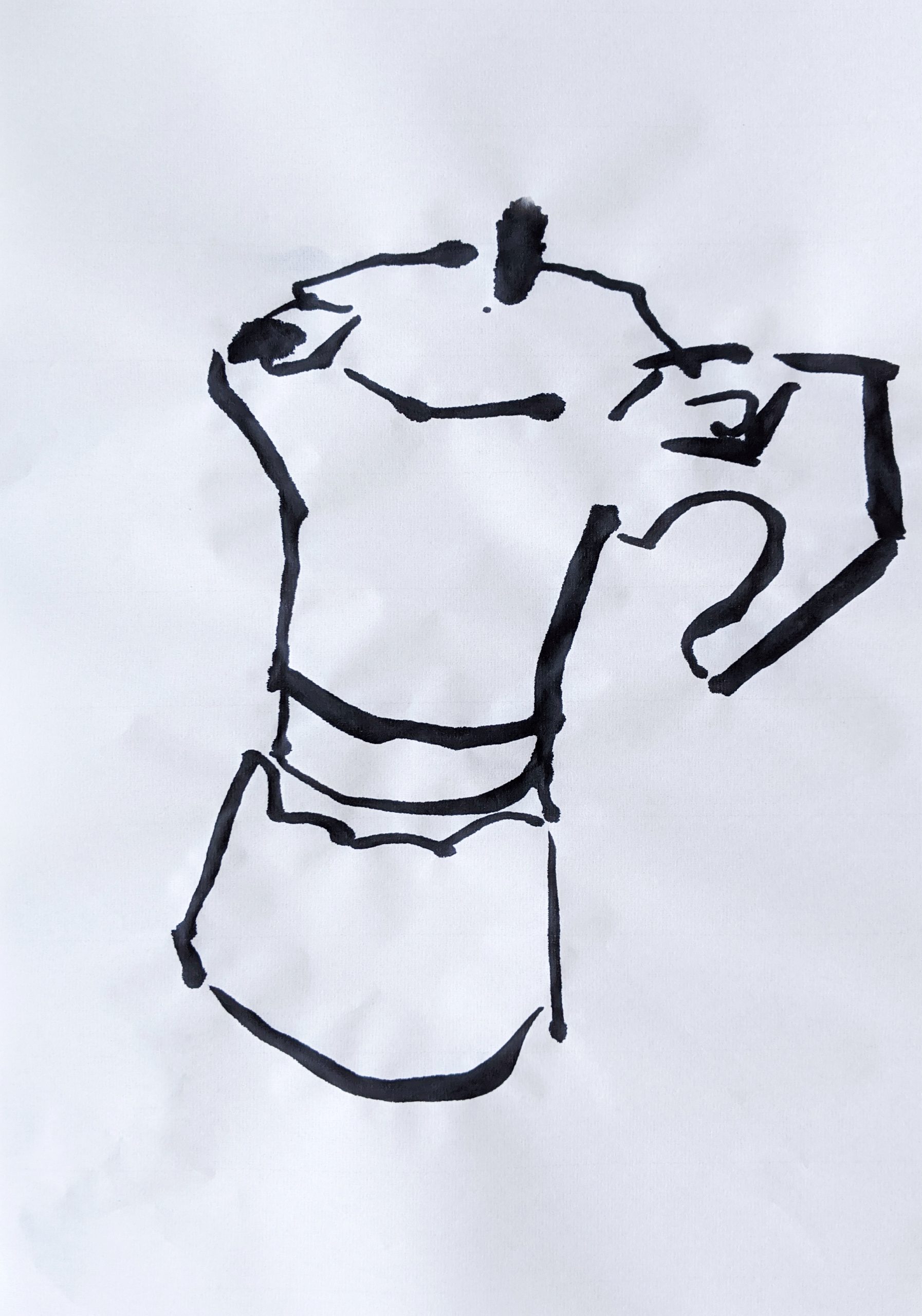
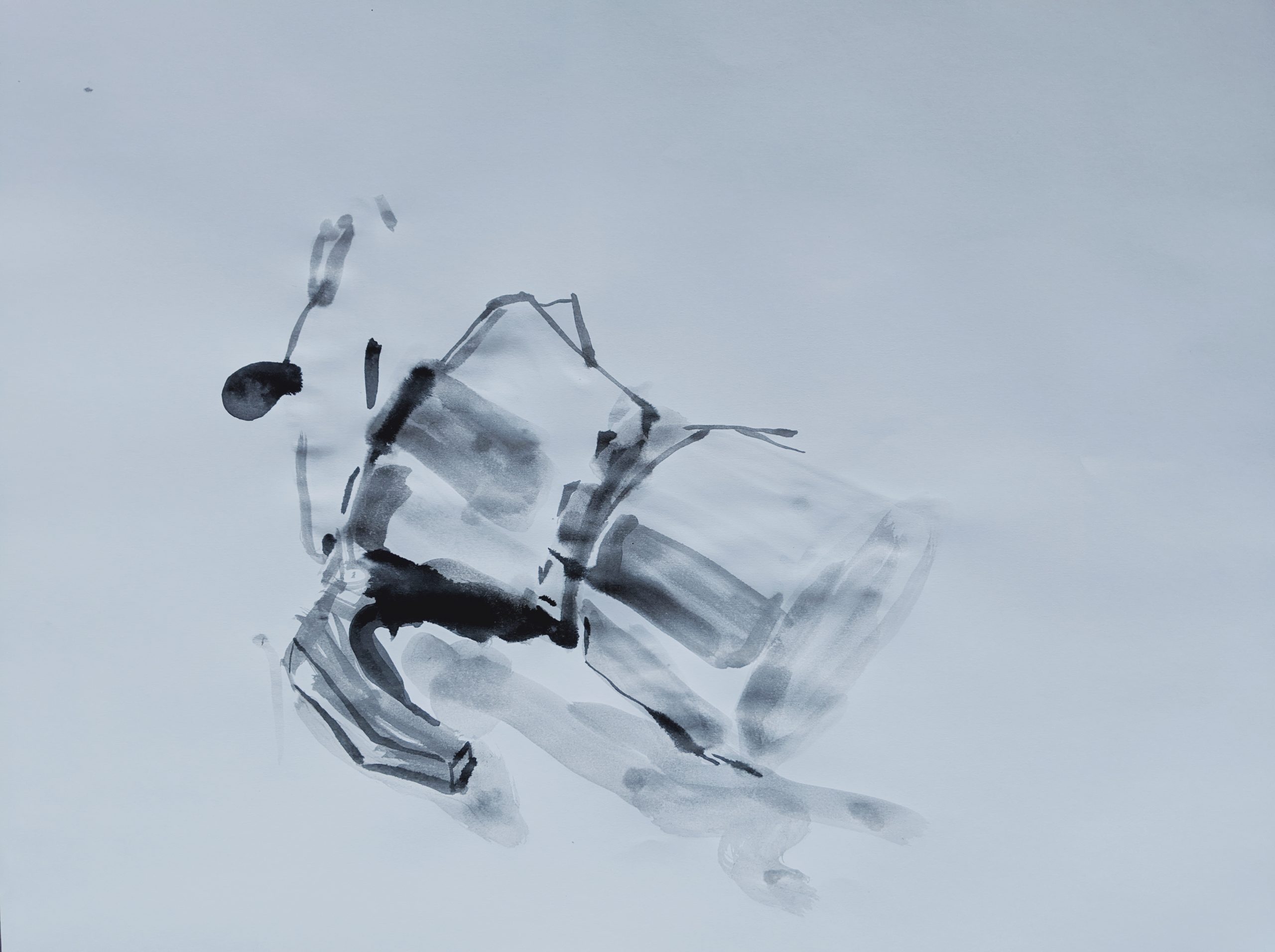
The drawing I am most drawn to is the last one you posted. I think there is something really interesting about your combination of light and dark washes that makes the form of the Moka pot really come off the page. I also think it does a nice job of communicating the texture of the surface (it looks convincingly metallic to me). My favorite “moment” is the way the darkest line under the handle plays with the other marks you made with lighter washes. I also like the boldness of using very few lines to describe the top of the pot in this drawing.
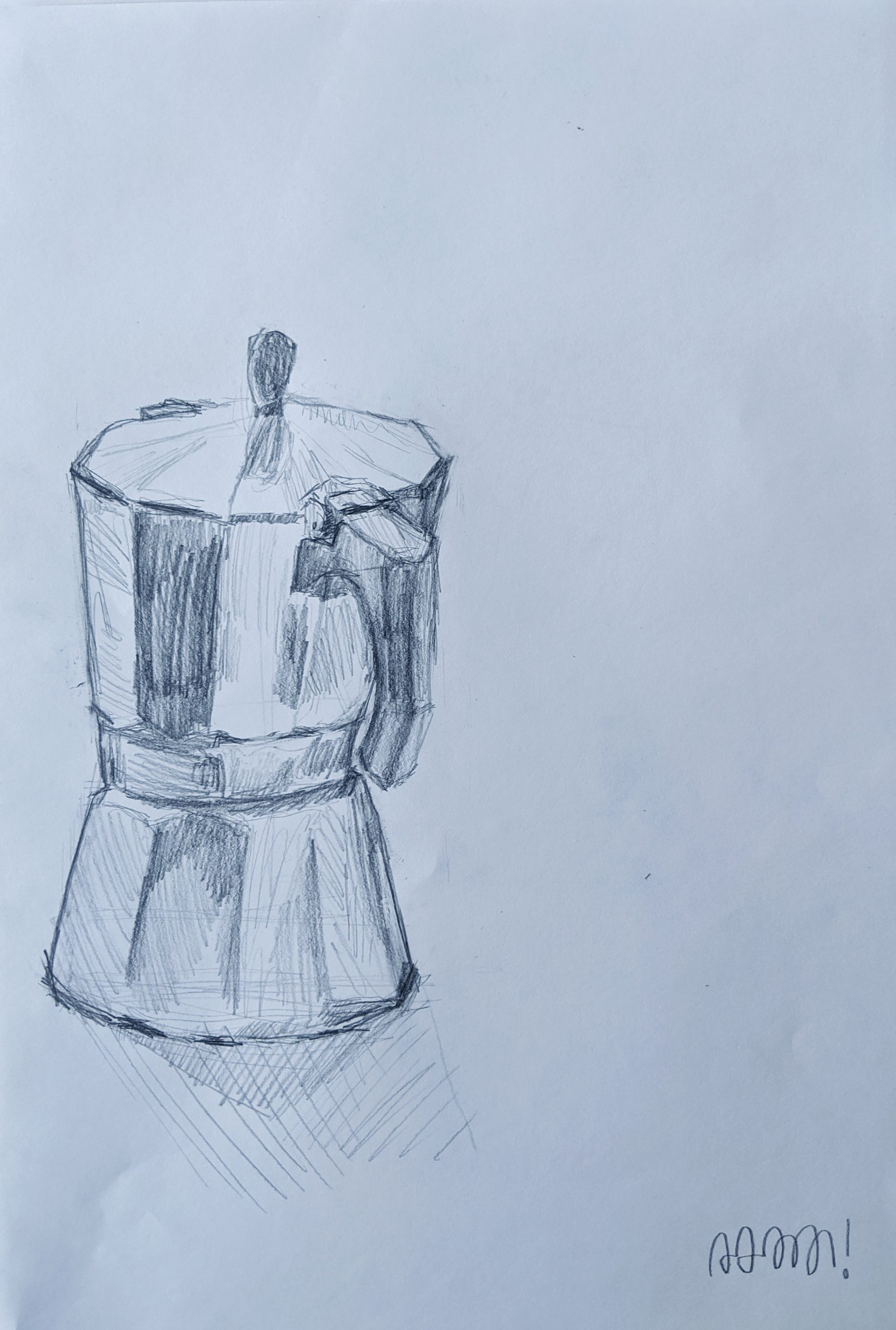
It seems like the repetition of drawing this Moka pot is paying off, especially in your 4th and 6th drawings using pencil.
One thing that you might want to consider more is shadow. Since the form of the pot is central to your project, I think adding a shadow that can tell us even more about the form of the pot could add value. I can see you already are doing this with some of your pieces.
So much of what I wanted to say Claire already said. In short: I also admire your experimentation and also feel most drawn to the last ink-wash piece. Stunning work. Really really awesome.
Again following Claire’s lead, I too am curious about the next iteration of drawings and think that playing more with light/shadow could be an interesting path to pursue. I like the pot on its own, and I also like it in space/atmosphere/light. It is evident that have already spent a good deal of time exploring the pot itself given your continued variation of material, line weight, and abstraction. Personally, I think this upcoming week could be a good time to develop the pot in context, like in your fifth drawing (which is sick).
One specific idea that comes to mind is depicting the pot in near darkness. Your marks thus far have all focused on the pot itself, and I think it could be cool to explore ways to draw the pot without actually drawing it, using shadow and environment to provide shape and form. Similar to the Tom + Frame drawings.
In general, I think all of your drawings have their own specialties. I am especially drawn to the brush and ink ones. The first three drawings convey a cool sense of abstraction with your concise use of lines (and for some reason, they remind me of calligraphy-style graphic design works). I love the the slightly jagged lines in the second drawing, done with dip pen and ink.
I consider the last drawing the strongest drawing that you did from your series. There were not a lot of depiction lines, yet the form the pot appears from the drawing paper. The light and dark semi-transparent wash portrays the shiny texture of the pot well. Don’t know if you did this intentionally–the shadow of the pot could also be seen as brushes of slight wash under the pot.
Since you want to focus on planes, I have a suggestion (that might be a little crazy!). You can either add a simple environment to the pot, or simply fill the page with the form of pot (observe it and draw it closely). This way, the details on the pot became a ‘landscape’, and the different bulges (for example, the handle) became changes on the ‘landscape’.
My family is obsessed with coffee so these pots are warm and familiar to me – I’m glad you chose this as something to focus on. I really love your drawing with the white acrylic paint and pencil and vine charcoal. The multimedia aspect is interesting and even though I never would have thought of doing this, it is my favorite one. I would be interested to see some explorations of the metal of the pot. The shininess is something to play with. I love the collection, and it will be fun to see the whole progression. Good job!!
Hi Adam!
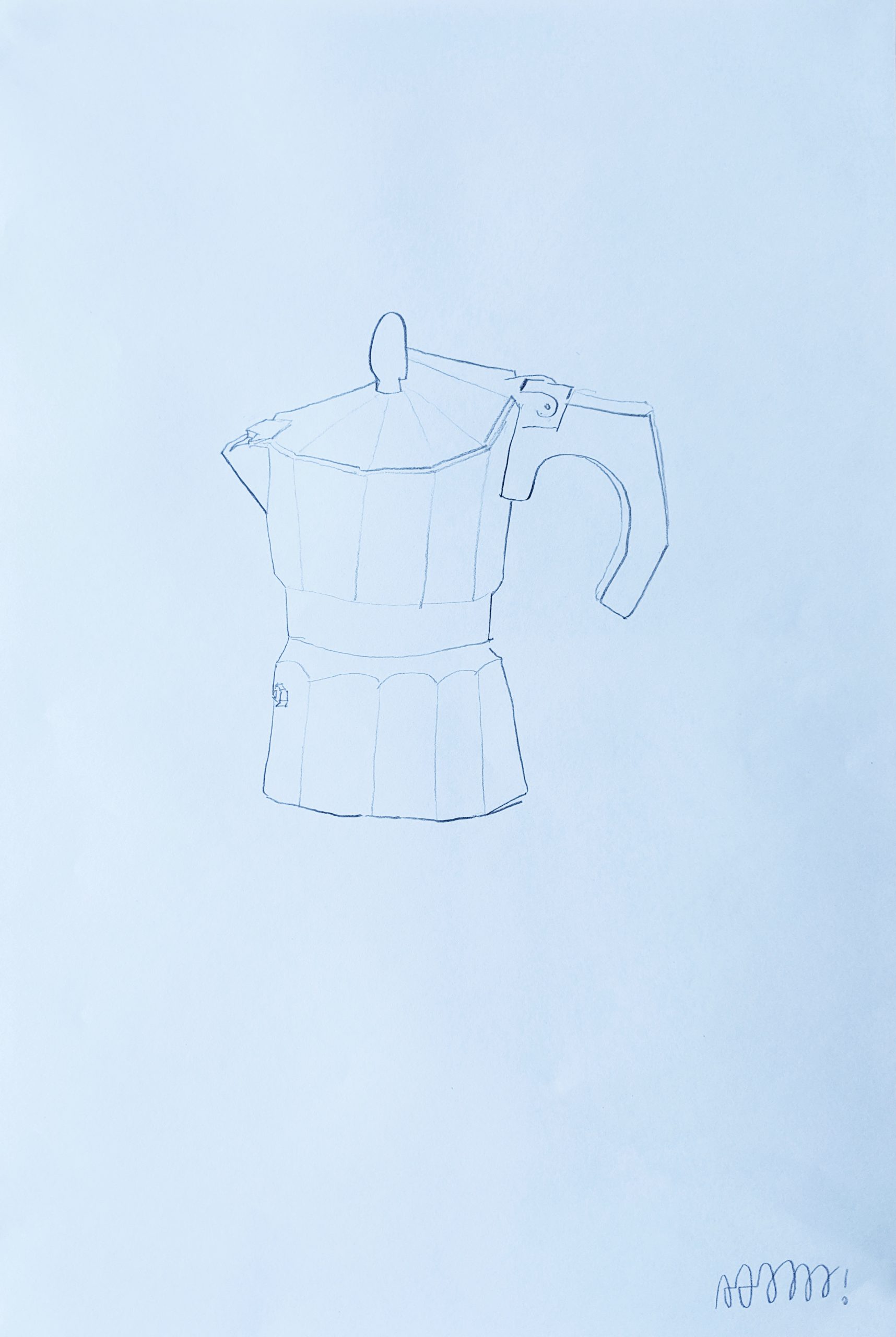
I really like that each of your drawings are so different and yet you are drawing the same subject! That really shows how much personality you are creating in your drawings with one still life. I can see that you are observing closely the form and the lights and darks of the moka pot. I really like the drawings that explore the different shades of the object, including the fourth, sixth, and seventh drawings. The representation of depth and the spatial orientation of the moka pot in these drawings is very strong. I also really like the variation in line weight you used in the first drawing using ink. This conveys the form of the moka pot successfully. I think it might be interesting to try adding some slight background context to your drawings – maybe lines to represent the counter/table the moka pot rests on or the lines on the wall behind. I look forward to seeing more of these drawings!


This week I experimented more with using graphite, as well as vine charcoal. I also tried using ink wash on thicker paper, which was very successful for a first attempt and a technique I’d like to drive further. This week, my goals were to continue learning about abstraction with line, via my quick brush and ink drawings, as well as trying to nail down some tighter proportion, seen with the more detailed graphite drawings. I started thinking more about planes and values of planes, which I would like to continue thinking about.
Hi Adam,
You produced a lot of drawings this week! I agree with you that the ink experimentation on heavier paper was successful and worth developing further.
The drawing I am most drawn to is the last one you posted. I think there is something really interesting about your combination of light and dark washes that makes the form of the Moka pot really come off the page. I also think it does a nice job of communicating the texture of the surface (it looks convincingly metallic to me). My favorite “moment” is the way the darkest line under the handle plays with the other marks you made with lighter washes. I also like the boldness of using very few lines to describe the top of the pot in this drawing.
It seems like the repetition of drawing this Moka pot is paying off, especially in your 4th and 6th drawings using pencil.
One thing that you might want to consider more is shadow. Since the form of the pot is central to your project, I think adding a shadow that can tell us even more about the form of the pot could add value. I can see you already are doing this with some of your pieces.
Adam!
So much of what I wanted to say Claire already said. In short: I also admire your experimentation and also feel most drawn to the last ink-wash piece. Stunning work. Really really awesome.
Again following Claire’s lead, I too am curious about the next iteration of drawings and think that playing more with light/shadow could be an interesting path to pursue. I like the pot on its own, and I also like it in space/atmosphere/light. It is evident that have already spent a good deal of time exploring the pot itself given your continued variation of material, line weight, and abstraction. Personally, I think this upcoming week could be a good time to develop the pot in context, like in your fifth drawing (which is sick).
One specific idea that comes to mind is depicting the pot in near darkness. Your marks thus far have all focused on the pot itself, and I think it could be cool to explore ways to draw the pot without actually drawing it, using shadow and environment to provide shape and form. Similar to the Tom + Frame drawings.
Looking forward to whatever comes next.
Jack
Hello Adam!
You are really working hard on those drawings!
In general, I think all of your drawings have their own specialties. I am especially drawn to the brush and ink ones. The first three drawings convey a cool sense of abstraction with your concise use of lines (and for some reason, they remind me of calligraphy-style graphic design works). I love the the slightly jagged lines in the second drawing, done with dip pen and ink.
I consider the last drawing the strongest drawing that you did from your series. There were not a lot of depiction lines, yet the form the pot appears from the drawing paper. The light and dark semi-transparent wash portrays the shiny texture of the pot well. Don’t know if you did this intentionally–the shadow of the pot could also be seen as brushes of slight wash under the pot.
Since you want to focus on planes, I have a suggestion (that might be a little crazy!). You can either add a simple environment to the pot, or simply fill the page with the form of pot (observe it and draw it closely). This way, the details on the pot became a ‘landscape’, and the different bulges (for example, the handle) became changes on the ‘landscape’.
Looking forward to your work next week!
Hi Adam,
My family is obsessed with coffee so these pots are warm and familiar to me – I’m glad you chose this as something to focus on. I really love your drawing with the white acrylic paint and pencil and vine charcoal. The multimedia aspect is interesting and even though I never would have thought of doing this, it is my favorite one. I would be interested to see some explorations of the metal of the pot. The shininess is something to play with. I love the collection, and it will be fun to see the whole progression. Good job!!
Hi Adam!
I really like that each of your drawings are so different and yet you are drawing the same subject! That really shows how much personality you are creating in your drawings with one still life. I can see that you are observing closely the form and the lights and darks of the moka pot. I really like the drawings that explore the different shades of the object, including the fourth, sixth, and seventh drawings. The representation of depth and the spatial orientation of the moka pot in these drawings is very strong. I also really like the variation in line weight you used in the first drawing using ink. This conveys the form of the moka pot successfully. I think it might be interesting to try adding some slight background context to your drawings – maybe lines to represent the counter/table the moka pot rests on or the lines on the wall behind. I look forward to seeing more of these drawings!