I spend the first few days drawing to get to grips on the medium and the mindset of a perspective drawing. I started with studies of architects’ sketches and drawings, trying to learn how perspective is described, and how line quality helps deliver the depth of field as well as quality and form of the subjects. I then moved on to exercises on trying to describe an image. I started working existing images, for the sake of convenience and accessibility.
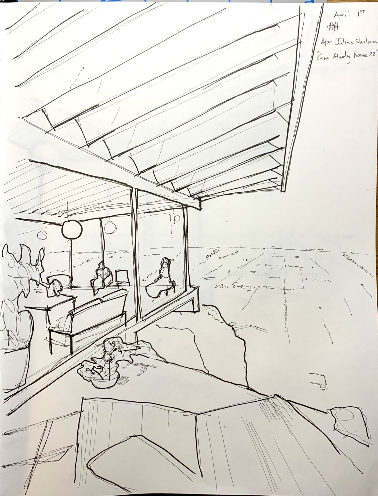
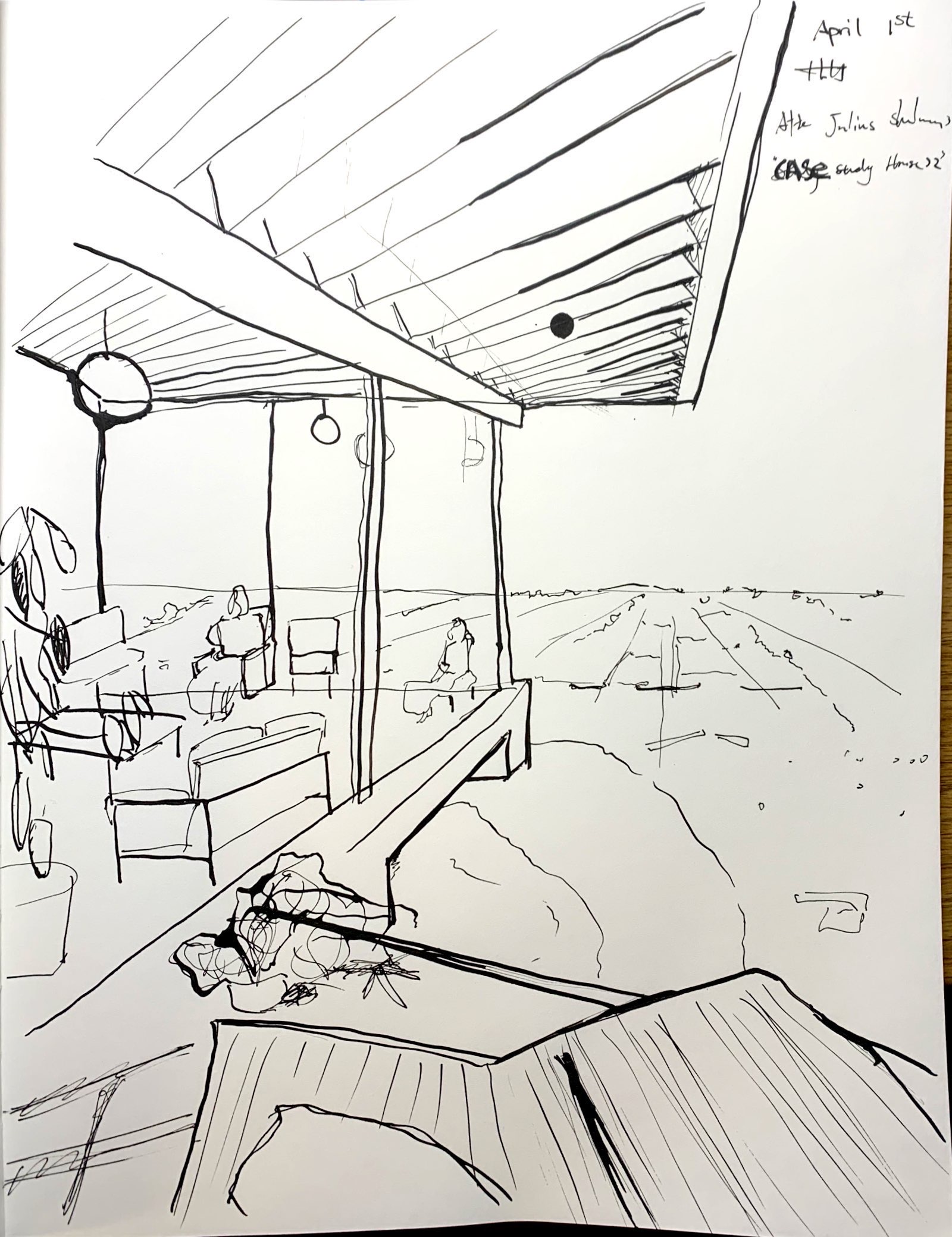
I remembered that Julius Shulman (an architecture photographer) had a photograph of the apparent depth of field and a linear, easy to articulate architecture. This photograph became my starting point of experimentation. I used both micron pens and dipping ink pen. I have to stress how much more satisfying it was to work with pen and ink, given the variety of line quality I’m able to achieve with it.
The next step will be studies of more architect’s drawings as well as making my own drawings from life.
Drawings Are in Chronological Order:
X
X
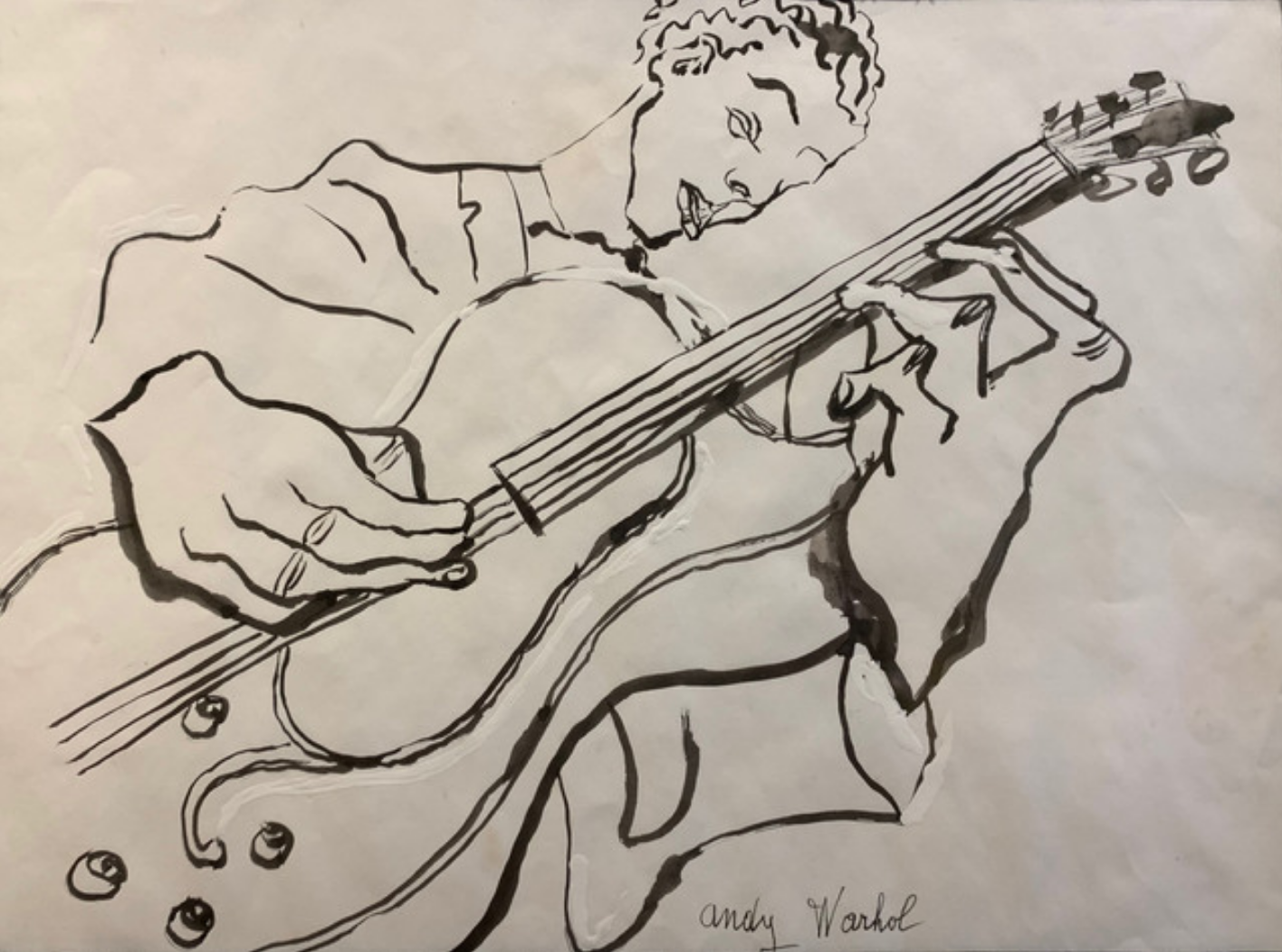
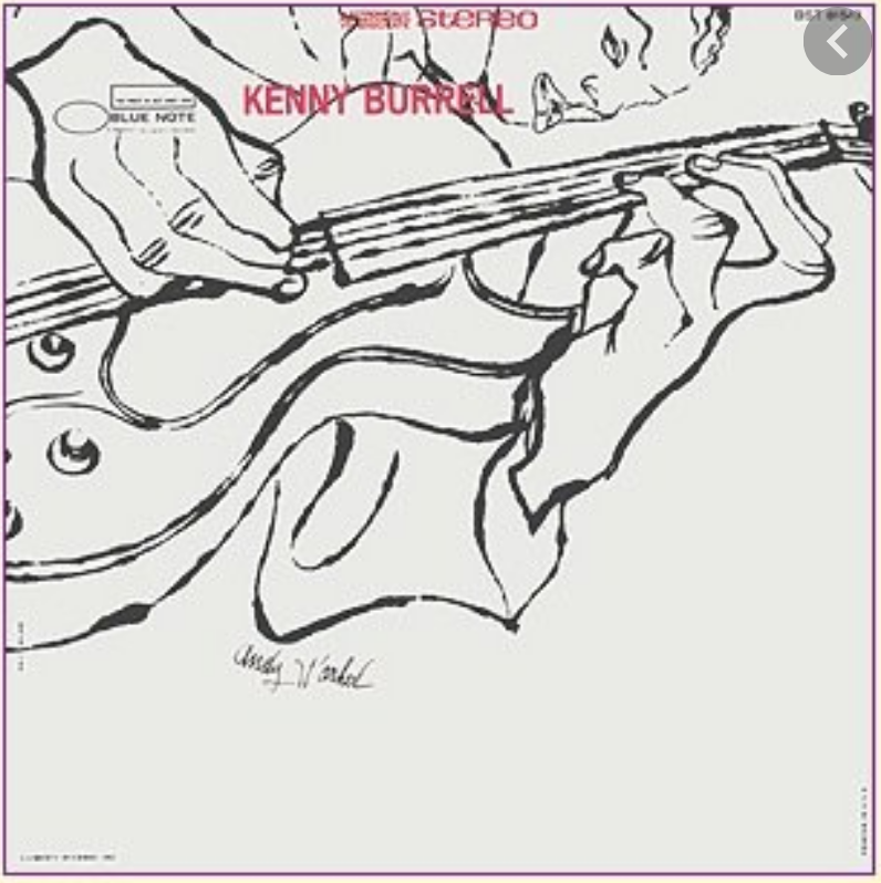 …and how they cropped and rotated it (and moved his signature) for the album cover. Don’t know what he was paid for it originally but it was recently priced at $125,000.
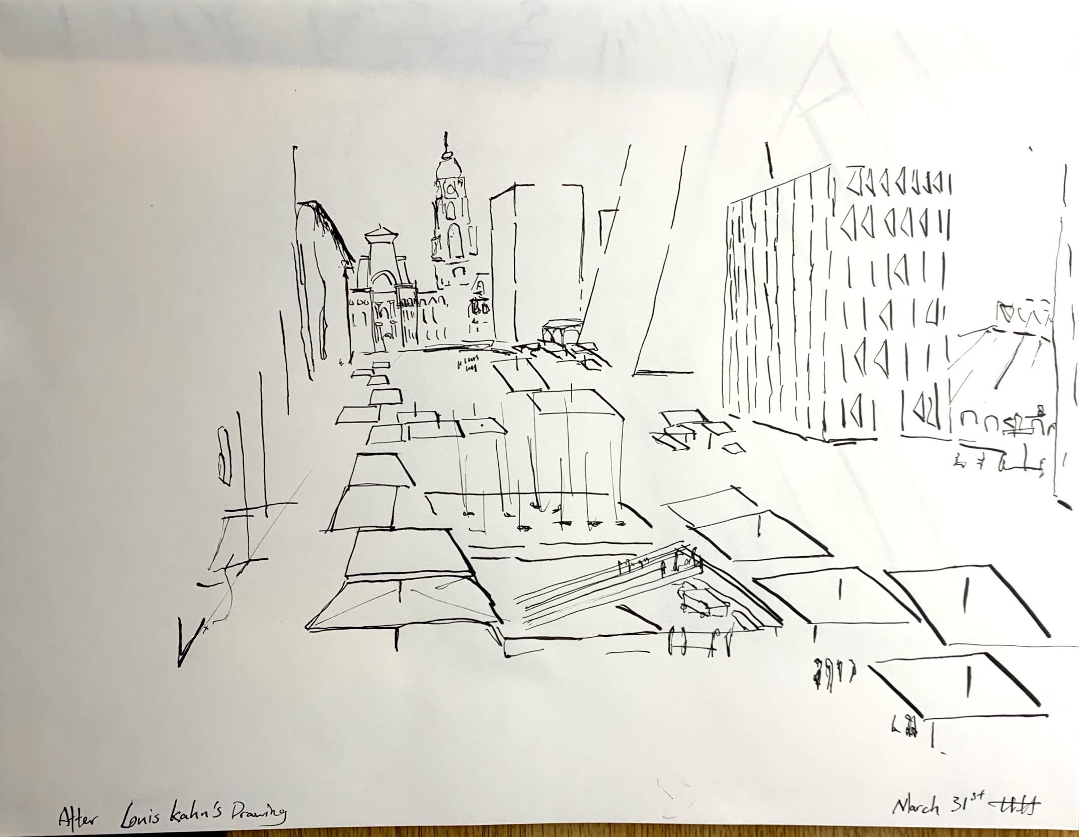
Attached are drawings were copies after Louis Khan and drawings on Julius Shulman’s photograph Case Study House 22 (Stahl House by Pierre Koenig, Hollywood).https://www.moma.org/media/W1siZiIsIjY0OTIiXSxbInAiLCJjb252ZXJ0IiwiLXJlc2l6ZSAyMDAweDIwMDBcdTAwM2UiXV0.jpg?sha=59ea14c058450229
http://blog.dwr.com/wp-content/uploads/2016/03/StahlHouse_Shulman.jpg
April 2nd
I really love these drawings. They are definitely architectural, so I think that since that is what you are going for, you are on the right track. I appreciated the very loose and squiggley forms you use to suggest people, plants, water etc because they provide a contrast to the straight lines used for the building and to create perspective. I think the micron pen vs the ink is interesting because they achieve different feelings. The micron pen one for me feels more like a draft of an architecture plan, while the ink feel more like a work of art in itself. The line weight of the eves really makes the second two drawings. Not sure what I would change, other than experimenting with how fast you draw. Maybe try some that are much more rough and fast, and then some that are more slow and exact. Great job!
Harry
Regarding your drawing after Kahn, you have done a good job of capturing the essence of the original. You do a good job of recreating the lively interplay of older and modern forms in space on a large scale. Your varying line weight helps give a sense of depth and energy to the drawing’s geometric shapes. One thing to keep in mind is to not get overly loose when drawing more expressively. Your ground panes in the bottom right don’t align with the vanishing point and start to “float” of the base plane. I make this mistakes like this all the time. It’s hard to to stay disciplined to the vanishing point/perspective meanwhile making lively and abbreviated marks.
The other drawings have no perspective issues whatsoever. Clean and convincing. Both provide a good sense of open space. Like Perrin, I also like the different feelings of the micron and the dipping ink pen. One showcases structure while the other articulates a vision + idea. On both, I admire the background landscape that can be seen over the rocks and through the windows. Great notations of depth, scale, and variety.
Moving forward, I’d keep in mind the different expressive characteristics of the pens. I would love to see you get more structural with the micron and more expressive with the dipping ink pen. Excited to see what comes next.
Hi Harry,
Great place to start, working from 2D sources to get your bearings with perspective, but in the process you’ve also done a good job exploring line quality, which is especially rich and lively in the Kahn study and the second Shulman image. Maybe not a bad idea to work from other architectural photos and drawings for another week.
In the first Shulman drawing the re-doubling of lines lessens their vibrancy. They become a bit more labored. Lines can be redoubled but that generally works better at a faster tempo (more sketchy and expressionistic–see drawings by Kirchner or John Marin). Interesting that both Perrin and Jack talk about the speed of your lines.
Note how the lines of the sofa in the first version look labored and awkward, but in the second drawing look much livelier, with better use of line weight and your “attack” with the pen/s.
That glimpse of the cliff, on the other hand, works better in the first version (although I would reverse the heavier and lighter line weight to represent near/far). In the second one they’re too nondescript, like bushes or maybe piles of laundry.
Meanwhile the line weights in the second Shulman drawing work beautifully. Probably not intended but they recall the line quality of drawings from the same vintage as the house (1950’s). See the example I added at the end of your images.
LOVE the plant life in the second one.
You have some very good thoughts from both Perrin and Jack that don’t bear repeating, especially about your handling of perspective, which I would second (third?).
Also–on the Add Media page, be sure to scroll all the way down in the box on the right and activate “Media File” under “Attachment Display Settings,” so that we can enlarge your drawings with a click (can’t believe I can actually teach you something about digital technology for a change…which I learned about 5 days ago….).
Great start–looking forward to the next iterations.