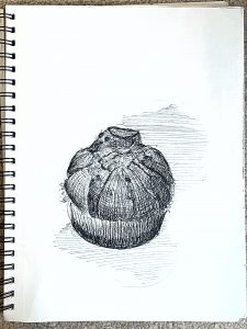
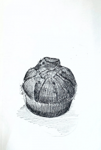
I noticed your hatching style, which I love overall, works much better on the garlic and the pears than on the muffin (which looks a little like a giant garlic). That’s because hatching isn’t one size fits all (actually it can be, if you’re Morandi, but even he was careful to chose objects with smoother planes). The muffin is getting lost in there somehow. Consider changing up to different, more textural hatching:
I also snuck in a suggestion here to make your hatching on the table more studied and purposeful. Note how those horizontal lines really hug that plane, rather than moving it, as in yours. Also using a more broken line to make the light flicker.
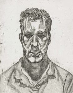
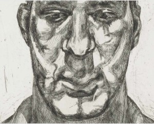
Study the all time great hatchers: Rembrandt, Goya, Whistler, Picasso, Morandi, Robert Crumb, and Freud, shown here:
Click to enlarge, look and learn:
Consider also minimizing the background “noise,” as I’ve done to yours here:
And then give more thought to composition (with either a drawn border or an X-Acto).
This is a great page, but needs better photography:
X (but with a better exposure)
X
Love the quixotic and wistful relationship between the garlic and the outlet (a children’s book waiting to happen), but these are weirdly composed and don’t go far enough:
Just a little more TLC in editing would make this so much better. Crop out the noise around the border and move the Saturation slider all the way to the left to eliminate the incidental color.
micron and prismacolor markers, 9 x 12
X
Note how it becomes so much more unified and coherent. I wasn’t even sure I liked this one, but now I do–a lot. Great contrast in the hatching for onion skin (perfect pairing) and the background hatching. Great composition as well–

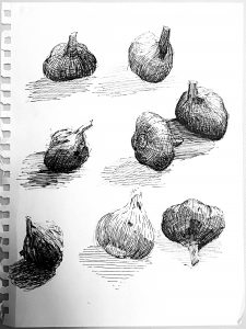
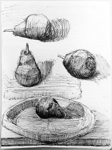
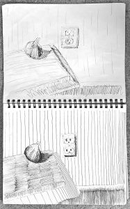
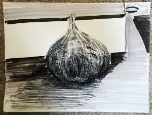
This week I experimented with differences in hatching styles and started thinking about making full, finished compositions.
My hatching experiments were what I enjoyed most this week. I tried to hone the “rules” or style of mark making, knowing that the big finish is on the approach. I had a lot of fun exploring different marks on the garlic. I was trying different variations of tight and loose contour hatching, line/shadow hatching, and scribble hatching. I’m most pleased with the two garlics that are near each other in the middle row near the right side of the page. I also like pear with its shadows done in all vertical lines with varying “layers” of value.
I was tempted to try a looser hatching style (re: muffin, two garlics, two to three of the pears, and the big garlic) after seeing Mark’s lesson on value that he sent to Drawing I. I liked the idea of how that style is less painstaking than the hatching style where all of the marks are regular and hug the form. I’m not very pleased with how any of the loosely hatched drawings turned out, though. They’re not loose enough? Or just done too haphazardly? They don’t have enough feeling? Not sure. It all just feels scribbley to me. I think the move for next week is to focus on “organized” hatching.
I also liked the idea of looser hatching since it’s easier to create general value tones over large spaces that way. I was thinking about this with regard to making more complete works, since making sure that all lines are straight, the same size, and equidistant from one another in order to give value to, say, a wall…? Not very fun. Lots of focus for (ideally) a minimal effect.
I had multiple moments of frustration and impatience this week, and you can probably tell. The biggest flop was the garlic and outlet drawing. Major irritation. The loose planning sketch I actually don’t mind–it’s the “finished” product that I dislike. I was experimenting with different ways to convey value with hatching, looking to some of Mark’s suggested works for inspiration. What happened was this: I would try one idea to convey value (starting with the side of the book), dislike like the appearance of the marks or how long it took to make them, then decide to try something else. Nothing worked. The end result is a weird mashup, hatching mania. Looks lame and/or dumb, I think.
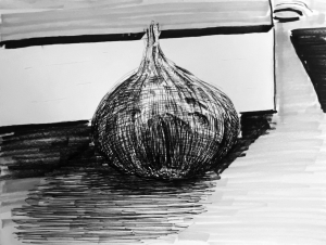
Finished the week with the zoomed garlic leaning on an encyclopedia on my desk. Better than the outlet drawing but too loose. I think close-up drawings, as Mark suggested, are the way to go moving forward. I cheated for value with this one and used some markers to get the idea across. At this point, I was experimenting more with composition than content and looks. Didn’t want to waste time and effort on a hatching scheme that might not pan out in the end.
Tricky week, not my favorite. Would love to hear input on potential compositions or ways to convey value effectively and strategically (aka not painstakingly tedious, but maybe that’s just how hatching works).
Hope you all have a lovely weekend and find some way to celebrate Ivies in light of the circumstances,
Jack
Hi Jack,
Nice work. Sometimes frustrating drawing weeks can point you towards work that flows better. I think you produced great drawings this week, and opened up even greater possibilities for next week.
I agree with others that your chocolate chip muffin from last week was incredibly strong. This week, my favorites are the two garlics that you mentioned (middle row of the “garlic study”). The lines are simple, descriptive, and really convey the texture of garlic. I think you are right in thinking they are good candidates for your final.
My overall favorite is the pear in the top left corner of your pear study. The loose nature of the hash marks and the way it’s laying completely horizontal give this pear a nice sense of character—I just really like it. My suggestion as you “search for the finale” is to take the most successful drawings you have done so far and apply the decisions you made in framing those objects to your final compositions. The two garlic, the pear, and the lone chocolate chip muffin all have character due to the way you oriented them in space and their scale. Seems like you have really figured out how to hatch, so I would keep the background simple and choose an interesting orientation. The background in your final image is good, but I think the horizontal lines of the box/ledge distract a little from the natural forms of the garlic. The negative space around the object can be just as interesting as the object itself! I’m really excited to see how it all comes together. This is a great project!
Hi Jack!
Your drawings this week are especially soothing to look at, both your choice of subject matter as well as your articulation. I also agree with your pears being the most successful, in terms of how you broke it down and sculpted it in a composite of patches of planes. They very accurately capture the shape of the pears in its particular lighting situation. I can almost tell that they each have a unique personality.
Your garlic drawings do a better job expressing the orientation of the plant’s inherent surface texture. I think some of your best articulations are in the shadowed sides. However, your garlic in the larger compositions could benefit from adopting you approach with the pears. The more carefully constructed planes might be able to settle the garlic more comfortable in a three-dimensional setting.