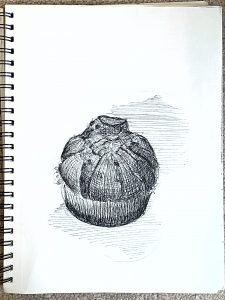
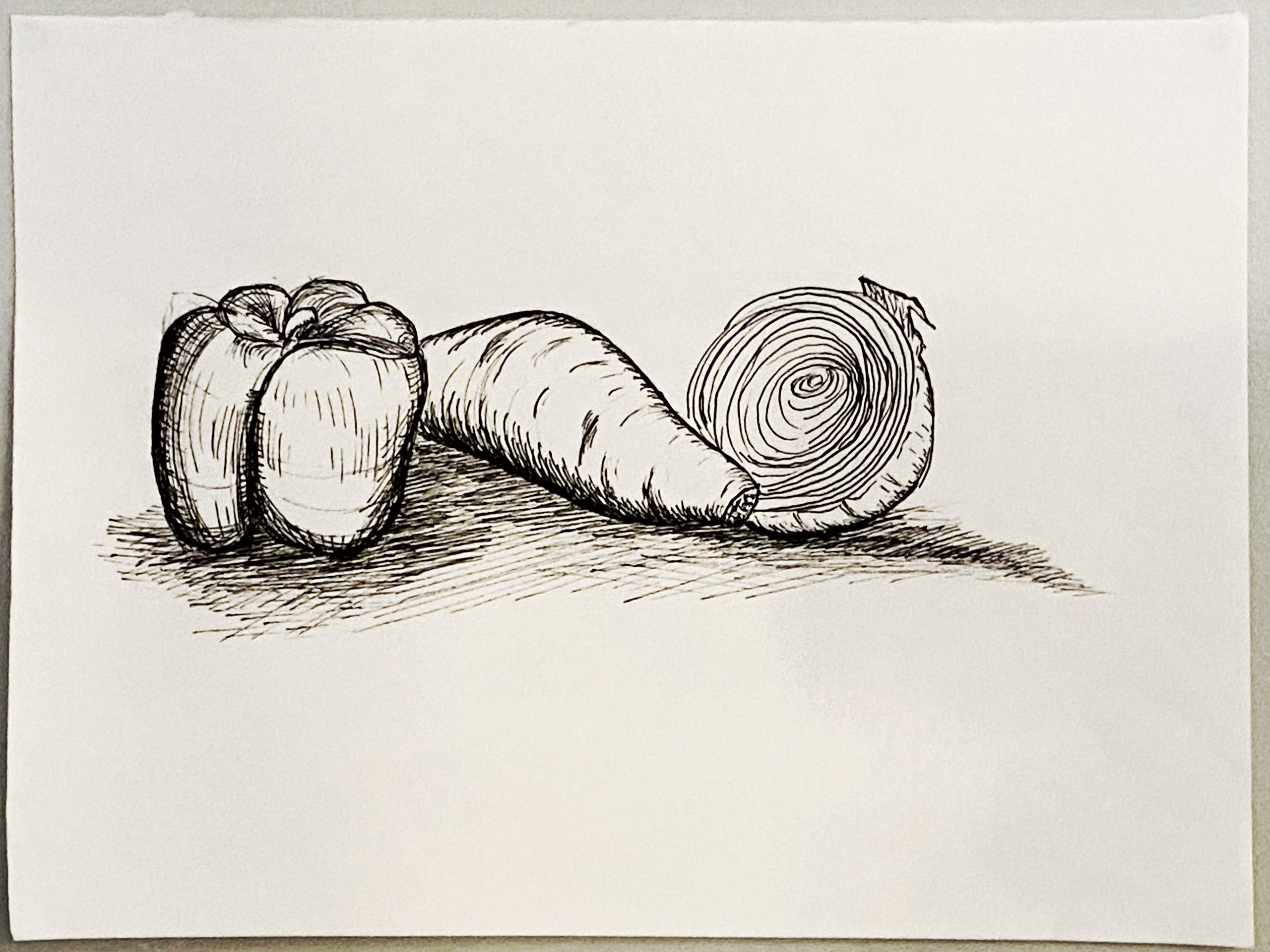
micron pen and paper, 9 x 12
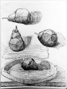
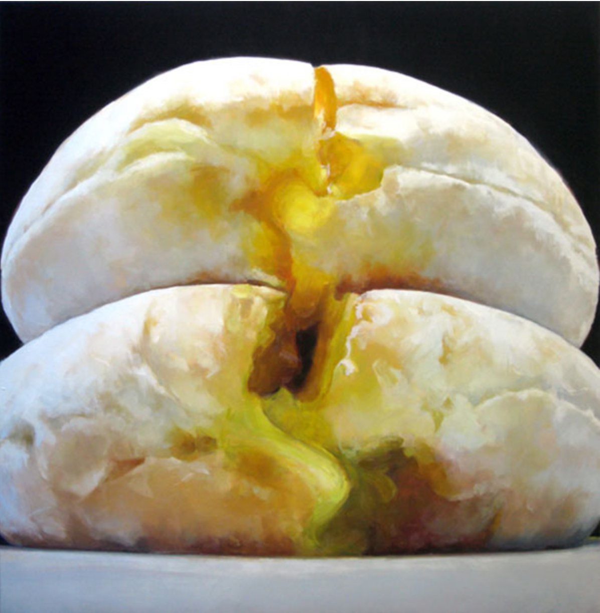
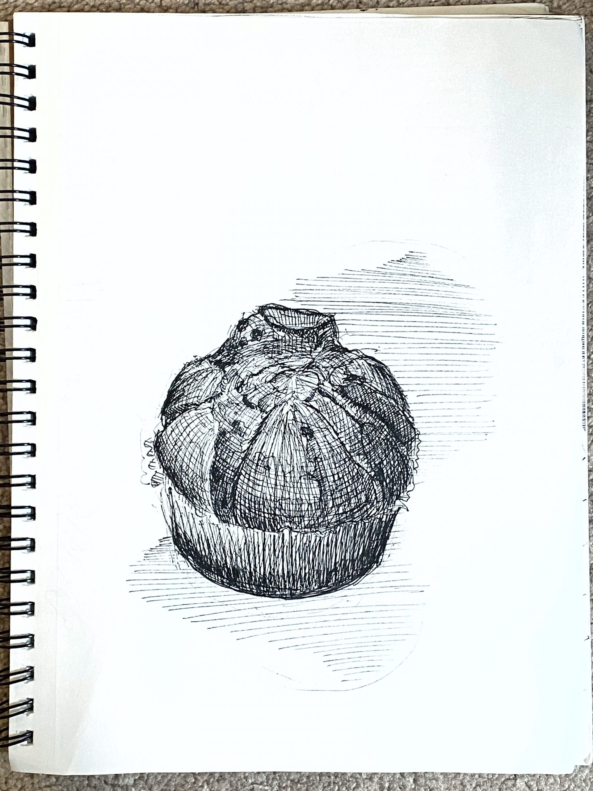
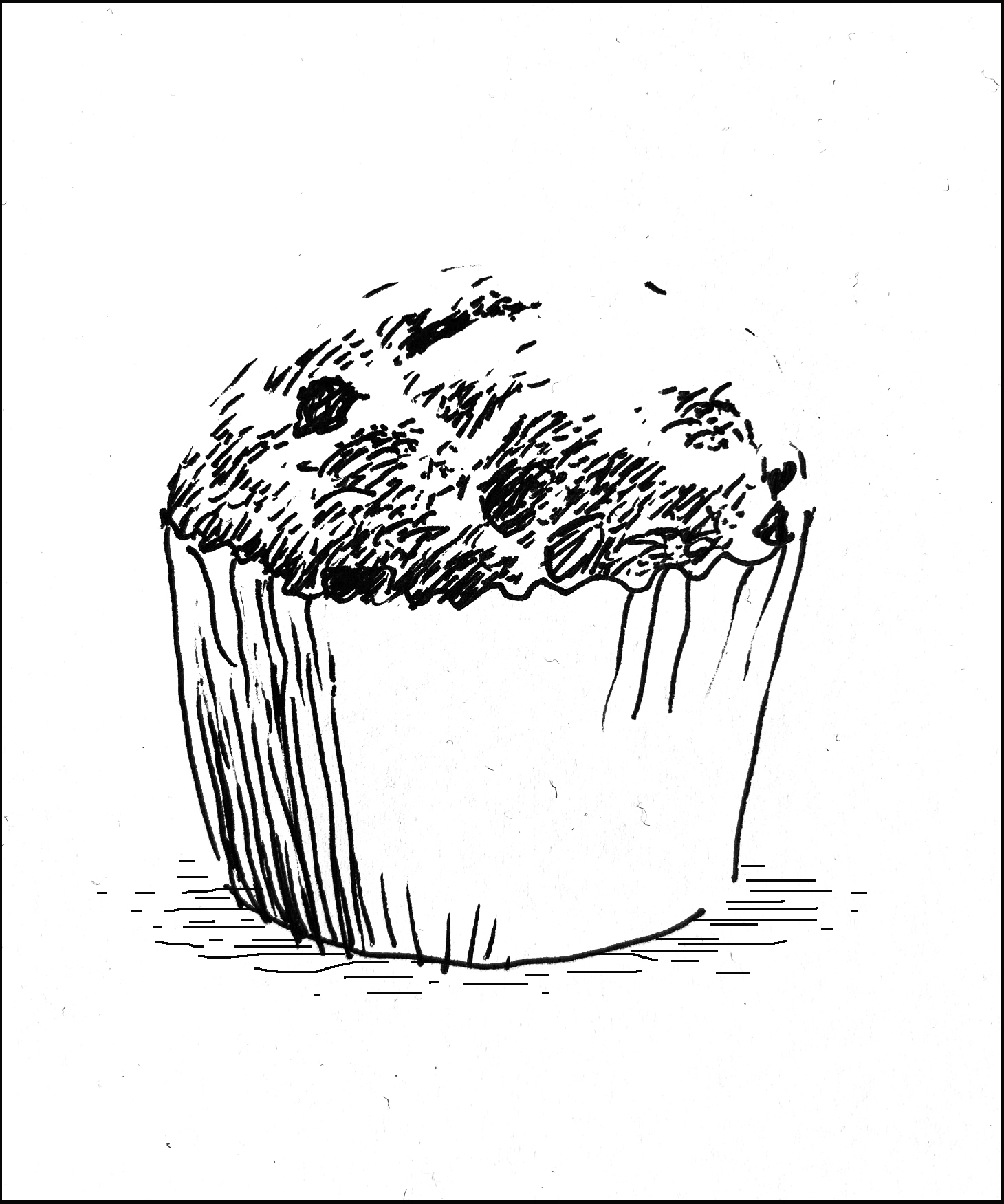
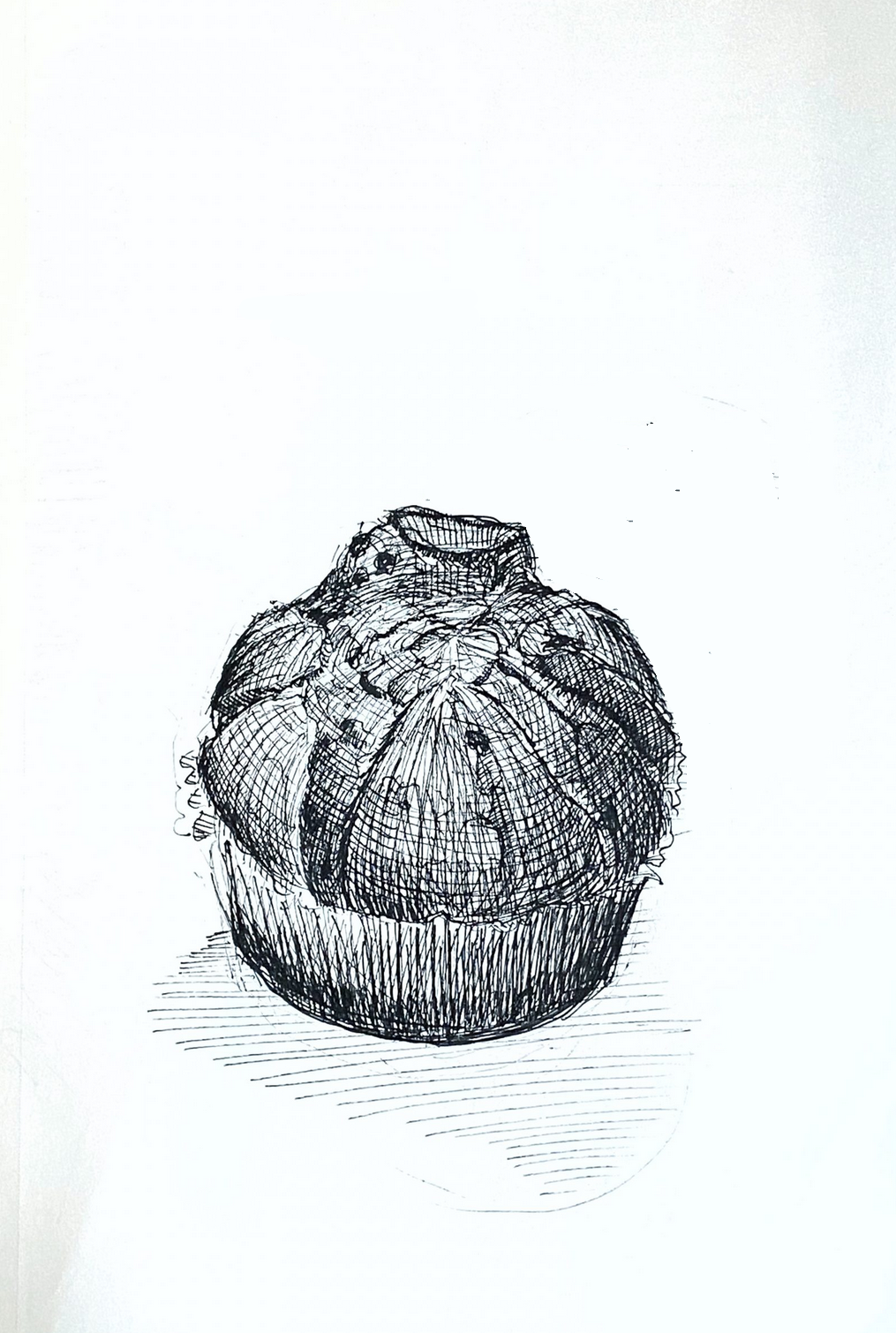
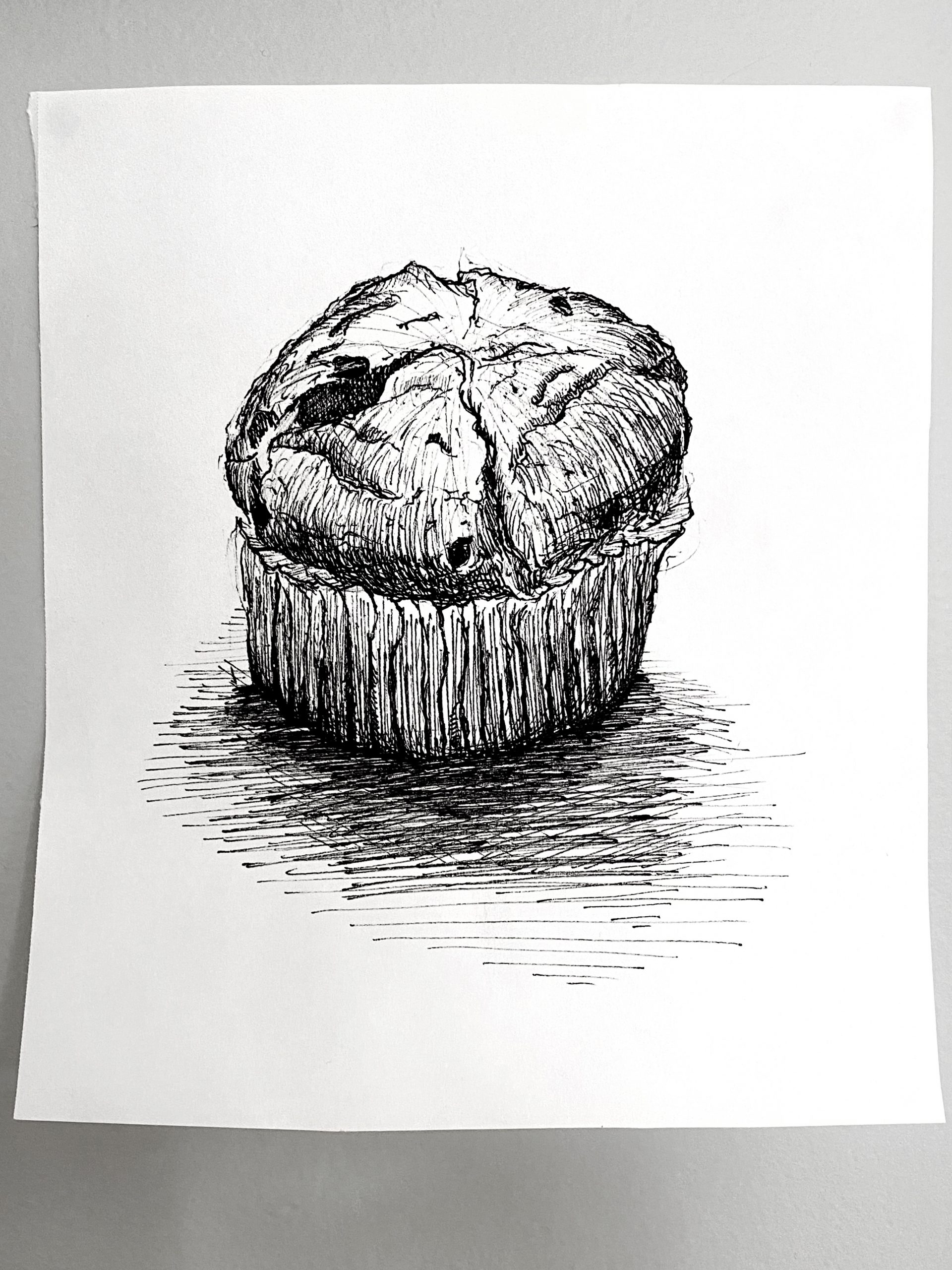
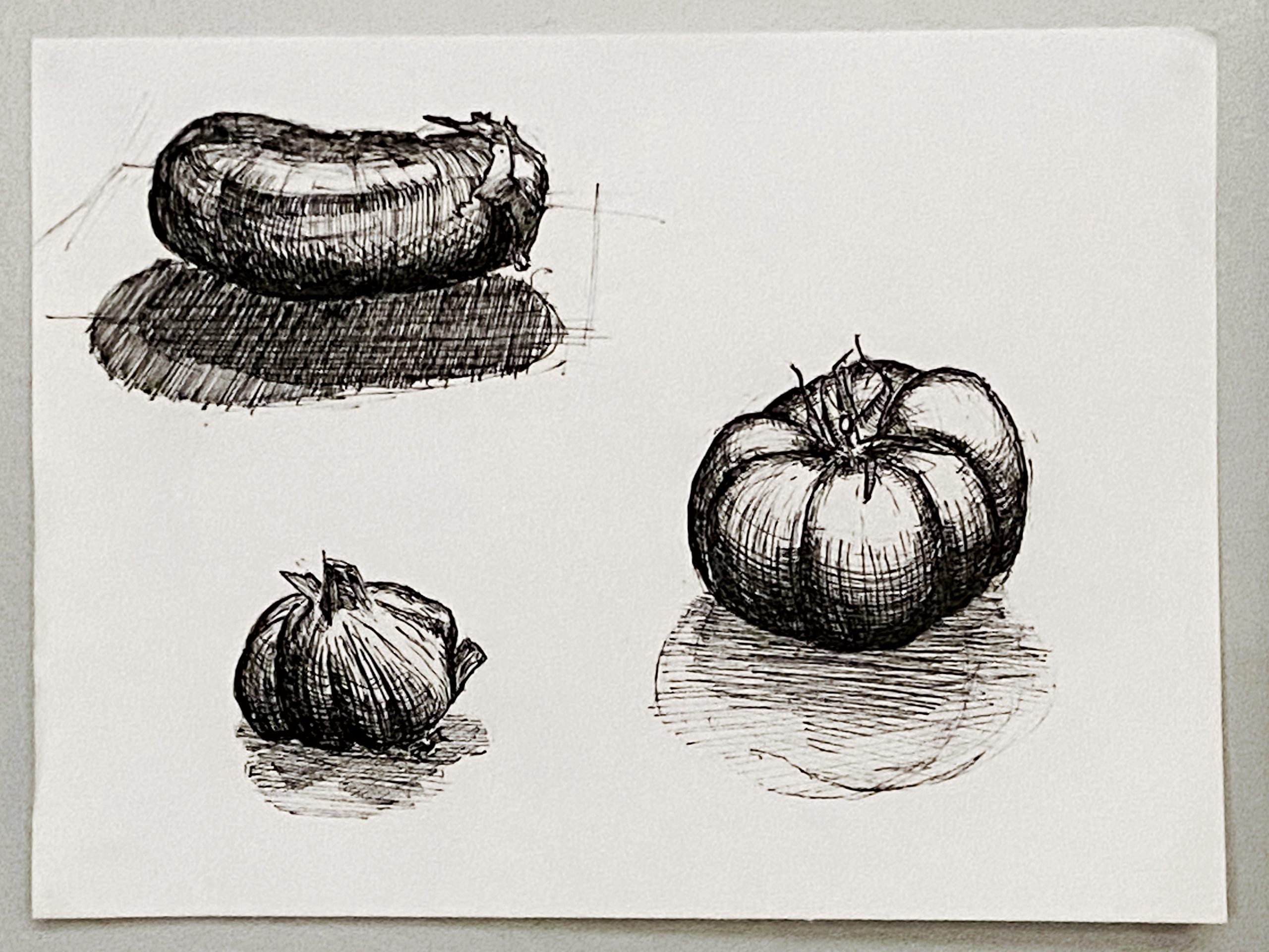
I noticed your hatching style, which I love overall, works much better on the garlic and the pears than on the muffin (which looks a little like a giant garlic). That’s because hatching isn’t one size fits all (actually it can be, if you’re Morandi, but even he was careful to chose objects with smoother planes). The muffin is getting lost in there somehow. Consider changing up to different, more textural hatching:

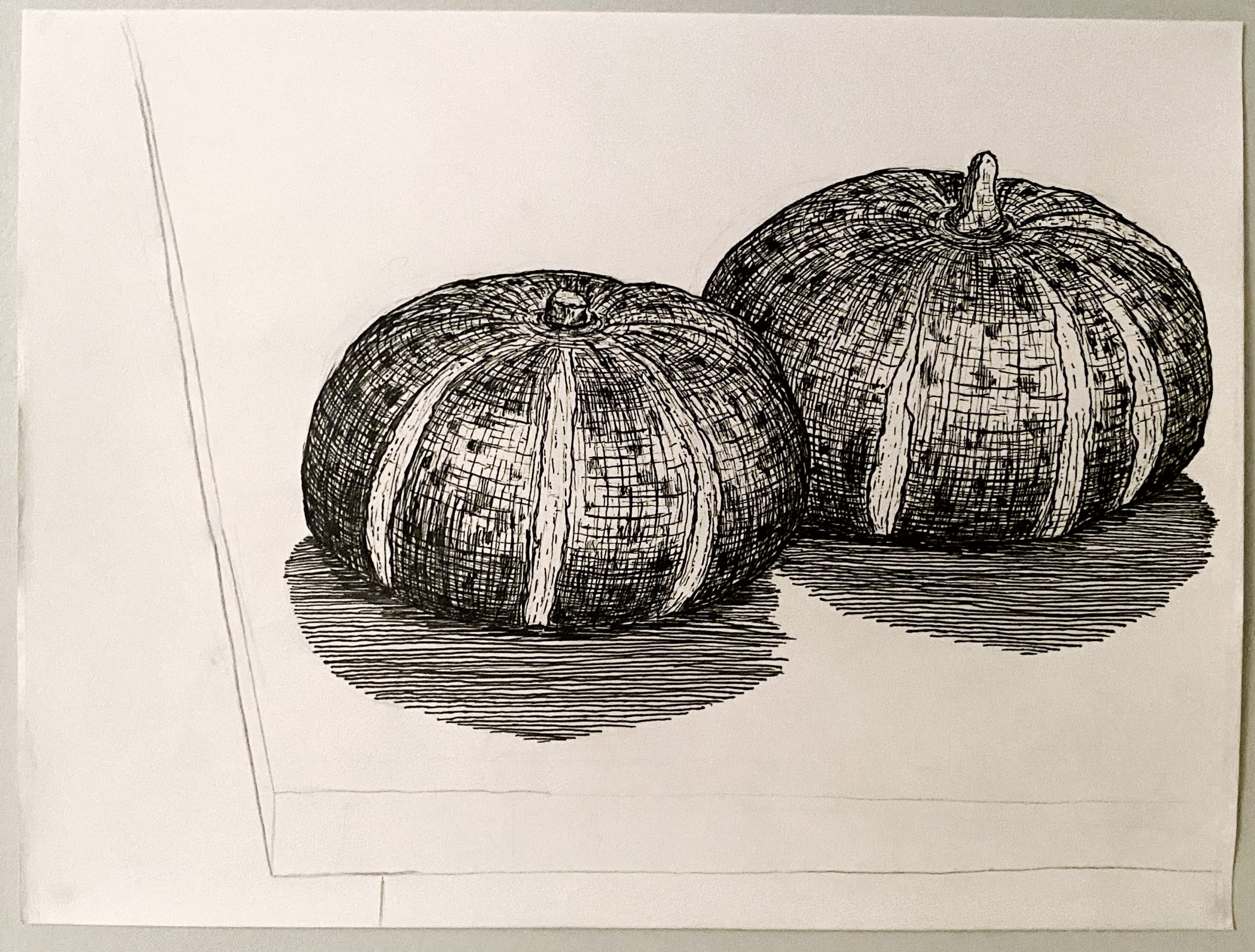
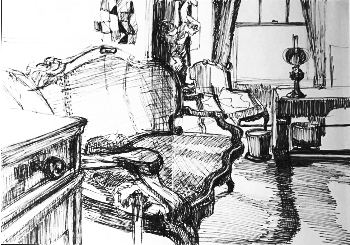
I also snuck in a suggestion here to make your hatching on the table more studied and purposeful. Note how those horizontal lines really hug that plane, rather than moving it, as in yours. Also using a more broken line to make the light flicker.
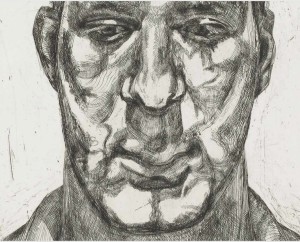
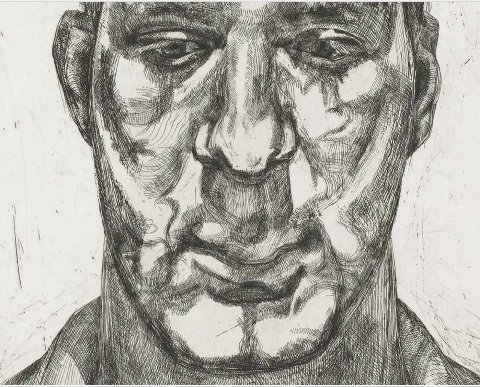
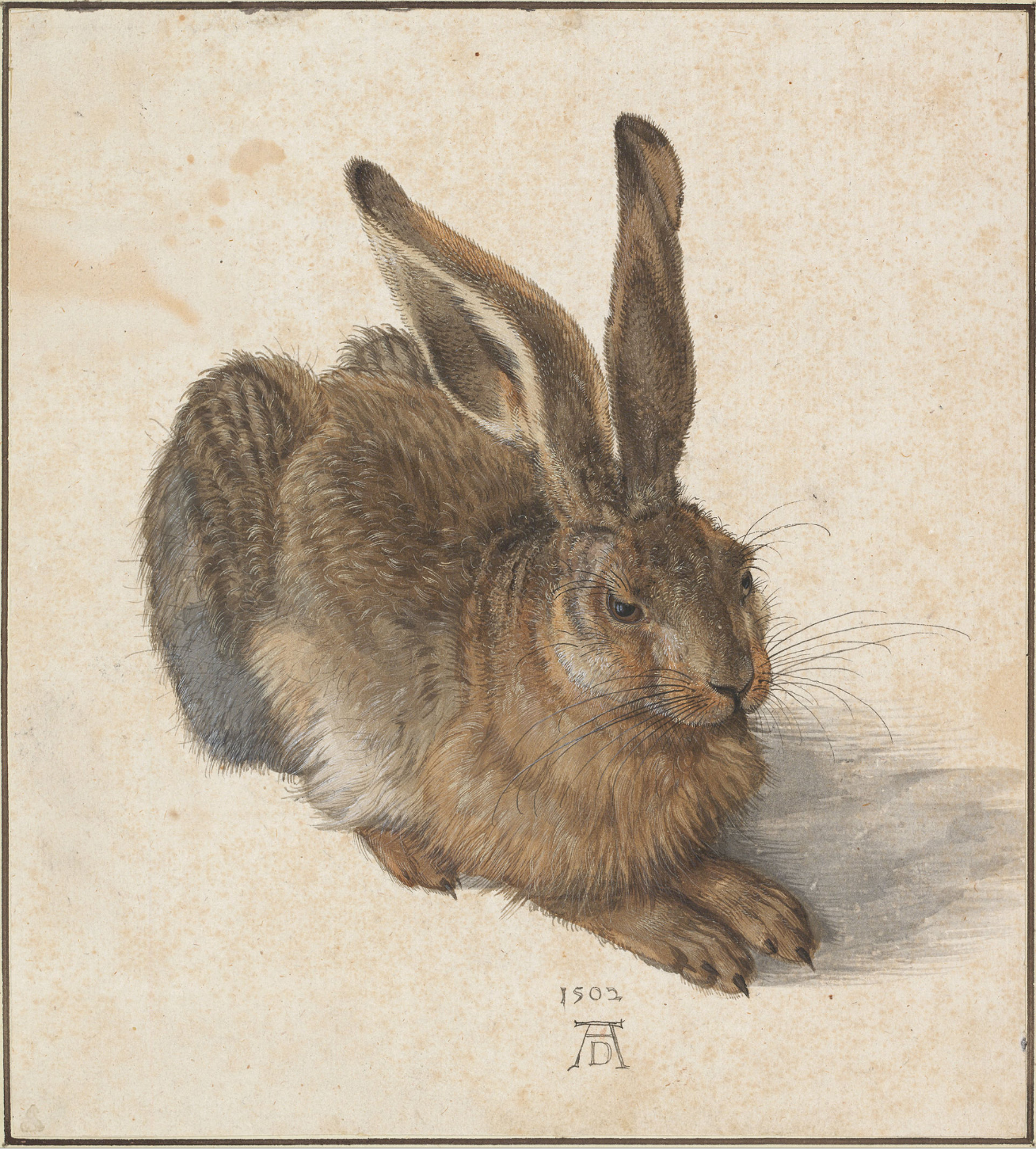
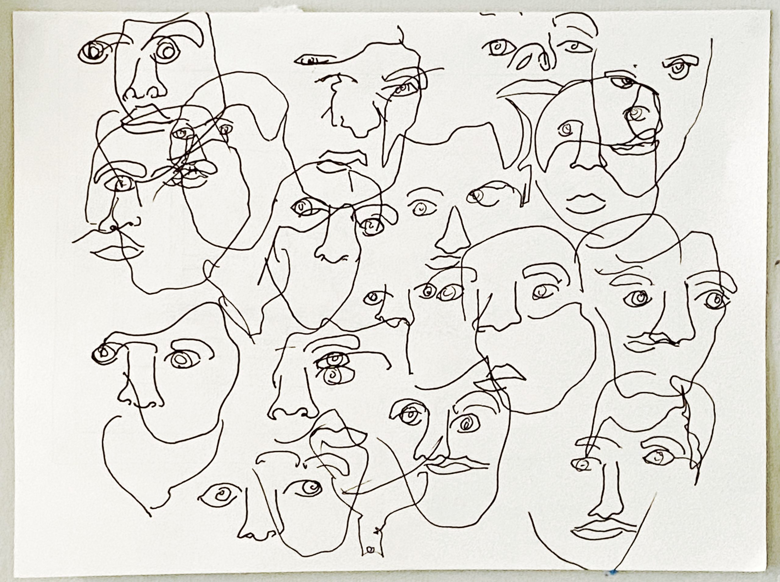
Study the all time great hatchers: Rembrandt, Goya, Whistler, Picasso, Morandi, Robert Crumb, and Freud, shown here:
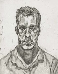
Click to enlarge, look and learn:
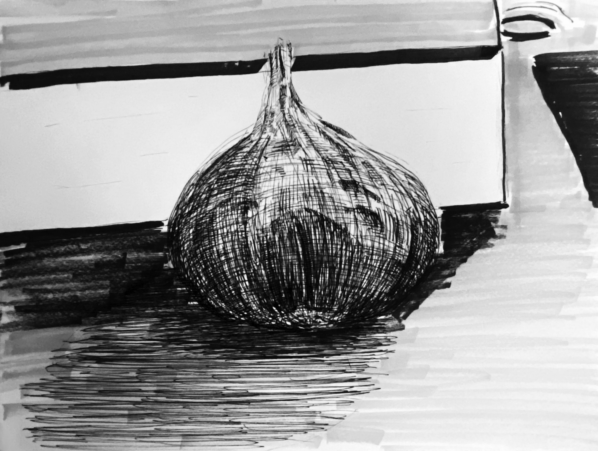
Consider also minimizing the background “noise,” as I’ve done to yours here:

And then give more thought to composition (with either a drawn border or an X-Acto).
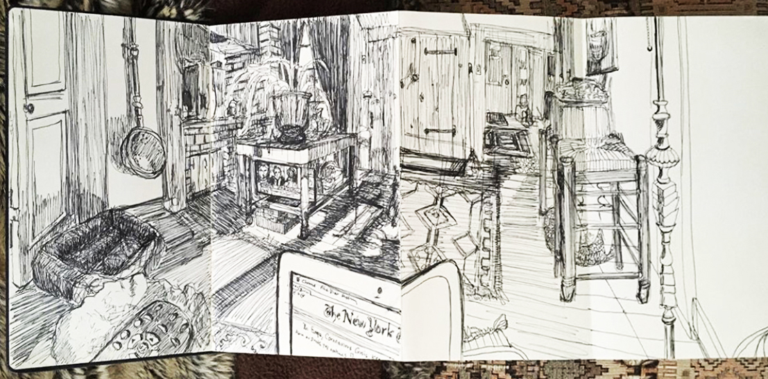
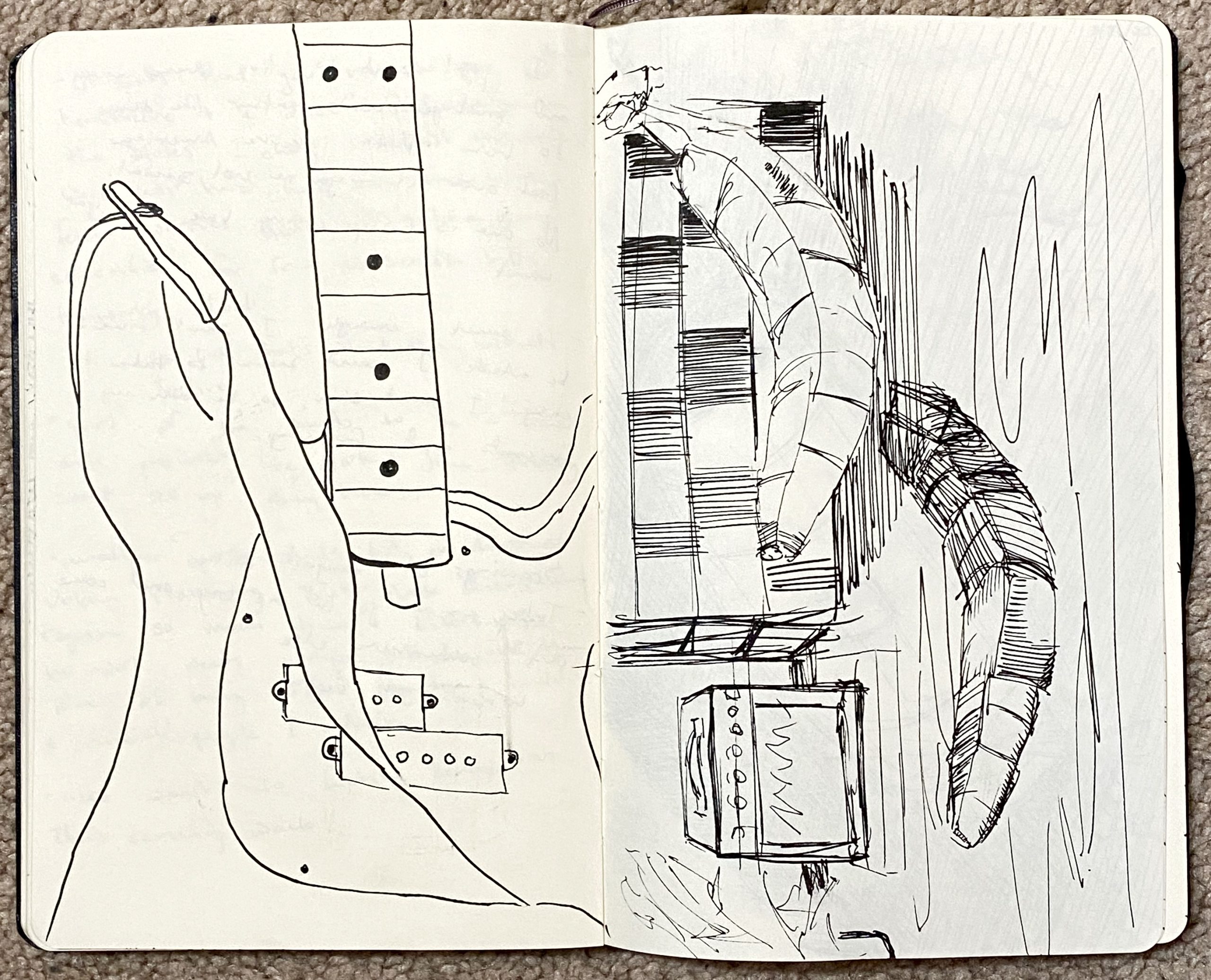
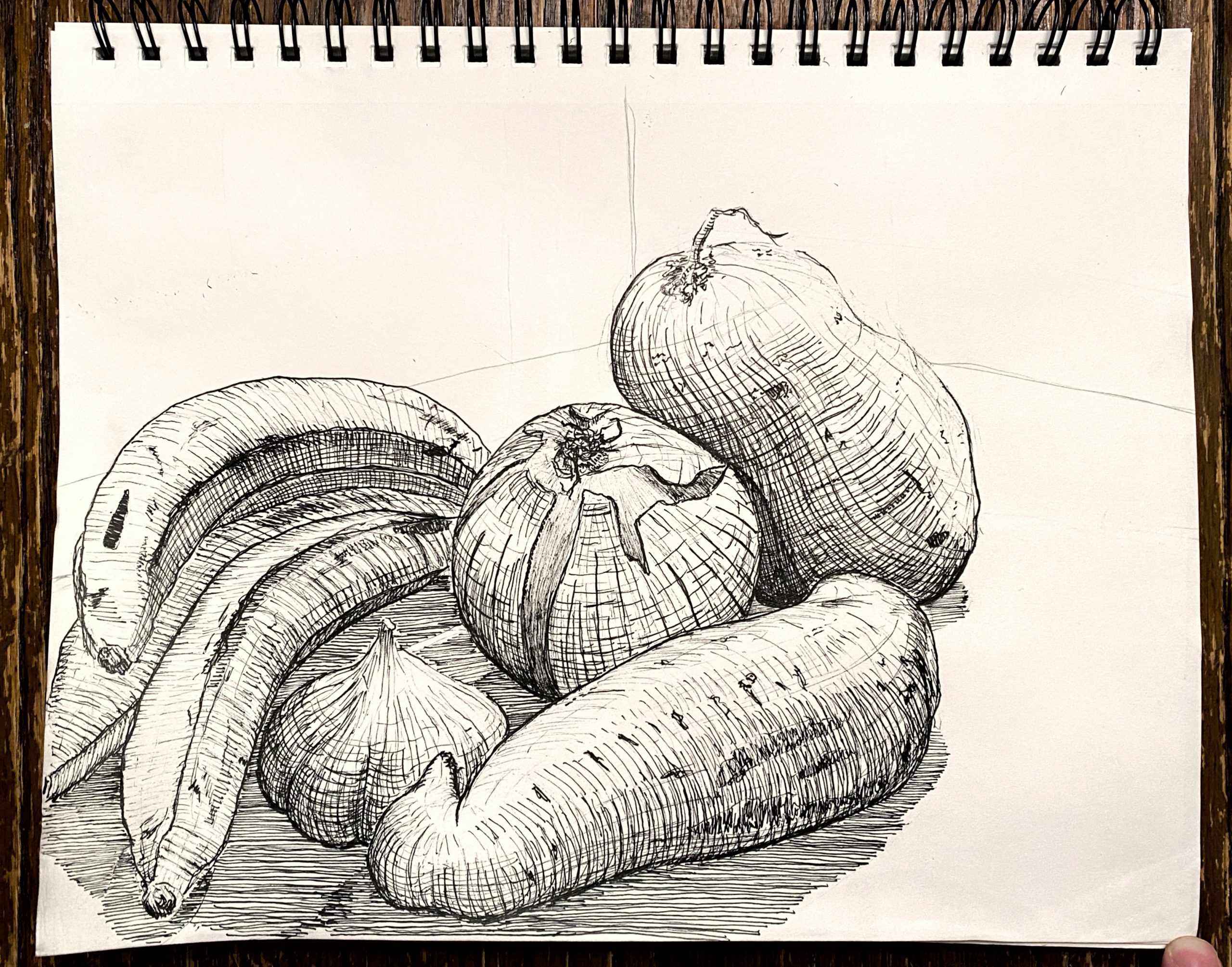
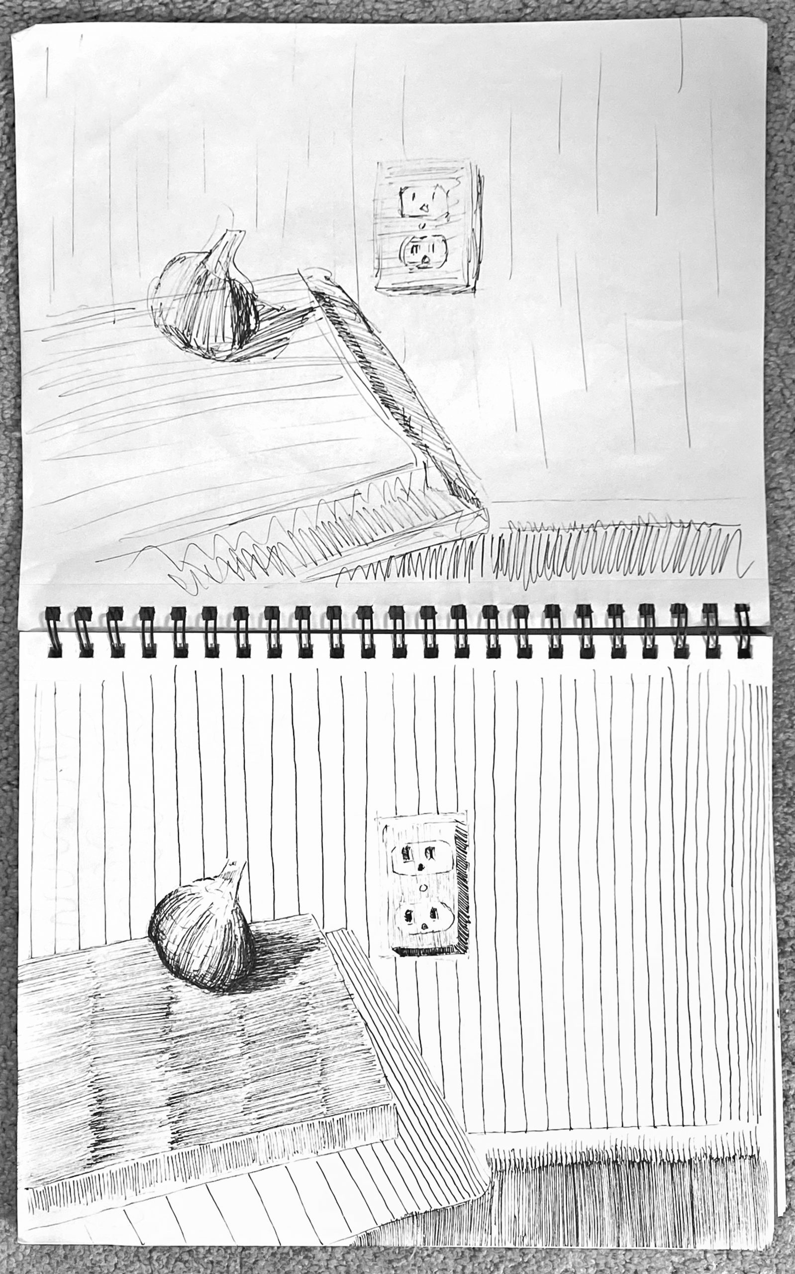
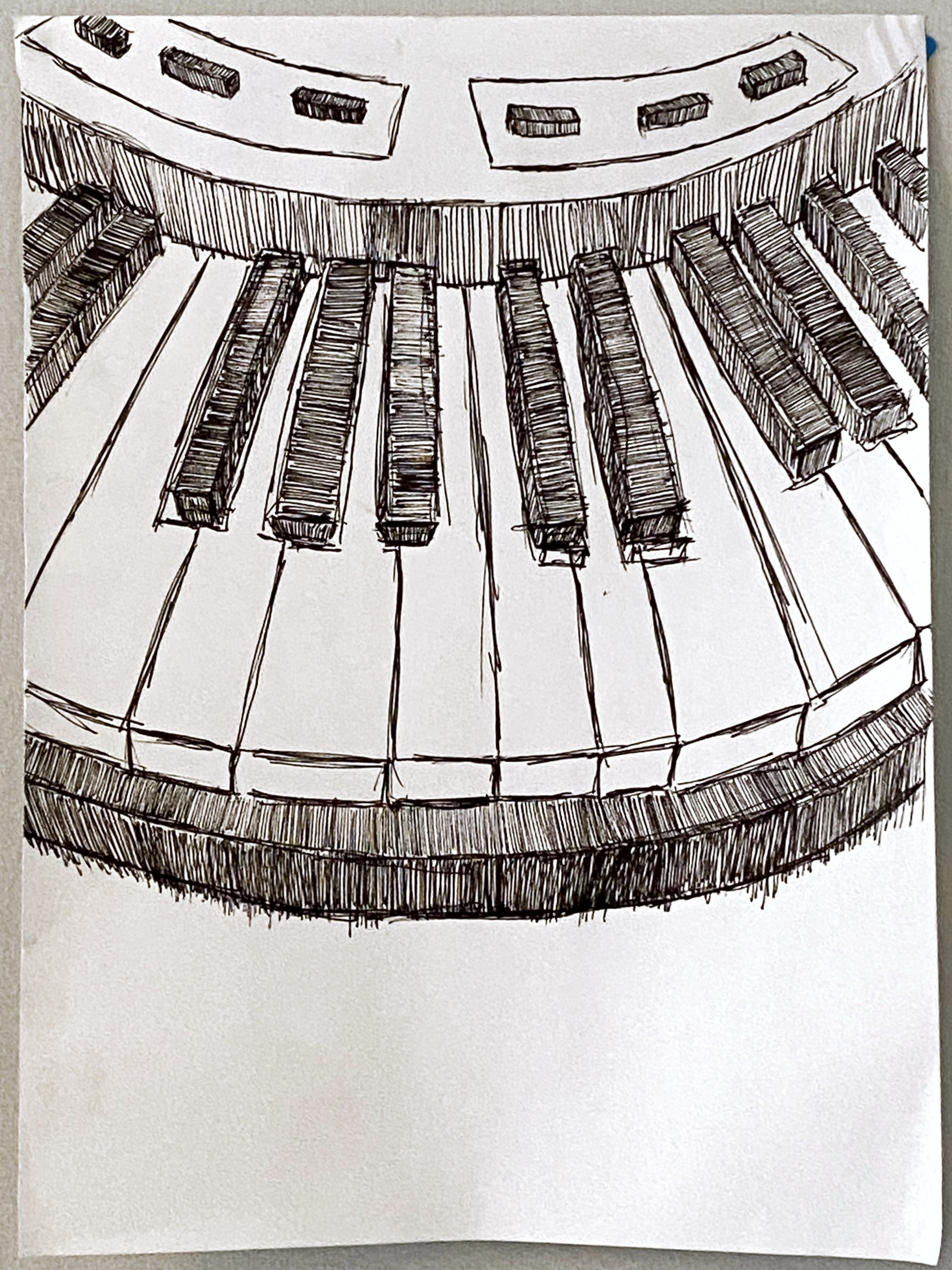
This is a great page, but needs better photography:
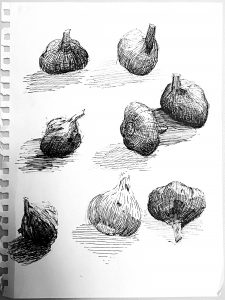
X (but with a better exposure)
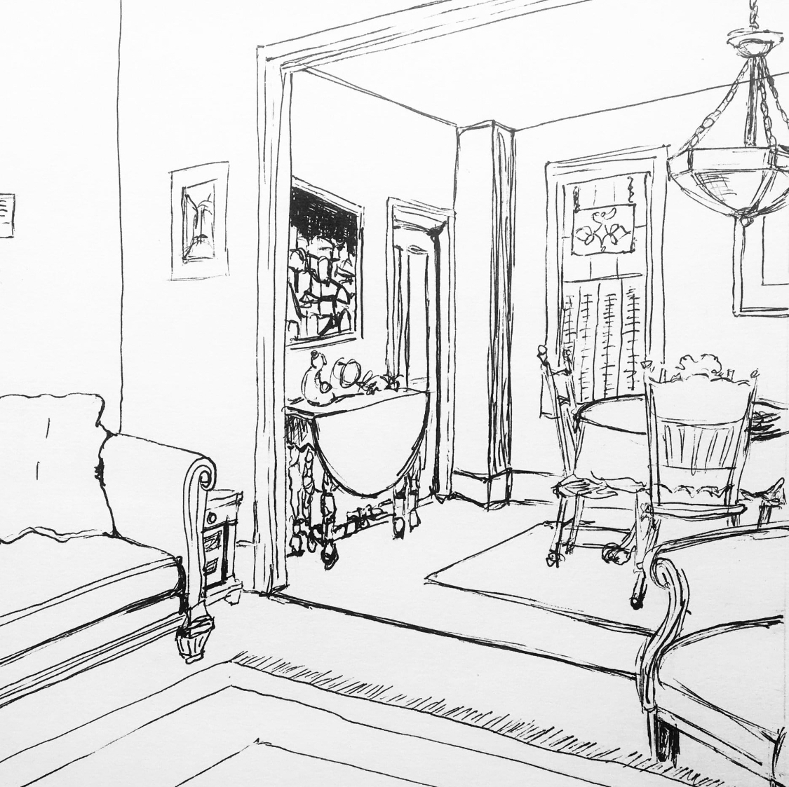
micron pen on paper, 9 x 12
X
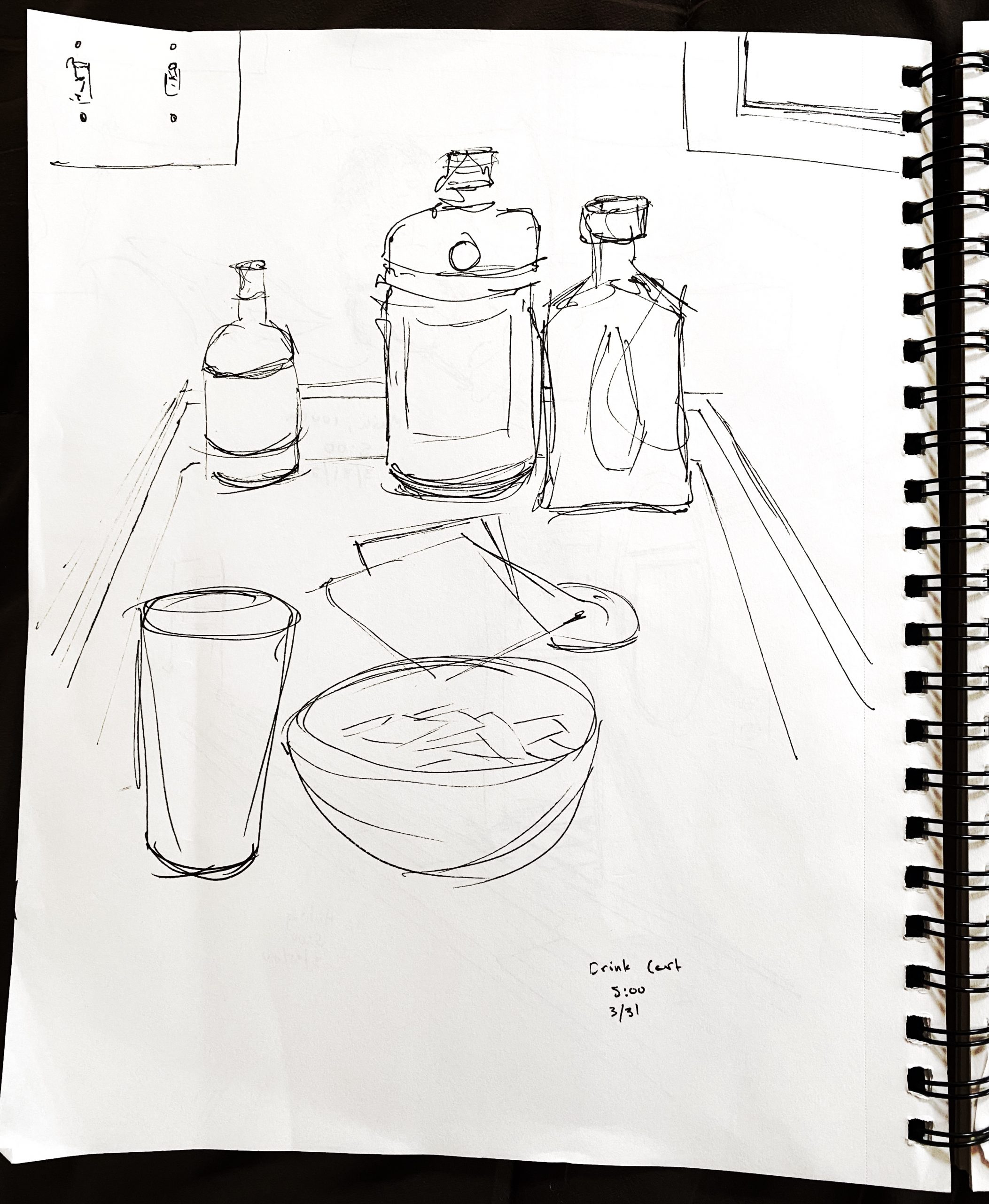
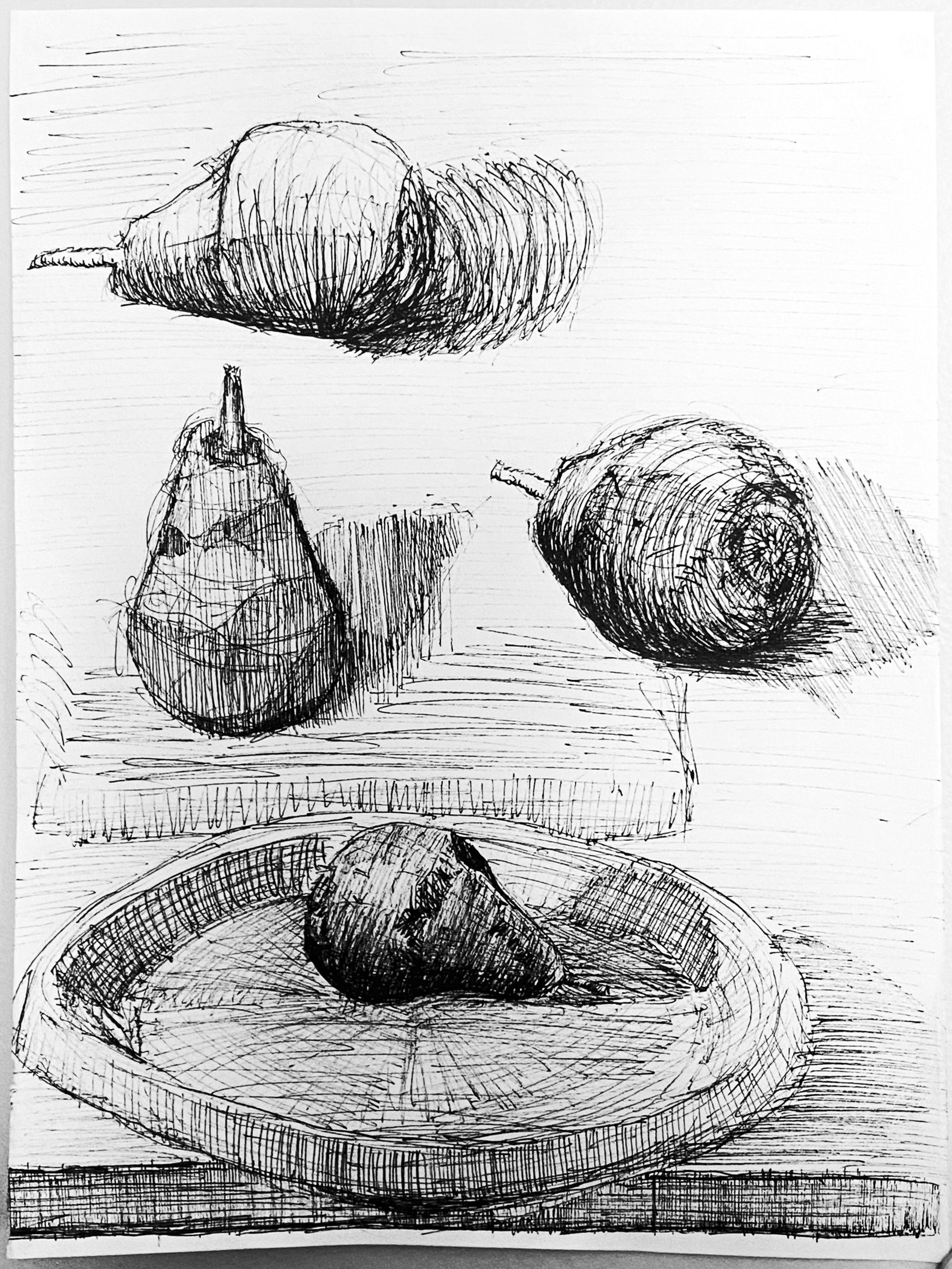
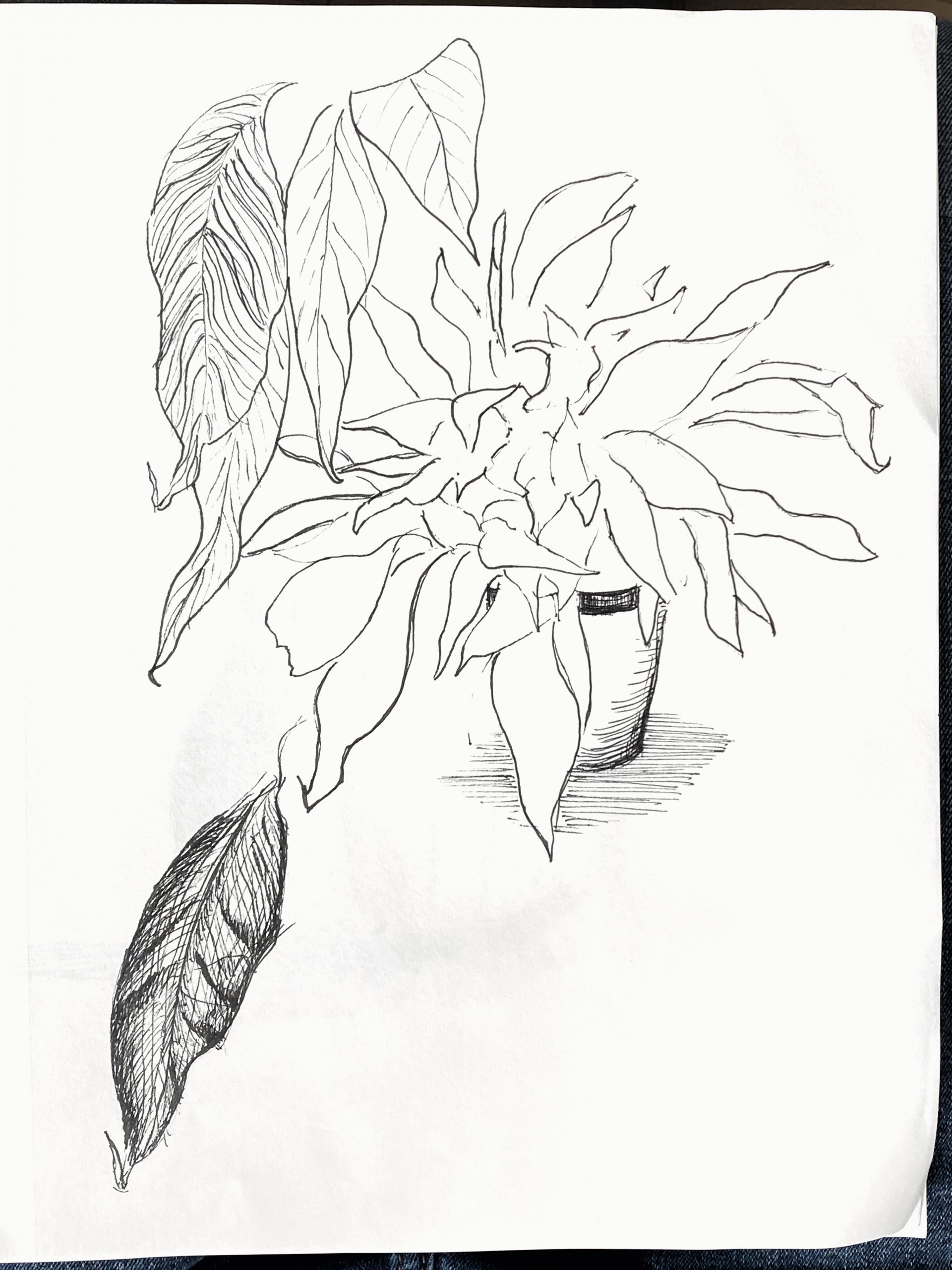
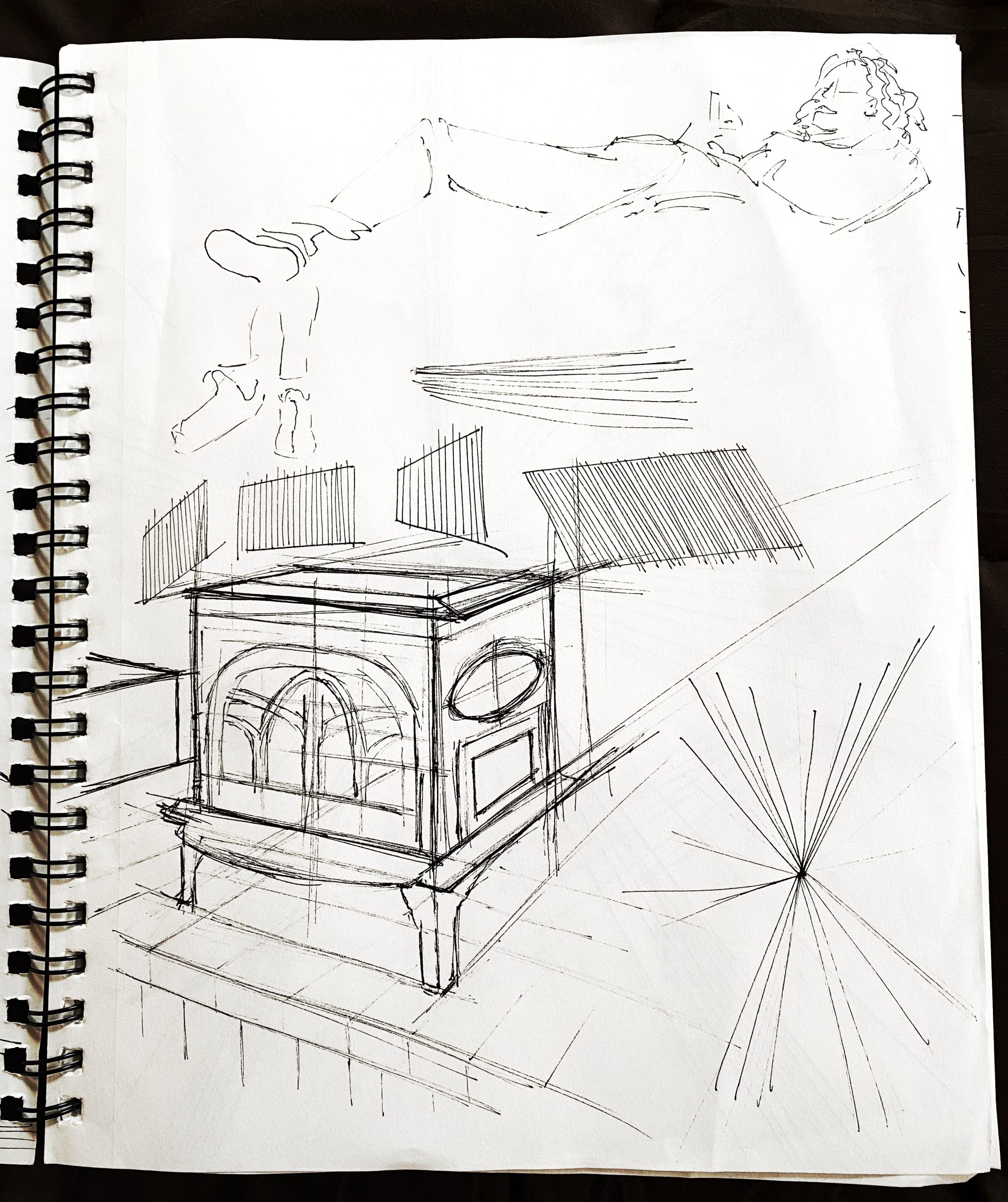
micron pen on paper, 9x 12
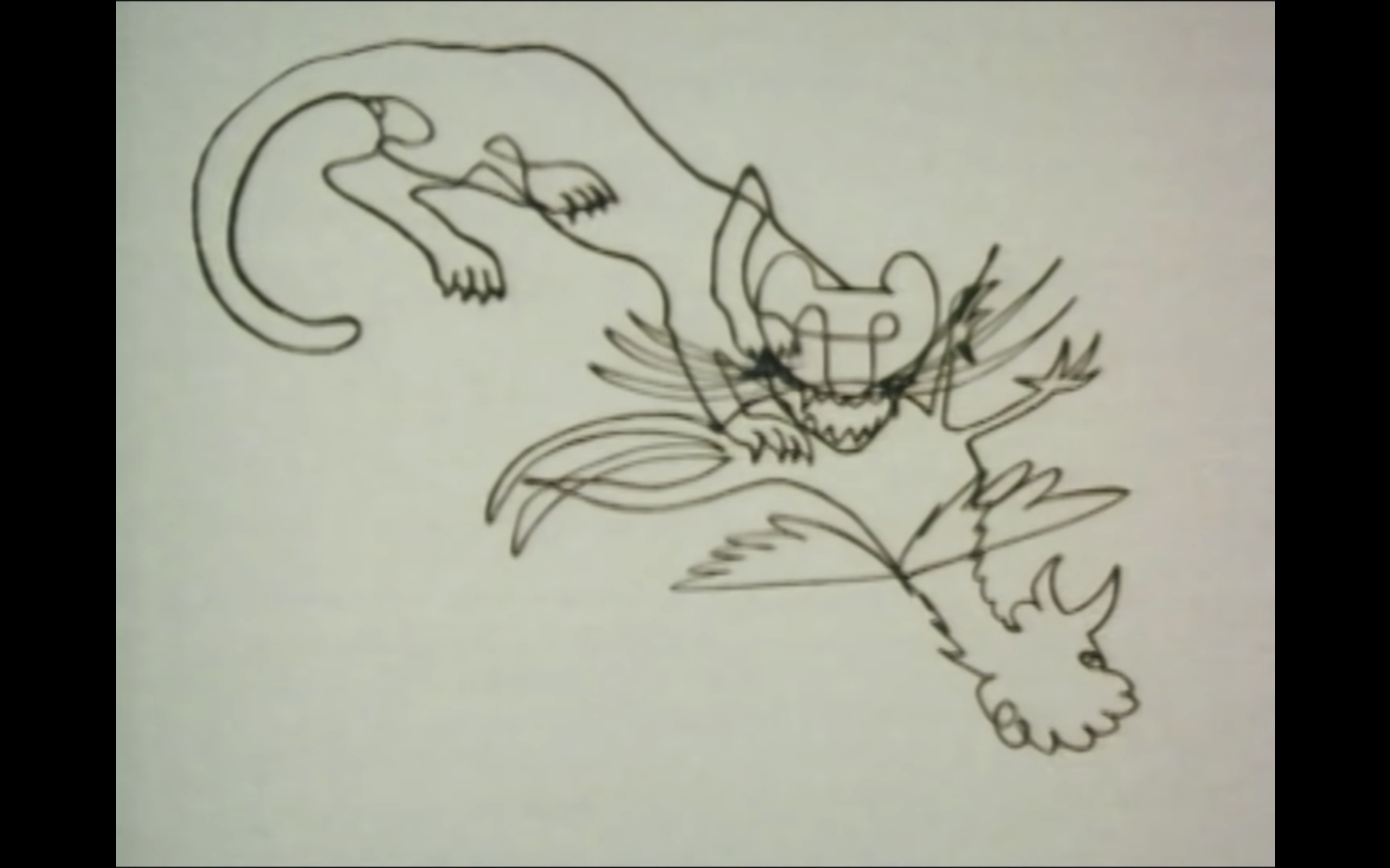
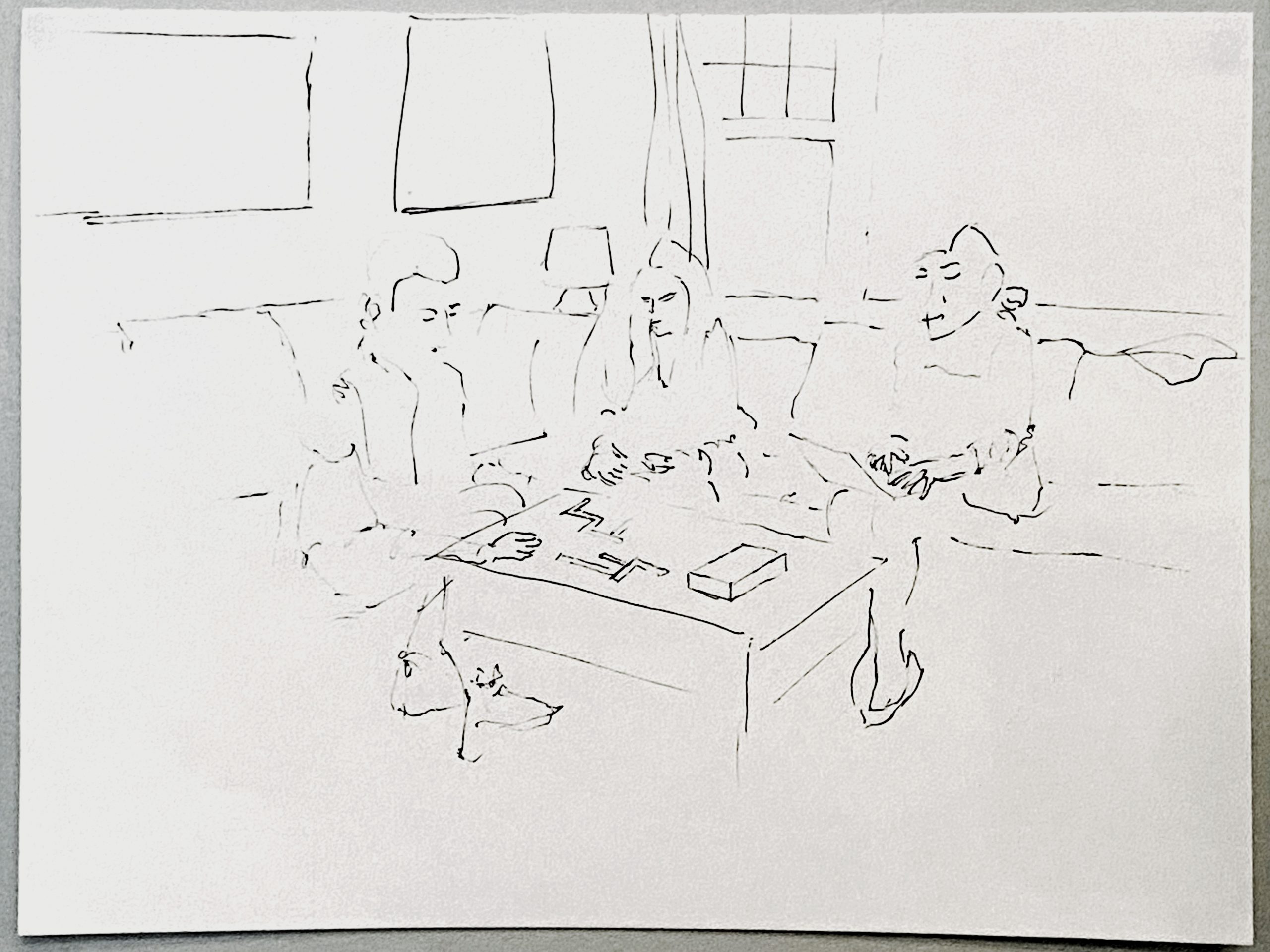
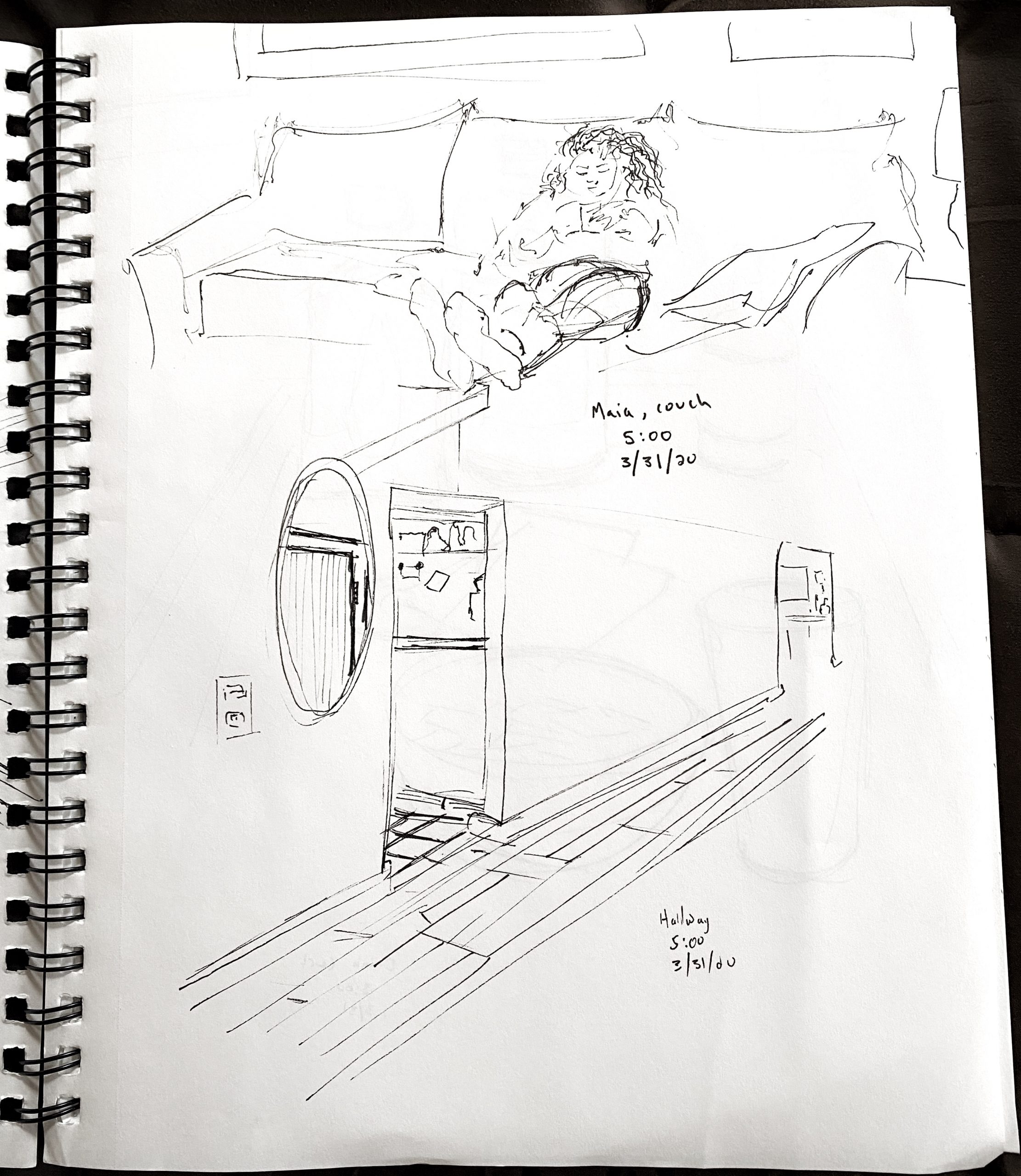
Love the quixotic and wistful relationship between the garlic and the outlet (a children’s book waiting to happen), but these are weirdly composed and don’t go far enough:
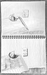
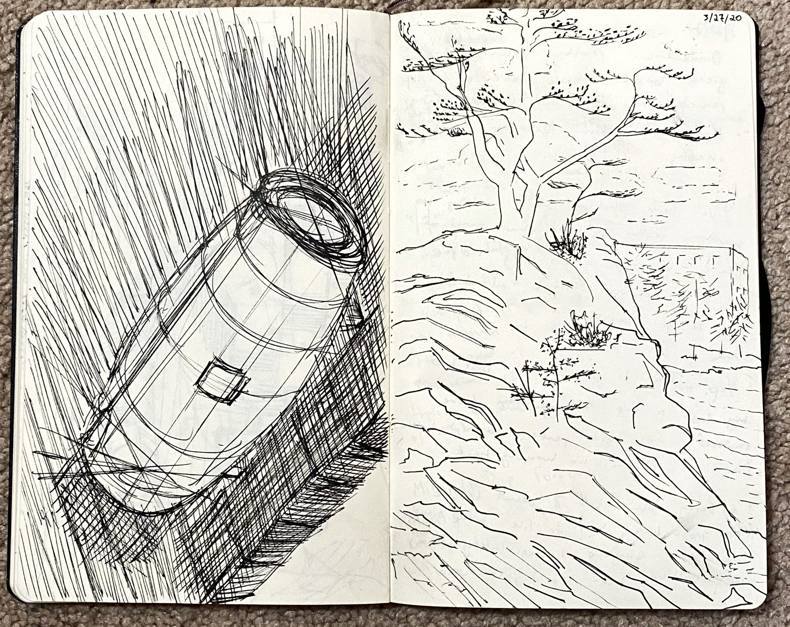
micron pen on paper, 9 x 12
Just a little more TLC in editing would make this so much better. Crop out the noise around the border and move the Saturation slider all the way to the left to eliminate the incidental color.
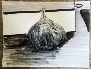
micron and prismacolor markers, 9 x 12
X
Note how it becomes so much more unified and coherent. I wasn’t even sure I liked this one, but now I do–a lot. Great contrast in the hatching for onion skin (perfect pairing) and the background hatching. Great composition as well–

 Micron on paper, 9 x 12
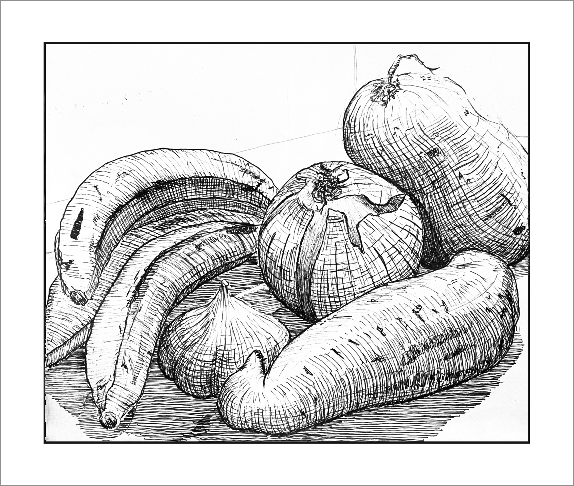
 Micron on paper, 9 x 12
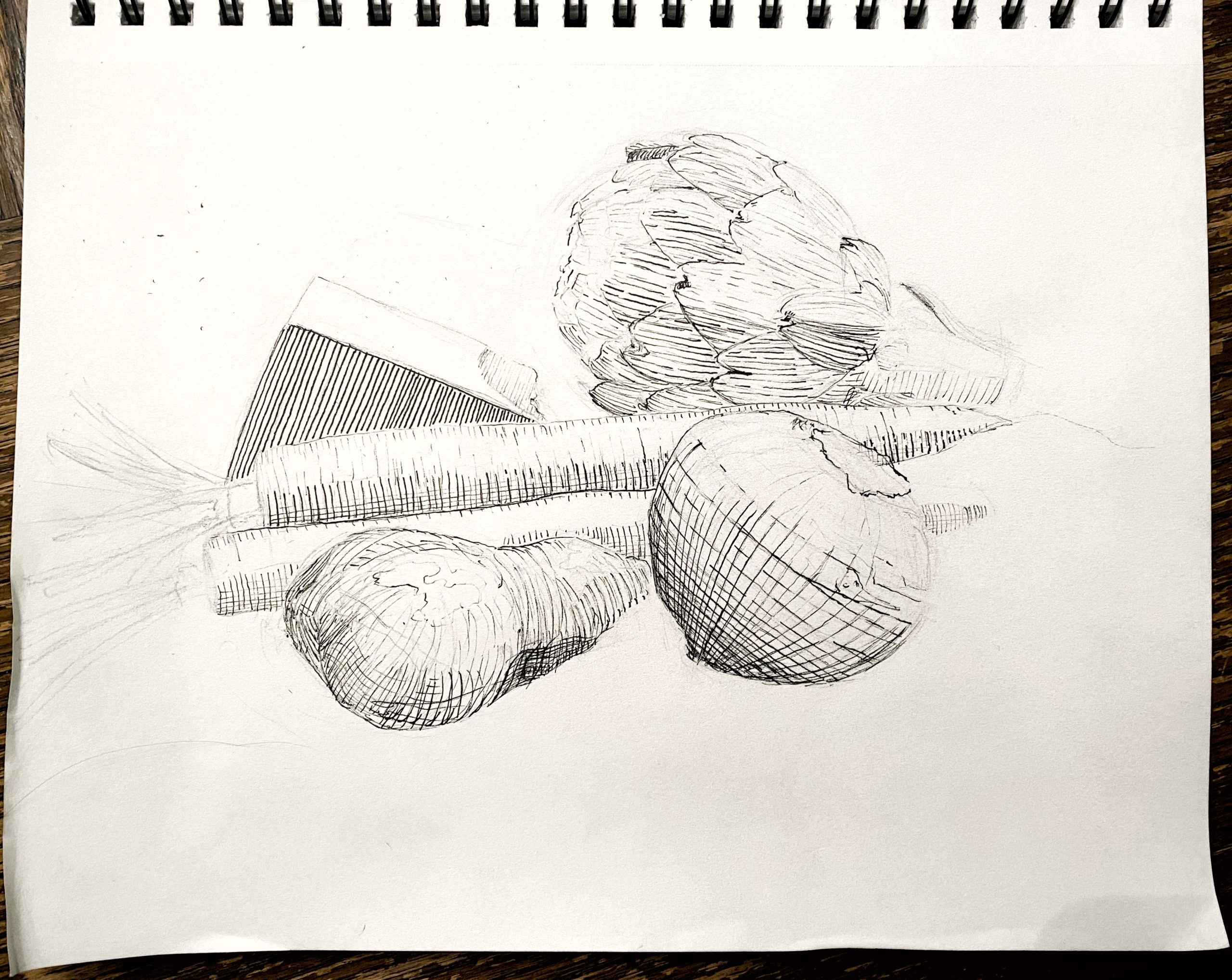
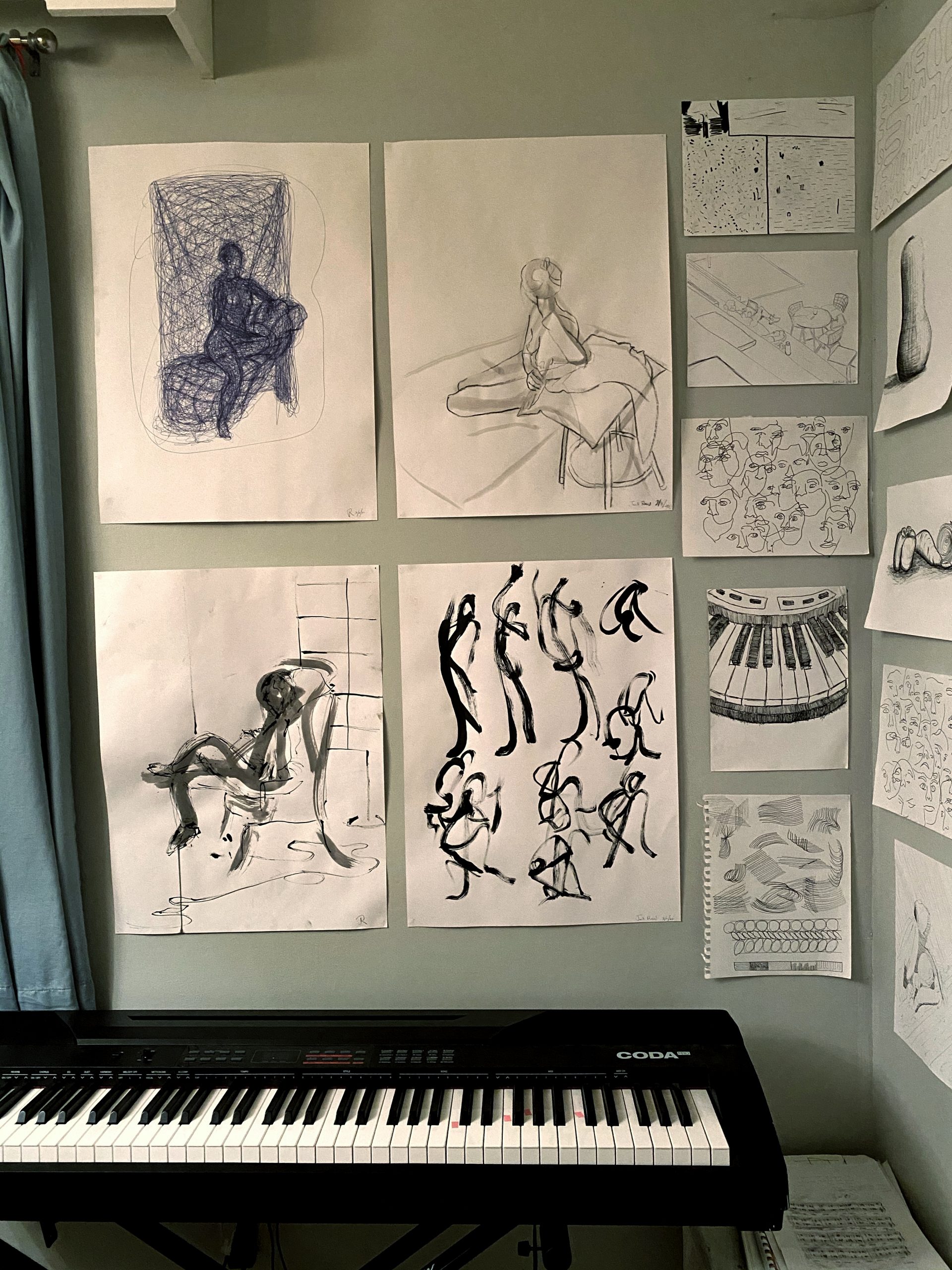
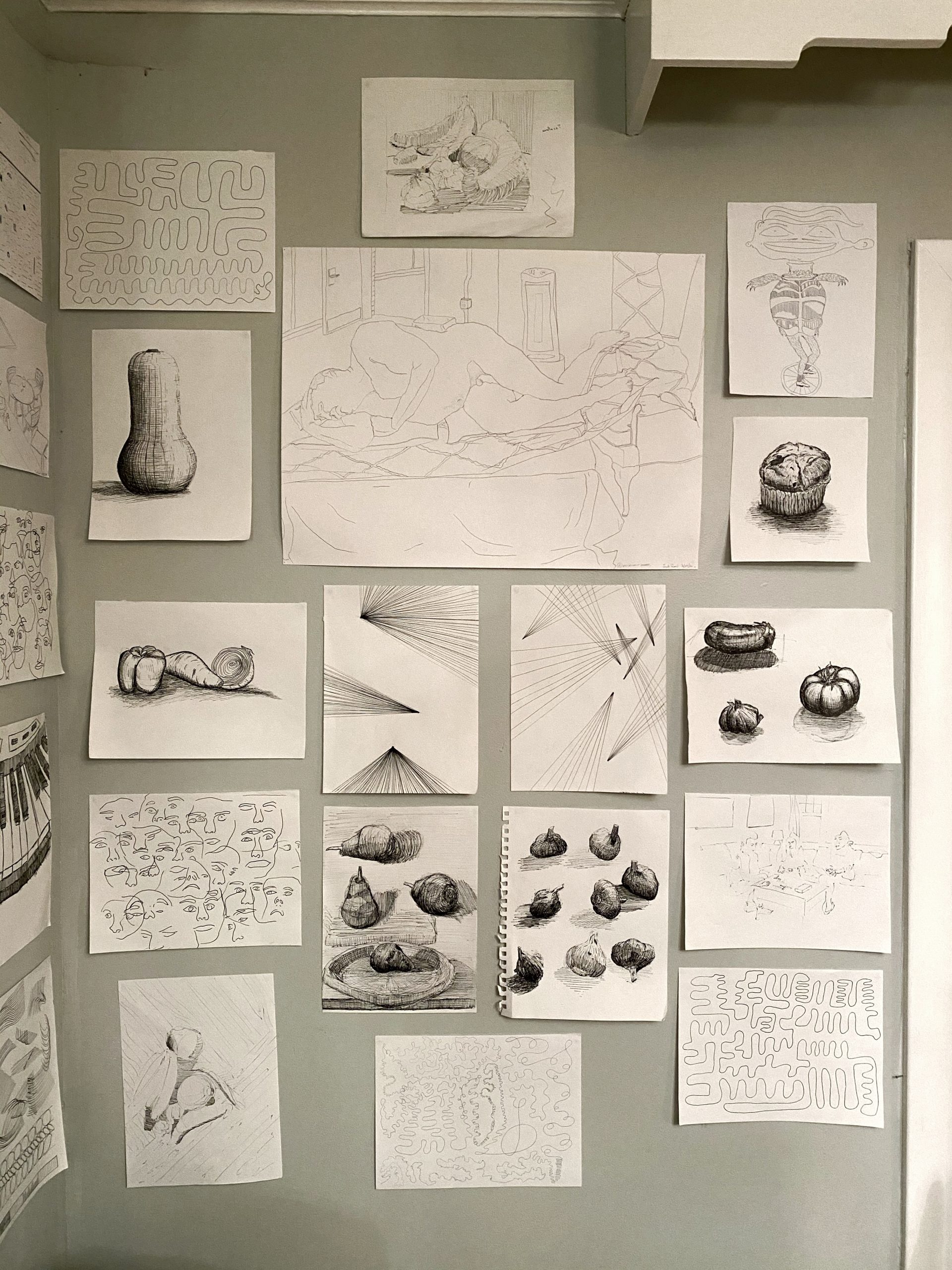


 Gina Occhiogrosso