X
X
X
X
Professor Mark Wethli – Spring 2020
X
X
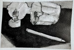
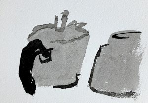
See my comment about the following:
Muqi Fashang, Six Persimmons, Ink wash, 13th century
X
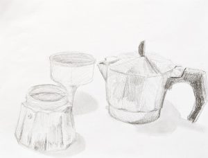
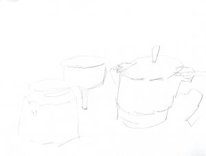
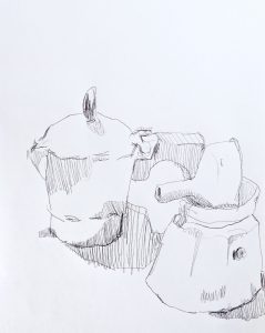
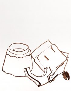
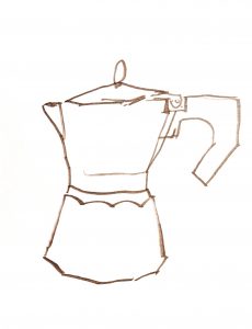
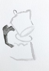
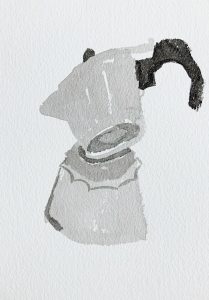
I’m suggesting that the one above and the next one down could be better composed to activate the page. They both feel a little cramped to me. Note the difference in the two revised versions I’ve included. I think it also isolates the objects more in space and makes it a bit more…forlorn?
There’s also something to be said for breaking out of the standard 9×12, 12×16, 16×20 world and working in a proportion that’s as decisive and unique as the images you’re making.
X
I ran across the following portrait of Richard Diebenkorn, by his friend David Park, and thought of your work. Just a few strokes, shapes, and values, but mostly about activating the white of the page.
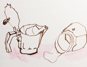
Also an interesting hybrid of your two main approaches–insouciant brushwork with an activated ground, but still “tied off” to the sides of the rectangle.
Went on a classic Sesame Street path for a bit and found that it stands up as an incredible collaborative art piece. Here are some selections that I personally enjoyed:
(I concur with C.M.’s conclusion)