Architecture Drawing

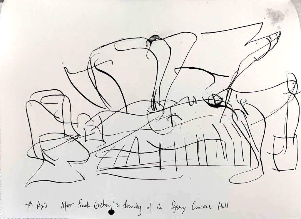
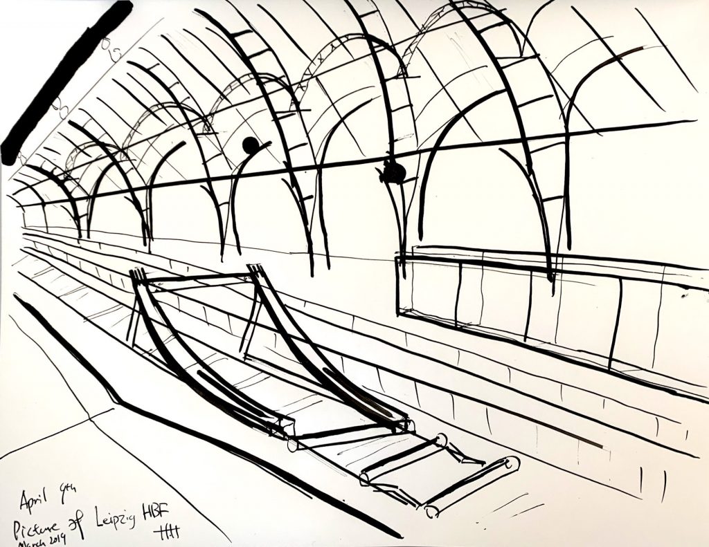
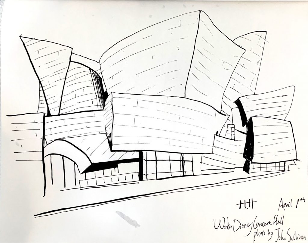
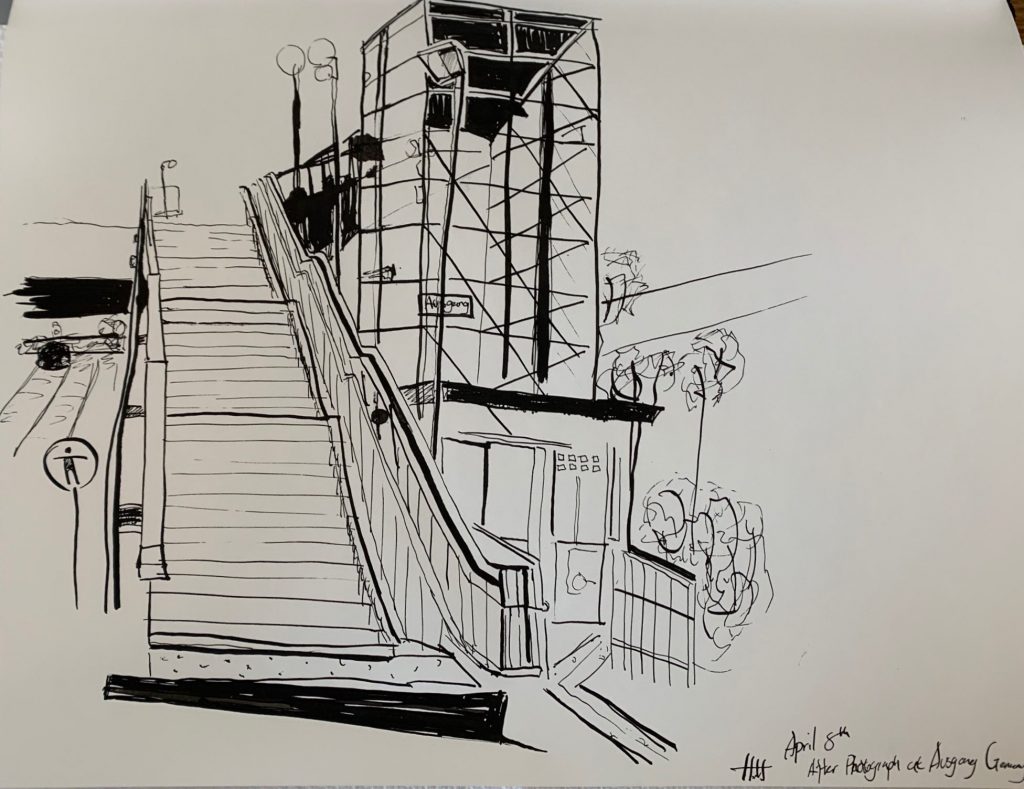
My prompt this week was similar last week. I got back to studying architect’s drawing and making my own from photographs from both photographers and my own.

I spent most of my time still, getting familiar with the medium. I found myself gaining better control over producing various line qualities. I started to experiment on using thinner lines to describe both structural information as well as texture details. These lines had such small visual weight to them. Thus they could be extremely quiet in an ordered formation, while capable of producing noise and attracting attention if drawn messy and unorganized.

I’m still having trouble with pinpoint accuracy with perspectives. I found it harder without settling down the major structural lines using thin sketch lines. Meanwhile, I do enjoy the decisiveness of tackling the structure right away.

Study of Frank Gehry

X


Leipzig HBF

X

Walt Disney Concert Hall Train Station

X

Sources:

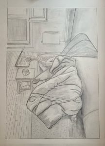
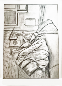
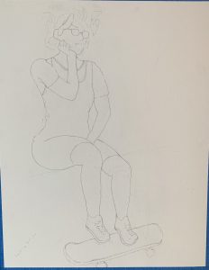
Working From Home

20 x 14 inches

Note the slight cropping at the bottom to activate that negative space and “launch” us into the space more strongly. This is also the best rendition of the drawing that I could muster from your photo. You need to start with a better exposure and then follow the editing instructions I’ve posted on Blackboard–it can take a little practice to get right, but the one of your grandmother suggests you’re getting the hang of it.


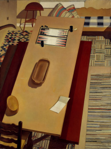
Charles Sheeler

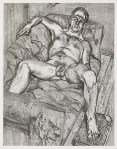
Lucian Freud

Polina Barskaya

Phoebe Nichols ’20

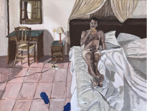
In this drawing, I wanted to continue working on my photo-realistic skills. I realized that in order to do this, I really needed to pay attention to value and making confident lines. I struggled with the amount of content and details of this drawing because of the size of the paper I decided to draw on. I think I began to build values but fell short in differentiating the values of the objects. If I had more time, I would continue to build the values and shading so that my composition would reflect the wide spectrum of lights and darks. I also struggled with the lights and shadows of the bundled blanket. I left out a lot of detail.

My Environment

Micron on paper 14×17

X

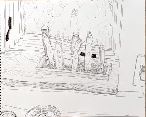
Darkening those latches might have been one of those steps too far–but you never learn about things like that until you try them. They kind of beg for a third (or maybe five) similar accents to establish them as a visual theme and unifying element. Or maybe things would have been better without them.


micron on paper 6×8

X

David Hockney

micron on paper 6×8

X

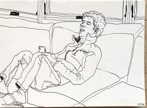
Someone suggested otherwise, but I think the slightly off center and unexpected cropping works well in these. It makes them more candid, like something caught at a glance.

micron on paper 6×8

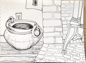
The wood texture opens the door to stippling on the stones and other hatched textures. The cross contours on the interior of the pot would work better if they actually described those planes, rather than being a 2D pattern inside an elliptical shape.


Week 2 Traum

Ink on Paper, 18 x 24
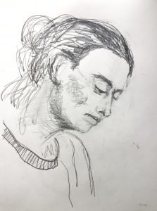
Graphite on Paper, 9 x 12
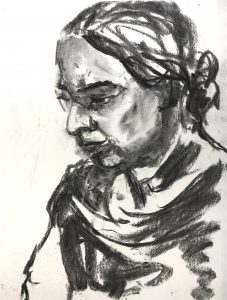
Charcoal on Paper, 9 x 12

X

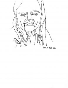
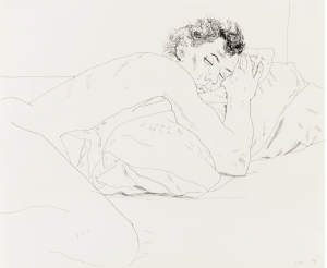
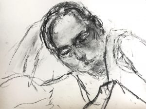
Jack’s comments on the one and below parallel my own and are very well expressed. Likewise Adam’s remarks. This is quite an extraordinary drawing, what I might call a “drawer’s drawing” (like when we speak about an “actor’s actor”). It’s so much about the inside game of drawing, about mark-making, and planes, and a meditation on seeing. And at the same time a very telling and convincing portrait of an individual. And so solid and self-assured.

When I teach portrait drawing  I make a big point about the importance of attire, and this is a textbook example. Love the way the sweep of that scarf (?) frames the portrait. Then something about that far arm being just an outline.

Charcoal on Paper, 9 x 12

X

As enthusiastic as I am about the one above it (and  by the way, not so terribly much about the 2 first ones), this one is next level. I don’t take it to be unfinished at all. Jack says it best: “It’s almost like you can see the model thinking and feeling in real time, not yet having reached any conclusions. This visual uncertainty seems like a fitting parallel to the uncertainty of covid times.”

It reminds me of an artist that I think you would like, R.B Kitaj.

Find out more about him—

And take very good care of these last two drawings of yours. There’s something very special at work in them.

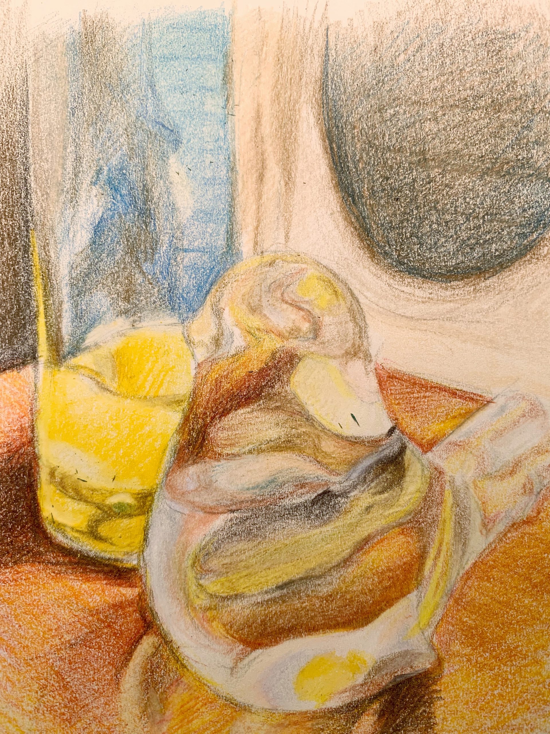
Through The Looking Glass–Week #2

This week, I focused more on using color to portray my objects. I did a glass bird and a glass with orange juice with hard colored pencil. Unfortunately, the pastel pencil order got canceled, so I couldn’t use blend-able pastel colors. Any advice are welcome!

For my self-reflection, I found that coloring with colored pencil was not as hard as I had thought, though I have never used colored pencils much. Drawing approximate ‘areas’ that divide the different colors before adding in the colors helps me with mastering the general look of the objects. The gradient effect and shades could be made with layering colors on top of each other (just like mixing colors in oil painting). It took me a little while to get used to blending colors in this manner. However, though layering dark colors over light colors was not difficult, it was a different story for doing the reverse. It was impossible when I was trying to add white highlights to the bird and the glass, so I did the highlights in eraser instead. I would like to add more touches of pastel pencil onto the colored pencil drawing to make better blends in the colors for next week. (If my pastel pencils arrive!)

5 x 8 1/4, white sketch paper with colored pencils

X

Still/Dynamic Life in the House

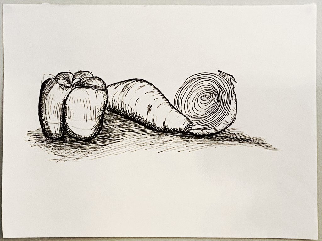
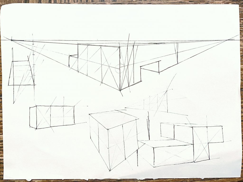
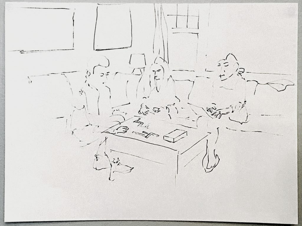
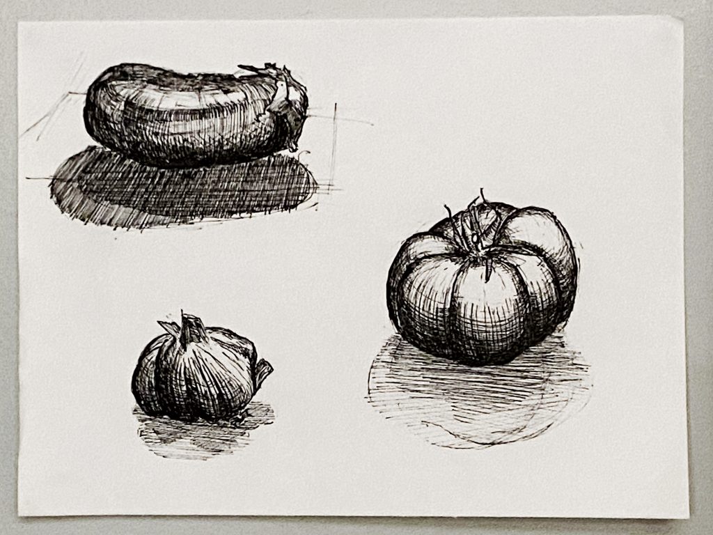
All drawings completed with micron .08 on 9 x 12 paper.
X (maybe…depends…)

Hey folks,

Having spent last week getting used to the micron, I figured now would be a good time to focus more on subject matter than medium.

I dedicated most of my drawing time this week to the hatched perishables. I spent a couple of days at the beginning of the week toying with “ideas” for drawings. After too much thinking I figured I should just sit down and draw an eggplant.

Good things for both eggplant and other foods. I like the tomato best. Prob 30-45 minutes for each on first sheet. Tried to be faster with the second, prob took about 40 minutes total.

I was thinking about shape more than light. I told myself that I’d rather have accurate structure than shading. It was freeing to not have to worry about “correct” shadows. None of the perishables closely resemble their real life counterparts with regard to light, but that doesn’t bother me. Shape is conveyed, and there’s enough value differentiation to get the job done.
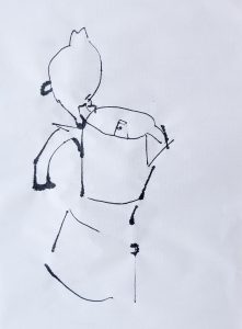
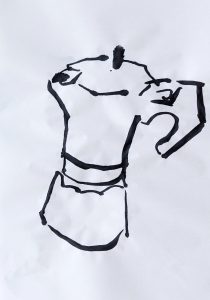
I also included a lesson from a drawing book on perspective. Helpful concepts, but I had a tough time applying perspective to things I actually looked at–hence the awkward plane around the eggplant. I intended to have all the foods “in space,” but then dropped the idea in favor of focusing on the food itself. To include perspective was too tricky.

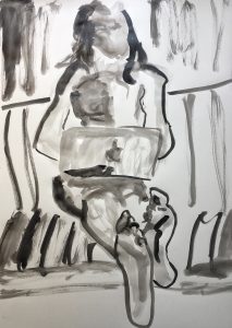
Last, a sketch of some housemates on the couch. Quick, prob 4-5 minutes. I like the way it feels like it’s beginning to materialize, with the darkest/boldest marks showing first. I don’t like the way laptop-roommate’s head is too big and also weird.

For next week, thinking of doing more still lives. There’s a big kale in the fridge that I have my eyes on rn, as well as some wilting flowers on the kitchen table.